
Recommended
More Related Content
Recently uploaded
Recently uploaded (20)
Featured
Featured (20)
Analysis of a double page spread
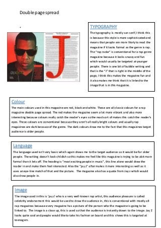
- 1. Double page spread + TYPOGRAPHY The typography is mostly san serif, I think this is because this style is more sophisticated and means that people are more likely to read the magazine if it looks formal as the genre is rap. The “rap radar” is conventional for a rap genre magazine because it looks snazzy and fun which would usually be targeted at younger people. There is one bit of bubble writing and that is the “J” that is right in the middle of the page, I think this makes the magazine fun and it also makes me think that it is linked to the image that is in this magazine. Colour The main colours used in this magazine are red, black and white. These are all classiccolours for a rap magazine double page spread. The red makes the magazine seema lot more vibrant and also more interesting because colours really catch the reader’s eyes so the read sort of makes this catch the reader’s eyes. These colours are conventional because they aren’t all really bright colours and usually rap magazines are dark because of the genre. The dark colours draw me to the fact that this magazines target audience is older people. Language The language used isn’t very basic which again draws me to the target audience so it would be for older people. The writing doesn’t look childish so this makes me feel like this magazine is trying to be abit more formal than it lets off. The heading is “most exciting people in music”, this line alone would draw the reader in and make them feel interested. Also the “jay z” after makes it more interesting as well as it uses an eye-line match of that and the picture. The magazine also has a quote from Jay z which would also draw people in. Image The image used in this is ‘jay z’ who is a very well-known rap artist, this audience pleasure is called celebrity endorsement this would be used to draw the audience in, this is conventional with mostly all rap magazines because every magazine has a picture of the person who the magazine is going to be linked to. The image is a close up, this is used so that the audience is instantly drawn to the image. Jay Z looks quite cool and people would like to take his fashion on board and this shows this is targeted at teenagers.
- 2. Double page spread Mode of address The mode of address used in this magazine is that the text is rather simple so that the audience knows what’s going on in the magazine, the text is also rather formal which is unconventional for a rap magazine because usually the magazines that are to do with music are usually in formal but because the target audience is older children this means that the magazine would have to be more mature.