Branding and packaging 2011 english
•
46 likes•5,096 views

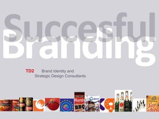
TD2 is a branding and strategic design consultancy founded in 1986 that provides services such as brand communication strategies, branding, packaging design, publications design, and online/visual identity design. They have a team of 10 specialists with experience since 1986 and expertise in strategy, creativity, and production. Their work is focused on analyzing brands and consumers to build brand differentiation and identity. They have experience working with various industries and have won international awards for their work.
![[object Object]](data:image/gif;base64,R0lGODlhAQABAIAAAAAAAP///yH5BAEAAAAALAAAAAABAAEAAAIBRAA7)
Recommended
More Related Content
What's hot
What's hot (20)
Viewers also liked
Viewers also liked (20)
Similar to Branding and packaging 2011 english
Similar to Branding and packaging 2011 english (20)
Recently uploaded
Recently uploaded (20)
Branding and packaging 2011 english
- 1. TD2 Brand Identity and Strategic Design Consultants
- 3. Track record of than 20 years with successful brands
- 4. Vision enriched by multi-industry experience
- 5. In-house research and innovation methods that produce value
- 9. Brand Names
- 10. Product Branding:- Brand logo- Packaging and labeling- Container and structural design- Product concepts- In and out concepts.
- 11. Point of Purchase Branding- Display stands- Printing and point-of-purchase concepts- Complete environmental branding- Structural design1 2 3 4
- 13. Publications and Print Media- Comprehensive print campaigns- Corporate or institutional brochures- Book publishing and production- Annual reports- Commercial brochures
- 14. Online Identity:- Concepts and contents- Look & Feel.5 6 7
- 16. What is Identity? Identity is a set of features unique to an individual or a group, that make them recognizable to others.
- 17. similar similar similar similar similar similar similar similar How similar or different can two members of the same category be?
- 18. It Depends on their Identity. The dimensions, depth and significance of the differentiation are what make up identity. And you have the power to control it. Differentiation is the heart of Branding.
- 19. At TD2, we are specialists in building this brand differentiation, through all forms of communication.
- 20. R What is a Brand? A brand is the mental and emotional impression people get from interacting with a product or service, bindingthem to it in a unique way.
- 21. A brand has an infinite number of contact points, and every one of them provides an opportunity to generate positive experiences that strengthen the ties between the brand and its market. Packaging Social Media Uniforms Advertising Architecture E mail Service Fairs Voice Mail Word of Mouth Brand Radio Publications Availability Internet ConstantQuality Ven dors Print PublicRelations Television Products Point of Purchase Signage Stationery Social Responsability Sales Personnel
- 22. At the same time, a point of contact that is neglected exposes a brand to negative associations or attack by competitors. Packaging Social Media Uniforms Advertising Architecture E mail Service Fairs Voice Mail Word of Mouth Brand Radio Publications Availability Internet ConstantQuality Ven dors Print PublicRelations Television Products Point of Purchase Signage Stationery Social Responsability Sales Personnel
- 23. DNA de la marca Quality Consistency Innovation capacity Reliability Values Commitment Credibility Sustainability Ability to adapt to change
- 24. We understand consumers, and we speak the visual language needed to conquer them.. Working on Branding projects means being an expert in managing visual language, to establish a clear difference in a highly competitive climate.
- 25. Revamping of the Palmolive Caprice line We turned the slightly awkward form of the label into an advantage, by using photos in which the model's hair flowed in all its splendor across the area, with pretty faces and smiling, friendly expressions, accompanied by ingredients depicted for taste appeal. From the selection of the models to the final product, we closely controlled all the details of the visual communication to create a design that drew an enthusiastic response in qualitative testing.
- 26. Before and after The variant's primary benefit for the hair is featured as a demo, with high shelf visibility. Models chosen for their friendly, fresh and modern look. Hair flows across the label. A triple-wave pattern gives the line its identity. Optimization and simplification of the typography Photo illustration in extreme close-up to emphasize fresh, natural qualities.
- 27. New Identity Old Identity
- 29. POP and Print We created specific pieces for different chains of supermarkets.The key visual poster concept is focused on the model’s hair, to achieve high impact from far distance.
- 31. Floor Display
- 32. We've created successful brands from scratch Unamarcadebeexpresar de manerainequivoca los valoresqueresuenan en la mente del públicoobjetivo, paralograr un vínculosólidoypositivo
- 35. +KOTA is a highly recognized brand in Mexico, with no advertising support
- 36. We give little fish teeth to eat the big ones. Understanding the dynamics of the category and the motivating factors behind a product purchase help us generate a focused, significant differentiation.
- 37. Before
- 39. Sold in duty-free stores in Cancun and Cozumel.
- 40. Sales of 3,000 bottles a year
- 42. After
- 43. • Well identified and aligned purchase drivers • Premium, international image • Re-focused values of tradition and culture • Optimization of available resources. • Same product, now sells for between $38 and $42 dollars • Production now tops 140,000 liters a year
- 44. • We developed a new name to secure brand registration in Mexico, Europe and United States Direct distribution in Miami, Texas and California
- 45. We keep working to build a premium identity Tequila Brand capable of conquer international markets.
- 46. We reinvent products with well-known brand names in order to keep them current. Consumers change, evolve, are in constant motion. For a brand to remain emotionally and rationally attractive, it has to evolve with its public, without losing its values.
- 52. 360ºBranding
- 53. 360ºBranding
- 55. This is the approved identity already in the marketplace
- 57. We exceed expectations by finding new opportunities. Many times, marketing areas known when it is time to evolve, but they're afraid the change will be too abrupt, and the result counterproductive. We have learned that we shouldn't underestimate the capacity to appreciate evolution and change, because we live in an era in which change is constant.
- 58. Alpura asked us to "refresh" the product, without touching their cartoon mascot but giving the brand more visibility. Before
- 59. • We ran an analysis of the brand's objectives and concluded that their mascot was out of line with the positioning they were looking for, and that there was a lot of opportunity to project taste appeal, natural goodness and healthy, family fun.
- 60. Before
- 61. We created de Identity for a new line of powdered Teas with the brand Zuko.
- 62. Sometimes an advantage must be gained through strategic creativity A brand should address all points of contact and take advantage of the opportunities that arise in various situations and times. Every detail counts. Failing to seize an opportunity also creates a negative impression in the mind of the target audience. .
- 64. We know how to redirect a brand's assets to renew it, focusing on its real target. For Casa San Matías, we revamped several brands. We identified the strongest assets and updated them, to remain with the current market while expanding to bring in a younger client base.
- 65. They did not have a standardized use of their Corporate Brand Identity across portfolio of products. These are some examples of how they identified the company in product labels.
- 66. The new corporate Brand Identity
- 67. The new corporate Brand Identity
- 68. Before
- 69. After
- 70. Before
- 71. After
- 72. Before
- 73. Before
- 74. After
- 75. We create identities through consistent concepts at all points of contact. Brand values are communicated at every opportunity, at every point of contact, in way that makes them attractive, relevant, memorable, and above all, that adds value to the experience of use.
- 76. Nestlé Nutrition NN is the Nestlé business unit that sells products scientifically designed to nourish babies from birth to 3 years old. Its communications are targeted at doctors, who recommend how a baby should be fed during the nursing period. The identity of this unit had to be totally different from Nestlé consumer products: reliable and credible in the medical community.
- 84. We treat local brands with the same enthusiasm as global brands Local brands have historically proven their ability to grow and position themselves as leaders, when managed strategically and creatively. Corona, Caprice, Gamesa and Cemex are just a few examples of local brands that have grown to become global giants.
- 85. Before Freska-ra is a Colgate local brand that had not changed its product identity in more than 10 years.We were asked to revitalize its packaging, keeping the its freshness and closeness as main values, and also keeping its price impression.
- 86. Finalistas These were the finalist designs of which the second was chosen.
- 88. Final Design
- 89. Nestlé Food Services NFS is the Nestlé business unit that sells its brands to the food preparation industry as part of its business model, from corner restaurants to corporate food chains. Its identity must be totally different and focused.
- 90. We started by using the existent brand logo visual assets to generate a fresh and clean visual look for all communications
- 91. All recipe books were designed with nutritional information “inside” the photo of the final dish.
- 92. The constant use of curves and generous white spaces was the signature style for all print and media communications
- 93. We focused the brand positioning by creating the new tagline. “Best brands working for you”
- 95. Designing high-level publications is one of our specialties. An annual report, an institutional brochure, or an art book--all are Identity tools that linger in the memory and among personal belongings.
- 96. Commemorative publication for Universidad Panamericana
- 97. Commemorative publication for Universidad Panamericana
- 98. Commemorative publication for Universidad Panamericana
- 99. AnnualReport Fundación Televisa 2007 Premio a! 2008
- 100. Annual Report FundaciónTelevisa 2008
- 101. Annual Report FundaciónTelevisa 2008
- 102. Commemorative 40-year Anniversary Publication GfaGrupoInmobiliario Creativity 36 Silver Award
- 103. Commemorative 40-year Anniversary Publication GfaGrupoInmobiliario Creativity 36 Silver Award
- 104. Commemorative 40-year Anniversary Publication GfaGrupoInmobiliario Creativity 36 Silver Award
- 105. Commemorative 40-year Anniversary Publication GfaGrupoInmobiliario Creativity 36 Silver Award
- 106. It would take forever to show you the full range of projects that we have successfully undertaken … Instead, let us hear about your needs, and share our ideas. AlcoholicBeverages Pharma Finnancial Foods Industrial Services B2B Education Entertaninment
- 107. Directors Rafael Treviño Rafael founded TD2 in 1986, and his earliest clients were Sabritas, Nielsen and Procter & Gamble. Since then, TD2 has built up an excellent reputation, managing band identity projects for companies like Alpura, Bimbo, Banamex, Citibank, Colgate, ConAgra Foods, LG Electronics and Nestlé, among many others. • Graphic design degree from UAM. • Marketing diploma from ITESM • Multimedia diploma from Gentec • Kellogg Executive Program on Branding, Northwestern University • Winner of Quorum prizes for packaging and annual report design. • Finalist in alcoholic beverage packaging in the London Festival Awards • Winner of various a! design awards, including a Platinum prize (Best of Show). • His work has been featured in the United States in specialized publications like Creativity and design books by Rockport Publishing. • He has given conferences on The Branding Show and Kids Marketing for the magazine Merca 2.0, and has written articles about branding for Expansión magazine. Ha publicado artículos sobre marcas en Expansión.
- 108. Directors Diana Mariño Diana joined TD2 in 2008 as Creative Director. She has a degree in advertising from the Universidad Jorge Tadeo Lozano in Bogotá, Colombia, with a major in Visual Communications. During her studies she has taken numerous workshops and seminars in the areas of creativity, alternative media advertising, and screenwriting for television and film. • Formerly art director at various agencies in Colombia, like Sabogal & Cía., MPC Inventaand Leo Burnett, until 2000; than at Creativa Integral (design and copywritig) and Leo Burnett and Lowe SSP3 until 2003. • In mid-2003 she was hired as Creative Director at Treetop-Rocket, the BTL division of SSP3. • In 2004 she joined Young & Rubicam Colombia as Creative Director. • In Mexico, she has worked as Creative Director at Studio 021 and is currently Creative Director of TD2, working with clients like Colgate-Palmolive, Unilever, Bayer and Conagra Foods, among others. • She has garnered awards and recognitions at festivals like Nova, Clio, FIAP, Festival del Caribe and was on the shortlist for Cannes and London Festival Awards. Has handled clients like American Express, Bimbo, Philip Morris, HaägenDasz, Renault, and Johnson & Johnson.
- 109. We can be the partner you need in creativity and innovation. TD2 is a company that delivers effective creativity, service, speed of response, technical capacity, and above all, a pro-active attitude.