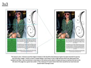
SlideShare a Scribd company logo
1 of 6
3x3

This layout is 3x3. I choose to put the image in 4 boxes in the top left corner because it gave me space around it to put my
text and other images. I chose to insert a simple design in two boxes in the to right because there was dead space that
needed to be filled. I also inserted text in two boxes in the bottom write which is simple and easy to read but the text to the
left side of the page has a green box under it. This is because if it wasn’t there then there would be too much text and
would make it boring to read.
6x4

My second layout is 6x4. the reason I did this was because it gave me more areas to split the page up making it look
more interesting. I split the text up at the top of the page into two sections which makes it more interesting to read. I
added the simple design in the middle to fill the dead space. I then inserted the image at the bottom next to the green
text.
4x6

This layout is 4x6. I chose to take up most of the space with the image because I wanted it to be the centre of the page. I added the
text in a long column to the side. Making the text longer makes it easier for people to read. I then added the green box at the
bottom just to finish off the page. Then finally I added the design in the corner because there was an empty space that needed to
be filled.
8x2
This layout is landscape 8x2. I chose to do this one
landscape because I wanted to see if I could lay the
page out better because the sizes were different. I
chose to place the image in the middle to split the
page up instead of having all the text at one side
because it would make it look like there was a lot of
text which will put people off from reading it. I split
the text up by adding the green box this make it
again look like there is less text making it more
attractive. Then I added the design on the left to pull
people in to the page.
5x6

This layout is 5x6. this time I chose not to stick within the grid completely. I split the page into two with one
side text and the colour side image. The text is covered with the design making it harder to read but still very
interesting. I did this because the design adds an interesting effect dragging people in to read more. I then did
two of the same image because I split it up into two parts just like the whole page. I then added part of the
same image across the page this pulled both side of the paper together, but leaving white space in the centre.
3x6

This layout is 3x6. this time I went completely against the grid and almost all parts of this page don’t fit within the grid
lines. It all fits within the boarder but then there is text that is spilt up into two parts and put next to each other in a way
that it is still easy to read. The 24 represents the page number but I made it big so it stood out and went against the
whole page. I split the image up into three sections because it make it more interesting that one simple image.

More Related Content

Viewers also liked

Greek Lesson 6 - Politics 3
Greek Lesson 6 - Politics 3Greek Lesson 6 - Politics 3
Greek Lesson 6 - Politics 3Lyricus
 
I’M A Proud Dad – Breastmilk Keeps My Baby Healthy And Strong
I’M A Proud Dad – Breastmilk Keeps My Baby Healthy And StrongI’M A Proud Dad – Breastmilk Keeps My Baby Healthy And Strong
I’M A Proud Dad – Breastmilk Keeps My Baby Healthy And StrongBiblioteca Virtual
 
Single User Electric Breast Pump Release Form
Single User Electric Breast Pump Release FormSingle User Electric Breast Pump Release Form
Single User Electric Breast Pump Release FormBiblioteca Virtual
 
The Renaissance, Reformation and Exploration lesson 2 renaissance origin an...
The Renaissance, Reformation and Exploration lesson 2   renaissance origin an...The Renaissance, Reformation and Exploration lesson 2   renaissance origin an...
The Renaissance, Reformation and Exploration lesson 2 renaissance origin an...Lyricus
 
R2iSMASH™: Tapping the Social Web to Reach Potential Members & Build Your On...
R2iSMASH™:  Tapping the Social Web to Reach Potential Members & Build Your On...R2iSMASH™:  Tapping the Social Web to Reach Potential Members & Build Your On...
R2iSMASH™: Tapping the Social Web to Reach Potential Members & Build Your On...R2integrated
 

Viewers also liked (10)

Greek Lesson 6 - Politics 3
Greek Lesson 6 - Politics 3Greek Lesson 6 - Politics 3
Greek Lesson 6 - Politics 3
 
What Can I Do If I Lose My Job
What Can I Do If I Lose My JobWhat Can I Do If I Lose My Job
What Can I Do If I Lose My Job
 
I’M A Proud Dad – Breastmilk Keeps My Baby Healthy And Strong
I’M A Proud Dad – Breastmilk Keeps My Baby Healthy And StrongI’M A Proud Dad – Breastmilk Keeps My Baby Healthy And Strong
I’M A Proud Dad – Breastmilk Keeps My Baby Healthy And Strong
 
Single User Electric Breast Pump Release Form
Single User Electric Breast Pump Release FormSingle User Electric Breast Pump Release Form
Single User Electric Breast Pump Release Form
 
The Renaissance, Reformation and Exploration lesson 2 renaissance origin an...
The Renaissance, Reformation and Exploration lesson 2   renaissance origin an...The Renaissance, Reformation and Exploration lesson 2   renaissance origin an...
The Renaissance, Reformation and Exploration lesson 2 renaissance origin an...
 
Carta
CartaCarta
Carta
 
Act Natural Breastfeed
Act Natural BreastfeedAct Natural Breastfeed
Act Natural Breastfeed
 
Suono K
Suono KSuono K
Suono K
 
R2iSMASH™: Tapping the Social Web to Reach Potential Members & Build Your On...
R2iSMASH™:  Tapping the Social Web to Reach Potential Members & Build Your On...R2iSMASH™:  Tapping the Social Web to Reach Potential Members & Build Your On...
R2iSMASH™: Tapping the Social Web to Reach Potential Members & Build Your On...
 
When Breastmilk Is Not Enough
When Breastmilk Is Not EnoughWhen Breastmilk Is Not Enough
When Breastmilk Is Not Enough
 

Similar to Task 4

6. production reflection
6. production reflection6. production reflection
6. production reflectionkallum-sykes
 
6. production reflection
6. production reflection6. production reflection
6. production reflectionkallum-sykes
 
Dps ps
Dps psDps ps
Dps psGemma
 
How I Made My Magazine (Presentation)
How I Made My Magazine (Presentation)How I Made My Magazine (Presentation)
How I Made My Magazine (Presentation)Andrew Johnson
 
Music Magazine Contents Page Drafts
Music Magazine Contents Page DraftsMusic Magazine Contents Page Drafts
Music Magazine Contents Page DraftsSarah Powney
 
Music Magazine Contents Page Drafts
Music Magazine Contents Page DraftsMusic Magazine Contents Page Drafts
Music Magazine Contents Page DraftsSarah Powney
 
Contents Page (Making)
Contents Page (Making)Contents Page (Making)
Contents Page (Making)fasihazaheer29
 
Front cover drafting 2
Front cover drafting 2Front cover drafting 2
Front cover drafting 2mickyb96
 
Construction of contents page
Construction of contents pageConstruction of contents page
Construction of contents pagesophcanning
 
Magazine cover layout decisions
Magazine cover layout decisions Magazine cover layout decisions
Magazine cover layout decisions trishamedia
 
Print screens of the double page spread
Print screens of the double page spreadPrint screens of the double page spread
Print screens of the double page spreadmiariam
 
production reflection magazine
production reflection magazine production reflection magazine
production reflection magazine DanMorland
 
School Magazine Stages of Production
School Magazine Stages of ProductionSchool Magazine Stages of Production
School Magazine Stages of Productionkittylantos
 
How I Made My Magazine (Presentation)
How I Made My Magazine (Presentation)How I Made My Magazine (Presentation)
How I Made My Magazine (Presentation)Andrew Johnson
 

Similar to Task 4 (20)

Presentation1
Presentation1Presentation1
Presentation1
 
Task 4
Task 4Task 4
Task 4
 
Task 4
Task 4Task 4
Task 4
 
Task 4 pp
Task 4 pp Task 4 pp
Task 4 pp
 
6. production reflection
6. production reflection6. production reflection
6. production reflection
 
6. production reflection
6. production reflection6. production reflection
6. production reflection
 
Dps ps
Dps psDps ps
Dps ps
 
Task 4
Task 4Task 4
Task 4
 
How I Made My Magazine (Presentation)
How I Made My Magazine (Presentation)How I Made My Magazine (Presentation)
How I Made My Magazine (Presentation)
 
Music Magazine Contents Page Drafts
Music Magazine Contents Page DraftsMusic Magazine Contents Page Drafts
Music Magazine Contents Page Drafts
 
Music Magazine Contents Page Drafts
Music Magazine Contents Page DraftsMusic Magazine Contents Page Drafts
Music Magazine Contents Page Drafts
 
Contents Page (Making)
Contents Page (Making)Contents Page (Making)
Contents Page (Making)
 
Front cover drafting 2
Front cover drafting 2Front cover drafting 2
Front cover drafting 2
 
Construction of contents page
Construction of contents pageConstruction of contents page
Construction of contents page
 
Magazine cover layout decisions
Magazine cover layout decisions Magazine cover layout decisions
Magazine cover layout decisions
 
Print screens of the double page spread
Print screens of the double page spreadPrint screens of the double page spread
Print screens of the double page spread
 
production reflection magazine
production reflection magazine production reflection magazine
production reflection magazine
 
Evaluation
EvaluationEvaluation
Evaluation
 
School Magazine Stages of Production
School Magazine Stages of ProductionSchool Magazine Stages of Production
School Magazine Stages of Production
 
How I Made My Magazine (Presentation)
How I Made My Magazine (Presentation)How I Made My Magazine (Presentation)
How I Made My Magazine (Presentation)
 

More from chloejefferson (20)

Task 10
Task 10Task 10
Task 10
 
Task 9
Task 9Task 9
Task 9
 
Task 2
Task 2Task 2
Task 2
 
Task 8
Task 8Task 8
Task 8
 
Task 2 unfinished
Task 2   unfinishedTask 2   unfinished
Task 2 unfinished
 
Task 7
Task 7Task 7
Task 7
 
Task 7
Task 7Task 7
Task 7
 
Task 1
Task 1Task 1
Task 1
 
Task 5
Task 5Task 5
Task 5
 
Task 6
Task 6Task 6
Task 6
 
Task 5
Task 5Task 5
Task 5
 
Task 3
Task 3Task 3
Task 3
 
Factual Writing: Task 1
Factual Writing: Task 1Factual Writing: Task 1
Factual Writing: Task 1
 
Discovery
DiscoveryDiscovery
Discovery
 
Task 3
Task 3Task 3
Task 3
 
Task 1
Task 1Task 1
Task 1
 
Task 5
Task 5Task 5
Task 5
 
Task 1
Task 1Task 1
Task 1
 
Task 2 22
Task 2 22Task 2 22
Task 2 22
 
Homeless questionnaire
Homeless questionnaireHomeless questionnaire
Homeless questionnaire
 

Task 4

  • 1. 3x3 This layout is 3x3. I choose to put the image in 4 boxes in the top left corner because it gave me space around it to put my text and other images. I chose to insert a simple design in two boxes in the to right because there was dead space that needed to be filled. I also inserted text in two boxes in the bottom write which is simple and easy to read but the text to the left side of the page has a green box under it. This is because if it wasn’t there then there would be too much text and would make it boring to read.
  • 2. 6x4 My second layout is 6x4. the reason I did this was because it gave me more areas to split the page up making it look more interesting. I split the text up at the top of the page into two sections which makes it more interesting to read. I added the simple design in the middle to fill the dead space. I then inserted the image at the bottom next to the green text.
  • 3. 4x6 This layout is 4x6. I chose to take up most of the space with the image because I wanted it to be the centre of the page. I added the text in a long column to the side. Making the text longer makes it easier for people to read. I then added the green box at the bottom just to finish off the page. Then finally I added the design in the corner because there was an empty space that needed to be filled.
  • 4. 8x2 This layout is landscape 8x2. I chose to do this one landscape because I wanted to see if I could lay the page out better because the sizes were different. I chose to place the image in the middle to split the page up instead of having all the text at one side because it would make it look like there was a lot of text which will put people off from reading it. I split the text up by adding the green box this make it again look like there is less text making it more attractive. Then I added the design on the left to pull people in to the page.
  • 5. 5x6 This layout is 5x6. this time I chose not to stick within the grid completely. I split the page into two with one side text and the colour side image. The text is covered with the design making it harder to read but still very interesting. I did this because the design adds an interesting effect dragging people in to read more. I then did two of the same image because I split it up into two parts just like the whole page. I then added part of the same image across the page this pulled both side of the paper together, but leaving white space in the centre.
  • 6. 3x6 This layout is 3x6. this time I went completely against the grid and almost all parts of this page don’t fit within the grid lines. It all fits within the boarder but then there is text that is spilt up into two parts and put next to each other in a way that it is still easy to read. The 24 represents the page number but I made it big so it stood out and went against the whole page. I split the image up into three sections because it make it more interesting that one simple image.