The biggest web design trends for 2015
•
0 likes•154 views

Every year a new set of design trends seek to shape the way that we view and communicate content. Sometimes these are just simple developments or incremental changes from the prior year, and sometimes they are big and new!

Recommended
More Related Content
Recently uploaded
Recently uploaded (20)
Featured
Featured (20)
The biggest web design trends for 2015
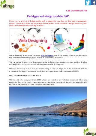
- 1. Call Us: 0418 693 764 The biggest web design trends for 2015 Every year a new set of design trends seek to shape the way that we view and communicate content. Sometimes these are just simple developments or incremental changes from the prior year, and sometimes they are big and new! But undoubtedly these trends influence Web Designers around the world, and start to make their way on to websites for large global brands as well as small businesses. You can try and forecast what these trends might be, but they are subject to change as ideas develop and people start to respond to what is being put out there by designers. However it is always nice to have an understanding of what we might see in the year ahead. So here are some of the biggest web design trends you can expect to see in the remainder of 2015. BIG, HIGH-RESOLUTION IMAGES This is a bit of a carryover from 2014, where we started to see websites implement full width images on their home pages. These are often accompanied by minimal text and are generally very expressive and visually stunning, when implemented well.
- 2. In the remainder of 2015 we can expect to see a further move towards the minimalist approach to these home pages, taking away text and replacing it with the more “experiential” images, particularly those that evoke an emotional response in consumers. LONG SCROLLING SITES As has been the trend with some of the biggest companies in the world (think Google and Apple), there will likely be more long scrolling sites (or one-page sites as they are often referred to) hitting the web. This is in response to the increased need for websites to be easier to navigate, and the massive shift towards mobile browsing. Long scrolling sites remove the need for the user to click through to find information, as it is mostly displayed on a single page. This also translates well to mobile devices, and fills the need for sites to be responsive to different screen sizes. CARD OR TILE DESIGN
- 3. Again, this goes hand in hand with the move towards mobile browsing. The benefit of this style of design is that it makes it easy to fill the space on a screen effectively without overcrowding it, and is easily scalable for a smaller screen. This is because the cards or tiles can simply shift to take into account the reduced width of a mobile device. For a great ecommerce website and online marketing solution, head over to Alinga Web Design and check out our portfolio. Like what you see? Contact us and one of our friendly staff will be more than happy to help you. Company Name: Alinga Web Media Design Address: 1 Como Crescent, Gold Coast, Queensland, 4215, Australia Phone: +61 418 693 764 Email id: alingawebdesign@gmail.com Website: http://www.alinga.com.au