Download as PDF, PPTX
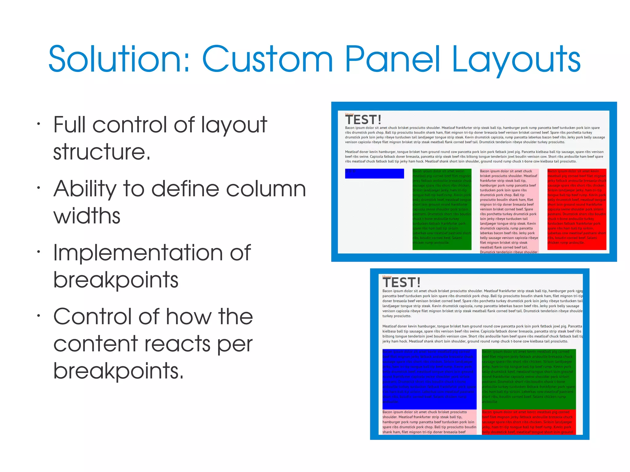
![hook_template_preprocess().
Utilize template hook to
add CSS classes to
regions
Provides means of
handling missing dynamic
content
// Sets the Panel layout classes.
$variables['attributes_array']['class'][] = 'panel-display';
$variables['attributes_array']['class'][] = 'panel-display—hero-four-column';
foreach($variables['content'] as $name => $item) {
$variables['region_attributes_array'][$name]['class'][] = 'panel-region';
$variables...['class'][] = 'panel-region--'.drupal_clean_css_identifier($name);
}](https://image.slidesharecdn.com/rockinresponsivecontentwithpanels-140308115948-phpapp02/75/Rockin-Responsive-Content-with-Panels-Layouts-11-2048.jpg)
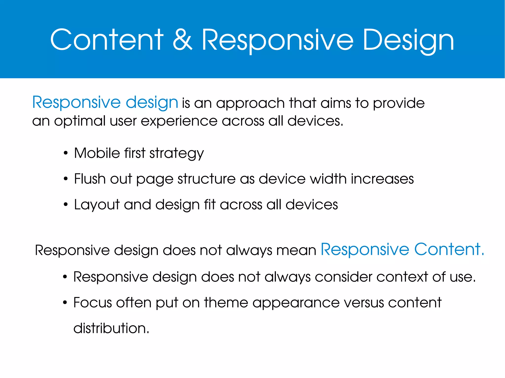
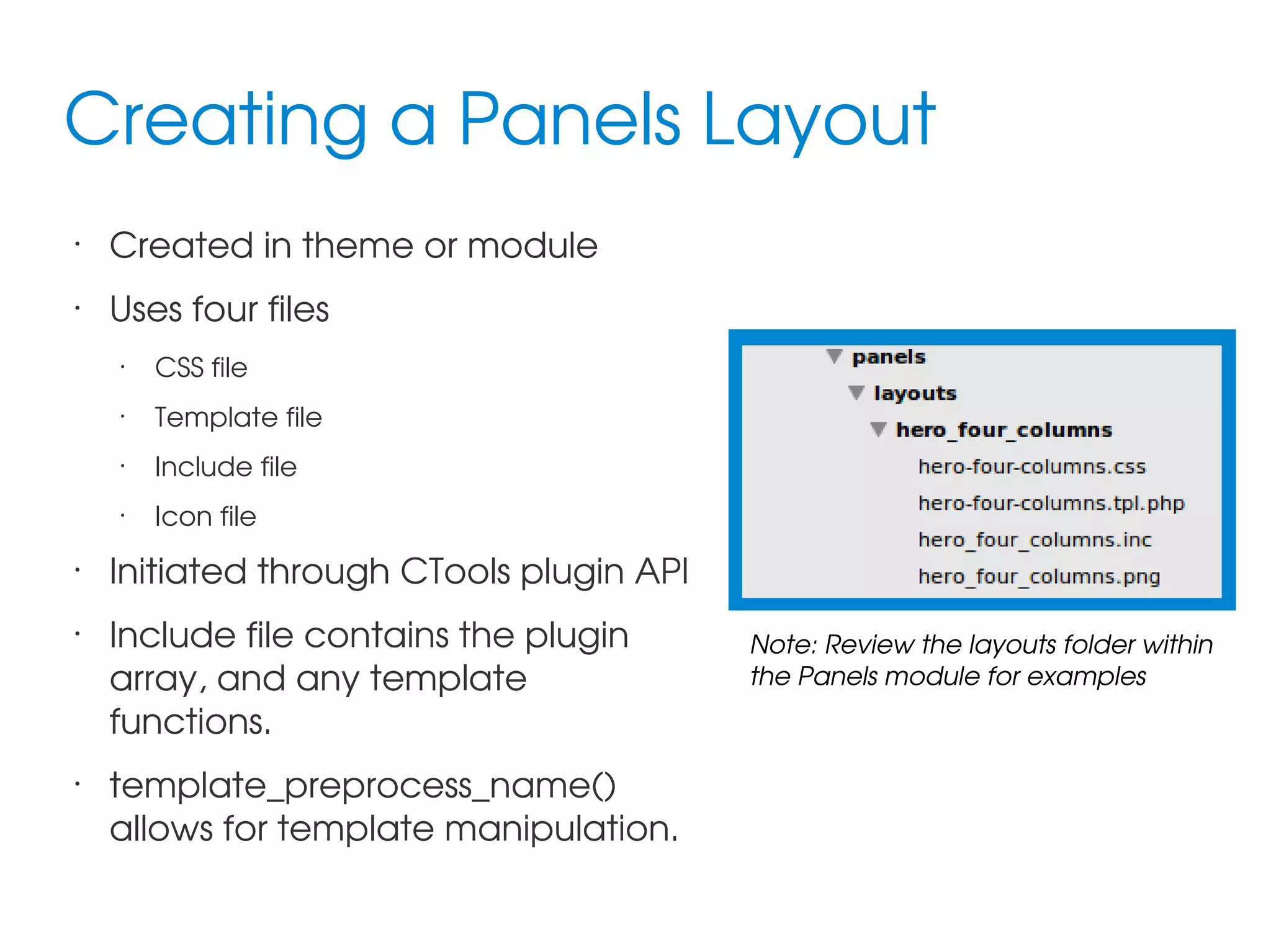
![Layout Template Example
•
•
•
•
<div<?php print $attributes ?>>
<div<?php print drupal_attributes($wrapper_attributes_array)?>>
<?php foreach(array_intersect_key($content, $layout['regions']) as $name =>
$item): ?>
<?php if (!empty($item)): ?>
<div<?php print drupal_attributes($region_attributes_array[$name])?>>
•
<?php print $item ?>
•
</div>
•
•
•
•
<?php endif; ?>
<?php endforeach; ?>
</div>](https://image.slidesharecdn.com/rockinresponsivecontentwithpanels-140308115948-phpapp02/75/Rockin-Responsive-Content-with-Panels-Layouts-12-2048.jpg)
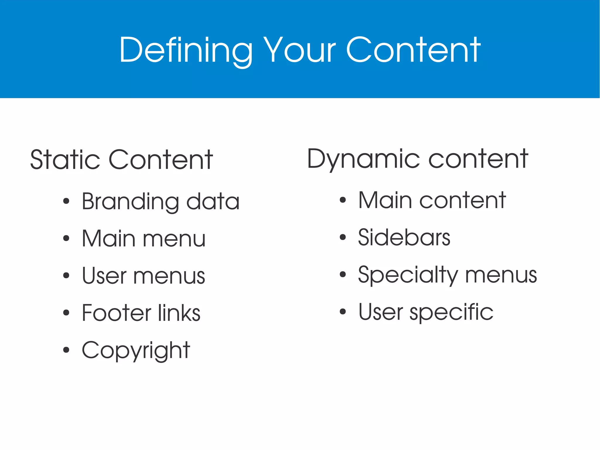
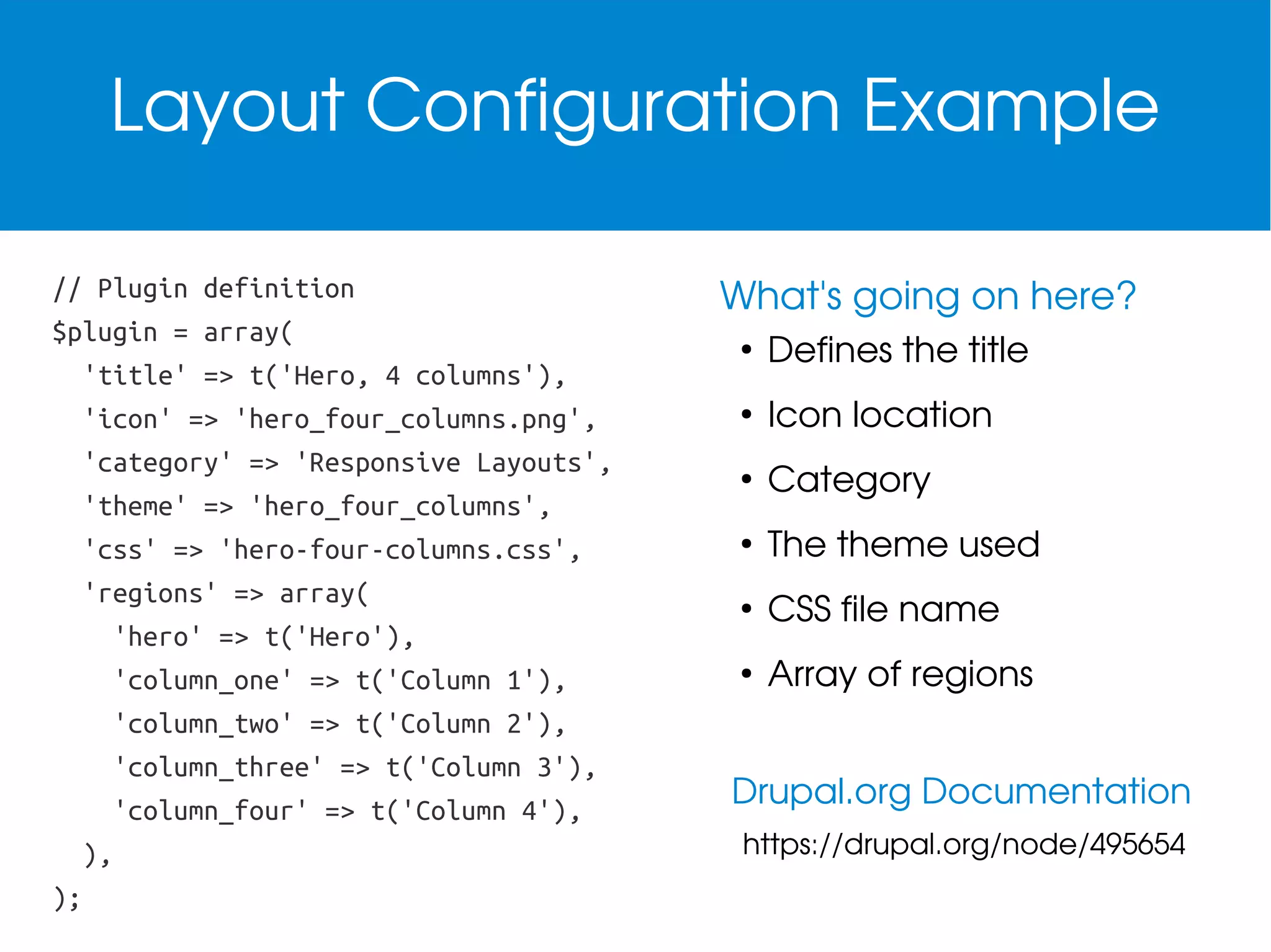
![Letting Panels Know About the Layout
Themes .info file
; Plugins
plugins[panels][layouts] = panels/layouts
Modules .module file
/**
* Implementation of hook_ctools_plugin_directory()
*/
function mymodule_ctools_plugin_directory($module, $plugin) {
if ($owner == 'panels') {
return "panels/$plugin";
}
}](https://image.slidesharecdn.com/rockinresponsivecontentwithpanels-140308115948-phpapp02/75/Rockin-Responsive-Content-with-Panels-Layouts-13-2048.jpg)

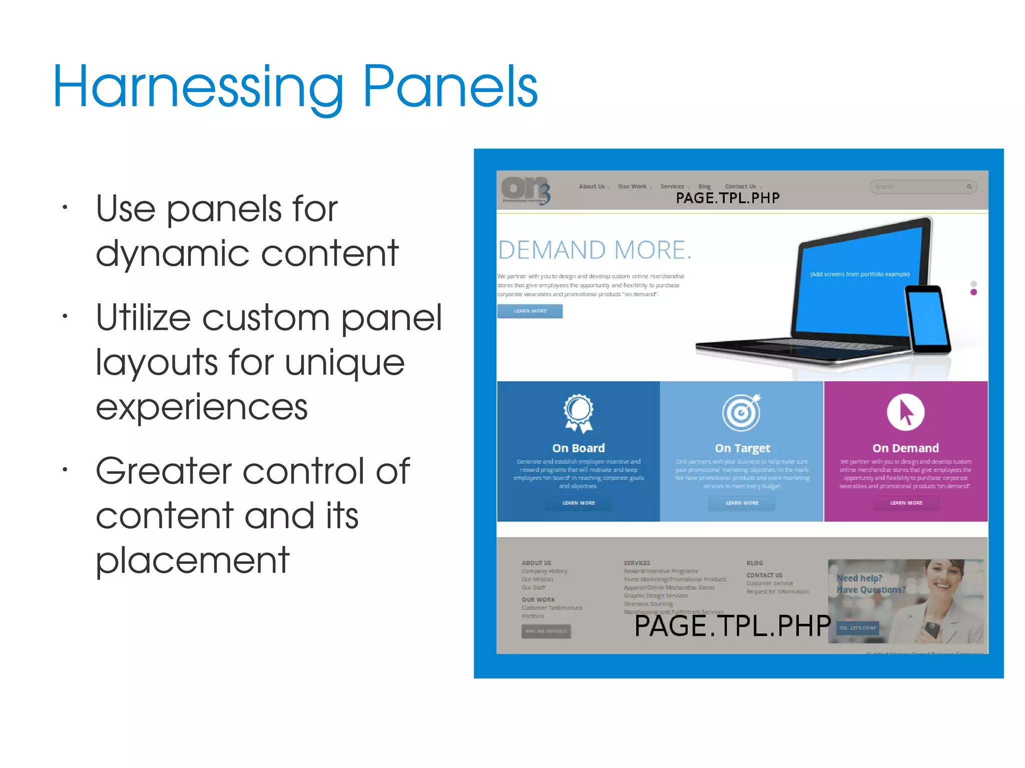
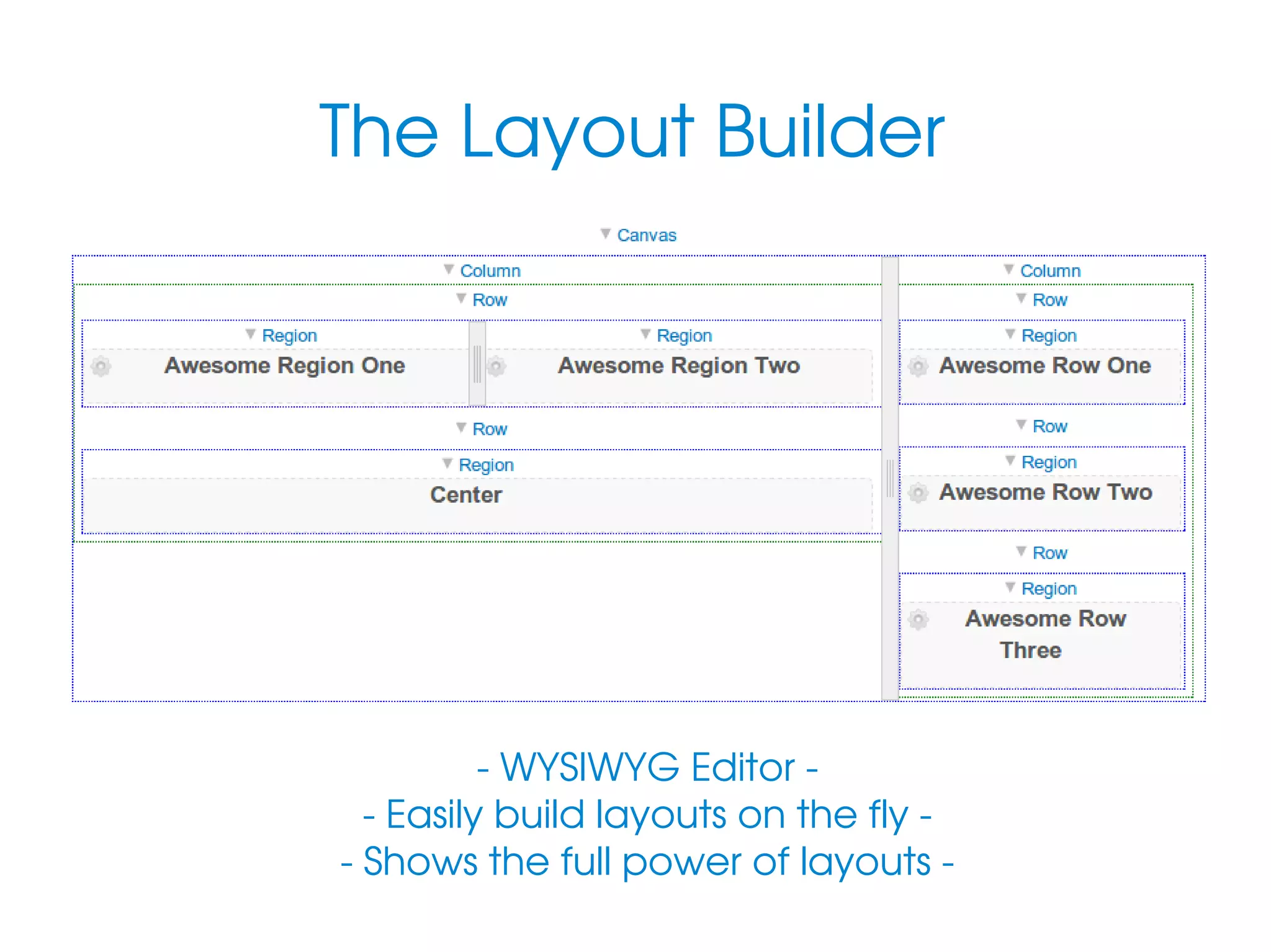
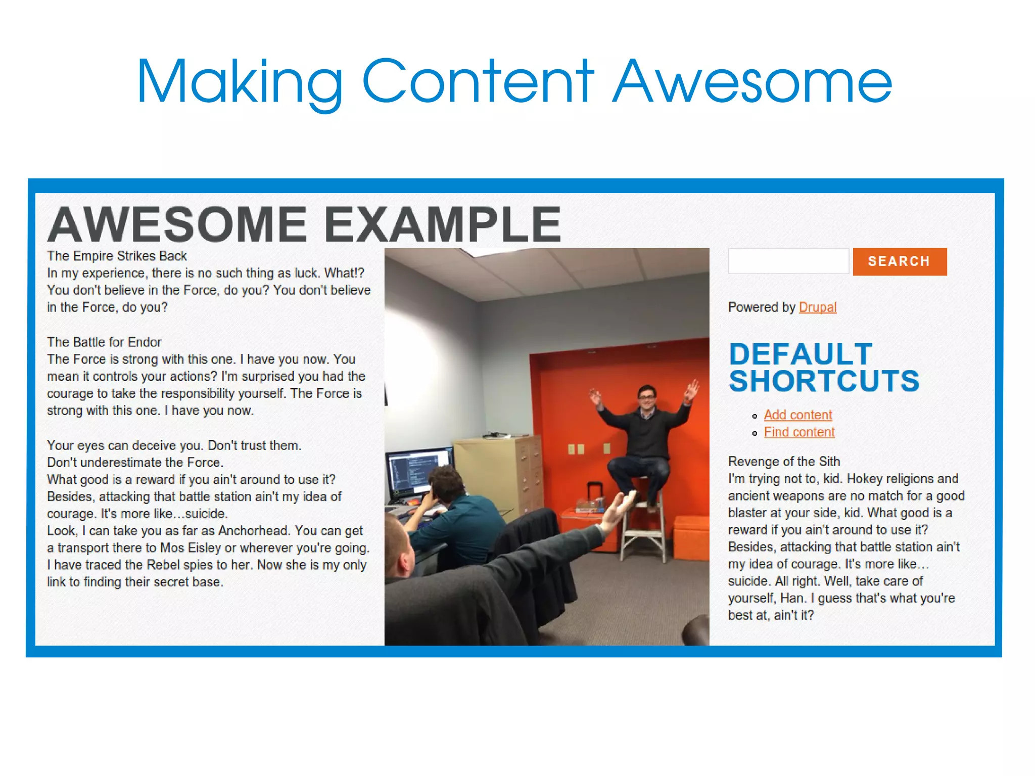
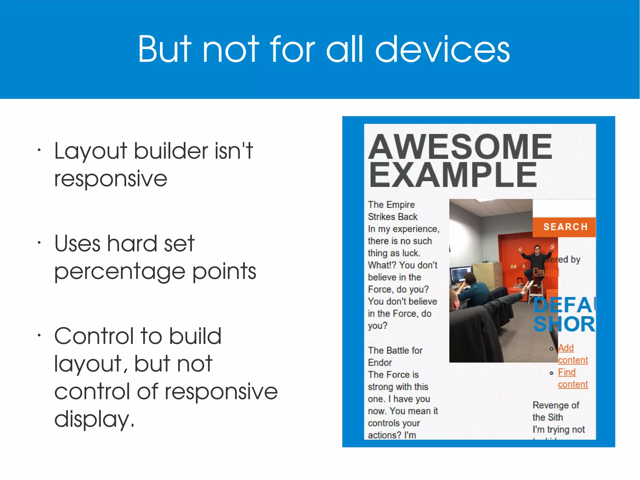
The document provides an overview of creating responsive content layouts using panels in web design, focusing on mobile-first strategies and the effective distribution of dynamic content across devices. It discusses the use of custom panel layouts, WYSIWYG layout builders, and the implementation of breakpoints for optimal experience across varied screen sizes. Additional resources and examples are included for creating and configuring layouts using tools like Singularity and Drupal.