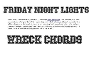
1. This is a font called FRIDAY NIGHT LIGHTS taken from www.dafont.com. I like this particular font
because it has a ‘campus theme’. It is a very simple yet effective because it has a black text with a
white lining around the text, this makes is very appealing too the audience as it is a fun and very
cool looking design. The ‘campus style’ font is also used at a lot alternative metal genres so it is a
recognisable and people already associate it with the genre.
2. This is a font that was taken from www.dafont.com. I like this font because it is
very sleek and stylish to look at, and the colour scheme with the black lower
half is very unique and attractive.
3. This is a screenshot from www.dafont.com , it is a potential candidate for
my masthead, however it is very stereotypical because it has one
uniform colour and it looks very much like other metal magazine
mastheads.