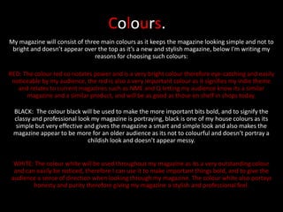
1. Colours.
My magazine will consist of three main colours as it keeps the magazine looking simple and not to
bright and doesn’t appear over the top as it’s a new and stylish magazine, below I'm writing my
reasons for choosing such colours:
RED: The colour red co notates power and is a very bright colour therefore eye-catching and easily
noticeable by my audience, the red is also a very important colour as it signifies my indie theme
and relates to current magazines such as NME and Q letting my audience know its a similar
magazine and a similar product, and will be as good as those on shelf in shops today.
BLACK: The colour black will be used to make the more important bits bold, and to signify the
classy and professional look my magazine is portraying, black is one of my house colours as its
simple but very effective and gives the magazine a smart and simple look and also makes the
magazine appear to be more for an older audience as its not to colourful and doesn’t portray a
childish look and doesn’t appear messy.
WHITE: The colour white will be used throughout my magazine as its a very outstanding colour
and can easily be noticed, therefore I can use it to make important things bold, and to give the
audience a sense of direction when looking through my magazine. The colour white also portays
honesty and purity therefore giving my magazine a stylish and professional feel.
2. Current Magazines Using These
Colours.
As you can see many magazines
use this colour scheme as its
powerful and is very attractive to
the eye, therefore after doing lots
of product research I have decided
to use these colours as many
successful magazines have used
them as they are stylish and classy.