2. The fact that there is a lack of dialogue means that the audience will purely judge the characters on their non-verbal
language and appearance. This helps with their exposition as it adds an element of mystery to the characters.
The supernatural figure will therefore be judged negatively due to its dark physique and lack of movement and
emotion through facial expressions. Also by creating a mystery it will entice the audience to watch on and find out
more about the characters.
In what ways does your media product use, develop or challenge
forms and conventions of real media products?
Plot- Our narrative is very conventional of supernatural horror. Paranormal activities begin to happen in the home, such as the music box
opening by itself and the flickering lights, and a mysterious figure appears. This then leads to a death. “The Amityville Horrors” takes a similar
format of this plotline.
We created the
supernatural
antagonist as an
enigma by not reviling
much information. For
example its gender ,age
and ethnicity is kept
unknown. We did this by
using mise en
scene to cover the
character. For example by
choosing certain
costume and make
up to make the figure
unidentifiable.
Also the low key lighting
and character
positioning meant that the
figure was hidden even more.
3. Titles- We used a dark Reddish-brown colour for our text to
connote death, horror and blood. This was inspired by
the red writing in Dawn Of The Dead.
Typography- We chose a thin font called ‘suicide draft’ It
visually works very well with our opening and is very creepy looking.
We ensure that we kept to the rule of thirds when placing the text so
that the audience’s eyes’ would naturally find the titles and therefore not
distract from the actual footage. We also didn’t animate or make the text
moving in anyway on the screen to make sure that all attention was on the
footage.
For our main title we also used a red-brownish colour
text. We made the screen fade to black so that the title
was clearly visible as the background would contrast
with the letters. The black background is very
conventional for horror films for example Insidious
used a black background with red writing.
4. Location- It is conventional for a supernatural horror to be set in the home of the protagonist. Supernatural horrors
are set in people’s homes because it promotes the fear of something unwanted and unfriendly entering your own personal space, making
you feel frightened in the one place designed to make a person feel comforted and safe, this is what we wanted to create for our
opening.
In the bedroom we made sure that
everything was plain and simplistic.
This way the set design
didn’t distract from the protagonist
Hannah and didn’t reveal much
information about her. Also the fact
that we kept the walls bare meant
we could create stylistic shadows
on the walls.
Having it set in what is meant to be a safe environment will
automatically place the audience on the side of the
protagonist and feel empathetic towards them
because we relate to how we would feel if our own homes
were being destroyed. This makes us defensive and angry
at the spirit for ruining what is usually a new safe place.
An example of a super natural horror film
which we have researched that is set in a
house is Paranormal Activity.
5. Characters -Our main character in the opening is a seemingly
normal girl who appears as harmless. We created her as a
relatable typical girl which is a very conventional
character in supernatural films. Characters within the horror genre are
conventionally natural women with a fresh faced look with simple
clothing , this presents the beautiful female form and doesn’t project
them as sexualised.
The first impression of the paranormal spirit is negative and confusing
as to why its tormenting the ordinary girl.
As many people believe that spirits and ghosts are just stories and not real
life its important to make the idea or notion seem as real as possible. So,
the use of characters in their own home relates them to the audience
watching, this common ground adds realism to make the characters
seem like them.
6. Props Usually in supernatural horrors if there are any weapons
it is, household appliances, kitchen utensils, ornaments,
and garden equipment anything that is sharp, long and or heavy.
So we have been conventional by using an iconic kitchen
knife.
This subgenre tends to have less blood and violence as it is more focused
on paranormal events. However we have challenged this convention
by making it very gruesome using a lot of prosthetics. This was inspired by
Zombieland.
7. For the non diegetic sound we slowly built in up through out the piece. At the start is low ambient music and then
later on we begin to overlay more sounds and incorporate high pitched sound at certain points. This way would could
slowly build tension and apprehension.
Sound- In this sub genre empathetic sound
is used to reflect the mood of the characters in
scenes of fear, panic and chaos. Using this
technique has allowed us to use sound to anchor
the visuals. For example when Hannah is
reading the article report of her own death high
pitched violins start to play to connote the fear she
feels:
In this genre, especially ones that involve a child-ghost, you can create
contrapuntal sound by adding sound that is supposed to be sweet,
innocent and endearing to a scene where something terrible is about to
occur. In our opening we have used the delicate music box sound which plays near
the start of the opening and returns at the end when the protagonist has died.
8. Many horror films use POV shots to make the audience feel more involved in the film and to create verisimilitude. The
audience will also relate more strongly to the character whose eyes they are looking through. We took this technique from the film
Zombieland.
The conventional flickering lights shots are inspired by Amityville. Light flickering indicates that something
unnatural, unexplainable and supernatural is about to happen. It creates tension and makes the audience feel
uneasy.
9. When developing concept we looked at a film called ‘The Possession’. Objects moving unexplainably and this is very
conventional of supernatural horror. It creates unease and breaks down verisimilitude which would be very disconcerting for the
audience to view.
We really liked the use of a box and how it
contained the power to possess the characters.
In ‘The Possession’ the box appeared to be alive.
We took this idea but decided to use a music box. This
way we could incorporate the delicate music box music
as well.
10. We were inspired by a clip in Donnie Darko. To recreate the clip we used a steady cam frame and rotated the camera. The shot
created a sense of uneasiness and almost places the audience in the confused mind of the character themselves.
Creating discomfort through camera movement is very conventional of horror films. It plays mind games on the audience and makes
them focus more on the film as they try to grasp what is happening.
11. We used continuity editing through out the piece to create verisimilitude. We achieved this by cutting on action. Continuity editing
meant that the piece is more realistic and believable as many people wouldn’t believe in the supernatural figure.
The continuity editing gave
prevalence to the protagonist
Hannah. This makes the audience
sympathise more with her than any other
character.
12. We used character blocking to convey which character was in control and superior in the situation.
As the antagonist is
placed behind the
protagonist it is in the
position of power
as it can see her but she
can’t see it, giving a huge
advantage to the
creature.
It is very conventional for the monsters in horror films
to be placed behind characters. This means that the
audience usually sees the monster before the characters
do, this adds apprehension to the audience as they
wait in anticipation for the character and monster to come
into contact. This is used in the film Insidious.
The protagonist is
oblivious to the fact
she is being watched,
her guard is down and
attention is being
averted to the article
on the wall. This
places her in a very
vulnerable
position.
13. It is very conventional for horror films to use slow and steady camera movement to build tension and
apprehension. We looked at Insidious and particularly liked the use of a slow pan from right to left across a room to
reveal a figure. We imitated this in our sequence.
This allowed the figure to only be in shot for a
short amount of time allowing the figure to stay
an enigma.
15. There are no males in the opening or any other ethnicities other than a White
American. This was unintentional, other ethnicities would have worked in our
opening but our main character established in the opening is appropriate for
the plot.
The fact that we have not included a broad range of ethnicities and
older generations means that we could possibly be narrowing
the demographic which our film would attract.
Social groups- The main Character in our opening is White
American young girl, working class. We chose to use a young
main character as this reflects horrors core audience, so she is
more relatable.
The supernatural figure is left unidentifiable in our
opening, you cannot tell the figures age gender or
ethnicity.
How does your media product represent particular social groups?
16. The main social group we
represent is White America,
this is an ideologically
loaded choice of ethnicity.
This ethnicity is used in most
Hollywood films as this means it
can relate and appeal to the
target audience, this
therefore creates a white-
centric convention for their
films.
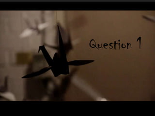
We also bring in a second social group into our
opening through the Japanese mythology of the
paper cranes.
Paper cranes were hang around the garage to
represent the spirits of all the people that have died
due to the spirit. The cranes were the main part of our
set design.
17. In our opening we have challenged the patriarchal society by presenting an emergent ideology. There is a main female
character, where as this genre is usually male dominated and orientated. Also we have thought about the rest of the film and would
have a strong female character as the protagonist, therefore reinforcing the progressive ideology that women are capable of being the
hero. Therefore our film would be targeted more aimed at females rather than males.
Our opening reinforces
some of the stereotypical
views of women in
society, such as them being
viewed as over emotional
and weak. The Binary
opposition is that a male
is strong heroic, in
control and powerful,
where as a female is weak
and not in control of
her emotions. This is due
to the patriarchal society
that we live in.
18. Representation:
The Supernatural figure is presented as an enigma, this means
the audience doesn’t know the gender or ethinicity of the
character. This means that there are no clear ideologies about
gender based or ethnic issues in the opening.
Hannah depicts both negative and positive
representations of women. In some ways Hanna is
represented as the stereotypical final girl. A final girl
is often included in horror films, this refers to the last woman
or girl alive who has to face the killer. The final girl has been
included in many films such as Halloween, Friday the
13th and A Nightmare on Elm Street.
Hannah is also represented as quite weak. Her will power is
displayed as low through non verbal language and use of
post production special effects. She is instantly
possessed and walks into the garage. We edited her eyes to turn
black to highlight the fact that she has been possessed and is no
longer in control.
19. However this shot also connotes power as you see herself come back and the
blackened eyes disappear as she is for one moment Hannah again and isn’t
being controlled. She has broken the power that the supernatural figure had over
her. This goes against the residual ideology that women are weak and
inferior to men.
The CU shot also makes the
audience relate more to the character
and relate to the emotion that she is
feeling.
The residual ideology
that all women are very
emotional and
vulnerable is highlighted
through our protagonist
Hannah which is very
regressive. There is a
CU shot of a tear
streaming down her face. The
non-verbal language
displays the fact she can’t
hide what she is truly feeling.
This CU was inspired from the
film Amityville.
This CU shot was inspired by the film Amityville.
20. We have used sound to makes you feel sympathetic for the character. For example as you see the CU of her face and the
fear in her eyes high pitched violins start to play. This connotes her fear and panic which she is feeling on the inside.
22. Survey monkey-this was very useful when testing out our ideas and getting
recorded feedback. Survey monkey allowed us to create a broad range of
questions with different ways of answering. For example open ended
questions and to what degree someone agreed with an idea. This enabled us to
see what our target audience through of our ideas and alter our ideas to meet
their opinions.
What have you learnt about technologies from the process of
constructing this product?
The first online tool that we used was our blog
on blogger. It enabled us to share ideas in a
number of formats such as text, videos,
pictures and slideshows. This made it
easy to see each others ideas, what we were
looking at for inspiration, any genre
development ideas, sharing research and any
location ideas. It also allowed us to comment
directly onto the posts and interact with each
others ideas easily.
We also used Prezi. This was very helpful when
developing out concept. We could easily make it visual
and communicate to others exactly what we had
envisioned. It also meant that we had an easily accessible
and managed way of storing our concept
development, and if anything changed along the way
it was easy to edit or add too our ideas.
23. Social networking sites such as Facebook and twitter allowed us to show a wide audience of people our
opening and receive feedback very easily and quickly.
The internet allowed us to do majority of our research. Such as looking into different horror sub genres, what were there conventions etc.
You tube- Firstly it was very useful when
researching title sequences and other horror
openings. It enabled us to find out a lot of information
and get a lot of inspiration. Also it allowed us to upload
any experimental shots we did before filming the actual
opening sequence, and also we were able to export our
finished product. This meant that these clips could receive
feedback through comments or likes and
dislikes. Now that our finished product is on you tube it
meant that we could market it though various forms of
social networking.
24. We also used the steady cam frame for a couple of shots. For example we were inspired by a clip from Donnie
Darko where the camera frame tilts and rotates. We imitated this in our opening and to achieve this shot:
The only small issue with the camera was the fact it was quite heavy,
so when using the steady cam frame and taking the rotating shot it
was difficult to keep the rotation smooth.
When filming our opening we used my DSLR camera which is a Canon 60 D. Using a
DSLR was very useful as it meant that we could adjust how bright the footage we were
recording by adjusting the camera settings. Also the camera enabled us to have HD quality
and create different depths of fields.
We used a tri pod to achieve still steady shots ensuring that
there was no unwanted movement or jerking making our
opening look more professional and high quality. We
could easily use the tri pod to move the camera frame to
different heights and angles, this made it possible to try
out a large variety of shots. The tripod also allowed us to
achieve steady slow pans. These were very effective.
25. As we shot at night we didn’t use any natural light. So in a way it was easier to keep lighting continuity as we weren’t relying on the
weather. For lighting we used one tall light which could adjust to different angles and positions very easily. This was very useful when we wanted to
create interesting shadows onto walls and faces. We could create dark figures through the low key lighting. We also used the built in
lighting in the garage. By having a free standing light it meant we were able to create a variety of shots and experiment and play with the lighting
quickly while on set. It allowed us to create a silhouette when Hannah has the knife in her hand which created tension :
The only difficult thing about the lighting was ensuring that nothing was too dark, as otherwise the footage would look grainy. So instead we
made the shots brighter than we wanted as we knew that in editing we could dark the shots if we wanted to. Also sometimes if the lighting was
behind the camera a shadow of the camera or tripod would be casted so we had to move around until it worked.
Lighting allowed us to
create a dramatic
silhouette shot for when
the protagonist is about to
die.
Intense shadowing on
the face created a more
stylistic shot .
The lighting
enabled us to
create a crisp
silhouette of
Hannah when
she first enters
the garage.
The shine on the
blood made the
sequence more
gruesome and
made prosthetics
look more realistic.
26. Colour grading- We took inspiration about colour grading from ‘The Road’ and ‘Sweeny Todd’. They both had the iconic
desaturated style. It makes the footage look more cold, creepy and sinister. So in Post Production on Premiere Dandy and I
desaturated the clips. As we used artificial lighting it meant that our footage had a yellow tint however in post production we were able to
change the colouring. Desaturating the clips illiminated the yellow tint on many of the shots which appeared due to the over head lighting.
BEFORE: AFTER:
‘The Road’ and ‘Sweeny Todd’
colour grading both look very
grey and unnatural. This
creates an uncomforting image
and also makes the characters
in the films look unhealthy .
We imitated this colouring
by lowering the saturation
of the clips and slightly
increasing the contrast to
make the shadows in our
piece more bold.
27. On premiere we selected a clip
and then went onto ‘edit effects’.
We selected image control
and started to experiment with how
saturated we wanted the
sequence and what contrast
and brightness looked best.
Once we had decided on the exact
colouring we used this same
grading for all of our clips. So all we
had to do was copy and paste this
effect onto all of our clips.
However we did decide to leave this effect off of a few clips.
For example in some clips we used fire and as we liked the
intensity of the orange/yellow fire against the other
desaturated footage so we decided to leave it un edited.
28. In and out points- after first initial editing stage realised how much more we could cur out, also making the swish pan shots faster
made it more dramatic and scary as it meant the supernatural figure wasn’t seen as clearly as was on screen for a very little amount of time.
.
Time stretch- when Hannah drops
the knife we decided to expand the clips time.
This made the clip appear as if it was in slow
motion. We wanted this shot to feel dramatic
and focus the audiences attention on the clip.
To do this we right-clicked on the clips and
then ‘time-stretch’ and decreased the speed
to 80%.
The swish pan was used to break
verisimilitude and create
something un natural and
discomforting
29. I have learnt about the 180 degree rule. It was completely new to me.
We ensured that in our opening we kept to this rule as it meant that
audience perspective would be kept. It was essential that we thought about
this rule while filming through out the opening.:
Initially when we edited together our rough cut we accidently didn’t abide by the
180 degree rule.
As we had made sure to take multiple shots of all our footage we had another shot which was at a
slightly different angle. This meant we could edit in this footage and ensure that it was clear to the
audience where Hannah was.
30. For the credits we decided to use the font
‘suicide draft’
I edited the credits and decided on the placement of
the text. We adhered to the rule of thirds
when placing the text so that the audiences eye
could easily follow the text.
The order of our credits were: Anchor bay
films, then key actors and key crew,
ensuring that the director was the last person
credited.
We researched opening sequence credits and
followed the typical pattern which opening credits
adhere to. For example we looked at Shutter
Island and Evil Dead.
In premiere we edited the titles so
that they faded on and off screen.
This meant that they flowed onto
the screen better.
When placing the credits we
made sure that they were
on plain surfaces so were
easy and clear to read.
31. Main title- I created the title using stop
motion. I used a pen and paper and slowly
wrote the title taking shots in between. I then
edited all of the clips together and reversed the
colours. This way the background was black and
the writing was white. Then I added a colour
tint so that the writing was a red/brown colour.
I also edited the title so it flickered on and off screen
to mimic the flickering lighting in the shot which was
before the title.
The stop motion was very effective
as it is conventional for
unnatural and for things to
appear/move with no explanation.
Black background meant that
the title appearing flowed with
the opening sequence very
well. As we made the room go
black and then the title
appears.
The main title appears after all of the
credits have been seen. This means
that the title will be left in the minds of
the audience. We decided to have the
title appear on a black background with
nothing else on the screen so that the
audience focuses 100% on the title.
32. We achieved continuity editing as we
made a specific effort to do so. We ensured
that the characters looked exactly the same in
each shot. We made sure there position,
costume and facial expressions were the same
if a shot angle changed.
Another way we achieved continuity
editing was successfully cutting on
action. This meant that an action looks fluid
and creates verisimilitude. We edited the
in and out points on the clips very
carefully on Premiere to make sure it was
perfect.
We did this very successfully at the
start of the sequence when Hannah
places the photo album onto the bed.
33. In post production we used an editing technique called
overlaying. We did this by selecting two different clips and
placed them on top of each other on the timeline. We then
lowered the opacity of one of the clips. This meant that both clips
could be seen on screen at the same time.
Firstly we used this technique to emulate that fact that time had
passed as Hannah folded a paper crane.
We also used overlaying to give added information to
the audience at the start of the sequence in a stylistic
way.
For example we overlayed shots of paper cranes as
Hannah made her way to the garage.
Also when Hannah is dying blood is dripping from her
neck. We then overlayed a shot of a crane dripping with
blood to emulate the fact that Hannah's spirit would be
transferred to that crane.
34. I utilised the option of manual focus on the canon60D and used pull focus to give a cinematic feel. This made our
piece look more stylistic and drew the audiences full attention on to what the article was titled.
I used a shallow depth of field focus when filming
the words on the article. This means that the
audience could pick out words appearing on the
article easily.
I shot a ECU of the
article title to ensure
that it was clear what it
was about.
35. When I was filming this scene I made
sure that when the knife was meant to
be cutting her throat that you couldn’t
actually see her neck. I did this by using
closer shots instead of MS and LS
where you would be able to see exactly
what was happening. This way the
suicide looked believable and
created verisimilitude.
If at any point her neck was shown we
edited it out or her hand was covering
the supposed slit on her throat.
In post production on
premiere we added
diegetic sound of
Hannah’s throat being slit. This
made the action more realistic
and also more gruesome and
uncomfortable to listen to.