Why responsive design is so important in today's digital world? What is actually? Get to know all stuffs about responsive web design in this presentation.
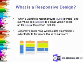
What is aResponsive Design?
• When a website is responsive, its layout (content) and
everything gets adapted to a small version based
on the size of the screen (mobile).
• Generally a responsive website gets automatically
adjusted to fit the device that is being viewed.
4.
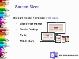
Screen Sizes
There aretypically 4 different screen sizes.
• Wide screen Monitor
• Smaller Desktop
• Tablet
• Mobile phone
5.
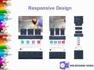
Examples of ResponsiveDesign
• Here are a few samples of our website, that gets
smaller according to the display screen.
6.
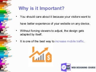
Why is itImportant?
• You should care about it because your visitors want to
have better experience of your website on any device.
• Without forcing viewers to adjust, the design gets
adapted by itself.
• It is one of the best way to increase mobile traffic.
7.
How Could itBenefit?
• Two ways it could benefit your audience in terms of
usability:
• Optimizing the layout of your content
• Adapting the content that is shown
8.
Optimizing the Layoutof Content
• Today’s phones will typically zoom automatically to
view entire website.
• This seems to be good, but it can also be annoying
when people try to find some menu on the upper right
corner which is not visible.
• This is the reason why you need to be responsive for
better mobile experience.
9.
Adapting the Contentthat’s Shown
• If you are running a restaurant site, visitor don’t feel
pretty with your food stuff that is scrolling left and right.
• They actually want to know where are you located,
what are the dishes available and how to make
reservation.
• This is where mobile responsive takes pride in
presenting information seamlessly.
10.
Responsive is theFuture of Web
• Mobile responsive is all about delivering your
audience with the content within the screen where
they viewing it.
• In simple, it is one website with multiple versions!
• Simplicity with perfection by the website owners
providing a great utility for the readers.
11.
Thank You
• Hopeyou would have known how important is a
website in today’s colorful world.
• Keeping it responsive will help you in achieving better
leads from all customers.
• Mobile Responsive is the Future of Web!
• Make your site responsive before it’s too late.
12.
Sponsored By
Web DesigningCourses
An emerging web design institute in Chennai
http://www.webdesigningcourse.in