1. Pritamji,
We are moving in right direction in terms of placement of components and designing of
individual components are concerned.
However we are wondering what should be done to make the site more appealing in terms of
using right combination of colours. Honestly things aren’t looking very appealing today and here
are few suggestions. (I would also suggest that we talk to some designer/Shraddha) to ask what
colours should be used for different components.
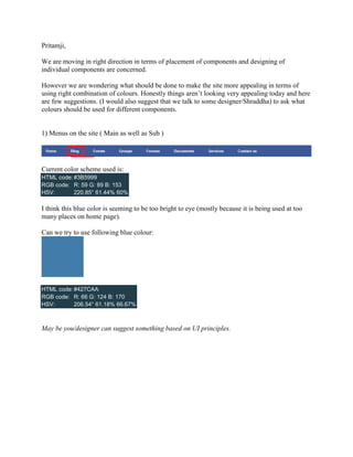
1) Menus on the site ( Main as well as Sub )
Current color scheme used is:
HTML code: #3B5999
RGB code: R: 59 G: 89 B: 153
HSV: 220.85° 61.44% 60%
I think this blue color is seeming to be too bright to eye (mostly because it is being used at too
many places on home page).
Can we try to use following blue colour:
HTML code: #427CAA
RGB code: R: 66 G: 124 B: 170
HSV: 206.54° 61.18% 66.67%
May be you/designer can suggest something based on UI principles.
2. 2) Menu on Hover:
Currently it is as follows:
We need to have a better visually appealing color combination/display format. (May be we just
play with fonts instead of having blocks for sub-headers)
3. 3) Page Background
Current background colour used is:
HTML code: #E7EBF4
RGB code: R: 231 G: 235 B: 244
HSV: 221.54° 5.33% 95.69%
Can you try to change it to following to match it to the new blue color suggested.
HTML code: #E6EBEF
RGB code: R: 230 G: 235 B: 239
HSV: 206.67° 3.77% 93.73%
4. 4) Login Menu:
Can we try to use different colors for Student, Colleges and Corporate here itself (and which can
be used to differentiate them later across the site)?
5) Buttons
I think we should use another colour (may be a shade of orange) to differentiate all buttons) - -
Since they call for user actions and should be differentiated (See Google – Compose, Send
buttons are different colour)
6) Page/Block Headers:
This should be having uniform color/font across all pages (even Black is ok)
7) Text heading and static information
This is not looking good as in current format. I think we could follow format across site for all
similar data above:
Note that the article heading is BOLD.
5. 8) Text footer:
This is also not delimiting the data properly. We could follow following format:
9) Page No Link : Currently it is like:
To make it better we can have it like following:
6. 10) Most popular (content) block: Currently it has not been organized in visually appealing
manner:
We could have it like: