![What are we* doing? ,[object Object]](data:image/gif;base64,R0lGODlhAQABAIAAAAAAAP///yH5BAEAAAAALAAAAAABAAEAAAIBRAA7)
Recommended
More Related Content
Viewers also liked
Similar to A new look for e4
Similar to A new look for e4 (20)
Recently uploaded
Recently uploaded (20)
A new look for e4
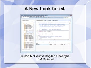
- 1. A New Look for e4 Susan McCourt & Bogdan Gheorghe IBM Rational
- 3. Design the default style sheet for the Eclipse SDK 4.0 (e4) workbench
- 5. e4 0.9: Proof of Concept
- 6. CSS Example ETabFolder { background-color: rgb(246, 246, 251); simple: true; maximize-visible: false; minimize-visible: false; webby-style: true; margin: 2px; tab-margin-offset: 4px; border-color: rgb(201, 200, 204) } #PerspectiveStack > ETabItem { background-color: rgb(246, 246, 251); padding-top: 4px; padding-bottom: 2px; margin-top: 0px; } #PerspectiveStack > ETabItem.active:selected { background-color: rgb(255, 255, 255) rgb(246, 245, 250); } ETabFolder.active { background-color: rgb(224, 226, 235); }
- 7. Goal: modern visual style
- 10. Goodbye preferences, hello CSS
- 11. Tweak the workbench visual style to your heart's content
- 12. Rich catalogs of alternate styles will become available
- 16. We may not relax the “single editor area” constraint
- 17. Influences: Web Design http://get.adobe.com/flashplayer/
- 18. Influences: Web Design http://www.officemax.com/
- 20. Every bit of ink (every pixel) requires a reason
- 21. Design the content, not the container
- 22. Clutter and overload aren't a characteristic of information quantity, but of design failure
- 24. Influences: Products & Platforms http://blogs.msdn.com/jasonz/archive/2009/02/20/a-new-look-for-visual-studio-2010.aspx
- 25. Flexibility: Screen Size http://www.w3schools.com/browsers/browsers_display.asp
- 26. Flexibility: User Expectations
- 28. User expectations are more flexible
- 29. Revisit old assumptions about implementation constraints
- 30. Users can change it if they don't like it
- 33. Pick signature places to be different
- 34. Respect for accessibility/high contrast
- 35. Classic look should be available
- 37. Borders
- 38. Toolbar
- 39. Tab shapes
- 40. Typography
- 41. Color
- 42. Iteration: Playful typography
- 44. An a-ha moment
- 46. Iteration: Respond to Feedback
- 47. Iteration: Add Design Elements
- 48. Current iteration: WinXP Olive
- 53. Selected stack color influences text colors on tabs and background colors
- 54. Perspective switching changes toolbar shadowing
- 55. Consider transitions between states
- 61. CSS editing without realizing it
- 65. e4 builds Susan McCourt, [email_address] Bogdan Gheorghe, [email_address] Linda Watson, [email_address]
Editor's Notes
- We want to take you on a whirlwind tour of the visual design process.
- By pushing the styling engine to support the design, we are ensuring others can design their own equally distinct styles Last year's work for the 0.9 release was really more of a proof on concept – a quick go at using the CSS engine to drive the styling of the workbench. We really wanted to show that we could tweak the look and feel of through CSS.
- Here is a picture of the e4 0.9 release and CtabFolder. For the e4 release, a new EtabFolder class was created to provide support for the additional styling requirements. The EtabFolder provided support for styling the following elements through CSS: Setting tab border colors, tab margins and tab padding as well as setting a custom “webby” style which switched between the classic tab look and the newer one.
- Here are some examples of what the CSS looked like for the e4 workbench. The first example is styling the E4 tab folder itself. The CSS engine will parse the style sheet and call the appropriate API on the widget. (#2) Here you see that all CSS constructs are valid including pseudo states. Here we are changing the color of the EtabFolder when it becomes active. (#3) More complex examples are possible too. The CSS Engine allows you to refer to parts of UI by their CSS Classname (in this example we are selecting the EtabItem that is the child of a control with the classname PerspectiveStack). (#4) The engine supports all CSS constructs, no matter how detailed.
- What's wrong with this picture? (Many of you in the audience have your own and possibly different answer to this question) We haven't updated the visual design substantially since 3.0 (2004), and a lot has happened in the world of design, particularly web design, since then Signature design elements (swoopy tabs) are looking dated Colors are looking outdated
- Scrollbars pushed against lines Cramped Gets worse as things scale up
- The idea is to have ability to control almost all of the visual elements of the design right from the style sheet. Almost all as there are certain UI elements that do not allow control over their looks – such as the Windows menu bar or table headers. For those types of controls the only real way to control their look is to custom draw them. This is how a number of applications on Windows 7 manage to get around this problem. An example of this would be the Firefox menu bar.
- There are other good ideas, but we probably don't have time for them Flexibility of workbench model and CSS puts alternatives in the hands of others – propose designs with code! At SDK level we have to consider all the products/projects who have made assumptions, the extension point model, corner cases, etc. All this takes time.
- Use of backgrounds and gradients Spaciousness, no borders everything just flows into each other.
- Plate on a colored background Minimalism of non-bordered, internal plates No borders = no clutter, lots of free space Also note the drop shadows being used to stand plate from the background.
- Original theory comes from printing media Ink for the data / Total ink = data ink ratio Ratio of the ink used on the data to the total ink used - this should always be high. Note that this is just a theory -> some people think using border + decoration IS good design but the point that Tufte is trying to make is that its just not needed to carry the message.
- Here we see that typography is used almost exclusively to organize the content rather than containers. There are no trees, no container boxes, etc. The only thing framed is the thing you are buying
- Distinct use of color and styling Guttering using themed colors Information is still dense but attempts to reduce clutter
- 1024 x 768 is still the single most common resolution, but higher resolutions prevail 1280 x 1024 and 1280 x 800 are the front runners We still design for 1024 x 768 but don't feel as restricted by this
- Even the developer audience is getting information with more modern styling and we are getting used to better design and presentation of information
- Users make choices via platform themes and we should try to acknowledge those However we want to offer our own style and move away from platform toward web design Some people are already happy, let's not forget to continue to support them We want to incorporate these new design influence in our styling but we are still responsible -> We will respect platform hues -> we don't want to completely ignore platform settingsl If you go to the trouble of specifying color, we'll respect it.
- Some of the “big picture” items aren't necessarily noticed at first glance (spacing, borders) but influence the overall direction We want to focus on places where we have more control over implementation (focus on tab shapes vs. menu bar color) Consider where platform expectations are important (toolbar) === What a designer sees is not what a developer will see. Developer consider tabs + toolbar as essential design points. Designer consider all of the elements in considering space, typeography, color.
- Play with color and typography Background image Fade out items that distract (tool bar) Reduce lines and separation Hard to parse ==== So now here's a bunch of early mockups: - This is using color for selection typography. - Playing with a design element in using a background image as opposed to color or gradient. - Here's an attempt to minimize distraction: - Go with Tufte model to use typography as a mechanism for selection - Linda mentions the “squint test”: squint and see where your eye draws focus -> notice how the tree still commands attention, fading the toolbar doesn't help, typography is lost.
- Reduce emphasis on tabs/containers Fade out things that aren't in focus Ho-hum/drab ============= Here we have an example where we are trying to simplify this by reducing all of the containers (no tab lines) Notice how the background is grey in an attempt to make the editor area pop out more. Still trying to fade out the toolbar. Overall impression: drab. Pushing really far in that direction to see what happens -> what happens is nothing?
- We were a little jealous of the simplicity of the viewlets. They don't have to deal with platform scrollbars and preexisting icons. The use of plates for separation looks clean in that environment
- Rather than demphasize/fade the things that distract, let's focus on separation. Here we separate platform things (trim, menu) and add a darker toolbar. Toolbar gets heavier treatment for separation and for transition between platform elements and the content area Borders become shadows, achieved by adding interior guttering to the plates so that the scroll bars don't detract from the plate edge Not a lot of thought into tab design, but minimizing non-selected tab treatment Starting to settle on the big picture items This is the first one published
- Shadow as selected stack emphasis was too subtle. Use platform selection color to indicate active stack and tighten up shadows View icons are back Tighten up toolbar shadow Clean and simple tab shape
- Add Search and Perspective Bar Visual design also brings up other questions (what is search used for?)
- ============== Example of what it would look like with an olive theme – notice how all the elements still remain in play regardless of color. - Doing a squint test -> notice that the scrollbars tend to pop out a lot but not much we can do.
- Notice the use of native elements change the design (round search box) Also, we may customize the toolbar because we don't need the 3-D separation from the menu bar like we do on other platforms, and Mac users have told us they want a flatter look. ============ The mocks ups pushed @ Xmas should the same toolbars across all platforms. Mac users replied that they wanted a more flat look.
- Icons act as a tab separator Must balance ingredients as a whole. 2 ways of looking at it: - stew (adjust one element, add another) - house of cards (change one element everything falls apart) - Icons on tabs -> as soon as they got added you need less separation.
- Detail about pixels and colors, deriving from platform See how close we can get in implementation and how this affects the CSS How does a user (non-CSS) influence the style?