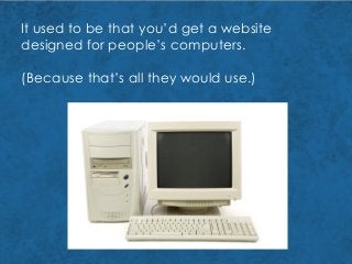
So you’ve hireda web
designer.
And while you’re
talking with them
about your website,
they ask,
3.
So you’ve hireda web
designer.
And while you’re
talking with them
about your website,
they ask,
Would you like it to be
desktop-first or
mobile-first design?
4.
So you’ve hireda web
designer.
And while you’re
talking with them
about your website,
they ask,
Would you like it to be
desktop-first or
mobile-first design?
And you’re like…
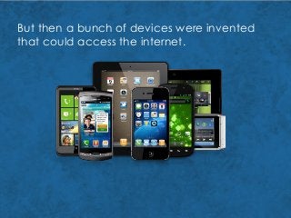
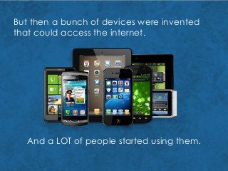
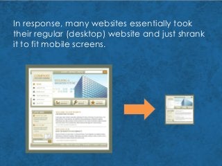
In response, manywebsites essentially took
their regular (desktop) website and just shrank
it to fit mobile screens.
14.
The problem withthis?
It was very difficult to view some desktop
websites on the smaller screens.
And the coding used for the websites didn’t
always work on the mobile devices.
So then a lot of smart businesses began
making specifically mobile sites.
15.
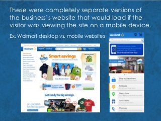
These were completelyseparate versions of
the business’s website that would load if the
visitor was viewing the site on a mobile device.
Ex. Walmart desktop vs. mobile websites
16.
As more peoplebegan visiting and using
mobile websites, many designers noticed that
certain design features and elements worked
much better on a mobile website than on a
desktop site.
This led to mobile websites starting to look and
behave very differently than their desktop
counterparts.
These become known as “mobile optimized”
sites.
17.
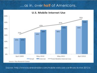
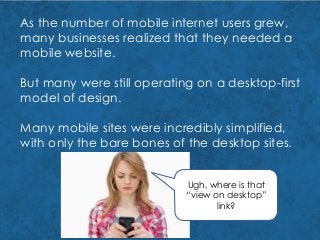
As the numberof mobile internet users grew,
many businesses realized that they needed a
mobile website.
But many were still operating on a desktop-first
model of design.
Many mobile sites were incredibly simplified,
with only the bare bones of the desktop sites.
Ugh, where is that
“view on desktop”
link?
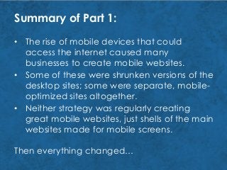
Summary of Part1:
• The rise of mobile devices that could
access the internet caused many
businesses to create mobile websites.
20.
Summary of Part1:
• Some of these were shrunken versions of the
desktop sites; some were separate, mobile-
optimized sites altogether.
• The rise of mobile devices that could
access the internet caused many
businesses to create mobile websites.
21.
Summary of Part1:
• Neither strategy was regularly creating
great mobile websites, just shells of the main
websites made for mobile screens.
• Some of these were shrunken versions of the
desktop sites; some were separate, mobile-
optimized sites altogether.
• The rise of mobile devices that could
access the internet caused many
businesses to create mobile websites.
22.
Summary of Part1:
Then everything changed…
• Neither strategy was regularly creating
great mobile websites, just shells of the main
websites made for mobile screens.
• Some of these were shrunken versions of the
desktop sites; some were separate, mobile-
optimized sites altogether.
• The rise of mobile devices that could
access the internet caused many
businesses to create mobile websites.
23.
Part 2: TheRise of
Responsive Design
and the Fully
Functional Mobile
Site
24.
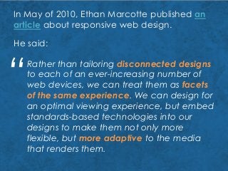
In May of2010, Ethan Marcotte published an
article about responsive web design.
He said:
Rather than tailoring disconnected designs
to each of an ever-increasing number of
web devices, we can treat them as facets
of the same experience. We can design for
an optimal viewing experience, but embed
standards-based technologies into our
designs to make them not only more
flexible, but more adaptive to the media
that renders them.
“
25.
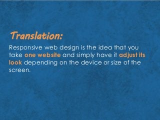
Responsive web designis the idea that you
take one website and simply have it adjust its
look depending on the device or size of the
screen.
Translation:
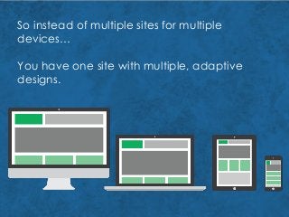
So instead ofmultiple sites for multiple
devices…
You have one site with multiple, adaptive
designs.
28.
Needless to say,this blew the minds of
lots of web designers and businesses.
29.
In addition tobeing just plain cool, what was
so great about responsive design was that,
at its heart, it believed that mobile user
experience was just as important as desktop
user experience.
In other words, that mobile sites could be as
functional and informative as desktop sites.
That they should be.
30.
Instead of creatingmobile websites with
limited options, information, and functionality,
responsive web design takes all the benefits of
a desktop website and presents them in a very
mobile-friendly way.
Business owners (youdon’t need a separate
website for every new kind of mobile device)
Your website guy
Smartphone makers
33.
Business owners
Your websiteguy (who now only has to
create, maintain, and update content for
one site)
Smartphone makers
34.
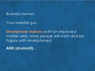
Business owners
Your websiteguy
Smartphone makers (with an improved
mobile web, more people will want and be
happy with smartphones)
AND (drumroll)…
35.
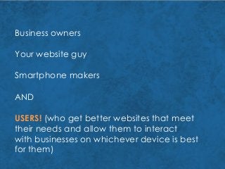
Business owners
Your websiteguy
Smartphone makers
AND
USERS! (who get better websites that meet
their needs and allow them to interact
with businesses on whichever device is best
for them)
36.
But what doesthis mean for the website
design process today?
37.
But what doesthis mean for the website
design process today?
You have to design with mobile in mind.
38.
But what doesthis mean for the website
design process today?
You have to design with mobile in mind.
And not just smartphones, either…
39.
Nowadays, people spendmore and more
time on their mobile devices than ever before.
0
20
40
60
80
100
2009 2010 2011 2012
Minutes Spent on Mobile Devices Per Day,
2009-2012
Source: http://www.emarketer.com/Article/Consumers-Spend-More-Time-with-Mobile-Online-
Growth-Slows/1009431
40.
They’re spending moreof that time on mobile
searches and using mobile websites.
0
2
4
6
8
10
12
Q1 2012 Q2 2012 Q3 2012 Q4 2012 Q1 2013
Smartphone
Tablet
Percentage of Website Visits by Device
Source: http://www.smartinsights.com/mobile-marketing/mobile-marketing-analytics/mobile-
marketing-statistics/
41.
And they’re oftenmoving from device to
device while interacting with a business
site, especially as they move through the
buying process.
Source: Google
http://services.google.com/fh/files/misc/multi-screen_infographic.pdf
42.
So your businesswebsite should provide a
quality user experience for your web visitors,
no matter what device they’re using to
interact with you.
Note: This doesn’t mean you have to use
responsive design on your site.
There are still some businesses and
circumstances in which it’s still a good idea
to have separate desktop and mobile
websites.
43.
But no matterwhether you decide to have
separate sites or use responsive design,
mobile websites are now more dynamic,
informative, and helpful than they were
even a few years ago.
Which means that the design of your mobile
website is just as crucial as the design of
your desktop website.
44.
Summary of Part2:
• As more people are using mobile devices,
however, this means that businesses have
to figure out how to bring the best
experience for their visitors.
• This meant that mobile websites were now
as functional, helpful, and informative as
their desktop counterparts.
• Responsive design changed the game by
using one website design that adapted to
different devices, rather than separate sites.
45.
Part 3: Don’tbury
the lead! What’s
this got to do with
desktop-first vs.
mobile-first
web design?
46.
Well, as manywebsites jumped into gear to
get fully mobile-optimized and mobile-
ready websites, web designers started
noticing a problem…
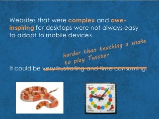
47.
It could bevery frustrating and time consuming.
Websites that were complex and awe-
inspiring for desktops were not always easy
to adapt to mobile devices.
48.
Websites that werecomplex and awe-
inspiring for desktops were not always easy
to adapt to mobile devices.
It could be very frustrating and time consuming.
49.
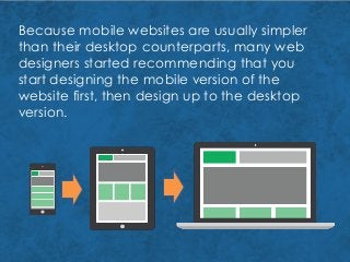
Because mobile websitesare usually simpler
than their desktop counterparts, many web
designers started recommending that you
start designing the mobile version of the
website first, then design up to the desktop
version.
50.
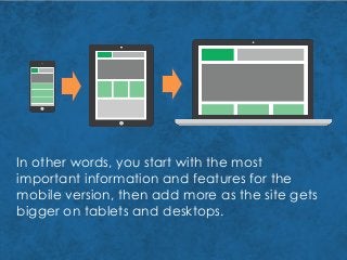
In other words,you start with the most
important information and features for the
mobile version, then add more as the site gets
bigger on tablets and desktops.
51.
However, while thisis a great idea and
helpful for website designers, it’s not always
so straightforward a decision for businesses.
52.
However, while thisis a great idea and
helpful for website designers, it’s not always
so straightforward a decision for businesses.
Sometimes mobile-first design makes the
most sense; sometimes desktop-first design
does.
53.
However, while thisis a great idea and
helpful for website designers, it’s not always
so straightforward a decision for businesses.
Sometimes mobile-first design makes the
most sense; sometimes desktop-first design
does.
Whether you decide to design for desktop
first or mobile first, you need to make sure
your decision is about providing the best
user experience to your target market.
54.
USER EXPERIENCE:
how aperson feels
about your business
or your product
based on their
interactions with,
perceptions of, and
expectations of you
(or, in this case, your
website)
55.
In other words,you want to start with the
design that would provide the best
experience for your target market.
For instance, if you knew that 80% of your
web traffic came to your site on mobile
devices, which would you do?
Mobile-first, most likely.
56.
What about ifyour traffic was split between
mobile and desktop 50-50, but the
majority of your sales (65%) came from the
desktop?
Probably desktop-first.
57.
What if you’rejust getting started on your
business’s website, and you don’t have any
data to go on about your web visitors and their
behavior?
58.
Take a lookat your target market.
Think about things like:
Who they are
What activities they like
How they spend their free time
Where they work or learn
How old they are
What ideas they identify with
What they need
How they will get what they need
59.
Take a lookat your target market.
Think about things like:
Who they are
What activities they like
How they spend their free time
Where they work or learn
How old they are
What ideas they identify with
What they need
How they will get what they need
60.
In other words,you want to know how, when,
and where your target market is
going to look for you (whether they know
they’re looking for you or not!).
Depending on what kind of information your
target market is looking for and
their general tastes and behaviors, you can
determine whether you should
do desktop-first or mobile-first design.
61.
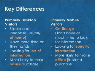
Key Differences
Primarily Desktop
Visitors
•Stable and
immobile (usually
at home)
• Have more time on
their hands
• Looking for lots of
information
• More likely to make
online purchase
Primarily Mobile
Visitors
• On-the-go
• Don’t have as
much time to look
for information
• Looking for specific
information
• More likely to make
offline (in store)
purchase
62.
If a majorityof your visitors or potential
visitors are going to come from the same
kind of devices and with the same kind of
goals, then that tells you which design you
should focus on first!
63.
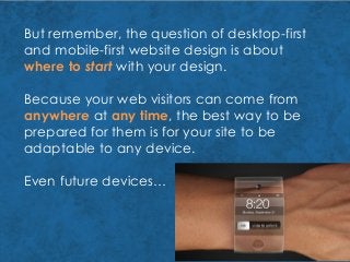
But remember, thequestion of desktop-first
and mobile-first website design is about
where to start with your design.
Because your web visitors can come from
anywhere at any time, the best way to be
prepared for them is for your site to be
adaptable to any device.
Even future devices…
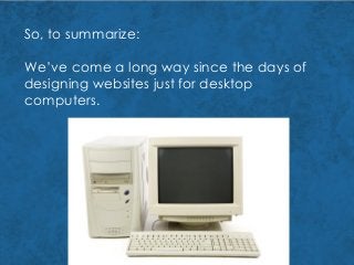
So, to summarize:
We’vecome a long way since the days of
designing websites just for desktop
computers.
66.
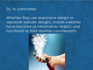
So, to summarize:
Whetherthey use responsive design or
separate website designs, mobile websites
have become as informative, helpful, and
functional as their desktop counterparts.
67.
So, to summarize:
Asa business, then, when trying to decide
whether mobile-first or desktop-first design
would be best for your website…
68.
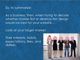
So, to summarize:
Asa business, then, when trying to decide
whether mobile-first or desktop-first design
would be best for your website…
Look at your target market.
69.
So, to summarize:
Asa business, then, when trying to decide
whether mobile-first or desktop-first design
would be best for your website…
Look at your target market.
Their interests, habits,
expectations, likes, and
dislikes.
70.
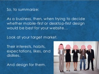
So, to summarize:
Asa business, then, when trying to decide
whether mobile-first or desktop-first design
would be best for your website…
Look at your target market.
Their interests, habits,
expectations, likes, and
dislikes.
And design for them.
71.
For more informationon
website design, knowing
your target market, and
other online marketing
subjects,
web
consulting
SEM
video
SEO
marketing
print
branding
Visit our blog at
www.splashomnimedia.com
Or click on the logo: