
Recommended
More Related Content
Viewers also liked
Recently uploaded
Recently uploaded (20)
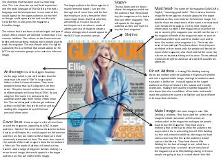
Glamour magazine analysis
- 1. The shot type that has been used is a mid/long shot. This is to show the natural facial expression and the body language of Ellie Golding. Her body language and facial expression is very natural this would appeal to the target audience as they feel as though could approach her and would aspire to be like her. It also gives the magazine a friendlier image. The colours that have been used are bright and pastel colours these colours are selected to show that it is a summer addition. The colours on the front cover are bright and eye catching, making more people want to read the magazine. The mast heads colour is slightly saturated; this is a method that would appeal to the B/C1 socio economic groups as it creates an informal image. Skyline Masthead- The name of the magazine GLAMOUR is English, “meaning good looks”. This creates a feminine image for the magazine. It would appeal to the target audience as they can relate to the feminine image. It is bold to show the importance of the name. the masthead is at the top of the page as it is the most important information, so when other magazines are stacked on top or covering the magazine you can still see the top of the magazine therefore the magazine want to put the masthead at the top to catch the readers eye and to show the readers what magazine it is. The cover star covers the masthead. They have done this as they are confident in their brand and that people will know the name of the magazine; also they feel that the cover star is the most important thing on the cover. The masthead is bold and bright to stand out and catch the audiences attention. Cover lines- there are quite a lot of cover lines around the magazine, appealing to A/B/C1 target audience. Most of the cover lines are based on fashion, beauty an d lifestyle, this would appeal to the feminine audience as they can relate to these topics are more commonly interested in them. The cover lines around the outside of the main image to show the importance of the star. The mode of address is formal as they haven’t used a range of linguistic devices making it a more formal image, this would appeal to the target audience as they can relate to this image. Direct Address – having Ellie Golding making direct eye contact with the audience, this gives a friendlier and more approachable image, making the audience want to aspire to be like her. It would appeal to the target audience as they can relate to this natural and friendly expression, making them want to read the magazine. It also shows that she is confident of her looks and would make the audience to want to be like her and be confident in the way that she looks. Main Image- the main image is over Ellie Golding a celebrity. They have used her as the main image to create star power, which acts as an ambassador for the magazine making more people want to buy the magazine. They have used a mid/long shot of the star to show the audience the way in which she is presenting herself. Ellie Golding is a thin and attractive celebrity, the magazine have used a cover star like this as the audience would aspire to be like her. They have chosen Ellie Golding for her fame through music, which has a very large fan base, so even if you’re not a fan of the magazine, due to Ellie Golding staring in it more people are going to buy it to read about their idol. Anchorage One of the biggest headings on the page which is just a bit smaller than the masthead is the word ‘Ellie’ in large capital letters so that it draws attention. They want people to know that such a big star is on their cover. They also haven’t written her surname confident people will know her as ‘Ellie’. By just using her first name it is personal to the audience and makes them feel as if they know her. This would appeal to the target audience as they can fell like they are know her and by reading this magazine they will find out personal information. Slogan- This has been used to boost about the magazine and show the audience that they should buy this magazine as it is better than any other magazine. This will appeal to the target audience as they will want to buy the ‘best magazine’. The target audience for this magazine is mainly feminine based. I can see this through use of cover lines and the fact that they have used a female for their main image shows that that who they are aiming at. It is also has used techniques such as colours, mode of address and use of image to create a informal image which would appeal to the B/C1 Socio economic groups.