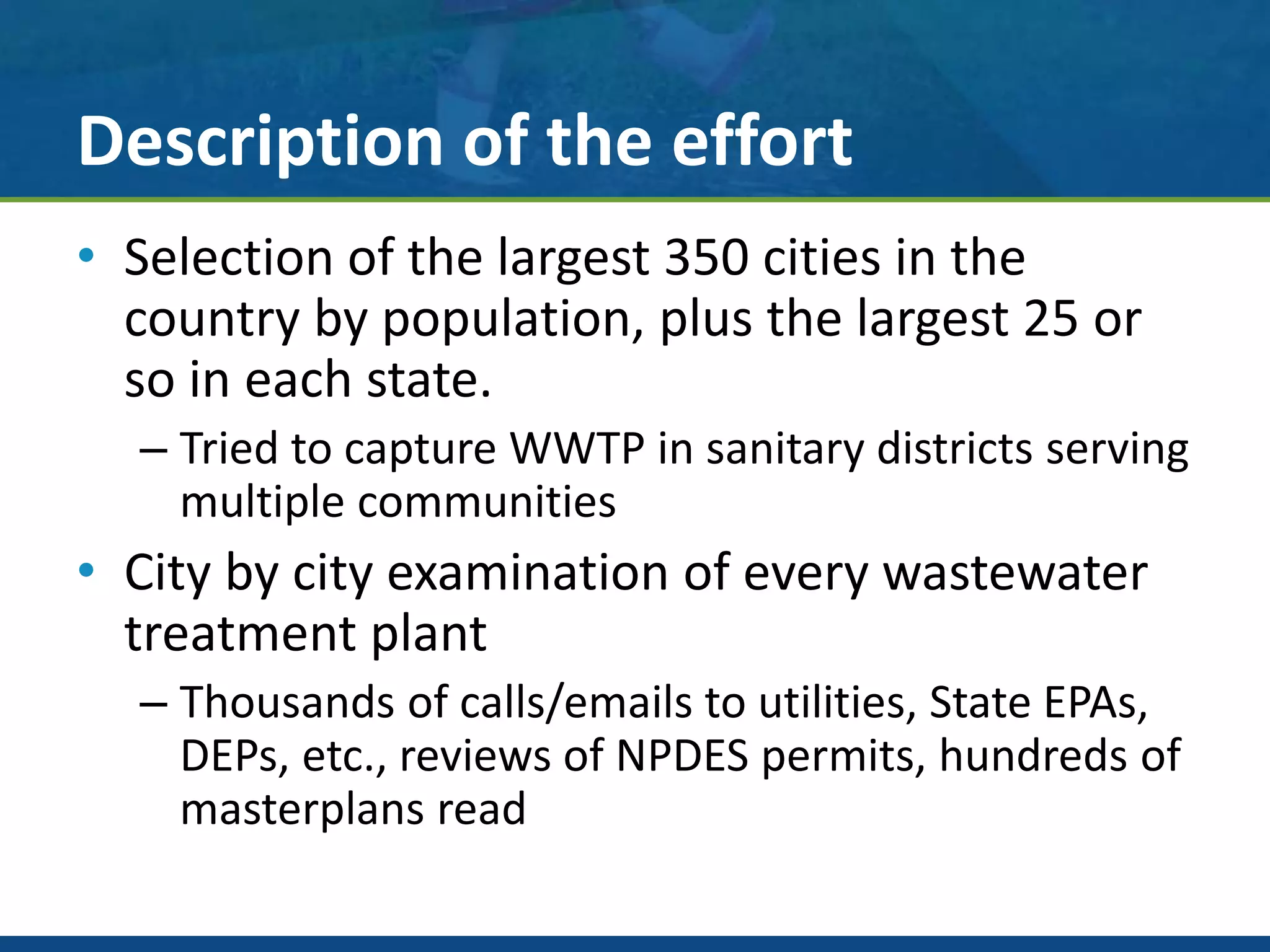
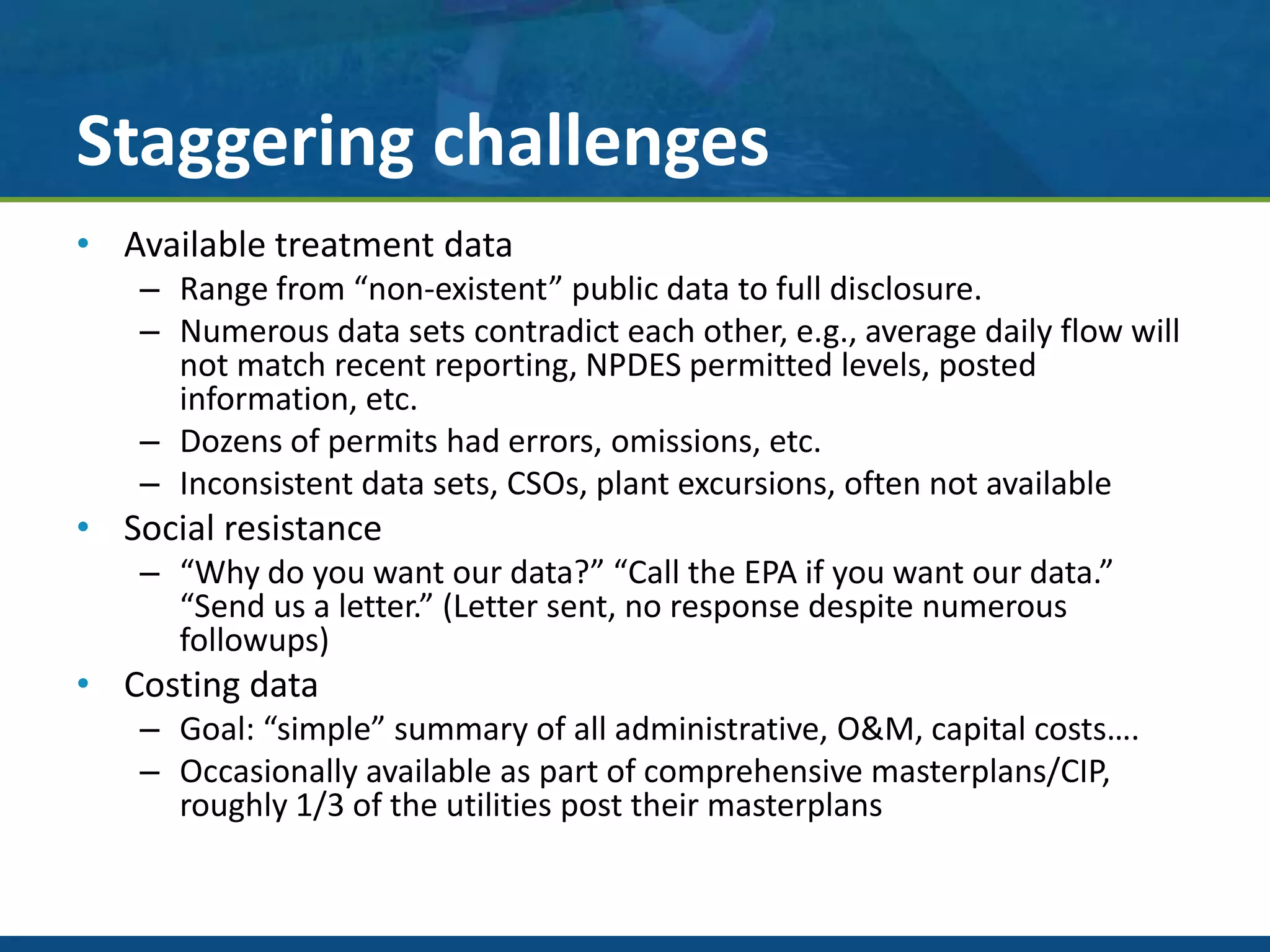
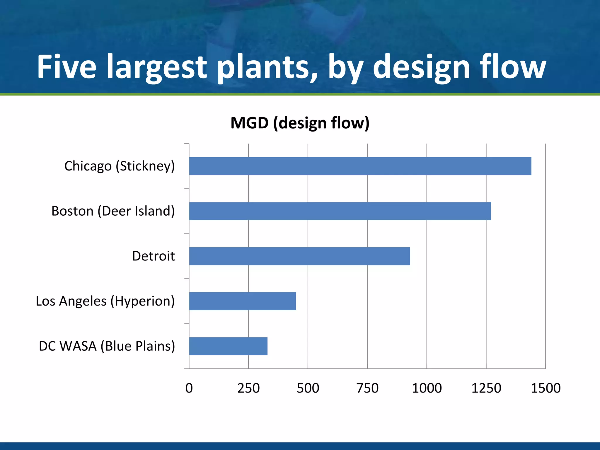
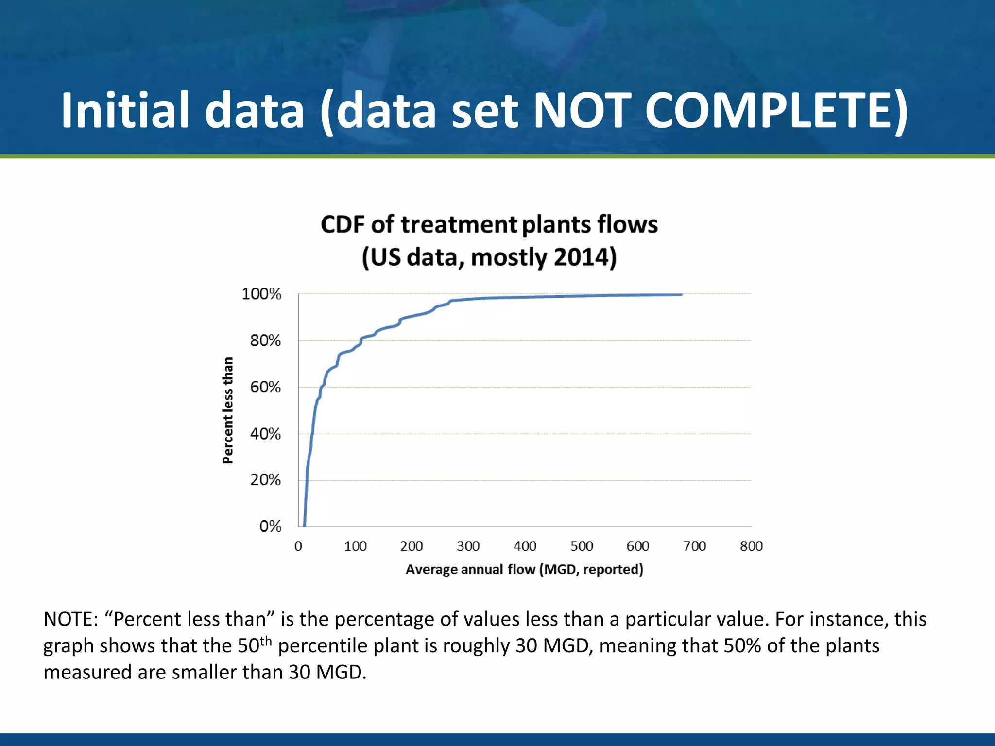
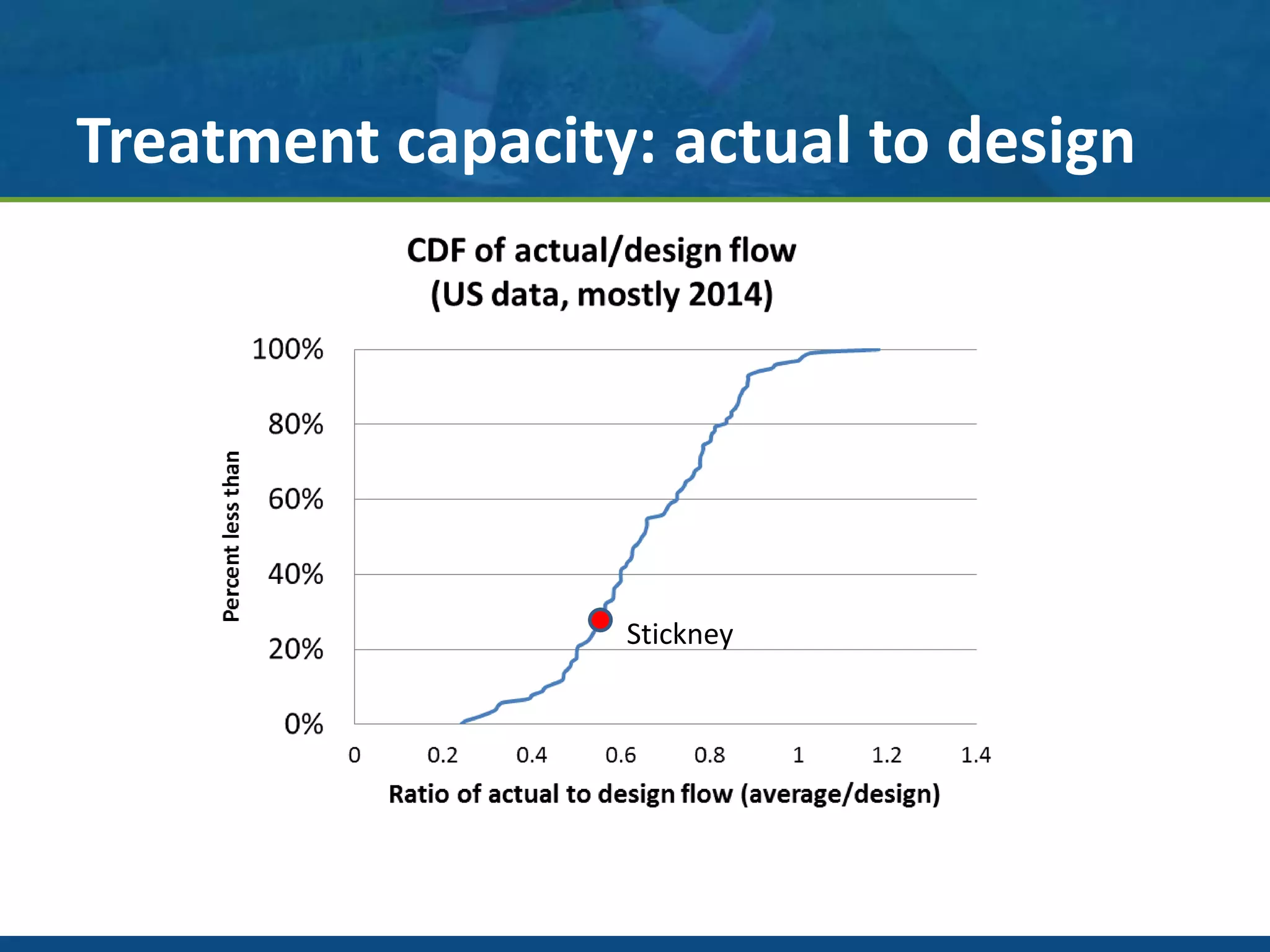
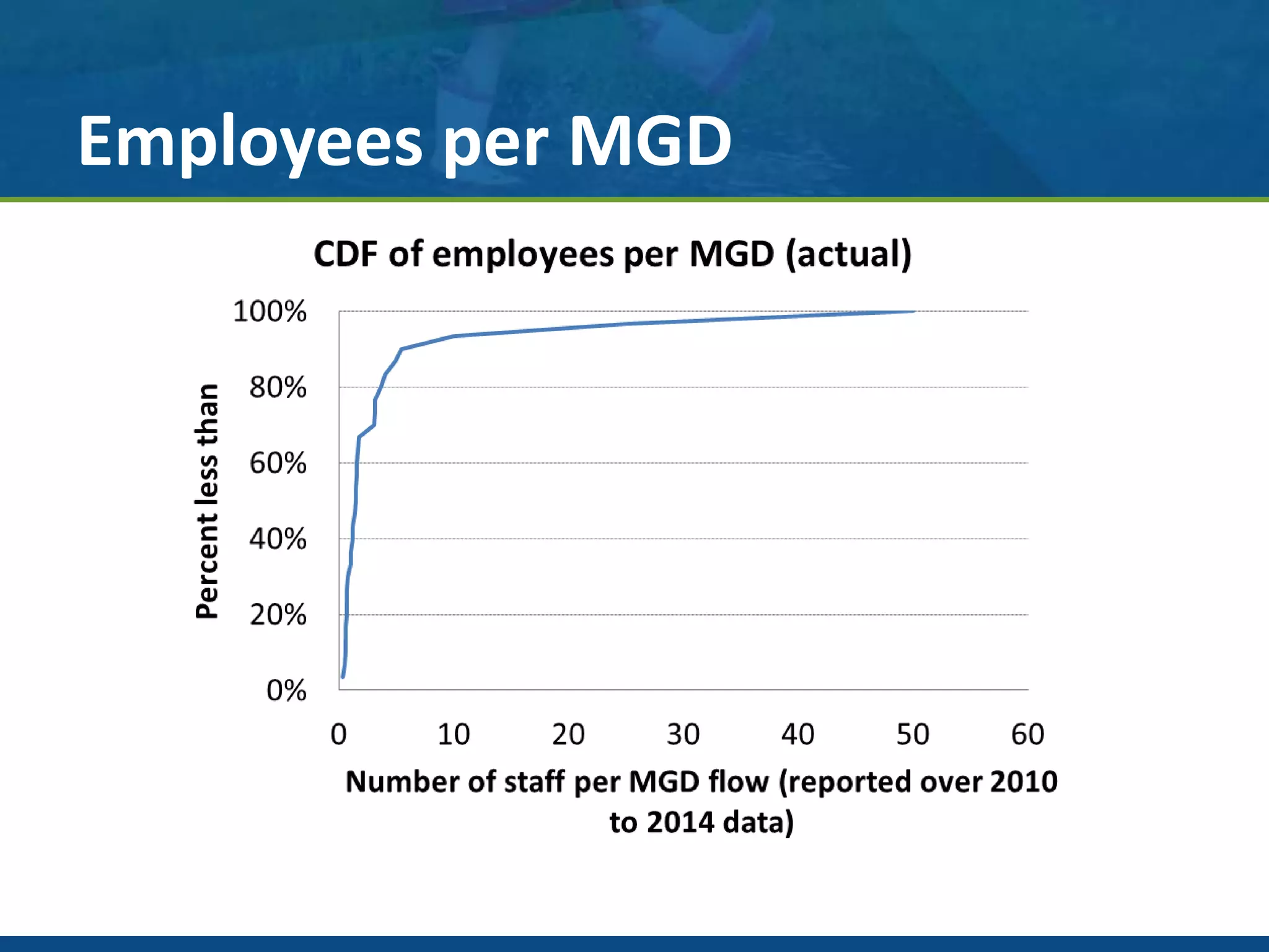
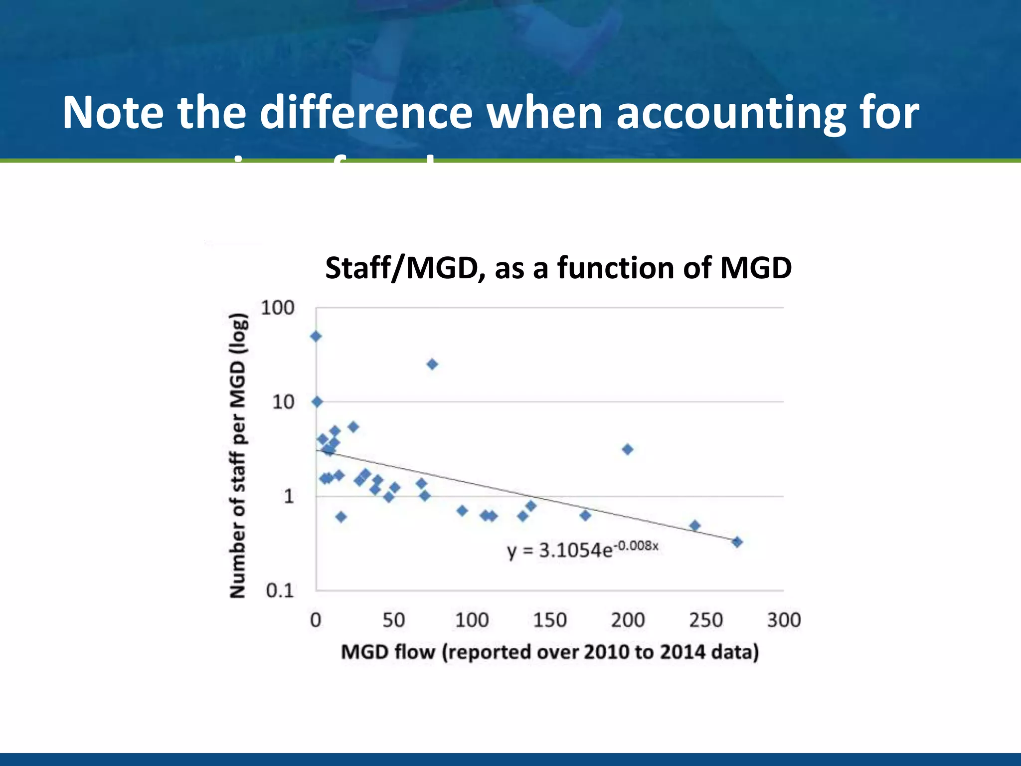
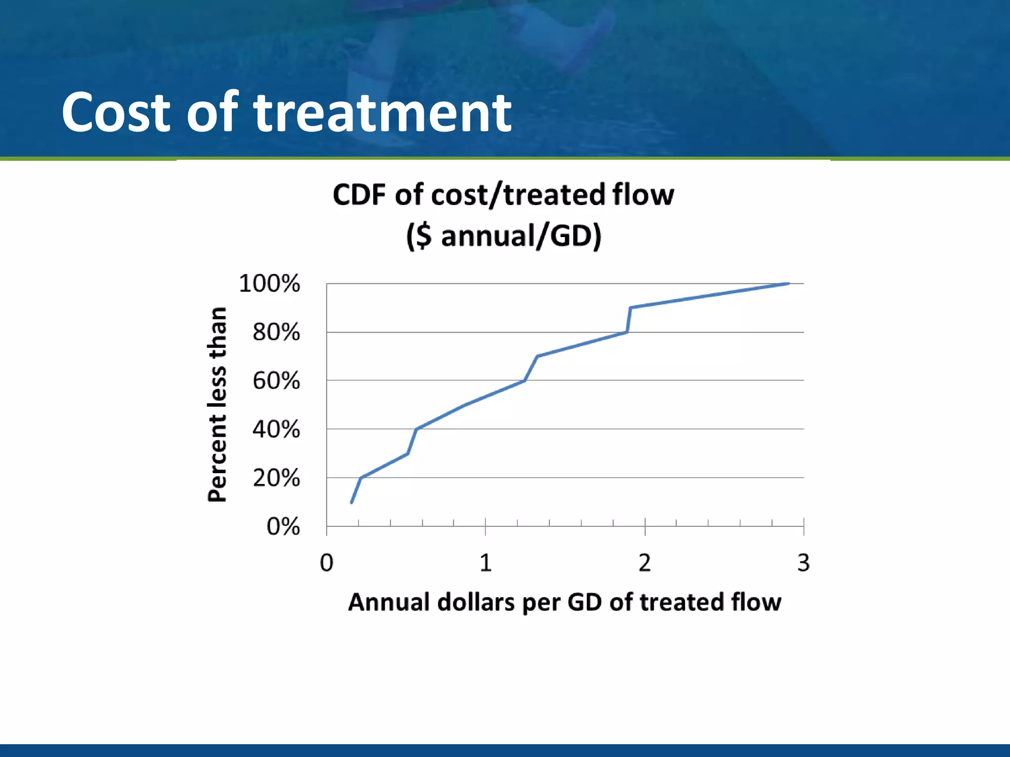
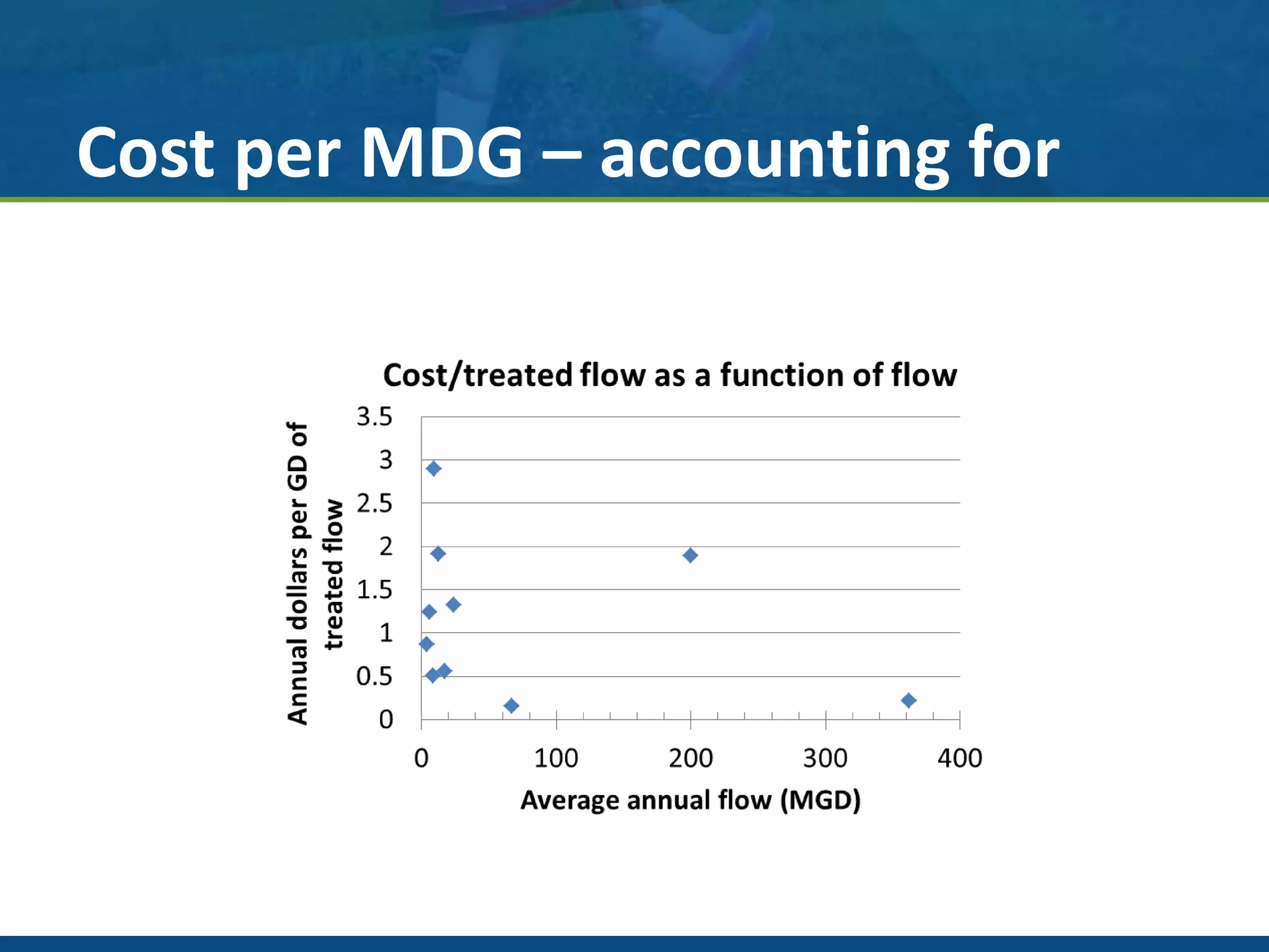
Preliminary analysis of the 250 largest
WWTP in the US:
Initial findings, benchmarking results, and next steps
February 29 - March 2, 2016
Dr. John Norton, PE
IWEA Annual Conference 2016
Description of the effort
• Selection of the largest 350 cities in the
country by population, plus the largest 25 or
so in each state.
– Tried to capture WWTP in sanitary districts serving
multiple communities
• City by city examination of every wastewater
treatment plant
– Thousands of calls/emails to utilities, State EPAs,
DEPs, etc., reviews of NPDES permits, hundreds of
masterplans read
Staggering challenges
• Available treatment data
– Range from “non-existent” public data to full disclosure.
– Numerous data sets contradict each other, e.g., average daily flow will
not match recent reporting, NPDES permitted levels, posted
information, etc.
– Dozens of permits had errors, omissions, etc.
– Inconsistent data sets, CSOs, plant excursions, often not available
• Social resistance
– “Why do you want our data?” “Call the EPA if you want our data.”
“Send us a letter.” (Letter sent, no response despite numerous
followups)
• Costing data
– Goal: “simple” summary of all administrative, O&M, capital costs….
– Occasionally available as part of comprehensive masterplans/CIP,
roughly 1/3 of the utilities post their masterplans
Five largest plants, by design flow
0 250 500 750 1000 1250 1500
DC WASA (Blue Plains)
Los Angeles (Hyperion)
Detroit
Boston (Deer Island)
Chicago (Stickney)
MGD (design flow)
Data (so far)
• Complete data for only about 20% of those WWTP
examined (about 60/320)
• Basic load and flow data
• O&M data, other costing data, very deficient
• Plant treatment processes are almost unique on a plant
by plant basis, typically basic data available ~ 40% of
the WWTP (135/320)
• BEST SYSTEM: Chicago! All treatment data posted
online (limited financial data though)
• Worst system: New York City! (They require a FOIA
request for EVERYTHING.)
Initial data (data set NOT COMPLETE)
NOTE: “Percent less than” is the percentage of values less than a particular value. For instance, this
graph shows that the 50th percentile plant is roughly 30 MGD, meaning that 50% of the plants
measured are smaller than 30 MGD.
Treatment capacity: actual to design
Stickney
Why benchmarking?
• Search for innovative ideas
– Internal: year over year performance comparison
– External: drill down into criteria to reveal success factors:
• e.g., energy reduction efforts, employee retention, health and safety
practices, equipment performance, etc
• Establish best practices
– Comprehensive and data-based comparison of efforts
• Gain broader, more accurate, organizational perspective
– Since it is based on what the best are doing it takes the emotion
out of arguments about the need to change
Data set: materials and methods
• Types of data
– Operational aspects such as flow and loading, treatment goals, and permit
compliance
– Economic aspects such as treatment cost, energy use, and capital investment
– Managerial aspects such as utility metrics, employee training, and
procurement systems
• Sources of data
– Facility websites, operations reports, master plans, NPDES permits, posted
data, personally provided data.
– This data is being collected into a comprehensive database.
– All data is being confirmed via multiple methods, including
• review with facility personnel,
• direct assessment of operational and other published data, and
• discussion and review with regulatory officials
• Current data set is preliminary and is provided as an example
Everyone is unique? Yes!
Employees per MGD
Note the difference when accounting for
economies of scale
Staff/MGD, as a function of MGD
Cost of treatment
Cost per MDG – accounting for
economies of scale
Challenges of benchmarking
• Economies of scale – “artificially” outstanding
performance
• Hidden correlations – dry climates
• Using the results – gaining traction for positive
change
Technology examples
• Inflow and infiltration reduction programs
• Energy use per unit treated
• Solids generation per unit treated
• Biogas utilization
Economics examples
• Cost per unit treated
• Employees per unit treated
• Capital investment over time
• Electrical energy rate agreements
Organizational examples
• Training expenditure per employee
• Organizational structure and type
– Integrated city service, independent political
agency, privately run
• Internal versus external laboratory services
• Operator scheduling, shift rate, etc.
Successfully enabling change needs
“The Whole Story”
REASONS
TARGETS
ACTIONS
Examples of data driving
organizational performance
• School systems:
– Graduation/placement data informs parents
• The World Bank –
– http://www.doingbusiness.org/, motivated countries to
initiate reforms, e.g., Namibia, Zambia, Singapore, etc.
• Toxics Release Inventory
– public information drove
huge reductions in
industrial pollution
Next steps
• “Stick with the effort” - >2,500 hours
personally invested
• Focus on a specific area to get an initial “win”
to share, motivate further collaboration
• Refine/streamline the approach based on
lessons learned
• Standardized data request?
Personal note
“I believe this type effort, these types of data and resulting
analysis, are a critical missing link in the management and
evolution of our country’s water infrastructure.
I feel that, so far, I have failed in my efforts to deliver even a
fraction of the promise that may yet come to pass.
I will never give up.”
- Dr. John, W. Norton, Jr., PE
March, 2016
Questions?
www.clarkdietz.com
John W. Norton, Jr., Ph.D., P.E.
977 N. Oaklawn Avenue, Suite 106
Elmhurst, IL 60126
630.413.4130 - office
312.550.1274 - cell
john.norton@clarkdietz.com

WWTP Performance Metrics - IWEA - 2016 - v2

  • 1.
    Preliminary analysis ofthe 250 largest WWTP in the US: Initial findings, benchmarking results, and next steps February 29 - March 2, 2016 Dr. John Norton, PE IWEA Annual Conference 2016
  • 2.
    Description of theeffort • Selection of the largest 350 cities in the country by population, plus the largest 25 or so in each state. – Tried to capture WWTP in sanitary districts serving multiple communities • City by city examination of every wastewater treatment plant – Thousands of calls/emails to utilities, State EPAs, DEPs, etc., reviews of NPDES permits, hundreds of masterplans read
  • 3.
    Staggering challenges • Availabletreatment data – Range from “non-existent” public data to full disclosure. – Numerous data sets contradict each other, e.g., average daily flow will not match recent reporting, NPDES permitted levels, posted information, etc. – Dozens of permits had errors, omissions, etc. – Inconsistent data sets, CSOs, plant excursions, often not available • Social resistance – “Why do you want our data?” “Call the EPA if you want our data.” “Send us a letter.” (Letter sent, no response despite numerous followups) • Costing data – Goal: “simple” summary of all administrative, O&M, capital costs…. – Occasionally available as part of comprehensive masterplans/CIP, roughly 1/3 of the utilities post their masterplans
  • 4.
    Five largest plants,by design flow 0 250 500 750 1000 1250 1500 DC WASA (Blue Plains) Los Angeles (Hyperion) Detroit Boston (Deer Island) Chicago (Stickney) MGD (design flow)
  • 5.
    Data (so far) •Complete data for only about 20% of those WWTP examined (about 60/320) • Basic load and flow data • O&M data, other costing data, very deficient • Plant treatment processes are almost unique on a plant by plant basis, typically basic data available ~ 40% of the WWTP (135/320) • BEST SYSTEM: Chicago! All treatment data posted online (limited financial data though) • Worst system: New York City! (They require a FOIA request for EVERYTHING.)
  • 6.
    Initial data (dataset NOT COMPLETE) NOTE: “Percent less than” is the percentage of values less than a particular value. For instance, this graph shows that the 50th percentile plant is roughly 30 MGD, meaning that 50% of the plants measured are smaller than 30 MGD.
  • 7.
    Treatment capacity: actualto design Stickney
  • 8.
    Why benchmarking? • Searchfor innovative ideas – Internal: year over year performance comparison – External: drill down into criteria to reveal success factors: • e.g., energy reduction efforts, employee retention, health and safety practices, equipment performance, etc • Establish best practices – Comprehensive and data-based comparison of efforts • Gain broader, more accurate, organizational perspective – Since it is based on what the best are doing it takes the emotion out of arguments about the need to change
  • 9.
    Data set: materialsand methods • Types of data – Operational aspects such as flow and loading, treatment goals, and permit compliance – Economic aspects such as treatment cost, energy use, and capital investment – Managerial aspects such as utility metrics, employee training, and procurement systems • Sources of data – Facility websites, operations reports, master plans, NPDES permits, posted data, personally provided data. – This data is being collected into a comprehensive database. – All data is being confirmed via multiple methods, including • review with facility personnel, • direct assessment of operational and other published data, and • discussion and review with regulatory officials • Current data set is preliminary and is provided as an example
  • 10.
  • 11.
  • 12.
    Note the differencewhen accounting for economies of scale Staff/MGD, as a function of MGD
  • 13.
  • 14.
    Cost per MDG– accounting for economies of scale
  • 15.
    Challenges of benchmarking •Economies of scale – “artificially” outstanding performance • Hidden correlations – dry climates • Using the results – gaining traction for positive change
  • 16.
    Technology examples • Inflowand infiltration reduction programs • Energy use per unit treated • Solids generation per unit treated • Biogas utilization
  • 17.
    Economics examples • Costper unit treated • Employees per unit treated • Capital investment over time • Electrical energy rate agreements
  • 18.
    Organizational examples • Trainingexpenditure per employee • Organizational structure and type – Integrated city service, independent political agency, privately run • Internal versus external laboratory services • Operator scheduling, shift rate, etc.
  • 19.
    Successfully enabling changeneeds “The Whole Story” REASONS TARGETS ACTIONS
  • 20.
    Examples of datadriving organizational performance • School systems: – Graduation/placement data informs parents • The World Bank – – http://www.doingbusiness.org/, motivated countries to initiate reforms, e.g., Namibia, Zambia, Singapore, etc. • Toxics Release Inventory – public information drove huge reductions in industrial pollution
  • 21.
    Next steps • “Stickwith the effort” - >2,500 hours personally invested • Focus on a specific area to get an initial “win” to share, motivate further collaboration • Refine/streamline the approach based on lessons learned • Standardized data request?
  • 22.
    Personal note “I believethis type effort, these types of data and resulting analysis, are a critical missing link in the management and evolution of our country’s water infrastructure. I feel that, so far, I have failed in my efforts to deliver even a fraction of the promise that may yet come to pass. I will never give up.” - Dr. John, W. Norton, Jr., PE March, 2016
  • 23.
    Questions? www.clarkdietz.com John W. Norton,Jr., Ph.D., P.E. 977 N. Oaklawn Avenue, Suite 106 Elmhurst, IL 60126 630.413.4130 - office 312.550.1274 - cell john.norton@clarkdietz.com