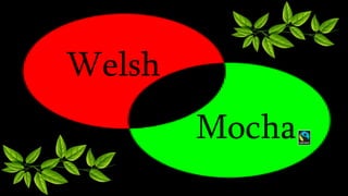
T-shirt design and logo
• Black background to fit the brief
• Red and green for wales
• Circles look like coffee cups
• Interlocking circles represent people coming together
• Green colour for nature
• Only two colours to fit the brief
• Leaves to show how the company protect the environment
• Appeals to the target audiences age (late teens to 40s)
• Bright colours to fit the brief
• Not gender specific
• The t-shirt is black in colour to fir what is stated in the brief. The brief
also states that the logo should consist if two colours which are red
and green similar to the welsh flag as the company is based in south
wales. The circles in the logo portray two coffee cups to represent
people coming together as the brief states that the company want to
show that they encourage being a community. The prominent colour
is green because the company wants to show that they intend to take
the environment into consideration and protect the trees. This links in
to the leaves in the logo as it shows how the company is not harming
the environment in any way as they are a free trade company. This is
shown with the free trade symbol within the logo. The symbol looks
like a full stop to portray putting an end to damaging the
environment. The logo appeals to the target audience of late teens to
forties as it is not childish nor too mature. As well as this it is not
gender specific as it does not cater to just male or female as this
would cut business in half and be bad for the company as only half
the population would be interested.
Welsh
Mocha

Welsh mocha

  • 1.
  • 2.
    • Black backgroundto fit the brief • Red and green for wales • Circles look like coffee cups • Interlocking circles represent people coming together • Green colour for nature • Only two colours to fit the brief • Leaves to show how the company protect the environment • Appeals to the target audiences age (late teens to 40s) • Bright colours to fit the brief • Not gender specific
  • 3.
    • The t-shirtis black in colour to fir what is stated in the brief. The brief also states that the logo should consist if two colours which are red and green similar to the welsh flag as the company is based in south wales. The circles in the logo portray two coffee cups to represent people coming together as the brief states that the company want to show that they encourage being a community. The prominent colour is green because the company wants to show that they intend to take the environment into consideration and protect the trees. This links in to the leaves in the logo as it shows how the company is not harming the environment in any way as they are a free trade company. This is shown with the free trade symbol within the logo. The symbol looks like a full stop to portray putting an end to damaging the environment. The logo appeals to the target audience of late teens to forties as it is not childish nor too mature. As well as this it is not gender specific as it does not cater to just male or female as this would cut business in half and be bad for the company as only half the population would be interested.
  • 4.