In this assignment I learned the importance of user experience when building a website. I had to perform two separate usability tests, analyze my results and then recommended changes to improve user experience.
Vip Model Call Girls (Delhi) Karol Bagh 9711199171✔️Body to body massage wit...
Usability Test
1. Usability Test for OmahaZoo.com
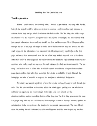
TestPreparation
Before I could conduct any usability tests, I needed to get familiar - not only with the site,
but with the tasks I would be asking my testers to complete - so I took about eight minutes to
scan the home page and get a feel for what the site had to offer. The first thing that really caught
my attention was the slideshow; not just because the pictures were bright, but because they had
just enough information to persuade me to click on them and learn more. Next, I began scrolling
through the rest of the page and began to notice all of the information they had packed into this
small space. All the information was important but did not necessarily need to be on the front
page, and since there was so much text, the rest of the page looked very dull next to the vibrant
slide show above it. The navigation bar was located in the traditional spot and had drop boxes for
each tab; what really caught my eye was the small pictures they had next to each exhibit. The last
thing I had noticed was all of the links to wildlife related associations along the bottom of the
page; these are links that help show users that the website is creditable. Overall I though the
homepage had a lot of potential to be good, but was just so unbalanced design-wise.
Now that I had a pretty good feel of how the website worked, I began to work through the
tasks. The first one asked me to determine where the handicapped parking was and whether or
not there was a parking fee. I went straight to the plan your visit tab and saw the
directions/parking section toward the bottom of the drop box. The first thing you see on this page
is a google map with the zoo’s address and in the top right corner of the map, was two options; to
get directions to the zoo or to save the location to your google maps account. The map did not
show the parking lots so I continued to scroll and happened to notice that the parking was free,
2. but if I was quickly scanning the site then, I would have missed it because it was awkwardly
placed. After that, I continued to look for the handicapped parking areas but was only able to
find directions on the many different ways to enter the zoo. The closet thing I could find is where
to rent wheelchairs and that if you parked in a certain lot, then you could pay to ride the metro to
the zoo. I even tried to search for it, but unfortunately all of the results would take me off the site
if I we to click on them. After about ten minutes of searching tabs, such as, wheelchair/stroller
rentals, admission fees, and even the zoo map, but still had no luck. So I gave up and moved on
to the second task.
The second task asked me to determine which IMAX movies will be showing in April. I
clicked on the “Lozier IMAX Theater” tab and was immediately able to see what movies were
currently playing. I was able to see the current movies that were playing, but nothing about what
was coming in the future. I then noticed the “Coming Soon” tab under the IMAX tab, so I
clicked it and was surprised to see that were no current shows to announce. I looked at the rest of
the tabs underneath IMAX and saw that there was another “Coming Soon” tab! I tried that one,
hoping for something better, but was taken to a completely blank page. I then resorted back to
the search bar but, once again, all of the results lead me away from the site. I went ahead and
went through the show times, now playing, and both coming soon tabs just to make sure I didn’t
somehow miss the information but was still unsuccessful. At this point, I was beginning to get
pretty frustrated because this was the second task I was unable to complete due to the lack of
information on the site.
I moved on to the last task, which asked me to determine the total cost for your
grandfather to visit the zoo, and see a movie. The first thing that I did was click on the
“Admission Fee” tab, and I immediately felt overwhelmed with all of the different dates and
3. prices on the page. Not only did I not understand why different dates cost more than others, but it
wasn’t until I had reached the bottom of the page that I saw the combo option. I had already
figured the prices before I even noticed that I could simply buy a combo for exactly what I
wanted. The only thing I did like about this page, was that the button for purchasing tickets
online was placed next to the current dates making it easier to buy the right tickets. This task was
the only one I was actually able to fully complete, but the organization of the page was still
lacking and was hard to understand.
Choosing Participants
Tester 1: Faith Seura
Faith is a 21 year old female from Grandview, Missouri that spends her summers
working as a part-time clerk at QuikTrip. She is a student at Northwest Missouri State University
so she spends quite a bit of time on the internet. However, she spends more time on social media
and online shopping than she does actually browsing the internet. Throughout the week, she
spends roughly 52 hours on the internet and about 60 percent of that is on social media. Factors
such as her being a student, her age, and weekly usage help classify Faith as my high-experience
tester.
Environment for Tester 1
I told Faith that I was supposed to conduct the test in her natural using environment and
without any hesitation, she told me that she does most of her internet browsing in her bed, but
decided that just sitting in her bedroom would be close enough. Her bedroom was pretty well lit
between the light arrangement and the three very large windows that let in a ton of sunlight. At
the time, the sun did not cause a glare, but I went ahead and asked her if that is ever an issue and
4. she said that the only time it is a problem, is when the sun sets. There were lots of band posters
on her wall and there was music playing in the bedroom next door, but other than that, her room
did not have very many distractions. Now if she was sitting in her bed, like she normally would,
then there would probably a few more distractions, such as pillows or fighting the urge to nap.
She used her HP Elite Book 840 that is provided by her school to conduct the test. The internet
connection was very strong and did not cause any delays in loading time. She used Google
Chrome as her browser and when I asked why she chose it, she simply replied that it was fast.
Tester 2: Tammy Martin
Tammy is 46 and she is the manager of the restaurant side of Gray’s Oil. She is very old
fashioned person and has a difficult time when it comes to dealing with electronics. On average
she stated that she only used the internet for about four hours a week and never gets on social
media. When I asked her to perform this usability test she was little nervous at first because she
knows her computer skills are lacking but once I told her she would be working with the Omaha
Zoo website she agreed. Tammy had visited the Zoo with her daughters a few years before and
loved her experience there so she was pretty excited to explore the site.
Environment for Tester 2
She used the internet so little that she only gets on the computer when she is at work. We
sat in the Gray’s office and conducted the test on a Dell monitor paired with a Nobilis tower. The
owner of Gray’s told me that they got the monitor back in 2000 and then bought the tower about
five years ago. At first I assumed that the pages on the site were going to take a while to load
because the technology was so old but by using chrome as the browser and their fiber optic
connection the page loaded very quickly. The office had two very large windows on the opposite
5. side of where the computer sat and there were no currents to block the sun so there was a large
glare on the screen throughout the whole test. There was also quite a few people coming in and
out of the office to ask her questions and this delayed to test from time to time.
TestResults
Initial Site thoughts
My two testers were very diverse yet they still experienced a lot of the same problems
when working through the three tasks. Both agreed that even though the front page gave the
illusion that the site would very informative they still struggled to complete the task. While
Faith’s attention was first grabbed by the slide show tammy first comments were on the color of
the background. Tammy really struggled to read the type throughout the whole test due to the
lack of contrast between the background colors the type. Neither of the testers could finish the
first two tasks and both were able to complete the last one. Despite their differences my testers’
results were very similar and made it easy to pinpoint the problems with this site.
Task 1: Determine where the handicapped parking is and whether there is a parking fee.
Tester1 Tester2 Average
Task Time 5 min 8 min 6.5 min
Average Satisfaction 1 1 1
SuccessRate no no 0%
Both testers were unable to complete this task due to lack information on the site. The
first thing they both did was drag their mouse to the plan your visit tab first. Tester one was able
to find the directions/parking tab pretty quickly but tester two moves a little bit slower and
6. struggled with the drop box. Tester two stumbled across the parking fee while looking for a map
of the parking lots but tester one never found it. Once tester two found the parking fee she tried
clicking on it to see if would link her to some information on the location of the parking lots.
Both testers scrolled the directions/parking tabs multiple times and began to get very frustrated
that there was so much information on how to enter the zoo but nothing about the handicapped
parking. Tester one even tried to use the search bar but all of the results would have lead her off
the site so this only furthered her frustration. Eventually both testers gave up and rated this task
with a one because the site was not helping them find what they need.
Highlights
1.) Testers were unable to find the parking fee due to the lack of visual hierarchy. All of the
type was the same throughout the website and this causes all of the information to blend
together. Both testers said that the lack of type variation made the site very overwhelming
at times and even cause them to overlook important information.
2.) Both the google map and the map of the zoo did not show where the handicapped parking
is located. There was a ton of information about how to get to the many different
entrances of the zoo but nothing on the layout of the parking lots. This is a very important
detail for some visitors and there is absolutely nothing about where or how far the
handicapped parking is from the entrance of the zoo.
3.) The search bar results lead the testers away from the website and therefore is totally
useless. One of the testers tried to find out more about the handicapped parking lots and
was only more frustrated when she could not click on any of the results.
Recommendations to improve UX for this task
7. Problem being fixed
I choose to fix that there was no information on the layout of the parking lots because I
feel that is very vital information for visitors that are either handicapped or visiting with
someone who is handicapped.
Alignment to Heuristic
The Heuristic that relates most to this issue is consistency and standards. Visitors expect
a website to be easy to use and similar to other related sites. The second tester actually tried
zooming in on the google map because she assumed that it would show her more about the
parking lots and she clicked on the “FREE parking” thinking it was a link. These are both things
that make sense and would have worked on a similar site; which only adds to the user’s
frustration when trying to complete what should be such a simple task.
Problem Improvement
The screenshot below is what the website currently has on its parking and directions
page, just a map followed by address, contact information and then the parking fee. “FREE
parking” is just about the only information on this page about parking. As I explained before,
Tester Two attempted to find more on parking by clicking both the map and “FREE Parking” but
8. of course did not find what she was looking for.
Figure 1: Directions and Parking page--Before
This next screenshot shows how I would improve this problem by adding in an
interactive map. I found this handy map on the Kansas City Zoo’s website, however this site was
also lacking when it came to parking information so I added in an extra section to help make this
information easier to access. I thought the having search bar was simply genus and would help
9. visitors quickly find exactly what they are looking for.
Figure 2: Directions and Parking Page--After
Task 2: Determine which IMAX movies will be showing in April
Tester1 Tester2 Average
Task Time 6 min 7 min 6.5 min
Average
Satisfaction 2 1 1.5
SuccessRate no no 0%
Highlights
1.) There was no information on what movies are coming to the theater: The movies that are
currently playing are clearly shown, but when it comes to future features, there is
nothing.
10. 2.) There was more than one coming soon tab with no information on either one: To make
the first problem worse, there were two different coming soon tabs that were both
completely blank.
3.) The prices of the movies were not listed under the Lozier IMAX Theater: Both testers
found the prices under admission fees, but commented that having this information on the
same page as the rest of the IMAX information would have been more helpful.
Recommendations to improve UX for this task
Problem being fixed
For this task, I chose to fix the first problem because it could greatly benefit the users and
because it would make the second problem pretty easy to fix.
Alignment to Heuristic
This issue also relates to the consistency and standards Heuristic, but for a different
reason; the website uses the standard coming soon to tab to guide users toward the right
information, but failed to supply information once they click on the tab. This does not follow
the standards of other websites and causes users to become irritated when they do not get
what they expected.
Problem Improvement
11. I plan on improving this
problem by simply adding in a
calendar that has all of the
upcoming movies for at least the
next month. In the screenshot to
the right, you can see that the
coming soon page is completely
blank. I believe that adding a calendar with all of the upcoming movies would easily fix this
problem. The screenshot below is from the Sprint Center and it gives the user options on how
they wish to view the upcoming events. Personally, I believe that the calendar is the best
route because it honors both the match between system and the real world, and the
consistency and standards Heuristics. This would give the users the information they were
looking for quickly and be able to easily understand.
Figure 3:Coming Soon--Before
13. Task 3: Determine the total cost for your grandfather to go to zoo and see a movie.
Tester1 Tester2 Average
Task Time 2 min 5 min 3.5 min
Average
Satisfaction 5 5 5
SuccessRate yes yes 100%
Highlights
1.) The combo deal was found at the bottom, and the testers did not find it until they had
already added up the prices in their head. This didn’t really frustrate the user, but would
definitely be more effective if it was properly placed.
2.) The way the information was presented was overwhelming to testers. The long pages of
text in the same font can get tedious and too much of it can stress users out. The
information needs to be organized in a more efficient way that involves less type and
more variety.
3.) The color of the background made it very hard for testers to read the type. This was
mainly a problem for my second tester and had a lot to do with her age, but this only
shows that this is probably a problem for other middle aged/older visitors.
Recommendations to improve UX for this task
Problem being fixed
For the third task, I have chosen to fix the design of the admission fee page and make the
combo-pack one of the first things the visitor sees.
14. Alignment to Heuristic
This last problem relates to the aesthetic and minimalist design Heuristics because the
site is presenting too much information at once. All of the information on the admission fee page
is all relevant, it just needs to be reorganized. The way they are showing everything all at once is
causing visitors to feel overwhelmed. They may resort to just calling in rather than sort through
all of the text in front of them.
Problem Improvement
To help improve user experience, I think the whole page needs to be redesigned. As you
can see in the screenshots below, the information is just piled on to this page. All of the different
seasons have different ticket prices and you don’t even see the combo-pack choice until you
reach the bottom of the page. Some visitors may even miss it all together like I did when
completing this task. Both testers found the combo-deal, but not until they had already added
their IMAX and zoo tickets together.
16. In the next screenshot below, I have used the admission fee page from the Boston
Museum of Fine Art to show how the Omaha Zoo’s page should look. The zoo would have to be
sure to specify that the prices vary by season and that it is on the current season’s prices. I also
showed where I think the combo deal should be placed so the users can see it before they add the
prices themselves. Lastly, I added in a link to take visitors to the rest of the ticket prices
according to the season they wish to visit.
Figure 7: Admission Fees page-- After
Testing Conclusions
After looking over the results of my study, I have found that this site has quite a few
problems but they are fixable. The results from my two testers were very similar despite their
17. very different backgrounds and ability levels. These results made it very easy to see where the
site needed improvement.
In my opinion, it looks as though the designer of this website quickly rushed through this
project without paying attentions to the ten Usability Heuristics. They were not worried about
following the standards of other sites or about the amount information they were putting on a
page. These things cannot go ignored. This was a smaller version of a usability test and yet, the
issues were still abundantly clear. Both testers experienced many of the same problems when
trying to complete their tasks and became very frustrated with the site. In order to make this
website more delightful, they must go back and fix these problems and make sure they are
meeting the Usability Heuristics.