
Recommended
More Related Content
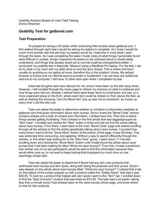
Similar to Usability analysis based on user field testing
Similar to Usability analysis based on user field testing (20)
Recently uploaded
Recently uploaded (20)
Usability analysis based on user field testing
- 1. Usability Analysis Based on User Field Testing Emma Wiseman Usability Test for getbevel.com Test Preparation To prepare for being a UX tester while conducting field studies about getbevel.com, I first walked through each task I would be asking my testers to complete. As I knew I would be much more familiar with the site than my testers would be, I kept this in mind while I went through the tasks. As I was completing the tasks I made notes of what things I personally found were difficult or unclear, things I expected my testers to be confused about or would easily understand, and things that already stood out to me that could be changed/done better. I conducted my usability test in Maryville, Missouri using a MacBook Pro laptop. For the test, I sat at my desk in my room with my desk lamp on and the door closed. This is where and how I usually do anything on my laptop at home, therefore this is the location I chose. My default browser is Ecosia and my internet service provider is Suddenlink. I do not have any additional add-ons to my computer. I did have 12 other tabs open while I completed my test. Initial site thoughts were less relevant for me, since I have been on the site many times. However, I still scrolled through the home page to refresh my memory on what it contained and how things were laid out. Already I wished there were fewer items to scroll down and see, or a more organized setup on the front, where each item could be clicked on from above the fold, as well as wishing the annoying “Join the Bevel fam” pop up was not so persistent, as it pops up every time I visit the site now. Task one asked the tester to determine whether or not there is information available at getbevel.com that gives information about razor bumps. Since I knew the “Bevel Code” section contains articles and a bulk of content and information, I clicked here first. Then this is where things started getting frustrating. First I clicked on the first article that was tagged/grouped as “Skin Care”. I scrolled and clicked the “Next” button 4 times and did not find the article talking about razor bumps. From there, I went back to the main “Bevel Code” page and started scrolling through all the articles to find the article specifically talking about razor bumps. I counted how many times I had to hit the “Show More” button at the bottom of the page. It was 59 times. This was extremely time consuming, and agitating. Without a way to search efficiently through the articles, or find what I was looking for in the “Skin Care” group, I spent about 11 minutes scrolling down and clicking the “Show More” button until I finally found the article about razor bumps that I had been looking for titled “What are razor bumps?” From this, I made a prediction that neither one of my test participants would be able to find this information because they would either give up, or not want to keep looking that long/spend so much time on one seemingly simple task. Task two asked the tester to determine if Bevel had any skin care products that addressed razor bumps and skin spots, along with listing the products and their prices. Since I was already on the article about razor bumps titled: “What are razor bumps?” I noticed that a tab on the bottom of the screen popped up with a product called the “Safety Razor” that said it was $39.95. To look for a product that helped with skin spots I went to the “Skin” tab. I scrolled down to find the “Spot Corrector” product that was listed as $14.95. This task was a lot easier, taking less than a minute since I had already been on the razor bumps article page, and knew where to look for skin products.
- 2. Task three asked the tester to determine whether there is a subscription available for the skin products that were just found. For this, I clicked on “Offers” and scrolled down and clicked on the Replenishment Plan “Learn More” button. From here I was able to scroll down to see which products were included in the Replenishment Plan, as well as the price of the plan. Clicking to find further information of the “Get First Shipment” button, I was able to find the 3 types of subscription packages, how often they were delivered, and what each package cost. This task was again much easier than the first task, again because I was familiar with the site and understood where to click to find the information I needed. This task took about 2 minutes. The final task, task four asked about some information I had already discovered. It asked to determine how much a one-year subscription to Bevel’s Replenishment Plan would cost, as well as how often the product would be shipped and what would be included in each shipment. Since I was already on the page I needed to be on, I quickly could see that a yearlong package would cost $200.00. I then clicked on “Choose” to find the rest of the information I needed. I then could see a list of the products included on the left under “What you get”: a safety razor, shave brush, 60 blades, 2 oz. of priming oil, 3.4 oz. of shaving cream, and 3.4 oz. of restoring balm. Then, under “Expected Payment & Delivery Schedule” I could see when products would be shipped (quarterly), and when replenishments would be shipped. This task was also relatively completed quickly, in about 3 minutes. Choosing Participants Tester 1: Gable Kleffner Tester 1 was Gable Kleffner. Gable Kleffner is one of my old friends from high school who is majoring in business, specifically human resources, and lives in St. Louis, Missouri. He is a 21 year old white male, and has multiple African American and mixed friends around his age, so he would be a reasonable tester since the goal was to find a tester who would be getting a gift from Bevel for someone. He has no familiarity of the site or what Bevel is, as I asked and made sure he would be going into the test with no knowledge of the site before I asked him to be a tester. Kleffner is familiar with Dollar Shave Club, one of Bevel’s competitors, but has never been to the Dollar Shave Club website. Therefore, he was a good tester on the basis of him having no knowledge or bias about Bevel and Bevel’s site. Environment for Tester 1 Location of test: The test was conducted in Festus, Missouri in Kleffner’s room, sitting on his bed. This location was chosen because this is where Kleffner typically does his online shopping. He explained that this is where he is most comfortable, and as he was using a laptop instead of a desktop, it made the most sense to him as he does not have a desk. Physical environment: The environment was mostly peaceful, since it was in his room which was a private place, however there were some distractions. Voices from his family in the other rooms were slightly distracting, as well as baby cries from his niece who is 1 years old. The lighting in the room was darker than in rooms where I had been viewing the site, since his lights were fully off, with only the glow of his laptop’s screen. These distractions made for a different environment than what I had been used to, which was good because it completed the goal of getting into the user’s environment for a field test.
- 3. Technical environment: The computer used was a MacBook Air laptop, with AT&T as the service provider. Kleffner’s default browser was google chrome, and he had one add on called Honey, which is a browser extension/ add-on that finds and applies coupon codes when checking out on an e commerce site such as Bevel. No other tabs were open, as the browser was started up again. Tester 2: Susan Wiseman Tester 2 was Susan Wiseman. Susan Wiseman is my mother and is an elementary school librarian assistant with a background in computer science who lives in St. Louis, Missouri. She is a 47 year old white female who also has non-white male friends that she might be buying a gift for. I chose this tester because she differed from Tester 1 in most all ways besides race. As an older, female tester I hoped she would have a different perspective, as well as having a different area of expertise than Tester 1. Much like Tester 1, I made sure she had no previous exposure to Bevel or getbevel.com so that she would also be seeing the sight with fresh eyes. She had not heard of Bevel’s competitors, such as Dollar Shave Club and Harry’s either. This was good because she had no bias about subscription shaving clubs in general. Environment for Tester 2 Location of test: The test was conducted in Fenton, Missouri in the basement of Wiseman’s home, in a home office. This location was chosen because this is usually where Wiseman does her computer work, as she does not have a laptop. She explained that this environment was the most normal to her, as she typically likes to sit at the desk in her home office when she is doing online shopping. Physical environment: The environment was very peaceful. As she had the room’s door closed, and she was sitting at a desk, the settings were very ideal. Little to no distractions were going on during the test, besides muffled noises from outside which were extremely minimal. The lighting was good and the room was cool since it was located in the basement of the house. Technical environment: The computer used was a Dell desktop computer running on Windows 10. The internet service provider was AT&T, and the default browser was google chrome. The computer had multiple add-ons including Rakaton, a cash back add on, Pinterest, a photo pinning add on, Norton Identity, a security add on, and Gyazo, a screen capture add on. 17 tabs were open upon turning on the desktop. Test Results Initial Site Thoughts Tester 1: Tester one’s initial site thoughts covered him browsing and reading the content on the home page, as well as comments regarding the design of the site. Tester one said the site looked “fancy, yet simple”, but that for some reason Bevel did not look like a legitimate brand. Tester one commented on many of the pictures on the homepage that stood out to him for negative reasons. He was confused that some pictures on the homepage did not match the content or the topic of the content. While scrolling he said that seeing that Bevel products could be found at Amazon and Target made it more trustworthy since those are reputable brands. Overall, Tester one found that the homepage of the site had very superficial information, and that he still wasn’t clear about what Bevel was and who it was for.
- 4. Tester 2: Tester two’s initial site thoughts also covered her browsing the homepage, as well as reading the small snippets of information provided. Tester two did a good job of thinking out loud, especially for her initial site thoughts. She audibly showed how she came to the conclusion that Bevel was a men’s shaving product company, after at first thinking it was centered on makeup and hair products. From there, she also audibly showed how she came to the conclusion that it was just for men as she scrolled through the homepage pictures of only men. After she concluded that the site was for men’s shaving products, she further concluded that it was for men of color, also from looking at the homepage pictures. She then started to wonder that if these shaving products are for men of color, asking “what is special about them?” She wondered what problems were different in shaving for men of color and how these shaving products worked to solve those problems. Similarities and differences: While Tester one seemed to understand right away that Bevel was a men’s shaving site for men of color, Tester two seemed to figure it out once she looked through the whole homepage. This could be because Tester one is a male and related to the site easier. Both testers didn’t have more than a few minor negative comments to make, nothing seemed too outrageously out of place or confusing on the homepage for either of them. Both testers could not find a bulk of information on the homepage, both noting they would have to click on some things to better understand Bevel and why Bevel was different than other shaving brands. Task 1: Determine whether there is any information available at getbevel.com that explains what razor bumps are, how they happen, and whether they cause discoloration, spotting or scarring. You want to learn details here, not just superficial information. Summary for Both Testers: Tester 1 Tester 2 Average Average Satisfaction 2 3 2.5 Success Rate 10% 30% 20% Top 2 Observations: 1. Testers were surprised that there was not an easier way to quickly find information about razor bumps. Both testers expressed distress while completing this task because they felt that there was no obvious place or page to go to in order to find this information. Both testers wandered around the site unsure of where to go, taking up an average of 8.5 minutes until they either thought they found enough information, or gave up looking for information. 2. Testers were unsure how to maneuver the site efficiently. Testers spent the first few minutes just trying to understand where things were, and what content from the first page lead to. This could partially be because this was their first task, and they had yet to explore the site on their own.
- 5. Biggest Problem: The single biggest problem for this task was that testers did not know what “Bevel Code” was, and that the information they were looking for would be there. Neither of the testers ended up on “Bevel Code” the whole time they were searching for the information to complete the task. Tester 1 first went to “Skin” and “Shave” thinking that the products there would have information about razor bumps. Some brief product descriptions of what the products helped with barely gave information about razor bumps. Clearly disappointed with not finding all the information he needed, Tester 1 sighed and scrolled down to look at the reviews, hoping someone there would address razor bumps. Without luck, Tester 1 then found the keyword review and typed in “Razor Bumps”, but as he scrolled through he still determined that this was not substantial enough information for him to feel as though he completed the task. Tester 1 then concluded that if he was alone, and not being tested, he would just go to the Google search engine to find more information. Figure 1 shows where Tester 1 gave up his search, concluding the information was either not on the site, or too difficult to find. Figure 1. Tester 2 started by clicking “Why you need it” on the homepage. She stated that she clicked here because she assumed it would address background information on the products. After scrolling through the page, she stated, “This is not what I want”, and goes back to the homepage. Then, Tester 2 clicked on “Learn More” on the homepage because she thought it may explain what razor bumps are and how to treat it with a specific Bevel product. Scrolling down, she saw the page contained mainly testimonials, so then again went back to the homepage. Next, Tester 2 went to the “Dermatologist: Learn More” section. At first she only saw statistics, looking confused. Then, she saw the video of the dermatologist talking, and decides to watch it. After watching the video, Tester 2 seems satisfied with the information about razor
- 6. bumps she was given and feels she has completed the task. Figure 2 shows where Tester 2 found the information that she felt allowed her to complete the task. Figure 2. Alignment to Heuristic: The heuristic that most aligned with the test results is Help and documentation. This heuristic has to do with having a clear area in place that answers questions about the site and the content on the site. This is a place where users go to when they cannot figure something out themselves and are asking for help. This heuristic aligns with the biggest problem found for this task, because both users could have benefitted from being able to ask for help or search for help while trying to find out about razor bumps. Although there is a help button located on getbevel.com, it is not in a prominent place, instead it is located in the lower right hand corner, a hidden area. Neither of the testers noticed this help button area, even when they clearly expressed that they would want to ask for help in where to go to find information about razor bumps. Task 2: Determine if Bevel has any skin-care products available that address razor bumps and skin spots. What are the products and how much do they cost? Summary for Both Testers: Tester 1 Tester 2 Average Average Satisfaction 3 2 2.5 Success Rate 50% 50% 50%
- 7. Top 2 Observations: 1. Testers were surprised that it was easy to find the spot corrector in the “Skin” section, after having trouble during the first task. Both testers located the spot corrector skin product quickly and with ease, which was a very different experience than when they were trying to find information about razor bumps during the previous task. 2. Testers were unsure how to find a product for razor bumps. Locating the spot corrector was easy for them because it was a self-explanatory product, however looking for a product for razor bumps was more difficult because they were unsure what type of product they would be looking for, unsure where to look for it, and still did not have a lot of information about razor bumps. Biggest Problem: The single biggest problem for this task was that testers could not search for products based on skin conditions such as razor bumps or spotting. Both testers made statements about how they weren’t sure if the products they were looking at on the “Skin” and “All Products” pages were specifically for razor bumps or spotting. They said descriptions were too concise, and they wish the descriptions had explained specifically what the benefits of the products were so that they knew for sure they were picking the right products. Tester 1 started by clicking on the “Skin” tab on the bar at the top of the page. He scrolled down and quickly found and identified the Spot Corrector product and saw that the price was $14.95. He then looked at the Moisturizing Face Gel, and upon clicking on the product page, saw that it did not say whether or not it helped with razor bumps. He then went back to the “Skin” page and clicked on both the Face Wash and Exfoliating Toner, clicking on each product page, and again concluding that neither of those products mentioned helping razor bumps. Tester 1 then concluded that there was not a product specifically for razor bumps since he looked at all the products on the “Skin” page, none of which discussed helping with razor bumps. Figure 3 shows where Tester 1 concluded that he could not find a product specifically for razor bumps.
- 8. Figure 3. Tester 2 followed the same initial sequence that Tester 1 followed to find the Spot Corrector, first clicking on the “Skin” tab on the bar at the top of the page, and then scrolling down to find and identify the Spot Corrector product and saw that the price was $14.95. After scrolling through the “Skin” page and looking briefly at the products, she states that she’s “Not sure where to go next”. She then, much like Tester 1, clicks on the remaining products on the skin page at reads through the descriptions and information there. Still not finding a product for razor bumps, she goes to the “All Products” tab and scrolls through it, still not convinced any of the products are what she is looking for. Concluding there is not a product for razor bumps that is clearly for razor bumps, she adds that she doesn’t understand why in the “All Products” page the product categories are different from the bar at the top. Figure 4 shows how the top bar labels are not listed in the same order as on the “All Products” page, which she felt was strange and confusing.
- 9. Figure 4. Alignment to Heuristic: The heuristic that most aligned with the test results is flexibility and efficiency of use. This heuristic has to do with accelerators that allow for both inexperienced and experienced users to have catered site experiences, as well as using filters and sorting to tailor to their needs. For this task, testers needed a way to search for products that specifically targeted razor bumps and spotting. If getbevel.com came up with a way to introduce a filtering section for their “All products” page, this would have made the testers’ task much easier. If the testers and users had the ability to check a box for products to specify what kind of skin type, hair type, or problem area they wanted to target, they would have a quicker and easier experience with finding the exact product they want. Task 3: Determine whether there is a subscription available for those skin products related to razor bumps and spotting. Summary for Both Testers: Tester 1 Tester 2 Average Average Satisfaction 2 4 2 Success Rate 10% 100% 55% Top 2 Observations: 1. Testers were surprised that the products they had just found did not have an easily accessible click or link to a page that talked about the subscriptions, instead they had to
- 10. find subscriptions plans page themselves. Both the testers went through multiple pages in order to find information about subscriptions 2. Testers were unsure how to learn more information about Bevel’s subscription plans. It was relatively easy to find out that Bevel had subscription plans, but getting details proved to be more difficult for both of the testers. One tester gave up trying to find additional information after assuming there would be no more, and another tester had to click multiple times to get to the main subscription plans page. Overall, the ease of finding information, a recurring problem now during these tests, was not there. Biggest Problem: The single biggest problem for this task was that there was no easy or quick way both testers could go back and find a quick link to the subscription pages. Both testers recalled seeing something early on in going through the site that had to do with subscriptions, but could not find where they saw it originally/it wasn’t clear exactly where to go specifically for subscription information. Because of this, the testers had to sift through information and different pages and tabs to find what they were looking for, instead of having a clear image, icon, button, etc. that was memorable and helpful. Tester 1 started by going to “Skin” and back to the Spot Corrector product, since this was the product he found that would be in the subscription he would want. However, he did not find a way to go to the subscription page from there. Tester 1 then recalled that he saw something on the homepage earlier that lead him to believe there was a button or link to a subscription information page. After finding nothing on the homepage however, Tester 1 clicked on the tab “Offers”, guessing this would show prices and hopefully subscription packages information. On this page Tester 1 saw three different kits, and assumed these were the subscription packages. Tester 1 was confused and upset that these images of the kits were not clickable, and did not link to a site with more information about them. Figure 5 shows where Tester 1 was trying to click on the images of the kits, but could not.
- 11. Figure 5. Tester 2 also remembered seeing something earlier about subscriptions, and also went back to the homepage. She then sighed with disappointment upon not finding what she had seen before on the homepage. Much like Tester 1, Tester 2 then clicked on the “Offers” tab. Unlike Tester 1 however, she scrolled down past the three kits, and saw a box that highlighted the Bevel Replenishment Plan, and clicked on the “Learn More” button inside the box. She was then able to see the Replenishment Plan packages, unlike Tester 1. Seeing this information, she was satisfied with understanding that Bevel had three main Replenishment Plan packages. Figure 6 shows where Tester 2 found out that Bevel had three main Replenishment Plan packages.
- 12. Figure 6. Alignment to Heuristic: The heuristic that most aligned with the test results is recognition rather than recall. This heuristic has to do with minimizing the user’s memory load by making options and actions available. For this task, testers struggled with remembering where they say information about subscriptions before, and going back to the homepage and locating where that information was. By having a clear option visible for users to go back to a page, or area they had previously viewed, this problem may not have existed. It’s clear that testers could vaguely recall seeing subscription information, but going back to find the information was a problem because there was no help for them to do that. Task 4: You’ve decided you want to give your friend a one-year subscription to Bevel’s Replenishment Subscription. Determine how much that will cost. Determine how often product will be shipped and what’s included with each shipment. Summary for Both Testers: Tester 1 Tester 2 Average Average Satisfaction 1 4 2.5 Success Rate 10% 100% 20%
- 13. Top 2 Observations: 1. Testers were surprised that the subscription package information was not on the homepage, or more prominent. Similar to the last task, both testers continued to wonder why they could recall seeing information about subscriptions earlier, but later could not find it. If there was possibly a direct link or button from the homepage that advertised their subscription packages, this problem may have been avoided, and testers would have had a quicker, easier, experience while looking for subscription information and details. 2. Testers were unsure how to go directly to a specific subscription package. Although Tester 2 eventually found her way to the details, Tester 1 did not, and that was an obvious issue. Testers had no way of searching for the exact type of package they wanted, which would have saved time and effort on their part. Especially since they were both first time site visitors, they did not know their way around the site and should not be expected to. Biggest Problem: The single biggest problem for this task was that it was difficult for the testers to easily find details and specifics about the Replenishment Subscriptions. Both testers seemed to take a large amount of time looking to find specifics, instead of having a page dedicated for answering all their questions about the subscription packages. Because of this, both testers spent too much time looking for subscription information that should have been clear and easy to find. By this point, Tester 1 was agitated that completing the previous tasks had not been easier, and was not happy that he had spent a large amount on the first and third tasks, and had little success in completing them. Tester 1 started this task by going to the “All Products” page, in which he only found a list of products, instead of information about a 1 year subscription package. From there he went back to “Offers”, as he did for the previous task, and again concluded that what he was looking for was not on this page, even though it was. This shows that the information was not clear enough, and not every user will know to scroll down and click the “Learn more” button. After this he went back to the homepage and then to “Hair”, and yet again did not find what he was looking for. At this point, Tester 1 expressed that he felt confused and did not think finding information about subscriptions should be this difficult, and stopped searching. Figure 7 shows where Tester 1 gave up looking for subscription information.
- 14. Figure 7. Tester 2 had a very different experience with this task, although she still took about 7 minutes, around the same amount of time as Tester 1, to complete the task. As she was already on the subscription page from the previous task, she clicked on “Get first shipment” to find out more details about the Replenishment Subscription plans. From there she noted that she saw that the yearly package was $200 a year, and that it was the best value price for the three options for packages. From there, she clicked on “Choose” to pick the yearly package. After this continued to look through the page and find out that the package is shipped quarterly, but wondered what the specifics of when quarterly was, as in exact dates. On this page Tester 2 found out that a safety razor, shave brush, 60 blades, 20 oz. priming oil, 3.4 oz. of shaving cream, and 3.4 oz. of restoring balm would be included in this package. She then went on to click and view the “FAQ” page to get more answers to her questions. She explained that if she was to actually purchase this for a friend, she would need a lot more specific details to make sure she understood the delivery schedule and which products would be replenished, and which products would not. Figure 8 shows where Tester 2 found the detailed subscription information, and Figure 9 shows where Tester 2 was finding additional information about subscription information.
- 15. Figure 8. Figure 9. Alignment to Heuristic: The heuristic that most aligned with the test results is aesthetic and minimalist design. This heuristic has to do with removing unnecessary elements, as well as having elements show up when the user needs them. For this task, both testers had some confusion on the details of the subscription packages. With minimal buttons that provided a tip, or quick answer when they scroll over a specific section of the page, this problem could have been avoided. When users tell you they need help with a particular thing, such as scrolling over
- 16. the “Replenishment” section of the subscription page, you can answer their questions by providing a small icon or box of information that pertains to that specific section. Final Site Thoughts Tester 1: Tester 1 rated his overall satisfaction with the site as a 2, or poor. He rated this way because he expressed that he felt like he completed some of the tasks, but not most, and that the tasks he did complete took too much time in his opinion. Tester 1 noted that he felt like there should be a tab in the main navigation just for subscriptions, to make it clear. He also noted that he thought “Bevel Code” was a discount code for purchasing products on the page, and that is why he had no inclination to go to that page. These are both two good feedback comments, and both had to do with the general navigation and labeling of navigation on the site. Tester 2: Tester 2 rated her overall satisfaction with the site as a 4, or good. She rated this way because she felt like overall the site was attractive and the layout made sense. However, she also noted that she felt surprised by a lot of the information on the site, specifically having to do with subscriptions, because it was either confusing or not enough or addressing problems that didn’t make sense/were not relevant. Tester 2 felt like if she would not want to buy a subscription plan from Bevel, because she still had a lot of unanswered questions. She said that if she needed to switch the address during the yearlong subscription, she would not know how to go about doing that from the subscription page and the FAQs section. Tester 2, just like Tester 1, noted that she did not know what “Bevel Code” was, and was confused about it being on the site. Similarities and Differences: Although the testers had different experiences with the site, neither tester rated the site as terrible, nor excellent. From this, it can be deduced that getbevel.com is not a complete failure, but there is definitely room for improvement. Both testers made comments about the confusion that surrounded “Bevel Code” because the name was confusing and ambiguous. Tester 1 noted that the overall upper navigation bar could use improvements in clarification, and Tester 2 also had a similar comment about making information more clear on certain pages of the site, such as the subscription page. Recommendations to improve user experience Single Problem Being Fixed An overarching problem that seemed to affect most of the tasks performed by the testers was navigation, specifically the top bar of navigation not being clear enough. Because of this problem, testers spent too much time trying to find information and content. This is the single most important problem that needs to be fixed because it affects the user’s overall experience with the site. Problem Improvement To improve this problem, I will use Before/After edited screenshots to explain and show how the main navigation can be improved, and therefore will decrease the time users will spend trying to figure out how and where to go to find specific content. In the “Before” image below, you will see how the navigation of getbevel.com is currently set up. Since testers struggled the
- 17. most with finding where specific content was within the site, the way the navigation is currently set up needs some improvements. The first improvement to help navigation has to do with the labels on the top navigation bar, more specifically “Offers” and “Bevel Code”. Both the labels of “Offers” and “Bevel Code” were confusing and not clear to the testers what type of content would be within these pages. Going off of this, the second improvement would be to create drop down menus for each of the labels on the top navigation bar. This way, users would be able to see what each label contained without having to go to the page to find out. This would also help users understand how to navigate the site easier and faster. A third improvement to help navigation and answer questions would be to create a search bar as well as make the “Help” button more obvious. Since the testers struggled with not knowing where to go for certain tasks, didn’t see the “Help” button, and wanted to give up rather than search through the site for it, both of these improvements would help. By having somewhere to directly search for questions that is easily recognizable, as well as having the help button in a place that is more prominent and visible, users will be able to search for what they need help with easily. Before: getbevel.com’s current homepage layout. In the “After” picture below, you can see how the changes to improve the navigation outlined above were done. For the first improvement, the confusing labels of “Offers” and “Bevel Code” were changed to “Subscriptions” and “Learn More”. Since the label of “Offers” did not clearly entail for testers that it contained subscription information, it was changed to “Subscriptions” so it was more obvious what the content was. For “Bevel Code”, testers had no idea that the page hosted articles, videos, and tips from the name. Both testers stated that they thought “Bevel Code” was a discount code page for purchases. Therefore, it was changed to “Learn more”, so that users will know that this page has general information that should answer information based questions. By changing these labels, the navigation is clearer and users will better understand what type of content is included on that page. Again going off this idea of knowing what content is on each page without having to go to the page is the addition of drop
- 18. down menus for all of the navigation labels showing their subcategories besides “Subscriptions” (since there is no sub categories). Besides giving the top navigation bar label’s drop down menus, the order of the subcategories on the “All Products” page was put in the same order as the order listed on the top navigation bar for consistency. The third improvement was made by putting a search bar in the top right of the navigation bar, so that users can directly search for a specific keyword and find content faster. Besides this, the help button was enlarged, it was made more noticeable, and it was placed in the top left area of the homepage so that users will not miss it, and it will not be in the user’s way. With both the drop down menus, and the help button, these items would not appear fully unless the user moused over them. For example, the “All Products” label would have to be moused over for the drop down menu containing the labels Shave, Hair, and Skin to appear. For the help button, only the “Here to Help!” label and the question mark icon would appear until the user moused over it, and then the box to type a question would appear. This aligns with the heuristic of aesthetic and minimalist design, because it still keeps the site simple and minimalistic, but allows for users to tell the site when they need additional information by mousing over. After: Edited version of getbevel.com to show problem improvements that should be made.