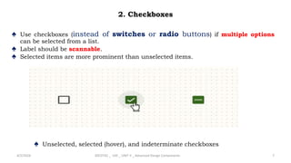
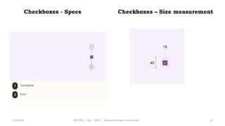
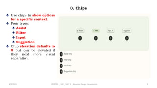
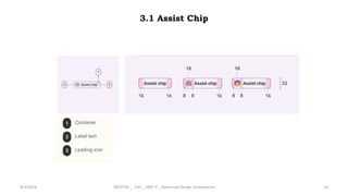
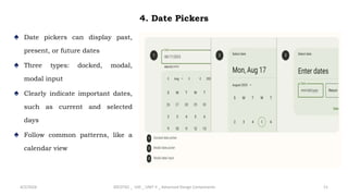
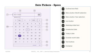
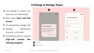
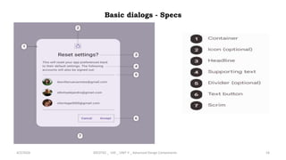
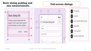
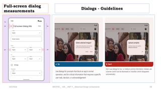
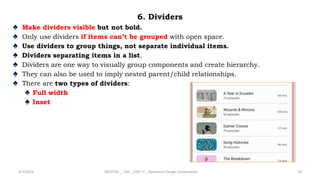
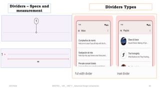
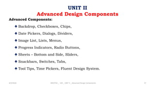
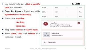
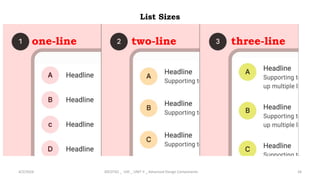
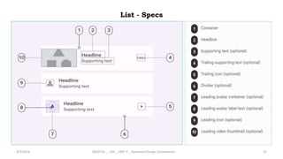
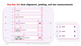
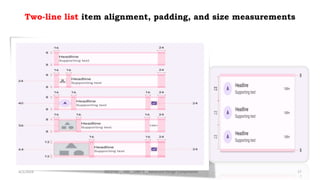
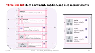
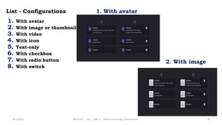
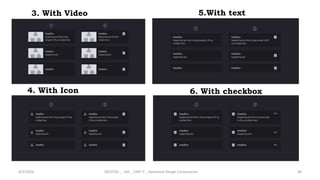
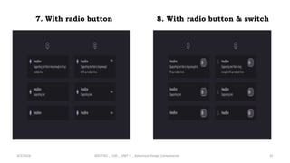
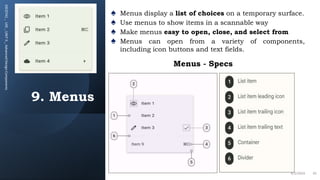
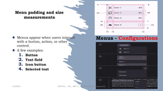
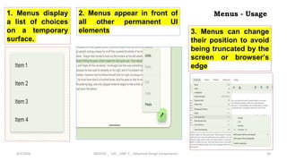
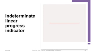
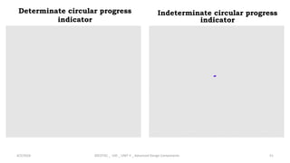
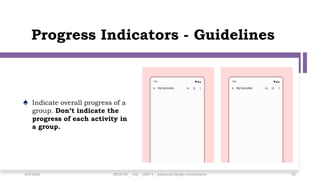
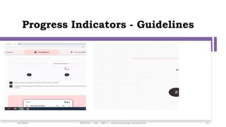
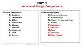
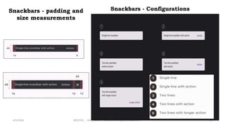
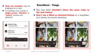
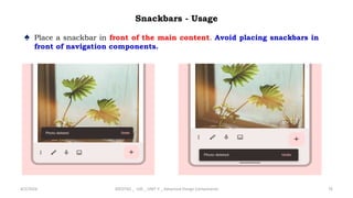
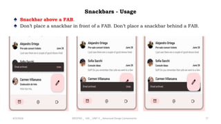
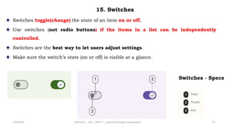
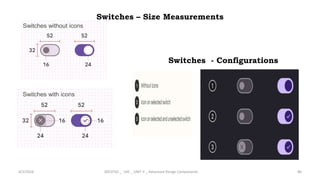
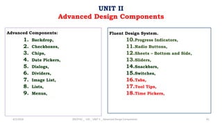
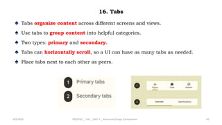
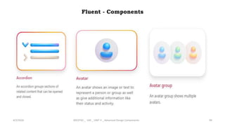
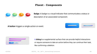
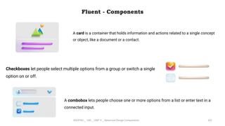
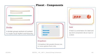
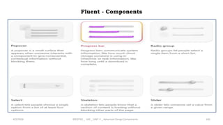
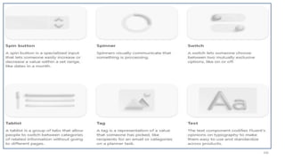
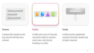
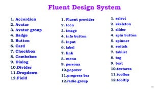
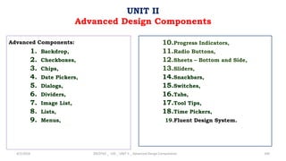
SlideShare a Scribd company logo
1 of 109
20CDT42 – User Interface Design
KONGU ENGINEERIG COLLEGE (AUTONOMOUS)
DEPARTMENT OF COMPUTER SCIENCE AND DESIGN
P.GOWSIKRAJA M.E., (Ph.D.,)
Assistant Professor
Department of Computer Science and Design
Advanced Components:
1. Backdrop,
2. Checkboxes,
3. Chips,
4. Date Pickers,
5. Dialogs,
6. Dividers,
7. Image List,
8. Lists,
9. Menus,
4/2/2024 20CDT42 _ UID _ UNIT II _ Advanced Design Components 2
UNIT II
Advanced Design Components
Fluent Design System.
10.Progress Indicators,
11.Radio Buttons,
12.Sheets – Bottom and Side,
13.Sliders,
14.Snackbars,
15.Switches,
16.Tabs,
17.Tool Tips,
18.Time Pickers,
1. Backdrop
♠ A backdrop appears behind all other surfaces in an app, displaying contextual
and actionable content.
♠ A backdrop is composed of two surfaces: a back layer and a front layer.
♠ The back layer displays actions and context, and these control and inform
the front layer's content.
4/2/2024 20CDT42 _ UID _ UNIT II _ Advanced Design Components 3
2.1 Advanced Design Components
Back Layer and Front Layer
4/2/2024 20CDT42 _ UID _ UNIT II _ Advanced Design Components 4
Active front layer
4/2/2024 20CDT42 _ UID _ UNIT II _ Advanced Design Components 5
Active back layer
4/2/2024 20CDT42 _ UID _ UNIT II _ Advanced Design Components 6
2. Checkboxes
♠ Use checkboxes (instead of switches or radio buttons) if multiple options
can be selected from a list.
♠ Label should be scannable.
♠ Selected items are more prominent than unselected items.
4/2/2024 20CDT42 _ UID _ UNIT II _ Advanced Design Components 7
♠ Unselected, selected (hover), and indeterminate checkboxes
Checkboxes - Specs
4/2/2024 20CDT42 _ UID _ UNIT II _ Advanced Design Components 8
Checkboxes – Size measurement
3. Chips
♠ Use chips to show options
for a specific context.
♠ Four types:
♠ Assist
♠ Filter
♠ Input
♠ Suggestion
♠ Chip elevation defaults to
0 but can be elevated if
they need more visual
separation.
4/2/2024 20CDT42 _ UID _ UNIT II _ Advanced Design Components 9
3.1 Assist Chip
4/2/2024 20CDT42 _ UID _ UNIT II _ Advanced Design Components 10
4. Date Pickers
♠ Date pickers can display past,
present, or future dates
♠ Three types: docked, modal,
modal input
♠ Clearly indicate important dates,
such as current and selected
days
♠ Follow common patterns, like a
calendar view
4/2/2024 20CDT42 _ UID _ UNIT II _ Advanced Design Components 11
Date Pickers - Specs
4/2/2024 20CDT42 _ UID _ UNIT II _ Advanced Design Components 12
Date Pickers - Specs
4/2/2024 20CDT42 _ UID _ UNIT II _ Advanced Design Components 13
Docked date picker padding and size measurements
4/2/2024 20CDT42 _ UID _ UNIT II _ Advanced Design Components 14
5.Dialogs & Dialogs Types
♠ Use dialogs to make sure
users act on information
♠ Two types: basic and full-
screen
♠ To completing a single task
♠ Display information
relevant to the task
♠ Commonly used to confirm
high-risk actions like
deleting progress
4/2/2024 20CDT42 _ UID _ UNIT II _ Advanced Design Components 15
Basic dialogs - Specs
4/2/2024 20CDT42 _ UID _ UNIT II _ Advanced Design Components 16
Basic dialog padding and
size measurements
4/2/2024 20CDT42 _ UID _ UNIT II _ Advanced Design Components 17
Full-screen dialogs
Full-screen dialog
measurements
4/2/2024 20CDT42 _ UID _ UNIT II _ Advanced Design Components 18
Dialogs - Guidelines
6. Dividers
♠ Make dividers visible but not bold.
♠ Only use dividers if items can’t be grouped with open space.
♠ Use dividers to group things, not separate individual items.
♠ Dividers separating items in a list.
♠ Dividers are one way to visually group components and create hierarchy.
♠ They can also be used to imply nested parent/child relationships.
♠ There are two types of dividers:
♠ Full width
♠ Inset
4/2/2024 20CDT42 _ UID _ UNIT II _ Advanced Design Components 19
Dividers – Specs and
measurement
4/2/2024 20CDT42 _ UID _ UNIT II _ Advanced Design Components 20
Dividers Types
Vertical divider
♠ A vertical divider can be used to arrange content on a larger screen, such as
separating paragraph text from video or imagery media.
4/2/2024 20CDT42 _ UID _ UNIT II _ Advanced Design Components 21
7. Image List
♠ Image lists display a collection of images in an organized grid.
♠ Image lists represent a collection of items in a repeated pattern. They help improve
the visual comprehension of the content they hold.
4/2/2024 20CDT42 _ UID _ UNIT II _ Advanced Design Components 22
Image List - Principles
Image List - Types
1. Standard image lists are best for items of equal importance.
They have a uniform container size, ratio, and
padding.
2. Quilted image lists emphasize certain items over others in a
collection. They create hierarchy using varied
container sizes and ratios.
4/2/2024 20CDT42 _ UID _ UNIT II _ Advanced Design Components 23
3. Woven image lists facilitate the browsing
of peer content. They display content in
containers of varying ratios to create a
rhythmic layout.
4. Masonry image lists facilitate the
browsing of uncropped peer content.
Container heights are sized based
on the image size.
24
Image List - Types
WOVEN IMAGE LIST
MASONRY IMAGE LIST
4/2/2024 20CDT42 _ UID _ UNIT II _ Advanced Design Components
Image list – anatomy
4/2/2024 20CDT42 _ UID _ UNIT II _ Advanced Design Components 25
1. Image container- displays an image
list item’s image or illustration.
2.Text labels (optional)
display one line of text related to an
image list item.
3. Actionable iconography (optional)
It represent related actions.
4.Text protection (optional)
It is a semi-opaque scrim placed in front
of imagery to keep text above it legible.
5.Image list item
It represent individual items in an
image list
Image list – padding
♠ Padding can vary between images in an image list.
♠ The following padding values are recommended: 1, 2, 4, 8, 16, 20, 24, 32 dp.
4/2/2024 20CDT42 _ UID _ UNIT II _ Advanced Design Components 26
Advanced Components:
♠ Backdrop, Checkboxes, Chips,
♠ Date Pickers, Dialogs, Dividers,
♠ Image List, Lists, Menus,
♠ Progress Indicators, Radio Buttons,
♠ Sheets – Bottom and Side, Sliders,
♠ Snackbars, Switches, Tabs,
♠ Tool Tips, Time Pickers, Fluent Design System.
4/2/2024 20CDT42 _ UID _ UNIT II _ Advanced Design Components 27
UNIT II
Advanced Design Components
Standard Image List
♠ Standard image lists can be displayed with or without text labels.
1. image list with images only
2. image list with images and text labels
4/2/2024 20CDT42 _ UID _ UNIT II _ Advanced Design Components 28
Quilted image list
♠ Quilted image lists emphasize certain items over others in a collection. They use varied
container sizes and ratios to create hierarchy across images.
♠ click the link
4/2/2024 20CDT42 _ UID _ UNIT II _ Advanced Design Components 29
♠ Woven image list
♠ Woven image lists use alternating container ratios to create a rhythmic layout.
♠ A woven image list is best for browsing peer content.
4/2/2024 20CDT42 _ UID _ UNIT II _ Advanced Design Components 30
Masonry image list
♠ Masonry image lists use
dynamically sized container heights
that reflect the aspect ratio of each
image.
♠ This image list is best used for
browsing uncropped peer content.
4/2/2024 20CDT42 _ UID _ UNIT II _ Advanced Design Components 31
Guess the
image list
types
32
1
4
3
2
1. Standard image list
2. Quilted image list
3. Woven image list
4. Masonry image list
4/2/2024 20CDT42 _ UID _ UNIT II _ Advanced Design Components
8. Lists
♠ Use lists to help users find a specific
item and act on it
♠ Order list items in logical ways (like
alphabetical or numerical)
♠ Three sizes: one-line,
two-line,
three-line
♠ Keep items short and easy to scan
♠ Show icons, text, and actions in a
consistent format.
4/2/2024 20CDT42 _ UID _ UNIT II _ Advanced Design Components 33
List Sizes
4/2/2024 20CDT42 _ UID _ UNIT II _ Advanced Design Components 34
one-line two-line three-line
List - Specs
4/2/2024 20CDT42 _ UID _ UNIT II _ Advanced Design Components 35
One-line list item alignment, padding, and size measurements
4/2/2024 20CDT42 _ UID _ UNIT II _ Advanced Design Components 36
Two-line list item alignment, padding, and size measurements
4/2/2024 20CDT42 _ UID _ UNIT II _ Advanced Design Components 37
Three-line list item alignment, padding, and size measurements
4/2/2024 20CDT42 _ UID _ UNIT II _ Advanced Design Components 38
List - Configurations
1. With avatar
2. With image or thumbnail
3. With video
4. With icon
5. Text-only
6. With checkbox
7. With radio button
8. With switch
4/2/2024 20CDT42 _ UID _ UNIT II _ Advanced Design Components 39
1. With avatar
2. With image
4. With Icon
4/2/2024 20CDT42 _ UID _ UNIT II _ Advanced Design Components 40
3. With Video 5.With text
6. With checkbox
8. With radio button & switch
4/2/2024 20CDT42 _ UID _ UNIT II _ Advanced Design Components 41
7. With radio button
9. Menus
20CDT42
_
UID
_
UNIT
II
_
Advanced
Design
Components
♠ Menus display a list of choices on a temporary surface.
♠ Use menus to show items in a scannable way
♠ Make menus easy to open, close, and select from
♠ Menus can open from a variety of components,
including icon buttons and text fields.
4/2/2024 42
Menus - Specs
Menu padding and size
measurements
♠ Menus appear when users interact
with a button, action, or other
control.
♠ A few examples:
1. Button
2. Text field
3. Icon button
4. Selected text
4/2/2024 20CDT42 _ UID _ UNIT II _ Advanced Design Components 43
Menus - Configurations
Menus - Usage
4/2/2024 20CDT42 _ UID _ UNIT II _ Advanced Design Components 44
1. Menus display
a list of choices
on a temporary
surface.
2. Menus appear in front of
all other permanent UI
elements 3. Menus can change
their position to avoid
being truncated by the
screen or browser’s
edge
Menus - Usage
4. The space between the
bottom of the menu and the
bottom of the screen is the
same size as the height of a
menu item.
4/2/2024 20CDT42 _ UID _ UNIT II _ Advanced Design Components 45
5. When content is scrollable,
menus display scrollbars
6. Menu with filter
showing a list of states
filtered by the letter C
Menus - Usage
7. A menu can be
triggered by an icon tap,
appearing below the
overflow menu icon
4/2/2024 20CDT42 _ UID _ UNIT II _ Advanced Design Components 46
Menus at different
positions on screen open
in different ways, adapting
to the space available
10. Progress Indicators
♠ Progress indicators show the status of a process in real time.
♠ Use the same progress indicator for all instances of a process (like loading)
♠ Two types: linear and circular
♠ Never use them as decoration
♠ They capture attention through motion
4/2/2024 20CDT42 _ UID _ UNIT II _ Advanced Design Components 47
Linear progress indicator
Linear progress indicator size
measurements
Determinate
linear progress
indicator
20CDT42 _ UID _ UNIT II _ Advanced Design Components 4/2/2024 48
Indeterminate
linear
progress
indicator
4/2/2024 20CDT42 _ UID _ UNIT II _ Advanced Design Components 49
Circular progress indicator anatomy and size measurement
4/2/2024 20CDT42 _ UID _ UNIT II _ Advanced Design Components 50
Determinate circular progress
indicator
4/2/2024 20CDT42 _ UID _ UNIT II _ Advanced Design Components 51
Indeterminate circular progress
indicator
Progress Indicators - Guidelines
♠ Indicate overall progress of a
group. Don’t indicate the
progress of each activity in
a group.
4/2/2024 20CDT42 _ UID _ UNIT II _ Advanced Design Components 52
Progress Indicators - Guidelines
4/2/2024 20CDT42 _ UID _ UNIT II _ Advanced Design Components 53
Progress Indicators - Guidelines
♠ A linear progress indicator
changes from indeterminate to
determinate while loading a
screen
4/2/2024 20CDT42 _ UID _ UNIT II _ Advanced Design Components 54
♠ A linear indicator at the center of the
screen indicates loading all screen
content
Progress Indicators - Guidelines
♠ circular indicators should be used for
short, indeterminate activities
(between 2-5 seconds). Longer activities
may require alternate methods of
communication, such as snackbars or
notifications.
4/2/2024 20CDT42 _ UID _ UNIT II _ Advanced Design Components 55
♠ Don’t apply progress indicators to every
button in your app. They can
unnecessarily interrupt the user’s task.
11. Radio Buttons
♠ Radio buttons let people select one option from a set of options.
♠ Use radio buttons (not switches) when only one item can be selected from a list
♠ Label should be scannable
♠ Selected items are more prominent than unselected items
4/2/2024 20CDT42 _ UID _ UNIT II _ Advanced Design Components 56
Radio button size
measurements
Radio Buttons – Specs & size
Radio Buttons –
Anatomy
4/2/2024 20CDT42 _ UID _ UNIT II _ Advanced Design Components 57
♠ Radio buttons should always be accompanied by clear inline labels.
♠ Radio buttons are single-select, unlike checkboxes which are multi-
select.
Radio Buttons - Guidelines
♠ Use radio buttons when only one option can be selected from a list.
♠ Use Checkboxes when multiple options can be selected from a list.
♠ Avoid nesting radio buttons or using radio buttons to select multiple options.
4/2/2024 20CDT42 _ UID _ UNIT II _ Advanced Design Components 58
12. Sheets – Bottom sheets
♠ Bottom sheets show secondary content anchored to the bottom of the
screen.
♠ Use bottom sheets in compact and medium window sizes
♠ Two types: standard and modal
♠ Content should be additional or secondary (not the app’s main content)
♠ Bottom sheets can be dismissed in order to interact with the main content
4/2/2024 20CDT42 _ UID _ UNIT II _ Advanced Design Components 59
Bottom sheets - Anatomy
4/2/2024 20CDT42 _ UID _ UNIT II _ Advanced Design Components 60
Bottom sheet padding and size
measurements
Bottom Sheets - Guidelines
♠ Bottom sheet containing
contacts and applications
4/2/2024 20CDT42 _ UID _ UNIT II _ Advanced Design Components 61
♠ Bottom sheet with menu
items in a list.
♠ Bottom sheet containing a
list with icons.
Bottom Sheets - Guidelines
♠ Bottom sheet with a divider
separating types of actions.
4/2/2024 20CDT42 _ UID _ UNIT II _ Advanced Design Components 62
♠ Bottom sheets can contain
thumbnails, images, and video.
Side Sheets
♠ Side sheets show secondary content anchored to the side of the screen.
♠ Use side sheets for optional content and actions without interrupting the main content.
♠ Two types: standard and modal.
♠ Users can navigate to another region within the sheet. It can contain a back icon for navigation.
4/2/2024 20CDT42 _ UID _ UNIT II _ Advanced Design Components 63
Side Sheets - Types
Standard side sheet
4/2/2024 20CDT42 _ UID _ UNIT II _ Advanced Design Components 64
Side sheet padding and size
measurements
Modal side sheet
4/2/2024 20CDT42 _ UID _ UNIT II _ Advanced Design Components 65
Modal side sheet padding and size
measurements
13. Sliders
♠ Sliders let users make selections from a range of values.
♠ Sliders should present the full range of choices that are available.
♠ Two types: continuous and discrete.
♠ The slider should immediately reflect any input made by a user.
4/2/2024 20CDT42 _ UID _ UNIT II _ Advanced Design Components 66
Sliders - Specs
4/2/2024 20CDT42 _ UID _ UNIT II _ Advanced Design Components 67
Sliders with two handles
♠ Sliders can have two selection handles
(also known as thumbs) for when a user
needs to select a range.
4/2/2024 20CDT42 _ UID _ UNIT II _ Advanced Design Components 68
Slider padding and size
measurements
Sliders – Usage
♠ Sliders can be used to
adjust a value in real time,
such as image attributes
4/2/2024 20CDT42 _ UID _ UNIT II _ Advanced Design Components 69
♠ Sliders can use icons or
labels to represent a
numeric or relative
scale.
♠ Selection changes are
immediately
reflected.
Advanced Components:
1. Backdrop,
2. Checkboxes,
3. Chips,
4. Date Pickers,
5. Dialogs,
6. Dividers,
7. Image List,
8. Lists,
9. Menus,
4/2/2024 20CDT42 _ UID _ UNIT II _ Advanced Design Components 70
UNIT II
Advanced Design Components
Fluent Design System.
10.Progress Indicators,
11.Radio Buttons,
12.Sheets – Bottom and Side,
13.Sliders,
14.Snackbars,
15.Switches,
16.Tabs,
17.Tool Tips,
18.Time Pickers,
Definition
Snackbars - padding and size measurements
Snackbars - Configurations
Snackbars - Usage
71
14. Snackbars
14. Snackbars
♠ Snackbars show short updates about app processes
at the bottom of the screen.
♠ Snackbars shouldn’t interrupt the user’s experience.
♠ Usually appear at the bottom of the UI.
♠ Can disappear on their own or remain on screen
until the user takes action.
4/2/2024 20CDT42 _ UID _ UNIT II _ Advanced Design Components 72
Snackbars - Specs
73
Snackbars - padding and
size measurements
4/2/2024 20CDT42 _ UID _ UNIT II _ Advanced Design Components 74
Snackbars - Configurations
Snackbars - Usage
♠ Only one snackbar may be
displayed at a time.
♠ A snackbar can contain a
single action. "Dismiss" or
"cancel" actions are
optional.
4/2/2024 20CDT42 _ UID _ UNIT II _ Advanced Design Components 75
♠ The text label shouldn’t share the same color as
the text button.
♠ Don’t use a filled or elevated button in a snackbar,
as it draws too much attention.
Snackbars - Usage
♠ Place a snackbar in front of the main content. Avoid placing snackbars in
front of navigation components.
4/2/2024 20CDT42 _ UID _ UNIT II _ Advanced Design Components 76
Snackbars - Usage
♠ Snackbar above a FAB.
♠ Don’t place a snackbar in front of a FAB. Don’t place a snackbar behind a FAB.
4/2/2024 20CDT42 _ UID _ UNIT II _ Advanced Design Components 77
Advanced Components:
1. Backdrop,
2. Checkboxes,
3. Chips,
4. Date Pickers,
5. Dialogs,
6. Dividers,
7. Image List,
8. Lists,
9. Menus,
4/2/2024 20CDT42 _ UID _ UNIT II _ Advanced Design Components 78
UNIT II
Advanced Design Components
Fluent Design System.
10.Progress Indicators,
11.Radio Buttons,
12.Sheets – Bottom and Side,
13.Sliders,
14.Snackbars,
15.Switches,
16.Tabs,
17.Tool Tips,
18.Time Pickers,
15. Switches
♠ Switches toggle(change) the state of an item on or off.
♠ Use switches (not radio buttons) if the items in a list can be independently
controlled.
♠ Switches are the best way to let users adjust settings.
♠ Make sure the switch’s state (on or off) is visible at a glance.
4/2/2024 20CDT42 _ UID _ UNIT II _ Advanced Design Components 79
Switches - Specs
Switches – Size Measurements
4/2/2024 20CDT42 _ UID _ UNIT II _ Advanced Design Components 80
Switches without icons
Switches with icons
Switches - Configurations
Advanced Components:
1. Backdrop,
2. Checkboxes,
3. Chips,
4. Date Pickers,
5. Dialogs,
6. Dividers,
7. Image List,
8. Lists,
9. Menus,
4/2/2024 20CDT42 _ UID _ UNIT II _ Advanced Design Components 81
UNIT II
Advanced Design Components
Fluent Design System.
10.Progress Indicators,
11.Radio Buttons,
12.Sheets – Bottom and Side,
13.Sliders,
14.Snackbars,
15.Switches,
16.Tabs,
17.Tool Tips,
18.Time Pickers,
16. Tabs
♠ Tabs organize content across different screens and views.
♠ Use tabs to group content into helpful categories.
♠ Two types: primary and secondary.
♠ Tabs can horizontally scroll, so a UI can have as many tabs as needed.
♠ Place tabs next to each other as peers.
4/2/2024 20CDT42 _ UID _ UNIT II _ Advanced Design Components 82
Tabs
♠ There are two types of tabs:
♠ Primary tabs
♠ Secondary tabs
♠ Primary tabs are placed at the top of the content pane under a top app bar. They
display the main content destinations.
♠ Secondary tabs are used within a content area to further separate related content and
establish hierarchy.
4/2/2024 20CDT42 _ UID _ UNIT II _ Advanced Design Components 83
Tabs - Specs
4/2/2024 20CDT42 _ UID _ UNIT II _ Advanced Design Components 84
Tabs – Measurements
17. Tooltips
♠ Tooltips display brief labels or messages.
♠ Use tooltips to add additional context to a
button or other UI element
♠ Two types: plain and rich. Use plain tooltips to
describe elements or actions of icon buttons
♠ Use rich tooltips to provide more details, like
describing the value of a feature
♠ Rich tooltips can include an optional title, link,
and buttons
♠ Rich tooltips are best used for longer text like
definitions or explanations.
4/2/2024 20CDT42 _ UID _ UNIT II _ Advanced Design Components 85
Tooltips - Types
Plain Tooltip -
Specs
4/2/2024 20CDT42 _ UID _ UNIT II _ Advanced Design Components 86
Plain Tooltip - Measurement
Click here:
Rich Tooltip - Specs
4/2/2024 20CDT42 _ UID _ UNIT II _ Advanced Design Components 87
Rich Tooltip - Measurement
Tooltips - Guidelines
♠ Use plain tooltips to label icon-only buttons.
♠ Plain tooltips aren't needed when the UI element already has label text.
♠ Use rich tooltips to provide extra information and actions about a UI element or
new feature.
♠ Plain tooltip with a 4dp distance between the target and tooltip.
4/2/2024 20CDT42 _ UID _ UNIT II _ Advanced Design Components 88
Rich Tooltip – placement.
♠ Four different rich tooltip locations based on dynamic positioning.
4/2/2024 20CDT42 _ UID _ UNIT II _ Advanced Design Components 89
18. Time pickers
♠ Time pickers help users select and set a
specific time.
♠ Time pickers are modal and cover the main
content.
♠ Two types: dial and input
♠ Users can select hours, minutes, or
periods of time.
♠ Make sure time can easily be selected by
hand on a mobile device.
4/2/2024 20CDT42 _ UID _ UNIT II _ Advanced Design Components 90
Time Picker Types
Input selector
♠ The input selector is a unique type of text field input. It differs from typical text
field inputs in that it has:
♠ An added highlight to call attention to the selected field
♠ A larger shape, size, and font
♠ A label below the field
♠ Hours and minutes should have separate inputs.
♠ For people using a 12 hour clock, an AM/PM selector appears to the right of
minutes.
♠ For people using a 24 hour clock, the AM/PM selector should not be present.
4/2/2024 20CDT42 _ UID _ UNIT II _ Advanced Design Components 91
Dial selector
♠ Dial selectors always mimic a round watch face.
♠ Hours and minutes can be selected by tapping a number or dragging the dial selector
track.
♠ When representing a 12 hour dial, all numbers appear in the outer ring.
♠ When representing a 24 hour dial, even numbers appear in an inner ring, and odd
numbers appear in the outer ring.
4/2/2024 20CDT42 _ UID _ UNIT II _ Advanced Design Components 92
Time Picker (dial) - Specs/Anatomy
4/2/2024 20CDT42 _ UID _ UNIT II _ Advanced Design Components 93
Time Picker (input) - Specs/Anatomy
4/2/2024 20CDT42 _ UID _ UNIT II _ Advanced Design Components 94
Time Picker - Measurements
4/2/2024 20CDT42 _ UID _ UNIT II _ Advanced Design Components 95
Time Picker - Guidelines
♠ Time pickers allow people to enter a
specific time value. They’re
displayed in dialogs and can be used
to select hours, minutes, or periods
of time.
♠ They can be used for a wide range of
scenarios. Common use cases
include:
♠ Setting an alarm
♠ Scheduling a meeting
♠ Time pickers are not ideal for
nuanced or granular time selection,
such as milliseconds for a
stopwatch application.
4/2/2024 20CDT42 _ UID _ UNIT II _ Advanced Design Components 96
24 hour time selection
Fluent Design System
♠ Explore the next evolution of Microsoft’s design system, enabling more
seamless collaboration and creativity than ever.
♠ Move fluidly from design to development, between apps, and across platforms.
♠ Fluent 2 boasts sweeping changes across-the-board to ensure frictionless
communication throughout the system.
♠ Fluent 2 provides a seamless maker experience from design to development
to delivery.
4/2/2024 20CDT42 _ UID _ UNIT II _ Advanced Design Components 97
Fluent – System Level Features
Click Here
4/2/2024 20CDT42 _ UID _ UNIT II _ Advanced Design Components 98
Fluent - Components
4/2/2024 20CDT42 _ UID _ UNIT II _ Advanced Design Components 99
Fluent - Components
4/2/2024 20CDT42 _ UID _ UNIT II _ Advanced Design Components 100
Badge: A badge is a visual indicator that communicates a status or
description of an associated component.
A button triggers a single action or event.
A dialog is a supplemental surface that can provide helpful interactions
or require someone to take an action before they can continue their task,
like confirming a deletion.
Fluent - Components
4/2/2024 20CDT42 _ UID _ UNIT II _ Advanced Design Components 101
A card is a container that holds information and actions related to a single concept
or object, like a document or a contact.
Checkboxes let people select multiple options from a group or switch a single
option on or off.
A combobox lets people choose one or more options from a list or enter text in a
connected input.
Fluent - Components
4/2/2024 20CDT42 _ UID _ UNIT II _ Advanced Design Components 102
Fluent - Components
4/2/2024 20CDT42 _ UID _ UNIT II _ Advanced Design Components 103
Fluent - Components
4/2/2024 20CDT42 _ UID _ UNIT II _ Advanced Design Components 104
Fluent - Components
4/2/2024 20CDT42 _ UID _ UNIT II _ Advanced Design Components 105
106
107
Fluent Design System
1. Accordion
2. Avatar
3. Avatar group
4. Badge
5. Button
6. Card
7. Checkbox
8. Combobox
9. Dialog
10.Divider
11.Dropdown
12.Field
108
1. Fluent provider
2. Icon
3. image
4. info button
5. input
6. label
7. link
8. menu
9. persona
10.popover
11.progress bar
12.radio group
1. select
2. skeleton
3. slider
4. spin button
5. spinner
6. switch
7. tablist
8. tag
9. text
10.textarea
11.toolbar
12.tooltip
Advanced Components:
1. Backdrop,
2. Checkboxes,
3. Chips,
4. Date Pickers,
5. Dialogs,
6. Dividers,
7. Image List,
8. Lists,
9. Menus,
4/2/2024 20CDT42 _ UID _ UNIT II _ Advanced Design Components 109
UNIT II
Advanced Design Components
10.Progress Indicators,
11.Radio Buttons,
12.Sheets – Bottom and Side,
13.Sliders,
14.Snackbars,
15.Switches,
16.Tabs,
17.Tool Tips,
18.Time Pickers,
19.Fluent Design System.

More Related Content

Similar to UNIT II ADVANCED DESIGN COMPONENTS USING FIGMA

37182661 make-sectors-help2
37182661 make-sectors-help237182661 make-sectors-help2
37182661 make-sectors-help2
luganoi
 
Micro station v8 manual
Micro station v8 manualMicro station v8 manual
Micro station v8 manual
yuri30
 
138436976-Lecture-1-Introduction-to-AutoCAD-ppt.ppt
138436976-Lecture-1-Introduction-to-AutoCAD-ppt.ppt138436976-Lecture-1-Introduction-to-AutoCAD-ppt.ppt
138436976-Lecture-1-Introduction-to-AutoCAD-ppt.ppt
Davidbham
 
LabReport-Autodesk Inventor 2008-MasterCam X4
LabReport-Autodesk Inventor 2008-MasterCam X4LabReport-Autodesk Inventor 2008-MasterCam X4
LabReport-Autodesk Inventor 2008-MasterCam X4
Kienho Chan
 
Understanding basic features
Understanding basic featuresUnderstanding basic features
Understanding basic features
Mr_Burns
 
UrbanoVisio_leaflet
UrbanoVisio_leafletUrbanoVisio_leaflet
UrbanoVisio_leaflet
Mihael Vaic
 

Similar to UNIT II ADVANCED DESIGN COMPONENTS USING FIGMA (20)

InnerSoft CAD Manual
InnerSoft CAD ManualInnerSoft CAD Manual
InnerSoft CAD Manual
 
37182661 make-sectors-help2
37182661 make-sectors-help237182661 make-sectors-help2
37182661 make-sectors-help2
 
Module 8 pcb editor basics
Module 8   pcb editor basicsModule 8   pcb editor basics
Module 8 pcb editor basics
 
Lecture-1.pptx
Lecture-1.pptxLecture-1.pptx
Lecture-1.pptx
 
IRJET- Review on Colored Object Sorting System using Arduino UNO
IRJET- Review on Colored Object Sorting System using Arduino UNOIRJET- Review on Colored Object Sorting System using Arduino UNO
IRJET- Review on Colored Object Sorting System using Arduino UNO
 
AutoCad 2D shortcut Keys
AutoCad 2D shortcut KeysAutoCad 2D shortcut Keys
AutoCad 2D shortcut Keys
 
Micro station v8 manual
Micro station v8 manualMicro station v8 manual
Micro station v8 manual
 
lecture_slides_esteem2019-231.pdf
lecture_slides_esteem2019-231.pdflecture_slides_esteem2019-231.pdf
lecture_slides_esteem2019-231.pdf
 
138436976-Lecture-1-Introduction-to-AutoCAD-ppt.ppt
138436976-Lecture-1-Introduction-to-AutoCAD-ppt.ppt138436976-Lecture-1-Introduction-to-AutoCAD-ppt.ppt
138436976-Lecture-1-Introduction-to-AutoCAD-ppt.ppt
 
LECTURE 1- BASIC CAD.pdf
LECTURE 1- BASIC CAD.pdfLECTURE 1- BASIC CAD.pdf
LECTURE 1- BASIC CAD.pdf
 
Fem lab manual 2
Fem lab manual 2Fem lab manual 2
Fem lab manual 2
 
LabReport-Autodesk Inventor 2008-MasterCam X4
LabReport-Autodesk Inventor 2008-MasterCam X4LabReport-Autodesk Inventor 2008-MasterCam X4
LabReport-Autodesk Inventor 2008-MasterCam X4
 
Training report on catia
Training report on catiaTraining report on catia
Training report on catia
 
Cad cam Presentation Report
Cad cam Presentation ReportCad cam Presentation Report
Cad cam Presentation Report
 
Understanding basic features
Understanding basic featuresUnderstanding basic features
Understanding basic features
 
IRJET - An Embedded Approach for Design and Development of the Mini CNC C...
IRJET -  	  An Embedded Approach for Design and Development of the Mini CNC C...IRJET -  	  An Embedded Approach for Design and Development of the Mini CNC C...
IRJET - An Embedded Approach for Design and Development of the Mini CNC C...
 
Mago3D Barcelona ICGC(카탈루니아 지형 및 지질연구소) 발표자료
Mago3D Barcelona ICGC(카탈루니아 지형 및 지질연구소) 발표자료Mago3D Barcelona ICGC(카탈루니아 지형 및 지질연구소) 발표자료
Mago3D Barcelona ICGC(카탈루니아 지형 및 지질연구소) 발표자료
 
“Analysis and Planning of Residential Building by Using AutoCAD and Revit.”
“Analysis and Planning of Residential Building by Using AutoCAD and Revit.”“Analysis and Planning of Residential Building by Using AutoCAD and Revit.”
“Analysis and Planning of Residential Building by Using AutoCAD and Revit.”
 
CAD Lab model viva questions
CAD Lab model viva questions CAD Lab model viva questions
CAD Lab model viva questions
 
UrbanoVisio_leaflet
UrbanoVisio_leafletUrbanoVisio_leaflet
UrbanoVisio_leaflet
 

Recently uploaded

call girls in Dakshinpuri (DELHI) 🔝 >༒9953056974 🔝 genuine Escort Service 🔝✔️✔️
call girls in Dakshinpuri  (DELHI) 🔝 >༒9953056974 🔝 genuine Escort Service 🔝✔️✔️call girls in Dakshinpuri  (DELHI) 🔝 >༒9953056974 🔝 genuine Escort Service 🔝✔️✔️
call girls in Dakshinpuri (DELHI) 🔝 >༒9953056974 🔝 genuine Escort Service 🔝✔️✔️
9953056974 Low Rate Call Girls In Saket, Delhi NCR
 
VVIP CALL GIRLS Lucknow 💓 Lucknow < Renuka Sharma > 7877925207 Escorts Service
VVIP CALL GIRLS Lucknow 💓 Lucknow < Renuka Sharma > 7877925207 Escorts ServiceVVIP CALL GIRLS Lucknow 💓 Lucknow < Renuka Sharma > 7877925207 Escorts Service
VVIP CALL GIRLS Lucknow 💓 Lucknow < Renuka Sharma > 7877925207 Escorts Service
aroranaina404
 
B. Smith. (Architectural Portfolio.).pdf
B. Smith. (Architectural Portfolio.).pdfB. Smith. (Architectural Portfolio.).pdf
B. Smith. (Architectural Portfolio.).pdf
University of Wisconsin-Milwaukee
 
Anamika Escorts Service Darbhanga ❣️ 7014168258 ❣️ High Cost Unlimited Hard ...
Anamika Escorts Service Darbhanga ❣️ 7014168258 ❣️ High Cost Unlimited Hard  ...Anamika Escorts Service Darbhanga ❣️ 7014168258 ❣️ High Cost Unlimited Hard  ...
Anamika Escorts Service Darbhanga ❣️ 7014168258 ❣️ High Cost Unlimited Hard ...
nirzagarg
 
Peaches App development presentation deck
Peaches App development presentation deckPeaches App development presentation deck
Peaches App development presentation deck
tbatkhuu1
 
Jigani Call Girls Service: 🍓 7737669865 🍓 High Profile Model Escorts | Bangal...
Jigani Call Girls Service: 🍓 7737669865 🍓 High Profile Model Escorts | Bangal...Jigani Call Girls Service: 🍓 7737669865 🍓 High Profile Model Escorts | Bangal...
Jigani Call Girls Service: 🍓 7737669865 🍓 High Profile Model Escorts | Bangal...
amitlee9823
 
FULL ENJOY Call Girls In Mahipalpur Delhi Contact Us 8377877756
FULL ENJOY Call Girls In Mahipalpur Delhi Contact Us 8377877756FULL ENJOY Call Girls In Mahipalpur Delhi Contact Us 8377877756
FULL ENJOY Call Girls In Mahipalpur Delhi Contact Us 8377877756
dollysharma2066
 
Verified Trusted Call Girls Adugodi💘 9352852248 Good Looking standard Profil...
Verified Trusted Call Girls Adugodi💘 9352852248  Good Looking standard Profil...Verified Trusted Call Girls Adugodi💘 9352852248  Good Looking standard Profil...
Verified Trusted Call Girls Adugodi💘 9352852248 Good Looking standard Profil...
kumaririma588
 
Escorts Service Nagavara ☎ 7737669865☎ Book Your One night Stand (Bangalore)
Escorts Service Nagavara ☎ 7737669865☎ Book Your One night Stand (Bangalore)Escorts Service Nagavara ☎ 7737669865☎ Book Your One night Stand (Bangalore)
Escorts Service Nagavara ☎ 7737669865☎ Book Your One night Stand (Bangalore)
amitlee9823
 
Editorial design Magazine design project.pdf
Editorial design Magazine design project.pdfEditorial design Magazine design project.pdf
Editorial design Magazine design project.pdf
tbatkhuu1
 

Recently uploaded (20)

VIP Model Call Girls Kalyani Nagar ( Pune ) Call ON 8005736733 Starting From ...
VIP Model Call Girls Kalyani Nagar ( Pune ) Call ON 8005736733 Starting From ...VIP Model Call Girls Kalyani Nagar ( Pune ) Call ON 8005736733 Starting From ...
VIP Model Call Girls Kalyani Nagar ( Pune ) Call ON 8005736733 Starting From ...
 
call girls in Dakshinpuri (DELHI) 🔝 >༒9953056974 🔝 genuine Escort Service 🔝✔️✔️
call girls in Dakshinpuri  (DELHI) 🔝 >༒9953056974 🔝 genuine Escort Service 🔝✔️✔️call girls in Dakshinpuri  (DELHI) 🔝 >༒9953056974 🔝 genuine Escort Service 🔝✔️✔️
call girls in Dakshinpuri (DELHI) 🔝 >༒9953056974 🔝 genuine Escort Service 🔝✔️✔️
 
Chapter 19_DDA_TOD Policy_First Draft 2012.pdf
Chapter 19_DDA_TOD Policy_First Draft 2012.pdfChapter 19_DDA_TOD Policy_First Draft 2012.pdf
Chapter 19_DDA_TOD Policy_First Draft 2012.pdf
 
VVIP CALL GIRLS Lucknow 💓 Lucknow < Renuka Sharma > 7877925207 Escorts Service
VVIP CALL GIRLS Lucknow 💓 Lucknow < Renuka Sharma > 7877925207 Escorts ServiceVVIP CALL GIRLS Lucknow 💓 Lucknow < Renuka Sharma > 7877925207 Escorts Service
VVIP CALL GIRLS Lucknow 💓 Lucknow < Renuka Sharma > 7877925207 Escorts Service
 
Sector 104, Noida Call girls :8448380779 Model Escorts | 100% verified
Sector 104, Noida Call girls :8448380779 Model Escorts | 100% verifiedSector 104, Noida Call girls :8448380779 Model Escorts | 100% verified
Sector 104, Noida Call girls :8448380779 Model Escorts | 100% verified
 
Sector 105, Noida Call girls :8448380779 Model Escorts | 100% verified
Sector 105, Noida Call girls :8448380779 Model Escorts | 100% verifiedSector 105, Noida Call girls :8448380779 Model Escorts | 100% verified
Sector 105, Noida Call girls :8448380779 Model Escorts | 100% verified
 
B. Smith. (Architectural Portfolio.).pdf
B. Smith. (Architectural Portfolio.).pdfB. Smith. (Architectural Portfolio.).pdf
B. Smith. (Architectural Portfolio.).pdf
 
Pooja 9892124323, Call girls Services and Mumbai Escort Service Near Hotel Hy...
Pooja 9892124323, Call girls Services and Mumbai Escort Service Near Hotel Hy...Pooja 9892124323, Call girls Services and Mumbai Escort Service Near Hotel Hy...
Pooja 9892124323, Call girls Services and Mumbai Escort Service Near Hotel Hy...
 
Pooja 9892124323, Call girls Services and Mumbai Escort Service Near Hotel Th...
Pooja 9892124323, Call girls Services and Mumbai Escort Service Near Hotel Th...Pooja 9892124323, Call girls Services and Mumbai Escort Service Near Hotel Th...
Pooja 9892124323, Call girls Services and Mumbai Escort Service Near Hotel Th...
 
AMBER GRAIN EMBROIDERY | Growing folklore elements | Root-based materials, w...
AMBER GRAIN EMBROIDERY | Growing folklore elements |  Root-based materials, w...AMBER GRAIN EMBROIDERY | Growing folklore elements |  Root-based materials, w...
AMBER GRAIN EMBROIDERY | Growing folklore elements | Root-based materials, w...
 
Anamika Escorts Service Darbhanga ❣️ 7014168258 ❣️ High Cost Unlimited Hard ...
Anamika Escorts Service Darbhanga ❣️ 7014168258 ❣️ High Cost Unlimited Hard  ...Anamika Escorts Service Darbhanga ❣️ 7014168258 ❣️ High Cost Unlimited Hard  ...
Anamika Escorts Service Darbhanga ❣️ 7014168258 ❣️ High Cost Unlimited Hard ...
 
💫✅jodhpur 24×7 BEST GENUINE PERSON LOW PRICE CALL GIRL SERVICE FULL SATISFACT...
💫✅jodhpur 24×7 BEST GENUINE PERSON LOW PRICE CALL GIRL SERVICE FULL SATISFACT...💫✅jodhpur 24×7 BEST GENUINE PERSON LOW PRICE CALL GIRL SERVICE FULL SATISFACT...
💫✅jodhpur 24×7 BEST GENUINE PERSON LOW PRICE CALL GIRL SERVICE FULL SATISFACT...
 
Peaches App development presentation deck
Peaches App development presentation deckPeaches App development presentation deck
Peaches App development presentation deck
 
SD_The MATATAG Curriculum Training Design.pptx
SD_The MATATAG Curriculum Training Design.pptxSD_The MATATAG Curriculum Training Design.pptx
SD_The MATATAG Curriculum Training Design.pptx
 
Jigani Call Girls Service: 🍓 7737669865 🍓 High Profile Model Escorts | Bangal...
Jigani Call Girls Service: 🍓 7737669865 🍓 High Profile Model Escorts | Bangal...Jigani Call Girls Service: 🍓 7737669865 🍓 High Profile Model Escorts | Bangal...
Jigani Call Girls Service: 🍓 7737669865 🍓 High Profile Model Escorts | Bangal...
 
FULL ENJOY Call Girls In Mahipalpur Delhi Contact Us 8377877756
FULL ENJOY Call Girls In Mahipalpur Delhi Contact Us 8377877756FULL ENJOY Call Girls In Mahipalpur Delhi Contact Us 8377877756
FULL ENJOY Call Girls In Mahipalpur Delhi Contact Us 8377877756
 
Verified Trusted Call Girls Adugodi💘 9352852248 Good Looking standard Profil...
Verified Trusted Call Girls Adugodi💘 9352852248  Good Looking standard Profil...Verified Trusted Call Girls Adugodi💘 9352852248  Good Looking standard Profil...
Verified Trusted Call Girls Adugodi💘 9352852248 Good Looking standard Profil...
 
Escorts Service Nagavara ☎ 7737669865☎ Book Your One night Stand (Bangalore)
Escorts Service Nagavara ☎ 7737669865☎ Book Your One night Stand (Bangalore)Escorts Service Nagavara ☎ 7737669865☎ Book Your One night Stand (Bangalore)
Escorts Service Nagavara ☎ 7737669865☎ Book Your One night Stand (Bangalore)
 
Editorial design Magazine design project.pdf
Editorial design Magazine design project.pdfEditorial design Magazine design project.pdf
Editorial design Magazine design project.pdf
 
Case Study of Hotel Taj Vivanta, Pune
Case Study of Hotel Taj Vivanta, PuneCase Study of Hotel Taj Vivanta, Pune
Case Study of Hotel Taj Vivanta, Pune
 

UNIT II ADVANCED DESIGN COMPONENTS USING FIGMA

  • 1. 20CDT42 – User Interface Design KONGU ENGINEERIG COLLEGE (AUTONOMOUS) DEPARTMENT OF COMPUTER SCIENCE AND DESIGN P.GOWSIKRAJA M.E., (Ph.D.,) Assistant Professor Department of Computer Science and Design
  • 2. Advanced Components: 1. Backdrop, 2. Checkboxes, 3. Chips, 4. Date Pickers, 5. Dialogs, 6. Dividers, 7. Image List, 8. Lists, 9. Menus, 4/2/2024 20CDT42 _ UID _ UNIT II _ Advanced Design Components 2 UNIT II Advanced Design Components Fluent Design System. 10.Progress Indicators, 11.Radio Buttons, 12.Sheets – Bottom and Side, 13.Sliders, 14.Snackbars, 15.Switches, 16.Tabs, 17.Tool Tips, 18.Time Pickers,
  • 3. 1. Backdrop ♠ A backdrop appears behind all other surfaces in an app, displaying contextual and actionable content. ♠ A backdrop is composed of two surfaces: a back layer and a front layer. ♠ The back layer displays actions and context, and these control and inform the front layer's content. 4/2/2024 20CDT42 _ UID _ UNIT II _ Advanced Design Components 3 2.1 Advanced Design Components
  • 4. Back Layer and Front Layer 4/2/2024 20CDT42 _ UID _ UNIT II _ Advanced Design Components 4
  • 5. Active front layer 4/2/2024 20CDT42 _ UID _ UNIT II _ Advanced Design Components 5
  • 6. Active back layer 4/2/2024 20CDT42 _ UID _ UNIT II _ Advanced Design Components 6
  • 7. 2. Checkboxes ♠ Use checkboxes (instead of switches or radio buttons) if multiple options can be selected from a list. ♠ Label should be scannable. ♠ Selected items are more prominent than unselected items. 4/2/2024 20CDT42 _ UID _ UNIT II _ Advanced Design Components 7 ♠ Unselected, selected (hover), and indeterminate checkboxes
  • 8. Checkboxes - Specs 4/2/2024 20CDT42 _ UID _ UNIT II _ Advanced Design Components 8 Checkboxes – Size measurement
  • 9. 3. Chips ♠ Use chips to show options for a specific context. ♠ Four types: ♠ Assist ♠ Filter ♠ Input ♠ Suggestion ♠ Chip elevation defaults to 0 but can be elevated if they need more visual separation. 4/2/2024 20CDT42 _ UID _ UNIT II _ Advanced Design Components 9
  • 10. 3.1 Assist Chip 4/2/2024 20CDT42 _ UID _ UNIT II _ Advanced Design Components 10
  • 11. 4. Date Pickers ♠ Date pickers can display past, present, or future dates ♠ Three types: docked, modal, modal input ♠ Clearly indicate important dates, such as current and selected days ♠ Follow common patterns, like a calendar view 4/2/2024 20CDT42 _ UID _ UNIT II _ Advanced Design Components 11
  • 12. Date Pickers - Specs 4/2/2024 20CDT42 _ UID _ UNIT II _ Advanced Design Components 12
  • 13. Date Pickers - Specs 4/2/2024 20CDT42 _ UID _ UNIT II _ Advanced Design Components 13
  • 14. Docked date picker padding and size measurements 4/2/2024 20CDT42 _ UID _ UNIT II _ Advanced Design Components 14
  • 15. 5.Dialogs & Dialogs Types ♠ Use dialogs to make sure users act on information ♠ Two types: basic and full- screen ♠ To completing a single task ♠ Display information relevant to the task ♠ Commonly used to confirm high-risk actions like deleting progress 4/2/2024 20CDT42 _ UID _ UNIT II _ Advanced Design Components 15
  • 16. Basic dialogs - Specs 4/2/2024 20CDT42 _ UID _ UNIT II _ Advanced Design Components 16
  • 17. Basic dialog padding and size measurements 4/2/2024 20CDT42 _ UID _ UNIT II _ Advanced Design Components 17 Full-screen dialogs
  • 18. Full-screen dialog measurements 4/2/2024 20CDT42 _ UID _ UNIT II _ Advanced Design Components 18 Dialogs - Guidelines
  • 19. 6. Dividers ♠ Make dividers visible but not bold. ♠ Only use dividers if items can’t be grouped with open space. ♠ Use dividers to group things, not separate individual items. ♠ Dividers separating items in a list. ♠ Dividers are one way to visually group components and create hierarchy. ♠ They can also be used to imply nested parent/child relationships. ♠ There are two types of dividers: ♠ Full width ♠ Inset 4/2/2024 20CDT42 _ UID _ UNIT II _ Advanced Design Components 19
  • 20. Dividers – Specs and measurement 4/2/2024 20CDT42 _ UID _ UNIT II _ Advanced Design Components 20 Dividers Types
  • 21. Vertical divider ♠ A vertical divider can be used to arrange content on a larger screen, such as separating paragraph text from video or imagery media. 4/2/2024 20CDT42 _ UID _ UNIT II _ Advanced Design Components 21
  • 22. 7. Image List ♠ Image lists display a collection of images in an organized grid. ♠ Image lists represent a collection of items in a repeated pattern. They help improve the visual comprehension of the content they hold. 4/2/2024 20CDT42 _ UID _ UNIT II _ Advanced Design Components 22 Image List - Principles
  • 23. Image List - Types 1. Standard image lists are best for items of equal importance. They have a uniform container size, ratio, and padding. 2. Quilted image lists emphasize certain items over others in a collection. They create hierarchy using varied container sizes and ratios. 4/2/2024 20CDT42 _ UID _ UNIT II _ Advanced Design Components 23
  • 24. 3. Woven image lists facilitate the browsing of peer content. They display content in containers of varying ratios to create a rhythmic layout. 4. Masonry image lists facilitate the browsing of uncropped peer content. Container heights are sized based on the image size. 24 Image List - Types WOVEN IMAGE LIST MASONRY IMAGE LIST 4/2/2024 20CDT42 _ UID _ UNIT II _ Advanced Design Components
  • 25. Image list – anatomy 4/2/2024 20CDT42 _ UID _ UNIT II _ Advanced Design Components 25 1. Image container- displays an image list item’s image or illustration. 2.Text labels (optional) display one line of text related to an image list item. 3. Actionable iconography (optional) It represent related actions. 4.Text protection (optional) It is a semi-opaque scrim placed in front of imagery to keep text above it legible. 5.Image list item It represent individual items in an image list
  • 26. Image list – padding ♠ Padding can vary between images in an image list. ♠ The following padding values are recommended: 1, 2, 4, 8, 16, 20, 24, 32 dp. 4/2/2024 20CDT42 _ UID _ UNIT II _ Advanced Design Components 26
  • 27. Advanced Components: ♠ Backdrop, Checkboxes, Chips, ♠ Date Pickers, Dialogs, Dividers, ♠ Image List, Lists, Menus, ♠ Progress Indicators, Radio Buttons, ♠ Sheets – Bottom and Side, Sliders, ♠ Snackbars, Switches, Tabs, ♠ Tool Tips, Time Pickers, Fluent Design System. 4/2/2024 20CDT42 _ UID _ UNIT II _ Advanced Design Components 27 UNIT II Advanced Design Components
  • 28. Standard Image List ♠ Standard image lists can be displayed with or without text labels. 1. image list with images only 2. image list with images and text labels 4/2/2024 20CDT42 _ UID _ UNIT II _ Advanced Design Components 28
  • 29. Quilted image list ♠ Quilted image lists emphasize certain items over others in a collection. They use varied container sizes and ratios to create hierarchy across images. ♠ click the link 4/2/2024 20CDT42 _ UID _ UNIT II _ Advanced Design Components 29
  • 30. ♠ Woven image list ♠ Woven image lists use alternating container ratios to create a rhythmic layout. ♠ A woven image list is best for browsing peer content. 4/2/2024 20CDT42 _ UID _ UNIT II _ Advanced Design Components 30
  • 31. Masonry image list ♠ Masonry image lists use dynamically sized container heights that reflect the aspect ratio of each image. ♠ This image list is best used for browsing uncropped peer content. 4/2/2024 20CDT42 _ UID _ UNIT II _ Advanced Design Components 31
  • 32. Guess the image list types 32 1 4 3 2 1. Standard image list 2. Quilted image list 3. Woven image list 4. Masonry image list 4/2/2024 20CDT42 _ UID _ UNIT II _ Advanced Design Components
  • 33. 8. Lists ♠ Use lists to help users find a specific item and act on it ♠ Order list items in logical ways (like alphabetical or numerical) ♠ Three sizes: one-line, two-line, three-line ♠ Keep items short and easy to scan ♠ Show icons, text, and actions in a consistent format. 4/2/2024 20CDT42 _ UID _ UNIT II _ Advanced Design Components 33
  • 34. List Sizes 4/2/2024 20CDT42 _ UID _ UNIT II _ Advanced Design Components 34 one-line two-line three-line
  • 35. List - Specs 4/2/2024 20CDT42 _ UID _ UNIT II _ Advanced Design Components 35
  • 36. One-line list item alignment, padding, and size measurements 4/2/2024 20CDT42 _ UID _ UNIT II _ Advanced Design Components 36
  • 37. Two-line list item alignment, padding, and size measurements 4/2/2024 20CDT42 _ UID _ UNIT II _ Advanced Design Components 37
  • 38. Three-line list item alignment, padding, and size measurements 4/2/2024 20CDT42 _ UID _ UNIT II _ Advanced Design Components 38
  • 39. List - Configurations 1. With avatar 2. With image or thumbnail 3. With video 4. With icon 5. Text-only 6. With checkbox 7. With radio button 8. With switch 4/2/2024 20CDT42 _ UID _ UNIT II _ Advanced Design Components 39 1. With avatar 2. With image
  • 40. 4. With Icon 4/2/2024 20CDT42 _ UID _ UNIT II _ Advanced Design Components 40 3. With Video 5.With text 6. With checkbox
  • 41. 8. With radio button & switch 4/2/2024 20CDT42 _ UID _ UNIT II _ Advanced Design Components 41 7. With radio button
  • 42. 9. Menus 20CDT42 _ UID _ UNIT II _ Advanced Design Components ♠ Menus display a list of choices on a temporary surface. ♠ Use menus to show items in a scannable way ♠ Make menus easy to open, close, and select from ♠ Menus can open from a variety of components, including icon buttons and text fields. 4/2/2024 42 Menus - Specs
  • 43. Menu padding and size measurements ♠ Menus appear when users interact with a button, action, or other control. ♠ A few examples: 1. Button 2. Text field 3. Icon button 4. Selected text 4/2/2024 20CDT42 _ UID _ UNIT II _ Advanced Design Components 43 Menus - Configurations
  • 44. Menus - Usage 4/2/2024 20CDT42 _ UID _ UNIT II _ Advanced Design Components 44 1. Menus display a list of choices on a temporary surface. 2. Menus appear in front of all other permanent UI elements 3. Menus can change their position to avoid being truncated by the screen or browser’s edge
  • 45. Menus - Usage 4. The space between the bottom of the menu and the bottom of the screen is the same size as the height of a menu item. 4/2/2024 20CDT42 _ UID _ UNIT II _ Advanced Design Components 45 5. When content is scrollable, menus display scrollbars 6. Menu with filter showing a list of states filtered by the letter C
  • 46. Menus - Usage 7. A menu can be triggered by an icon tap, appearing below the overflow menu icon 4/2/2024 20CDT42 _ UID _ UNIT II _ Advanced Design Components 46 Menus at different positions on screen open in different ways, adapting to the space available
  • 47. 10. Progress Indicators ♠ Progress indicators show the status of a process in real time. ♠ Use the same progress indicator for all instances of a process (like loading) ♠ Two types: linear and circular ♠ Never use them as decoration ♠ They capture attention through motion 4/2/2024 20CDT42 _ UID _ UNIT II _ Advanced Design Components 47 Linear progress indicator Linear progress indicator size measurements
  • 48. Determinate linear progress indicator 20CDT42 _ UID _ UNIT II _ Advanced Design Components 4/2/2024 48
  • 49. Indeterminate linear progress indicator 4/2/2024 20CDT42 _ UID _ UNIT II _ Advanced Design Components 49
  • 50. Circular progress indicator anatomy and size measurement 4/2/2024 20CDT42 _ UID _ UNIT II _ Advanced Design Components 50
  • 51. Determinate circular progress indicator 4/2/2024 20CDT42 _ UID _ UNIT II _ Advanced Design Components 51 Indeterminate circular progress indicator
  • 52. Progress Indicators - Guidelines ♠ Indicate overall progress of a group. Don’t indicate the progress of each activity in a group. 4/2/2024 20CDT42 _ UID _ UNIT II _ Advanced Design Components 52
  • 53. Progress Indicators - Guidelines 4/2/2024 20CDT42 _ UID _ UNIT II _ Advanced Design Components 53
  • 54. Progress Indicators - Guidelines ♠ A linear progress indicator changes from indeterminate to determinate while loading a screen 4/2/2024 20CDT42 _ UID _ UNIT II _ Advanced Design Components 54 ♠ A linear indicator at the center of the screen indicates loading all screen content
  • 55. Progress Indicators - Guidelines ♠ circular indicators should be used for short, indeterminate activities (between 2-5 seconds). Longer activities may require alternate methods of communication, such as snackbars or notifications. 4/2/2024 20CDT42 _ UID _ UNIT II _ Advanced Design Components 55 ♠ Don’t apply progress indicators to every button in your app. They can unnecessarily interrupt the user’s task.
  • 56. 11. Radio Buttons ♠ Radio buttons let people select one option from a set of options. ♠ Use radio buttons (not switches) when only one item can be selected from a list ♠ Label should be scannable ♠ Selected items are more prominent than unselected items 4/2/2024 20CDT42 _ UID _ UNIT II _ Advanced Design Components 56 Radio button size measurements Radio Buttons – Specs & size
  • 57. Radio Buttons – Anatomy 4/2/2024 20CDT42 _ UID _ UNIT II _ Advanced Design Components 57 ♠ Radio buttons should always be accompanied by clear inline labels. ♠ Radio buttons are single-select, unlike checkboxes which are multi- select. Radio Buttons - Guidelines
  • 58. Radio Buttons - Guidelines ♠ Use radio buttons when only one option can be selected from a list. ♠ Use Checkboxes when multiple options can be selected from a list. ♠ Avoid nesting radio buttons or using radio buttons to select multiple options. 4/2/2024 20CDT42 _ UID _ UNIT II _ Advanced Design Components 58
  • 59. 12. Sheets – Bottom sheets ♠ Bottom sheets show secondary content anchored to the bottom of the screen. ♠ Use bottom sheets in compact and medium window sizes ♠ Two types: standard and modal ♠ Content should be additional or secondary (not the app’s main content) ♠ Bottom sheets can be dismissed in order to interact with the main content 4/2/2024 20CDT42 _ UID _ UNIT II _ Advanced Design Components 59
  • 60. Bottom sheets - Anatomy 4/2/2024 20CDT42 _ UID _ UNIT II _ Advanced Design Components 60 Bottom sheet padding and size measurements
  • 61. Bottom Sheets - Guidelines ♠ Bottom sheet containing contacts and applications 4/2/2024 20CDT42 _ UID _ UNIT II _ Advanced Design Components 61 ♠ Bottom sheet with menu items in a list. ♠ Bottom sheet containing a list with icons.
  • 62. Bottom Sheets - Guidelines ♠ Bottom sheet with a divider separating types of actions. 4/2/2024 20CDT42 _ UID _ UNIT II _ Advanced Design Components 62 ♠ Bottom sheets can contain thumbnails, images, and video.
  • 63. Side Sheets ♠ Side sheets show secondary content anchored to the side of the screen. ♠ Use side sheets for optional content and actions without interrupting the main content. ♠ Two types: standard and modal. ♠ Users can navigate to another region within the sheet. It can contain a back icon for navigation. 4/2/2024 20CDT42 _ UID _ UNIT II _ Advanced Design Components 63 Side Sheets - Types
  • 64. Standard side sheet 4/2/2024 20CDT42 _ UID _ UNIT II _ Advanced Design Components 64 Side sheet padding and size measurements
  • 65. Modal side sheet 4/2/2024 20CDT42 _ UID _ UNIT II _ Advanced Design Components 65 Modal side sheet padding and size measurements
  • 66. 13. Sliders ♠ Sliders let users make selections from a range of values. ♠ Sliders should present the full range of choices that are available. ♠ Two types: continuous and discrete. ♠ The slider should immediately reflect any input made by a user. 4/2/2024 20CDT42 _ UID _ UNIT II _ Advanced Design Components 66
  • 67. Sliders - Specs 4/2/2024 20CDT42 _ UID _ UNIT II _ Advanced Design Components 67
  • 68. Sliders with two handles ♠ Sliders can have two selection handles (also known as thumbs) for when a user needs to select a range. 4/2/2024 20CDT42 _ UID _ UNIT II _ Advanced Design Components 68 Slider padding and size measurements
  • 69. Sliders – Usage ♠ Sliders can be used to adjust a value in real time, such as image attributes 4/2/2024 20CDT42 _ UID _ UNIT II _ Advanced Design Components 69 ♠ Sliders can use icons or labels to represent a numeric or relative scale. ♠ Selection changes are immediately reflected.
  • 70. Advanced Components: 1. Backdrop, 2. Checkboxes, 3. Chips, 4. Date Pickers, 5. Dialogs, 6. Dividers, 7. Image List, 8. Lists, 9. Menus, 4/2/2024 20CDT42 _ UID _ UNIT II _ Advanced Design Components 70 UNIT II Advanced Design Components Fluent Design System. 10.Progress Indicators, 11.Radio Buttons, 12.Sheets – Bottom and Side, 13.Sliders, 14.Snackbars, 15.Switches, 16.Tabs, 17.Tool Tips, 18.Time Pickers,
  • 71. Definition Snackbars - padding and size measurements Snackbars - Configurations Snackbars - Usage 71 14. Snackbars
  • 72. 14. Snackbars ♠ Snackbars show short updates about app processes at the bottom of the screen. ♠ Snackbars shouldn’t interrupt the user’s experience. ♠ Usually appear at the bottom of the UI. ♠ Can disappear on their own or remain on screen until the user takes action. 4/2/2024 20CDT42 _ UID _ UNIT II _ Advanced Design Components 72 Snackbars - Specs
  • 73. 73
  • 74. Snackbars - padding and size measurements 4/2/2024 20CDT42 _ UID _ UNIT II _ Advanced Design Components 74 Snackbars - Configurations
  • 75. Snackbars - Usage ♠ Only one snackbar may be displayed at a time. ♠ A snackbar can contain a single action. "Dismiss" or "cancel" actions are optional. 4/2/2024 20CDT42 _ UID _ UNIT II _ Advanced Design Components 75 ♠ The text label shouldn’t share the same color as the text button. ♠ Don’t use a filled or elevated button in a snackbar, as it draws too much attention.
  • 76. Snackbars - Usage ♠ Place a snackbar in front of the main content. Avoid placing snackbars in front of navigation components. 4/2/2024 20CDT42 _ UID _ UNIT II _ Advanced Design Components 76
  • 77. Snackbars - Usage ♠ Snackbar above a FAB. ♠ Don’t place a snackbar in front of a FAB. Don’t place a snackbar behind a FAB. 4/2/2024 20CDT42 _ UID _ UNIT II _ Advanced Design Components 77
  • 78. Advanced Components: 1. Backdrop, 2. Checkboxes, 3. Chips, 4. Date Pickers, 5. Dialogs, 6. Dividers, 7. Image List, 8. Lists, 9. Menus, 4/2/2024 20CDT42 _ UID _ UNIT II _ Advanced Design Components 78 UNIT II Advanced Design Components Fluent Design System. 10.Progress Indicators, 11.Radio Buttons, 12.Sheets – Bottom and Side, 13.Sliders, 14.Snackbars, 15.Switches, 16.Tabs, 17.Tool Tips, 18.Time Pickers,
  • 79. 15. Switches ♠ Switches toggle(change) the state of an item on or off. ♠ Use switches (not radio buttons) if the items in a list can be independently controlled. ♠ Switches are the best way to let users adjust settings. ♠ Make sure the switch’s state (on or off) is visible at a glance. 4/2/2024 20CDT42 _ UID _ UNIT II _ Advanced Design Components 79 Switches - Specs
  • 80. Switches – Size Measurements 4/2/2024 20CDT42 _ UID _ UNIT II _ Advanced Design Components 80 Switches without icons Switches with icons Switches - Configurations
  • 81. Advanced Components: 1. Backdrop, 2. Checkboxes, 3. Chips, 4. Date Pickers, 5. Dialogs, 6. Dividers, 7. Image List, 8. Lists, 9. Menus, 4/2/2024 20CDT42 _ UID _ UNIT II _ Advanced Design Components 81 UNIT II Advanced Design Components Fluent Design System. 10.Progress Indicators, 11.Radio Buttons, 12.Sheets – Bottom and Side, 13.Sliders, 14.Snackbars, 15.Switches, 16.Tabs, 17.Tool Tips, 18.Time Pickers,
  • 82. 16. Tabs ♠ Tabs organize content across different screens and views. ♠ Use tabs to group content into helpful categories. ♠ Two types: primary and secondary. ♠ Tabs can horizontally scroll, so a UI can have as many tabs as needed. ♠ Place tabs next to each other as peers. 4/2/2024 20CDT42 _ UID _ UNIT II _ Advanced Design Components 82
  • 83. Tabs ♠ There are two types of tabs: ♠ Primary tabs ♠ Secondary tabs ♠ Primary tabs are placed at the top of the content pane under a top app bar. They display the main content destinations. ♠ Secondary tabs are used within a content area to further separate related content and establish hierarchy. 4/2/2024 20CDT42 _ UID _ UNIT II _ Advanced Design Components 83
  • 84. Tabs - Specs 4/2/2024 20CDT42 _ UID _ UNIT II _ Advanced Design Components 84 Tabs – Measurements
  • 85. 17. Tooltips ♠ Tooltips display brief labels or messages. ♠ Use tooltips to add additional context to a button or other UI element ♠ Two types: plain and rich. Use plain tooltips to describe elements or actions of icon buttons ♠ Use rich tooltips to provide more details, like describing the value of a feature ♠ Rich tooltips can include an optional title, link, and buttons ♠ Rich tooltips are best used for longer text like definitions or explanations. 4/2/2024 20CDT42 _ UID _ UNIT II _ Advanced Design Components 85 Tooltips - Types
  • 86. Plain Tooltip - Specs 4/2/2024 20CDT42 _ UID _ UNIT II _ Advanced Design Components 86 Plain Tooltip - Measurement Click here:
  • 87. Rich Tooltip - Specs 4/2/2024 20CDT42 _ UID _ UNIT II _ Advanced Design Components 87 Rich Tooltip - Measurement
  • 88. Tooltips - Guidelines ♠ Use plain tooltips to label icon-only buttons. ♠ Plain tooltips aren't needed when the UI element already has label text. ♠ Use rich tooltips to provide extra information and actions about a UI element or new feature. ♠ Plain tooltip with a 4dp distance between the target and tooltip. 4/2/2024 20CDT42 _ UID _ UNIT II _ Advanced Design Components 88
  • 89. Rich Tooltip – placement. ♠ Four different rich tooltip locations based on dynamic positioning. 4/2/2024 20CDT42 _ UID _ UNIT II _ Advanced Design Components 89
  • 90. 18. Time pickers ♠ Time pickers help users select and set a specific time. ♠ Time pickers are modal and cover the main content. ♠ Two types: dial and input ♠ Users can select hours, minutes, or periods of time. ♠ Make sure time can easily be selected by hand on a mobile device. 4/2/2024 20CDT42 _ UID _ UNIT II _ Advanced Design Components 90 Time Picker Types
  • 91. Input selector ♠ The input selector is a unique type of text field input. It differs from typical text field inputs in that it has: ♠ An added highlight to call attention to the selected field ♠ A larger shape, size, and font ♠ A label below the field ♠ Hours and minutes should have separate inputs. ♠ For people using a 12 hour clock, an AM/PM selector appears to the right of minutes. ♠ For people using a 24 hour clock, the AM/PM selector should not be present. 4/2/2024 20CDT42 _ UID _ UNIT II _ Advanced Design Components 91
  • 92. Dial selector ♠ Dial selectors always mimic a round watch face. ♠ Hours and minutes can be selected by tapping a number or dragging the dial selector track. ♠ When representing a 12 hour dial, all numbers appear in the outer ring. ♠ When representing a 24 hour dial, even numbers appear in an inner ring, and odd numbers appear in the outer ring. 4/2/2024 20CDT42 _ UID _ UNIT II _ Advanced Design Components 92
  • 93. Time Picker (dial) - Specs/Anatomy 4/2/2024 20CDT42 _ UID _ UNIT II _ Advanced Design Components 93
  • 94. Time Picker (input) - Specs/Anatomy 4/2/2024 20CDT42 _ UID _ UNIT II _ Advanced Design Components 94
  • 95. Time Picker - Measurements 4/2/2024 20CDT42 _ UID _ UNIT II _ Advanced Design Components 95
  • 96. Time Picker - Guidelines ♠ Time pickers allow people to enter a specific time value. They’re displayed in dialogs and can be used to select hours, minutes, or periods of time. ♠ They can be used for a wide range of scenarios. Common use cases include: ♠ Setting an alarm ♠ Scheduling a meeting ♠ Time pickers are not ideal for nuanced or granular time selection, such as milliseconds for a stopwatch application. 4/2/2024 20CDT42 _ UID _ UNIT II _ Advanced Design Components 96 24 hour time selection
  • 97. Fluent Design System ♠ Explore the next evolution of Microsoft’s design system, enabling more seamless collaboration and creativity than ever. ♠ Move fluidly from design to development, between apps, and across platforms. ♠ Fluent 2 boasts sweeping changes across-the-board to ensure frictionless communication throughout the system. ♠ Fluent 2 provides a seamless maker experience from design to development to delivery. 4/2/2024 20CDT42 _ UID _ UNIT II _ Advanced Design Components 97
  • 98. Fluent – System Level Features Click Here 4/2/2024 20CDT42 _ UID _ UNIT II _ Advanced Design Components 98
  • 99. Fluent - Components 4/2/2024 20CDT42 _ UID _ UNIT II _ Advanced Design Components 99
  • 100. Fluent - Components 4/2/2024 20CDT42 _ UID _ UNIT II _ Advanced Design Components 100 Badge: A badge is a visual indicator that communicates a status or description of an associated component. A button triggers a single action or event. A dialog is a supplemental surface that can provide helpful interactions or require someone to take an action before they can continue their task, like confirming a deletion.
  • 101. Fluent - Components 4/2/2024 20CDT42 _ UID _ UNIT II _ Advanced Design Components 101 A card is a container that holds information and actions related to a single concept or object, like a document or a contact. Checkboxes let people select multiple options from a group or switch a single option on or off. A combobox lets people choose one or more options from a list or enter text in a connected input.
  • 102. Fluent - Components 4/2/2024 20CDT42 _ UID _ UNIT II _ Advanced Design Components 102
  • 103. Fluent - Components 4/2/2024 20CDT42 _ UID _ UNIT II _ Advanced Design Components 103
  • 104. Fluent - Components 4/2/2024 20CDT42 _ UID _ UNIT II _ Advanced Design Components 104
  • 105. Fluent - Components 4/2/2024 20CDT42 _ UID _ UNIT II _ Advanced Design Components 105
  • 106. 106
  • 107. 107
  • 108. Fluent Design System 1. Accordion 2. Avatar 3. Avatar group 4. Badge 5. Button 6. Card 7. Checkbox 8. Combobox 9. Dialog 10.Divider 11.Dropdown 12.Field 108 1. Fluent provider 2. Icon 3. image 4. info button 5. input 6. label 7. link 8. menu 9. persona 10.popover 11.progress bar 12.radio group 1. select 2. skeleton 3. slider 4. spin button 5. spinner 6. switch 7. tablist 8. tag 9. text 10.textarea 11.toolbar 12.tooltip
  • 109. Advanced Components: 1. Backdrop, 2. Checkboxes, 3. Chips, 4. Date Pickers, 5. Dialogs, 6. Dividers, 7. Image List, 8. Lists, 9. Menus, 4/2/2024 20CDT42 _ UID _ UNIT II _ Advanced Design Components 109 UNIT II Advanced Design Components 10.Progress Indicators, 11.Radio Buttons, 12.Sheets – Bottom and Side, 13.Sliders, 14.Snackbars, 15.Switches, 16.Tabs, 17.Tool Tips, 18.Time Pickers, 19.Fluent Design System.