Download as PDF, PPTX
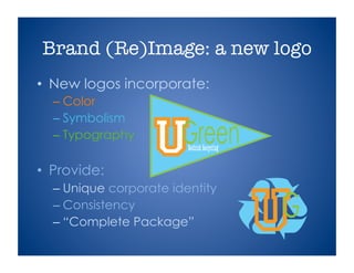

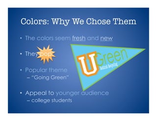

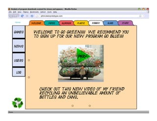


The document outlines Ugreen's initial sprint review for their recycling brand redesign, emphasizing new logos, a consistent corporate identity, and a user-friendly website. Targeting college students, the design focuses on simplicity, thematic elements, and promotes a 'going green' initiative. Future goals include a functional website with operational links, login capabilities, and interactive features like polls and surveys, with a drop date set for November 15.


