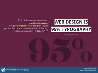
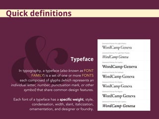
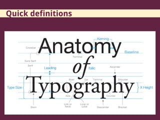
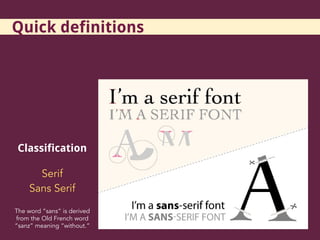
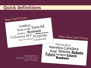
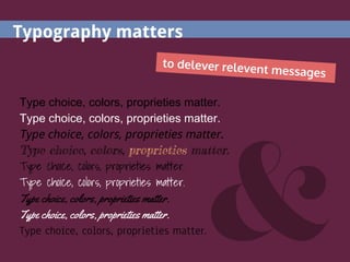
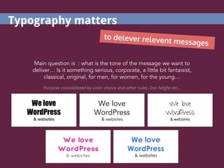
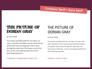
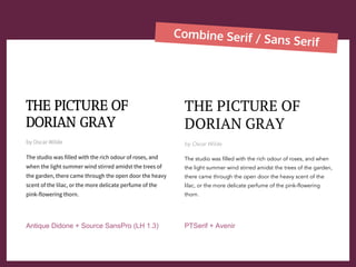
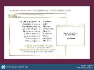
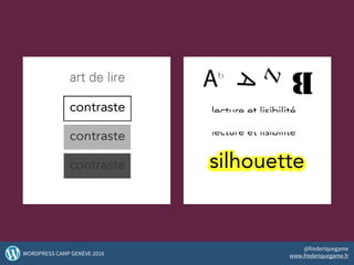
Typeface, Typography, Theme…
@frederiquegame
Frédérique Game
Design matters
Frédérique Game
Designer & Consultant in editorial strategy and branding
My passions :
Typography - Design - Art - Innovation - User Experience
WordPress and the Web!
My aspiration :
Contribute to make the web pleasant, simple and efficient.
2WORDPRESS CAMP GENÈVE 2016
@frederiquegame
www.frederiquegame.fr
95% of the content on the web
is written language.
An good excellent web designer should
get involved in the main discipline of shaping
written information: TYPOGRAPHY.
3WORDPRESS CAMP GENÈVE 2016
@frederiquegame
www.frederiquegame.fr
WEB DESIGN IS
95% TYPOGRAPHY
Oliver Reichenstein
what is it about ?
4WORDPRESS CAMP GENÈVE 2016
@frederiquegame
www.frederiquegame.fr
Typeface
In typography, a typeface (also known as FONT
FAMILY) is a set of one or more FONTS
each composed of glyphs (which represents an
individual letter, number, punctuation mark, or other
symbol) that share common design features.
Each font of a typeface has a specific weight, style,
condensation, width, slant, italicization,
ornamentation, and designer or foundry.
Quick definitions
Quick definitions
Graphic Art
Quick definitions
Classification
Serif
Sans Serif
The word “sans” is derived
from the Old French word
“sanz” meaning “without.”
Quick definitions
Main Sans Serif Fonts
Main Serif Fonts
+ subcategories as :
monospace / cursive / roman
gothic / fantaisy...
Quick definitions
why does-it matter ?
10WORDPRESS CAMP GENÈVE 2016
@frederiquegame
www.frederiquegame.fr
To avoid this...
And present this...
13WORDPRESS CAMP GENÈVE 2016
@frederiquegame
www.frederiquegame.fr
14WORDPRESS CAMP GENÈVE 2016
@frederiquegame
www.frederiquegame.fr
15WORDPRESS CAMP GENÈVE 2016
@frederiquegame
www.frederiquegame.fr
16WORDPRESS CAMP GENÈVE 2016
@frederiquegame
www.frederiquegame.fr
17WORDPRESS CAMP GENÈVE 2016
@frederiquegame
www.frederiquegame.fr
Type choice, colors, proprieties matter.
Typography matters
to delever relevent messages
We love
WordPress
& websites
We love
WordPress
& websites
We love
WordPress
& websites
We love
WordPress
& websites
Main question is : what is the tone of the message we want to
deliver… Is it something serious, corporate, a little bit fantaisist,
classical, original, for men, for women, for the young…
Purpose consolidated by color choice and other rules, line-height etc...
We love
WordPress
& websites
Typography matters
to delever relevent messages
We love
WordPress
We love
WordPress
We love
WordPress
We love
WordPress
Perception
=
Strong /Powerful
Sweet /Friendly
Trendy /Modern
Trustworthy
Beautiful...
We love
WordPress
Typography matters
Unreadable
Unreadable
Unreadable
humm...readable
readable
readable
confortable
& accessible
Type choice, colors, proprieties
really matter.
Typography matters
to allow access to anyone
21WORDPRESS CAMP GENÈVE 2016
@frederiquegame
www.frederiquegame.fr
Typography matters
to make content readable
Readability is the delivery of a
clear and understandable
message.
It refers to the recipient of the
content.
22WORDPRESS CAMP GENÈVE 2016
@frederiquegame
www.frederiquegame.fr
Typography matters
to make content readable
The picture of Dorian Gray by Oscar Wilde
CHAPTER 1
The studio was filled with the rich odour of roses,
and when the light summer wind stirred amidst the
trees of the garden, there came through the open
door the heavy scent of the lilac, or the more
delicate perfume of the pink-flowering thorn.
From the corner of the divan of Persian saddle-bags
on which he was lying, smoking, as was his custom,
innumerable cigarettes, Lord Henry Wotton could
just catch the gleam of the honey-sweet and
honey-coloured blossoms of a laburnum, whose
tremulous branches seemed hardly able to bear the
burden of a beauty so flamelike as theirs; and now
and then the fantastic shadows of birds in flight
flitted across the long tussore-silk curtains that were
stretched in front of the huge window, producing a
kind of momentary Japanese effect, and making
him think of those pallid, jade-faced painters of
Tokyo who, through the medium of an art that is
necessarily immobile, seek to convey the sense of
swiftness and motion.
The picture of Dorian Gray by Oscar Wilde
CHAPTER 1
The studio was filled with the rich odour of roses, and
when the light summer wind stirred amidst the trees of
the garden, there came through the open door the heavy
scent of the lilac, or the more delicate perfume of the
pink-flowering thorn.
From the corner of the divan of Persian saddle-bags on
which he was lying, smoking, as was his custom,
innumerable cigarettes, mobile, seek to convey the
sense of swiftness and motion.
Readability is not a measurable commodity.
But it’s when it is scarce
that one realizes its necessity.
La lisibilité n’est pas une denrée mesurable.
C’est pourtant quand elle se fait rare
que l’on se rend compte de sa nécessité.
24WORDPRESS CAMP GENÈVE 2016
@frederiquegame
www.frederiquegame.fr
How can we enhance our design ?
25WORDPRESS CAMP GENÈVE 2016
@frederiquegame
www.frederiquegame.fr
Be Global and Be Specific
My title
by Frédérique - 12th of November
Fonts, colors, rythme, alignments
too. Typography is an art.
And space areas allow the all
layout to be strong.
Line-height, contrast...
Other mentions, metas and so on...
Hierarchy of content.
Avoid NOISY pages :)
Typography is a question of LAYOUT, GLOBAL SETTINGS.
And many little rules inside… Many particular propriety.
27WORDPRESS CAMP GENÈVE 2016
@frederiquegame
www.frederiquegame.fr
Harmonious grid...
28WORDPRESS CAMP GENÈVE 2016
@frederiquegame
www.frederiquegame.fr
Blank spaces
What's missing from your site is as important as
what's in it.
The blank space of a page represents the parts
that do not include neither text nor illustrations.
IT WOULD FACILITATE:
The processing of information
The identification of important points
The concentration of visitors
Visual comfort
Be simple and Be clear
Hy Geneva :)
29WORDPRESS CAMP GENÈVE 2016
@frederiquegame
www.frederiquegame.fr
Be simple and Be clear
The picture of Dorian Gray by Oscar Wilde
The studio was filled with the rich odour of roses, and
when the light summer wind stirred amidst the trees of
the garden, there came through the open door the
heavy scent of the lilac, or the more delicate perfume of
the pink-flowering thorn.
From the corner of the divan of Persian saddle-bags on
which he was lying, smoking, as was his custom,
innumerable cigarettes, Lord Henry Wotton could just
catch the gleam of the honey-sweet and honey-coloured
blossoms of a laburnum, whose tremulous branches
seemed hardly able to bear the burden of a beauty so
flamelike as theirs; and now and then the fantastic
shadows of birds in flight flitted across the long
tussore-silk curtains that were stretched in front of the
huge window, producing a kind of momentary Japanese
effect, and making him think of those pallid, jade-faced
painters of Tokyo who, through the medium of an art
that is necessarily immobile, seek to convey the sense
of swiftness and motion.
The picture of Dorian Gray by Oscar Wilde
The studio was filled with the rich odour of roses, and
when the light summer wind stirred amidst the trees of
the garden, there came through the open door the
heavy scent of the lilac, or the more delicate perfume of
the pink-flowering thorn.
From the corner of the divan of Persian saddle-bags on
which he was lying, smoking, as was his custom,
innumerable cigarettes, Lord Henry Wotton could just
catch the gleam of the honey-sweet and
honey-coloured blossoms of a laburnum, whose
tremulous branches seemed hardly able to bear the
burden of a beauty so flamelike as theirs; and now and
then the fantastic shadows of birds in flight flitted
across the long tussore-silk curtains that were stretched
in front of the huge window, producing a kind of
momentary Japanese effect, and making him think of
those pallid, jade-faced painters of Tokyo who, through
the medium of an art that is necessarily immobile, seek
to convey the sense of swiftness and motion.
Which kind of Font ?
Same size, but for a long reading, one is more confortable than the other...
ARIMO 12px AVENIR 12px
Be simple and Be clear
THE PICTURE OF DORIAN GRAY by Oscar Wilde
The studio was filled with the rich odour of roses, and
when the light summer wind stirred amidst the trees of
the garden, there came through the open door the
heavy scent of the lilac, or the more delicate perfume of
the pink-flowering thorn.
From the corner of the divan of Persian saddle-bags on
which he was lying, smoking, as was his custom,
innumerable cigarettes, Lord Henry Wotton could just
catch the gleam of the honey-sweet and
honey-coloured blossoms of a laburnum, whose
tremulous branches seemed hardly able to bear the
burden of a beauty so flamelike as theirs; and now and
then the fantastic shadows of birds in flight flitted
across the long tussore-silk curtains that were stretched
in front of the huge window, producing a kind of
momentary Japanese effect, and making him think of
those pallid, jade-faced painters of Tokyo who, through
the medium of an art that is necessarily immobile, seek
to convey the sense of swiftness and motion.
THE PICTURE OF DORIAN GRAY by Oscar Wilde
The studio was filled with the rich odour of roses, and
when the light summer wind stirred amidst the trees of
the garden, there came through the open door the
heavy scent of the lilac, or the more delicate perfume of
the pink-flowering thorn.
From the corner of the divan of Persian saddle-bags on
which he was lying, smoking, as was his custom,
innumerable cigarettes, Lord Henry Wotton could just
catch the gleam of the honey-sweet and
honey-coloured blossoms of a laburnum, whose
tremulous branches seemed hardly able to bear the
burden of a beauty so flamelike as theirs; and now and
then the fantastic shadows of birds in flight flitted
across the long tussore-silk...
AVENIR 12px AVENIR 12px + LINE-HEIGHT : 1.35
Combine Serif / Sans Serif
THE PICTURE OF
DORIAN GRAY
by Oscar Wilde
The studio was filled with the rich odour of roses,
and when the light summer wind stirred amidst
the trees of the garden, there came through the
open door the heavy scent of the lilac, or the more
delicate perfume of the pink-flowering thorn.
THE PICTURE OF
DORIAN GRAY
by Oscar Wilde
The studio was filled with the rich odour of roses, and
when the light summer wind stirred amidst the trees of
the garden, there came through the open door the heavy
scent of the lilac, or the more delicate perfume of the
pink-flowering thorn.
Open Sans + Baskerville (LH 1.35) Oswald + Quattrocento
Combine Serif / Sans Serif
THE PICTURE OF
DORIAN GRAY
by Oscar Wilde
The studio was filled with the rich odour of
roses, and when the light summer wind stirred
amidst the trees of the garden, there came
through the open door the heavy scent of the
lilac, or the more delicate perfume of the
pink-flowering thorn.
THE PICTURE OF
DORIAN GRAY
by Oscar Wilde
The studio was filled with the rich odour of roses, and
when the light summer wind stirred amidst the trees of
the garden, there came through the open door the
heavy scent of the lilac, or the more delicate perfume of
the pink-flowering thorn.
Fredericka + Quattrocento (14px/1.15) Imprima + Avenir (12px)
Combine Serif / Sans Serif
THE PICTURE OF
DORIAN GRAY
by Oscar Wilde
The studio was filled with the rich odour of roses, and
when the light summer wind stirred amidst the trees of
the garden, there came through the open door the heavy
scent of the lilac, or the more delicate perfume of the
pink-flowering thorn.
THE PICTURE OF
DORIAN GRAY
by Oscar Wilde
The studio was filled with the rich odour of roses, and when
the light summer wind stirred amidst the trees of the garden,
there came through the open door the heavy scent of the
lilac, or the more delicate perfume of the pink-flowering
thorn.
Antique Didone + Source SansPro (LH 1.3) PTSerif + Avenir
35WORDPRESS CAMP GENÈVE 2016
@frederiquegame
www.frederiquegame.fr
36WORDPRESS CAMP GENÈVE 2016
@frederiquegame
www.frederiquegame.fr
The studio was filled with the rich odour
of roses, and when the light summer
wind stirred amidst the trees of the
garden, there came through the open
door the heavy scent of the lilac, or the
more delicate perfume of the
pink-flowering thorn.
The studio was filled with the rich odour
of roses, and when the light summer
wind stirred amidst the trees of the
garden, there came through the open
door the heavy scent of the lilac, or the
more delicate perfume of the
pink-flowering thorn.
Prefer left
alignment
37WORDPRESS CAMP GENÈVE 2016
@frederiquegame
www.frederiquegame.fr
in your choice of fonts...
Choosing Typeface(s)
according to:
Branding
Values
Style
Content
Purpose
38WORDPRESS CAMP GENÈVE 2016
@frederiquegame
www.frederiquegame.fr
photos via VisualHint
Quick test with
a Wedding Planner Website
39WORDPRESS CAMP GENÈVE 2016
@frederiquegame
www.frederiquegame.fr
in your choice of fonts...E.g : Searching Types
or Glyphs for a wedding
planner webiste
Cochin / Lust Didone (same family)
Traditional, Litterature, Classic...
Quick exercice, needs deeper research in
colors, types, layout.
Fonts combined with images…
Wahou !
Could be... amazing :)
Wedding Planner
services
Wedding
Planner
Typography matters
”Typography exists to
honor content”
Robert Bringhurst / The elements of typographical style
L’objectif de tout projet web
=
la satisfaction et le confort de l’utilisateur final
CSS for the WEB
Some good pratices
44WORDPRESS CAMP GENÈVE 2016
@frederiquegame
www.frederiquegame.fr
font-family (named | serif | arial)
font-size (1.2em)
font-style (normal | italic | oblique)
font-variant (normal | small-caps)
font-weight (bold | bolder | 500)
text-align (left | right | center | justify)
text-decoration (none | underline | overline | line-through)
text-indent (5px)
text-transform (capitalize | uppercase | lowercase | none)
line-heigth (normal, 2, 50%)
letter-spacing (-2px)
word-spacing (3px)
CSS2 CSS3
word-wrap (normal | break-word)
text-overflow (clip |ellipsis |chaîne)
text-shadow (2px 2px 4px #999)
font-smoothing (none |
subpixel-antaliased | antaliased)
white-space (nowrap | pre-line…)
font-stretch (wider | condensed…)
text-stroke (text-fill-color |
text-stroke-color | text-stroke-width)
text-wrap (normal | suppress…)
::first-letter selector
::first-line selector
Some CSS properties
CSS properties
46WORDPRESS CAMP GENÈVE 2016
@frederiquegame
www.frederiquegame.fr
FONT-FACE
FONT SQUIRREL
GOOGLE FONTS
or CDN (fontawesome)
TYPEKIT
FONTS.com
TYPECAST.com
Upload your fonts to
/theme/yourtheme/fonts
Add to functions.php Add to functions.php
@font-face
in stylesheet
Enqueue
wp_enqueue_style
Enqueue
wp_enqueue_script
USE
p {font-family:’font’; font-size:1rem;}
Methods...
47WORDPRESS CAMP GENÈVE 2016
@frederiquegame
www.frederiquegame.fr
SOMES RULES (guides)
FONT SIZE : 16px, 1em, 1rem (100% on
<html>)
BOLD : better for headlines and links
LINKS : highlight
LINE HEIGHT : relative to main font size
TITLES : 30 to 40 characters per line
(MOBILE)
45 to 75 characters per line (DESKTOP)
48WORDPRESS CAMP GENÈVE 2016
@frederiquegame
www.frederiquegame.fr
49WORDPRESS CAMP GENÈVE 2016
@frederiquegame
www.frederiquegame.fr
Links, touchscreen
mini
40 x 40 px
http://caniuse.com
Check out proprieties
http://w3.org
50WORDPRESS CAMP GENÈVE 2016
@frederiquegame
www.frederiquegame.fr
Little checklist…
Be careful with a set of common rules
&
Design Globally and Specifically
Font Size / Line height
Paragraph width
Whitespace
Rythm
Hierarchy
Letter spacing
Contrast
Combination
51WORDPRESS CAMP GENÈVE 2016
@frederiquegame
www.frederiquegame.fr
Design for the others ...
For ease of reading,
their research, their navigation.
Let’s do Quality
Enjoy :)
52WORDPRESS CAMP GENÈVE 2016
@frederiquegame
www.frederiquegame.fr
Thank you !
53WORDPRESS CAMP GENÈVE 2016
@frederiquegame
www.frederiquegame.fr

Typeface, Typography, Theme... Design matters.

  • 1.
  • 2.
    Frédérique Game Designer &Consultant in editorial strategy and branding My passions : Typography - Design - Art - Innovation - User Experience WordPress and the Web! My aspiration : Contribute to make the web pleasant, simple and efficient. 2WORDPRESS CAMP GENÈVE 2016 @frederiquegame www.frederiquegame.fr
  • 3.
    95% of thecontent on the web is written language. An good excellent web designer should get involved in the main discipline of shaping written information: TYPOGRAPHY. 3WORDPRESS CAMP GENÈVE 2016 @frederiquegame www.frederiquegame.fr WEB DESIGN IS 95% TYPOGRAPHY Oliver Reichenstein
  • 4.
    what is itabout ? 4WORDPRESS CAMP GENÈVE 2016 @frederiquegame www.frederiquegame.fr
  • 5.
    Typeface In typography, atypeface (also known as FONT FAMILY) is a set of one or more FONTS each composed of glyphs (which represents an individual letter, number, punctuation mark, or other symbol) that share common design features. Each font of a typeface has a specific weight, style, condensation, width, slant, italicization, ornamentation, and designer or foundry. Quick definitions
  • 6.
  • 7.
  • 8.
    Classification Serif Sans Serif The word“sans” is derived from the Old French word “sanz” meaning “without.” Quick definitions
  • 9.
    Main Sans SerifFonts Main Serif Fonts + subcategories as : monospace / cursive / roman gothic / fantaisy... Quick definitions
  • 10.
    why does-it matter? 10WORDPRESS CAMP GENÈVE 2016 @frederiquegame www.frederiquegame.fr
  • 11.
  • 13.
    And present this... 13WORDPRESSCAMP GENÈVE 2016 @frederiquegame www.frederiquegame.fr
  • 14.
    14WORDPRESS CAMP GENÈVE2016 @frederiquegame www.frederiquegame.fr
  • 15.
    15WORDPRESS CAMP GENÈVE2016 @frederiquegame www.frederiquegame.fr
  • 16.
    16WORDPRESS CAMP GENÈVE2016 @frederiquegame www.frederiquegame.fr
  • 17.
    17WORDPRESS CAMP GENÈVE2016 @frederiquegame www.frederiquegame.fr
  • 18.
    Type choice, colors,proprieties matter. Type choice, colors, proprieties matter. Type choice, colors, proprieties matter. Type choice, colors, proprieties matter. Type choice, colors, proprieties matter. Type choice, colors, proprieties matter. Type choice, colors, proprieties matter. Type choice, colors, proprieties matter. Type choice, colors, proprieties matter. Typography matters to delever relevent messages
  • 19.
    We love WordPress & websites Welove WordPress & websites We love WordPress & websites We love WordPress & websites Main question is : what is the tone of the message we want to deliver… Is it something serious, corporate, a little bit fantaisist, classical, original, for men, for women, for the young… Purpose consolidated by color choice and other rules, line-height etc... We love WordPress & websites Typography matters to delever relevent messages
  • 20.
    We love WordPress We love WordPress Welove WordPress We love WordPress Perception = Strong /Powerful Sweet /Friendly Trendy /Modern Trustworthy Beautiful... We love WordPress Typography matters
  • 21.
    Unreadable Unreadable Unreadable humm...readable readable readable confortable & accessible Type choice,colors, proprieties really matter. Typography matters to allow access to anyone 21WORDPRESS CAMP GENÈVE 2016 @frederiquegame www.frederiquegame.fr
  • 22.
    Typography matters to makecontent readable Readability is the delivery of a clear and understandable message. It refers to the recipient of the content. 22WORDPRESS CAMP GENÈVE 2016 @frederiquegame www.frederiquegame.fr
  • 23.
    Typography matters to makecontent readable The picture of Dorian Gray by Oscar Wilde CHAPTER 1 The studio was filled with the rich odour of roses, and when the light summer wind stirred amidst the trees of the garden, there came through the open door the heavy scent of the lilac, or the more delicate perfume of the pink-flowering thorn. From the corner of the divan of Persian saddle-bags on which he was lying, smoking, as was his custom, innumerable cigarettes, Lord Henry Wotton could just catch the gleam of the honey-sweet and honey-coloured blossoms of a laburnum, whose tremulous branches seemed hardly able to bear the burden of a beauty so flamelike as theirs; and now and then the fantastic shadows of birds in flight flitted across the long tussore-silk curtains that were stretched in front of the huge window, producing a kind of momentary Japanese effect, and making him think of those pallid, jade-faced painters of Tokyo who, through the medium of an art that is necessarily immobile, seek to convey the sense of swiftness and motion. The picture of Dorian Gray by Oscar Wilde CHAPTER 1 The studio was filled with the rich odour of roses, and when the light summer wind stirred amidst the trees of the garden, there came through the open door the heavy scent of the lilac, or the more delicate perfume of the pink-flowering thorn. From the corner of the divan of Persian saddle-bags on which he was lying, smoking, as was his custom, innumerable cigarettes, mobile, seek to convey the sense of swiftness and motion.
  • 24.
    Readability is nota measurable commodity. But it’s when it is scarce that one realizes its necessity. La lisibilité n’est pas une denrée mesurable. C’est pourtant quand elle se fait rare que l’on se rend compte de sa nécessité. 24WORDPRESS CAMP GENÈVE 2016 @frederiquegame www.frederiquegame.fr
  • 25.
    How can weenhance our design ? 25WORDPRESS CAMP GENÈVE 2016 @frederiquegame www.frederiquegame.fr
  • 26.
    Be Global andBe Specific
  • 27.
    My title by Frédérique- 12th of November Fonts, colors, rythme, alignments too. Typography is an art. And space areas allow the all layout to be strong. Line-height, contrast... Other mentions, metas and so on... Hierarchy of content. Avoid NOISY pages :) Typography is a question of LAYOUT, GLOBAL SETTINGS. And many little rules inside… Many particular propriety. 27WORDPRESS CAMP GENÈVE 2016 @frederiquegame www.frederiquegame.fr
  • 28.
    Harmonious grid... 28WORDPRESS CAMPGENÈVE 2016 @frederiquegame www.frederiquegame.fr
  • 29.
    Blank spaces What's missingfrom your site is as important as what's in it. The blank space of a page represents the parts that do not include neither text nor illustrations. IT WOULD FACILITATE: The processing of information The identification of important points The concentration of visitors Visual comfort Be simple and Be clear Hy Geneva :) 29WORDPRESS CAMP GENÈVE 2016 @frederiquegame www.frederiquegame.fr
  • 30.
    Be simple andBe clear The picture of Dorian Gray by Oscar Wilde The studio was filled with the rich odour of roses, and when the light summer wind stirred amidst the trees of the garden, there came through the open door the heavy scent of the lilac, or the more delicate perfume of the pink-flowering thorn. From the corner of the divan of Persian saddle-bags on which he was lying, smoking, as was his custom, innumerable cigarettes, Lord Henry Wotton could just catch the gleam of the honey-sweet and honey-coloured blossoms of a laburnum, whose tremulous branches seemed hardly able to bear the burden of a beauty so flamelike as theirs; and now and then the fantastic shadows of birds in flight flitted across the long tussore-silk curtains that were stretched in front of the huge window, producing a kind of momentary Japanese effect, and making him think of those pallid, jade-faced painters of Tokyo who, through the medium of an art that is necessarily immobile, seek to convey the sense of swiftness and motion. The picture of Dorian Gray by Oscar Wilde The studio was filled with the rich odour of roses, and when the light summer wind stirred amidst the trees of the garden, there came through the open door the heavy scent of the lilac, or the more delicate perfume of the pink-flowering thorn. From the corner of the divan of Persian saddle-bags on which he was lying, smoking, as was his custom, innumerable cigarettes, Lord Henry Wotton could just catch the gleam of the honey-sweet and honey-coloured blossoms of a laburnum, whose tremulous branches seemed hardly able to bear the burden of a beauty so flamelike as theirs; and now and then the fantastic shadows of birds in flight flitted across the long tussore-silk curtains that were stretched in front of the huge window, producing a kind of momentary Japanese effect, and making him think of those pallid, jade-faced painters of Tokyo who, through the medium of an art that is necessarily immobile, seek to convey the sense of swiftness and motion. Which kind of Font ? Same size, but for a long reading, one is more confortable than the other... ARIMO 12px AVENIR 12px
  • 31.
    Be simple andBe clear THE PICTURE OF DORIAN GRAY by Oscar Wilde The studio was filled with the rich odour of roses, and when the light summer wind stirred amidst the trees of the garden, there came through the open door the heavy scent of the lilac, or the more delicate perfume of the pink-flowering thorn. From the corner of the divan of Persian saddle-bags on which he was lying, smoking, as was his custom, innumerable cigarettes, Lord Henry Wotton could just catch the gleam of the honey-sweet and honey-coloured blossoms of a laburnum, whose tremulous branches seemed hardly able to bear the burden of a beauty so flamelike as theirs; and now and then the fantastic shadows of birds in flight flitted across the long tussore-silk curtains that were stretched in front of the huge window, producing a kind of momentary Japanese effect, and making him think of those pallid, jade-faced painters of Tokyo who, through the medium of an art that is necessarily immobile, seek to convey the sense of swiftness and motion. THE PICTURE OF DORIAN GRAY by Oscar Wilde The studio was filled with the rich odour of roses, and when the light summer wind stirred amidst the trees of the garden, there came through the open door the heavy scent of the lilac, or the more delicate perfume of the pink-flowering thorn. From the corner of the divan of Persian saddle-bags on which he was lying, smoking, as was his custom, innumerable cigarettes, Lord Henry Wotton could just catch the gleam of the honey-sweet and honey-coloured blossoms of a laburnum, whose tremulous branches seemed hardly able to bear the burden of a beauty so flamelike as theirs; and now and then the fantastic shadows of birds in flight flitted across the long tussore-silk... AVENIR 12px AVENIR 12px + LINE-HEIGHT : 1.35
  • 32.
    Combine Serif /Sans Serif THE PICTURE OF DORIAN GRAY by Oscar Wilde The studio was filled with the rich odour of roses, and when the light summer wind stirred amidst the trees of the garden, there came through the open door the heavy scent of the lilac, or the more delicate perfume of the pink-flowering thorn. THE PICTURE OF DORIAN GRAY by Oscar Wilde The studio was filled with the rich odour of roses, and when the light summer wind stirred amidst the trees of the garden, there came through the open door the heavy scent of the lilac, or the more delicate perfume of the pink-flowering thorn. Open Sans + Baskerville (LH 1.35) Oswald + Quattrocento
  • 33.
    Combine Serif /Sans Serif THE PICTURE OF DORIAN GRAY by Oscar Wilde The studio was filled with the rich odour of roses, and when the light summer wind stirred amidst the trees of the garden, there came through the open door the heavy scent of the lilac, or the more delicate perfume of the pink-flowering thorn. THE PICTURE OF DORIAN GRAY by Oscar Wilde The studio was filled with the rich odour of roses, and when the light summer wind stirred amidst the trees of the garden, there came through the open door the heavy scent of the lilac, or the more delicate perfume of the pink-flowering thorn. Fredericka + Quattrocento (14px/1.15) Imprima + Avenir (12px)
  • 34.
    Combine Serif /Sans Serif THE PICTURE OF DORIAN GRAY by Oscar Wilde The studio was filled with the rich odour of roses, and when the light summer wind stirred amidst the trees of the garden, there came through the open door the heavy scent of the lilac, or the more delicate perfume of the pink-flowering thorn. THE PICTURE OF DORIAN GRAY by Oscar Wilde The studio was filled with the rich odour of roses, and when the light summer wind stirred amidst the trees of the garden, there came through the open door the heavy scent of the lilac, or the more delicate perfume of the pink-flowering thorn. Antique Didone + Source SansPro (LH 1.3) PTSerif + Avenir
  • 35.
    35WORDPRESS CAMP GENÈVE2016 @frederiquegame www.frederiquegame.fr
  • 36.
    36WORDPRESS CAMP GENÈVE2016 @frederiquegame www.frederiquegame.fr
  • 37.
    The studio wasfilled with the rich odour of roses, and when the light summer wind stirred amidst the trees of the garden, there came through the open door the heavy scent of the lilac, or the more delicate perfume of the pink-flowering thorn. The studio was filled with the rich odour of roses, and when the light summer wind stirred amidst the trees of the garden, there came through the open door the heavy scent of the lilac, or the more delicate perfume of the pink-flowering thorn. Prefer left alignment 37WORDPRESS CAMP GENÈVE 2016 @frederiquegame www.frederiquegame.fr
  • 38.
    in your choiceof fonts... Choosing Typeface(s) according to: Branding Values Style Content Purpose 38WORDPRESS CAMP GENÈVE 2016 @frederiquegame www.frederiquegame.fr
  • 39.
    photos via VisualHint Quicktest with a Wedding Planner Website 39WORDPRESS CAMP GENÈVE 2016 @frederiquegame www.frederiquegame.fr
  • 40.
    in your choiceof fonts...E.g : Searching Types or Glyphs for a wedding planner webiste
  • 41.
    Cochin / LustDidone (same family) Traditional, Litterature, Classic... Quick exercice, needs deeper research in colors, types, layout.
  • 42.
    Fonts combined withimages… Wahou ! Could be... amazing :) Wedding Planner services Wedding Planner
  • 43.
    Typography matters ”Typography existsto honor content” Robert Bringhurst / The elements of typographical style L’objectif de tout projet web = la satisfaction et le confort de l’utilisateur final
  • 44.
    CSS for theWEB Some good pratices 44WORDPRESS CAMP GENÈVE 2016 @frederiquegame www.frederiquegame.fr
  • 45.
    font-family (named |serif | arial) font-size (1.2em) font-style (normal | italic | oblique) font-variant (normal | small-caps) font-weight (bold | bolder | 500) text-align (left | right | center | justify) text-decoration (none | underline | overline | line-through) text-indent (5px) text-transform (capitalize | uppercase | lowercase | none) line-heigth (normal, 2, 50%) letter-spacing (-2px) word-spacing (3px) CSS2 CSS3 word-wrap (normal | break-word) text-overflow (clip |ellipsis |chaîne) text-shadow (2px 2px 4px #999) font-smoothing (none | subpixel-antaliased | antaliased) white-space (nowrap | pre-line…) font-stretch (wider | condensed…) text-stroke (text-fill-color | text-stroke-color | text-stroke-width) text-wrap (normal | suppress…) ::first-letter selector ::first-line selector Some CSS properties
  • 46.
    CSS properties 46WORDPRESS CAMPGENÈVE 2016 @frederiquegame www.frederiquegame.fr
  • 47.
    FONT-FACE FONT SQUIRREL GOOGLE FONTS orCDN (fontawesome) TYPEKIT FONTS.com TYPECAST.com Upload your fonts to /theme/yourtheme/fonts Add to functions.php Add to functions.php @font-face in stylesheet Enqueue wp_enqueue_style Enqueue wp_enqueue_script USE p {font-family:’font’; font-size:1rem;} Methods... 47WORDPRESS CAMP GENÈVE 2016 @frederiquegame www.frederiquegame.fr
  • 48.
    SOMES RULES (guides) FONTSIZE : 16px, 1em, 1rem (100% on <html>) BOLD : better for headlines and links LINKS : highlight LINE HEIGHT : relative to main font size TITLES : 30 to 40 characters per line (MOBILE) 45 to 75 characters per line (DESKTOP) 48WORDPRESS CAMP GENÈVE 2016 @frederiquegame www.frederiquegame.fr
  • 49.
    49WORDPRESS CAMP GENÈVE2016 @frederiquegame www.frederiquegame.fr Links, touchscreen mini 40 x 40 px
  • 50.
    http://caniuse.com Check out proprieties http://w3.org 50WORDPRESSCAMP GENÈVE 2016 @frederiquegame www.frederiquegame.fr
  • 51.
    Little checklist… Be carefulwith a set of common rules & Design Globally and Specifically Font Size / Line height Paragraph width Whitespace Rythm Hierarchy Letter spacing Contrast Combination 51WORDPRESS CAMP GENÈVE 2016 @frederiquegame www.frederiquegame.fr
  • 52.
    Design for theothers ... For ease of reading, their research, their navigation. Let’s do Quality Enjoy :) 52WORDPRESS CAMP GENÈVE 2016 @frederiquegame www.frederiquegame.fr
  • 53.
    Thank you ! 53WORDPRESSCAMP GENÈVE 2016 @frederiquegame www.frederiquegame.fr