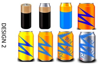
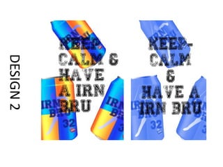
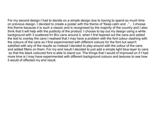
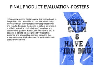
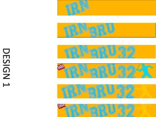
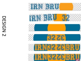
For a class project, the student designed various packaging concepts for an energy drink called Irn Bru, including can designs, posters, and web banners. Their third can design featured simple shapes and fonts balanced well together with a watermarked silhouette in the center. For posters, their second design used the phrase "Keep Calm and Have a Bru" with scattered cans and a light blue filter. Their second web banner featured circular shapes separating the text and a flipped "32" to add visual interest. Overall, the student was happy with how their designs incorporated consistent branding elements while experimenting with different concepts.