Download to read offline

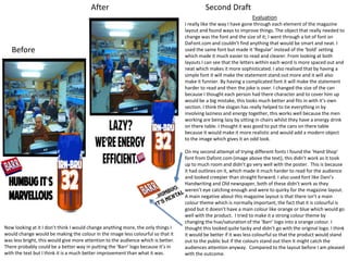

The document provides an evaluation of a can, magazine, and web banner design for Irn-Bru. The evaluator made several improvements, including changing fonts to make text clearer, adjusting alignments and spacing, and adding effects like motion blur to elements. Peer feedback was positive about the designs standing out and using color schemes and themes consistently across formats. The evaluator was pleased with the outcomes but noted a few further small changes could be made, like improving paintwork details or increasing depth of field elements.


![Presentation1 [autosaved]](https://cdn.slidesharecdn.com/ss_thumbnails/presentation1autosaved-180329155155-thumbnail.jpg?width=640&height=640&fit=bounds)


