The document summarizes and analyzes several instructional documents:
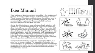
1) An Ikea instruction manual that uses illustrations to simply and clearly convey assembly instructions without needing multiple language translations.
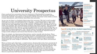
2) A university prospectus that uses formatting, color, images and sourced statistics to positively promote the university.
3) A BBC recipe article that uses clear language, formatting and an accompanying image to simply demonstrate how to make pancakes.
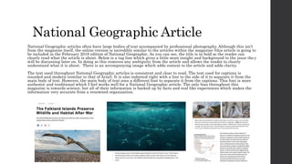
4) A sample National Geographic article that separates text for readability and includes a headline, tagline and image to provide context without ambiguity.