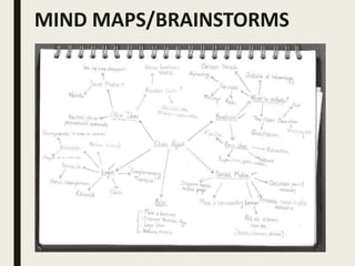
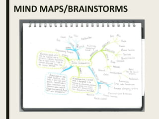
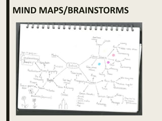
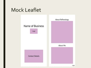
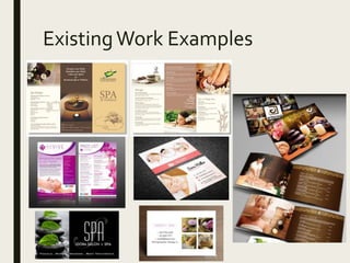
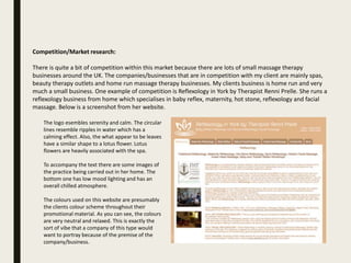
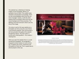
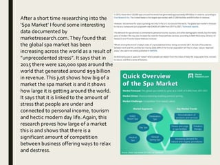
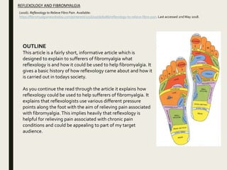
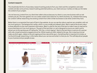
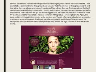
CLIENT PROJECT
PRO- FORMA
Millie Casemore
MIND MAPS/BRAINSTORMS
ASSESSMENT OF
IDEAS
Idea 1
My first idea was to create a brochure that is trifold and is
designed to be handed to people to advertise the business. It
will also be designed so people can gain information about the
business and what it has to offer in terms of services.The
colour scheme used will be what the client has asked for (pink,
blue, purple and cream) because this is what is stated in the
brief.There will be a nature theme because my client has
asked for a nature theme and this fits in well with the business.
Butterflies will be a recurring theme throughout my brochure
because my client said she likes butterflies which implies she
wants it to be a theme in the work I’m going to produce. I
would like to use butterflies around the border of the page and
possibly include it into the logo, I think this could create a nice
effect.
Evaluation of idea
WHAT DOYOU LIKEABOUTTHE IDEA?
I like this idea because I feel that it is what the client has asked for and that it’s executable with the
resources and timeframe I have.The idea overall could potentially create a really nice product which is
attractive to the consumer.
DOES IT MATCHWHATTHE CLIENTWANTS?
I do feel that this matches what the client wants because I am including the relevant colour scheme and
creating a brochure like she asked for. My client also said she enjoys natures themes and butterflies –
which is something I am trying to include in my product.
AREYOU CAPABLE OF DELIVERINGTHIS?
I believe that I am capable of delivering this, maybe with some help and guidance.The advice I could
possibly need may be on how to carry out a certain technique or execute a certain task.
CANYOU DOTHIS ONTIME?
Yes, I feel that I am capable of completing this project on time if I stick to a schedule. It could be quite a
large workload if I end up doing some photography but I should be able to manage my time effectively. In
order to manage my workload I will make a schedule to follow with instructions on what I should be doing
on each day. If I fall behind on my schedule I will need to try and catch up.
DOYOU HAVETHE RESOURCES AVAILABLETO DOTHIS?
I do have the resources available to make this piece. At college I have access to iMacs with full Adobe suite
which I can use for free. If I need to do any photography I have access to DSLR cameras and lighting
equipment. I am also able to hire out a graphics tablet if I end up needing one to do some designs on the
brochure.
Idea 2
My second idea is similar to my previous idea, however the
layout and overall product will be slightly different. I am
planning to make a two sided handout which will be
rectangular – this is different to my initial idea of making a
brochure. My client has asked for a brochure but this ‘leaflet’
will be of a similar style and will contain the same information. I
think this is a good idea because it will look sophisticated and
professional.The front will have the logo and basic contact
details.The back will have the about section which will contain
information about the practice and who the client is. I was
thinking of using a cream background with purple text.These
colours fit into my clients requested colour palette.The product
will be nature themed with butterflies as requested by the
client.
Evaluation of idea
WHAT DOYOU LIKEABOUTTHE IDEA?
I really like this idea because I feel the handout could look more professional than the brochure – more
upmarket/high end. It is essentially what the client has asked for just ever so slightly different to a
brochure. It will contain the same information just in a different format and layout. If the handout was
printed on card I think this would really make it look good.
DOES IT MATCHWHATTHE CLIENTWANTS?
This idea does essentially match what the client wants however it is slightly different. My client asked for
a brochure, but this idea I have made it a handout/leaflet because I feel this could look professional
AREYOU CAPABLE OF DELIVERINGTHIS?
I believe that I am capable of delivering this, maybe with some help and guidance.The advice I could
possibly need may be on how to carry out a certain technique or execute a certain task.
CANYOU DOTHIS ONTIME?
Yes, I feel that I am capable of completing this project on time if I stick to a schedule. It could be quite a
large workload if I end up doing some photography but I should be able to manage my time effectively. In
order to manage my workload I will make a schedule to follow with instructions on what I should be doing
on each day. If I fall behind on my schedule I will need to try and catch up.
DOYOU HAVETHE RESOURCES AVAILABLETO DOTHIS?
I do have the resources available to make this piece. At college I have access to iMacs with full Adobe suite
which I can use for free. If I need to do any photography I have access to DSLR cameras and lighting
equipment. I am also able to hire out a graphics tablet if I end up needing one to do some designs on the
brochure.
Idea 3
My third idea is to create a business card which will be designed to
promote my clients business to potential customers.The front of the
business card will have the clients logo on, which I am going to create,
and will have the name of the business above.There will also be some
contact details on the front. On the back of the business card there
will be a small ‘about section’ which will contain information about my
client and what services she offers. The front of the business card will
be cream and the back of the business card will be blue.
Evaluation of idea
WHAT DOYOU LIKEABOUTTHE IDEA?
I think this idea is a fairly good idea and could potentially be very helpful for my client. It would help
promote their business is a easy and affordable way. Also, it is a very simple idea which will not take too
much time to do.This leaves time for other possible products.
DOES IT MATCHWHATTHE CLIENTWANTS?
This idea doesn’t actually match what the client asked for, which is my main problem with the idea. My
client asked for a brochure, but instead this is a business card.
AREYOU CAPABLE OF DELIVERINGTHIS?
I believe that I am definitely capable of delivering this. It is a fairly simple task which I have the necessary
skillset to complete.
CANYOU DOTHIS ONTIME?
Yes, I can definitely do this on time because of the simplicity of the task. Making a business card will not
take too much time and may leave me extra time to possibly create another piece of work for my client.
DOYOU HAVETHE RESOURCES AVAILABLETO DOTHIS?
I do have the resources available to make this piece. At college I have access to iMacs with full Adobe suite
which I can use for free. If I need to do any photography I have access to DSLR cameras and lighting
equipment. I am also able to hire out a graphics tablet if I end up needing one to do some designs on the
brochure.
Idea Evaluation
Which of your ideas do you want to develop further? Explain
why you think that is the right idea to take forward.
The idea which I would like to take forward is idea 2. Idea 2 is the idea
where I said that I wanted to make a leaflet for my client. I feel this type of
promotional material is the most suitable for my clients needs. This is
because my client has only just started up her business so she hasn’t got a
set amount of treatments so a smaller version of a brochure could work
best for her.This type of promotional material will also look the most
professional and will be effective for promoting her business.
As part of this idea I would also like to create some business cards for my
client. I think this could be helpful for promoting her business again and
would be a nice addition to her end product. My client also said she would
like to develop her social media platform (Facebook) so maybe it would be
nice to create a Facebook banner/timeline photo or her page.
DEVELOPMENT
Development
Use the next slides to document your idea development.
This should include mood boards and other visual examples of work. It could include basic
mock ups of your vision for the project using the work of others.
If you are taking doing something outside of your ordinary skill set or way of working, you
could include test work or practice work here too.
There is room to develop a second idea here as well.This could give you a greater variety
of options to give to your client.
You will then assess your developed idea against the constraints of the project before
producing a final treatment.
Moodboard 1
Moodboard
Mock Leaflet
ExistingWork Examples
Assessment of final ideas
Suitable for audience?
I haven’t established an exact audience but I am aiming my work towards women because I feel this is a suitable target
audience. I want my work to portray calm and serenity so I plan to use tranquil, neutral colours which should appeal to
women and people seeking relaxation. I feel this will make my product suitable for the audience. People seeking
relaxation through the spa or complementary therapies generally have enough money to spend on them so they must
be upper working class or middle class. This means that I can use a slightly higher level of vocabulary and it means I
have to have a high level of standard and class when completing my work.
Suitability for client?
My final idea will be very suitable for the client and will meet the brief set out by the client. My client asked for a
brochure and I plan to create something very similar to a brochure, but it will be more like a leaflet, so it will essentially
meet my client’s brief – they did say they were flexible. I also plan to use the exact colour scheme that my client asked
for and include the information my client asked for. So overall my product will be very suitable for the client.
Appeal of the work:
I feel that my work will look appealing to others. This is because I am ensuring that my work is visually appealing by
using colour schemes and getting feedback from my peers.
Timescales for production:
The timescale for production is two weeks and I will be creating a production schedule to manage my workload. I plan
to dedicate my first week to creating my brochure and my second week of production will be dedicated to making a
business card. There will also be time for client feedback and running over final pieces to improve anything.
Costs:
The costs for this project will be very low, if anything at all. I do not need to pay for use of equipment because I have
access to all the equipment I will need at college. The computers are equipped with full Adobe suite. The only money
that I will need to spend, will be spent on fuel costs to travel to see my client – these costs will be between £5-£10.
Personnel:
I will be the only person working on my project.This is because I am capable of carrying out production by myself without the
need of help from others. I am capable of carrying out all of the graphic design work independently and I am able to receive
advice from my peers, client and tutor.
Assessment of final ideas
Legal and ethical issues:
The main legal problem that I will come across is ensuring that any work I produce
doesn’t infringe any copyright laws. Something that I will need to work hard to find is
a font that is completely free to use. After having a short look online most of the fonts
in the style I want to use are not free to use commercially. This will cause problems
because I will either have to buy rights to the font (which is expensive), make my own
font or spend more time looking for a free to use font. Also I will need to find and use
images that are free from copyright laws. To do this it will be easier to take any
images I may need myself, because then I do not need to worry about copyright.
Most of my illustrations will be drawn by hand on a graphics tablet so I won’t need to
worry too much about any copyright laws.
I don’t need to worry too much about any ethical issues because my work doesn’t
really come across any of these issues. If I were to consider one it would be the
animal testing debate. My client’s business is in the spa and beauty industry which
often gets a lot of backlash when discussing animal testing. So I may need to ensure
my client uses products that are free from animal testing and animal products (or
make sure it’s declared if not).
RESEARCH
Competition/Market research:
There is quite a bit of competition within this market because there are lots of small massage therapy
businesses around the UK. The companies/businesses that are in competition with my client are mainly spas,
beauty therapy outlets and home run massage therapy businesses. My clients business is home run and very
much a small business. One example of competition is Reflexology in York by Therapist Renni Prelle. She runs a
reflexology business from home which specialises in baby reflex, maternity, hot stone, reflexology and facial
massage. Below is a screenshot from her website.
The logo esembles serenity and calm. The circular
lines resemble ripples in water which has a
calming effect. Also, the what appear to be leaves
have a similar shape to a lotus flower. Lotus
flowers are heavily associated with the spa.
To accompany the text there are some images of
the practice being carried out in her home. The
bottom one has low mood lighting and has an
overall chilled atmosphere.
The colours used on this website are presumably
the clients colour scheme throughout their
promotional material. As you can see, the colours
are very neutral and relaxed. This is exactly the
sort of vibe that a company of this type would
want to portray because of the premise of the
company/business.
This website has a slideshow of relaxing
images on the homepage. Below is an
example of one of them. The candles imply
relaxation and peaceful surroundings. There
are also stones/pebbles which link into hot
stone massages. Finally, as with the other
website there are flowers which link into the
natural background of these practises. The
lighting is low level and warm which suits the
tone of the image.
The colours used on this spas website are a
bit brighter yet still convey the same theme
as the previous website. Calm and serenity is
still very prevalent throughout this website
through the colours. The main colour is
fuchsia with a black gradient – this creates a
relaxing tone.
When you open the website there is a small
introductory paragraph. This paragraph is
designed to entice readers to come to their
spa. It explains the scents, treatments and
atmosphere of their spa. This is a good way to
attract people to their spa.
After a short time researching into the
‘Spa Market’ I found some interesting
data documented by
marketresearch.com.They found that
the global spa market has been
increasing across the world as a result of
”unprecedented stress”. It says that in
2015 there were 120,000 spas around the
world that generated around $99 billion
in revenue.This just shows how big of a
market the spa market is and it shows
how large it is getting around the world.
It says that it is linked to the amount of
stress that people are under and
connected to personal income, tourism
and hectic modern day life. Again, this
research proves how large of a market
this is and shows that there is a
significant amount of competition
between business offering ways to relax
and destress.
Audience/Customer research:
Who is the audience or customer that your client is trying to reach? Perhaps they have already told you. Perhaps
you should ask. You could also do further research in to the type of audience or customer you are hoping to
appeal to.
The audience that my client is trying to reach is quite vague with no definitive answer, however there is some
answers as to who the audience is. One area where my client may choose to try and reach could be sports
people/athletes. Reflexology by definition “is a therapeutic method of relieving pain by stimulating predefined
pressure points on the feet and hands. This controlled pressure alleviates the source of the discomfort. In the
absence of any particular malady or abnormality, reflexology may be as effective for promoting good health and
for preventing illness as it may be for relieving symptoms of stress, injury, and illness.” Sports people may choose
to seek help to get relief via reflexology for injured muscles or joints so it may appeal heavily to them. Another
group of people it may appeal to is people who struggle with chronic pain conditions. Seen as reflexology uses a
map of the body on the feet and hands it is designed so it can help all over the body. People who struggle with
Crohns, fibromyalgia or rheumatoid arthritis (just to name a few) may feel like they could benefit from this
practice. So my client may also want to aim her therapies towards this group of people. The final group of people
this could be aimed towards is anyone seeking help to relax and destress – so essentially anyone. These sorts of
therapies (like massages) are usually more appealing to women who are more renowned for wanting to look
after themselves by getting a massage. This may give my client a basic direction in where to aim their product.
(2016). Reflexology to Relieve Fibro Pain. Available:
https://fibromyalgianewstoday.com/pinterest/2016/10/06/6086/reflexology-to-relieve-fibro-pain. Last accessed 2nd May 2018.
REFLEXOLOGY AND FIBROMYALGIA
OUTLINE
This article is a fairly short, informative article which is
designed to explain to sufferers of fibromyalgia what
reflexology is and how it could be used to help fibromyalgia. It
gives a basic history of how reflexology came about and how it
is carried out in todays society.
As you continue the read through the article it explains how
reflexology could be used to help sufferers of fibromyalgia. It
explains that reflexologists use various different pressure
points along the foot with the aim of relieving pain associated
with fibromyalgia. This implies heavily that reflexology is
helpful for relieving pain associated with chronic pain
conditions and could be appealing to part of my target
audience.
Content research:
This should take the form of secondary research (exiting products from your client and the competition and wider
market) and also some primary research (asking potential audience, your client and your market,) to help you formalise
the content of your project.
I do not have any content from my client that I able to discuss because my client is a very new business with no real
content just yet.The main goal for me is to create content and a basis for my client’s business. So, instead of discussing
her content I will be researching into existing content from other similar businesses to see what content they have.
Below there is a screenshot from part of Clarin’s Spa website.As you can see the colours used are very simplistic with not
too much going on.The background is white, which is a very simple and relaxed colour. Red is used as the accent colour
to draw attention to the most important information. Black is used for the rest of the text to make it easy to read and to
ensure that there isn’t too much going on.The part of the text that is in red is designed to ensure you read it and to
attract you to this spa because of it being the “UK’s No.1 in Anti-Ageing”. Next to the text there is a picture of a woman
with only a towel somewhat wrapped around her.White towels are often related to the spa. She is wearing minimal
make up which again, relates to the anti-ageing and how natural the spa is. Something that is important to include, as
I’ve found through researching, is information about your services and what it is that you do.This will help attract people
to your business and put people at ease.
Below is a screenshot from a different spa business with a slightly more vibrant feel to the website.There
seems to be a common theme throughout these websites that I have looked at throughout research and
that is that they use relaxed, warm toned regardless of how vibrant they are.This is something that I will
needed to consider including in my product. Nature is often also a common theme throughout spa leaflets
and websites.This is because the spa and all relating practices are based around nature so it makes sense.
My client has asked for nature to be included somehow in the product I am going to create. Again, the
same content is included in this website as the previous one.There is information about what services they
provide and who the business is.The logo is placed at the top with a slideshow of images below.The
background is a fuchsia colour with a warm glow radiating around the logo; this links in with the relaxed
theme.
TREATMENT
Treatment
My project is to design a brochure for my client’s reflexology business which she has just started up. I aim to
create a brochure/leaflet for my client along with a business card to easily promote her business. First I need to
create a logo for my client because she doesn’t currently have one.The aim of this logo is to look eye catching
and to convey the message I want across to a consumer.The message that I want to convey is calm and serenity
in order to encapsulate consumers and make them want to find out more about this business. I will be using a
carefully handwritten style font which will write “complementary” and be a toned down pink. “Therapies” will
be written in a darker pink below and will be a squarer, more rounded font.As you can see, I have included a
colour scheme and a font style section on the moodboard I created.These colours flow well together and will
convey the tone that I want.To accompany the text there will be a corresponding illustration. I intend to hand
draw a lotus flower which will be in a somewhat abstract style.The lotus flower will match the colours of the text
and will add a lot to the logo to further draw in the consumer.
Next I intend to create the brochure/leaflet. It will be a double sided leaflet with different information/visual
elements on each side.The front of the leaflet is designed to attract the reader to my client’s business. In order
to do so I need to make sure that the front is attractive and portrays the right message/image to consumers.
Halfway between the top and the middle I will place the logo with a slightly larger than normal lotus flower, this
is the ’centre’ piece of the leaflet.Then at the bottom of the leaflet there will be a box containing relevant
contact details.This will need to written in a clear, yet attractive manor so people can clearly understand what it
says. I will have the details written in a bolder colour in comparison to the other colours so they stand out.
People will be able to easily read the contact details and hopefully will want to contact my client requesting her
services.The front of this leaflet also needs to convey calm and serenity. In order to do this the background will
be cream and will only contain neutral colours on the front page. It will be very simplistic and will not contain
much else than the logo and the contact details box. I think this will create a really lovely effect and should work
effectively.
Treatment
The back of my leaflet will be the same colour as the front, a relaxed, cream colour which should further convey
the tone I want. On the back there will be an about section which will contain information about my client and
the services she offers.The first box will contain appealing information about reflexology that is designed to
entice the reader into choosing my clients service. Below that there will be a small box that is about my client
and who she is.This is designed to reassure customers that my client is registered and has all the necessary
qualifications needed to provide a reflexology service.The back will have a lot more on it than the front because
it’s aim is to provide information to anyone who reads the leaflet. I feel this will balance out with the front that is
very calm and quiet.
Finally, if I have the time I will be creating an eye catching business card.This business card will look professional
and will portray serenity. On the front there will be my clients logo, which I will be creating once I start
production.This logo is designed so it attracts potential customers to pick up the business card and find out
what it is about.The front of my business card will be cream to match with the brochure. However, the back of
the business card will be light blue to incorporate another colour that my client asked for.The blue will make the
business card standout against others and will make it more interesting. On the back there will be my client’s
contact details written clearly and in the same format as they are on the leaflet.This ensures that people are
able to clearly read the details so they can potentially contact my client.
To conclude, my work will be visually calming but also eye catching in order to promote my clients newly
established business. My work will meet the brief and provide a professional product that my client asked for
which is beautifully designed and well thought out.
PRODUCTION
SCHEDULE
Day What IWill be Producing Resources Needed
WEEK 1
Monday Begin producing the brochure by
designing the layout and arranging the
text on the front.
• Client brief
• Photoshop
• InDesign
Wednesday Start adding in the colours using the
colour scheme designed previously –
ensuring the colours work together. Add
illustrations/graphics.
• Photoshop
• InDesign
• Graphics tablet
Thursday CLIENT FEEDBACK – Send current work
to client to get feedback to implement on
the next day.
Add and arrange text to the back of the
brochure/leaflet.
• Client brief
• Photoshop
• InDesign
• Graphics tablet
Friday Implement client feedback into my work
and refine the back of the leaflet.
• Client brief
• Photoshop
• InDesign
• Graphics tablet
Day What IWill be Producing Resources Needed
WEEK 2
Monday Begin designing the business card and
ensure I am finished designing the
brochure.
• Client brief
• Photoshop
• Graphics tablet
Wednesday Finish designing the business card,
completing it to a high professional
standard.
• Client brief
• Photoshop
• Graphics tablet
Thursday CLIENT FEEDBACK – Send current work
to client to get feedback to implement on
the next day.
• Client brief
Friday Implement client feedback
Refine work to a high standard and
ensure it looks professional and meets my
client’s need.
• Client brief
• Photoshop
• InDesign
• Graphics tablet

Idea Development Pro Forma

  • 1.
  • 2.
  • 3.
  • 4.
  • 5.
  • 6.
    Idea 1 My firstidea was to create a brochure that is trifold and is designed to be handed to people to advertise the business. It will also be designed so people can gain information about the business and what it has to offer in terms of services.The colour scheme used will be what the client has asked for (pink, blue, purple and cream) because this is what is stated in the brief.There will be a nature theme because my client has asked for a nature theme and this fits in well with the business. Butterflies will be a recurring theme throughout my brochure because my client said she likes butterflies which implies she wants it to be a theme in the work I’m going to produce. I would like to use butterflies around the border of the page and possibly include it into the logo, I think this could create a nice effect.
  • 7.
    Evaluation of idea WHATDOYOU LIKEABOUTTHE IDEA? I like this idea because I feel that it is what the client has asked for and that it’s executable with the resources and timeframe I have.The idea overall could potentially create a really nice product which is attractive to the consumer. DOES IT MATCHWHATTHE CLIENTWANTS? I do feel that this matches what the client wants because I am including the relevant colour scheme and creating a brochure like she asked for. My client also said she enjoys natures themes and butterflies – which is something I am trying to include in my product. AREYOU CAPABLE OF DELIVERINGTHIS? I believe that I am capable of delivering this, maybe with some help and guidance.The advice I could possibly need may be on how to carry out a certain technique or execute a certain task. CANYOU DOTHIS ONTIME? Yes, I feel that I am capable of completing this project on time if I stick to a schedule. It could be quite a large workload if I end up doing some photography but I should be able to manage my time effectively. In order to manage my workload I will make a schedule to follow with instructions on what I should be doing on each day. If I fall behind on my schedule I will need to try and catch up. DOYOU HAVETHE RESOURCES AVAILABLETO DOTHIS? I do have the resources available to make this piece. At college I have access to iMacs with full Adobe suite which I can use for free. If I need to do any photography I have access to DSLR cameras and lighting equipment. I am also able to hire out a graphics tablet if I end up needing one to do some designs on the brochure.
  • 8.
    Idea 2 My secondidea is similar to my previous idea, however the layout and overall product will be slightly different. I am planning to make a two sided handout which will be rectangular – this is different to my initial idea of making a brochure. My client has asked for a brochure but this ‘leaflet’ will be of a similar style and will contain the same information. I think this is a good idea because it will look sophisticated and professional.The front will have the logo and basic contact details.The back will have the about section which will contain information about the practice and who the client is. I was thinking of using a cream background with purple text.These colours fit into my clients requested colour palette.The product will be nature themed with butterflies as requested by the client.
  • 9.
    Evaluation of idea WHATDOYOU LIKEABOUTTHE IDEA? I really like this idea because I feel the handout could look more professional than the brochure – more upmarket/high end. It is essentially what the client has asked for just ever so slightly different to a brochure. It will contain the same information just in a different format and layout. If the handout was printed on card I think this would really make it look good. DOES IT MATCHWHATTHE CLIENTWANTS? This idea does essentially match what the client wants however it is slightly different. My client asked for a brochure, but this idea I have made it a handout/leaflet because I feel this could look professional AREYOU CAPABLE OF DELIVERINGTHIS? I believe that I am capable of delivering this, maybe with some help and guidance.The advice I could possibly need may be on how to carry out a certain technique or execute a certain task. CANYOU DOTHIS ONTIME? Yes, I feel that I am capable of completing this project on time if I stick to a schedule. It could be quite a large workload if I end up doing some photography but I should be able to manage my time effectively. In order to manage my workload I will make a schedule to follow with instructions on what I should be doing on each day. If I fall behind on my schedule I will need to try and catch up. DOYOU HAVETHE RESOURCES AVAILABLETO DOTHIS? I do have the resources available to make this piece. At college I have access to iMacs with full Adobe suite which I can use for free. If I need to do any photography I have access to DSLR cameras and lighting equipment. I am also able to hire out a graphics tablet if I end up needing one to do some designs on the brochure.
  • 10.
    Idea 3 My thirdidea is to create a business card which will be designed to promote my clients business to potential customers.The front of the business card will have the clients logo on, which I am going to create, and will have the name of the business above.There will also be some contact details on the front. On the back of the business card there will be a small ‘about section’ which will contain information about my client and what services she offers. The front of the business card will be cream and the back of the business card will be blue.
  • 11.
    Evaluation of idea WHATDOYOU LIKEABOUTTHE IDEA? I think this idea is a fairly good idea and could potentially be very helpful for my client. It would help promote their business is a easy and affordable way. Also, it is a very simple idea which will not take too much time to do.This leaves time for other possible products. DOES IT MATCHWHATTHE CLIENTWANTS? This idea doesn’t actually match what the client asked for, which is my main problem with the idea. My client asked for a brochure, but instead this is a business card. AREYOU CAPABLE OF DELIVERINGTHIS? I believe that I am definitely capable of delivering this. It is a fairly simple task which I have the necessary skillset to complete. CANYOU DOTHIS ONTIME? Yes, I can definitely do this on time because of the simplicity of the task. Making a business card will not take too much time and may leave me extra time to possibly create another piece of work for my client. DOYOU HAVETHE RESOURCES AVAILABLETO DOTHIS? I do have the resources available to make this piece. At college I have access to iMacs with full Adobe suite which I can use for free. If I need to do any photography I have access to DSLR cameras and lighting equipment. I am also able to hire out a graphics tablet if I end up needing one to do some designs on the brochure.
  • 12.
    Idea Evaluation Which ofyour ideas do you want to develop further? Explain why you think that is the right idea to take forward. The idea which I would like to take forward is idea 2. Idea 2 is the idea where I said that I wanted to make a leaflet for my client. I feel this type of promotional material is the most suitable for my clients needs. This is because my client has only just started up her business so she hasn’t got a set amount of treatments so a smaller version of a brochure could work best for her.This type of promotional material will also look the most professional and will be effective for promoting her business. As part of this idea I would also like to create some business cards for my client. I think this could be helpful for promoting her business again and would be a nice addition to her end product. My client also said she would like to develop her social media platform (Facebook) so maybe it would be nice to create a Facebook banner/timeline photo or her page.
  • 13.
  • 14.
    Development Use the nextslides to document your idea development. This should include mood boards and other visual examples of work. It could include basic mock ups of your vision for the project using the work of others. If you are taking doing something outside of your ordinary skill set or way of working, you could include test work or practice work here too. There is room to develop a second idea here as well.This could give you a greater variety of options to give to your client. You will then assess your developed idea against the constraints of the project before producing a final treatment.
  • 15.
  • 16.
  • 17.
  • 18.
  • 19.
    Assessment of finalideas Suitable for audience? I haven’t established an exact audience but I am aiming my work towards women because I feel this is a suitable target audience. I want my work to portray calm and serenity so I plan to use tranquil, neutral colours which should appeal to women and people seeking relaxation. I feel this will make my product suitable for the audience. People seeking relaxation through the spa or complementary therapies generally have enough money to spend on them so they must be upper working class or middle class. This means that I can use a slightly higher level of vocabulary and it means I have to have a high level of standard and class when completing my work. Suitability for client? My final idea will be very suitable for the client and will meet the brief set out by the client. My client asked for a brochure and I plan to create something very similar to a brochure, but it will be more like a leaflet, so it will essentially meet my client’s brief – they did say they were flexible. I also plan to use the exact colour scheme that my client asked for and include the information my client asked for. So overall my product will be very suitable for the client. Appeal of the work: I feel that my work will look appealing to others. This is because I am ensuring that my work is visually appealing by using colour schemes and getting feedback from my peers. Timescales for production: The timescale for production is two weeks and I will be creating a production schedule to manage my workload. I plan to dedicate my first week to creating my brochure and my second week of production will be dedicated to making a business card. There will also be time for client feedback and running over final pieces to improve anything. Costs: The costs for this project will be very low, if anything at all. I do not need to pay for use of equipment because I have access to all the equipment I will need at college. The computers are equipped with full Adobe suite. The only money that I will need to spend, will be spent on fuel costs to travel to see my client – these costs will be between £5-£10. Personnel: I will be the only person working on my project.This is because I am capable of carrying out production by myself without the need of help from others. I am capable of carrying out all of the graphic design work independently and I am able to receive advice from my peers, client and tutor.
  • 20.
    Assessment of finalideas Legal and ethical issues: The main legal problem that I will come across is ensuring that any work I produce doesn’t infringe any copyright laws. Something that I will need to work hard to find is a font that is completely free to use. After having a short look online most of the fonts in the style I want to use are not free to use commercially. This will cause problems because I will either have to buy rights to the font (which is expensive), make my own font or spend more time looking for a free to use font. Also I will need to find and use images that are free from copyright laws. To do this it will be easier to take any images I may need myself, because then I do not need to worry about copyright. Most of my illustrations will be drawn by hand on a graphics tablet so I won’t need to worry too much about any copyright laws. I don’t need to worry too much about any ethical issues because my work doesn’t really come across any of these issues. If I were to consider one it would be the animal testing debate. My client’s business is in the spa and beauty industry which often gets a lot of backlash when discussing animal testing. So I may need to ensure my client uses products that are free from animal testing and animal products (or make sure it’s declared if not).
  • 21.
  • 22.
    Competition/Market research: There isquite a bit of competition within this market because there are lots of small massage therapy businesses around the UK. The companies/businesses that are in competition with my client are mainly spas, beauty therapy outlets and home run massage therapy businesses. My clients business is home run and very much a small business. One example of competition is Reflexology in York by Therapist Renni Prelle. She runs a reflexology business from home which specialises in baby reflex, maternity, hot stone, reflexology and facial massage. Below is a screenshot from her website. The logo esembles serenity and calm. The circular lines resemble ripples in water which has a calming effect. Also, the what appear to be leaves have a similar shape to a lotus flower. Lotus flowers are heavily associated with the spa. To accompany the text there are some images of the practice being carried out in her home. The bottom one has low mood lighting and has an overall chilled atmosphere. The colours used on this website are presumably the clients colour scheme throughout their promotional material. As you can see, the colours are very neutral and relaxed. This is exactly the sort of vibe that a company of this type would want to portray because of the premise of the company/business.
  • 23.
    This website hasa slideshow of relaxing images on the homepage. Below is an example of one of them. The candles imply relaxation and peaceful surroundings. There are also stones/pebbles which link into hot stone massages. Finally, as with the other website there are flowers which link into the natural background of these practises. The lighting is low level and warm which suits the tone of the image. The colours used on this spas website are a bit brighter yet still convey the same theme as the previous website. Calm and serenity is still very prevalent throughout this website through the colours. The main colour is fuchsia with a black gradient – this creates a relaxing tone. When you open the website there is a small introductory paragraph. This paragraph is designed to entice readers to come to their spa. It explains the scents, treatments and atmosphere of their spa. This is a good way to attract people to their spa.
  • 24.
    After a shorttime researching into the ‘Spa Market’ I found some interesting data documented by marketresearch.com.They found that the global spa market has been increasing across the world as a result of ”unprecedented stress”. It says that in 2015 there were 120,000 spas around the world that generated around $99 billion in revenue.This just shows how big of a market the spa market is and it shows how large it is getting around the world. It says that it is linked to the amount of stress that people are under and connected to personal income, tourism and hectic modern day life. Again, this research proves how large of a market this is and shows that there is a significant amount of competition between business offering ways to relax and destress.
  • 25.
    Audience/Customer research: Who isthe audience or customer that your client is trying to reach? Perhaps they have already told you. Perhaps you should ask. You could also do further research in to the type of audience or customer you are hoping to appeal to. The audience that my client is trying to reach is quite vague with no definitive answer, however there is some answers as to who the audience is. One area where my client may choose to try and reach could be sports people/athletes. Reflexology by definition “is a therapeutic method of relieving pain by stimulating predefined pressure points on the feet and hands. This controlled pressure alleviates the source of the discomfort. In the absence of any particular malady or abnormality, reflexology may be as effective for promoting good health and for preventing illness as it may be for relieving symptoms of stress, injury, and illness.” Sports people may choose to seek help to get relief via reflexology for injured muscles or joints so it may appeal heavily to them. Another group of people it may appeal to is people who struggle with chronic pain conditions. Seen as reflexology uses a map of the body on the feet and hands it is designed so it can help all over the body. People who struggle with Crohns, fibromyalgia or rheumatoid arthritis (just to name a few) may feel like they could benefit from this practice. So my client may also want to aim her therapies towards this group of people. The final group of people this could be aimed towards is anyone seeking help to relax and destress – so essentially anyone. These sorts of therapies (like massages) are usually more appealing to women who are more renowned for wanting to look after themselves by getting a massage. This may give my client a basic direction in where to aim their product.
  • 26.
    (2016). Reflexology toRelieve Fibro Pain. Available: https://fibromyalgianewstoday.com/pinterest/2016/10/06/6086/reflexology-to-relieve-fibro-pain. Last accessed 2nd May 2018. REFLEXOLOGY AND FIBROMYALGIA OUTLINE This article is a fairly short, informative article which is designed to explain to sufferers of fibromyalgia what reflexology is and how it could be used to help fibromyalgia. It gives a basic history of how reflexology came about and how it is carried out in todays society. As you continue the read through the article it explains how reflexology could be used to help sufferers of fibromyalgia. It explains that reflexologists use various different pressure points along the foot with the aim of relieving pain associated with fibromyalgia. This implies heavily that reflexology is helpful for relieving pain associated with chronic pain conditions and could be appealing to part of my target audience.
  • 27.
    Content research: This shouldtake the form of secondary research (exiting products from your client and the competition and wider market) and also some primary research (asking potential audience, your client and your market,) to help you formalise the content of your project. I do not have any content from my client that I able to discuss because my client is a very new business with no real content just yet.The main goal for me is to create content and a basis for my client’s business. So, instead of discussing her content I will be researching into existing content from other similar businesses to see what content they have. Below there is a screenshot from part of Clarin’s Spa website.As you can see the colours used are very simplistic with not too much going on.The background is white, which is a very simple and relaxed colour. Red is used as the accent colour to draw attention to the most important information. Black is used for the rest of the text to make it easy to read and to ensure that there isn’t too much going on.The part of the text that is in red is designed to ensure you read it and to attract you to this spa because of it being the “UK’s No.1 in Anti-Ageing”. Next to the text there is a picture of a woman with only a towel somewhat wrapped around her.White towels are often related to the spa. She is wearing minimal make up which again, relates to the anti-ageing and how natural the spa is. Something that is important to include, as I’ve found through researching, is information about your services and what it is that you do.This will help attract people to your business and put people at ease.
  • 28.
    Below is ascreenshot from a different spa business with a slightly more vibrant feel to the website.There seems to be a common theme throughout these websites that I have looked at throughout research and that is that they use relaxed, warm toned regardless of how vibrant they are.This is something that I will needed to consider including in my product. Nature is often also a common theme throughout spa leaflets and websites.This is because the spa and all relating practices are based around nature so it makes sense. My client has asked for nature to be included somehow in the product I am going to create. Again, the same content is included in this website as the previous one.There is information about what services they provide and who the business is.The logo is placed at the top with a slideshow of images below.The background is a fuchsia colour with a warm glow radiating around the logo; this links in with the relaxed theme.
  • 29.
  • 30.
    Treatment My project isto design a brochure for my client’s reflexology business which she has just started up. I aim to create a brochure/leaflet for my client along with a business card to easily promote her business. First I need to create a logo for my client because she doesn’t currently have one.The aim of this logo is to look eye catching and to convey the message I want across to a consumer.The message that I want to convey is calm and serenity in order to encapsulate consumers and make them want to find out more about this business. I will be using a carefully handwritten style font which will write “complementary” and be a toned down pink. “Therapies” will be written in a darker pink below and will be a squarer, more rounded font.As you can see, I have included a colour scheme and a font style section on the moodboard I created.These colours flow well together and will convey the tone that I want.To accompany the text there will be a corresponding illustration. I intend to hand draw a lotus flower which will be in a somewhat abstract style.The lotus flower will match the colours of the text and will add a lot to the logo to further draw in the consumer. Next I intend to create the brochure/leaflet. It will be a double sided leaflet with different information/visual elements on each side.The front of the leaflet is designed to attract the reader to my client’s business. In order to do so I need to make sure that the front is attractive and portrays the right message/image to consumers. Halfway between the top and the middle I will place the logo with a slightly larger than normal lotus flower, this is the ’centre’ piece of the leaflet.Then at the bottom of the leaflet there will be a box containing relevant contact details.This will need to written in a clear, yet attractive manor so people can clearly understand what it says. I will have the details written in a bolder colour in comparison to the other colours so they stand out. People will be able to easily read the contact details and hopefully will want to contact my client requesting her services.The front of this leaflet also needs to convey calm and serenity. In order to do this the background will be cream and will only contain neutral colours on the front page. It will be very simplistic and will not contain much else than the logo and the contact details box. I think this will create a really lovely effect and should work effectively.
  • 31.
    Treatment The back ofmy leaflet will be the same colour as the front, a relaxed, cream colour which should further convey the tone I want. On the back there will be an about section which will contain information about my client and the services she offers.The first box will contain appealing information about reflexology that is designed to entice the reader into choosing my clients service. Below that there will be a small box that is about my client and who she is.This is designed to reassure customers that my client is registered and has all the necessary qualifications needed to provide a reflexology service.The back will have a lot more on it than the front because it’s aim is to provide information to anyone who reads the leaflet. I feel this will balance out with the front that is very calm and quiet. Finally, if I have the time I will be creating an eye catching business card.This business card will look professional and will portray serenity. On the front there will be my clients logo, which I will be creating once I start production.This logo is designed so it attracts potential customers to pick up the business card and find out what it is about.The front of my business card will be cream to match with the brochure. However, the back of the business card will be light blue to incorporate another colour that my client asked for.The blue will make the business card standout against others and will make it more interesting. On the back there will be my client’s contact details written clearly and in the same format as they are on the leaflet.This ensures that people are able to clearly read the details so they can potentially contact my client. To conclude, my work will be visually calming but also eye catching in order to promote my clients newly established business. My work will meet the brief and provide a professional product that my client asked for which is beautifully designed and well thought out.
  • 32.
  • 33.
    Day What IWillbe Producing Resources Needed WEEK 1 Monday Begin producing the brochure by designing the layout and arranging the text on the front. • Client brief • Photoshop • InDesign Wednesday Start adding in the colours using the colour scheme designed previously – ensuring the colours work together. Add illustrations/graphics. • Photoshop • InDesign • Graphics tablet Thursday CLIENT FEEDBACK – Send current work to client to get feedback to implement on the next day. Add and arrange text to the back of the brochure/leaflet. • Client brief • Photoshop • InDesign • Graphics tablet Friday Implement client feedback into my work and refine the back of the leaflet. • Client brief • Photoshop • InDesign • Graphics tablet
  • 34.
    Day What IWillbe Producing Resources Needed WEEK 2 Monday Begin designing the business card and ensure I am finished designing the brochure. • Client brief • Photoshop • Graphics tablet Wednesday Finish designing the business card, completing it to a high professional standard. • Client brief • Photoshop • Graphics tablet Thursday CLIENT FEEDBACK – Send current work to client to get feedback to implement on the next day. • Client brief Friday Implement client feedback Refine work to a high standard and ensure it looks professional and meets my client’s need. • Client brief • Photoshop • InDesign • Graphics tablet