SlideShare a Scribd company logo
SurfOpen Follow Up
A study on the existing user experience with proposals for improvement
Introduction 					 1
Surf behaviour				 2
Transcoding					 3
Simplicity & Ease of use		 4
What do the users want?		 5
References					 6
Introduction
This study was carried out in Q4 2009, when the service known
as SurfOpen had been out in the Swedish market for about eight
months. The purpose of the study was to collect attitudes and opin-
ions from the ones that use SurfOpen on a daily basis, and use that
as input when improving the service in future versions.
SurfOpen is a free service which enables mobile phones to display
web pages that is transcoded to a mobile format, thus giving access
to a bigger part of the Internet than just the sites which have mobile
versions. Some high-end phones does this already, hence the target
profile is primarily mid-range phones. Together with the transcoding
feature comes a toolbar with functions like web search, browsing his-
tory and bookmarks.
The data were collected with an eighteen days long diary study where
ten users with ages from 14 to 68 used SurfOpen as an integrated
part of their daily routines, followed up by an in depth interview. For
the analysis, input from other surveys and statistical data have been
used as well. These sources can be found in the references in this
document.
November 2009 - Design & Usability*
* Design & Usability is a unit within TeliaSonera, Mobility Services 1
Surf behaviour
People that don’t have high-end phones tend to limit their mobile
Internet browsing to a small set of web sites they know work well and
have a keen interest in. These sites are to a great extent either con-
text related information like time tables, weather forecasts or open-
ing hours, social services like e-mail or communities, or news sites.
Sometimes search results take the users to web sites they haven’t
visited before, but due to all the limitations with a small phone and
the fact that most users prefer to wait with their inquiry until they can
access a normal web browser and a big screen, the mobile Internet
surfing is very limited in both web pages visited and time per session.
The functions that are mainly used, both for SurfOpen and for the
built-in browser functionality, are bookmarks and URL entry, i.e. navi-
gation to pages known to the user. Sometimes the need to search for
information occurs, and then search engines that are recognized from
the desktop environment is preferred.
To support this behaviour primary focus should be on giving
quick access to the sites that are often visited, and second-
ary inspire users to visit new sites with a good user experience, that
they might enjoy.
On a side note, costs are not a hinderance when the users access the
net from their mobiles. Most of them are aware of the price plan, and
mean that they would notice if the invoice became remarkably high,
and adjust their surf habits. Others have flat rate subscriptions and
therefore don’t worry about the amount of data they consume.
2
Transcoding
“YOU SHOULD BE ABLE TO LOG IN TO ALL SITES ON INTERNET”
Words from an unsatisfied user. This should be true indeed. A large
amount of the complaints on SurfOpen are about failed log in attemp-
tions. Today’s Internet is very much based on idetification and per-
sonalized content, so if a user can’t identify herself it’s a bit
like window shopping - you can watch but you can’t interact.
The transcoding of a page, using SurfOpen, means that a web site
that does not supply a mobile version gets its content rerendered in
a format optimized for the phone requesting the page. This means a
long, scrollable document chopped into sections. The more compe-
tent a phone, the less sections have to be used. This way of display-
ing a big web page leads to a lot of scrolling, and sometimes pages
displayed in an unlogical way. Both these issues are big annoyances
for the users and things that ruins the user experience, sometimes to
the extent that the user quit using the service.
But after all, SurfOpen delivers a last option if you can’t access the
net any other way, and for that it works pretty well. It’s not a joy, but
it gives the user access to information she needs at that place and
at that time. In general the users take it for what it is and are quite
pleased with what they get.
3
Simplicity & Ease of use
Something that is often brought up when talking to elderly and novice
users is the need for simplicity and explanations. Explanations could
be implemented as tool tips and help sections but above all, the
functions must be presented in such an understandable
way that the interaction becomes intuitive.
Graphics
Existing solution with ad banner and toolbar recieves various opin-
ions. On big screens (≥ 240x320 px) it doesn’t seem to be a problem,
but on smaller screens it occupies around half the screen real estate
and that is too much. The ad banner is using a lot of space and if that
could be removed or made smaller the problem might be solved. Ei-
ther way, the aim should be to have the toolbar area as slim as
possible without compromizing the legibility.
The icons in the toolbar are understood but few of them are used. The
reason for this seem to be lack of need/interest rather than confusion.
A way to get a higher click rate would be to communicate some-
thing the users can relate to, e.g. use a Google logo instead of
a magnifying glass for search. Worth mentioning is the problem Nokia
users have with seeing which icon is highlighted since the buttons
are black and the cursor/highlight frame also is black. Details like this
must be taken into account in future versions.
4
What do the users want?
To sum up what the users want, we find better transcoding,
faster access to one’s favourite sites and better overview
of the page visited. In the overview discussion, Opera Mini was
highly appreciated for its way to disaply a web page as a whole with
possibility to zoom in to see details. On the contradictory many us-
ers preferred the scroll view because then they could read headlines
and be sure not to miss anything. Opera Mini is great for sites you are
familiar with and know where to look, but not so great when you end
up on pages you don’t know the structure of. Maybe the best option
would be a hybrid of overview with zoom and vertical scroll.
Discussing the new, javascript based surfbar by ByteMobile, the
users were positive to the dynamic content panes, and also the pos-
sibility to personalize it after one’s needs. For novice users this might
even work as an eye-opener since they don’t even know that you
can read your email in your phone, or visit popular sites that can be
presented in the surfbar. The users showed an interest in saving their
own quick links to their favourite sites, i.e. quick access to book-
marks. This implies that if we want to offer a bookmark functionality
that add something more than the phone’s built in one does, it has to
be extremely accessable and reliable.
5
References
1. Diary study in Q4 2009, by Design & Usability, TeliaSonera
2. Online survey in October 2009, 170 users, by Stelacon
3. Online survey in September - October 2009, 615 users, by More
Mobile Relations
4. Click statistics on the SurfOpen toolbar in March - May 2009, by
ByteMobile
Send an email to martin.sandstrom@teliasonera.com to request any
of the reports.
6

More Related Content

What's hot

Responsive Web Design vs Mobile Web App
Responsive Web Design vs Mobile Web AppResponsive Web Design vs Mobile Web App
Responsive Web Design vs Mobile Web App
Pamela Ireri
 
Mobile first 2014 final
Mobile first 2014 finalMobile first 2014 final
Mobile first 2014 final
Thanh Dao
 

What's hot (9)

Responsive Web Design vs Mobile Web App
Responsive Web Design vs Mobile Web AppResponsive Web Design vs Mobile Web App
Responsive Web Design vs Mobile Web App
 
How to Perform Mobile Keyword Research?
How to Perform Mobile Keyword Research?How to Perform Mobile Keyword Research?
How to Perform Mobile Keyword Research?
 
Is Your Website Ready to go Mobile?
Is Your Website Ready to go Mobile?Is Your Website Ready to go Mobile?
Is Your Website Ready to go Mobile?
 
Mobile first 2014 final
Mobile first 2014 finalMobile first 2014 final
Mobile first 2014 final
 
REPORT
REPORTREPORT
REPORT
 
Trimax solutions article why your website must now be responsive for smartp...
Trimax solutions article   why your website must now be responsive for smartp...Trimax solutions article   why your website must now be responsive for smartp...
Trimax solutions article why your website must now be responsive for smartp...
 
Hard-Won Lessons in Responsive Email Design - ConvergeSE 2014
Hard-Won Lessons in Responsive Email Design - ConvergeSE 2014Hard-Won Lessons in Responsive Email Design - ConvergeSE 2014
Hard-Won Lessons in Responsive Email Design - ConvergeSE 2014
 
Website vs web app
Website vs web appWebsite vs web app
Website vs web app
 
Accelerated mobile pages - AuroIN
Accelerated mobile pages - AuroINAccelerated mobile pages - AuroIN
Accelerated mobile pages - AuroIN
 

Similar to SurfOpen Diary Study & Customer Insights

Heuristics for developing and evaluating smartphone mobile websites(paper) - ...
Heuristics for developing and evaluating smartphone mobile websites(paper) - ...Heuristics for developing and evaluating smartphone mobile websites(paper) - ...
Heuristics for developing and evaluating smartphone mobile websites(paper) - ...
Vasileios Xanthopoulos
 
Responsive website
Responsive websiteResponsive website
Responsive website
borjanshoes
 
Mobile Website Optimization
Mobile Website OptimizationMobile Website Optimization
Mobile Website Optimization
hebsyesh
 

Similar to SurfOpen Diary Study & Customer Insights (20)

Mobile web marketing - eSalesData
Mobile web marketing - eSalesDataMobile web marketing - eSalesData
Mobile web marketing - eSalesData
 
Mobile usability for emerging markets
Mobile usability for emerging marketsMobile usability for emerging markets
Mobile usability for emerging markets
 
Topic14 essay
Topic14 essayTopic14 essay
Topic14 essay
 
Mobile seminar-worksheet
Mobile seminar-worksheetMobile seminar-worksheet
Mobile seminar-worksheet
 
Web In Extreme Environment: Beyond Cross Browsing
Web In Extreme Environment: Beyond Cross BrowsingWeb In Extreme Environment: Beyond Cross Browsing
Web In Extreme Environment: Beyond Cross Browsing
 
Mobile web design
Mobile web designMobile web design
Mobile web design
 
On Demand Service Provider App Development - 2024
On Demand Service Provider App Development - 2024On Demand Service Provider App Development - 2024
On Demand Service Provider App Development - 2024
 
Heuristics for developing and evaluating smartphone mobile websites(paper) - ...
Heuristics for developing and evaluating smartphone mobile websites(paper) - ...Heuristics for developing and evaluating smartphone mobile websites(paper) - ...
Heuristics for developing and evaluating smartphone mobile websites(paper) - ...
 
What You Need to Know About Single-Page Applications for Your Business!
What You Need to Know About Single-Page Applications for Your Business!What You Need to Know About Single-Page Applications for Your Business!
What You Need to Know About Single-Page Applications for Your Business!
 
Responsive Design for Landing Pages
Responsive Design for Landing PagesResponsive Design for Landing Pages
Responsive Design for Landing Pages
 
optimize website for mobile marketing
optimize website for mobile marketingoptimize website for mobile marketing
optimize website for mobile marketing
 
Responsive website
Responsive websiteResponsive website
Responsive website
 
What Is Responsive website
What Is Responsive websiteWhat Is Responsive website
What Is Responsive website
 
Carousel30: Optimizing for the mobile user experience whitepaper
Carousel30: Optimizing for the mobile user experience whitepaperCarousel30: Optimizing for the mobile user experience whitepaper
Carousel30: Optimizing for the mobile user experience whitepaper
 
Design proposal final
Design proposal finalDesign proposal final
Design proposal final
 
Benefits of Mobile Website
Benefits of Mobile WebsiteBenefits of Mobile Website
Benefits of Mobile Website
 
4 Effective Tips to Optimize Your Mobile E-commerce Conversion Rates
4 Effective Tips to Optimize Your Mobile E-commerce Conversion Rates4 Effective Tips to Optimize Your Mobile E-commerce Conversion Rates
4 Effective Tips to Optimize Your Mobile E-commerce Conversion Rates
 
DOC
DOCDOC
DOC
 
Mobile Website Optimization
Mobile Website OptimizationMobile Website Optimization
Mobile Website Optimization
 
Usability Factors Mobile Web Apps Usability Factors 0209
Usability Factors Mobile Web Apps Usability Factors 0209Usability Factors Mobile Web Apps Usability Factors 0209
Usability Factors Mobile Web Apps Usability Factors 0209
 

SurfOpen Diary Study & Customer Insights

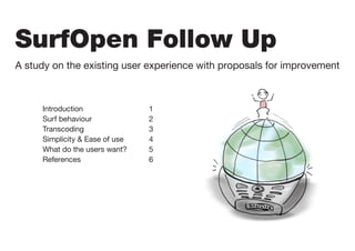
  • 1. SurfOpen Follow Up A study on the existing user experience with proposals for improvement Introduction 1 Surf behaviour 2 Transcoding 3 Simplicity & Ease of use 4 What do the users want? 5 References 6
  • 2. Introduction This study was carried out in Q4 2009, when the service known as SurfOpen had been out in the Swedish market for about eight months. The purpose of the study was to collect attitudes and opin- ions from the ones that use SurfOpen on a daily basis, and use that as input when improving the service in future versions. SurfOpen is a free service which enables mobile phones to display web pages that is transcoded to a mobile format, thus giving access to a bigger part of the Internet than just the sites which have mobile versions. Some high-end phones does this already, hence the target profile is primarily mid-range phones. Together with the transcoding feature comes a toolbar with functions like web search, browsing his- tory and bookmarks. The data were collected with an eighteen days long diary study where ten users with ages from 14 to 68 used SurfOpen as an integrated part of their daily routines, followed up by an in depth interview. For the analysis, input from other surveys and statistical data have been used as well. These sources can be found in the references in this document. November 2009 - Design & Usability* * Design & Usability is a unit within TeliaSonera, Mobility Services 1
  • 3. Surf behaviour People that don’t have high-end phones tend to limit their mobile Internet browsing to a small set of web sites they know work well and have a keen interest in. These sites are to a great extent either con- text related information like time tables, weather forecasts or open- ing hours, social services like e-mail or communities, or news sites. Sometimes search results take the users to web sites they haven’t visited before, but due to all the limitations with a small phone and the fact that most users prefer to wait with their inquiry until they can access a normal web browser and a big screen, the mobile Internet surfing is very limited in both web pages visited and time per session. The functions that are mainly used, both for SurfOpen and for the built-in browser functionality, are bookmarks and URL entry, i.e. navi- gation to pages known to the user. Sometimes the need to search for information occurs, and then search engines that are recognized from the desktop environment is preferred. To support this behaviour primary focus should be on giving quick access to the sites that are often visited, and second- ary inspire users to visit new sites with a good user experience, that they might enjoy. On a side note, costs are not a hinderance when the users access the net from their mobiles. Most of them are aware of the price plan, and mean that they would notice if the invoice became remarkably high, and adjust their surf habits. Others have flat rate subscriptions and therefore don’t worry about the amount of data they consume. 2
  • 4. Transcoding “YOU SHOULD BE ABLE TO LOG IN TO ALL SITES ON INTERNET” Words from an unsatisfied user. This should be true indeed. A large amount of the complaints on SurfOpen are about failed log in attemp- tions. Today’s Internet is very much based on idetification and per- sonalized content, so if a user can’t identify herself it’s a bit like window shopping - you can watch but you can’t interact. The transcoding of a page, using SurfOpen, means that a web site that does not supply a mobile version gets its content rerendered in a format optimized for the phone requesting the page. This means a long, scrollable document chopped into sections. The more compe- tent a phone, the less sections have to be used. This way of display- ing a big web page leads to a lot of scrolling, and sometimes pages displayed in an unlogical way. Both these issues are big annoyances for the users and things that ruins the user experience, sometimes to the extent that the user quit using the service. But after all, SurfOpen delivers a last option if you can’t access the net any other way, and for that it works pretty well. It’s not a joy, but it gives the user access to information she needs at that place and at that time. In general the users take it for what it is and are quite pleased with what they get. 3
  • 5. Simplicity & Ease of use Something that is often brought up when talking to elderly and novice users is the need for simplicity and explanations. Explanations could be implemented as tool tips and help sections but above all, the functions must be presented in such an understandable way that the interaction becomes intuitive. Graphics Existing solution with ad banner and toolbar recieves various opin- ions. On big screens (≥ 240x320 px) it doesn’t seem to be a problem, but on smaller screens it occupies around half the screen real estate and that is too much. The ad banner is using a lot of space and if that could be removed or made smaller the problem might be solved. Ei- ther way, the aim should be to have the toolbar area as slim as possible without compromizing the legibility. The icons in the toolbar are understood but few of them are used. The reason for this seem to be lack of need/interest rather than confusion. A way to get a higher click rate would be to communicate some- thing the users can relate to, e.g. use a Google logo instead of a magnifying glass for search. Worth mentioning is the problem Nokia users have with seeing which icon is highlighted since the buttons are black and the cursor/highlight frame also is black. Details like this must be taken into account in future versions. 4
  • 6. What do the users want? To sum up what the users want, we find better transcoding, faster access to one’s favourite sites and better overview of the page visited. In the overview discussion, Opera Mini was highly appreciated for its way to disaply a web page as a whole with possibility to zoom in to see details. On the contradictory many us- ers preferred the scroll view because then they could read headlines and be sure not to miss anything. Opera Mini is great for sites you are familiar with and know where to look, but not so great when you end up on pages you don’t know the structure of. Maybe the best option would be a hybrid of overview with zoom and vertical scroll. Discussing the new, javascript based surfbar by ByteMobile, the users were positive to the dynamic content panes, and also the pos- sibility to personalize it after one’s needs. For novice users this might even work as an eye-opener since they don’t even know that you can read your email in your phone, or visit popular sites that can be presented in the surfbar. The users showed an interest in saving their own quick links to their favourite sites, i.e. quick access to book- marks. This implies that if we want to offer a bookmark functionality that add something more than the phone’s built in one does, it has to be extremely accessable and reliable. 5
  • 7. References 1. Diary study in Q4 2009, by Design & Usability, TeliaSonera 2. Online survey in October 2009, 170 users, by Stelacon 3. Online survey in September - October 2009, 615 users, by More Mobile Relations 4. Click statistics on the SurfOpen toolbar in March - May 2009, by ByteMobile Send an email to martin.sandstrom@teliasonera.com to request any of the reports. 6