Download as PDF, PPTX


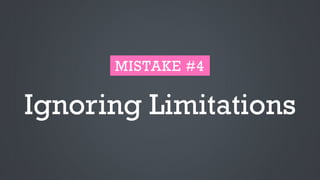
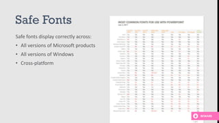

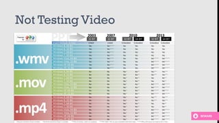


The document provides guidance on improving presentation design by avoiding common mistakes. It discusses mistakes related to including too much information in slides, using stock images or photos that do not effectively convey the intended message, and failing to consider limitations in fonts, text size, or color usage that could impact readability. The overall message is that presentations should focus on the key high-level points, use visuals purposefully, and design slides that can be easily viewed and understood by all audiences.


![Def Jam[1]](https://cdn.slidesharecdn.com/ss_thumbnails/DefJam1-122990476152-phpapp03-thumbnail.jpg?width=640&height=640&fit=bounds)


