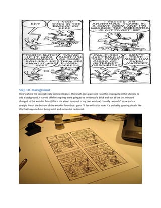
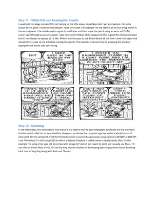
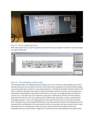
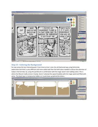
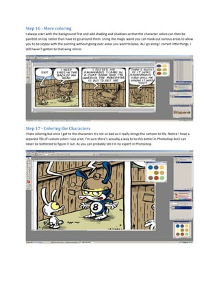
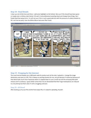
SlideShare a Scribd company logo
Step 1 - An Idea
The first step is to come up with an idea. I carry a sketchbook/notebook and write down any crazy idea that enters
my head. I also use it for casual life drawing, figuring out characters, scribbling observations, writing telephone
numbers down and for stealing ideas from other people that I can modify for my own evil purposes. I get through
about one sketchbook a month. It's not uncommon for me to wake up in the middle of the night or whip out my
book in the middle of a darkened theater to write down and idea. I have lots of ideas, however nearly all of them
are pretty lame in the cold light of day. I'd say currently, even with a daily schedule to keep, I still reject 90% of my
ideas although it should probably be higher. So it's definitely quality not quantity that's important. I spent ages
here trying to find a page of my sketchbook that didn't look completely embarrassing.

Step 2 - Rough Sketch
My rough sketches are so rough that sometimes I have trouble deciphering them myself. Usually this is because I
am intent on getting the idea on paper as quickly as possible before I forget. I end up writing out some words again
more legibly and also to remind myself how to spell them later on. There is lots of crossing out and added lines.
Sometimes I have several "punch lines" for one joke. The example I'm going to show is an idea that originated from
the little mirror I stick on my bicycle helmet. I'm not sure this idea is not one of my best. However, I've learned that
sometimes mediocre ideas come to life once they are colored so we'll see.
Step 3 - A Quiet Space
Although ideas and rough sketches can occur anywhere and everywhere, I can ink in no place other than my
underworld studio. Here you can see my three external hard drives on the shelf —filled mostly with music—buried
amongst toys, books and CDs. I keep my art tools on the left of the desk (note elephants foot) even though I'm
right handed because the other side has the laptop and the Wacom tablet. Other useful items include an
intercom/telephone to the upstairs world, large supply of music, glass of water and paper towels (not shown). The
real important think is the lighting. I have three light sources and two windows so when I draw there are no
shadows. Thank you Ikea. I have a little slanted drawing board that I usually use to work on but it's upstairs at the
moment so I'll be working directly on the desk today. It's usually a bit neater than this believe it or not.


Step 4 - Panels
This is a four panel strip so I pull out my four panel template (each box is 5" x 3"). This is something I made for
myself out of matte (some say mat) board and anXacto knife and is extremely useful and saves a lot of time. I also
made one for 3 panels (10.5" x 3.5") and "editorial" size (10" x 7"). Because my scanner is 9" x 12" and I haven't
figured out how to "stitch" two scans together, this is the maximum size of all my art. That's the scanner standing
vertical behind the laptop. I like the fact it uses very little real estate on my desk. You can also see my Elviki
statuette and some of my Tikis and fez monkeys. The photo makes it look quite dark (probably because the small
spot lamp is shining right into the camera).


Step 5 - Pencils
The strip is initially sketched with my favorite Faber Castel DS05 pencil (which I've had since 1976!) with a 2B lead
on Strathmore Vellum Bristol board. There are two types of Bristol board that I know of. The "smooth" type tends
to bleed to much for my liking although most cartoonists tend to prefer it. I already started inking the first letter
when I remembered I hadn't photographed this stage. Sorry.
Step 6 - Lettering
I use a green plastic Rapidesign lettering guide template. I used to use an Ames lettering guide that drew lines but
I'm too lazy these days. Plus I like the effect I get when the pen slightly touches the guide and makes a straight
edge at the bottom. I'm a bit sloppy with the lettering but I refuse to use a computer font as it's nearly impossible
to get that to look good unless you have someone who makes a font out of your own handwriting. I should
probably take more care and pride in my lettering. Something to work on I think.


Step 7 - Finished Lettering
When I ink over the penciled lettering I can center it more and make corrections although there's still time to
adjust this once it's scanned. Sometimes I even completely change text at this point. I think that because it's
becoming "final" I take a more critical view of what I'm actually doing. I'm still not sure this is funny. Too late to
back out now.
Step 8 - Inking the Characters
I ink using size 0 and 00 Robert Simmons 785 white sable brushes and Pelikan drawing ink. I'd like to use cruelty-
free brushes but I haven't found any good synthetic ones yet so those poor sables suffer for my art. Supposedly the
best brushes are the Windsor and Newton Series 7. However, they have very long barrels so that don't have the
accuracy of the shorter brushes although they do last longer without having to reload. I have a supply of vintage
Pelikan ink that seems to be so much darker than the new stuff but it's probably also full of all sorts of banned
chemicals that will cause me to go blind and grow a third nipple. It's important to use the correct waterproof non-
fade drawing ink and not the stuff you put in fountain pens. Some of the details are done with Pigma Micron or
CopicMultiliner pens (usually 08 and 05 sizes) and I usually draw the borders with a customized KuretakeSumi
Brush pen. I also use crow quill pens a lot (I even have one I made myself out of an actually crow quill I found).
These are much better than a brush for certain effects, namely cross-hatching and really thin lines. The nibs I like
best are Hunt 102. 108 and 99 but that's only because those are the nibs I read my favorite cartoonists use.
Speedball recently bought up Hunt and the poor quality nibs they now produce are a thing of great bitterness
among cartoonists these days. Speedball do sell a handy little "cartooning" nib pack which is a pretty cheap way of
experimenting. Gillotte is another good brand of nibs. If someone was paying me to do this properly I would use
crow quills more than I do.


Step 9 - Finished Inking the Characters
I ink the characters first which is the opposite of how I color (background first). One important thing is to make
sure the weight of the brush is heavier on the character outlines and the undersides of the character's bodies.
Notices I left Weenus' hands out in the first panel. They were too small to do with a brush. I probably should have
left the other hands undone as well. Oh well, no one will notice.
Step 10 - Background
Here's where the context really comes into play. The brush goes away and I use the crow quills or the Microns to
add a background. I started off thinking they were going to be in front of a brick wall but at the last minute I
changed to the wooden fence (this is the view I have out of my own window). Usually I wouldn't draw such a
straight line at the bottom of the wooden fence but I guess I'll live with it for now. It's probably ignoring details like
this that keep me from being a rich and successful cartoonist.
Step 11 - White Out and Erasing the Pencils
I usually do this stage outside if it's not raining so the little eraser snowflakes don't get everywhere. For some
reason at this point I notice several details I need to fix later. For example I'm not keen at all on that wing mirror in
the second panel. I fix mistakes with regular Liquid Paper and then erase the pencil using an extra soft TriTip
eraser. I get through an eraser a week. I also have some Pelikan white opaque ink that is good for inking over black
but it's not always as opaque as I'd like. When I was too poor to use Bristol board all the time I used thin paper and
would often crease up my art while erasing the pencils. That disaster is second only to dropping the brush or
tipping the ink bottle over everything.


Step 12 - Scanning
In the olden days, that would be it. You'd stick it in a tube to mail to your newspaper syndicate and try and make
the last postal collection to beat deadline. However, somehow the computer age has added a whole bunch of
extra work for the cartoonist. First the finished artwork is scanned as grayscale using a Canon LiDE500F at 600 DPI.
I use Photoshop (I'm still using CS2) for which a Wacom Graphire II tablet comes in really handy. Also, for this
example I'm using a five year old Sony Vaio with a huge 18" screen but I want to point out I usually use Macs. I'm
not a fan of either Macs or PCs. If I had my way anyone involved in developing operating systems would be doing
hard time in Sing Sing along with Bush and Cheney.
Step 13 - Rearranging the Boxes
With a three panel strip I can skip this stage but since I drew the "two-up two-down" formation I need to rearrange
as a regular looking strip.


Step 14 - Threasholding and Layering
The threshold setting is very important because it reduces your art to 2 bit black or white allowing you to create a
neat layer which you can color behind. If you don't do this there will be a graduation from black to white through a
series of gray which will not make for a crisp coloring experience. In Photoshop the default Threshold setting is 128
which is usually fine although I prefer 140 as it makes my lines bolder and more masculine. Once you adjust your
threshold you immediately see a wonderful transformation on the screen as the jaggy grayscale scan becomes a
crisp line art. It's now safe to turn your image from a grayscale to a RGB mode so we have a full color palette to
work with (if this were for "print" you would convert to a CMYK mode). Next stage is to make a second layer for
the background colors. I then use the magic wand set at 10 to select the white areas in the top layer and delete
them. The bottom later is then selected and filled with a color which will be the majority of the background (or the
area behind the most fiddly bits). In this case brown for the fence. So basically I now have a top later which is just a
web of black lines on transparentness and the color layer underneath will show through ensuring I won't
accidentally color over any of the black. I forgot to do a screenshot with the brown behind but you'll get the idea.
Step 15 - Coloring the Background
So now comes the less interesting part. From time to time I color the old fashioned way using Schmincke
watercolors but that's a very different and more subtle look than the bold colors needed to attract the attention of
today's Internet kids. So, using the paintbrush in combination with the magic wand I start adding colors. This is
where the Wacom really comes in handy. Here's I selected the speech bubbles with the magic wand and filled with
white. The black layer is temporarily hidden so I could clean up behind the letters.
Step 16 - More coloring
I always start with the background first and add shading and shadows so that the character colors can then be
painted on top rather than have to go around them. Using the magic wand you can mask out various areas to allow
you to be sloppy with the painting without going over areas you want to keep. As I go along I correct little things. I
still haven't gotten to that wing mirror.


Step 17 - Coloring the Characters
I hate coloring but once I get to the characters it's not so bad as it really brings the cartoon to life. Notice I have a
separate file of custom colors I use a lot. I'm sure there's actually a way to to this better in Photoshop but I can
never be bothered to figure it out. As you can probably tell I'm no expert in Photoshop.
Step 18 - Final Details
I clean up a lot of bits here and there. I add some highlights to the helmet. Not sure if this should have been green
or maybe even a military style helmet. Oh well. A real professional would go back and change these things. See I
finally fixed that wing mirror. I'm still not sure if this is such a great joke but with the pressure of a daily schedule to
fill I can't be too picky. Even the White Album had some filler tracks.


Step 19 - Prepping for the Internet
The usual internet display size is 600 pixels wide for pretty much all the sites I upload to. I change the image
dimensions and save as a JPG. This is always an exciting moment for me, not just because I'm done but because all
that detail looks much more impressive when it's zapped down to such a small size and the annoying little pixel
messes aren't so obvious. I guess better artists than me are devastated that their huge masterpieces are reduced
to a tiny bitmap but that's why I'm still a struggling unknown.

Step 20 - All Done!
After backing up my scan file and the final output file, it's ready for uploading. Huzzah!

More Related Content

Viewers also liked

Juang jaya breeding marketing center english
Juang jaya breeding marketing center   englishJuang jaya breeding marketing center   english
Juang jaya breeding marketing center englishJohannes Silaban
 
Utpl
UtplUtpl
Shepherd j presentation
Shepherd j presentationShepherd j presentation
Shepherd j presentationjshepherd5107
 
Develop Windows 8 & Windows Phone apps using crucial Google APIs
Develop Windows 8 & Windows Phone apps using crucial Google APIsDevelop Windows 8 & Windows Phone apps using crucial Google APIs
Develop Windows 8 & Windows Phone apps using crucial Google APIs
Isham Mohamed Iqbal
 
Communications program 2011 jjaa [compatibility mode]
Communications program 2011 jjaa [compatibility mode]Communications program 2011 jjaa [compatibility mode]
Communications program 2011 jjaa [compatibility mode]
Johannes Silaban
 
Aurora, location based blogging platform
Aurora, location based blogging platformAurora, location based blogging platform
Aurora, location based blogging platform
Isham Mohamed Iqbal
 
Revista Bimby Agosto 2015
Revista Bimby Agosto 2015Revista Bimby Agosto 2015
Revista Bimby Agosto 2015
Vanda Maio
 
Atomic physics
Atomic physicsAtomic physics
Atomic physics
BangYee AloneMan
 
Transition management
Transition managementTransition management
Transition management
Aditi Sharma
 
Copyright & Plagiarism
Copyright & PlagiarismCopyright & Plagiarism
Copyright & Plagiarismlauholland
 
Nonfiction Features Gr 4-5
Nonfiction Features Gr 4-5Nonfiction Features Gr 4-5
Nonfiction Features Gr 4-5lauholland
 
Do convento para a Bimby
Do convento para a BimbyDo convento para a Bimby
Do convento para a Bimby
Vanda Maio
 
Introduction to Xamarin Development
Introduction to Xamarin DevelopmentIntroduction to Xamarin Development
Introduction to Xamarin DevelopmentIsham Mohamed Iqbal
 
Nonfiction Features Gr 1-3
Nonfiction Features Gr 1-3Nonfiction Features Gr 1-3
Nonfiction Features Gr 1-3lauholland
 
Vinay sattur Job analysis
Vinay sattur   Job analysisVinay sattur   Job analysis
Vinay sattur Job analysisVinay sattur
 
Structure of-predication- Edwin Sulispriyanto
Structure of-predication- Edwin SulispriyantoStructure of-predication- Edwin Sulispriyanto
Structure of-predication- Edwin Sulispriyanto
Edwin Clemenz
 
Bharati College Logo Quiz Prelims
Bharati College Logo Quiz PrelimsBharati College Logo Quiz Prelims
Bharati College Logo Quiz Prelims
Abhishek Mishra
 
Revista Bimby Setembro 2015
Revista Bimby Setembro 2015Revista Bimby Setembro 2015
Revista Bimby Setembro 2015
Vanda Maio
 
Business research-process
Business research-processBusiness research-process
Business research-processDerick Wade
 

Viewers also liked (20)

Juang jaya breeding marketing center english
Juang jaya breeding marketing center   englishJuang jaya breeding marketing center   english
Juang jaya breeding marketing center english
 
Utpl
UtplUtpl
Utpl
 
Shepherd j presentation
Shepherd j presentationShepherd j presentation
Shepherd j presentation
 
Develop Windows 8 & Windows Phone apps using crucial Google APIs
Develop Windows 8 & Windows Phone apps using crucial Google APIsDevelop Windows 8 & Windows Phone apps using crucial Google APIs
Develop Windows 8 & Windows Phone apps using crucial Google APIs
 
Communications program 2011 jjaa [compatibility mode]
Communications program 2011 jjaa [compatibility mode]Communications program 2011 jjaa [compatibility mode]
Communications program 2011 jjaa [compatibility mode]
 
Aurora, location based blogging platform
Aurora, location based blogging platformAurora, location based blogging platform
Aurora, location based blogging platform
 
Revista Bimby Agosto 2015
Revista Bimby Agosto 2015Revista Bimby Agosto 2015
Revista Bimby Agosto 2015
 
Atomic physics
Atomic physicsAtomic physics
Atomic physics
 
Transition management
Transition managementTransition management
Transition management
 
Copyright & Plagiarism
Copyright & PlagiarismCopyright & Plagiarism
Copyright & Plagiarism
 
Nonfiction Features Gr 4-5
Nonfiction Features Gr 4-5Nonfiction Features Gr 4-5
Nonfiction Features Gr 4-5
 
Do convento para a Bimby
Do convento para a BimbyDo convento para a Bimby
Do convento para a Bimby
 
Introduction to Xamarin Development
Introduction to Xamarin DevelopmentIntroduction to Xamarin Development
Introduction to Xamarin Development
 
Nonfiction Features Gr 1-3
Nonfiction Features Gr 1-3Nonfiction Features Gr 1-3
Nonfiction Features Gr 1-3
 
Vinay sattur Job analysis
Vinay sattur   Job analysisVinay sattur   Job analysis
Vinay sattur Job analysis
 
Structure of-predication- Edwin Sulispriyanto
Structure of-predication- Edwin SulispriyantoStructure of-predication- Edwin Sulispriyanto
Structure of-predication- Edwin Sulispriyanto
 
Bharati College Logo Quiz Prelims
Bharati College Logo Quiz PrelimsBharati College Logo Quiz Prelims
Bharati College Logo Quiz Prelims
 
El poema
El poemaEl poema
El poema
 
Revista Bimby Setembro 2015
Revista Bimby Setembro 2015Revista Bimby Setembro 2015
Revista Bimby Setembro 2015
 
Business research-process
Business research-processBusiness research-process
Business research-process
 

Similar to Step by step giude [Comic Strip]

100+ Creative Personal Art Project Ideas
100+ Creative Personal Art Project Ideas100+ Creative Personal Art Project Ideas
100+ Creative Personal Art Project Ideas
Atifhussain670120
 
The fine art of drawing
The fine art of drawingThe fine art of drawing
The fine art of drawing
Pandora Garcia
 
Ilustración Digital
Ilustración DigitalIlustración Digital
Ilustración Digital
Osvaldo Torrecillas
 
Meanders
MeandersMeanders
Meanders
Shalin Hai-Jew
 
Trickle
TrickleTrickle
Teardrop
TeardropTeardrop
Teardrop
Shalin Hai-Jew
 
Thaw
ThawThaw
Digital Journal Part 1
Digital Journal Part 1Digital Journal Part 1
Digital Journal Part 1
winhhh
 
On the Rise_v1sec
On the Rise_v1secOn the Rise_v1sec
On the Rise_v1secTom Langton
 
Stain
StainStain
Sleet
SleetSleet
1.development pro forma
1.development pro forma1.development pro forma
1.development pro formaEdogHTA
 
1.development pro forma
1.development pro forma1.development pro forma
1.development pro forma
EdogHTA
 
1.development pro forma
1.development pro forma1.development pro forma
1.development pro forma
EdogHTA
 
Year 2 FMP Problem Solving
Year 2 FMP Problem SolvingYear 2 FMP Problem Solving
Year 2 FMP Problem Solving
JoeDuffy28
 
6. production reflection
6. production reflection6. production reflection
6. production reflection
Brendan Storr
 
photoshop tutorial
photoshop tutorialphotoshop tutorial
photoshop tutorial
Justo Fernandez
 

Similar to Step by step giude [Comic Strip] (20)

100+ Creative Personal Art Project Ideas
100+ Creative Personal Art Project Ideas100+ Creative Personal Art Project Ideas
100+ Creative Personal Art Project Ideas
 
The fine art of drawing
The fine art of drawingThe fine art of drawing
The fine art of drawing
 
Problem solving
Problem solvingProblem solving
Problem solving
 
Ilustración Digital
Ilustración DigitalIlustración Digital
Ilustración Digital
 
Meanders
MeandersMeanders
Meanders
 
Problem solving
Problem solvingProblem solving
Problem solving
 
Trickle
TrickleTrickle
Trickle
 
Teardrop
TeardropTeardrop
Teardrop
 
Thaw
ThawThaw
Thaw
 
Digital Journal Part 1
Digital Journal Part 1Digital Journal Part 1
Digital Journal Part 1
 
On the Rise_v1sec
On the Rise_v1secOn the Rise_v1sec
On the Rise_v1sec
 
Stain
StainStain
Stain
 
Sleet
SleetSleet
Sleet
 
1.development pro forma
1.development pro forma1.development pro forma
1.development pro forma
 
1.development pro forma
1.development pro forma1.development pro forma
1.development pro forma
 
1.development pro forma
1.development pro forma1.development pro forma
1.development pro forma
 
Year 2 FMP Problem Solving
Year 2 FMP Problem SolvingYear 2 FMP Problem Solving
Year 2 FMP Problem Solving
 
6. production reflection
6. production reflection6. production reflection
6. production reflection
 
photoshop tutorial
photoshop tutorialphotoshop tutorial
photoshop tutorial
 
Bonus exercises
Bonus exercisesBonus exercises
Bonus exercises
 

Recently uploaded

一比一原版(Bristol毕业证书)布里斯托大学毕业证成绩单如何办理
一比一原版(Bristol毕业证书)布里斯托大学毕业证成绩单如何办理一比一原版(Bristol毕业证书)布里斯托大学毕业证成绩单如何办理
一比一原版(Bristol毕业证书)布里斯托大学毕业证成绩单如何办理
smpc3nvg
 
Borys Sutkowski portfolio interior design
Borys Sutkowski portfolio interior designBorys Sutkowski portfolio interior design
Borys Sutkowski portfolio interior design
boryssutkowski
 
Common Designing Mistakes and How to avoid them
Common Designing Mistakes and How to avoid themCommon Designing Mistakes and How to avoid them
Common Designing Mistakes and How to avoid them
madhavlakhanpal29
 
一比一原版(Brunel毕业证书)布鲁内尔大学毕业证成绩单如何办理
一比一原版(Brunel毕业证书)布鲁内尔大学毕业证成绩单如何办理一比一原版(Brunel毕业证书)布鲁内尔大学毕业证成绩单如何办理
一比一原版(Brunel毕业证书)布鲁内尔大学毕业证成绩单如何办理
smpc3nvg
 
一比一原版(毕业证)长崎大学毕业证成绩单如何办理
一比一原版(毕业证)长崎大学毕业证成绩单如何办理一比一原版(毕业证)长崎大学毕业证成绩单如何办理
一比一原版(毕业证)长崎大学毕业证成绩单如何办理
taqyed
 
Design Thinking Design thinking Design thinking
Design Thinking Design thinking Design thinkingDesign Thinking Design thinking Design thinking
Design Thinking Design thinking Design thinking
cy0krjxt
 
Top Israeli Products and Brands - Plan it israel.pdf
Top Israeli Products and Brands - Plan it israel.pdfTop Israeli Products and Brands - Plan it israel.pdf
Top Israeli Products and Brands - Plan it israel.pdf
PlanitIsrael
 
Book Formatting: Quality Control Checks for Designers
Book Formatting: Quality Control Checks for DesignersBook Formatting: Quality Control Checks for Designers
Book Formatting: Quality Control Checks for Designers
Confidence Ago
 
Коричневый и Кремовый Деликатный Органический Копирайтер Фрилансер Марке...
Коричневый и Кремовый Деликатный Органический Копирайтер Фрилансер Марке...Коричневый и Кремовый Деликатный Органический Копирайтер Фрилансер Марке...
Коричневый и Кремовый Деликатный Органический Копирайтер Фрилансер Марке...
ameli25062005
 
一比一原版(BU毕业证书)伯恩茅斯大学毕业证成绩单如何办理
一比一原版(BU毕业证书)伯恩茅斯大学毕业证成绩单如何办理一比一原版(BU毕业证书)伯恩茅斯大学毕业证成绩单如何办理
一比一原版(BU毕业证书)伯恩茅斯大学毕业证成绩单如何办理
h7j5io0
 
RTUYUIJKLDSADAGHBDJNKSMAL,D
RTUYUIJKLDSADAGHBDJNKSMAL,DRTUYUIJKLDSADAGHBDJNKSMAL,D
RTUYUIJKLDSADAGHBDJNKSMAL,D
cy0krjxt
 
一比一原版(NCL毕业证书)纽卡斯尔大学毕业证成绩单如何办理
一比一原版(NCL毕业证书)纽卡斯尔大学毕业证成绩单如何办理一比一原版(NCL毕业证书)纽卡斯尔大学毕业证成绩单如何办理
一比一原版(NCL毕业证书)纽卡斯尔大学毕业证成绩单如何办理
7sd8fier
 
Can AI do good? at 'offtheCanvas' India HCI prelude
Can AI do good? at 'offtheCanvas' India HCI preludeCan AI do good? at 'offtheCanvas' India HCI prelude
Can AI do good? at 'offtheCanvas' India HCI prelude
Alan Dix
 
PORTFOLIO FABIANA VILLANI ARCHITECTURE.pdf
PORTFOLIO FABIANA VILLANI ARCHITECTURE.pdfPORTFOLIO FABIANA VILLANI ARCHITECTURE.pdf
PORTFOLIO FABIANA VILLANI ARCHITECTURE.pdf
fabianavillanib
 
一比一原版(Bolton毕业证书)博尔顿大学毕业证成绩单如何办理
一比一原版(Bolton毕业证书)博尔顿大学毕业证成绩单如何办理一比一原版(Bolton毕业证书)博尔顿大学毕业证成绩单如何办理
一比一原版(Bolton毕业证书)博尔顿大学毕业证成绩单如何办理
h7j5io0
 
Expert Accessory Dwelling Unit (ADU) Drafting Services
Expert Accessory Dwelling Unit (ADU) Drafting ServicesExpert Accessory Dwelling Unit (ADU) Drafting Services
Expert Accessory Dwelling Unit (ADU) Drafting Services
ResDraft
 
一比一原版(MMU毕业证书)曼彻斯特城市大学毕业证成绩单如何办理
一比一原版(MMU毕业证书)曼彻斯特城市大学毕业证成绩单如何办理一比一原版(MMU毕业证书)曼彻斯特城市大学毕业证成绩单如何办理
一比一原版(MMU毕业证书)曼彻斯特城市大学毕业证成绩单如何办理
7sd8fier
 
一比一原版(CITY毕业证书)谢菲尔德哈勒姆大学毕业证如何办理
一比一原版(CITY毕业证书)谢菲尔德哈勒姆大学毕业证如何办理一比一原版(CITY毕业证书)谢菲尔德哈勒姆大学毕业证如何办理
一比一原版(CITY毕业证书)谢菲尔德哈勒姆大学毕业证如何办理
9a93xvy
 
一比一原版(UCB毕业证书)伯明翰大学学院毕业证成绩单如何办理
一比一原版(UCB毕业证书)伯明翰大学学院毕业证成绩单如何办理一比一原版(UCB毕业证书)伯明翰大学学院毕业证成绩单如何办理
一比一原版(UCB毕业证书)伯明翰大学学院毕业证成绩单如何办理
h7j5io0
 
Research 20 slides Amelia gavryliuks.pdf
Research 20 slides Amelia gavryliuks.pdfResearch 20 slides Amelia gavryliuks.pdf
Research 20 slides Amelia gavryliuks.pdf
ameli25062005
 

Recently uploaded (20)

一比一原版(Bristol毕业证书)布里斯托大学毕业证成绩单如何办理
一比一原版(Bristol毕业证书)布里斯托大学毕业证成绩单如何办理一比一原版(Bristol毕业证书)布里斯托大学毕业证成绩单如何办理
一比一原版(Bristol毕业证书)布里斯托大学毕业证成绩单如何办理
 
Borys Sutkowski portfolio interior design
Borys Sutkowski portfolio interior designBorys Sutkowski portfolio interior design
Borys Sutkowski portfolio interior design
 
Common Designing Mistakes and How to avoid them
Common Designing Mistakes and How to avoid themCommon Designing Mistakes and How to avoid them
Common Designing Mistakes and How to avoid them
 
一比一原版(Brunel毕业证书)布鲁内尔大学毕业证成绩单如何办理
一比一原版(Brunel毕业证书)布鲁内尔大学毕业证成绩单如何办理一比一原版(Brunel毕业证书)布鲁内尔大学毕业证成绩单如何办理
一比一原版(Brunel毕业证书)布鲁内尔大学毕业证成绩单如何办理
 
一比一原版(毕业证)长崎大学毕业证成绩单如何办理
一比一原版(毕业证)长崎大学毕业证成绩单如何办理一比一原版(毕业证)长崎大学毕业证成绩单如何办理
一比一原版(毕业证)长崎大学毕业证成绩单如何办理
 
Design Thinking Design thinking Design thinking
Design Thinking Design thinking Design thinkingDesign Thinking Design thinking Design thinking
Design Thinking Design thinking Design thinking
 
Top Israeli Products and Brands - Plan it israel.pdf
Top Israeli Products and Brands - Plan it israel.pdfTop Israeli Products and Brands - Plan it israel.pdf
Top Israeli Products and Brands - Plan it israel.pdf
 
Book Formatting: Quality Control Checks for Designers
Book Formatting: Quality Control Checks for DesignersBook Formatting: Quality Control Checks for Designers
Book Formatting: Quality Control Checks for Designers
 
Коричневый и Кремовый Деликатный Органический Копирайтер Фрилансер Марке...
Коричневый и Кремовый Деликатный Органический Копирайтер Фрилансер Марке...Коричневый и Кремовый Деликатный Органический Копирайтер Фрилансер Марке...
Коричневый и Кремовый Деликатный Органический Копирайтер Фрилансер Марке...
 
一比一原版(BU毕业证书)伯恩茅斯大学毕业证成绩单如何办理
一比一原版(BU毕业证书)伯恩茅斯大学毕业证成绩单如何办理一比一原版(BU毕业证书)伯恩茅斯大学毕业证成绩单如何办理
一比一原版(BU毕业证书)伯恩茅斯大学毕业证成绩单如何办理
 
RTUYUIJKLDSADAGHBDJNKSMAL,D
RTUYUIJKLDSADAGHBDJNKSMAL,DRTUYUIJKLDSADAGHBDJNKSMAL,D
RTUYUIJKLDSADAGHBDJNKSMAL,D
 
一比一原版(NCL毕业证书)纽卡斯尔大学毕业证成绩单如何办理
一比一原版(NCL毕业证书)纽卡斯尔大学毕业证成绩单如何办理一比一原版(NCL毕业证书)纽卡斯尔大学毕业证成绩单如何办理
一比一原版(NCL毕业证书)纽卡斯尔大学毕业证成绩单如何办理
 
Can AI do good? at 'offtheCanvas' India HCI prelude
Can AI do good? at 'offtheCanvas' India HCI preludeCan AI do good? at 'offtheCanvas' India HCI prelude
Can AI do good? at 'offtheCanvas' India HCI prelude
 
PORTFOLIO FABIANA VILLANI ARCHITECTURE.pdf
PORTFOLIO FABIANA VILLANI ARCHITECTURE.pdfPORTFOLIO FABIANA VILLANI ARCHITECTURE.pdf
PORTFOLIO FABIANA VILLANI ARCHITECTURE.pdf
 
一比一原版(Bolton毕业证书)博尔顿大学毕业证成绩单如何办理
一比一原版(Bolton毕业证书)博尔顿大学毕业证成绩单如何办理一比一原版(Bolton毕业证书)博尔顿大学毕业证成绩单如何办理
一比一原版(Bolton毕业证书)博尔顿大学毕业证成绩单如何办理
 
Expert Accessory Dwelling Unit (ADU) Drafting Services
Expert Accessory Dwelling Unit (ADU) Drafting ServicesExpert Accessory Dwelling Unit (ADU) Drafting Services
Expert Accessory Dwelling Unit (ADU) Drafting Services
 
一比一原版(MMU毕业证书)曼彻斯特城市大学毕业证成绩单如何办理
一比一原版(MMU毕业证书)曼彻斯特城市大学毕业证成绩单如何办理一比一原版(MMU毕业证书)曼彻斯特城市大学毕业证成绩单如何办理
一比一原版(MMU毕业证书)曼彻斯特城市大学毕业证成绩单如何办理
 
一比一原版(CITY毕业证书)谢菲尔德哈勒姆大学毕业证如何办理
一比一原版(CITY毕业证书)谢菲尔德哈勒姆大学毕业证如何办理一比一原版(CITY毕业证书)谢菲尔德哈勒姆大学毕业证如何办理
一比一原版(CITY毕业证书)谢菲尔德哈勒姆大学毕业证如何办理
 
一比一原版(UCB毕业证书)伯明翰大学学院毕业证成绩单如何办理
一比一原版(UCB毕业证书)伯明翰大学学院毕业证成绩单如何办理一比一原版(UCB毕业证书)伯明翰大学学院毕业证成绩单如何办理
一比一原版(UCB毕业证书)伯明翰大学学院毕业证成绩单如何办理
 
Research 20 slides Amelia gavryliuks.pdf
Research 20 slides Amelia gavryliuks.pdfResearch 20 slides Amelia gavryliuks.pdf
Research 20 slides Amelia gavryliuks.pdf
 

Step by step giude [Comic Strip]

  • 1. Step 1 - An Idea The first step is to come up with an idea. I carry a sketchbook/notebook and write down any crazy idea that enters my head. I also use it for casual life drawing, figuring out characters, scribbling observations, writing telephone numbers down and for stealing ideas from other people that I can modify for my own evil purposes. I get through about one sketchbook a month. It's not uncommon for me to wake up in the middle of the night or whip out my book in the middle of a darkened theater to write down and idea. I have lots of ideas, however nearly all of them are pretty lame in the cold light of day. I'd say currently, even with a daily schedule to keep, I still reject 90% of my ideas although it should probably be higher. So it's definitely quality not quantity that's important. I spent ages here trying to find a page of my sketchbook that didn't look completely embarrassing. Step 2 - Rough Sketch My rough sketches are so rough that sometimes I have trouble deciphering them myself. Usually this is because I am intent on getting the idea on paper as quickly as possible before I forget. I end up writing out some words again more legibly and also to remind myself how to spell them later on. There is lots of crossing out and added lines. Sometimes I have several "punch lines" for one joke. The example I'm going to show is an idea that originated from the little mirror I stick on my bicycle helmet. I'm not sure this idea is not one of my best. However, I've learned that sometimes mediocre ideas come to life once they are colored so we'll see.
  • 2. Step 3 - A Quiet Space Although ideas and rough sketches can occur anywhere and everywhere, I can ink in no place other than my underworld studio. Here you can see my three external hard drives on the shelf —filled mostly with music—buried amongst toys, books and CDs. I keep my art tools on the left of the desk (note elephants foot) even though I'm right handed because the other side has the laptop and the Wacom tablet. Other useful items include an intercom/telephone to the upstairs world, large supply of music, glass of water and paper towels (not shown). The real important think is the lighting. I have three light sources and two windows so when I draw there are no shadows. Thank you Ikea. I have a little slanted drawing board that I usually use to work on but it's upstairs at the moment so I'll be working directly on the desk today. It's usually a bit neater than this believe it or not. Step 4 - Panels This is a four panel strip so I pull out my four panel template (each box is 5" x 3"). This is something I made for myself out of matte (some say mat) board and anXacto knife and is extremely useful and saves a lot of time. I also made one for 3 panels (10.5" x 3.5") and "editorial" size (10" x 7"). Because my scanner is 9" x 12" and I haven't figured out how to "stitch" two scans together, this is the maximum size of all my art. That's the scanner standing vertical behind the laptop. I like the fact it uses very little real estate on my desk. You can also see my Elviki statuette and some of my Tikis and fez monkeys. The photo makes it look quite dark (probably because the small spot lamp is shining right into the camera). Step 5 - Pencils The strip is initially sketched with my favorite Faber Castel DS05 pencil (which I've had since 1976!) with a 2B lead on Strathmore Vellum Bristol board. There are two types of Bristol board that I know of. The "smooth" type tends to bleed to much for my liking although most cartoonists tend to prefer it. I already started inking the first letter when I remembered I hadn't photographed this stage. Sorry.
  • 3. Step 6 - Lettering I use a green plastic Rapidesign lettering guide template. I used to use an Ames lettering guide that drew lines but I'm too lazy these days. Plus I like the effect I get when the pen slightly touches the guide and makes a straight edge at the bottom. I'm a bit sloppy with the lettering but I refuse to use a computer font as it's nearly impossible to get that to look good unless you have someone who makes a font out of your own handwriting. I should probably take more care and pride in my lettering. Something to work on I think. Step 7 - Finished Lettering When I ink over the penciled lettering I can center it more and make corrections although there's still time to adjust this once it's scanned. Sometimes I even completely change text at this point. I think that because it's becoming "final" I take a more critical view of what I'm actually doing. I'm still not sure this is funny. Too late to back out now.
  • 4. Step 8 - Inking the Characters I ink using size 0 and 00 Robert Simmons 785 white sable brushes and Pelikan drawing ink. I'd like to use cruelty- free brushes but I haven't found any good synthetic ones yet so those poor sables suffer for my art. Supposedly the best brushes are the Windsor and Newton Series 7. However, they have very long barrels so that don't have the accuracy of the shorter brushes although they do last longer without having to reload. I have a supply of vintage Pelikan ink that seems to be so much darker than the new stuff but it's probably also full of all sorts of banned chemicals that will cause me to go blind and grow a third nipple. It's important to use the correct waterproof non- fade drawing ink and not the stuff you put in fountain pens. Some of the details are done with Pigma Micron or CopicMultiliner pens (usually 08 and 05 sizes) and I usually draw the borders with a customized KuretakeSumi Brush pen. I also use crow quill pens a lot (I even have one I made myself out of an actually crow quill I found). These are much better than a brush for certain effects, namely cross-hatching and really thin lines. The nibs I like best are Hunt 102. 108 and 99 but that's only because those are the nibs I read my favorite cartoonists use. Speedball recently bought up Hunt and the poor quality nibs they now produce are a thing of great bitterness among cartoonists these days. Speedball do sell a handy little "cartooning" nib pack which is a pretty cheap way of experimenting. Gillotte is another good brand of nibs. If someone was paying me to do this properly I would use crow quills more than I do. Step 9 - Finished Inking the Characters I ink the characters first which is the opposite of how I color (background first). One important thing is to make sure the weight of the brush is heavier on the character outlines and the undersides of the character's bodies. Notices I left Weenus' hands out in the first panel. They were too small to do with a brush. I probably should have left the other hands undone as well. Oh well, no one will notice.
  • 5. Step 10 - Background Here's where the context really comes into play. The brush goes away and I use the crow quills or the Microns to add a background. I started off thinking they were going to be in front of a brick wall but at the last minute I changed to the wooden fence (this is the view I have out of my own window). Usually I wouldn't draw such a straight line at the bottom of the wooden fence but I guess I'll live with it for now. It's probably ignoring details like this that keep me from being a rich and successful cartoonist.
  • 6. Step 11 - White Out and Erasing the Pencils I usually do this stage outside if it's not raining so the little eraser snowflakes don't get everywhere. For some reason at this point I notice several details I need to fix later. For example I'm not keen at all on that wing mirror in the second panel. I fix mistakes with regular Liquid Paper and then erase the pencil using an extra soft TriTip eraser. I get through an eraser a week. I also have some Pelikan white opaque ink that is good for inking over black but it's not always as opaque as I'd like. When I was too poor to use Bristol board all the time I used thin paper and would often crease up my art while erasing the pencils. That disaster is second only to dropping the brush or tipping the ink bottle over everything. Step 12 - Scanning In the olden days, that would be it. You'd stick it in a tube to mail to your newspaper syndicate and try and make the last postal collection to beat deadline. However, somehow the computer age has added a whole bunch of extra work for the cartoonist. First the finished artwork is scanned as grayscale using a Canon LiDE500F at 600 DPI. I use Photoshop (I'm still using CS2) for which a Wacom Graphire II tablet comes in really handy. Also, for this example I'm using a five year old Sony Vaio with a huge 18" screen but I want to point out I usually use Macs. I'm not a fan of either Macs or PCs. If I had my way anyone involved in developing operating systems would be doing hard time in Sing Sing along with Bush and Cheney.
  • 7. Step 13 - Rearranging the Boxes With a three panel strip I can skip this stage but since I drew the "two-up two-down" formation I need to rearrange as a regular looking strip. Step 14 - Threasholding and Layering The threshold setting is very important because it reduces your art to 2 bit black or white allowing you to create a neat layer which you can color behind. If you don't do this there will be a graduation from black to white through a series of gray which will not make for a crisp coloring experience. In Photoshop the default Threshold setting is 128 which is usually fine although I prefer 140 as it makes my lines bolder and more masculine. Once you adjust your threshold you immediately see a wonderful transformation on the screen as the jaggy grayscale scan becomes a crisp line art. It's now safe to turn your image from a grayscale to a RGB mode so we have a full color palette to work with (if this were for "print" you would convert to a CMYK mode). Next stage is to make a second layer for the background colors. I then use the magic wand set at 10 to select the white areas in the top layer and delete them. The bottom later is then selected and filled with a color which will be the majority of the background (or the area behind the most fiddly bits). In this case brown for the fence. So basically I now have a top later which is just a web of black lines on transparentness and the color layer underneath will show through ensuring I won't accidentally color over any of the black. I forgot to do a screenshot with the brown behind but you'll get the idea.
  • 8. Step 15 - Coloring the Background So now comes the less interesting part. From time to time I color the old fashioned way using Schmincke watercolors but that's a very different and more subtle look than the bold colors needed to attract the attention of today's Internet kids. So, using the paintbrush in combination with the magic wand I start adding colors. This is where the Wacom really comes in handy. Here's I selected the speech bubbles with the magic wand and filled with white. The black layer is temporarily hidden so I could clean up behind the letters.
  • 9. Step 16 - More coloring I always start with the background first and add shading and shadows so that the character colors can then be painted on top rather than have to go around them. Using the magic wand you can mask out various areas to allow you to be sloppy with the painting without going over areas you want to keep. As I go along I correct little things. I still haven't gotten to that wing mirror. Step 17 - Coloring the Characters I hate coloring but once I get to the characters it's not so bad as it really brings the cartoon to life. Notice I have a separate file of custom colors I use a lot. I'm sure there's actually a way to to this better in Photoshop but I can never be bothered to figure it out. As you can probably tell I'm no expert in Photoshop.
  • 10. Step 18 - Final Details I clean up a lot of bits here and there. I add some highlights to the helmet. Not sure if this should have been green or maybe even a military style helmet. Oh well. A real professional would go back and change these things. See I finally fixed that wing mirror. I'm still not sure if this is such a great joke but with the pressure of a daily schedule to fill I can't be too picky. Even the White Album had some filler tracks. Step 19 - Prepping for the Internet The usual internet display size is 600 pixels wide for pretty much all the sites I upload to. I change the image dimensions and save as a JPG. This is always an exciting moment for me, not just because I'm done but because all that detail looks much more impressive when it's zapped down to such a small size and the annoying little pixel messes aren't so obvious. I guess better artists than me are devastated that their huge masterpieces are reduced to a tiny bitmap but that's why I'm still a struggling unknown. Step 20 - All Done! After backing up my scan file and the final output file, it's ready for uploading. Huzzah!