The document contains a shot list for filming two separate scenes - a performance scene on August 26th and a narrative scene on August 29th. For the performance scene, various shots are planned of a musician playing guitar at different outdoor locations, including wide shots, close-ups, and shots with camera movement. For the narrative scene on the 29th, various shots are planned of a couple interacting at different locations, including close-ups, two shots, shots with camera movement around the couple, and a low-angle long shot of the couple rolling down a hill.
The storyboard outlines 10 shots showing a male character who is bored and fed up while fixing his bike, until he discovers a can of Match spray which energizes him and makes him feel happier. After spraying the Match product, the character is shown pretending to play drums, dancing in his garage in a biker outfit, riding his bike, and a final shot of a match being lit, suggesting the spray reignites passion.
The document outlines the scenes and shots planned for a music video. It describes various locations that will be filmed, including a bedroom, brick wall, dock by a river, and train station. It provides details on lighting, camera angles, clothing continuity, and the emotions to be conveyed. Key shots include close-ups of the artist's face singing, two artists against a plain background, and an artist sitting on a dock by the river. The train station scene was later replaced with more performance footage of the artist.
The document outlines the scenes and shots planned for a music video. It describes various locations that will be filmed, including a bedroom, brick wall, dock by a river, and train station. It provides details on lighting, camera angles, clothing continuity, and the emotions being conveyed. Key shots include close-ups of the artist's face, two artists against a plain background, and the artist looking at a photograph on a dock by the river. The planned length of scenes ranges from 15 to 27 seconds.
This document provides a storyboard for the music video for the song "Gunslinger" by Avenged Sevenfold. It outlines 23 shots with descriptions of the camera actions and lyrics or actions occurring in each shot. The storyboard shows various shots of a singer and soldiers, with camera movements including pans, pulls, tilts and static shots. It appears to tell a narrative story through the sequence of shots.
The document is a shot-by-shot outline for a music video featuring a band playing in an apartment and a man walking through a city. It includes 16 shots of the band performing, intercut with 9 shots of the man walking or laying in the street. The camera movements include static shots, panning, tracking, and handheld footage.
The video begins with an establishing long shot of the band in front of an American city backdrop. It then cuts to close up shots of the lead singer during the first verse to make the audience feel close to him. Throughout the video, shots include the band performing live, home videos that portray their personal lives, and close ups of other band members. These shots aim to show the band personally and make the audience feel like they are with the band. The video ends with a close up of the lead singer placed off-center and fading out of focus to signify the end of the song.
The storyboard depicts a female character who seems bored and fed up while hoovering. In shot 4, she notices a match spray product that has dropped. In subsequent shots, she sprays herself, feels happier, and starts dancing joyfully. Shot 9 shows the match spray product alongside an out-of-focus shot of the dancing woman. The storyboard concludes by showing a match being lit, suggesting the product "sprays the spark back into your life." The storyboard uses nine shots over about 60 seconds to advertise a match spray product for women.
The document summarizes the opening sequences of four films:
1) Psycho (1960) - The opening relies heavily on sound to set the horror/thriller tone through non-diegetic music with fast strings and orchestra.
2) Gattaca (1997) - It depicts a technological future through a sci-fi lens, using extreme close-ups of fake body parts and medical imagery.
3) Texas Chain Saw (1974) - Dangerous equipment and a close-up on a masked face are used to emphasize the horror genre through fear and discomfort.
4) The openings aim to create intrigue and leave the audience wanting more information through limited revealing of characters, plots, and contexts
Throughout the project, the student used various media technologies for planning, research, construction, and evaluation. For planning and organizing work, the student created a blog using Blogger and uploaded documents and evaluations. During production of the music video, the student used a Sony video camera to capture higher quality footage compared to a handycam. Editing software like Final Cut Pro and Photoshop were used to edit video, add transitions, color correct, and section shots with masks. The internet was also used for research and sourcing sound effects.
The document discusses the importance of audience feedback in developing promotional materials for an unsigned artist. The creator gathered feedback at various stages of production, including questionnaires about music video conventions, comments on early edits of the video, and surveys about album artwork and magazine advertisements. This feedback revealed preferences of the target audience and helped shape the final products to better appeal to viewers. Changes like adding a color filter to the video and selecting the most popular album design increased the likelihood that the audience would engage with and purchase the artist's music and materials.
The document discusses promotional products created for an unsigned artist, including a music video, magazine advert, and digipack. The creator aimed to include recurring themes across the products to associate them and increase awareness of the artist. One theme was a key chain necklace worn by the artist. The artist was also featured visually in the music video and print products. Additionally, themes of love from the song and music video narrative carried through to images on the print materials. Consistent fonts and colors were also used to link the different promotional items.
The document discusses conventions used in acoustic music videos and how the media product challenges or develops those conventions. It analyzes conventions related to camera shots, locations/settings, lighting, costumes, props, music video structure, and editing. It discusses using conventions like close-ups, outdoor natural settings, casual clothing, and incorporating both a narrative and performance sections. It also discusses challenging conventions like using tracking shots atypical for acoustic videos. The goal was to create a media product that was recognizably of the acoustic genre while also being interesting.
The document summarizes the results of a questionnaire about a digipack design. Most respondents associated the digipack with people aged 18-25, and both males and females. Most liked the font and photos used. Most thought the genre was acoustic. Most would expect to find the product for sale online rather than in stores. The results suggest the digipack design successfully appeals to and represents the intended target audience and genre of music.
The document summarizes the results of an online questionnaire about a music magazine advertisement. 18 people completed the questionnaire, which was aimed predominantly at the target audience of 13-24 year old males and females. The results showed that most respondents associated the ad with acoustic music, the target audience of 13-24, both male and female genders, and expected it to appear in music magazines like Mojo and NME. The majority of respondents reported liking the advertisement.
The document summarizes the design process for a digipack album cover. The designer edited photos in Photoshop to create the front and back covers. For the front, they resized a photo to fit the square format, flipped it, and changed the sign to say the song title. For the back, they adjusted colors and brightness, painted the sky to match the front, and added the track listing and artist information. The final design includes continuity across the front and back covers.
The document summarizes the cover design of a magazine called "Dimension" aimed at teenagers aged 13-20. The cover features a photo of a rock band around the same age as the target audience. It uses fonts and layouts similar to existing popular music magazines to make it recognizable. The name "Dimension" was chosen as it is catchy and reflects the wide range of music genres covered in the magazine. Headlines and lists of artists are included to encourage sales by appealing to readers' interests.
The document is a questionnaire about a digipack album cover. It asks respondents to identify the target audience's age and gender. It also asks about preferences on font, genre, photos, and expected retail locations. The questionnaire collects opinions to evaluate the design and marketing of a digipack album cover.
The music video for "Hey There Delilah" by Plain White Ts is analyzed. The editing features boxes dividing the screen, which the analyst thinks could be an effective technique to incorporate. The video has a 50/50 split between narrative and performance sections, and slow pacing that matches the acoustic music. The theme of a journey is also present in the narrative. Analysis is also provided of the album cover for Plain White Ts, discussing possible interpretations of the abandoned theme park imagery and how it relates to the band and music.
Francesqa - Ghosts - Music Video Analysisharrywbfmv
The music video opens with shots of the band playing powerfully in an abandoned studio, representing their independence. Scenes show the singer wandering alone and lyrics about forgetting dreams, suggesting he's trying to move past difficulties. Shots alternate between the band's performance and a narrative of the singer and a woman whose white dress signifies innocence. Their intimate scenes seem to depict a relationship, but later they are shown separately, implying it has ended. The video effectively balances literal and metaphorical connections between lyrics and visuals.
The document summarizes the results of a questionnaire the author conducted on their first digipack design for their target audience of 13-24 year old males and females. Most respondents did not like the album artwork on the front cover and commented that it was too plain and did not reflect the genre of music. The majority liked the font used but some wanted it larger. Most also liked the color of the red font used. Suggestions to improve the design included adding a picture of the artist and making the text bigger. Respondents had mixed views on the proposed box structure with some noting logistical problems, leading the author to decide a simpler conventional structure would be better.
This document provides details on how the author created a magazine advertisement in Adobe Photoshop CS3 to promote an unsigned artist's upcoming single release. Key steps included extending the canvas size from the original album cover, painting the extension sky blue to match the cover, positioning the artist's name and text at the top in a consistent font and color, and adding ratings and quotes from music magazines to endorse the release.
To create costumes for their music video that would appeal to their target audience of 13-24 year olds, the document discusses researching the fashion styles of that age group on social media. It describes choosing a checked shirt for the male actor that symbolizes romance, as well as jeans and a floral top for the actors that would be casual outfits for a park visit. The document also notes keeping the musician in trademark clothes like at concerts to establish his persona for new fans.
Unsigned music and the Norwich music sceneharrywbfmv
This document discusses the unsigned music scene in Norwich, England from the perspective of someone in an unsigned band. It notes that the main venues for unsigned bands to perform are smaller venues like The Waterfront, Brick Makers, B2, The Marquee and the Arts Centre. The author's band primarily performed at B2, a venue with a bar area and modernized gig space that is free to rent. However, the document also states there has been a decline in teenage promoters in recent years, making it harder for unsigned bands to get gigs and promote their music compared to 4 years ago when there was more support from promoters in the heavy metal scene at that time.
The document outlines the objective, date, time, location, props, equipment, actors, and estimated time needed to film the narrative and performance parts of a music video. It plans to film the narrative part in Kings Lynn on Sunday August 29th at 11:30 AM which will involve Thomas and Kayleigh acting out their love and fun times at the park over 4 hours. It also plans to film the performance part on Thursday August 26th at 11:30 AM in Kings Lynn using 4 hours to film the band The Next Forever performing their song from different angles.
The document summarizes an advertisement for the new Paramore single "Crush Crush Crush". It includes the logo for the song and band name, information on purchasing and release formats/date. The scratchy pen font of the song title creates connotations of youth culture, representing the band's original style. The blue title stands out against the black-white background, grabbing attention. The simple yet readable "Paramore" font and central positioning emphasize its importance. The song title also connotes youthful themes of attraction, hinting at the band and music's target audience. The ad offers text message signups for updates and ringtones, appealing to younger audiences.
The magazine cover features a large image of the band Paramore, drawing attention to the main article about the band. Large text displays the band's name and the magazine's name prominently. Additional text and images advertise other content like interviews and articles about other bands. The use of bold colors, fonts, and images throughout aims to attract readers, particularly fans of the featured band and artists, and ultimately encourage people to buy the magazine.
The magazine cover features a large image of the band Paramore, drawing attention to the main article about the band. In bold text above the image, the band's name is prominently displayed to further emphasize the focus of this issue. Additional text and images around the cover promote other aspects of the magazine, such as a competition to win posters, details of articles on other bands, and an attractive female singer to appeal to various audiences. The cover design utilizes prominent images and text in different fonts, sizes, and colors to attract readers and fans of the featured band as well as other musical content within the issue.
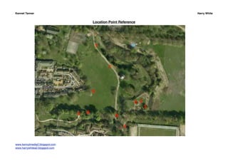
1. Kennet Tanner Harry White
Location Point Reference
www.kennytmedia2.blogspot.com
www.harrywhitea2.blogspot.com
2. Kennet Tanner Harry White
Shot List
Date Location Shot/Angle Movement Props Equipment Description Storyboard
Point Reference
PERFORMANCE SECTION - 26 AUG
26 1 Wide shot/noddy shot Static Guitar and guitar case Tripod and Camera Lewis walks into the 1, 2
Aug Eye Level frame from right to
left, sets his guitar
case down, sits on it
and plays the first 10
seconds of track.
26 1 Mid shot, Close Up, Handheld Guitar and guitar case Camera Lewis sat on his 7, 13, 15, 27,
Aug Ultra Close Up Noddy guitar case playing 29
shot the entire song
Low Angle, Eye level several times. Will
film multiple times
moving camera
(during) to film
different angles and
shot types
26 3 Mid shot, Close Up, Handheld Guitar Camera Lewis sat under the 6, 14, 16
Aug Noddy shot willow tree at location
Low Angle, Eye level point 3 playing the
entire song. Will film
multiple times
moving camera
(during) to film
different angles and
shot types.
www.kennytmedia2.blogspot.com
www.harrywhitea2.blogspot.com
3. Kennet Tanner Harry White
Date Location Shot/Angle Movement Props Equipment Description Storyboard
Point Reference
26 4 Very wide shot Static Guitar and guitar case Tripod and Camera Lewis will be sat 8
Aug playing his guitar on
a bench. We will film
from over the castle
wall.
26 7 Medium close up Handheld - Guitar Camera Lewis will perform 12, 23
Aug Eye level Walking with the the song multiple
actor times while waling
along the pathway at
location point 7. We
will be walking
backwards with the
camera facing Lewis.
26 8 Wide shot Static Guitar Tripod and Camera Lewis will be sat in a 19
Aug Eye level cove in the castle
wall playing the
song. We will film
from a fair distance
using a tripod
NARRATIVE SECTION - 29 AUG
29 2 Medium close up Handheld Wedding rings Camera Kayleigh and Tom 3
Aug will be holding hands
walking towards the
camera. We will be
filming from hand
height.
www.kennytmedia2.blogspot.com
www.harrywhitea2.blogspot.com
4. Kennet Tanner Harry White
Date Location Shot/Angle Movement Props Equipment Description Storyboard
Point Reference
29 2 Very wide shot Tracking shot Bicycle Camera, Dolly, Tripod Kayleigh and Tom 4
Aug will be holding hands
and walking and
chatting. There will
be a cyclist riding
past in the
background as we
use the dolly to
follow their
movement.
29 2 Two shot Handheld N/A Camera Kayleigh and Tom 5
Aug will be holding hands
walking towards the
camera.
29 5 Close up Handheld circling N/A Camera Kayleigh and Tom 9, 10, 11
Aug Eye level the couple kissing are kissing and the
camera movement is
circling them as they
kiss.
29 6 MId shot, Handheld circling N/A Camera Kayleigh and Tom 1,011
Aug Eye level the couple will be holding hands
and spinning around.
The camera will
circle them spinning
but in the opposite
direction.
www.kennytmedia2.blogspot.com
www.harrywhitea2.blogspot.com
5. Kennet Tanner Harry White
Date Location Shot/Angle Movement Props Equipment Description Storyboard
Point Reference
29 7 Low angle Static N/A Camera, Tripod Kayleigh and Tom 11
Aug Long shot will be holding hands
and rolling down the
hill. We will use the
tripod as low as it will
go to get a low angle
steady shot and to
show the hill.
29 6 Mid shot Tracking shot N/A Camera, Dolly, Tripod Kayleigh and Tom 17
Aug Eye level will be sat on the
bench kissing and
we will use the dolly
to add depth to the
shot.
29 6 Ultra close up Static N/A Camera, Tripod Ultra close ups on 18
Aug Kayleigh and Tom’s
lips as they kiss
29 9 Medium close up Handheld Picnic items Camera Filming upwards
Aug Low angle
www.kennytmedia2.blogspot.com
www.harrywhitea2.blogspot.com
6. Kennet Tanner Harry White
www.kennytmedia2.blogspot.com
www.harrywhitea2.blogspot.com