Segmented pie chart data driven ppt slides diagrams templates
•
0 likes•170 views

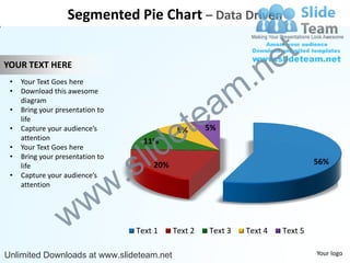
The document describes a segmented pie chart that displays data in 5 categories. The chart shows the percentage of data for each category with Text 1 representing 56% of the data, Text 2 representing 20%, Text 3 representing 11%, Text 4 representing 8% and Text 5 representing 5%. The document provides instructions on how to edit the colors and chart data for the pie chart.

Recommended
Recommended
More Related Content
Similar to Segmented pie chart data driven ppt slides diagrams templates
Similar to Segmented pie chart data driven ppt slides diagrams templates (20)
More from SlideTeam.net
More from SlideTeam.net (20)
Segmented pie chart data driven ppt slides diagrams templates
- 1. Segmented Pie Chart – Data Driven e t .n YOUR TEXT HERE m • Your Text Goes here a • Download this awesome diagram te • Bring your presentation to e life • Capture your audience’s 8% 5% id attention l 11% • Your Text Goes here s • . Bring your presentation to life 20% 56% w • Capture your audience’s attention w w Text 1 Text 2 Text 3 Text 4 Text 5 Unlimited Downloads at www.slideteam.net Your logo
- 2. Edit Color 2 3 e t 1 m .n tea id e . s l w w 1. Select the shape to change the color and Right click the object( click any object which you w want to change color) 2. Choose Format Data Series in the dialog box. 3. Choose “Fill” in the Format Shape box then “Solid” or “Gradient” depending on the appearance of the object. Change colour as shown in the picture. Unlimited Downloads at www.slideteam.net
- 3. Edit Chart 2 3 e t .n 1 a m e te s l id w . w w 1. Select the shape to edit chart and Right click the object. 2. Choose Edit Data in the dialog box. Unlimited Downloads at www.slideteam.net