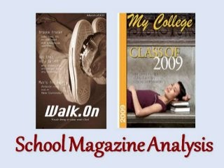
2. Walk.On
I prefer this magazine
to the other because…
It’s more informal.
This make it a lot
more relatable to the
students reading it.
Specifically, the
converses, which is
very modern and
worn by a lot of
reenagers.
More information.
It talks about love,
backstage secrets
etc. It’s not exactly
school-related
meaning it evokes a
lot more interest and
curiosity.
It’s sepia.
The different colour
makes it look quite
professional and
adds more interest.
3. My College
However, this one…
Is too formal.
The use of fonts and the
picture doesn’t connect with
the reader as it seems too
mature. Even the model
looks too old to be in sixth
form.
Isn’t as attractive.
I don’t feel like the
colours match as well
as the other magazine.
It also doesn’t go well
with the audience as it
isn’t eye-catching.
Hardly has any
information.
There’s hardly any
information in this
cover, meaning there’s
little reason why
someone would want
to read it.