
Recommended
More Related Content
Viewers also liked
Viewers also liked (20)
More from carolineyes
Remember the milk
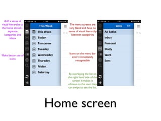
- 1. Add a sense of visual hierarchy to The menu screens are the home screen - very bland and have no separate sense of visual hierarchy categories and between categories inbox Icons on the menu bar Make better use of aren’t immediately icons recognisable By overlaying the list on the right hand side of the screen it makes it obvious to the user they can swipe to see the list. Home screen
- 2. Example searches appear complicated - would be easier to type in a ‘tag’ which is set up upon entering the task and use the search function to search certain words No search bar on search screen - have to click through Search Function
- 3. A lot of white space visible on both of these screens Informal fonts clash/not easily readable at a It is possible to add a glance task directly to the list you are viewing Can add freeform notes Less white space to the task Change the title and body fonts to Keep freeform work in synergy The orange does not notes as an signal high priority well optional thing Find a way to tick in one click Task list and details
- 4. Can add a task quickly or in detail Keep adding tasks as simple as possible with the possibility to go into more detail if wanted Reduce white space Add task
- 6. Settings