Report
Share
Recommended
Rondreis 3D in het ArcGIS-platform
Presentatie over de mogelijkheden om in 3D te werken met het gehele ArcGIS-Platform. De presentatie gaat in op 3D in 3D Analyst, CityEngine en ArcGIS Online.
29 ubiquidade de microorganismos
Este documento apresenta um experimento para pesquisar a presença de microorganismos em diversos ambientes através de culturas em placas de Petri. O experimento inclui a preparação do meio de cultura, coleta e inoculação de amostras de solo, água, ar e objetos, e observação do crescimento de colônias após 24 horas, 48 horas e 5 dias.
Codes and conventions of a short film
This document discusses key conventions of short films, including characters, twists, and situations. It provides examples of films that effectively employ these conventions. Regarding characters, short films typically focus on 2-3 main characters to develop their personalities within limited time. An example film is "Strangers" which develops binary opposite main characters. Regarding twists, most short films include a twist to maintain viewer interest and provide narrative impact. Example films are "December" with a genre twist, and "Sight" with a dark thriller twist. Regarding situations, films keep viewers engaged by developing intriguing situations, like "The Horribly Slow Murderer" and its comedic ridiculous premise.
SOLAR ENERGY
This document discusses solar radiation and angles used in calculating radiation on surfaces with different orientations. It defines terms like irradiance, irradiation, extraterrestrial radiation, and describes equations to calculate the radiation incident on horizontal, vertical, and inclined surfaces throughout the year based on location and time. An example calculation is provided to determine daylight hours using the sunset hour angle equation.
Relacion etica y ciencia
La ética y la ciencia están estrechamente relacionadas. La ciencia debe realizarse con responsabilidad y respeto por los seres humanos, y sus aplicaciones deben beneficiar a la humanidad de manera responsable. Los científicos deben asegurarse de que su trabajo se realice de forma ética y se utilice para mejorar vidas.
Flat plans
1) The document discusses four different layout designs for a tabloid newspaper mock layout.
2) The first design has the advertisement at the top and uses columns for the copy. The second places more emphasis on the large image and has a higher text to image ratio.
3) The third layout uses a more traditional design with masthead, headline and image on the right with wrapping text.
4) The fourth contemporary design pushes boundaries with a minimal caption and large centered image and advertisement.
My layouts eval
The document discusses layout design for magazine articles using InDesign. It describes using grids and margins to structure the layout and place elements correctly. Headers, drop caps, and baseline spacing are tested in different layouts to attract readers' attention and make the text appear denser. Font choices are considered in terms of masculinity/femininity and their effect on different audiences. Overall the layouts are assessed as dull due to a lack of color and complexity in the mock-ups. Further extension tasks experiment with overlapping elements and different page configurations.
Evaluation of existing factual writing
This document provides an analysis of three different informational posters or leaflets. It evaluates the design, language, and content of each document. For the first document about pet store animals, it notes the use of images and red colors to grab attention, as well as short sentences. It finds the information is one-sided against pet stores. For the diabetes poster, it analyzes the blue and white colors, bold font, and clear bullet points. It says information is accurate but biased against the disease. For the abortion poster, it discusses the use of red, white and green colors and a baby image. It finds the language formal but could be more concise. In all cases, it checks the documents against codes of practice
My layouts eval
The document discusses the author's experience creating mock layouts using InDesign. It describes using grids, margins, columns and different font styles. The author notes some limitations of the mock layouts, like a lack of color and interactivity. Goals for future iterations include making the designs more visually appealing and technically advanced. Extension tasks involve creating layouts with non-standard dimensions and overlapping text/images.
Double page spread eval
This document provides an analysis of the layout, design elements, and stylistic choices made in four magazine articles or spreads. It discusses the use of margins, columns, grids, large initial letters, page numbers, and other conventions in Q Magazine, Marc Jacobs magazine, Elle Magazine, and Cara's Magazine. The analysis focuses on design principles like organization, hierarchy, flow, and the use of images, text, and white space to engage the reader.
Should factual products contain bias
Media bias has become more prevalent as viewers increasingly rely on media to shape their opinions on political and social issues. Journalists can claim bias by saying they are sticking to a "side" and only discussing one subject rather than multiple perspectives, and some bias is obvious like only stating the good parts of an issue and one bad thing. The information consumed from media is akin to an injection that automatically sends the viewer a message about a topic.
Evaluation of existing factual writing
This document analyzes a leaflet about discouraging pet purchases from pet stores. It notes the leaflet uses images of dogs in kennels and puppies with a caption saying "puppies are dying" to make audiences feel guilty. Red and black text is used to convey seriousness. Red bullet points signal potentially distressing information. The leaflet avoids ambiguity but is biased against pet stores by only mentioning the negatives. It provides no evidence to support its arguments and does not reference sources. In summary, the document evaluates the design, language use, and factual accuracy of an advocacy leaflet discouraging pet store purchases.
Evaluation
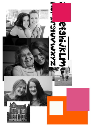
The document summarizes the student's experimental photography project. The student created collage images mixing photos of two subjects within triangular compositions. When creating the images manually, a mistake led to an unexpected but successful design. Scanning the images allowed the student to add texture and a vintage look in Photoshop. Overall, the student is pleased with the minimalist yet interesting final pieces and feels they fulfilled the assignment requirements by taking aesthetic, technical, and experimental approaches.
Evaluation
The document provides an analysis and evaluation of experimental photography work by the author. It discusses the creative process, influences, techniques, and outcomes of creating four composite photographic images. Key points include:
- The final images came out as expected or better, though with some unexpected elements that worked well. Manual creation and scanning allowed for creativity.
- Influences included artists David Hockney and John Stezaker. Styles from both were incorporated, such as collages with mixed subjects.
- Editing in Photoshop added lines, textures, and tones for aesthetic effect. Weak points may be confusion over mixed subjects, but the work fulfills the brief and experimental goals.
Evaluation
The document provides an analysis and evaluation of experimental photography work by the author. It discusses the creative process, influences, techniques, and outcomes of creating four composite photographic images. Key points include:
- The final images came out as expected or better, though with some unexpected elements that worked well.
- Influences included artists David Hockney and John Stezaker, as well as album artwork.
- Techniques included manual collage, scanning, and digital editing in Photoshop to add lines and textures.
- The work fulfills the brief of a minimum of three images and experiments with different media and techniques.
Evaluation
The document summarizes the student's final imagery project. It discusses how the student manually created collages with triangles made of smaller shapes and subjects, which were then scanned and edited digitally. The student experimented with techniques like channel mixing and adding white outlines. While some elements like the small collage pieces could be confusing, the student is overall pleased with the minimalist, vintage aesthetic achieved. Room for further improvement includes developing a stronger holographic effect and considering alternate angles. The work fulfills the assignment requirements through a variety of manual and digital media.
Planning pro forma
Steph Westerman is proposing a photo project that involves taking portraits of family members with their favorite pet incorporated into the image. She will take pictures of each pet separately and cut and tile the pet images onto the person's face and body to give the portrait a textured look. She will then alter the colors and contrast to make the images look pale and vintage. Her target audience is teenagers and young adults who would appreciate this artistic style that is similar to images seen on CD covers.
More Related Content
More from katiesteph5
Flat plans
1) The document discusses four different layout designs for a tabloid newspaper mock layout.
2) The first design has the advertisement at the top and uses columns for the copy. The second places more emphasis on the large image and has a higher text to image ratio.
3) The third layout uses a more traditional design with masthead, headline and image on the right with wrapping text.
4) The fourth contemporary design pushes boundaries with a minimal caption and large centered image and advertisement.
My layouts eval
The document discusses layout design for magazine articles using InDesign. It describes using grids and margins to structure the layout and place elements correctly. Headers, drop caps, and baseline spacing are tested in different layouts to attract readers' attention and make the text appear denser. Font choices are considered in terms of masculinity/femininity and their effect on different audiences. Overall the layouts are assessed as dull due to a lack of color and complexity in the mock-ups. Further extension tasks experiment with overlapping elements and different page configurations.
Evaluation of existing factual writing
This document provides an analysis of three different informational posters or leaflets. It evaluates the design, language, and content of each document. For the first document about pet store animals, it notes the use of images and red colors to grab attention, as well as short sentences. It finds the information is one-sided against pet stores. For the diabetes poster, it analyzes the blue and white colors, bold font, and clear bullet points. It says information is accurate but biased against the disease. For the abortion poster, it discusses the use of red, white and green colors and a baby image. It finds the language formal but could be more concise. In all cases, it checks the documents against codes of practice
My layouts eval
The document discusses the author's experience creating mock layouts using InDesign. It describes using grids, margins, columns and different font styles. The author notes some limitations of the mock layouts, like a lack of color and interactivity. Goals for future iterations include making the designs more visually appealing and technically advanced. Extension tasks involve creating layouts with non-standard dimensions and overlapping text/images.
Double page spread eval
This document provides an analysis of the layout, design elements, and stylistic choices made in four magazine articles or spreads. It discusses the use of margins, columns, grids, large initial letters, page numbers, and other conventions in Q Magazine, Marc Jacobs magazine, Elle Magazine, and Cara's Magazine. The analysis focuses on design principles like organization, hierarchy, flow, and the use of images, text, and white space to engage the reader.
Should factual products contain bias
Media bias has become more prevalent as viewers increasingly rely on media to shape their opinions on political and social issues. Journalists can claim bias by saying they are sticking to a "side" and only discussing one subject rather than multiple perspectives, and some bias is obvious like only stating the good parts of an issue and one bad thing. The information consumed from media is akin to an injection that automatically sends the viewer a message about a topic.
Evaluation of existing factual writing
This document analyzes a leaflet about discouraging pet purchases from pet stores. It notes the leaflet uses images of dogs in kennels and puppies with a caption saying "puppies are dying" to make audiences feel guilty. Red and black text is used to convey seriousness. Red bullet points signal potentially distressing information. The leaflet avoids ambiguity but is biased against pet stores by only mentioning the negatives. It provides no evidence to support its arguments and does not reference sources. In summary, the document evaluates the design, language use, and factual accuracy of an advocacy leaflet discouraging pet store purchases.
Evaluation
The document summarizes the student's experimental photography project. The student created collage images mixing photos of two subjects within triangular compositions. When creating the images manually, a mistake led to an unexpected but successful design. Scanning the images allowed the student to add texture and a vintage look in Photoshop. Overall, the student is pleased with the minimalist yet interesting final pieces and feels they fulfilled the assignment requirements by taking aesthetic, technical, and experimental approaches.
Evaluation
The document provides an analysis and evaluation of experimental photography work by the author. It discusses the creative process, influences, techniques, and outcomes of creating four composite photographic images. Key points include:
- The final images came out as expected or better, though with some unexpected elements that worked well. Manual creation and scanning allowed for creativity.
- Influences included artists David Hockney and John Stezaker. Styles from both were incorporated, such as collages with mixed subjects.
- Editing in Photoshop added lines, textures, and tones for aesthetic effect. Weak points may be confusion over mixed subjects, but the work fulfills the brief and experimental goals.
Evaluation
The document provides an analysis and evaluation of experimental photography work by the author. It discusses the creative process, influences, techniques, and outcomes of creating four composite photographic images. Key points include:
- The final images came out as expected or better, though with some unexpected elements that worked well.
- Influences included artists David Hockney and John Stezaker, as well as album artwork.
- Techniques included manual collage, scanning, and digital editing in Photoshop to add lines and textures.
- The work fulfills the brief of a minimum of three images and experiments with different media and techniques.
Evaluation
The document summarizes the student's final imagery project. It discusses how the student manually created collages with triangles made of smaller shapes and subjects, which were then scanned and edited digitally. The student experimented with techniques like channel mixing and adding white outlines. While some elements like the small collage pieces could be confusing, the student is overall pleased with the minimalist, vintage aesthetic achieved. Room for further improvement includes developing a stronger holographic effect and considering alternate angles. The work fulfills the assignment requirements through a variety of manual and digital media.
Planning pro forma
Steph Westerman is proposing a photo project that involves taking portraits of family members with their favorite pet incorporated into the image. She will take pictures of each pet separately and cut and tile the pet images onto the person's face and body to give the portrait a textured look. She will then alter the colors and contrast to make the images look pale and vintage. Her target audience is teenagers and young adults who would appreciate this artistic style that is similar to images seen on CD covers.