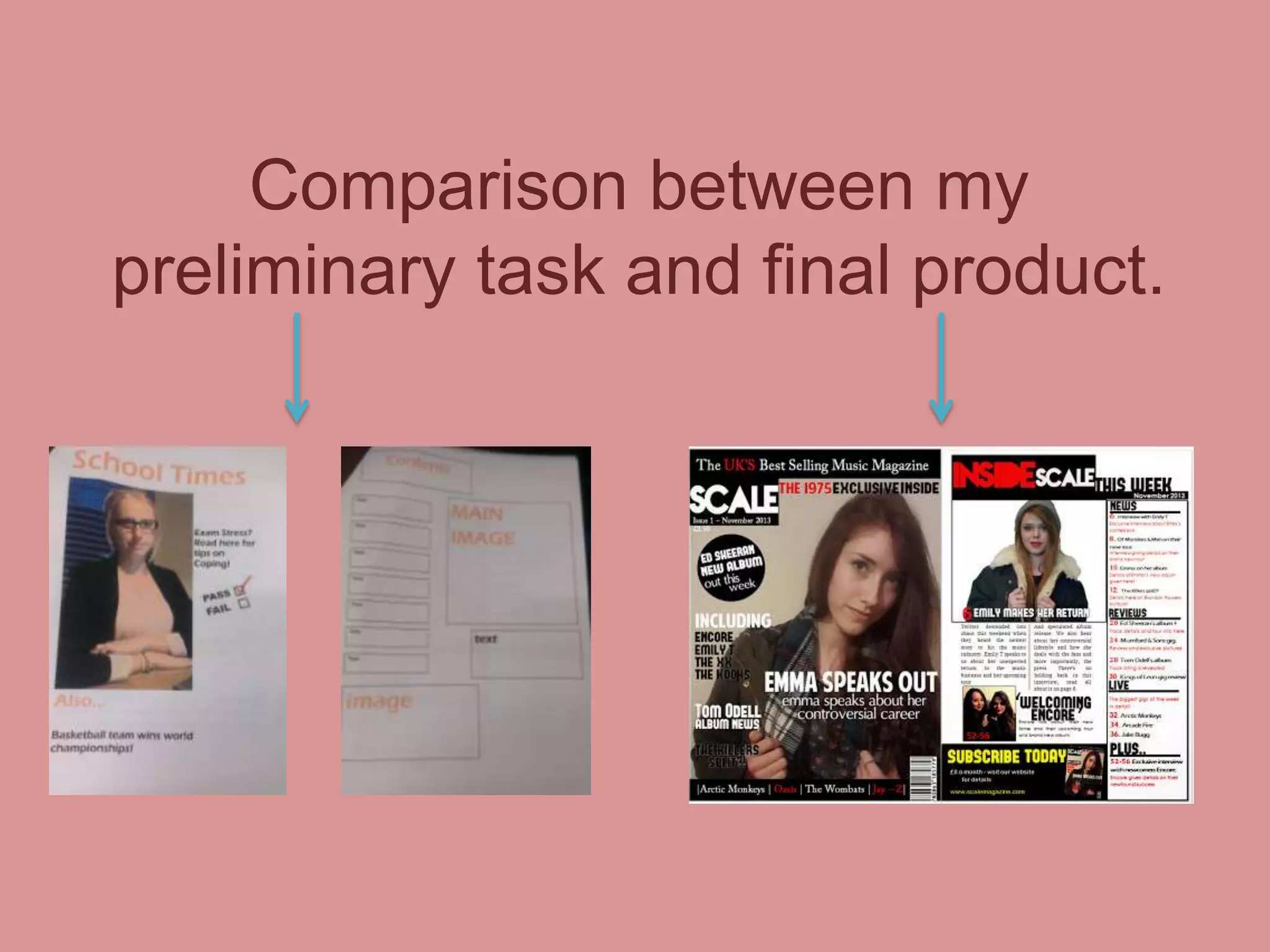
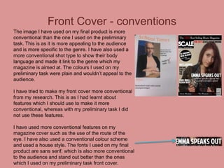
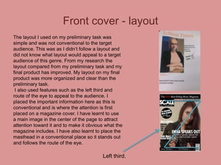
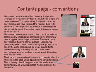
The document compares the conventions used in the preliminary and final versions of magazine covers and contents pages created by the author. For the final versions, the author used more conventional images, layouts, fonts, and colors that would appeal better to the target audience based on research. The front covers and contents pages in the final version follow conventions like using the left third and route of eye for important information, and have clearer and better organized layouts compared to the preliminary versions.