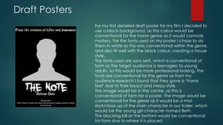
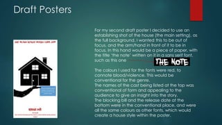
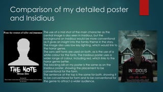
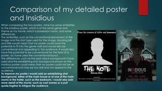
The document discusses the student's process for creating draft posters and a magazine cover for their horror film project. For the posters, they considered conventions related to genre (horror) and form (poster design). Key elements included font style, image placement, and use of color. Compared to the Insidious poster, the student's designs demonstrated some effective conventions but could be improved with additional details or an establishing shot background. The magazine cover also incorporated genre and form conventions, but its long shot image and limited colors made it less conventional than the Insidious example.