Download to read offline
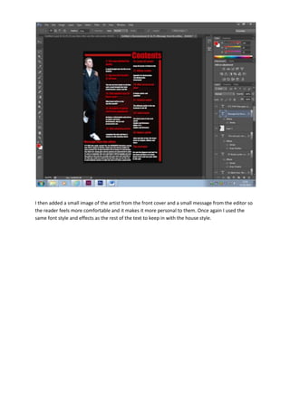
The document discusses adding a small image of the artist from the front cover and a small message from the editor to make the reader feel more comfortable and personal. The same font style and effects were used to keep the text consistent with the overall style of the publication.


