Downloaded 120 times
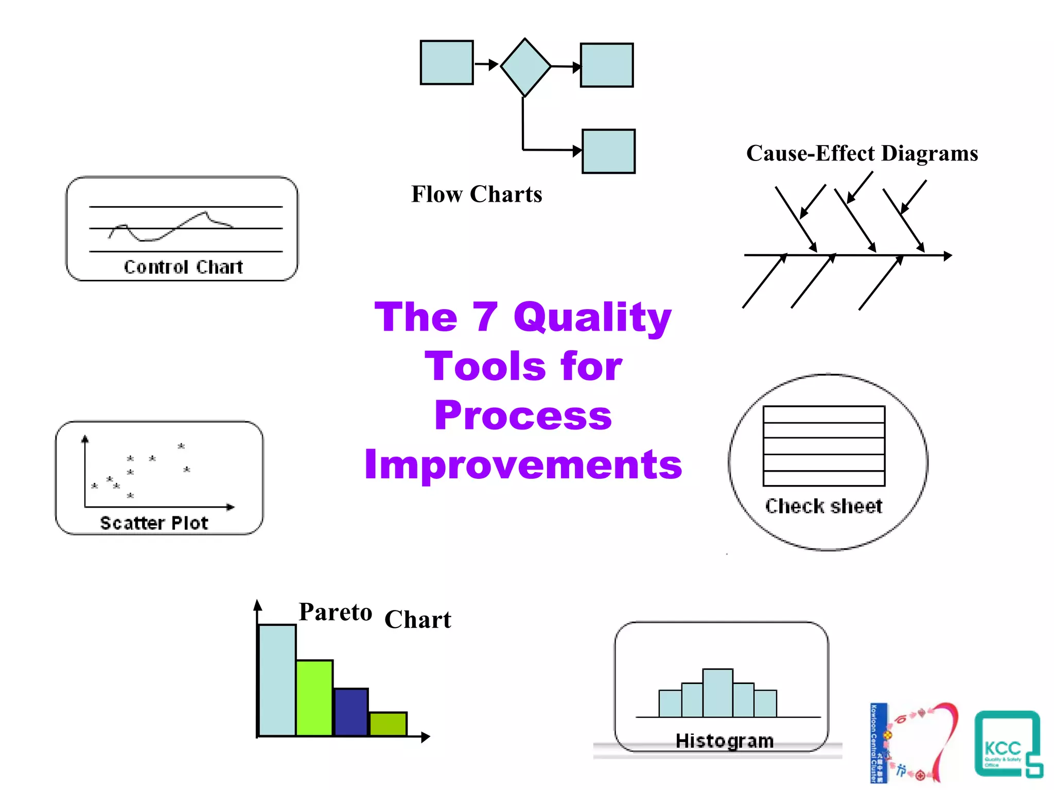
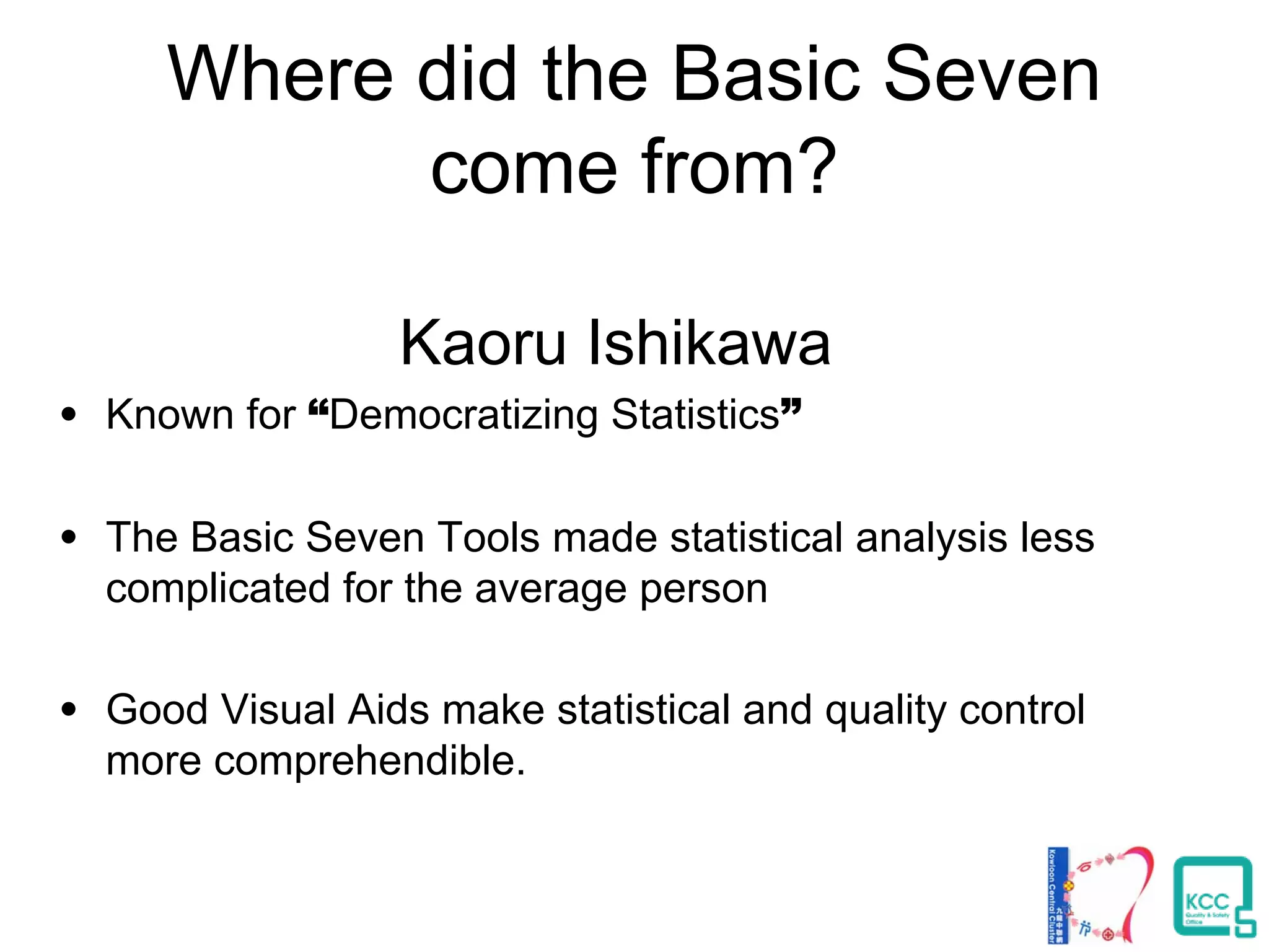
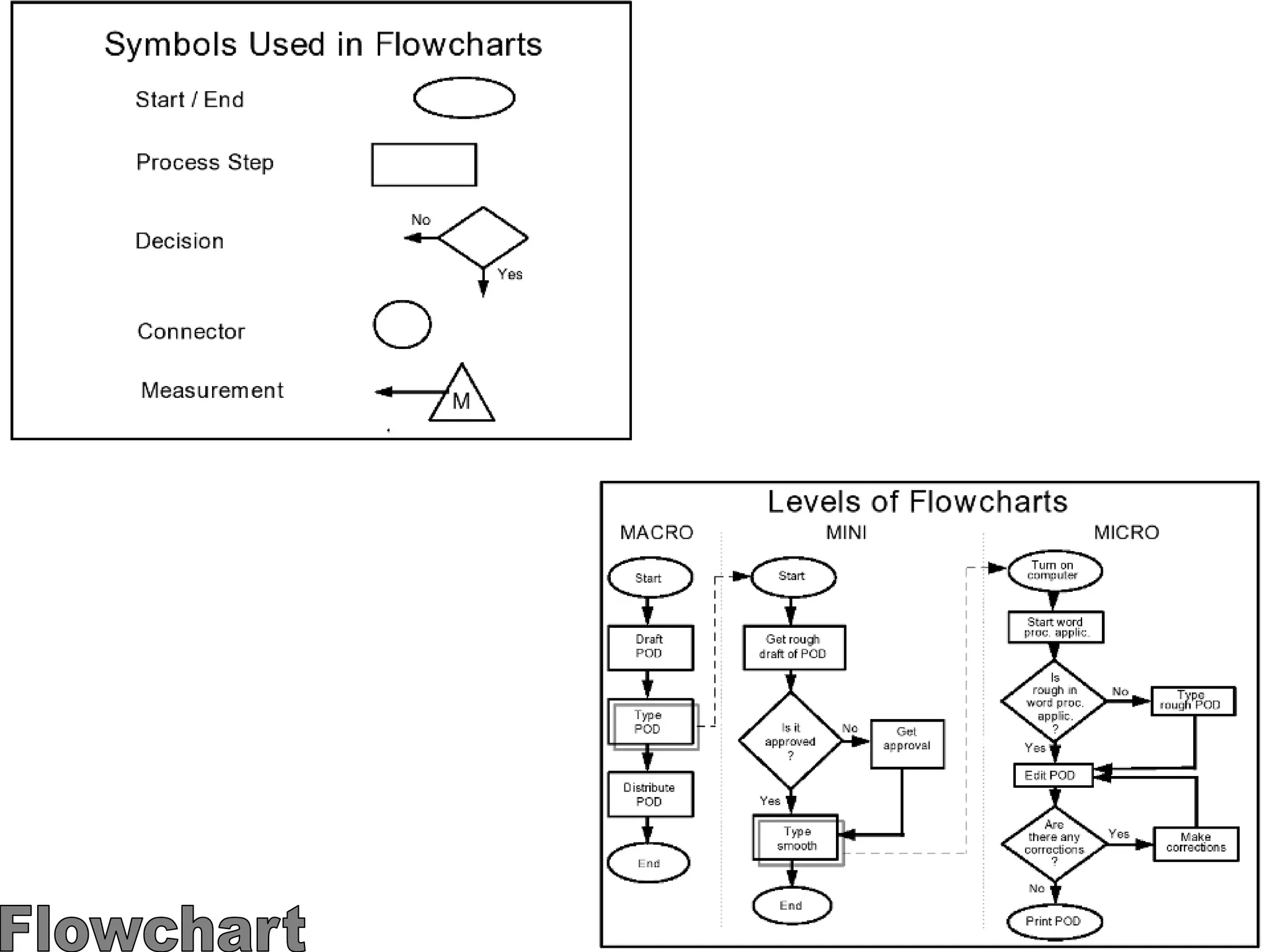
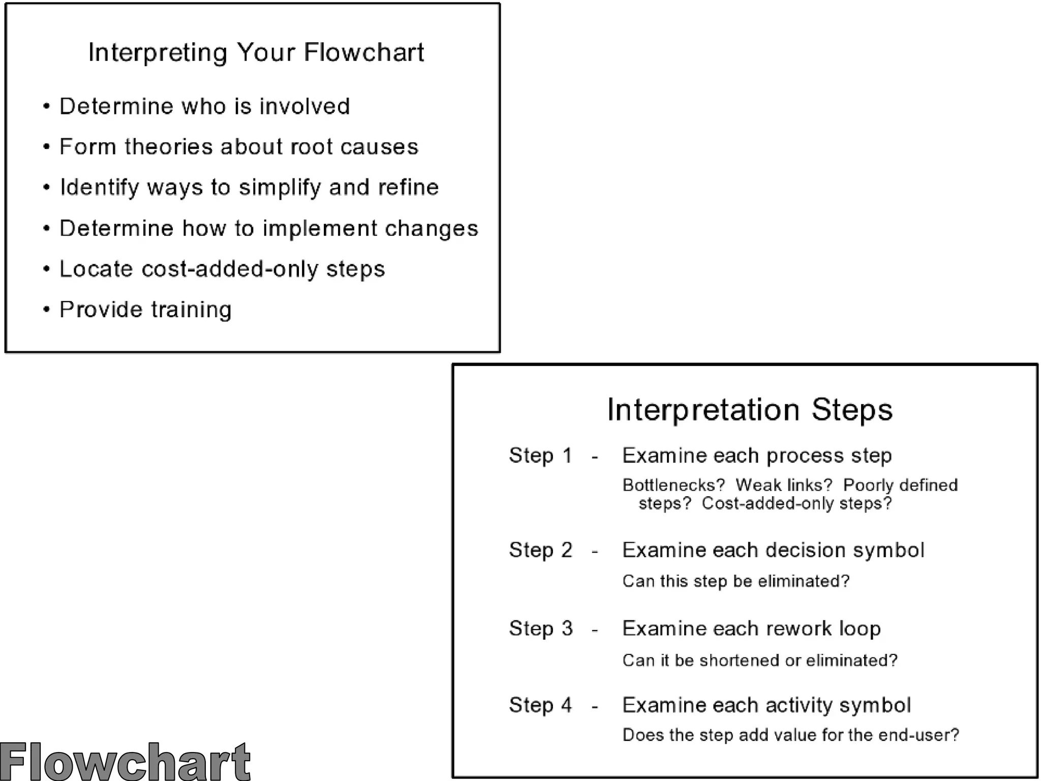
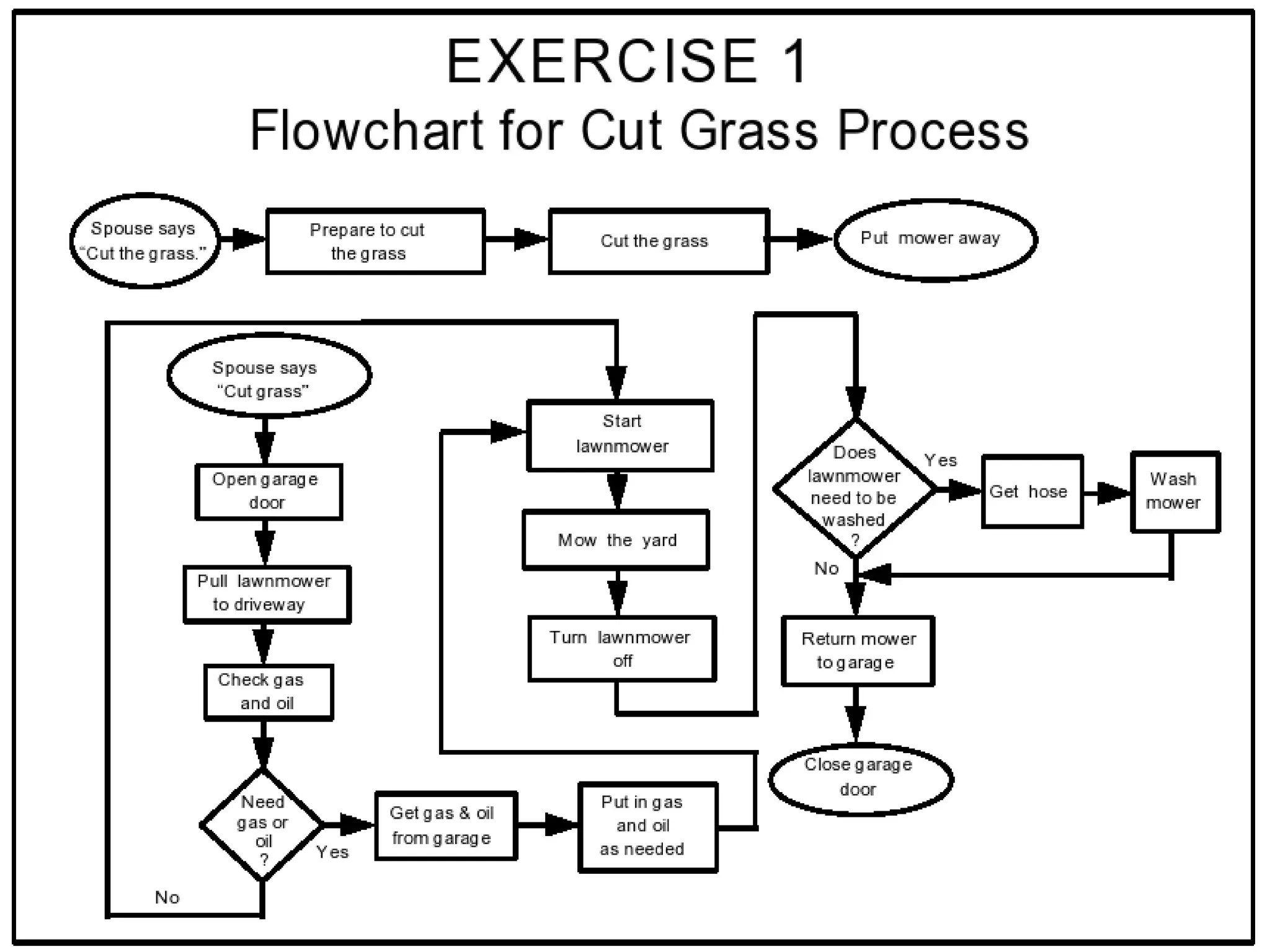
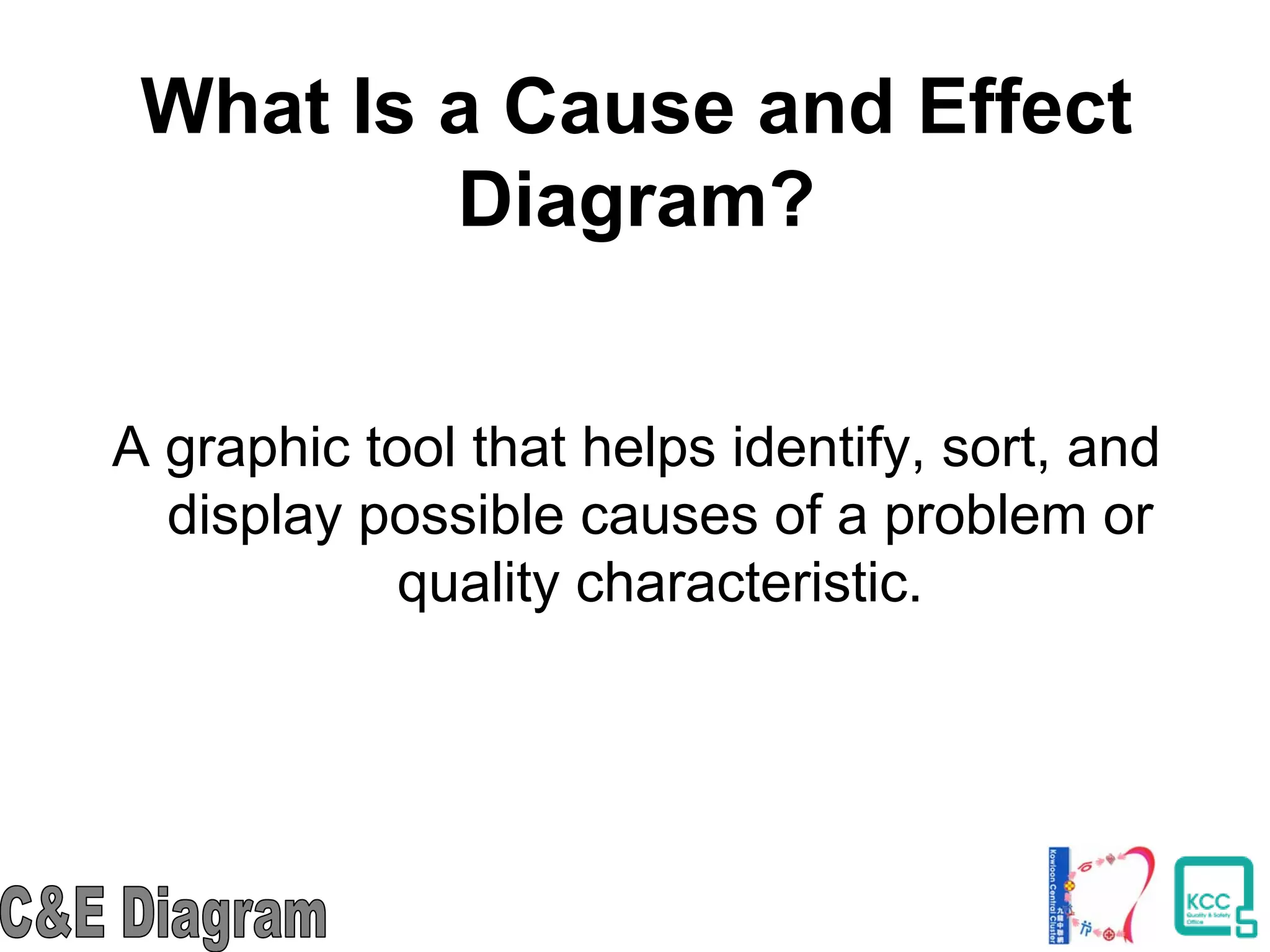
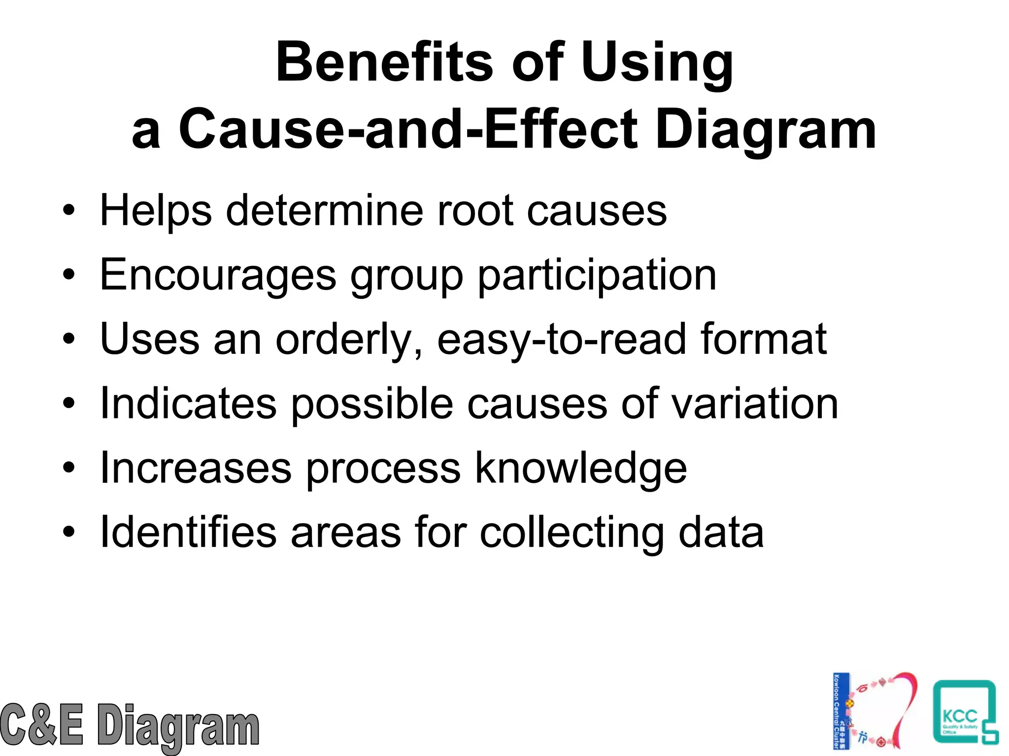
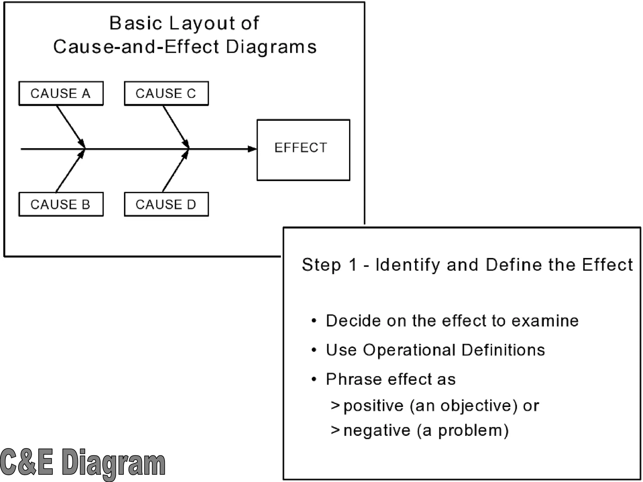
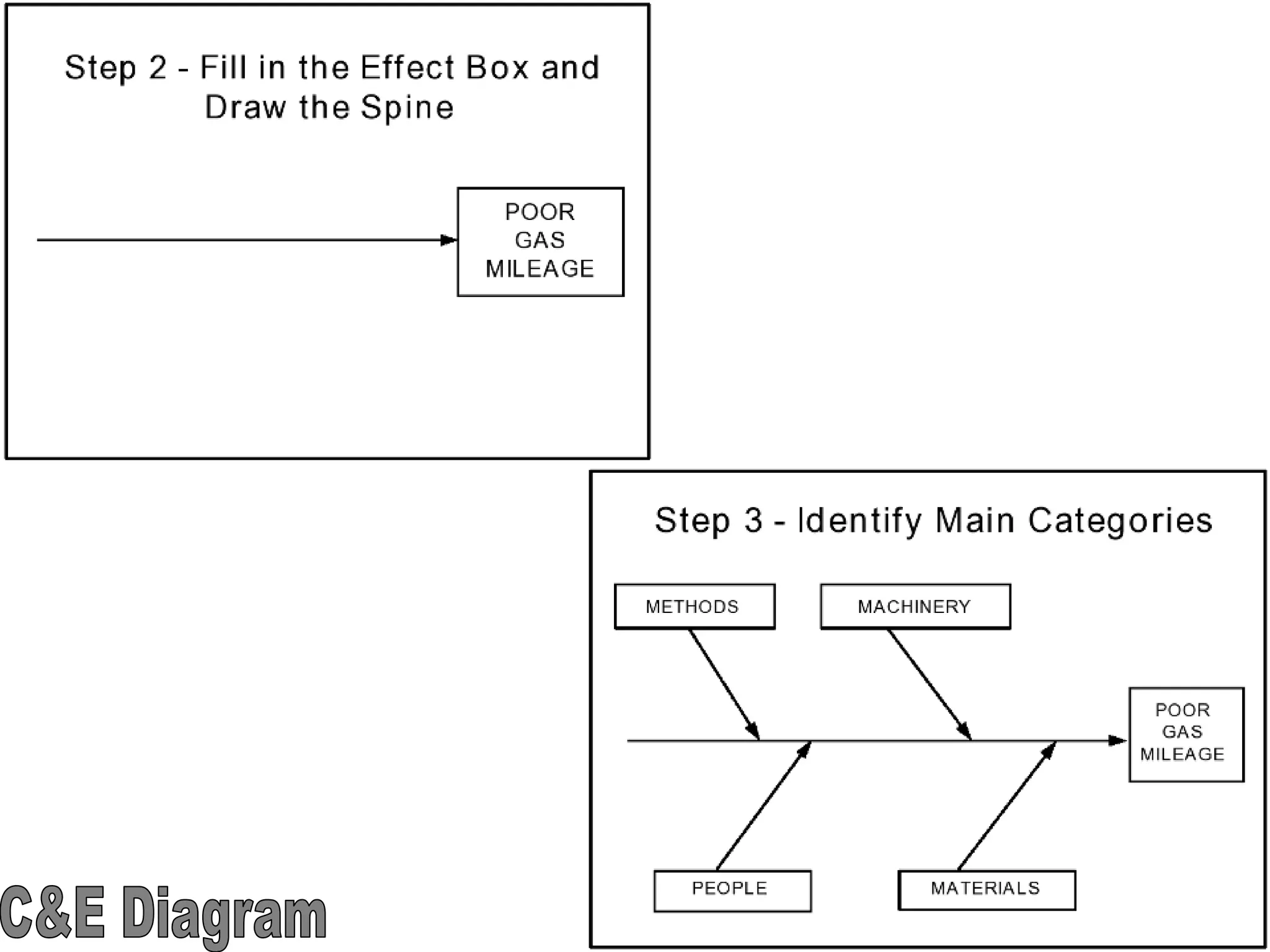
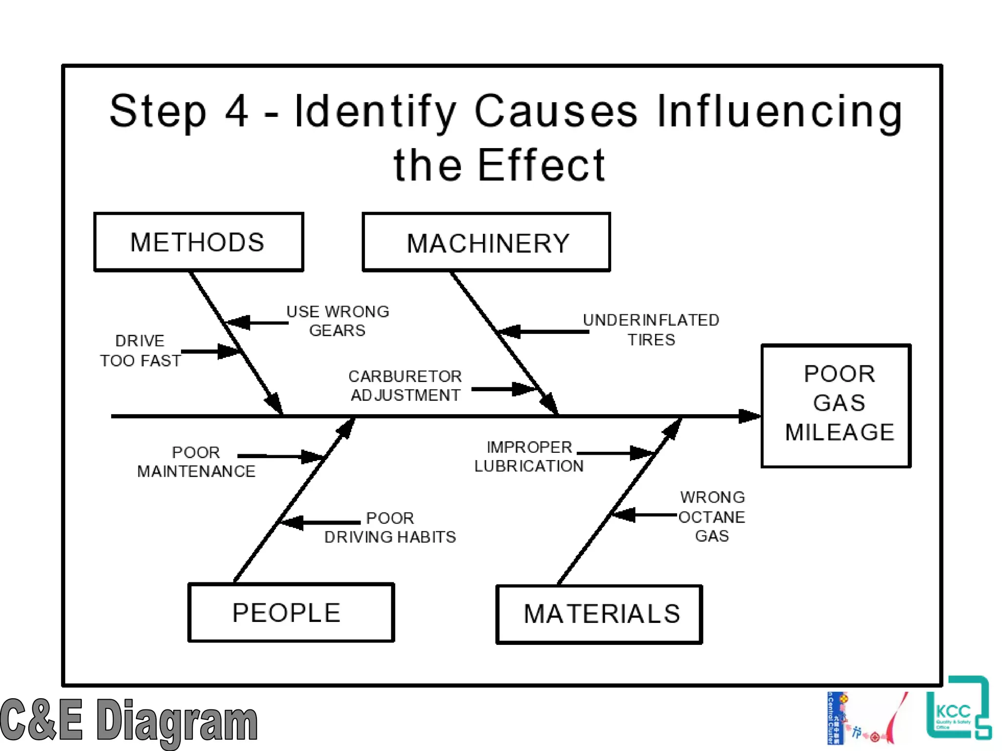
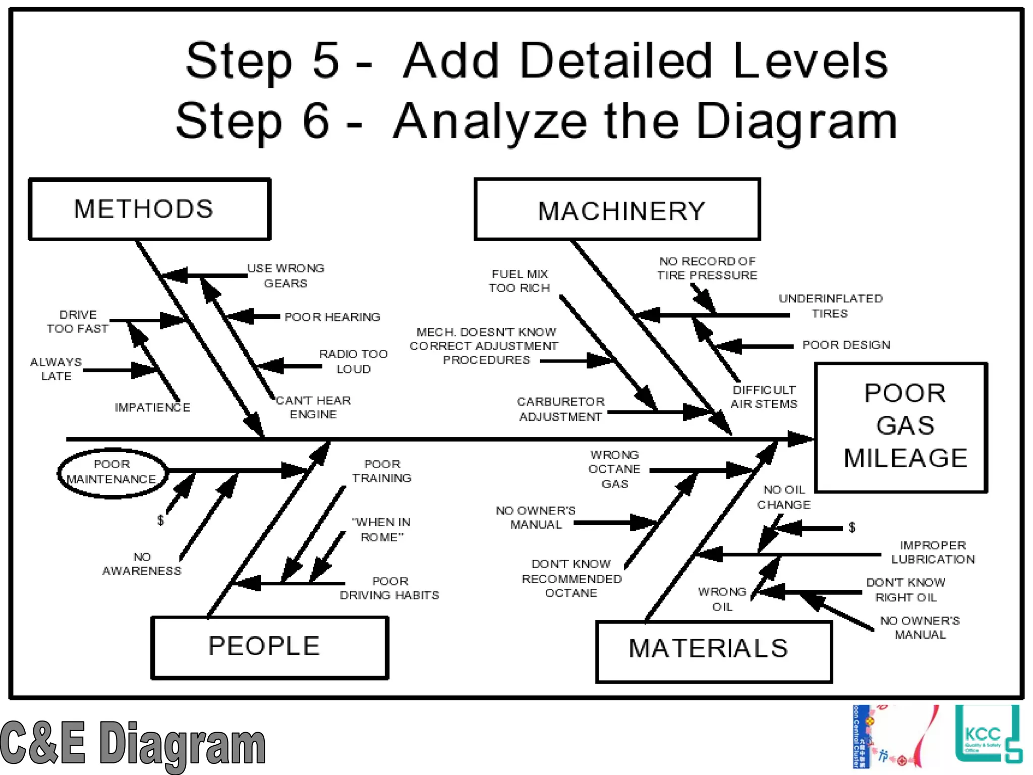
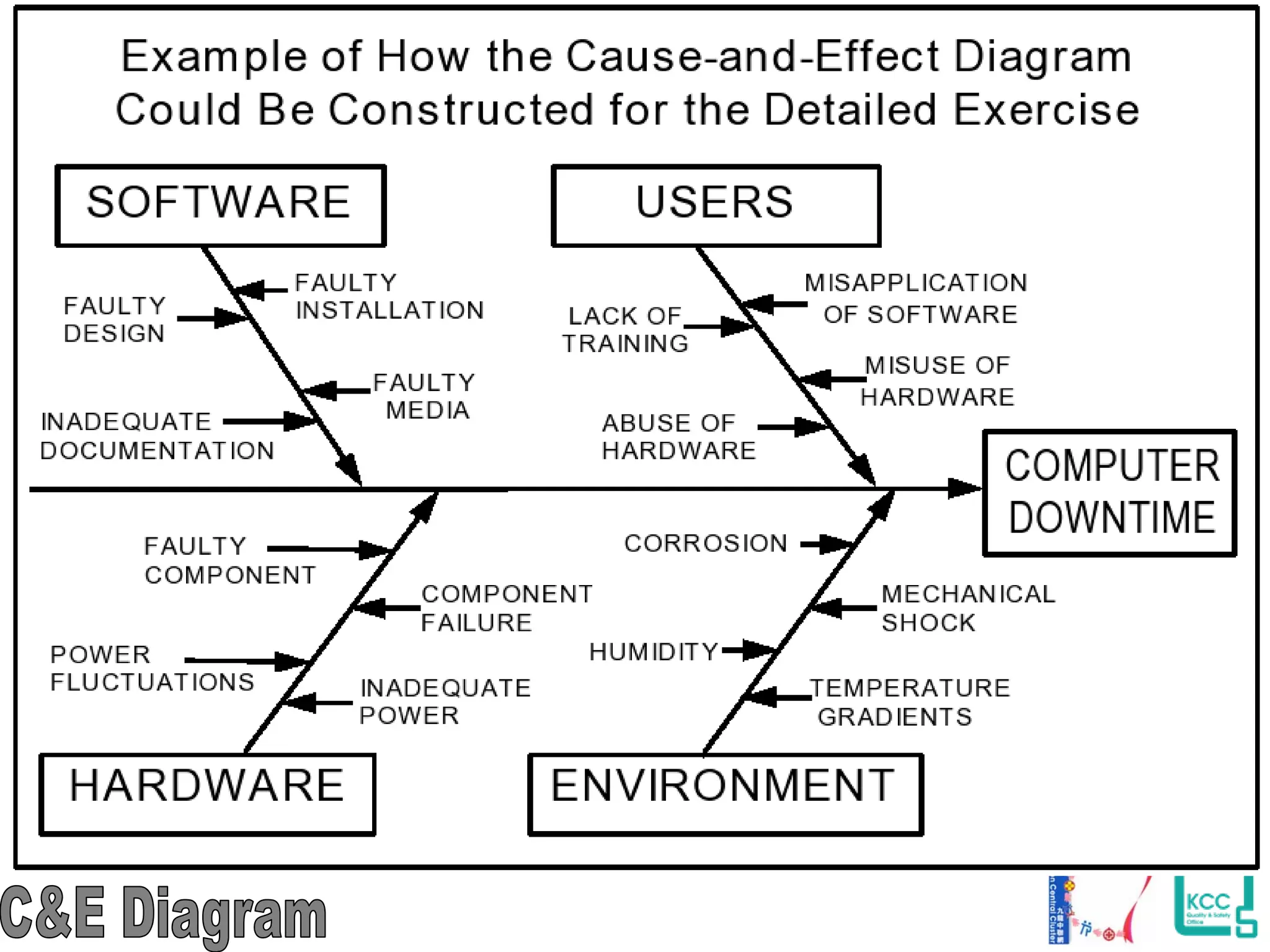
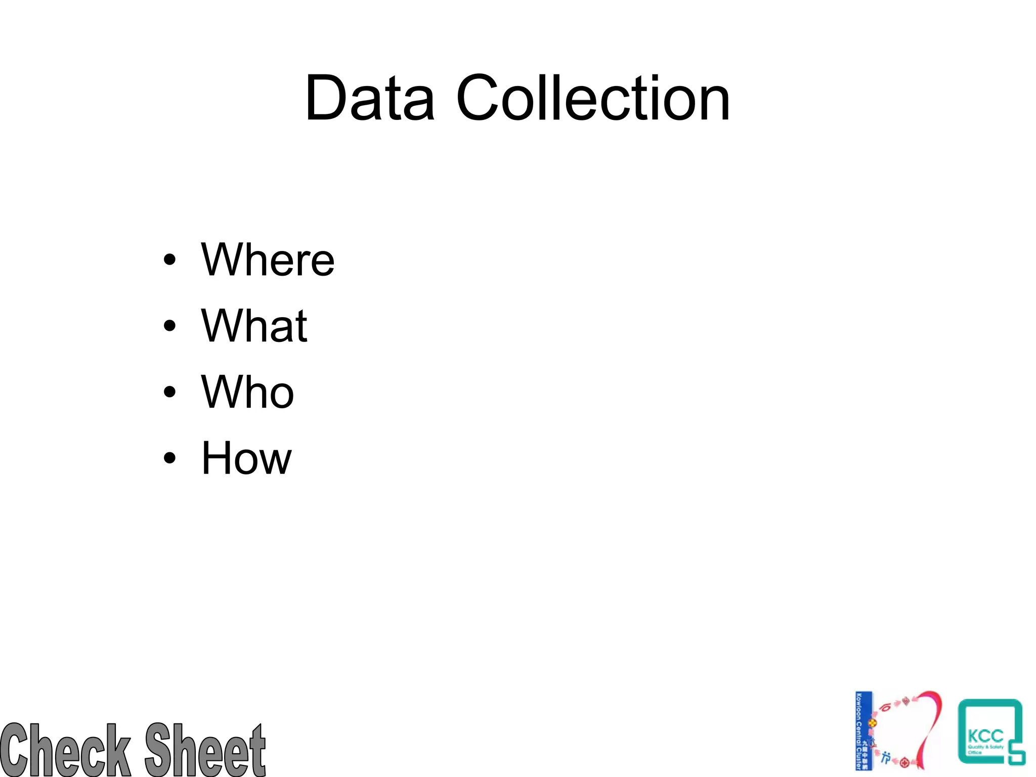
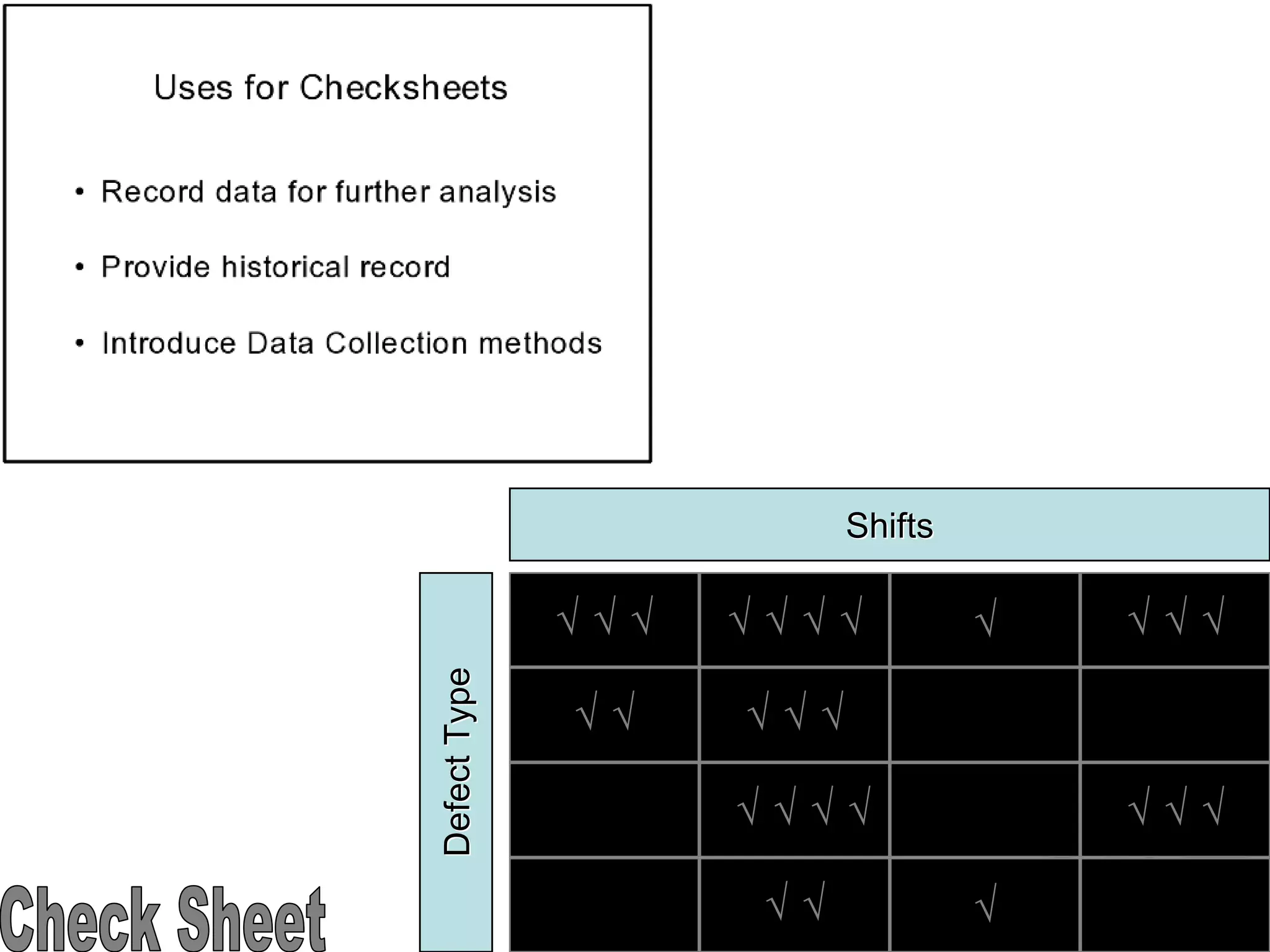
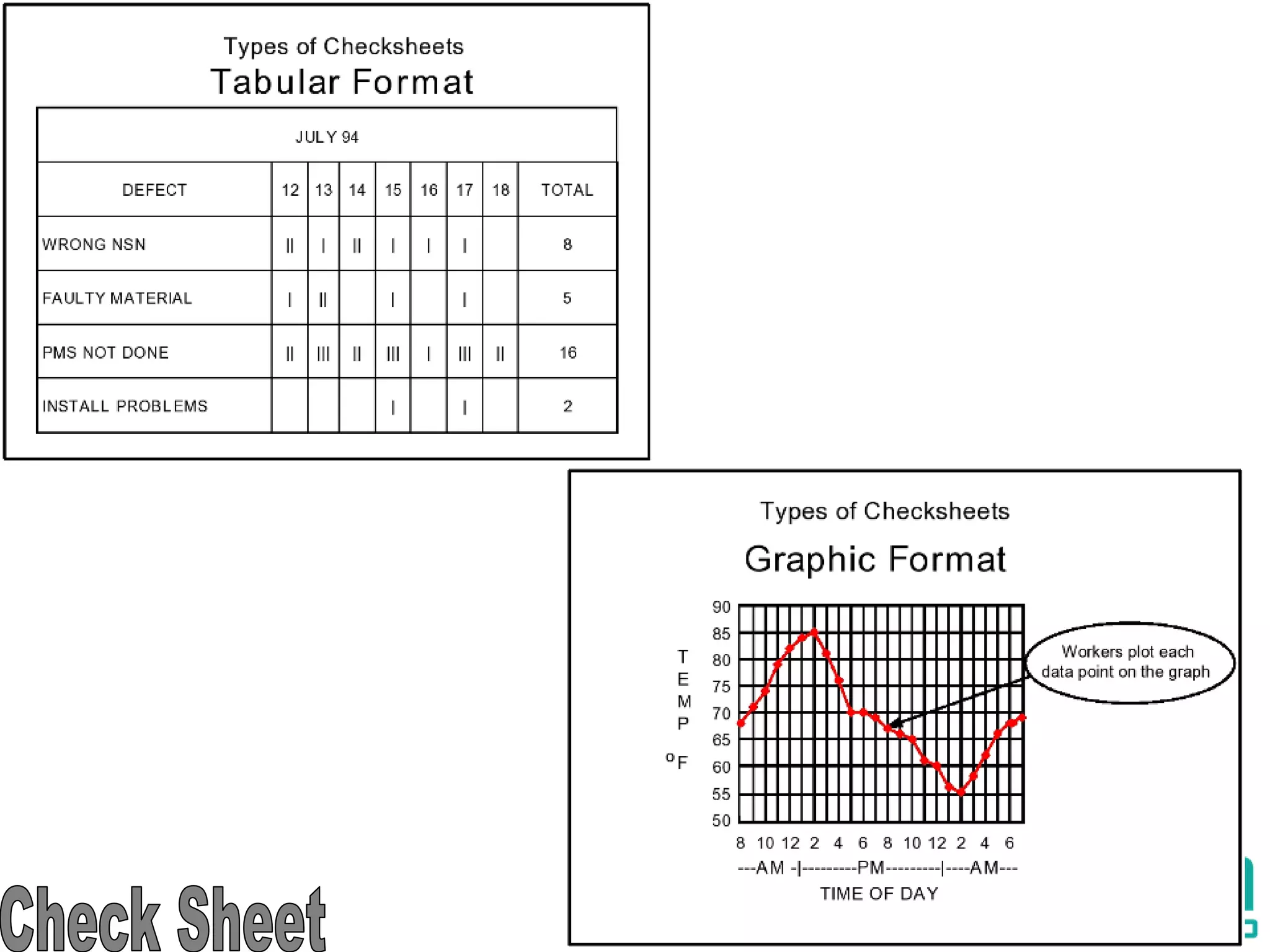
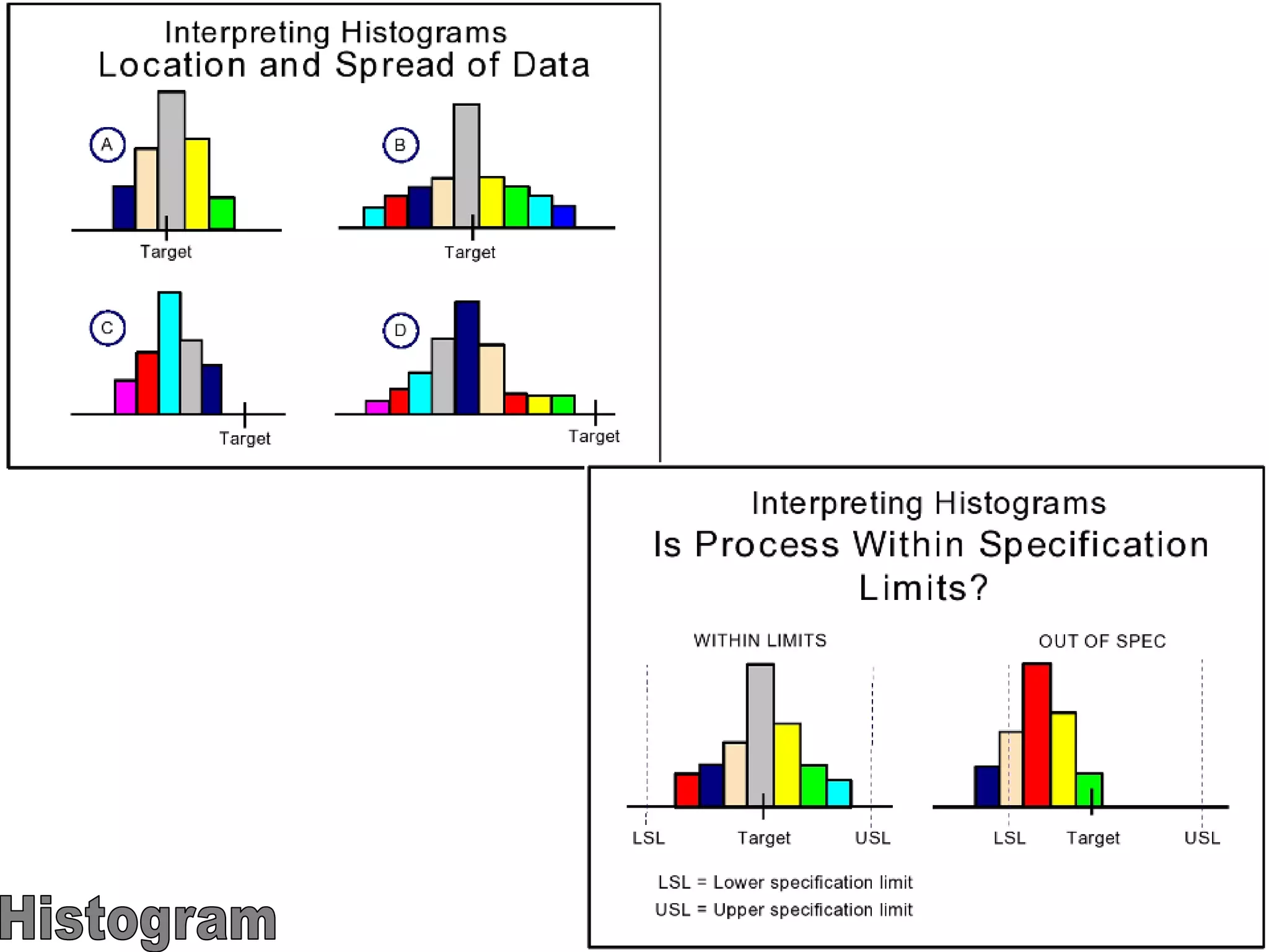
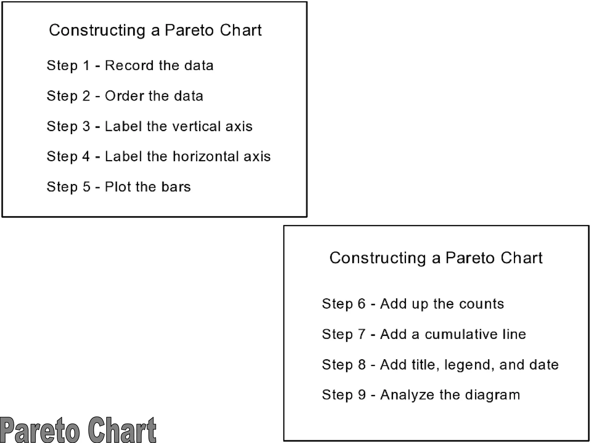
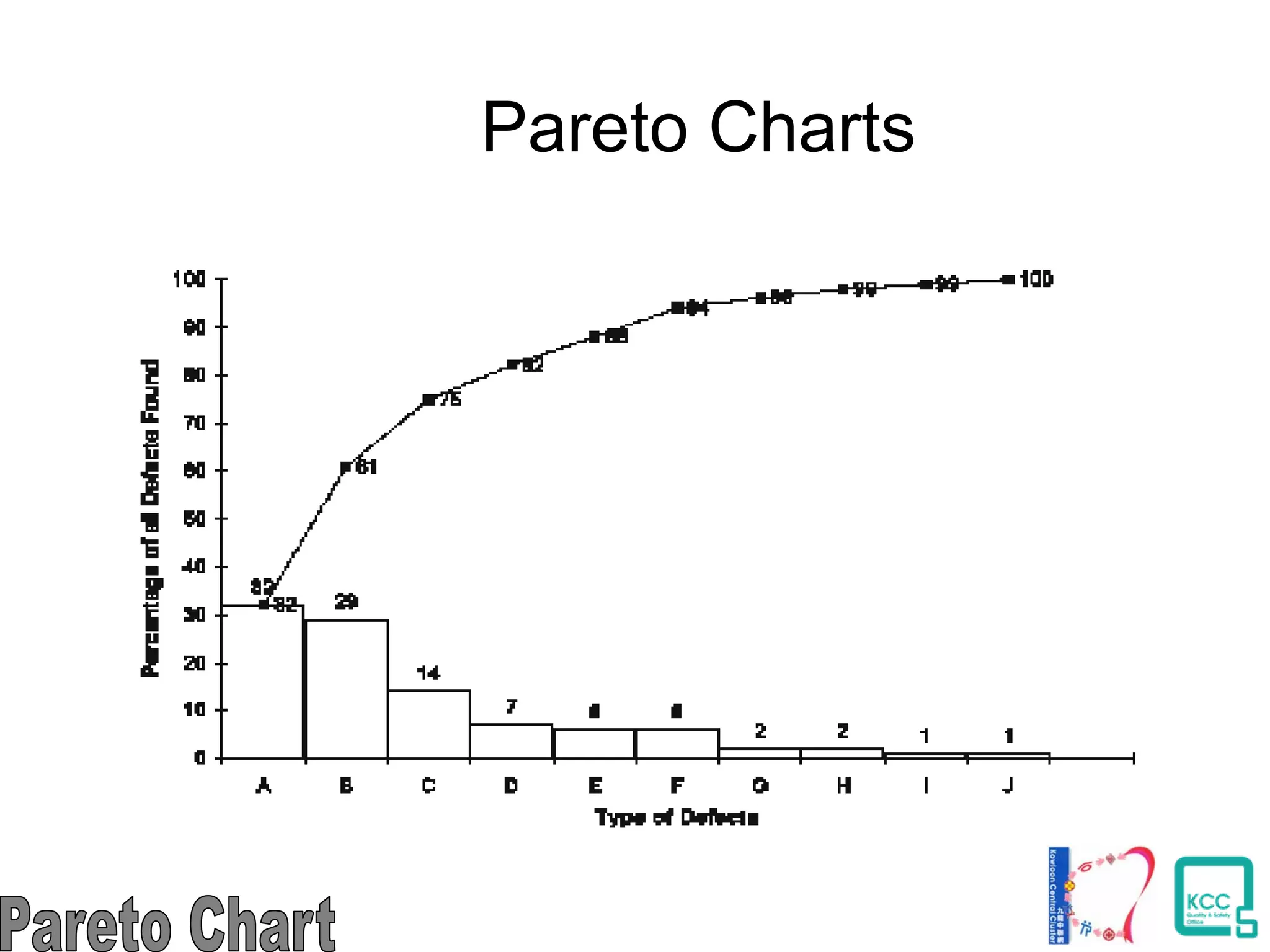
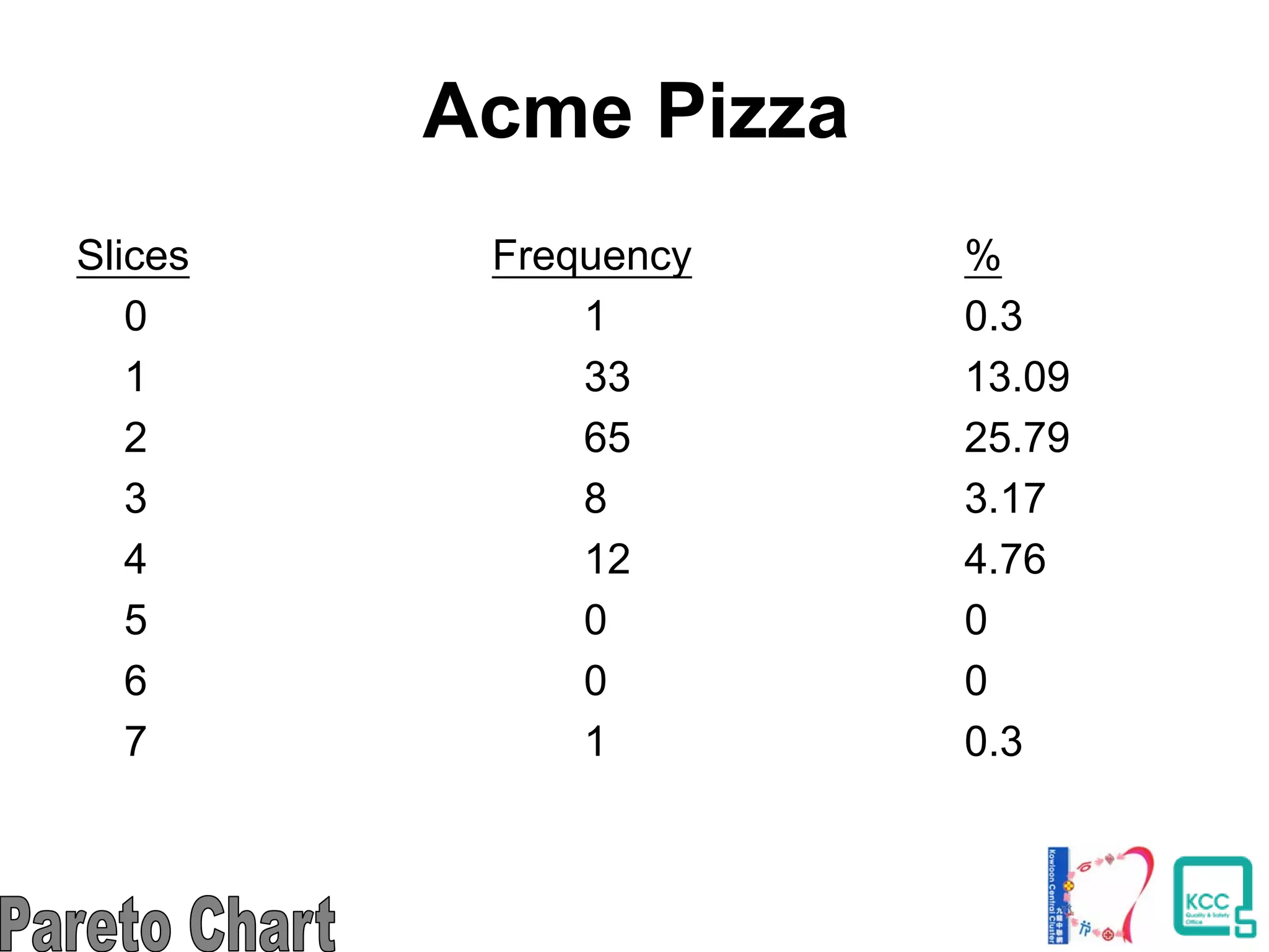
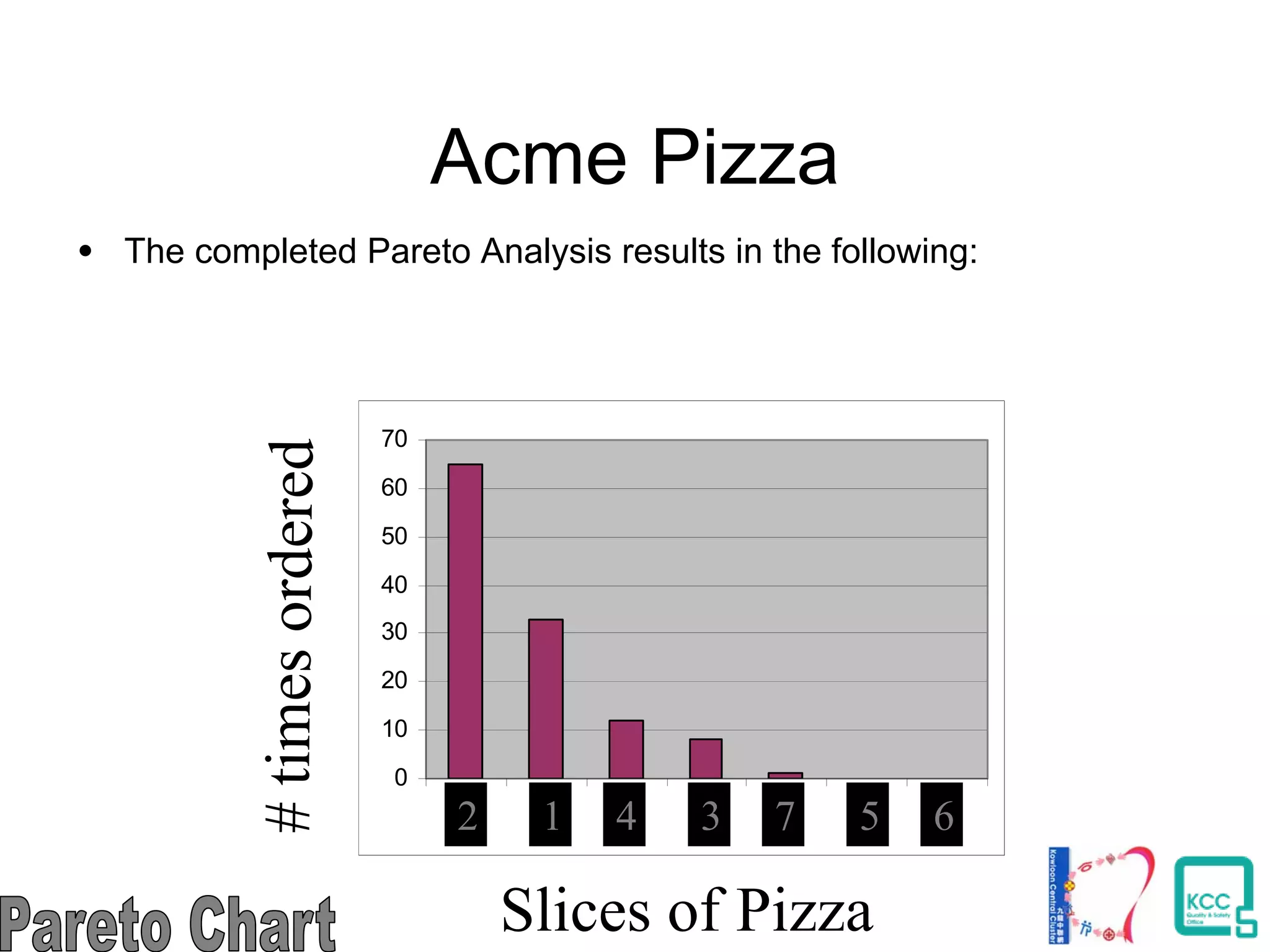

The document discusses the 7 quality tools including flow charts, cause-and-effect diagrams, and Pareto charts. It explains that Kaoru Ishikawa developed the basic 7 tools to make statistical analysis more accessible. Flow charts map out process steps to identify problems and improvements. Cause-and-effect diagrams help determine root causes of issues through a graphical format. Pareto charts follow the 80/20 rule to identify the most important causes of problems based on frequency data. The tools provide visual aids to improve understanding of processes and identify areas for data collection and enhancements.


![7 qc tools[1] to print](https://cdn.slidesharecdn.com/ss_thumbnails/7qctools1toprint-191017092858-thumbnail.jpg?width=640&height=640&fit=bounds)