The document discusses how newspapers tend to report more negative news stories than positive ones. It analyzes the front pages of three local newspapers and finds that the majority of stories on each were negative. Examples given include stories about criminal acts like a hammer attack and rapists being jailed. Only one positive story was identified, about a royal couple visiting one of the towns. The document concludes that local newspapers demonstrate a clear preference for negative news over positive news in what they choose to feature prominently.
The magazine aims to represent 16-25 year olds interested in indie and rock music. It uses conventions from real magazines like NME, such as featuring artists on the cover, but also challenges conventions by using original photography. The target audience would enjoy reading about music festivals, fashion, and new artists. The magazine would be distributed by IPC Media and sold in stores like WHSmith, HMV, and corner shops to be convenient for its target audience.
The majority of people surveyed preferred pop music, but the magazine will focus on indie music as it was the second most popular genre and easiest to feature in photographs. Respondents said the front cover and featured artists would influence them to buy the magazine. They wanted the magazine to advertise its content prominently and include upcoming festival information and artist interviews. Most did not think free gifts would increase music magazine purchases since cosmetic items usually given do not relate well to music.
The document describes a student's music magazine media product. The student used conventions from real music magazines like NME, including featuring an artist on the front cover. However, the student also challenged some conventions by using their own photography on the cover to make it seem more realistic. The target audience is described as males and females aged 16-25 interested in rock and indie music. The student believes IPC Media would be a suitable distributor as they already distribute magazines like NME. The student learned various technologies through creating the magazine, including Photoshop, Fireworks, and how to edit images. They reflect that their skills have progressed from the preliminary task to the full magazine product.
The magazine uses conventions from real music magazines like NME, such as featuring artists on the cover and including articles about new musical talent. However, it also challenges some conventions by using original photography on the cover and not including freebies. The magazine represents social groups like college students and young workers aged 16-25 by using models in that age range and portraying an "indie" style that stands out from other magazines through its unique presentation and variety of rock/indie artists featured.
The document provides an analysis of a magazine cover and article about John Lennon. It notes that the large image of Lennon combined with the dramatic title and minimal text makes for an eye-catching cover. The use of red text and black and white imagery creates a somber mood fitting for the 30th anniversary of Lennon's death. Within the article, close-up images of Lennon in black and white further connect him to the past and the magazine's tone.
Most people buy magazines on a monthly basis due to magazines typically being published monthly rather than weekly. A survey found that images are the main focus of music magazine covers, followed by color and font, and that having a celebrity on the cover increases the likelihood that students will read the magazine. While 60% of students surveyed read music magazines, 15% said a celebrity would not impact their decision to buy an issue, showing that some consumers focus on content over celebrities.
The document provides an analysis of the layout, design elements, and stylistic choices used in various magazine articles and issues. Key elements highlighted include the use of bold fonts, large images, and minimal text to draw attention to articles. Color choices and photographic styles are also discussed in the context of conveying different tones and meanings that relate to the topics covered.
The document provides an analysis of the layout, design elements, and stylistic choices used in various magazine articles and issues. Key elements highlighted include the use of bold fonts, large images, and minimal text to draw attention to articles. Color choices and photographic styles are also discussed in conveying different tones and meanings that relate to the topics covered.
The document provides an analysis of the layout, design elements, and stylistic choices used in various magazine articles and issues. Key elements highlighted include the use of bold fonts, large images, and minimal text to draw attention to articles. Color choices and photographic styles are also discussed in the context of conveying different tones and meanings that relate to the topics covered.
Odia New Web Series at your fingerprint.mikedanoffice
Stay ahead of the curve with the latest in Odia entertainment! Our Odia new web series promise an exciting blend of fresh narratives, talented performances, and engaging plots. Immerse yourself in the evolving world of Odia storytelling with our curated selection of cutting-edge web content. for more visit: https://aaonxt.com/series
Leonardo DiCaprio House: A Journey Through His Extravagant Real Estate Portfoliogreendigital
Introduction
Leonardo DiCaprio, A name synonymous with Hollywood excellence. is not only known for his stellar acting career but also for his impressive real estate investments. The "Leonardo DiCaprio house" is a topic that piques the interest of many. as the Oscar-winning actor has amassed a diverse portfolio of luxurious properties. DiCaprio's homes reflect his varied tastes and commitment to sustainability. from retreats to historic mansions. This article will delve into the fascinating world of Leonardo DiCaprio's real estate. Exploring the details of his most notable residences. and the unique aspects that make them stand out.
Follow us on: Pinterest
Leonardo DiCaprio House: Malibu Beachfront Retreat
A Prime Location
His Malibu beachfront house is one of the most famous properties in Leonardo DiCaprio's real estate portfolio. Situated in the exclusive Carbon Beach. also known as "Billionaire's Beach," this property boasts stunning ocean views and private beach access. The "Leonardo DiCaprio house" in Malibu is a testament to the actor's love for the sea and his penchant for luxurious living.
Architectural Highlights
The Malibu house features a modern design with clean lines, large windows. and open spaces blending indoor and outdoor living. The expansive deck and patio areas provide ample space for entertaining guests or enjoying a quiet sunset. The house has state-of-the-art amenities. including a gourmet kitchen, a home theatre, and many guest suites.
Sustainable Features
Leonardo DiCaprio is a well-known environmental activist. whose Malibu house reflects his commitment to sustainability. The property incorporates solar panels, energy-efficient appliances, and sustainable building materials. The landscaping around the house is also designed to be water-efficient. featuring drought-resistant plants and intelligent irrigation systems.
Leonardo DiCaprio House: Hollywood Hills Hideaway
Privacy and Seclusion
Another remarkable property in Leonardo DiCaprio's collection is his Hollywood Hills house. This secluded retreat offers privacy and tranquility. making it an ideal escape from the hustle and bustle of Los Angeles. The "Leonardo DiCaprio house" in Hollywood Hills nestled among lush greenery. and offers panoramic views of the city and surrounding landscapes.
Design and Amenities
The Hollywood Hills house is a mid-century modern gem characterized by its sleek design and floor-to-ceiling windows. The open-concept living space is perfect for entertaining. while the cozy bedrooms provide a comfortable retreat. The property also features a swimming pool, and outdoor dining area. and a spacious deck that overlooks the cityscape.
Environmental Initiatives
The Hollywood Hills house incorporates several green features that are in line with DiCaprio's environmental values. The home has solar panels, energy-efficient lighting, and a rainwater harvesting system. Additionally, the landscaping designed to support local wildlife and promote
Sara Saffari: Turning Underweight into Fitness Success at 23get joys
Uncover the remarkable journey of Sara Saffari, whose transformation from underweight struggles to being recognized as a fitness icon at 23 underscores the importance of perseverance, discipline, and embracing a healthy lifestyle.
The Evolution of the Leonardo DiCaprio Haircut: A Journey Through Style and C...greendigital
Leonardo DiCaprio, a name synonymous with Hollywood stardom and acting excellence. has captivated audiences for decades with his talent and charisma. But, the Leonardo DiCaprio haircut is one aspect of his public persona that has garnered attention. From his early days as a teenage heartthrob to his current status as a seasoned actor and environmental activist. DiCaprio's hairstyles have evolved. reflecting both his personal growth and the changing trends in fashion. This article delves into the many phases of the Leonardo DiCaprio haircut. exploring its significance and impact on pop culture.
The Future of Independent Filmmaking Trends and Job OpportunitiesLetsFAME
The landscape of independent filmmaking is evolving at an unprecedented pace. Technological advancements, changing consumer preferences, and new distribution models are reshaping the industry, creating new opportunities and challenges for filmmakers and film industry jobs. This article explores the future of independent filmmaking, highlighting key trends and emerging job opportunities.
Leonardo DiCaprio Super Bowl: Hollywood Meets America’s Favorite Gamegreendigital
Introduction
Leonardo DiCaprio is synonymous with Hollywood stardom and acclaimed performances. has a unique connection with one of America's most beloved sports events—the Super Bowl. The "Leonardo DiCaprio Super Bowl" phenomenon combines the worlds of cinema and sports. drawing attention from fans of both domains. This article delves into the multifaceted relationship between DiCaprio and the Super Bowl. exploring his appearances at the event, His involvement in Super Bowl advertisements. and his cultural impact that bridges the gap between these two massive entertainment industries.
Follow us on: Pinterest
Leonardo DiCaprio: The Hollywood Icon
Early Life and Career Beginnings
Leonardo Wilhelm DiCaprio was born in Los Angeles, California, on November 11, 1974. His journey to stardom began at a young age with roles in television commercials and educational programs. DiCaprio's breakthrough came with his portrayal of Luke Brower in the sitcom "Growing Pains" and later as Tobias Wolff in "This Boy's Life" (1993). where he starred alongside Robert De Niro.
Rise to Stardom
DiCaprio's career skyrocketed with his performance in "What's Eating Gilbert Grape" (1993). earning him his first Academy Award nomination. He continued to gain acclaim with roles in "Romeo + Juliet" (1996) and "Titanic" (1997). the latter of which cemented his status as a global superstar. Over the years, DiCaprio has showcased his versatility in films like "The Aviator" (2004). "Start" (2010), and "The Revenant" (2015), for which he finally won an Academy Award for Best Actor.
Environmental Activism
Beyond his film career, DiCaprio is also renowned for his environmental activism. He established the Leonardo DiCaprio Foundation in 1998, focusing on global conservation efforts. His commitment to ecological issues often intersects with his public appearances. including those related to the Super Bowl.
The Super Bowl: An American Institution
History and Significance
The Super Bowl is the National Football League (NFL) championship game. is one of the most-watched sporting events in the world. First played in 1967, the Super Bowl has evolved into a cultural phenomenon. featuring high-profile halftime shows, memorable advertisements, and significant media coverage. The event attracts a diverse audience, from avid sports fans to casual viewers. making it a prime platform for celebrities to appear.
Entertainment and Advertisements
The Super Bowl is not only about football but also about entertainment. The halftime show features performances by some of the biggest names in the music industry. while the commercials are often as anticipated as the game itself. Companies invest millions in Super Bowl ads. creating iconic and sometimes controversial commercials that capture public attention.
Leonardo DiCaprio's Super Bowl Appearances
A Celebrity Among the Fans
Leonardo DiCaprio's presence at the Super Bowl has noted several times. As a high-profile celebrity. DiCaprio attracts
From Teacher to OnlyFans: Brianna Coppage's Story at 28get joys
At 28, Brianna Coppage left her teaching career to become an OnlyFans content creator. This bold move into digital entrepreneurship allowed her to harness her creativity and build a new identity. Brianna's experience highlights the intersection of technology and personal branding in today's economy.
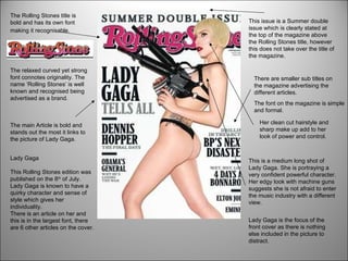
1. Lady Gaga This Rolling Stones edition was published on the 8 th of July. Lady Gaga is known to have a quirky character and sense of style which gives her individuality. There is an article on her and this is in the largest font, there are 6 other articles on the cover. This is a medium long shot of Lady Gaga. She is portraying a very confident powerful character. Her edgy look with machine guns suggests she is not afraid to enter the music industry with a different view. Lady Gaga is the focus of the front cover as there is nothing else included in the picture to distract. The Rolling Stones title is bold and has its own font making it recognisable. The main Article is bold and stands out the most it links to the picture of Lady Gaga. This issue is a Summer double issue which is clearly stated at the top of the magazine above the Rolling Stones title, however this does not take over the title of the magazine. There are smaller sub titles on the magazine advertising the different articles. The font on the magazine is simple and formal. The relaxed curved yet strong font connotes originality. The name ‘Rolling Stones’ is well known and recognised being advertised as a brand. Her clean cut hairstyle and sharp make up add to her look of power and control.
2. The title is bold and red. Its short and precise. The format is simple and bold connoting a straight to the point no fuss magazine. The picture is a medium close up of Florence Welch of Florence and the Machine. She is looking straight into the camera Anchors the title with the image. Has the name of the band in bold and the main singers name who the picture is of in smaller print. The magazine advertises a free 16 tracks from their top 40. This may persuade the reader as they feel like they would be getting more for their money. The plain background allows the eye to only focus on the artist. All of the names of the artists that are featured in this magazine are lined one under another on the right hand side. This separates them from the main feature creating an organised feel. The and of is underlined and in a smaller font that ‘BEST’ and ‘2010’. The fact its in 2010 makes the magazine current. The title of the magazine is in capitals making it stand out. There is a slight messy tone to the image styling. Her hair has movement and her make up simple yet dramatic. This sort of image mimics the genre of Indie/rock music.
3. ‘ Access All Areas’ is in a red and black font and is underlined, showing it’s importance. Underneath is a half nude picture of Shakira which mirrors the heading of ‘Access all Areas’ , showing her vulnerable side. The background picture shows Shakira n her working environment which is a contrast to the second image. She looks casual and relaxed. It shows her in a music studio writing which implies she works and writes her own songs. ‘ I now go after my desires in a predatory way- with teeth and claws’ This quote was picked out and put in bold as the editor obviously thought it was a quote that summed up what the artist featured was about and how they work. This heading shows what the article will be about. This double page spread was in ‘Q’ magazine, their logo consists of a white Q on a red background. This ‘In the Studio’ sub heading continues with the format of the ‘Q’ magazine logo. The font is simple and the bold white format stands out on the dark background. The word ‘Danger’ is associated with warning so would obviously connote the colour of red so its unusual how the font colour is red, however the red sole of the shoe is behind, which is cleverly placed. The article starts with a larger letter font for impact it also adds detail. Although she is casually dressed in a loose top and jeans she adds an element of sex appeal with heels, which symbolises the competitive and glamorous industry.
4. This double page spread is on the band ‘The Vaccines’. They are an alternate rock band formed in 2010. They supporting the rough vintage look with what they are wearing with off colour shirts and oversized jackets, this suggests they are relaxed and laid back. The electric guitar gives the reader an idea of what genre of music they are associated with. The image is quite large and the reader may focus more on the image than the article written, I think a balance of image and text is important when doing a feature on a band. The band in which the feature is on is clearly displayed at the top right of the page , this presents the band. The font is bold and simple which doesn't interfere with the relaxed feeling of the page There is a simple colour scheme on the page of black white and a light blue, this is effective as the colours compliment each other . The small blue shapes thrown across the page add detail and suggest an almost messy party element.
5. The first feature advertised is anchored to the image The name of the magazine is clearly stated at the top of the page. It’s bold and the font is white standing out on a red background. In the corner of the page there is a blue box which tells the reader who the front cover was photographed and styled by. The plain grey background of the picture does not complicate the simple image, and compliments the straight-forward colour scheme and font. I like the font as it matches the title of the magazine and throughout the contents page the font and colour remains the same. This is obviously a key quote in Duffy’s feature page in the magazine. The fact that it has a place on the contents page highlights it’s importance and it suggests how Duffy is a real musician doing it for the only fact that she ‘loves’ music. The pink guitar adds an element of innocence and youth however as its held behind her head it suggests chaos. Her make-up is heavy and hair messy which is a modern contemporary chic look. Her hand is stretched out and the captured image resembles action.
6. The title of the magazine has the same colour scheme of the music magazine ‘SPIN’. The title of this magazine is ‘Q’ it short and simple however I think it could have been made a bit bigger as the ‘Contents’ is bold and larger. I think that there is a perfect balance between image and text on this contents page. The image is simple and the background is of a view which doesn’t distract the reader from the featuring band. The background suggests that the band have a relaxed characteristic. The sub headings match with the style of the title of the magazine, this is effective as it keeps the same scheme throughout. The ‘Oasis’ special is sectioned off and is surrounded by a gold box. The colour gold connotes power and wealth. The magazine splits there content between the features of this months copy and what features in the magazine every month. The colour red connotes desire, passion and attention. The magazine has a different section for their reviews. This has been a recurring factor on contents pages, quotes are taken from the features in the magazine.