SlideShare a Scribd company logo
1 of 9
Download to read offline
1
Dixons Heathrow Terminal 5. The Dixons concept centered around
catering for all passenger types at all times in the travel process.
There were to be originally 5 stores from self-service easy shop
through to experience retailing through to that last minute
purchase.
There are two examples illustrated. the first being the Dixons On
store concept, which came to fruition as the Add Store. Next a
concept design for a experiential retail environment dedicated to
technical presentations and customer interaction.

The Add store incorporates simple Muji esqe principles. Were the
                                                                         2
shopping experience is fall over simple. Graphics and simple naviga-
tion is key to this design, where all products are out on show,
payment is utilising roaming systems.

The Lounge concept, is set as a brand connection piece. The main
floor is given over to Informative presentations. Here a “Tech-Genius”
informs the customer, as an example about seemless technology,
where your mobile, TV and computer can be utilized to its fullest
capabilities. Large format, movable screens can be used to enclose
presentation spaces and the graphics and message changed digi-
tally. The perimeter walls incorporate pull-out storage and also
contain preminum merchandise.
3

                                                                                              4


    What is Shweppevence? Well that is the question in designing the new Schweppes
                                                                                                   Redesign Sydney Qantas Terminal 3. A flow led design solution but also a brand
    HQ in Melbourne Australia. the Shweppevence marketing campaign is based around
                                                                                                   piece for Qantas. On entering the terminal you are met by free-standing totems,
    act of opening the Schweppes bottle and the realization of the experience of drinking the
                                                                                                   each with digital graphics, creating a meeting point and also marketing oppor-
    fuid. This can be narrowed down or focussed to a point in time , right here, right now, then
                                                                                                   tunities. A central hub of all information needed for the traveller, 12m in Diam-
    being transported to another dimension. This was the basis for the design.
                                                                                                   eter suspended from the ceiling. Conveys all airport information.
    Experience meeting pods are set around the work stations, where screen printed images
                                                                                                   Highly visble numbered checkin zones with dynamic interchangeable digital
    portray a landscape from a beach scene to a wooded enclosure with camp fire, this
                                                                                                   graphics to add a level of flexibility. Self Service kiosks with enclosing canopy,
    reinforcing the different dimension concept.
                                                                                                   utilizing proxemics , enclosing the traveller and assuring them with their
    A continious band around the lift core tells the story of the brand as a museum piece, this
                                                                                                   personal enclosure, behind this curved Interactive media walls incorporating
    tells the brand story ,gradually adapts into personal zones which can be owned by the people
                                                                                                   ipod downloads docks, internet access and meeting spaces. 5m from floor level
    sitting adjacent.
                                                                                                   a dynamic stretched fabric membrane incorporating projection graphics
    A large format flexible meeting zone/ catering offer mirrored on both sides by workplace
                                                                                                   encloses the space, conveying the thrill of speed and of the optomistic future of
    meeting rooms which can open on to this arena. Semi-transparent projection screens
                                                                                                   flight thereforere reinforcing the Qantas brand.
    can be utilized for presentation and also enclose the space. Modular seating components
    and servery counters can be moved for an adaptable solution.
    The yellow portrays the focussed singularity of the brand.
5
        Experiental Retailing principles apply. Eurotel a
        mobile phone service provider based in the
        Czech Republic required a moble phone store
        to stave of the opposition, primarily Voda-
        phone
        The concept behind the design hinged on a
        Retail/Exhibition which was led by the amb-
        tious turnaround time of 2 months, Concept to
        completion. A uid, free formed design was
        implemented where experience and brand was
        key and sales secondary. The typical cash
        counters redesigned so that customers were to
        be met by roaming assistants, and the majority
        of transactions through roaming payment
        systems. Hero product displayed in
        freestanding internally lit pods. Projection
        zones would carry the brand message and
        various seating options would cater for the
        change in pace. A dynamic exhibition design in
        a retail shopping center where Brand is the
        hero


    6
7


    A modular Kit of Parts, with dials up and down capabilities depending on the
    cost and general requirements. Rolled out in America, Europe and Asia Pac..
    a very successfull design which has been used for roaming Exhibitons, Retail
    and “Pop Ups” from Moscow to Vegas, a design that has a thousand fathers!

    The idea is heavily based around the sences, where
    the brand, materials specification, and graphics synergy
    create a connection to the retail offer and the shoppers
    experience. The design Incorporates a “Peoples Bench” that
    is mirrored in the shopfront and inside the store.
    this connects at one pace to the the passers-by at street level
    where they can meet and interact with friends and also connects
    inside at retail pace as a bench to try and test the latest
    technologies, also heavily reinforced with the graphic message.

    Other levels and pace of design and connection create a space
    that although based on modular principles can feel inviting and
    adaptable to different personality types.
9
Where the organic retailing principles
 .
apply, the Deli conecpt lives in the Brand
cross over between Richies Supermarket
and Don meats producer in Victoria
Australia.

At the heart of the Deli design is flexibility.
A highly adaptable kit of parts that can be
installed in various Richies store layouts in
varying sizes and orientation.

The freestanding Deli can also be
flatpacked and shipped to different parts
of Australia, for stand alone exhibitions or
food hall presentations.

The Deil hinges on the food preparation
area where the idea of fresh and theatre
come together to create a different pace
in the store and also gives a sence of
connection with the community.

Large format deli 100m2 to small format
Deli of 15m2.
10
Tampines Jakarta. A 80,000m2 Retail
Shopping Center Environment. A compe-
tition piece built 2006-2009. The main
question was how to connect the 5 levels
and through to the escalators and the
Entrance zone?
The Ground Floor Level entrance pace
was set for eating and entertainment
creating a sense of buzz and excitement.
Open walk-ways, with eateries set around
the perimeter create vantage points. An
Auditorium at Ground level incorporates
steps and seating creates meeting and
watching spaces. Connecting the different
floors levels a central focal point, full
height LED Light Poles form a connection
with the roof terrace 5 floors above and at
ground level. Each slab level has a void
cut-out ensuring that visual connection
can be formed with each of the shopping
levels and the feature connecting poles.
Escalators within the shopping center set
to intersect the different levels at various
offset angles creates a sense of dynamism.
The elevators wrapped in a layered glass
effect, encloses the Shopper and also
forms a connection with the other levels.
11
.
    Bacardi Exhibition Cannes 2006. A Stand
    Concept that incorporates the product
    display on high gloss black perimeter
    walls, this creates a design pace and is
    also aligned with the premium Brand
    aspect of the product. Following from
    this wall the exhibition opens into a
    Reception/ Meet and Greet Zone. Here
    delegates can unwind and form informal
    meetings, enclosing these informal zones
    are curtain details suspended from the
    ceiling. These incorporate Hung beads that
    Give a sense of intimacy while also keeping
    the sense of “openness” A feature Brand
                             .
    Wall, aligned with the Bacardi Brand Attributes
    and the pace of the Exhibition encompasses
    the main meeting zone. This wall comprises
    acrylic backlit panels creating a low level
    ambience to the meeting zone. To the rear
    of the feature wall is the Back of house.
    There are 3 meeting spaces given over
    to the Bacardi Sub-Brands in front of the
    informal seating zone. These meeting areas,
     invitation only, are heavily aligned with
    the Brand Attributes from the Seating through
    to the lighting detailing. These “Brand” zones
    can vaguely be seen while sitting in the
    informal seating/ foyer zone as there is slight
    frosting to the access doors to these zones
    which go to create a level of interest and
    intrigue.
12
 Rio Tinto Brisbane headquarters Australia.
 The concept behind the foyer design was
.based on the concept of flow. A “flow”
 device was to be centered which would
 navigate employees and visitors through
 to the High Rise and Low Rise Lifts and
 create one Focal Area/ Meet & Greet point
 as the process of security, signing in and
 induction was paramount. The mesh
 “Flow Wall” design seems extracted from
 the Rear Brand Wall thus conveying the
 process of extraction, aligned to a mining
 company like Rio Tinto. The core materials
 used in Mining were implemented in the
 design of the Flow Wall. A stipulation
 from the building owner was that the
 base-building designed by Hassles Archi-
 tects was not to be interfered with, there-
 fore a quasi freestanding Architectural /
 Exhibition was designed. This, easily
 constructed and erected within the core
 environment can be altered and adapted
 as the concept is so simple and removed
 if required.
 A community zone situated on the outer-
 perimeter of the “flow Wall.” This zone
 comprises many small LCD screen relay-
 ing information about culturally aligned
 sensitivities, information regarding the
 Brand and the Rio Tinto Employees. The
 informal seating to the front, follows the
 extract design principles. The tables are
 formed of zinc plate which seem pulled
 out of the floor. The Zinc plate continues
 through the foyer floor and runs flush
 with the exterior pavement.
 The key to the Foyer Design is the Brand
 connection at street level. The design is
 formed of layers, The Rear Brand wall, the
 mesh “flow Wall” the community LCD
                    ,
 Screens and the informal seating area, all
 form a Brand montage which can be
 viewed and interpreted by the passer-by
 at street level.
13  Rio Tinto Brisbane Headquarters Australia.
    Level 13 split into two main zones. A floor
.
    heavily based on meeting and interaction.
    Two main areas, one formal and the other
    informal. These are connected by one
    central connecting workbench which
    encompasses planting at each end. The
    bench performs as a wayfinding piece, as
    both zones are connected by the bench
    and both planting zones can be seen
    when exiting from the staircase and the
    lift core. The bench can be utilized in
    various different ways depending on
    different personality types. It contains
    storage and various modular seating and
    working options which ensures flexibility.
    Situated at one end of the bench a coffee
    bar layout with various organic seating/
    meeting points which can be used either
    as seating/ lying/ leaning or perching
    suiting different informal meeting situa-
    tions. An Auditorium/Step Zone overlooks
    this space which creates a presentation
    point, various modular bench options fit
    the steps enabling a degree of flexibility. A
    “Strata Wall” surface is revealed behind
    the auditorium which enforces the
    essence of Mining and Extraction.
    One of the main features of this floor
    plate are the green meeting areas. These
    are comprised of numerous counter-sunk
    meeting pods that are set below a
    planted strata, therefore when having a
    meeting you are surrounded by planting.
    Enclosing these pods are semi-
    transparent curved screens that add a
    sense of privacy and also can be used for
    projections/ presentations. This concept is
    Brand aligned and adds a different
    dimension/ pace to the Rio Tinto work-
    place.

More Related Content

Similar to Dixons Heathrow Terminal 5 retail concepts

VW Refresh by StudioMeraz + And Then What Creative
VW Refresh by StudioMeraz + And Then What CreativeVW Refresh by StudioMeraz + And Then What Creative
VW Refresh by StudioMeraz + And Then What CreativeAnd Then What Creative
 
Latest in-store digital solutions, innovations and cutting edge techniques
Latest in-store digital solutions, innovations and cutting edge techniquesLatest in-store digital solutions, innovations and cutting edge techniques
Latest in-store digital solutions, innovations and cutting edge techniquesMediaZest
 
Informa Ipex 2017 'Feature Areas' Case Study
Informa Ipex 2017 'Feature Areas' Case StudyInforma Ipex 2017 'Feature Areas' Case Study
Informa Ipex 2017 'Feature Areas' Case StudyMatthias Stammers
 
SIS Mannequin brochure 2015
SIS Mannequin brochure 2015SIS Mannequin brochure 2015
SIS Mannequin brochure 2015Michelle Gabbott
 
Nomadic Brochure sje 2013
Nomadic Brochure sje 2013Nomadic Brochure sje 2013
Nomadic Brochure sje 2013Greg Sinclair
 
Offisquare Presentation (English Version)
Offisquare Presentation (English Version)Offisquare Presentation (English Version)
Offisquare Presentation (English Version)Giosuè Amati
 
Offisquare Presentation (English Version)
Offisquare Presentation (English Version)Offisquare Presentation (English Version)
Offisquare Presentation (English Version)Giosuè Amati
 
4sight presentation print master april 2013
4sight presentation print master april 20134sight presentation print master april 2013
4sight presentation print master april 2013my4sight
 
Manuel_Tavora_Architectural_Design_2016
Manuel_Tavora_Architectural_Design_2016Manuel_Tavora_Architectural_Design_2016
Manuel_Tavora_Architectural_Design_2016Manuel Távora
 
How to attract customers to your exhibition stand
How to attract customers to your exhibition standHow to attract customers to your exhibition stand
How to attract customers to your exhibition standNishchal Par
 
Midwich Solutions 2016 LOW RES FINAL
Midwich Solutions 2016 LOW RES FINAL Midwich Solutions 2016 LOW RES FINAL
Midwich Solutions 2016 LOW RES FINAL Rachel Bannon
 
Pufferfish: Solutions for Green, Sustainable Messaging
Pufferfish: Solutions for Green, Sustainable MessagingPufferfish: Solutions for Green, Sustainable Messaging
Pufferfish: Solutions for Green, Sustainable MessagingChanel Turner
 
Hybrid solutions for exhibitions stand design
Hybrid solutions for exhibitions stand designHybrid solutions for exhibitions stand design
Hybrid solutions for exhibitions stand designSerena Ferrari
 
NCTA Industry Exhibition
NCTA Industry ExhibitionNCTA Industry Exhibition
NCTA Industry Exhibitiondesigncontact
 
4sight presentation print master april 2013
4sight presentation print master april 20134sight presentation print master april 2013
4sight presentation print master april 2013my4sight
 

Similar to Dixons Heathrow Terminal 5 retail concepts (20)

Wrap 4
Wrap 4Wrap 4
Wrap 4
 
VW Refresh by StudioMeraz + And Then What Creative
VW Refresh by StudioMeraz + And Then What CreativeVW Refresh by StudioMeraz + And Then What Creative
VW Refresh by StudioMeraz + And Then What Creative
 
Partnering For Growth.
Partnering For Growth.Partnering For Growth.
Partnering For Growth.
 
Latest in-store digital solutions, innovations and cutting edge techniques
Latest in-store digital solutions, innovations and cutting edge techniquesLatest in-store digital solutions, innovations and cutting edge techniques
Latest in-store digital solutions, innovations and cutting edge techniques
 
SMT_Credentials_2015
SMT_Credentials_2015SMT_Credentials_2015
SMT_Credentials_2015
 
Informa Ipex 2017 'Feature Areas' Case Study
Informa Ipex 2017 'Feature Areas' Case StudyInforma Ipex 2017 'Feature Areas' Case Study
Informa Ipex 2017 'Feature Areas' Case Study
 
SIS Mannequin brochure 2015
SIS Mannequin brochure 2015SIS Mannequin brochure 2015
SIS Mannequin brochure 2015
 
Nomadic Brochure sje 2013
Nomadic Brochure sje 2013Nomadic Brochure sje 2013
Nomadic Brochure sje 2013
 
Offisquare Presentation (English Version)
Offisquare Presentation (English Version)Offisquare Presentation (English Version)
Offisquare Presentation (English Version)
 
Offisquare Presentation (English Version)
Offisquare Presentation (English Version)Offisquare Presentation (English Version)
Offisquare Presentation (English Version)
 
Explora series white paper
Explora series white paperExplora series white paper
Explora series white paper
 
4sight presentation print master april 2013
4sight presentation print master april 20134sight presentation print master april 2013
4sight presentation print master april 2013
 
Manuel_Tavora_Architectural_Design_2016
Manuel_Tavora_Architectural_Design_2016Manuel_Tavora_Architectural_Design_2016
Manuel_Tavora_Architectural_Design_2016
 
How to attract customers to your exhibition stand
How to attract customers to your exhibition standHow to attract customers to your exhibition stand
How to attract customers to your exhibition stand
 
Midwich Solutions 2016 LOW RES FINAL
Midwich Solutions 2016 LOW RES FINAL Midwich Solutions 2016 LOW RES FINAL
Midwich Solutions 2016 LOW RES FINAL
 
Pufferfish: Solutions for Green, Sustainable Messaging
Pufferfish: Solutions for Green, Sustainable MessagingPufferfish: Solutions for Green, Sustainable Messaging
Pufferfish: Solutions for Green, Sustainable Messaging
 
EXHIBITION DESIGN for BRICS 2017
EXHIBITION DESIGN for BRICS 2017EXHIBITION DESIGN for BRICS 2017
EXHIBITION DESIGN for BRICS 2017
 
Hybrid solutions for exhibitions stand design
Hybrid solutions for exhibitions stand designHybrid solutions for exhibitions stand design
Hybrid solutions for exhibitions stand design
 
NCTA Industry Exhibition
NCTA Industry ExhibitionNCTA Industry Exhibition
NCTA Industry Exhibition
 
4sight presentation print master april 2013
4sight presentation print master april 20134sight presentation print master april 2013
4sight presentation print master april 2013
 

Dixons Heathrow Terminal 5 retail concepts

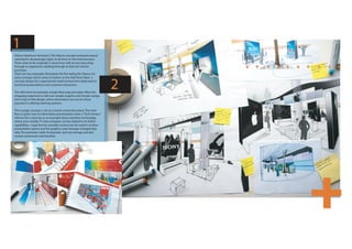
  • 1. 1 Dixons Heathrow Terminal 5. The Dixons concept centered around catering for all passenger types at all times in the travel process. There were to be originally 5 stores from self-service easy shop through to experience retailing through to that last minute purchase. There are two examples illustrated. the first being the Dixons On store concept, which came to fruition as the Add Store. Next a concept design for a experiential retail environment dedicated to technical presentations and customer interaction. The Add store incorporates simple Muji esqe principles. Were the 2 shopping experience is fall over simple. Graphics and simple naviga- tion is key to this design, where all products are out on show, payment is utilising roaming systems. The Lounge concept, is set as a brand connection piece. The main floor is given over to Informative presentations. Here a “Tech-Genius” informs the customer, as an example about seemless technology, where your mobile, TV and computer can be utilized to its fullest capabilities. Large format, movable screens can be used to enclose presentation spaces and the graphics and message changed digi- tally. The perimeter walls incorporate pull-out storage and also contain preminum merchandise.
  • 2. 3 4 What is Shweppevence? Well that is the question in designing the new Schweppes Redesign Sydney Qantas Terminal 3. A flow led design solution but also a brand HQ in Melbourne Australia. the Shweppevence marketing campaign is based around piece for Qantas. On entering the terminal you are met by free-standing totems, act of opening the Schweppes bottle and the realization of the experience of drinking the each with digital graphics, creating a meeting point and also marketing oppor- fuid. This can be narrowed down or focussed to a point in time , right here, right now, then tunities. A central hub of all information needed for the traveller, 12m in Diam- being transported to another dimension. This was the basis for the design. eter suspended from the ceiling. Conveys all airport information. Experience meeting pods are set around the work stations, where screen printed images Highly visble numbered checkin zones with dynamic interchangeable digital portray a landscape from a beach scene to a wooded enclosure with camp fire, this graphics to add a level of flexibility. Self Service kiosks with enclosing canopy, reinforcing the different dimension concept. utilizing proxemics , enclosing the traveller and assuring them with their A continious band around the lift core tells the story of the brand as a museum piece, this personal enclosure, behind this curved Interactive media walls incorporating tells the brand story ,gradually adapts into personal zones which can be owned by the people ipod downloads docks, internet access and meeting spaces. 5m from floor level sitting adjacent. a dynamic stretched fabric membrane incorporating projection graphics A large format flexible meeting zone/ catering offer mirrored on both sides by workplace encloses the space, conveying the thrill of speed and of the optomistic future of meeting rooms which can open on to this arena. Semi-transparent projection screens flight thereforere reinforcing the Qantas brand. can be utilized for presentation and also enclose the space. Modular seating components and servery counters can be moved for an adaptable solution. The yellow portrays the focussed singularity of the brand.
  • 3. 5 Experiental Retailing principles apply. Eurotel a mobile phone service provider based in the Czech Republic required a moble phone store to stave of the opposition, primarily Voda- phone The concept behind the design hinged on a Retail/Exhibition which was led by the amb- tious turnaround time of 2 months, Concept to completion. A uid, free formed design was implemented where experience and brand was key and sales secondary. The typical cash counters redesigned so that customers were to be met by roaming assistants, and the majority of transactions through roaming payment systems. Hero product displayed in freestanding internally lit pods. Projection zones would carry the brand message and various seating options would cater for the change in pace. A dynamic exhibition design in a retail shopping center where Brand is the hero 6
  • 4. 7 A modular Kit of Parts, with dials up and down capabilities depending on the cost and general requirements. Rolled out in America, Europe and Asia Pac.. a very successfull design which has been used for roaming Exhibitons, Retail and “Pop Ups” from Moscow to Vegas, a design that has a thousand fathers! The idea is heavily based around the sences, where the brand, materials specification, and graphics synergy create a connection to the retail offer and the shoppers experience. The design Incorporates a “Peoples Bench” that is mirrored in the shopfront and inside the store. this connects at one pace to the the passers-by at street level where they can meet and interact with friends and also connects inside at retail pace as a bench to try and test the latest technologies, also heavily reinforced with the graphic message. Other levels and pace of design and connection create a space that although based on modular principles can feel inviting and adaptable to different personality types.
  • 5. 9 Where the organic retailing principles . apply, the Deli conecpt lives in the Brand cross over between Richies Supermarket and Don meats producer in Victoria Australia. At the heart of the Deli design is flexibility. A highly adaptable kit of parts that can be installed in various Richies store layouts in varying sizes and orientation. The freestanding Deli can also be flatpacked and shipped to different parts of Australia, for stand alone exhibitions or food hall presentations. The Deil hinges on the food preparation area where the idea of fresh and theatre come together to create a different pace in the store and also gives a sence of connection with the community. Large format deli 100m2 to small format Deli of 15m2.
  • 6. 10 Tampines Jakarta. A 80,000m2 Retail Shopping Center Environment. A compe- tition piece built 2006-2009. The main question was how to connect the 5 levels and through to the escalators and the Entrance zone? The Ground Floor Level entrance pace was set for eating and entertainment creating a sense of buzz and excitement. Open walk-ways, with eateries set around the perimeter create vantage points. An Auditorium at Ground level incorporates steps and seating creates meeting and watching spaces. Connecting the different floors levels a central focal point, full height LED Light Poles form a connection with the roof terrace 5 floors above and at ground level. Each slab level has a void cut-out ensuring that visual connection can be formed with each of the shopping levels and the feature connecting poles. Escalators within the shopping center set to intersect the different levels at various offset angles creates a sense of dynamism. The elevators wrapped in a layered glass effect, encloses the Shopper and also forms a connection with the other levels.
  • 7. 11 . Bacardi Exhibition Cannes 2006. A Stand Concept that incorporates the product display on high gloss black perimeter walls, this creates a design pace and is also aligned with the premium Brand aspect of the product. Following from this wall the exhibition opens into a Reception/ Meet and Greet Zone. Here delegates can unwind and form informal meetings, enclosing these informal zones are curtain details suspended from the ceiling. These incorporate Hung beads that Give a sense of intimacy while also keeping the sense of “openness” A feature Brand . Wall, aligned with the Bacardi Brand Attributes and the pace of the Exhibition encompasses the main meeting zone. This wall comprises acrylic backlit panels creating a low level ambience to the meeting zone. To the rear of the feature wall is the Back of house. There are 3 meeting spaces given over to the Bacardi Sub-Brands in front of the informal seating zone. These meeting areas, invitation only, are heavily aligned with the Brand Attributes from the Seating through to the lighting detailing. These “Brand” zones can vaguely be seen while sitting in the informal seating/ foyer zone as there is slight frosting to the access doors to these zones which go to create a level of interest and intrigue.
  • 8. 12 Rio Tinto Brisbane headquarters Australia. The concept behind the foyer design was .based on the concept of flow. A “flow” device was to be centered which would navigate employees and visitors through to the High Rise and Low Rise Lifts and create one Focal Area/ Meet & Greet point as the process of security, signing in and induction was paramount. The mesh “Flow Wall” design seems extracted from the Rear Brand Wall thus conveying the process of extraction, aligned to a mining company like Rio Tinto. The core materials used in Mining were implemented in the design of the Flow Wall. A stipulation from the building owner was that the base-building designed by Hassles Archi- tects was not to be interfered with, there- fore a quasi freestanding Architectural / Exhibition was designed. This, easily constructed and erected within the core environment can be altered and adapted as the concept is so simple and removed if required. A community zone situated on the outer- perimeter of the “flow Wall.” This zone comprises many small LCD screen relay- ing information about culturally aligned sensitivities, information regarding the Brand and the Rio Tinto Employees. The informal seating to the front, follows the extract design principles. The tables are formed of zinc plate which seem pulled out of the floor. The Zinc plate continues through the foyer floor and runs flush with the exterior pavement. The key to the Foyer Design is the Brand connection at street level. The design is formed of layers, The Rear Brand wall, the mesh “flow Wall” the community LCD , Screens and the informal seating area, all form a Brand montage which can be viewed and interpreted by the passer-by at street level.
  • 9. 13 Rio Tinto Brisbane Headquarters Australia. Level 13 split into two main zones. A floor . heavily based on meeting and interaction. Two main areas, one formal and the other informal. These are connected by one central connecting workbench which encompasses planting at each end. The bench performs as a wayfinding piece, as both zones are connected by the bench and both planting zones can be seen when exiting from the staircase and the lift core. The bench can be utilized in various different ways depending on different personality types. It contains storage and various modular seating and working options which ensures flexibility. Situated at one end of the bench a coffee bar layout with various organic seating/ meeting points which can be used either as seating/ lying/ leaning or perching suiting different informal meeting situa- tions. An Auditorium/Step Zone overlooks this space which creates a presentation point, various modular bench options fit the steps enabling a degree of flexibility. A “Strata Wall” surface is revealed behind the auditorium which enforces the essence of Mining and Extraction. One of the main features of this floor plate are the green meeting areas. These are comprised of numerous counter-sunk meeting pods that are set below a planted strata, therefore when having a meeting you are surrounded by planting. Enclosing these pods are semi- transparent curved screens that add a sense of privacy and also can be used for projections/ presentations. This concept is Brand aligned and adds a different dimension/ pace to the Rio Tinto work- place.