Master the core of data science with Practical Statistics for Data Scientists — a concise, hands-on guide to essential statistical concepts with R and Python examples. Ideal for beginners, analysts, and anyone working with data. More resources at: https://kienthucmo.com/


![kc_tax0 <- subset(kc_tax, TaxAssessedValue < 750000 &
SqFtTotLiving > 100 &
SqFtTotLiving < 3500)
nrow(kc_tax0)
432693
In pandas, we filter the data set as follows:
kc_tax0 = kc_tax.loc[(kc_tax.TaxAssessedValue < 750000) &
(kc_tax.SqFtTotLiving > 100) &
(kc_tax.SqFtTotLiving < 3500), :]
kc_tax0.shape
(432693, 3)
Figure 1-8 is a hexagonal binning plot of the relationship between the finished square
feet and the tax-assessed value for homes in King County. Rather than plotting
points, which would appear as a monolithic dark cloud, we grouped the records into
hexagonal bins and plotted the hexagons with a color indicating the number of
records in that bin. In this chart, the positive relationship between square feet and
tax-assessed value is clear. An interesting feature is the hint of additional bands above
the main (darkest) band at the bottom, indicating homes that have the same square
footage as those in the main band but a higher tax-assessed value.
Figure 1-8 was generated by the powerful R package ggplot2, developed by Hadley
Wickham [ggplot2]. ggplot2 is one of several new software libraries for advanced
exploratory visual analysis of data; see “Visualizing Multiple Variables” on page 43:
ggplot(kc_tax0, (aes(x=SqFtTotLiving, y=TaxAssessedValue))) +
stat_binhex(color='white') +
theme_bw() +
scale_fill_gradient(low='white', high='black') +
labs(x='Finished Square Feet', y='Tax-Assessed Value')
In Python, hexagonal binning plots are readily available using the pandas data frame
method hexbin:
ax = kc_tax0.plot.hexbin(x='SqFtTotLiving', y='TaxAssessedValue',
gridsize=30, sharex=False, figsize=(5, 4))
ax.set_xlabel('Finished Square Feet')
ax.set_ylabel('Tax-Assessed Value')
Exploring Two or More Variables | 37](https://image.slidesharecdn.com/part2-251108121636-04ee5e19/85/Practical-Statistics-for-Data-Scientists-50-Essential-Concepts-Using-R-and-Python-Part-2-5-320.jpg)


![Table 1-8. Contingency table of loan grade and status
Grade Charged off Current Fully paid Late Total
A 1562 50051 20408 469 72490
0.022 0.690 0.282 0.006 0.161
B 5302 93852 31160 2056 132370
0.040 0.709 0.235 0.016 0.294
C 6023 88928 23147 2777 120875
0.050 0.736 0.191 0.023 0.268
D 5007 53281 13681 2308 74277
0.067 0.717 0.184 0.031 0.165
E 2842 24639 5949 1374 34804
0.082 0.708 0.171 0.039 0.077
F 1526 8444 2328 606 12904
0.118 0.654 0.180 0.047 0.029
G 409 1990 643 199 3241
0.126 0.614 0.198 0.061 0.007
Total 22671 321185 97316 9789 450961
Contingency tables can look only at counts, or they can also include column and total
percentages. Pivot tables in Excel are perhaps the most common tool used to create
contingency tables. In R, the CrossTable function in the descr package produces
contingency tables, and the following code was used to create Table 1-8:
library(descr)
x_tab <- CrossTable(lc_loans$grade, lc_loans$status,
prop.c=FALSE, prop.chisq=FALSE, prop.t=FALSE)
The pivot_table method creates the pivot table in Python. The aggfunc argument
allows us to get the counts. Calculating the percentages is a bit more involved:
crosstab = lc_loans.pivot_table(index='grade', columns='status',
aggfunc=lambda x: len(x), margins=True)
df = crosstab.loc['A':'G',:].copy()
df.loc[:,'Charged Off':'Late'] = df.loc[:,'Charged Off':'Late'].div(df['All'],
axis=0)
df['All'] = df['All'] / sum(df['All'])
perc_crosstab = df
The margins keyword argument will add the column and row sums.
We create a copy of the pivot table, ignoring the column sums.
We divide the rows with the row sum.
40 | Chapter 1: Exploratory Data Analysis](https://image.slidesharecdn.com/part2-251108121636-04ee5e19/85/Practical-Statistics-for-Data-Scientists-50-Essential-Concepts-Using-R-and-Python-Part-2-8-320.jpg)

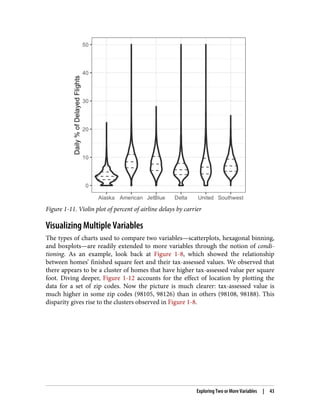
![Alaska stands out as having the fewest delays, while American has the most delays:
the lower quartile for American is higher than the upper quartile for Alaska.
A violin plot, introduced by [Hintze-Nelson-1998], is an enhancement to the boxplot
and plots the density estimate with the density on the y-axis. The density is mirrored
and flipped over, and the resulting shape is filled in, creating an image resembling a
violin. The advantage of a violin plot is that it can show nuances in the distribution
that aren’t perceptible in a boxplot. On the other hand, the boxplot more clearly
shows the outliers in the data. In ggplot2, the function geom_violin can be used to
create a violin plot as follows:
ggplot(data=airline_stats, aes(airline, pct_carrier_delay)) +
ylim(0, 50) +
geom_violin() +
labs(x='', y='Daily % of Delayed Flights')
Violin plots are available with the violinplot method of the seaborn package:
ax = sns.violinplot(airline_stats.airline, airline_stats.pct_carrier_delay,
inner='quartile', color='white')
ax.set_xlabel('')
ax.set_ylabel('Daily % of Delayed Flights')
The corresponding plot is shown in Figure 1-11. The violin plot shows a concentra‐
tion in the distribution near zero for Alaska and, to a lesser extent, Delta. This phe‐
nomenon is not as obvious in the boxplot. You can combine a violin plot with a
boxplot by adding geom_boxplot to the plot (although this works best when colors
are used).
42 | Chapter 1: Exploratory Data Analysis](https://image.slidesharecdn.com/part2-251108121636-04ee5e19/85/Practical-Statistics-for-Data-Scientists-50-Essential-Concepts-Using-R-and-Python-Part-2-10-320.jpg)

![zip_codes = [98188, 98105, 98108, 98126]
kc_tax_zip = kc_tax0.loc[kc_tax0.ZipCode.isin(zip_codes),:]
kc_tax_zip
def hexbin(x, y, color, **kwargs):
cmap = sns.light_palette(color, as_cmap=True)
plt.hexbin(x, y, gridsize=25, cmap=cmap, **kwargs)
g = sns.FacetGrid(kc_tax_zip, col='ZipCode', col_wrap=2)
g.map(hexbin, 'SqFtTotLiving', 'TaxAssessedValue',
extent=[0, 3500, 0, 700000])
g.set_axis_labels('Finished Square Feet', 'Tax-Assessed Value')
g.set_titles('Zip code {col_name:.0f}')
Use the arguments col and row to specify the conditioning variables. For a single
conditioning variable, use col together with col_wrap to wrap the faceted graphs
into multiple rows.
The map method calls the hexbin function with subsets of the original data set for
the different zip codes. extent defines the limits of the x- and y-axes.
The concept of conditioning variables in a graphics system was pioneered with Trellis
graphics, developed by Rick Becker, Bill Cleveland, and others at Bell Labs [Trellis-
Graphics]. This idea has propagated to various modern graphics systems, such as the
lattice [lattice] and ggplot2 packages in R and the seaborn [seaborn] and Bokeh
[bokeh] modules in Python. Conditioning variables are also integral to business intel‐
ligence platforms such as Tableau and Spotfire. With the advent of vast computing
power, modern visualization platforms have moved well beyond the humble begin‐
nings of exploratory data analysis. However, key concepts and tools developed a half
century ago (e.g., simple boxplots) still form a foundation for these systems.
Key Ideas
• Hexagonal binning and contour plots are useful tools that permit graphical
examination of two numeric variables at a time, without being overwhelmed by
huge amounts of data.
• Contingency tables are the standard tool for looking at the counts of two catego‐
rical variables.
• Boxplots and violin plots allow you to plot a numeric variable against a categori‐
cal variable.
Exploring Two or More Variables | 45](https://image.slidesharecdn.com/part2-251108121636-04ee5e19/85/Practical-Statistics-for-Data-Scientists-50-Essential-Concepts-Using-R-and-Python-Part-2-13-320.jpg)


![selecting after the fact the person (or persons) who gets 10 heads at the stadium does
not indicate they have any special talent—it’s most likely luck.
Since repeated review of large data sets is a key value proposition in data science,
selection bias is something to worry about. A form of selection bias of particular con‐
cern to data scientists is what John Elder (founder of Elder Research, a respected data
mining consultancy) calls the vast search effect. If you repeatedly run different models
and ask different questions with a large data set, you are bound to find something
interesting. But is the result you found truly something interesting, or is it the chance
outlier?
We can guard against this by using a holdout set, and sometimes more than one hold‐
out set, against which to validate performance. Elder also advocates the use of what
he calls target shuffling (a permutation test, in essence) to test the validity of predic‐
tive associations that a data mining model suggests.
Typical forms of selection bias in statistics, in addition to the vast search effect,
include nonrandom sampling (see “Random Sampling and Sample Bias” on page 48),
cherry-picking data, selection of time intervals that accentuate a particular statistical
effect, and stopping an experiment when the results look “interesting.”
Regression to the Mean
Regression to the mean refers to a phenomenon involving successive measurements
on a given variable: extreme observations tend to be followed by more central ones.
Attaching special focus and meaning to the extreme value can lead to a form of selec‐
tion bias.
Sports fans are familiar with the “rookie of the year, sophomore slump” phenomenon.
Among the athletes who begin their career in a given season (the rookie class), there
is always one who performs better than all the rest. Generally, this “rookie of the year”
does not do as well in his second year. Why not?
In nearly all major sports, at least those played with a ball or puck, there are two ele‐
ments that play a role in overall performance:
• Skill
• Luck
Regression to the mean is a consequence of a particular form of selection bias. When
we select the rookie with the best performance, skill and good luck are probably con‐
tributing. In his next season, the skill will still be there, but very often the luck will
not be, so his performance will decline—it will regress. The phenomenon was first
identified by Francis Galton in 1886 [Galton-1886], who wrote of it in connection
Selection Bias | 55](https://image.slidesharecdn.com/part2-251108121636-04ee5e19/85/Practical-Statistics-for-Data-Scientists-50-Essential-Concepts-Using-R-and-Python-Part-2-23-320.jpg)


![The histogram of the individual data values is broadly spread out and skewed toward
higher values, as is to be expected with income data. The histograms of the means of
5 and 20 are increasingly compact and more bell-shaped. Here is the R code to gener‐
ate these histograms, using the visualization package ggplot2:
library(ggplot2)
# take a simple random sample
samp_data <- data.frame(income=sample(loans_income, 1000),
type='data_dist')
# take a sample of means of 5 values
samp_mean_05 <- data.frame(
income = tapply(sample(loans_income, 1000*5),
rep(1:1000, rep(5, 1000)), FUN=mean),
type = 'mean_of_5')
# take a sample of means of 20 values
samp_mean_20 <- data.frame(
income = tapply(sample(loans_income, 1000*20),
rep(1:1000, rep(20, 1000)), FUN=mean),
type = 'mean_of_20')
# bind the data.frames and convert type to a factor
income <- rbind(samp_data, samp_mean_05, samp_mean_20)
income$type = factor(income$type,
levels=c('data_dist', 'mean_of_5', 'mean_of_20'),
labels=c('Data', 'Mean of 5', 'Mean of 20'))
# plot the histograms
ggplot(income, aes(x=income)) +
geom_histogram(bins=40) +
facet_grid(type ~ .)
The Python code uses seaborn’s FacetGrid to show the three histograms:
import pandas as pd
import seaborn as sns
sample_data = pd.DataFrame({
'income': loans_income.sample(1000),
'type': 'Data',
})
sample_mean_05 = pd.DataFrame({
'income': [loans_income.sample(5).mean() for _ in range(1000)],
'type': 'Mean of 5',
})
sample_mean_20 = pd.DataFrame({
'income': [loans_income.sample(20).mean() for _ in range(1000)],
'type': 'Mean of 20',
})
results = pd.concat([sample_data, sample_mean_05, sample_mean_20])
g = sns.FacetGrid(results, col='type', col_wrap=1, height=2, aspect=2)
g.map(plt.hist, 'income', range=[0, 200000], bins=40)
Sampling Distribution of a Statistic | 59](https://image.slidesharecdn.com/part2-251108121636-04ee5e19/85/Practical-Statistics-for-Data-Scientists-50-Essential-Concepts-Using-R-and-Python-Part-2-27-320.jpg)


![a. Calculate their standard deviation (this estimates sample mean standard
error).
b. Produce a histogram or boxplot.
c. Find a confidence interval.
R, the number of iterations of the bootstrap, is set somewhat arbitrarily. The more
iterations you do, the more accurate the estimate of the standard error, or the confi‐
dence interval. The result from this procedure is a bootstrap set of sample statistics or
estimated model parameters, which you can then examine to see how variable they
are.
The R package boot combines these steps in one function. For example, the following
applies the bootstrap to the incomes of people taking out loans:
library(boot)
stat_fun <- function(x, idx) median(x[idx])
boot_obj <- boot(loans_income, R=1000, statistic=stat_fun)
The function stat_fun computes the median for a given sample specified by the
index idx. The result is as follows:
Bootstrap Statistics :
original bias std. error
t1* 62000 -70.5595 209.1515
The original estimate of the median is $62,000. The bootstrap distribution indicates
that the estimate has a bias of about –$70 and a standard error of $209. The results
will vary slightly between consecutive runs of the algorithm.
The major Python packages don’t provide implementations of the bootstrap
approach. It can be implemented using the scikit-learn method resample:
results = []
for nrepeat in range(1000):
sample = resample(loans_income)
results.append(sample.median())
results = pd.Series(results)
print('Bootstrap Statistics:')
print(f'original: {loans_income.median()}')
print(f'bias: {results.mean() - loans_income.median()}')
print(f'std. error: {results.std()}')
The bootstrap can be used with multivariate data, where the rows are sampled as
units (see Figure 2-8). A model might then be run on the bootstrapped data, for
example, to estimate the stability (variability) of model parameters, or to improve
predictive power. With classification and regression trees (also called decision trees),
running multiple trees on bootstrap samples and then averaging their predictions (or,
with classification, taking a majority vote) generally performs better than using a
The Bootstrap | 63](https://image.slidesharecdn.com/part2-251108121636-04ee5e19/85/Practical-Statistics-for-Data-Scientists-50-Essential-Concepts-Using-R-and-Python-Part-2-31-320.jpg)


![Key Terms for Confidence Intervals
Confidence level
The percentage of confidence intervals, constructed in the same way from the
same population, that are expected to contain the statistic of interest.
Interval endpoints
The top and bottom of the confidence interval.
There is a natural human aversion to uncertainty; people (especially experts) say “I
don’t know” far too rarely. Analysts and managers, while acknowledging uncertainty,
nonetheless place undue faith in an estimate when it is presented as a single number
(a point estimate). Presenting an estimate not as a single number but as a range is one
way to counteract this tendency. Confidence intervals do this in a manner grounded
in statistical sampling principles.
Confidence intervals always come with a coverage level, expressed as a (high) per‐
centage, say 90% or 95%. One way to think of a 90% confidence interval is as follows:
it is the interval that encloses the central 90% of the bootstrap sampling distribution
of a sample statistic (see “The Bootstrap” on page 61). More generally, an x% confi‐
dence interval around a sample estimate should, on average, contain similar sample
estimates x% of the time (when a similar sampling procedure is followed).
Given a sample of size n, and a sample statistic of interest, the algorithm for a boot‐
strap confidence interval is as follows:
1. Draw a random sample of size n with replacement from the data (a resample).
2. Record the statistic of interest for the resample.
3. Repeat steps 1–2 many (R) times.
4. For an x% confidence interval, trim [(100-x) / 2]% of the R resample results from
either end of the distribution.
5. The trim points are the endpoints of an x% bootstrap confidence interval.
Figure 2-9 shows a 90% confidence interval for the mean annual income of loan
applicants, based on a sample of 20 for which the mean was $62,231.
66 | Chapter 2: Data and Sampling Distributions](https://image.slidesharecdn.com/part2-251108121636-04ee5e19/85/Practical-Statistics-for-Data-Scientists-50-Essential-Concepts-Using-R-and-Python-Part-2-34-320.jpg)


![Long-Tailed Distributions
Despite the importance of the normal distribution historically in statistics, and in
contrast to what the name would suggest, data is generally not normally distributed.
Key Terms for Long-Tailed Distributions
Tail
The long narrow portion of a frequency distribution, where relatively extreme
values occur at low frequency.
Skew
Where one tail of a distribution is longer than the other.
While the normal distribution is often appropriate and useful with respect to the dis‐
tribution of errors and sample statistics, it typically does not characterize the distribu‐
tion of raw data. Sometimes, the distribution is highly skewed (asymmetric), such as
with income data; or the distribution can be discrete, as with binomial data. Both
symmetric and asymmetric distributions may have long tails. The tails of a distribu‐
tion correspond to the extreme values (small and large). Long tails, and guarding
against them, are widely recognized in practical work. Nassim Taleb has proposed the
black swan theory, which predicts that anomalous events, such as a stock market
crash, are much more likely to occur than would be predicted by the normal
distribution.
A good example to illustrate the long-tailed nature of data is stock returns.
Figure 2-12 shows the QQ-Plot for the daily stock returns for Netflix (NFLX). This is
generated in R by:
nflx <- sp500_px[,'NFLX']
nflx <- diff(log(nflx[nflx>0]))
qqnorm(nflx)
abline(a=0, b=1, col='grey')
The corresponding Python code is:
nflx = sp500_px.NFLX
nflx = np.diff(np.log(nflx[nflx>0]))
fig, ax = plt.subplots(figsize=(4, 4))
stats.probplot(nflx, plot=ax)
Long-Tailed Distributions | 73](https://image.slidesharecdn.com/part2-251108121636-04ee5e19/85/Practical-Statistics-for-Data-Scientists-50-Essential-Concepts-Using-R-and-Python-Part-2-41-320.jpg)
![Figure 2-12. QQ-Plot of the returns for Netflix (NFLX)
In contrast to Figure 2-11, the points are far below the line for low values and far
above the line for high values, indicating the data are not normally distributed. This
means that we are much more likely to observe extreme values than would be
expected if the data had a normal distribution. Figure 2-12 shows another common
phenomenon: the points are close to the line for the data within one standard devia‐
tion of the mean. Tukey refers to this phenomenon as data being “normal in the mid‐
dle” but having much longer tails (see [Tukey-1987]).
74 | Chapter 2: Data and Sampling Distributions](https://image.slidesharecdn.com/part2-251108121636-04ee5e19/85/Practical-Statistics-for-Data-Scientists-50-Essential-Concepts-Using-R-and-Python-Part-2-42-320.jpg)