Master the core of data science with Practical Statistics for Data Scientists — a concise, hands-on guide to essential statistical concepts with R and Python examples. Ideal for beginners, analysts, and anyone working with data. More resources at: https://kienthucmo.com/


![978-1-492-07294-2
[LSI]
Practical Statistics for Data Scientists
by Peter Bruce, Andrew Bruce, and Peter Gedeck
Copyright © 2020 Peter Bruce, Andrew Bruce, and Peter Gedeck. All rights reserved.
Printed in the United States of America.
Published by O’Reilly Media, Inc., 1005 Gravenstein Highway North, Sebastopol, CA 95472.
O’Reilly books may be purchased for educational, business, or sales promotional use. Online editions are
also available for most titles (http://oreilly.com). For more information, contact our corporate/institutional
sales department: 800-998-9938 or corporate@oreilly.com.
Editor: Nicole Tache
Production Editor: Kristen Brown
Copyeditor: Piper Editorial
Proofreader: Arthur Johnson
Indexer: Ellen Troutman-Zaig
Interior Designer: David Futato
Cover Designer: Karen Montgomery
Illustrator: Rebecca Demarest
May 2017: First Edition
May 2020: Second Edition
Revision History for the Second Edition
2020-04-10: First Release
See http://oreilly.com/catalog/errata.csp?isbn=9781492072942 for release details.
The O’Reilly logo is a registered trademark of O’Reilly Media, Inc. Practical Statistics for Data Scientists,
the cover image, and related trade dress are trademarks of O’Reilly Media, Inc.
The views expressed in this work are those of the authors, and do not represent the publisher’s views.
While the publisher and the authors have used good faith efforts to ensure that the information and
instructions contained in this work are accurate, the publisher and the authors disclaim all responsibility
for errors or omissions, including without limitation responsibility for damages resulting from the use of
or reliance on this work. Use of the information and instructions contained in this work is at your own
risk. If any code samples or other technology this work contains or describes is subject to open source
licenses or the intellectual property rights of others, it is your responsibility to ensure that your use
thereof complies with such licenses and/or rights.](https://image.slidesharecdn.com/part1-251108120905-9cb081c4/85/Practical-Statistics-for-Data-Scientists-50-Essential-Concepts-Using-R-and-Python-Part-1-4-320.jpg)


![CHAPTER 1
Exploratory Data Analysis
This chapter focuses on the first step in any data science project: exploring the data.
Classical statistics focused almost exclusively on inference, a sometimes complex set
of procedures for drawing conclusions about large populations based on small sam‐
ples. In 1962, John W. Tukey (Figure 1-1) called for a reformation of statistics in his
seminal paper “The Future of Data Analysis” [Tukey-1962]. He proposed a new scien‐
tific discipline called data analysis that included statistical inference as just one com‐
ponent. Tukey forged links to the engineering and computer science communities (he
coined the terms bit, short for binary digit, and software), and his original tenets are
surprisingly durable and form part of the foundation for data science. The field of
exploratory data analysis was established with Tukey’s 1977 now-classic book Explor‐
atory Data Analysis [Tukey-1977]. Tukey presented simple plots (e.g., boxplots, scat‐
terplots) that, along with summary statistics (mean, median, quantiles, etc.), help
paint a picture of a data set.
With the ready availability of computing power and expressive data analysis software,
exploratory data analysis has evolved well beyond its original scope. Key drivers of
this discipline have been the rapid development of new technology, access to more
and bigger data, and the greater use of quantitative analysis in a variety of disciplines.
David Donoho, professor of statistics at Stanford University and former undergradu‐
ate student of Tukey’s, authored an excellent article based on his presentation at the
Tukey Centennial workshop in Princeton, New Jersey [Donoho-2015]. Donoho traces
the genesis of data science back to Tukey’s pioneering work in data analysis.
1](https://image.slidesharecdn.com/part1-251108120905-9cb081c4/85/Practical-Statistics-for-Data-Scientists-50-Essential-Concepts-Using-R-and-Python-Part-1-19-320.jpg)


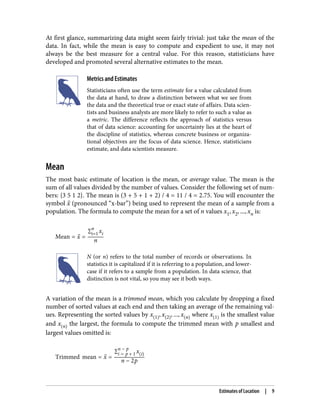


![Example: Location Estimates of Population and Murder Rates
Table 1-2 shows the first few rows in the data set containing population and murder
rates (in units of murders per 100,000 people per year) for each US state (2010
Census).
Table 1-2. A few rows of the data.frame state of population and murder rate by state
State Population Murder rate Abbreviation
1 Alabama 4,779,736 5.7 AL
2 Alaska 710,231 5.6 AK
3 Arizona 6,392,017 4.7 AZ
4 Arkansas 2,915,918 5.6 AR
5 California 37,253,956 4.4 CA
6 Colorado 5,029,196 2.8 CO
7 Connecticut 3,574,097 2.4 CT
8 Delaware 897,934 5.8 DE
Compute the mean, trimmed mean, and median for the population using R:
> state <- read.csv('state.csv')
> mean(state[['Population']])
[1] 6162876
> mean(state[['Population']], trim=0.1)
[1] 4783697
> median(state[['Population']])
[1] 4436370
To compute mean and median in Python we can use the pandas methods of the data
frame. The trimmed mean requires the trim_mean function in scipy.stats:
state = pd.read_csv('state.csv')
state['Population'].mean()
trim_mean(state['Population'], 0.1)
state['Population'].median()
The mean is bigger than the trimmed mean, which is bigger than the median.
This is because the trimmed mean excludes the largest and smallest five states
(trim=0.1 drops 10% from each end). If we want to compute the average murder rate
for the country, we need to use a weighted mean or median to account for different
populations in the states. Since base R doesn’t have a function for weighted median,
we need to install a package such as matrixStats:
> weighted.mean(state[['Murder.Rate']], w=state[['Population']])
[1] 4.445834
> library('matrixStats')
12 | Chapter 1: Exploratory Data Analysis](https://image.slidesharecdn.com/part1-251108120905-9cb081c4/85/Practical-Statistics-for-Data-Scientists-50-Essential-Concepts-Using-R-and-Python-Part-1-30-320.jpg)
![> weightedMedian(state[['Murder.Rate']], w=state[['Population']])
[1] 4.4
Weighted mean is available with NumPy. For weighted median, we can use the special‐
ized package wquantiles:
np.average(state['Murder.Rate'], weights=state['Population'])
wquantiles.median(state['Murder.Rate'], weights=state['Population'])
In this case, the weighted mean and the weighted median are about the same.
Key Ideas
• The basic metric for location is the mean, but it can be sensitive to extreme
values (outlier).
• Other metrics (median, trimmed mean) are less sensitive to outliers and unusual
distributions and hence are more robust.
Further Reading
• The Wikipedia article on central tendency contains an extensive discussion of
various measures of location.
• John Tukey’s 1977 classic Exploratory Data Analysis (Pearson) is still widely read.
Estimates of Variability
Location is just one dimension in summarizing a feature. A second dimension, varia‐
bility, also referred to as dispersion, measures whether the data values are tightly clus‐
tered or spread out. At the heart of statistics lies variability: measuring it, reducing it,
distinguishing random from real variability, identifying the various sources of real
variability, and making decisions in the presence of it.
Key Terms for Variability Metrics
Deviations
The difference between the observed values and the estimate of location.
Synonyms
errors, residuals
Variance
The sum of squared deviations from the mean divided by n – 1 where n is the
number of data values.
Estimates of Variability | 13](https://image.slidesharecdn.com/part1-251108120905-9cb081c4/85/Practical-Statistics-for-Data-Scientists-50-Essential-Concepts-Using-R-and-Python-Part-1-31-320.jpg)


![between percentiles. In a data set, the Pth percentile is a value such that at least P per‐
cent of the values take on this value or less and at least (100 – P) percent of the values
take on this value or more. For example, to find the 80th percentile, sort the data.
Then, starting with the smallest value, proceed 80 percent of the way to the largest
value. Note that the median is the same thing as the 50th percentile. The percentile is
essentially the same as a quantile, with quantiles indexed by fractions (so the .8 quan‐
tile is the same as the 80th percentile).
A common measurement of variability is the difference between the 25th percentile
and the 75th percentile, called the interquartile range (or IQR). Here is a simple exam‐
ple: {3,1,5,3,6,7,2,9}. We sort these to get {1,2,3,3,5,6,7,9}. The 25th percentile is at 2.5,
and the 75th percentile is at 6.5, so the interquartile range is 6.5 – 2.5 = 4. Software
can have slightly differing approaches that yield different answers (see the following
tip); typically, these differences are smaller.
For very large data sets, calculating exact percentiles can be computationally very
expensive since it requires sorting all the data values. Machine learning and statistical
software use special algorithms, such as [Zhang-Wang-2007], to get an approximate
percentile that can be calculated very quickly and is guaranteed to have a certain
accuracy.
Percentile: Precise Definition
If we have an even number of data (n is even), then the percentile is
ambiguous under the preceding definition. In fact, we could take
on any value between the order statistics x j and x j + 1 where j
satisfies:
100 *
j
n
≤ P < 100 *
j + 1
n
Formally, the percentile is the weighted average:
Percentile P = 1 − w x j + wx j + 1
for some weight w between 0 and 1. Statistical software has slightly
differing approaches to choosing w. In fact, the R function quan
tile offers nine different alternatives to compute the quantile.
Except for small data sets, you don’t usually need to worry about
the precise way a percentile is calculated. At the time of this writ‐
ing, Python’s numpy.quantile supports only one approach, linear
interpolation.
Estimates of Variability | 17](https://image.slidesharecdn.com/part1-251108120905-9cb081c4/85/Practical-Statistics-for-Data-Scientists-50-Essential-Concepts-Using-R-and-Python-Part-1-35-320.jpg)
![Example: Variability Estimates of State Population
Table 1-3 (repeated from Table 1-2 for convenience) shows the first few rows in the
data set containing population and murder rates for each state.
Table 1-3. A few rows of the data.frame state of population and murder rate by state
State Population Murder rate Abbreviation
1 Alabama 4,779,736 5.7 AL
2 Alaska 710,231 5.6 AK
3 Arizona 6,392,017 4.7 AZ
4 Arkansas 2,915,918 5.6 AR
5 California 37,253,956 4.4 CA
6 Colorado 5,029,196 2.8 CO
7 Connecticut 3,574,097 2.4 CT
8 Delaware 897,934 5.8 DE
Using R’s built-in functions for the standard deviation, the interquartile range (IQR),
and the median absolute deviation from the median (MAD), we can compute esti‐
mates of variability for the state population data:
> sd(state[['Population']])
[1] 6848235
> IQR(state[['Population']])
[1] 4847308
> mad(state[['Population']])
[1] 3849870
The pandas data frame provides methods for calculating standard deviation and
quantiles. Using the quantiles, we can easily determine the IQR. For the robust MAD,
we use the function robust.scale.mad from the statsmodels package:
state['Population'].std()
state['Population'].quantile(0.75) - state['Population'].quantile(0.25)
robust.scale.mad(state['Population'])
The standard deviation is almost twice as large as the MAD (in R, by default, the scale
of the MAD is adjusted to be on the same scale as the mean). This is not surprising
since the standard deviation is sensitive to outliers.
18 | Chapter 1: Exploratory Data Analysis](https://image.slidesharecdn.com/part1-251108120905-9cb081c4/85/Practical-Statistics-for-Data-Scientists-50-Essential-Concepts-Using-R-and-Python-Part-1-36-320.jpg)

![Percentiles and Boxplots
In “Estimates Based on Percentiles” on page 16, we explored how percentiles can be
used to measure the spread of the data. Percentiles are also valuable for summarizing
the entire distribution. It is common to report the quartiles (25th, 50th, and 75th per‐
centiles) and the deciles (the 10th, 20th, …, 90th percentiles). Percentiles are espe‐
cially valuable for summarizing the tails (the outer range) of the distribution. Popular
culture has coined the term one-percenters to refer to the people in the top 99th per‐
centile of wealth.
Table 1-4 displays some percentiles of the murder rate by state. In R, this would be
produced by the quantile function:
quantile(state[['Murder.Rate']], p=c(.05, .25, .5, .75, .95))
5% 25% 50% 75% 95%
1.600 2.425 4.000 5.550 6.510
The pandas data frame method quantile provides it in Python:
state['Murder.Rate'].quantile([0.05, 0.25, 0.5, 0.75, 0.95])
Table 1-4. Percentiles of murder rate by state
5% 25% 50% 75% 95%
1.60 2.42 4.00 5.55 6.51
The median is 4 murders per 100,000 people, although there is quite a bit of variabil‐
ity: the 5th percentile is only 1.6 and the 95th percentile is 6.51.
Boxplots, introduced by Tukey [Tukey-1977], are based on percentiles and give a
quick way to visualize the distribution of data. Figure 1-2 shows a boxplot of the pop‐
ulation by state produced by R:
boxplot(state[['Population']]/1000000, ylab='Population (millions)')
pandas provides a number of basic exploratory plots for data frame; one of them is
boxplots:
ax = (state['Population']/1_000_000).plot.box()
ax.set_ylabel('Population (millions)')
20 | Chapter 1: Exploratory Data Analysis](https://image.slidesharecdn.com/part1-251108120905-9cb081c4/85/Practical-Statistics-for-Data-Scientists-50-Essential-Concepts-Using-R-and-Python-Part-1-38-320.jpg)
![Figure 1-2. Boxplot of state populations
From this boxplot we can immediately see that the median state population is about 5
million, half the states fall between about 2 million and about 7 million, and there are
some high population outliers. The top and bottom of the box are the 75th and 25th
percentiles, respectively. The median is shown by the horizontal line in the box. The
dashed lines, referred to as whiskers, extend from the top and bottom of the box to
indicate the range for the bulk of the data. There are many variations of a boxplot;
see, for example, the documentation for the R function boxplot [R-base-2015]. By
default, the R function extends the whiskers to the furthest point beyond the box,
except that it will not go beyond 1.5 times the IQR. Matplotlib uses the same imple‐
mentation; other software may use a different rule.
Any data outside of the whiskers is plotted as single points or circles (often consid‐
ered outliers).
Exploring the Data Distribution | 21](https://image.slidesharecdn.com/part1-251108120905-9cb081c4/85/Practical-Statistics-for-Data-Scientists-50-Essential-Concepts-Using-R-and-Python-Part-1-39-320.jpg)
![Frequency Tables and Histograms
A frequency table of a variable divides up the variable range into equally spaced seg‐
ments and tells us how many values fall within each segment. Table 1-5 shows a fre‐
quency table of the population by state computed in R:
breaks <- seq(from=min(state[['Population']]),
to=max(state[['Population']]), length=11)
pop_freq <- cut(state[['Population']], breaks=breaks,
right=TRUE, include.lowest=TRUE)
table(pop_freq)
The function pandas.cut creates a series that maps the values into the segments.
Using the method value_counts, we get the frequency table:
binnedPopulation = pd.cut(state['Population'], 10)
binnedPopulation.value_counts()
Table 1-5. A frequency table of population by state
BinNumber BinRange Count States
1 563,626–4,232,658 24 WY,VT,ND,AK,SD,DE,MT,RI,NH,ME,HI,ID,NE,WV,NM,NV,UT,KS,AR,MS,IA,CT,OK,OR
2 4,232,659–
7,901,691
14 KY,LA,SC,AL,CO,MN,WI,MD,MO,TN,AZ,IN,MA,WA
3 7,901,692–
11,570,724
6 VA,NJ,NC,GA,MI,OH
4 11,570,725–
15,239,757
2 PA,IL
5 15,239,758–
18,908,790
1 FL
6 18,908,791–
22,577,823
1 NY
7 22,577,824–
26,246,856
1 TX
8 26,246,857–
29,915,889
0
9 29,915,890–
33,584,922
0
10 33,584,923–
37,253,956
1 CA
The least populous state is Wyoming, with 563,626 people, and the most populous is
California, with 37,253,956 people. This gives us a range of 37,253,956 – 563,626 =
36,690,330, which we must divide up into equal size bins—let’s say 10 bins. With 10
equal size bins, each bin will have a width of 3,669,033, so the first bin will span from
563,626 to 4,232,658. By contrast, the top bin, 33,584,923 to 37,253,956, has only one
state: California. The two bins immediately below California are empty, until we
22 | Chapter 1: Exploratory Data Analysis](https://image.slidesharecdn.com/part1-251108120905-9cb081c4/85/Practical-Statistics-for-Data-Scientists-50-Essential-Concepts-Using-R-and-Python-Part-1-40-320.jpg)
![reach Texas. It is important to include the empty bins; the fact that there are no values
in those bins is useful information. It can also be useful to experiment with different
bin sizes. If they are too large, important features of the distribution can be obscured.
If they are too small, the result is too granular, and the ability to see the bigger picture
is lost.
Both frequency tables and percentiles summarize the data by creat‐
ing bins. In general, quartiles and deciles will have the same count
in each bin (equal-count bins), but the bin sizes will be different.
The frequency table, by contrast, will have different counts in the
bins (equal-size bins), and the bin sizes will be the same.
A histogram is a way to visualize a frequency table, with bins on the x-axis and the
data count on the y-axis. In Figure 1-3, for example, the bin centered at 10 million
(1e+07) runs from roughly 8 million to 12 million, and there are six states in that bin.
To create a histogram corresponding to Table 1-5 in R, use the hist function with the
breaks argument:
hist(state[['Population']], breaks=breaks)
pandas supports histograms for data frames with the DataFrame.plot.hist method.
Use the keyword argument bins to define the number of bins. The various plot meth‐
ods return an axis object that allows further fine-tuning of the visualization using
Matplotlib:
ax = (state['Population'] / 1_000_000).plot.hist(figsize=(4, 4))
ax.set_xlabel('Population (millions)')
The histogram is shown in Figure 1-3. In general, histograms are plotted such that:
• Empty bins are included in the graph.
• Bins are of equal width.
• The number of bins (or, equivalently, bin size) is up to the user.
• Bars are contiguous—no empty space shows between bars, unless there is an
empty bin.
Exploring the Data Distribution | 23](https://image.slidesharecdn.com/part1-251108120905-9cb081c4/85/Practical-Statistics-for-Data-Scientists-50-Essential-Concepts-Using-R-and-Python-Part-1-41-320.jpg)
![Figure 1-3. Histogram of state populations
Statistical Moments
In statistical theory, location and variability are referred to as the
first and second moments of a distribution. The third and fourth
moments are called skewness and kurtosis. Skewness refers to
whether the data is skewed to larger or smaller values, and kurtosis
indicates the propensity of the data to have extreme values. Gener‐
ally, metrics are not used to measure skewness and kurtosis;
instead, these are discovered through visual displays such as Fig‐
ures 1-2 and 1-3.
Density Plots and Estimates
Related to the histogram is a density plot, which shows the distribution of data values
as a continuous line. A density plot can be thought of as a smoothed histogram,
although it is typically computed directly from the data through a kernel density esti‐
mate (see [Duong-2001] for a short tutorial). Figure 1-4 displays a density estimate
superposed on a histogram. In R, you can compute a density estimate using the
density function:
24 | Chapter 1: Exploratory Data Analysis](https://image.slidesharecdn.com/part1-251108120905-9cb081c4/85/Practical-Statistics-for-Data-Scientists-50-Essential-Concepts-Using-R-and-Python-Part-1-42-320.jpg)
![hist(state[['Murder.Rate']], freq=FALSE)
lines(density(state[['Murder.Rate']]), lwd=3, col='blue')
pandas provides the density method to create a density plot. Use the argument
bw_method to control the smoothness of the density curve:
ax = state['Murder.Rate'].plot.hist(density=True, xlim=[0,12], bins=range(1,12))
state['Murder.Rate'].plot.density(ax=ax)
ax.set_xlabel('Murder Rate (per 100,000)')
Plot functions often take an optional axis (ax) argument, which will cause the
plot to be added to the same graph.
A key distinction from the histogram plotted in Figure 1-3 is the scale of the y-axis: a
density plot corresponds to plotting the histogram as a proportion rather than counts
(you specify this in R using the argument freq=FALSE). Note that the total area under
the density curve = 1, and instead of counts in bins you calculate areas under the
curve between any two points on the x-axis, which correspond to the proportion of
the distribution lying between those two points.
Figure 1-4. Density of state murder rates
Exploring the Data Distribution | 25](https://image.slidesharecdn.com/part1-251108120905-9cb081c4/85/Practical-Statistics-for-Data-Scientists-50-Essential-Concepts-Using-R-and-Python-Part-1-43-320.jpg)
![Density Estimation
Density estimation is a rich topic with a long history in statistical
literature. In fact, over 20 R packages have been published that
offer functions for density estimation. [Deng-Wickham-2011] give
a comprehensive review of R packages, with a particular recom‐
mendation for ASH or KernSmooth. The density estimation methods
in pandas and scikit-learn also offer good implementations. For
many data science problems, there is no need to worry about the
various types of density estimates; it suffices to use the base
functions.
Key Ideas
• A frequency histogram plots frequency counts on the y-axis and variable values
on the x-axis; it gives a sense of the distribution of the data at a glance.
• A frequency table is a tabular version of the frequency counts found in a
histogram.
• A boxplot—with the top and bottom of the box at the 75th and 25th percentiles,
respectively—also gives a quick sense of the distribution of the data; it is often
used in side-by-side displays to compare distributions.
• A density plot is a smoothed version of a histogram; it requires a function to esti‐
mate a plot based on the data (multiple estimates are possible, of course).
Further Reading
• A SUNY Oswego professor provides a step-by-step guide to creating a boxplot.
• Density estimation in R is covered in Henry Deng and Hadley Wickham’s paper
of the same name.
• R-Bloggers has a useful post on histograms in R, including customization ele‐
ments, such as binning (breaks).
• R-Bloggers also has a similar post on boxplots in R.
• Matthew Conlen published an interactive presentation that demonstrates the
effect of choosing different kernels and bandwidth on kernel density estimates.
26 | Chapter 1: Exploratory Data Analysis](https://image.slidesharecdn.com/part1-251108120905-9cb081c4/85/Practical-Statistics-for-Data-Scientists-50-Essential-Concepts-Using-R-and-Python-Part-1-44-320.jpg)

![Figure 1-5. Bar chart of airline delays at DFW by cause
Note that a bar chart resembles a histogram; in a bar chart the x-axis represents dif‐
ferent categories of a factor variable, while in a histogram the x-axis represents values
of a single variable on a numeric scale. In a histogram, the bars are typically shown
touching each other, with gaps indicating values that did not occur in the data. In a
bar chart, the bars are shown separate from one another.
Pie charts are an alternative to bar charts, although statisticians and data visualization
experts generally eschew pie charts as less visually informative (see [Few-2007]).
28 | Chapter 1: Exploratory Data Analysis](https://image.slidesharecdn.com/part1-251108120905-9cb081c4/85/Practical-Statistics-for-Data-Scientists-50-Essential-Concepts-Using-R-and-Python-Part-1-46-320.jpg)


![raised is an example: as tax rates increase from zero, the revenue raised also increases.
However, once tax rates reach a high level and approach 100%, tax avoidance increa‐
ses and tax revenue actually declines.
Table 1-7, called a correlation matrix, shows the correlation between the daily returns
for telecommunication stocks from July 2012 through June 2015. From the table, you
can see that Verizon (VZ) and ATT (T) have the highest correlation. Level 3 (LVLT),
which is an infrastructure company, has the lowest correlation with the others. Note
the diagonal of 1s (the correlation of a stock with itself is 1) and the redundancy of
the information above and below the diagonal.
Table 1-7. Correlation between telecommunication stock returns
T CTL FTR VZ LVLT
T 1.000 0.475 0.328 0.678 0.279
CTL 0.475 1.000 0.420 0.417 0.287
FTR 0.328 0.420 1.000 0.287 0.260
VZ 0.678 0.417 0.287 1.000 0.242
LVLT 0.279 0.287 0.260 0.242 1.000
A table of correlations like Table 1-7 is commonly plotted to visually display the rela‐
tionship between multiple variables. Figure 1-6 shows the correlation between the
daily returns for major exchange-traded funds (ETFs). In R, we can easily create this
using the package corrplot:
etfs <- sp500_px[row.names(sp500_px) > '2012-07-01',
sp500_sym[sp500_sym$sector == 'etf', 'symbol']]
library(corrplot)
corrplot(cor(etfs), method='ellipse')
It is possible to create the same graph in Python, but there is no implementation in
the common packages. However, most support the visualization of correlation matri‐
ces using heatmaps. The following code demonstrates this using the seaborn.heat
map package. In the accompanying source code repository, we include Python code to
generate the more comprehensive visualization:
etfs = sp500_px.loc[sp500_px.index > '2012-07-01',
sp500_sym[sp500_sym['sector'] == 'etf']['symbol']]
sns.heatmap(etfs.corr(), vmin=-1, vmax=1,
cmap=sns.diverging_palette(20, 220, as_cmap=True))
The ETFs for the S&P 500 (SPY) and the Dow Jones Index (DIA) have a high correla‐
tion. Similarly, the QQQ and the XLK, composed mostly of technology companies,
are positively correlated. Defensive ETFs, such as those tracking gold prices (GLD),
oil prices (USO), or market volatility (VXX), tend to be weakly or negatively correla‐
ted with the other ETFs. The orientation of the ellipse indicates whether two variables
32 | Chapter 1: Exploratory Data Analysis](https://image.slidesharecdn.com/part1-251108120905-9cb081c4/85/Practical-Statistics-for-Data-Scientists-50-Essential-Concepts-Using-R-and-Python-Part-1-50-320.jpg)


