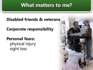
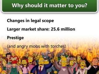
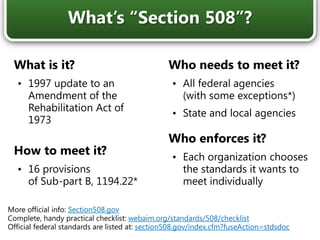
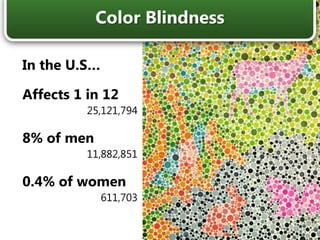
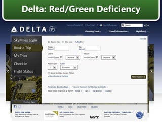
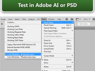
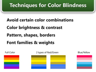
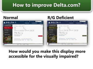
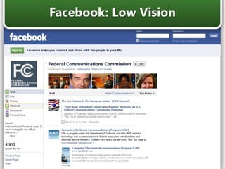
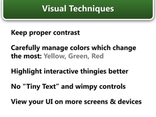
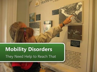
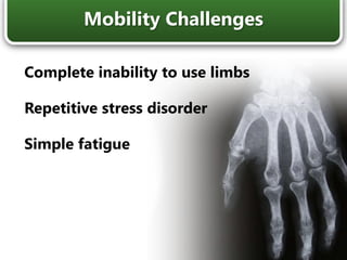
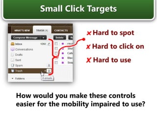
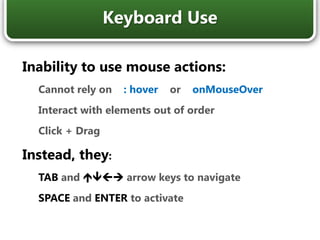
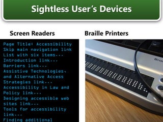
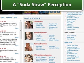
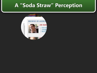
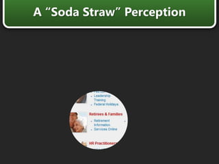
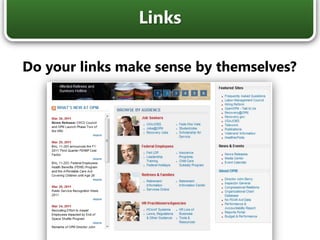
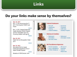
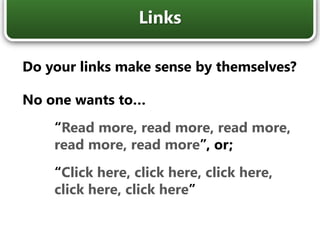
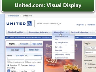
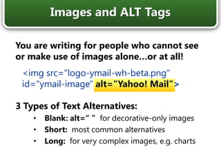
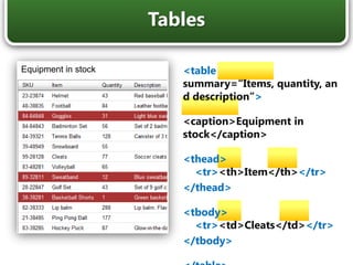
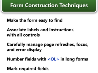
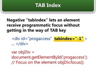
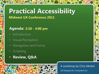
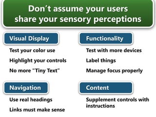
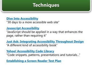
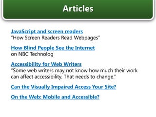
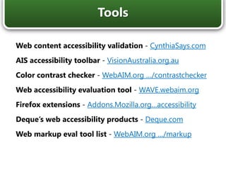
SlideShare a Scribd company logo
1 of 74
Practical Accessibility Midwest UX Conference 2011 Agenda: 2:10 - 4:00 pm ,[object Object]
Visual Perception
Navigation and Forms
Scripting
Review, Q&AA workshop by Chris Merkel UX Designer/IA, Computech Inc.
Computech, Inc.Design and UX Lead, FCC Licensing & Auctions Spikesource, Inc.UX Manager, Microsoft & Intel contracts Xerox Corporation,Creative Lead, Xerox.com & DocuShare Yahoo!Producer, Yahoo! Personals Who’s this Chris Merkel guy?
Disabled friends & veterans Corporate responsibility Personal fears:    physical injury    sight loss What matters to me?
Changes in legal scope Larger market share: 25.6 million Prestige (and angry mobs with torches) Why should it matter to you?
What is it? ,[object Object],How to meet it? ,[object Object],Who needs to meet it? ,[object Object]
State and local agencies  Who enforces it? ,[object Object],What’s “Section 508”? More official info: Section508.gov Complete, handy practical checklist: webaim.org/standards/508/checklist Official federal standards are listed at: section508.gov/index.cfm?fuseAction=stdsdoc
What is it? ,[object Object],How to meet it? ,[object Object]
WCAG 1.0 created 1999
WCAG 2.0 updated in 2008Who needs to meet it? ,[object Object],Who enforces it? ,[object Object]
Private companies
DOJ may soon use WCAGWhat’s “WCAG”? * More info at w3.org/TR/WCAG20/ (2008) and w3.org/TR/WCAG10/ (1999)
Practical Accessibility Midwest UX Conference 2011 Agenda: 2:10 - 4:00 pm ,[object Object]
Visual Perception
Navigation and Forms
Scripting
Review, Q&AA workshop by Chris Merkel UX Designer/IA, Computech Inc.
In the U.S… Affects 1 in 12 25,121,794 8% of men 11,882,851 0.4% of women 611,703 Color Blindness
Delta: Full Color Vision
Delta: Red/Green Deficiency
Test in Adobe AI or PSD
Avoid certain color combinations Color brightness & contrast Pattern, shapes, borders Font families & weights Techniques for Color Blindness Full Color 2 types of Red/Green Blue/Yellow
How to improve Delta.com? Normal R/G Deficient How would you make this display more accessible for the visually impaired?
Facebook: Low Vision
Keep proper contrast Carefully manage colors which change the most: Yellow, Green, Red Highlight interactive thingies better No “Tiny Text” and wimpy controls View your UI on more screens & devices Visual Techniques
Practical Accessibility Midwest UX Conference 2011 Agenda: 2:10 - 4:00 pm ,[object Object]
Visual Perception
Navigation and Forms
Scripting
Review, Q&AA workshop by Chris Merkel UX Designer/IA, Computech Inc.
Mobility Disorders They Need Help to Reach That
Complete inability to use limbs Repetitive stress disorder Simple fatigue Mobility Challenges
xHard to spot xHard to click on XHard to use Small Click Targets How would you make these controls easier for the mobility impaired to use?
Inability to use mouse actions: Cannot rely on    : hover    or    onMouseOver Interact with elements out of order Click + Drag Instead, they:  TAB andÛÜÙÚarrow keys to navigate SPACE and ENTER to activate  Keyboard Use
Twitter: Visual Focus
Facebook: Visual Focus
Consider the TAB order Surface intuitive directional and command keys, and common modifiers: , Shift, Control, Escape Use common HTML controls, then enhance progressively Keyboard Access Techniques
Keyboard Use What would you do to make this playlist accessible for mobility handicapped?
You, with the smartphone: Inability to use  :hover  oronMouseOver Difficulty with Click + Drag Limited viewing area Difficulty with lighting Patchy attention span Multimedia access Mobile Users
Non-Visual Users Some People Can Only Hear the Web
Screen Readers Braille Printers Sightless User’s Devices Page Title: AccessibilitySkip main navigation linkList with six items... Introduction link...Barriers link...  Assistive Technologies, and Alternative Access Strategies link...Accessibility in Law and Policy link...Designing accessible web sites link...Tools for accessibility link...Finding additional resources on Web accessibility link...
A “Soda Straw” Perception
Browsers: IE 8:	 43.1% Firefox 3+:	  23.5% IE 7:	  12.5% Safari:       9.6% Others:      11.4%(incl. IE6, 9, Chrome) Screen Readers: JAWS:   69.6% NVDA:    34.8% VoiceOver:    20.2% Window-Eyes:     19.0% Others:   29.7%(incl. System Access & ZoomText) Damned Lies & Statistics 2009 to2010
Dispatch.com
Dispatch.com: Headers & Links
Dispatch.com: Headers & Links “Ongoing Stories, Heading Level 3” “Ted Williams… Heading Level 2, Where we live… Heading Level 2”
Just like making an outline Gives blind users a sense of a document’s contents and structure Search engines will be better able to index your site with this grouping (this only works with real heading tags) Headers
Do your links make sense by themselves? Links
Do your links make sense by themselves? No one wants to… “Read more, read more, read more, read more, read more”, or; “Click here, click here, click here, click here, click here” Links
United.com: Visual Display
Same Site: No Images
<imgsrc="logo-ymail-wh-beta.png" alt=“ “> <imgsrc="logo-ymail-wh-beta.png" alt=“Home”> <imgsrc="logo-ymail-wh-beta.png" alt=“Yahoo! Mail”> <imgsrc="logo-ymail-wh-beta.png" alt=“Yahoo! Mail homepage”> What’s the Right Description?
You are writing for people who cannot see or make use of images alone…or at all! <imgsrc="logo-ymail-wh-beta.png" id="ymail-image" alt="Yahoo! Mail"> 3 Types of Text Alternatives: Blank: alt=“ ”  for decorative-only images Short:most common alternatives Long: for very complex images, e.g. charts Images and ALT Tags
<table summary=“Items, quantity, and description”> <caption>Equipment in stock</caption> <thead>    <tr><th>Item</th></tr> </thead> <tbody>     <tr><td>Cleats</td></tr> </tbody> </table> Equipment in stock Tables
<ol>  Ordered List <li>  List Items <ul>  Unordered List <li>  List Items <dl>  Definition List <dt> Definition Terms <dd> Definition Description (s) Lists
Lists: Google Search Results List with 10 items… Out of list, List item one… Accessibility and Assistive Technology…
<em>Accessibility 2011</em>: Escape! | <em>Facebook</em> Bold, Strong? Italic, Emphasis?
Skip Links “Link: A different version of this web site containing similar content optimized for screen readers and mobile devices may be found at the web address www.amazon.com/access.”
Document Landmark Roles article banner complementary contentinfo main navigation search Introduction to WAI ARIA banner main article navigation article contentinfo
Document Landmark Roles Introduction to WAI ARIA banner main <div role=“main“>...</div> article navigation article <li  role=“article“>...</li> contentinfo
Improve Twitter for the Blind How would you make this application more accessible for sightless users?
Use real headings in an outline order Include a text alternative for all images Make links and commands intuitive Construct tables properly Give users ways to skip through content Don’t rely on mouse interactions Non-Visual Techniques
Form Construction Making Pesky Forms Accessible
Normal Reading Forms Edit Mode Speaks the content of an entire window Most users skip through content via shortcut keys Turns on when focusing on a form control Users then TAB from one field or control to another They do not hear any text that is not part of a field Screen Reader Modes
All form fields need a label United.com: Field Labels
<label for="shipping-user-companyName" >  <span>Company Name (optional)</span> </label> <input name="shipping-user-companyName" type="text"  id="shipping-user-companyName"  aria-label="Company Name (optional)" > Apple.com: Advanced Labels
Asterisks aren’t good enough Add understandable text to form labels Use ARIA attributes: <input type="text" id="contactname“  name="contactname" size="30“ aria-required="true"> Mark Form Fields Required

More Related Content

Viewers also liked

UXR2/17: Accessibility Trends – Anspruch und Wirklichkeit der Barrierefreihei...
UXR2/17: Accessibility Trends – Anspruch und Wirklichkeit der Barrierefreihei...UXR2/17: Accessibility Trends – Anspruch und Wirklichkeit der Barrierefreihei...
UXR2/17: Accessibility Trends – Anspruch und Wirklichkeit der Barrierefreihei...uxHH
 
WCAG 2.0 for Designers
WCAG 2.0 for DesignersWCAG 2.0 for Designers
WCAG 2.0 for DesignersBrunner
 
The Velvet Rope - making user experience accessible
The Velvet Rope - making user experience accessibleThe Velvet Rope - making user experience accessible
The Velvet Rope - making user experience accessibleHenny Swan
 
2017 CSUN Color Contrast
2017 CSUN Color Contrast2017 CSUN Color Contrast
2017 CSUN Color ContrastCrystal Baker
 
Mind Your lang — Accessibility Camp Toronto 2016
Mind Your lang — Accessibility Camp Toronto 2016Mind Your lang — Accessibility Camp Toronto 2016
Mind Your lang — Accessibility Camp Toronto 2016Adrian Roselli
 
Implementing Accessibility: Accessibility Toronto
Implementing Accessibility: Accessibility TorontoImplementing Accessibility: Accessibility Toronto
Implementing Accessibility: Accessibility TorontoAdrian Roselli
 
Accessibility and Design: Where Productivity and Philosophy Meet
Accessibility and Design:  Where Productivity and Philosophy MeetAccessibility and Design:  Where Productivity and Philosophy Meet
Accessibility and Design: Where Productivity and Philosophy MeetJoe Lonsky
 

Viewers also liked (8)

UXR2/17: Accessibility Trends – Anspruch und Wirklichkeit der Barrierefreihei...
UXR2/17: Accessibility Trends – Anspruch und Wirklichkeit der Barrierefreihei...UXR2/17: Accessibility Trends – Anspruch und Wirklichkeit der Barrierefreihei...
UXR2/17: Accessibility Trends – Anspruch und Wirklichkeit der Barrierefreihei...
 
WCAG 2.0 for Designers
WCAG 2.0 for DesignersWCAG 2.0 for Designers
WCAG 2.0 for Designers
 
The Velvet Rope - making user experience accessible
The Velvet Rope - making user experience accessibleThe Velvet Rope - making user experience accessible
The Velvet Rope - making user experience accessible
 
2017 CSUN Color Contrast
2017 CSUN Color Contrast2017 CSUN Color Contrast
2017 CSUN Color Contrast
 
Accessible Responsive Web Design
Accessible Responsive Web DesignAccessible Responsive Web Design
Accessible Responsive Web Design
 
Mind Your lang — Accessibility Camp Toronto 2016
Mind Your lang — Accessibility Camp Toronto 2016Mind Your lang — Accessibility Camp Toronto 2016
Mind Your lang — Accessibility Camp Toronto 2016
 
Implementing Accessibility: Accessibility Toronto
Implementing Accessibility: Accessibility TorontoImplementing Accessibility: Accessibility Toronto
Implementing Accessibility: Accessibility Toronto
 
Accessibility and Design: Where Productivity and Philosophy Meet
Accessibility and Design:  Where Productivity and Philosophy MeetAccessibility and Design:  Where Productivity and Philosophy Meet
Accessibility and Design: Where Productivity and Philosophy Meet
 

Similar to Practical Accessibility - Midwest UX conference 2011

Performance Optimisation For Web & Mobile
Performance Optimisation For Web & MobilePerformance Optimisation For Web & Mobile
Performance Optimisation For Web & Mobileformfunction
 
Accessibility And 508 Compliance In 2009
Accessibility And 508 Compliance In 2009Accessibility And 508 Compliance In 2009
Accessibility And 508 Compliance In 2009Emagination ®
 
corePHP Usability Accessibility by Steven Pignataro
corePHP Usability Accessibility by Steven PignatarocorePHP Usability Accessibility by Steven Pignataro
corePHP Usability Accessibility by Steven PignataroJohn Coonen
 
Is accessibility the new black?
Is accessibility the new black?Is accessibility the new black?
Is accessibility the new black?George Otoiu
 
Developing an Accessible Web
Developing an Accessible WebDeveloping an Accessible Web
Developing an Accessible WebArnoldBail
 
Intro to Web Accessibility
Intro to Web Accessibility Intro to Web Accessibility
Intro to Web Accessibility Ashley Dzick
 
A Primer on Web Accessibility for Teams
A Primer on Web Accessibility for TeamsA Primer on Web Accessibility for Teams
A Primer on Web Accessibility for TeamsMikey Ilagan
 
User Experience Design Heuristics
User Experience Design HeuristicsUser Experience Design Heuristics
User Experience Design HeuristicsNathanael Boehm
 
Designing Accessible Drupal Themes
Designing Accessible Drupal ThemesDesigning Accessible Drupal Themes
Designing Accessible Drupal ThemesHeather Wozniak
 
Browsee - AI assisted tool to improve User Experience on your Website
Browsee - AI assisted tool to improve User Experience on your WebsiteBrowsee - AI assisted tool to improve User Experience on your Website
Browsee - AI assisted tool to improve User Experience on your WebsiteShraddhaSrivastava78
 
Rich User Experience Documentation - Update
Rich User Experience Documentation - UpdateRich User Experience Documentation - Update
Rich User Experience Documentation - UpdateJohn Yesko
 
Skip to Content ↵ENTER Skip to Menu ↵ENTER Skip to Footer ↵
 Skip to Content ↵ENTER   Skip to Menu ↵ENTER   Skip to Footer ↵ Skip to Content ↵ENTER   Skip to Menu ↵ENTER   Skip to Footer ↵
Skip to Content ↵ENTER Skip to Menu ↵ENTER Skip to Footer ↵MoseStaton39
 
JavaScript and DOM Pattern Implementation
JavaScript and DOM Pattern ImplementationJavaScript and DOM Pattern Implementation
JavaScript and DOM Pattern Implementationdavejohnson
 
How you can start building accessible websites today (... and why!)
How you can start building accessible websites today (... and why!)How you can start building accessible websites today (... and why!)
How you can start building accessible websites today (... and why!)nrasul
 
Accessibility and Web Technologies @HTML5_Toronto
Accessibility and Web Technologies @HTML5_TorontoAccessibility and Web Technologies @HTML5_Toronto
Accessibility and Web Technologies @HTML5_TorontoGeorge Zamfir
 
Creating the Best Experience: Accessibility & Usability
Creating the Best Experience: Accessibility & UsabilityCreating the Best Experience: Accessibility & Usability
Creating the Best Experience: Accessibility & UsabilityCarol Smith
 
SEO through Accessibility- How designing accessible websites leads to automat...
SEO through Accessibility- How designing accessible websites leads to automat...SEO through Accessibility- How designing accessible websites leads to automat...
SEO through Accessibility- How designing accessible websites leads to automat...Abhay Rautela
 
Accounting For Every Camper
Accounting For Every CamperAccounting For Every Camper
Accounting For Every CamperAshley Dzick
 

Similar to Practical Accessibility - Midwest UX conference 2011 (20)

Accessibility Usability Professional Summry
Accessibility Usability Professional SummryAccessibility Usability Professional Summry
Accessibility Usability Professional Summry
 
Performance Optimisation For Web & Mobile
Performance Optimisation For Web & MobilePerformance Optimisation For Web & Mobile
Performance Optimisation For Web & Mobile
 
Accessibility And 508 Compliance In 2009
Accessibility And 508 Compliance In 2009Accessibility And 508 Compliance In 2009
Accessibility And 508 Compliance In 2009
 
corePHP Usability Accessibility by Steven Pignataro
corePHP Usability Accessibility by Steven PignatarocorePHP Usability Accessibility by Steven Pignataro
corePHP Usability Accessibility by Steven Pignataro
 
Is accessibility the new black?
Is accessibility the new black?Is accessibility the new black?
Is accessibility the new black?
 
Developing an Accessible Web
Developing an Accessible WebDeveloping an Accessible Web
Developing an Accessible Web
 
Intro to Web Accessibility
Intro to Web Accessibility Intro to Web Accessibility
Intro to Web Accessibility
 
A Primer on Web Accessibility for Teams
A Primer on Web Accessibility for TeamsA Primer on Web Accessibility for Teams
A Primer on Web Accessibility for Teams
 
User Experience Design Heuristics
User Experience Design HeuristicsUser Experience Design Heuristics
User Experience Design Heuristics
 
Dfg Intranet Development
Dfg Intranet DevelopmentDfg Intranet Development
Dfg Intranet Development
 
Designing Accessible Drupal Themes
Designing Accessible Drupal ThemesDesigning Accessible Drupal Themes
Designing Accessible Drupal Themes
 
Browsee - AI assisted tool to improve User Experience on your Website
Browsee - AI assisted tool to improve User Experience on your WebsiteBrowsee - AI assisted tool to improve User Experience on your Website
Browsee - AI assisted tool to improve User Experience on your Website
 
Rich User Experience Documentation - Update
Rich User Experience Documentation - UpdateRich User Experience Documentation - Update
Rich User Experience Documentation - Update
 
Skip to Content ↵ENTER Skip to Menu ↵ENTER Skip to Footer ↵
 Skip to Content ↵ENTER   Skip to Menu ↵ENTER   Skip to Footer ↵ Skip to Content ↵ENTER   Skip to Menu ↵ENTER   Skip to Footer ↵
Skip to Content ↵ENTER Skip to Menu ↵ENTER Skip to Footer ↵
 
JavaScript and DOM Pattern Implementation
JavaScript and DOM Pattern ImplementationJavaScript and DOM Pattern Implementation
JavaScript and DOM Pattern Implementation
 
How you can start building accessible websites today (... and why!)
How you can start building accessible websites today (... and why!)How you can start building accessible websites today (... and why!)
How you can start building accessible websites today (... and why!)
 
Accessibility and Web Technologies @HTML5_Toronto
Accessibility and Web Technologies @HTML5_TorontoAccessibility and Web Technologies @HTML5_Toronto
Accessibility and Web Technologies @HTML5_Toronto
 
Creating the Best Experience: Accessibility & Usability
Creating the Best Experience: Accessibility & UsabilityCreating the Best Experience: Accessibility & Usability
Creating the Best Experience: Accessibility & Usability
 
SEO through Accessibility- How designing accessible websites leads to automat...
SEO through Accessibility- How designing accessible websites leads to automat...SEO through Accessibility- How designing accessible websites leads to automat...
SEO through Accessibility- How designing accessible websites leads to automat...
 
Accounting For Every Camper
Accounting For Every CamperAccounting For Every Camper
Accounting For Every Camper
 

Recently uploaded

Presentation on how to chat with PDF using ChatGPT code interpreter
Presentation on how to chat with PDF using ChatGPT code interpreterPresentation on how to chat with PDF using ChatGPT code interpreter
Presentation on how to chat with PDF using ChatGPT code interpreternaman860154
 
Swan(sea) Song – personal research during my six years at Swansea ... and bey...
Swan(sea) Song – personal research during my six years at Swansea ... and bey...Swan(sea) Song – personal research during my six years at Swansea ... and bey...
Swan(sea) Song – personal research during my six years at Swansea ... and bey...Alan Dix
 
SIEMENS: RAPUNZEL – A Tale About Knowledge Graph
SIEMENS: RAPUNZEL – A Tale About Knowledge GraphSIEMENS: RAPUNZEL – A Tale About Knowledge Graph
SIEMENS: RAPUNZEL – A Tale About Knowledge GraphNeo4j
 
Understanding the Laravel MVC Architecture
Understanding the Laravel MVC ArchitectureUnderstanding the Laravel MVC Architecture
Understanding the Laravel MVC ArchitecturePixlogix Infotech
 
Benefits Of Flutter Compared To Other Frameworks
Benefits Of Flutter Compared To Other FrameworksBenefits Of Flutter Compared To Other Frameworks
Benefits Of Flutter Compared To Other FrameworksSoftradix Technologies
 
WhatsApp 9892124323 ✓Call Girls In Kalyan ( Mumbai ) secure service
WhatsApp 9892124323 ✓Call Girls In Kalyan ( Mumbai ) secure serviceWhatsApp 9892124323 ✓Call Girls In Kalyan ( Mumbai ) secure service
WhatsApp 9892124323 ✓Call Girls In Kalyan ( Mumbai ) secure servicePooja Nehwal
 
Handwritten Text Recognition for manuscripts and early printed texts
Handwritten Text Recognition for manuscripts and early printed textsHandwritten Text Recognition for manuscripts and early printed texts
Handwritten Text Recognition for manuscripts and early printed textsMaria Levchenko
 
[2024]Digital Global Overview Report 2024 Meltwater.pdf
[2024]Digital Global Overview Report 2024 Meltwater.pdf[2024]Digital Global Overview Report 2024 Meltwater.pdf
[2024]Digital Global Overview Report 2024 Meltwater.pdfhans926745
 
IAC 2024 - IA Fast Track to Search Focused AI Solutions
IAC 2024 - IA Fast Track to Search Focused AI SolutionsIAC 2024 - IA Fast Track to Search Focused AI Solutions
IAC 2024 - IA Fast Track to Search Focused AI SolutionsEnterprise Knowledge
 
Slack Application Development 101 Slides
Slack Application Development 101 SlidesSlack Application Development 101 Slides
Slack Application Development 101 Slidespraypatel2
 
SQL Database Design For Developers at php[tek] 2024
SQL Database Design For Developers at php[tek] 2024SQL Database Design For Developers at php[tek] 2024
SQL Database Design For Developers at php[tek] 2024Scott Keck-Warren
 
A Domino Admins Adventures (Engage 2024)
A Domino Admins Adventures (Engage 2024)A Domino Admins Adventures (Engage 2024)
A Domino Admins Adventures (Engage 2024)Gabriella Davis
 
08448380779 Call Girls In Greater Kailash - I Women Seeking Men
08448380779 Call Girls In Greater Kailash - I Women Seeking Men08448380779 Call Girls In Greater Kailash - I Women Seeking Men
08448380779 Call Girls In Greater Kailash - I Women Seeking MenDelhi Call girls
 
Tech-Forward - Achieving Business Readiness For Copilot in Microsoft 365
Tech-Forward - Achieving Business Readiness For Copilot in Microsoft 365Tech-Forward - Achieving Business Readiness For Copilot in Microsoft 365
Tech-Forward - Achieving Business Readiness For Copilot in Microsoft 3652toLead Limited
 
Automating Business Process via MuleSoft Composer | Bangalore MuleSoft Meetup...
Automating Business Process via MuleSoft Composer | Bangalore MuleSoft Meetup...Automating Business Process via MuleSoft Composer | Bangalore MuleSoft Meetup...
Automating Business Process via MuleSoft Composer | Bangalore MuleSoft Meetup...shyamraj55
 
04-2024-HHUG-Sales-and-Marketing-Alignment.pptx
04-2024-HHUG-Sales-and-Marketing-Alignment.pptx04-2024-HHUG-Sales-and-Marketing-Alignment.pptx
04-2024-HHUG-Sales-and-Marketing-Alignment.pptxHampshireHUG
 
How to convert PDF to text with Nanonets
How to convert PDF to text with NanonetsHow to convert PDF to text with Nanonets
How to convert PDF to text with Nanonetsnaman860154
 
Factors to Consider When Choosing Accounts Payable Services Providers.pptx
Factors to Consider When Choosing Accounts Payable Services Providers.pptxFactors to Consider When Choosing Accounts Payable Services Providers.pptx
Factors to Consider When Choosing Accounts Payable Services Providers.pptxKatpro Technologies
 
Scaling API-first – The story of a global engineering organization
Scaling API-first – The story of a global engineering organizationScaling API-first – The story of a global engineering organization
Scaling API-first – The story of a global engineering organizationRadu Cotescu
 
Transcript: #StandardsGoals for 2024: What’s new for BISAC - Tech Forum 2024
Transcript: #StandardsGoals for 2024: What’s new for BISAC - Tech Forum 2024Transcript: #StandardsGoals for 2024: What’s new for BISAC - Tech Forum 2024
Transcript: #StandardsGoals for 2024: What’s new for BISAC - Tech Forum 2024BookNet Canada
 

Recently uploaded (20)

Presentation on how to chat with PDF using ChatGPT code interpreter
Presentation on how to chat with PDF using ChatGPT code interpreterPresentation on how to chat with PDF using ChatGPT code interpreter
Presentation on how to chat with PDF using ChatGPT code interpreter
 
Swan(sea) Song – personal research during my six years at Swansea ... and bey...
Swan(sea) Song – personal research during my six years at Swansea ... and bey...Swan(sea) Song – personal research during my six years at Swansea ... and bey...
Swan(sea) Song – personal research during my six years at Swansea ... and bey...
 
SIEMENS: RAPUNZEL – A Tale About Knowledge Graph
SIEMENS: RAPUNZEL – A Tale About Knowledge GraphSIEMENS: RAPUNZEL – A Tale About Knowledge Graph
SIEMENS: RAPUNZEL – A Tale About Knowledge Graph
 
Understanding the Laravel MVC Architecture
Understanding the Laravel MVC ArchitectureUnderstanding the Laravel MVC Architecture
Understanding the Laravel MVC Architecture
 
Benefits Of Flutter Compared To Other Frameworks
Benefits Of Flutter Compared To Other FrameworksBenefits Of Flutter Compared To Other Frameworks
Benefits Of Flutter Compared To Other Frameworks
 
WhatsApp 9892124323 ✓Call Girls In Kalyan ( Mumbai ) secure service
WhatsApp 9892124323 ✓Call Girls In Kalyan ( Mumbai ) secure serviceWhatsApp 9892124323 ✓Call Girls In Kalyan ( Mumbai ) secure service
WhatsApp 9892124323 ✓Call Girls In Kalyan ( Mumbai ) secure service
 
Handwritten Text Recognition for manuscripts and early printed texts
Handwritten Text Recognition for manuscripts and early printed textsHandwritten Text Recognition for manuscripts and early printed texts
Handwritten Text Recognition for manuscripts and early printed texts
 
[2024]Digital Global Overview Report 2024 Meltwater.pdf
[2024]Digital Global Overview Report 2024 Meltwater.pdf[2024]Digital Global Overview Report 2024 Meltwater.pdf
[2024]Digital Global Overview Report 2024 Meltwater.pdf
 
IAC 2024 - IA Fast Track to Search Focused AI Solutions
IAC 2024 - IA Fast Track to Search Focused AI SolutionsIAC 2024 - IA Fast Track to Search Focused AI Solutions
IAC 2024 - IA Fast Track to Search Focused AI Solutions
 
Slack Application Development 101 Slides
Slack Application Development 101 SlidesSlack Application Development 101 Slides
Slack Application Development 101 Slides
 
SQL Database Design For Developers at php[tek] 2024
SQL Database Design For Developers at php[tek] 2024SQL Database Design For Developers at php[tek] 2024
SQL Database Design For Developers at php[tek] 2024
 
A Domino Admins Adventures (Engage 2024)
A Domino Admins Adventures (Engage 2024)A Domino Admins Adventures (Engage 2024)
A Domino Admins Adventures (Engage 2024)
 
08448380779 Call Girls In Greater Kailash - I Women Seeking Men
08448380779 Call Girls In Greater Kailash - I Women Seeking Men08448380779 Call Girls In Greater Kailash - I Women Seeking Men
08448380779 Call Girls In Greater Kailash - I Women Seeking Men
 
Tech-Forward - Achieving Business Readiness For Copilot in Microsoft 365
Tech-Forward - Achieving Business Readiness For Copilot in Microsoft 365Tech-Forward - Achieving Business Readiness For Copilot in Microsoft 365
Tech-Forward - Achieving Business Readiness For Copilot in Microsoft 365
 
Automating Business Process via MuleSoft Composer | Bangalore MuleSoft Meetup...
Automating Business Process via MuleSoft Composer | Bangalore MuleSoft Meetup...Automating Business Process via MuleSoft Composer | Bangalore MuleSoft Meetup...
Automating Business Process via MuleSoft Composer | Bangalore MuleSoft Meetup...
 
04-2024-HHUG-Sales-and-Marketing-Alignment.pptx
04-2024-HHUG-Sales-and-Marketing-Alignment.pptx04-2024-HHUG-Sales-and-Marketing-Alignment.pptx
04-2024-HHUG-Sales-and-Marketing-Alignment.pptx
 
How to convert PDF to text with Nanonets
How to convert PDF to text with NanonetsHow to convert PDF to text with Nanonets
How to convert PDF to text with Nanonets
 
Factors to Consider When Choosing Accounts Payable Services Providers.pptx
Factors to Consider When Choosing Accounts Payable Services Providers.pptxFactors to Consider When Choosing Accounts Payable Services Providers.pptx
Factors to Consider When Choosing Accounts Payable Services Providers.pptx
 
Scaling API-first – The story of a global engineering organization
Scaling API-first – The story of a global engineering organizationScaling API-first – The story of a global engineering organization
Scaling API-first – The story of a global engineering organization
 
Transcript: #StandardsGoals for 2024: What’s new for BISAC - Tech Forum 2024
Transcript: #StandardsGoals for 2024: What’s new for BISAC - Tech Forum 2024Transcript: #StandardsGoals for 2024: What’s new for BISAC - Tech Forum 2024
Transcript: #StandardsGoals for 2024: What’s new for BISAC - Tech Forum 2024
 

Practical Accessibility - Midwest UX conference 2011

  • 1.
  • 5. Review, Q&AA workshop by Chris Merkel UX Designer/IA, Computech Inc.
  • 6. Computech, Inc.Design and UX Lead, FCC Licensing & Auctions Spikesource, Inc.UX Manager, Microsoft & Intel contracts Xerox Corporation,Creative Lead, Xerox.com & DocuShare Yahoo!Producer, Yahoo! Personals Who’s this Chris Merkel guy?
  • 7. Disabled friends & veterans Corporate responsibility Personal fears: physical injury sight loss What matters to me?
  • 8. Changes in legal scope Larger market share: 25.6 million Prestige (and angry mobs with torches) Why should it matter to you?
  • 9.
  • 10.
  • 11.
  • 13.
  • 15. DOJ may soon use WCAGWhat’s “WCAG”? * More info at w3.org/TR/WCAG20/ (2008) and w3.org/TR/WCAG10/ (1999)
  • 16.
  • 20. Review, Q&AA workshop by Chris Merkel UX Designer/IA, Computech Inc.
  • 21. In the U.S… Affects 1 in 12 25,121,794 8% of men 11,882,851 0.4% of women 611,703 Color Blindness
  • 24. Test in Adobe AI or PSD
  • 25. Avoid certain color combinations Color brightness & contrast Pattern, shapes, borders Font families & weights Techniques for Color Blindness Full Color 2 types of Red/Green Blue/Yellow
  • 26. How to improve Delta.com? Normal R/G Deficient How would you make this display more accessible for the visually impaired?
  • 28. Keep proper contrast Carefully manage colors which change the most: Yellow, Green, Red Highlight interactive thingies better No “Tiny Text” and wimpy controls View your UI on more screens & devices Visual Techniques
  • 29.
  • 33. Review, Q&AA workshop by Chris Merkel UX Designer/IA, Computech Inc.
  • 34. Mobility Disorders They Need Help to Reach That
  • 35. Complete inability to use limbs Repetitive stress disorder Simple fatigue Mobility Challenges
  • 36. xHard to spot xHard to click on XHard to use Small Click Targets How would you make these controls easier for the mobility impaired to use?
  • 37. Inability to use mouse actions: Cannot rely on : hover or onMouseOver Interact with elements out of order Click + Drag Instead, they: TAB andÛÜÙÚarrow keys to navigate SPACE and ENTER to activate Keyboard Use
  • 40. Consider the TAB order Surface intuitive directional and command keys, and common modifiers: , Shift, Control, Escape Use common HTML controls, then enhance progressively Keyboard Access Techniques
  • 41. Keyboard Use What would you do to make this playlist accessible for mobility handicapped?
  • 42. You, with the smartphone: Inability to use :hover oronMouseOver Difficulty with Click + Drag Limited viewing area Difficulty with lighting Patchy attention span Multimedia access Mobile Users
  • 43. Non-Visual Users Some People Can Only Hear the Web
  • 44. Screen Readers Braille Printers Sightless User’s Devices Page Title: AccessibilitySkip main navigation linkList with six items... Introduction link...Barriers link... Assistive Technologies, and Alternative Access Strategies link...Accessibility in Law and Policy link...Designing accessible web sites link...Tools for accessibility link...Finding additional resources on Web accessibility link...
  • 45. A “Soda Straw” Perception
  • 46. A “Soda Straw” Perception
  • 47. A “Soda Straw” Perception
  • 48. A “Soda Straw” Perception
  • 49. Browsers: IE 8: 43.1% Firefox 3+: 23.5% IE 7: 12.5% Safari: 9.6% Others: 11.4%(incl. IE6, 9, Chrome) Screen Readers: JAWS: 69.6% NVDA: 34.8% VoiceOver: 20.2% Window-Eyes: 19.0% Others: 29.7%(incl. System Access & ZoomText) Damned Lies & Statistics 2009 to2010
  • 52. Dispatch.com: Headers & Links “Ongoing Stories, Heading Level 3” “Ted Williams… Heading Level 2, Where we live… Heading Level 2”
  • 53. Just like making an outline Gives blind users a sense of a document’s contents and structure Search engines will be better able to index your site with this grouping (this only works with real heading tags) Headers
  • 54. Do your links make sense by themselves? Links
  • 55. Do your links make sense by themselves? Links
  • 56. Do your links make sense by themselves? No one wants to… “Read more, read more, read more, read more, read more”, or; “Click here, click here, click here, click here, click here” Links
  • 58. Same Site: No Images
  • 59. <imgsrc="logo-ymail-wh-beta.png" alt=“ “> <imgsrc="logo-ymail-wh-beta.png" alt=“Home”> <imgsrc="logo-ymail-wh-beta.png" alt=“Yahoo! Mail”> <imgsrc="logo-ymail-wh-beta.png" alt=“Yahoo! Mail homepage”> What’s the Right Description?
  • 60. You are writing for people who cannot see or make use of images alone…or at all! <imgsrc="logo-ymail-wh-beta.png" id="ymail-image" alt="Yahoo! Mail"> 3 Types of Text Alternatives: Blank: alt=“ ” for decorative-only images Short:most common alternatives Long: for very complex images, e.g. charts Images and ALT Tags
  • 61. <table summary=“Items, quantity, and description”> <caption>Equipment in stock</caption> <thead> <tr><th>Item</th></tr> </thead> <tbody> <tr><td>Cleats</td></tr> </tbody> </table> Equipment in stock Tables
  • 62. <ol> Ordered List <li> List Items <ul> Unordered List <li> List Items <dl> Definition List <dt> Definition Terms <dd> Definition Description (s) Lists
  • 63. Lists: Google Search Results List with 10 items… Out of list, List item one… Accessibility and Assistive Technology…
  • 64. <em>Accessibility 2011</em>: Escape! | <em>Facebook</em> Bold, Strong? Italic, Emphasis?
  • 65. Skip Links “Link: A different version of this web site containing similar content optimized for screen readers and mobile devices may be found at the web address www.amazon.com/access.”
  • 66. Document Landmark Roles article banner complementary contentinfo main navigation search Introduction to WAI ARIA banner main article navigation article contentinfo
  • 67. Document Landmark Roles Introduction to WAI ARIA banner main <div role=“main“>...</div> article navigation article <li role=“article“>...</li> contentinfo
  • 68. Improve Twitter for the Blind How would you make this application more accessible for sightless users?
  • 69. Use real headings in an outline order Include a text alternative for all images Make links and commands intuitive Construct tables properly Give users ways to skip through content Don’t rely on mouse interactions Non-Visual Techniques
  • 70. Form Construction Making Pesky Forms Accessible
  • 71. Normal Reading Forms Edit Mode Speaks the content of an entire window Most users skip through content via shortcut keys Turns on when focusing on a form control Users then TAB from one field or control to another They do not hear any text that is not part of a field Screen Reader Modes
  • 72. All form fields need a label United.com: Field Labels
  • 73. <label for="shipping-user-companyName" > <span>Company Name (optional)</span> </label> <input name="shipping-user-companyName" type="text" id="shipping-user-companyName" aria-label="Company Name (optional)" > Apple.com: Advanced Labels
  • 74. Asterisks aren’t good enough Add understandable text to form labels Use ARIA attributes: <input type="text" id="contactname“ name="contactname" size="30“ aria-required="true"> Mark Form Fields Required
  • 75. Make the form easy to find Associate labels and instructions with all controls Carefully manage page refreshes, focus, and error display Number fields with <OL> in long forms Mark required fields Form Construction Techniques
  • 76.
  • 80. Review, Q&AA workshop by Chris Merkel UX Designer/IA, Computech Inc.
  • 81. Yahoo UI: Dialog Boxes developer.yahoo.com/yui/examples/container/container-ariaplugin.html
  • 82. Negative “tabindex” lets an element receive programmatic focus without getting in the way of TAB key <div id="progaccess" tabindex="-1" > ... </div> varobjDiv = document.getElementById('progaccess'); // Focus on the element objDiv.focus(); TAB Index
  • 83. Twitter: Page Changes www.twitter.com
  • 84. Twitter: Page Changes www.twitter.com
  • 85. ARIA Live Regions off:<ularia-live="off" >…</ul> polite: <ularia-live="polite">…</ul> assertive: <ularia-live="assertive" >…</ul> Handle Data Refresh with ARIA
  • 86. Roles: application grid gridcell alert button States and properties: aria-labeledby aria-disabled aria-grabbed aria-dropeffect Announce States with ARIA test.cita.illinois.edu/aria/draganddrop/draganddrop1.php
  • 87. Carefully manage page refresh & errors Alert non-visual users to any changes Ensure the proper focus in widgets and dialogs during user interaction Keep keyboard commands in mind Use libraries: YUI, jQuery UI, GWT, etc. Scripting Techniques
  • 88.
  • 92. Review, Q&AA workshop by Chris Merkel UX Designer/IA, Computech Inc.
  • 93. Don’t assume your users share your sensory perceptions Visual Display Test your color use Highlight your controls No more “Tiny Text” Navigation Use real headings Links must make sense Functionality Test with more devices Label things Manage focus properly Content Supplement controls with instructions
  • 94. Dive Into Accessibility“30 days to a more accessible web site” Javascript Accessibility“JavaScript should be applied in a way that enhances the page, rather than requiring it” Just Ask: Integrating Accessibility Throughout Design“A different kind of accessibility book” Yahoo! Accessibility Code Library“Code snippets, patterns, presentations and tutorials…” Establishing a Screen Reader Test Plan Techniques
  • 95. JavaScript and screen readers“How Screen Readers Read Webpages” How Blind People See the Interneton NBC Technolog Accessibility for Web Writers“Some web writers may not know how much their work can affect accessibility. That needs to change.” Can the Visually Impaired Access Your Site? On the Web: Mobile and Accessible? Articles
  • 96. Web Axe:webaxe.blogspot.com | @webaxe Web Accessibility In Mind: webaim.org Windows Developers:msdn.microsoft.com…bb735024 The Paciello Group:paciellogroup.com/blog Opera Community:dev.opera.com/articles/accessibility AOL Developers:dev.aol.com/accessibility/bestpractices Accessibility Insights:accessibilityinsights.com Twitter:#a11y , #accessibility , #wcag , #wcag2 , #axs Organizations & People
  • 97. Web content accessibility validation - CynthiaSays.com AIS accessibility toolbar- VisionAustralia.org.au Color contrast checker - WebAIM.org …/contrastchecker Web accessibility evaluation tool- WAVE.webaim.org Firefox extensions- Addons.Mozilla.org…accessibility Deque’sweb accessibility products- Deque.com Web markup eval tool list - WebAIM.org …/markup Tools
  • 98. Section508 Easy checklist: WebAIM.org/standards/508/checklist Official specifications:Section508.gov WCAGEasy checklist: WebAIM.org/standards/wcag/checklistOfficial specifications: w3.org/TR/WCAG20/ Standards & Compliance
  • 99. Keep up the Conversation christophermerkel@yahoo.com | @merkelwerks

Editor's Notes

  1. Hello, and welcome to Practical Accessibility, your afternoon workshop.
  2. You’re probably wondering who the hell I am, and why this subject is so important to me. I’m lucky to have worked at a series of great companies, and I’m currently at the Federal Communications Commission as an IA and user experience designer on their licensing and auction applications. Accessibility has been a priority for all of these organizations, but my interest in equal access goes back further.
  3. I grew up in North Carolina, and my old home state’s major products are still tobacco, Marines, and Paratroopers. Many of my friends went into the military right after highschool, going to wonderful overseas resorts like Somalia, Iraq, Afghanistan, and Korea. 1 never came home alive, and 3 others have problems with their eyesight, holding things, moving around, and understanding things around them in the same ways they used to. Other friends I’ve met over the years have had similar problems they’ve lived with since birth or after accidents.Xerox, Yahoo, Intel, and Microsoft treat accessibility as a high priority, and now at the FCC I have a federal mandate for the applications I design to meet certain standards. Or else!And I have personal fears. Could I do my job as an artist with my non-dominant hand after an accident? What would my quality of life be like if my eyesight diminishes?
  4. You might share any of those personal fears. And I’m guessing many of you have chosen to come because you care, too. Just in case you were asked to or ordered to come, or you need to bring up the subject to your clients and management, they’ve reasons to make accessibility more of a priority than in the past.ADA and DOJ: The Americans with Disabilities Act of 1990 pre-dates and does not address web accessibility at all. That may soon be changing. In June of 2010, the US Department of Justice announced that they are considering expanding the scope of the Americans with Disabilities Act to cover some web sites. Market share: Conservative statistics indicate that at least 8.5% of the population has a disability that would affect internet use. This may not seem significant, though I bet that most web developers spend time ensuring compatibility with browsers that are used by even fewer users. Prestige: Those businesses that are ahead of the curve with accessibility compliance have the potential to greatly benefit from receiving the business of this audience. Apple, for example, sees this potential; they’ve implemented high levels of accessibility into their new products, such as the iPhone and iPad, despite no regulatory requirement that they do so.
  5. Many of you working with government organizationsare already familiar with Section 508. Section 508 is a fairly recent update to the Rehabilitation Act of 1973. It actually covers all forms of computer procurement, down to the desks we sit at. For those of us working on websites for government organizations, we should be focused on 16 provisions of a specific sub-part of that amendment. Otherwise, the United States Access Board will come after our companies. Private companies might enforce Section 508 as a voluntary standard for all releases, such as I’ve done at Xerox and Intel, and colleagues of mine at Kaiser Permanente. At each of these organizations, this extends to include their internal applications and content.There are some exceptions, such as programs at the NSA and the military where the use of an application would be prohibitive to the disabled, such as having Stevie Wonder manage air-ground traffic controls. Possible? Maybe. Practical? Not really.
  6. The World-Wide Web Consortium have put out two versions of these guidelines from their Web Accessibility Initiative. Their first Web Content Accessibility Guidelines, or WCAG, appeared in 1999, and while thorough it was criticized for being too technical, inaccurate at times, and contradictory between related areas.The second version of WCAG was just updated a couple of years ago. It has obsolete policies removed, such as guidelines for using tables in layout, and the specs have an accompanying document with some good techniques and examples. While it is more consistent, it is still a very heavy technical text and isn’t without its problems. In many locations it becomes vague, and leaves itself open to some pretty wild interpretation, with vendors claiming the highest AAA rating with questionable practices.WCAG is just a guideline, not federally enforced. Yet. But some disability rights groups are using WCAG as a standard, and are claiming in courts of law that commercial sites should be held as accountable as brick and mortar stores.
  7. How do we meet these compliance guidelines? One of the easiest to tackle are the understanding the eyesight of people who don’t share the “norm” of visual perception. Another is putting ourselves in the physical space of users who aren’t able to use the same input devices as the rest of us.
  8. The 2009 Census states that some form of color blindness affects 1 in 12 of all Americans. That’s over 25 million people. 8% of all men, or just under 12 million, have the strongest forms of color blindness, and a rare few can only tell shades of light apart with no color perception at all. And before you ladies call us men “broken”, there is strong scientific proof that this “disability” was our way of evolving to find food hiding in forests: your female ancestors survived, so you’re welcome, and let’s leave it at that.Incidentally, how many animals did you guys spot in the image on the right?
  9. Let’s take a real, live example. When I was getting’ my travel on to come see you, I tried out the Delta site, just in case they had any deals. As I started out, something about their color choicesreminded me of issues identified with the 2004-era Xerox.com website, when our corporate branding group was using more red and black than 1930s Germany.I took a screenshot, and ran it through a filter I’ve used for some time,aaannd….
  10. This is the most common form of color vision deficiency: the difficulty in telling Red and Green apart, called “Protanopia”.Yeah, where’d those red highlights go? How many of you can see which section I’m on now?To people who have this condition, red looks just the same as olive drab… and in Delta’s color scheme, it’s nearly the exact same gray value as the non-focused buttons.
  11. One quick tool in our most common image editors will help you determine whether a document is visually accessible to different ranges of color.In Photoshop, Illustrator or Fireworks, do the following:Convert the document to RGB color mode, which provides the most accurate soft proofs for color blindness.To simultaneously view the original document and a soft-proof, choose Window &gt; New Window and arrange the windows for a side by side view (optional).Choose View &gt; Proof Setup &gt; Color Blindness, and then choose either Protanopia-type or Deuteranopia-type. I urge you to check your document in both views.
  12. Techniques to consider:If objects are difficult to distinguish in color-blind proofs, adjust the design by doing any of the following:Change color brightness or hue:Pure red tends to appear dark and muddy; orange-red is easier to recognize.Bluish green is less confusing than yellowish green.Gray may be confused with magenta, pale pink, pale green, or emerald green.Avoid the following combinations whenever possible: red and green; yellow and bright green; light blue and pink; dark blue and violet.Apply different patterns or shapes.Add large white, black, or dark-colored borders on color boundaries.Use different font families or styles which would provide more contrast: avoid using Light varieties of fonts in software outside of gigantic banners and headlines
  13. So here is your first assignment of the day: How would you improve this interface? Turn around to the other 5 people around you, and discuss your ideas as a small group. Use your laptops, write down notes, and describe color, texture, fonts, anything which works for you.In 5 minutes, I’ll stop everyone, and ask each group to shout out their top 3 ideas.
  14. American Foundation for the Blind, a U.S.-based non-profit organization that expands possibilities for people with vision loss, is working together with Facebook to make the site more accessible and user-friendly for people who are blind or visually impaired. They started much of this work in 2009, and though they’ve made a lot of headway, their work appears to be focused on keyboard and blind users. Let’s look at Facebook as regular users, though. How legible is Facebook to you?How would you improve the display?
  15. I want all of you to keep in mind that not everyone has your same range of color perception. Not everyone can focus on things the same way.Subtly marking interactive elements might be… well, too subtle. If there’s one thing I want you to take away, it’s to Test, test, and test again. Get off your 30” Cinema screens and look at your work on different devices, ask your colleagues’ opinions, and adjust to what you find out.
  16. Now we’re going to get into more technical areas of planning and coding. I’m going to show how people use various devices to overcome their physical disabilities to use software, including those who are completely blind.
  17. When making accessible sites, we might tend to think about the needs of just blind and deaf users. They are a big part, but still only part, of the overall accessibility audience. Often-overlooked, when it comes to accessible software, are the motor impaired.They can’t click on things very easily, sometimes can’t click and drag, and others aren’t able to use a mouse at all and navigate sites with the keyboard.And keep in mind, this could be any one of us, whether it’s something as big as a car accident, or something as trivial as pulling an all-nighter and losing strength in your fingers for a day.
  18. This is a small, tight little block of controls. Each of these main buttons—Inbox, Conversations, Drafts, etc—are set to take you into that section. But Inbox, Spam, and Trash have other commands as well: Reload, and Empty or Delete. For many users, though, these small little buttons are both hard to spot and hard to click on with a mouse or other pointing device.How would you improve the usability of this section? Please form up into your groups again, and discuss some ideas for5 minutes. I’ll stop everyone, and ask each group to shout out their top 3 ideas.
  19. Ensure Controls Have Key-Press FunctionalityMany online media players don&apos;t currently cater for keyboard-only users, as the key-press functionality they require increases the amount of JavaScript needed. This is made even more complicated when catering for different browsers,some of which won&apos;t let you tab into a Flash player.Two basic features to make accessible videos for keyboard-only users include:Provide a focus state for each control, so when tabbing on to each button it&apos;s highlighted (the use of a yellow border to achieve this has started to become the convention)Ensure the tabbing order is logical, essentially going from top-left to bottom-rightUse Unobtrusive JavaScriptThe key when designing accessible videos is to use JavaScript unobtrusively. This means the basic informative and functional elements of the page are coded using HTML, while all the extra &apos;bells and whistles&apos; functionality is implemented through JavaScript sitting on top of the HTML. Think about which elements of your media (and indeed your web page) are decorative and which are functional. Ensure all functional elements can be controlled by the keyboard, and that only decorative elements have functionality that&apos;s restricted to the mouse.
  20. Two basic features to make things accessiblefor keyboard-only users include:Provide a focus state for each control, so when tabbing on to each button it&apos;s highlighted (the use of a yellow border to achieve this has started to become the convention)Ensure the tabbing order is logical, essentially going from top-left to bottom-rightLet’s poke holes in an application many of us use on a daily basis… and let’s try to use it with only a keyboard…{{ open Twitter.com, TAB through from top of page, point out the near-complete lack of highlights }}
  21. In comparison, let’s look at how responsive the Facebook site is to visual keyboard users.{{ open Facebook.com, TAB through from top of page, point out the highlights }}
  22. Make Functionality Keyboard-AccessibleAn example of making functionality accessible by the keyboard is the use of sliders for the audio time elapsed on that last example. The sliders are designed to be clicked on with the mouse to enable mouse users to jump to different points in the track via drag-and-drop. The time elapsed could instead be a text input field which can be changed using the keyboard (for example,by typing in the time elapsed, and the media jumping to that time), allowing keyboard-only users the same functionality as other users.One thing&apos;s for sure - as the use of video and other multimedia functionality increases on the web, more time will need to be spent on making sure your applications and websites is accessible to all users. Accessible design in any element of your website is key in providing a good user experience for all, and it&apos;s crucial to equal access that it receives the attention that it deserves.
  23. In this example, let’s look at this as something built in HTML. It’s a song playlist, and at the very least, users need to be able to jump between songs, control the position of the current song, and adjust the volume, and at all times know what control is active.Knowing what you do now about keyboard use, how would you add a layer of accessibility to this interface?Describe anything from visual appearance to interaction patterns, ideas about javascript, whatever you feel will improve it. Please group yourselves again, and come up with some ideas in the next 5 minutes. I’ll then ask for your top 3 ideas by group.
  24. Before we move on, I’d like to point out a cross-over with mobile users, who have constraints very similar to the disabled. Consider the limitations in vision, mobility, our ability to focus our attention, and the available controls in a mostly-one-handed device.
  25. Moving into an area crossing over visual and mobility disorders are those who aren’t able to see at all. This is when the structure of your site, and the details you add to objects, really matter.What I’m going to do for the next several minutes before our next exercise is give you a way of thinking about this experience, and some best practices to apply.
  26. Blind users access software in very different ways than sighted users. To begin with, they use screen reader software to hear the content of an interface through audio, and others prefer a braille printer, shown on the right, which refreshes line by line by alternating raised pins. Both of these devices require the use of even more keyboard shortcuts, most of which the user has to memorize. We sighted users are accustomed to using a mouse for navigation, or at least seeing an interface to visually scan its information in all directions almost simultaneously. These are habits that a sighted person must set aside while testing with a screen reader.
  27. In a very real sense, browsing like the blind will make you think differently. A sighted person tends to think of web sites in terms of blocks of information organized visually. Most web pages have navigation features either at the top or side of the viewable area. They often have graphics designed to attract your attention to &quot;important&quot; elements like new content, specially-priced merchandise, or other things. Good designs draw your visual attention to the content and use visual cues to help you understand the site&apos;s organization in a matter of 1 or 2 seconds.Screen reader users cannot survey the entirety of a web page with such immediacy. Web content is linear and text-based in its structure. They won&apos;t often think in terms of left and right or position on the page. It is irrelevant to them whether the most important content is visually in the middle with the boldest colors and most artistic design. Positioning and visual artistry do not inherently help or hinder the accessibility of web content for screen reader users. This type of information is simply useless to them.If I might make a visual metaphor here, it’s like looking at something through a straw, where you can just make out what’s in front of you, but nothing up, down, left, or right of it, and when you want to come back to something, you have to remember where it is.
  28. In a very real sense, browsing like the blind will make you think differently. A sighted person tends to think of web sites in terms of blocks of information organized visually. Most web pages have navigation features either at the top or side of the viewable area. They often have graphics designed to attract your attention to &quot;important&quot; elements like new content, specially-priced merchandise, or other things. Good designs draw your visual attention to the content and use visual cues to help you understand the site&apos;s organization in a matter of 1 or 2 seconds.Screen reader users cannot survey the entirety of a web page with such immediacy. Web content is linear and text-based in its structure. They won&apos;t often think in terms of left and right or position on the page. It is irrelevant to them whether the most important content is visually in the middle with the boldest colors and most artistic design. Positioning and visual artistry do not inherently help or hinder the accessibility of web content for screen reader users. This type of information is simply useless to them.If I might make a visual metaphor here, it’s like looking at something through a straw, where you can just make out what’s in front of you, but nothing up, down, left, or right of it, and when you want to come back to something, you have to remember where it is.
  29. In a very real sense, browsing like the blind will make you think differently. A sighted person tends to think of web sites in terms of blocks of information organized visually. Most web pages have navigation features either at the top or side of the viewable area. They often have graphics designed to attract your attention to &quot;important&quot; elements like new content, specially-priced merchandise, or other things. Good designs draw your visual attention to the content and use visual cues to help you understand the site&apos;s organization in a matter of 1 or 2 seconds.Screen reader users cannot survey the entirety of a web page with such immediacy. Web content is linear and text-based in its structure. They won&apos;t often think in terms of left and right or position on the page. It is irrelevant to them whether the most important content is visually in the middle with the boldest colors and most artistic design. Positioning and visual artistry do not inherently help or hinder the accessibility of web content for screen reader users. This type of information is simply useless to them.If I might make a visual metaphor here, it’s like looking at something through a straw, where you can just make out what’s in front of you, but nothing up, down, left, or right of it, and when you want to come back to something, you have to remember where it is.
  30. In a very real sense, browsing like the blind will make you think differently. A sighted person tends to think of web sites in terms of blocks of information organized visually. Most web pages have navigation features either at the top or side of the viewable area. They often have graphics designed to attract your attention to &quot;important&quot; elements like new content, specially-priced merchandise, or other things. Good designs draw your visual attention to the content and use visual cues to help you understand the site&apos;s organization in a matter of 1 or 2 seconds.Screen reader users cannot survey the entirety of a web page with such immediacy. Web content is linear and text-based in its structure. They won&apos;t often think in terms of left and right or position on the page. It is irrelevant to them whether the most important content is visually in the middle with the boldest colors and most artistic design. Positioning and visual artistry do not inherently help or hinder the accessibility of web content for screen reader users. This type of information is simply useless to them.If I might make a visual metaphor here, it’s like looking at something through a straw, where you can just make out what’s in front of you, but nothing up, down, left, or right of it, and when you want to come back to something, you have to remember where it is.
  31. Internet Explorer accountedfor 65.3% of the browser share among respondents in this 2010 survey by Web Accessibility In Mind, one of the largest surveys of its kind. Since the October 2009 survey, Internet Explorer usage dropped , and Firefox and Safari usage both grew.So when testing with disabilities in mind, there are your primary targets.
  32. Let’s look at your local newspaper website, dispatch.com. For the visually disabled, there’s good news and bad news. One of the first things a disabled user does when they come to a webpage is pull up a list of either the headings on the page (if they’re uncertain how complex the page is), or a list of links (if they’re sure they want to take a particular action or type of action). Your newspaper makes use of headings, so a blind person will hear…“Heading Level 3, Fire station a potential fire hazard”, “State Budget Simulator, Heading Level 2”Unfortunately, the headings are not in order by level. There’s also no overall page title specified. “Metro and State” visually looks like a main heading, but it has no structural “backbone”.
  33. Lower down the page is a good example. Take a moment to look at its visual appearance.
  34. Here’s what the blind (including search engines!) understand from the coded structure of the page.The “Ongoing Stories” subtitle is a lower-level title than the articles contained underneath it!
  35. Correct tags are essential for the blind (and screen readers!) to identify certain types of information and relationships between them. For instance, headings need the appropriate heading tag because font size increases aren’t visible to everyone. Screen reader users will often bring up a list of headings for a content page, and search engines like Google and Bing use content structure for their indexing. It only works if real heading tags are used.Think of this in much the same way that you use the cascade of headings in Word or InDesign.For the title of the page, use the  h1 (heading level 1) tag.Then, use the use the h2 tag for the main page headings. If you have sub-headings within an h2 section, use an h3—and so on. There are 6 levels of headings available to structure your content.Heading level tags have to be used logically to work correctly. For example, you cannot skip heading levels and go from an h1 to an h3. An h3 heading must always be within a section of your content labelled with an h2.Heading markup should never be used for visual effect alone. If text isn’t a heading, don’t use the heading markup.  If you just want larger text for a decorative effect, make a class in your stylesheet, and place it on a presentation-only tag, such as a &lt;span&gt; tag.
  36. Besides reading a list of headers, another popular first action for visually disabled users is to listen to a list of links from the page.
  37. Look at this site closer. Most of it is fine, but let’s look at the “What’s New” section…“More, Link.” “More, Link.” “More, Link.” “More, Link.”…and so on.Remember the Elements List in the screen reader? When a blind user starts to hear a lot of links on a page, or they know a page is mostly an index, they’ll pull up that same List and read through it…in this case, hearing the word “More” repeated more than half a dozen times in a row.What would be a better way to handle the interaction of driving down deeper into each article?
  38. Your site or application’s commands should make sense without the need for much or any supporting content around them. And for the blind, no one wants to listen to the same link repeated over and over and over again, at the same time not understanding what those links are meant to do.Sometimes a “read more” link makes sense when it follows a linked header for a blog post. A user will hear the article title first in the list of links, and then the call to action “Read more”, so it is more understandable…though redundant, and it does double the amount of links a blind or keyboard-only user will have to TAB through.
  39. The visual display of a page is very important to us and our clients when we’re handling visual identity, photography, and video, but not everyone can see lighting and hear thunder, right?Let’s look at another commonly-used flight booking site… Here’s what all or most of us in the room perceive in its visual form. Next, let’s “turn off the lights” in a manner of speaking…
  40. …and view the site without images displaying at all. This simple technique goes a distance towards showing what non-visual users (and search engines!) perceive. This is an easy way to test your site which anyone can do by modifying some of your web browsers’ settings.Now, quite a lot of the site seems fine: the United logo, the Search Flights and Redeem Miles tabs, all show up as text… but you might be wondering where those links went in the main navigation bar. So am I! Anyone have any ideas what happened here?While the menus themselves are built using text, the buttons on the main bar were entirely rendered using background images and no text alternatives at all. Screen readers—and search engines!—will read these empty links out as…”Link”. That’s it… just, “Link”…because there is no text or any code being linked, just an empty space.It is for issues just like this that companies are being sued for quite a bit of money, and all it takes to make is to add text alternatives to images. American Airlines and Continental have already been through that. So have eBay and Target, though Target went through being sued for 6 million first. Let that sink in a moment… that’s 6 million reasons for improving your sites’ accessibility.
  41. The key to writing text alternatives for images is to remember that you are writing for those who cannot see or make use of the image. You need to consider the role the image plays on the page, what you want it to communicate, and how it relates to the surrounding content. Then ask yourself:Is a blank text alternative appropriate?If you write one, will users hear words that are not relevant to the content (such as “pink bullet point” for a decorative image)?Will a text alternative just repeat information already provided in the text on the page, such as an image caption?Short or long text alternative?Can you replace the image with just a few words?Does your text alternative need structure or formatting to be understood?What should you write to ensure users get all the relevant information from the image?Will the text alternative make sense given the surrounding content on the page?
  42. To sum up: Whenever you use an image on a web page, provide a text alternative—a text version of the information or function provided by the image—unlessthe image is purely decorative, when the best practice is to make it “silent” to blind users. Text alternatives are one of the most basic requirements for accessibility, but also one of the most misunderstood. Many websites have poor text alternatives.Text alternatives help people who:Have little or no sight, and use screen reader softwareRead web pages with a Braille device because they are deaf and blind, or blind and prefer not to listen to a screen reader. Braille is read with the fingertips, a line at a time, on the braille printer device I showed you earlierIf they have a learning disability that makes it hard to read text, a “talking browser” will read the text alternative in the proper context for themSometimes users struggle to understand the meaning of an image or its relevance to the content because they may have trouble ‘processing’ some types of visual information.Text alternatives are also useful for:People who use a text-only browser to surf the web because they have a slow internet connection, or prefer not to look at imagesDon’t forget search engines. They cannot ‘see’ the content in images (yet!) but can read text alternatives.
  43. Simple tables will just need the th tag for header rows or columns and the td tag for data cells. What this does for screen readers is read out the table header and the contents of the currently-selected table cell simultaneously. If your table has a caption, be sure you use the table caption tag. The summary tag is Another good element to use, and required if you are working with complex data and need to meet government standards, is, in which you add a short sentence summarizing the table’s content.Very complex tables might need a developer’s help, such as associating data with multiple levels of headers, and tables with data arranged horizontally. These types of complex tables are very difficult to make accessible to blind users, and the level of control necessary to work with tables that deeply is usually out of reach for most CMS, too.
  44. Using real lists allows a blind user to understand that a section of content is made up of elements meant to be understood together as a group of items. Their assistive tech will announce what type of list it is, and how many items are in it. This can also be useful to you when creating forms, by making each input a list item: your blind users will understand right away how long is your form, and can then make an informed choice of how much time it’ll take them to finish it.Use ol (ordered list) for a numbered list of items which you want to be understood in a sequence, and ul (unordered list) for a list of dot points. Then use li (list item) for each item in the list.Definition lists can associate multiple definitions with a single term. They’re a specialized type of list which might be useful to you when constructing a Glossary or an FAQ page, or maybe a personnel roster.Avoid making lists with visual formatting written out in text, like dashes or asterisks, and don’t use the li tag just to indent text; visual appearance is what CSS is for.
  45. We can see (or rather, hear) this in action on the Google search results page. Each search result is an item in an ordered list. In this way, the visually disabled user knows that there are 10 items on the page, and that they are meant to be understood in a specific sequence (since the search results are always sorted, by relevancy or date or some method).
  46. If you want to emphasize a word or phrase for visually disabled users, you can use the em tag (meaning ‘add emphasis’) or the strong tag (‘add strong emphasis’). These are recommended instead of the i (italics) and b (bold) tags which are just instructions for visual formatting, and may not even work on some devices. What this does for users through a screen reader is make an extra auditory emphasis to those highlighted words in the reader’s voice through stress and volume.In this example of Google’s search results, the non-visual user will hear the auditory emphasis of their search keywords, “Accessibility 2011… Escape… Facebook”, so that they get back an auditory highlight in their primary sense in just the same way that we sighted users get a visual highlight of the bolded terms.
  47. One of the problems with many template designs is that the main content is not usually the first thing on the page in its source order. People using screen readers are often forced to listen to a long list of navigation links, sub-lists of links, corporate icons, site searches, and other elements before ever arriving at the main content. In fact, all keyboard users are forced to tab through all of the top links in order to reach the main content.Without some sort of system for bypassing the long list of links, users are at a huge disadvantage. Consider the disabled users we looked at earlier with no arm movement, who use computers by tapping their heads on a switch or puffing a straw. Requiring users to tap their head 118 times before reaching the main content is simply unacceptable.Of course, sighted people who use their mouse don’t have any trouble with pages such as this. We can almost immediately scan over the page and identify where the main content is. In effect, sighted users have a built-in &quot;skip navigation&quot; mechanism: their eyes. They can also bypass all of the 118 links before the main content and click directly on the link they want with the mouse. The &quot;skip navigation&quot; idea was invented to give screen reader and keyboard users the same capability of going directly to the main content that sighted mouse users take for granted.Users don’t have to click on the &quot;skip navigation&quot; link. If they want to listen to all of the navigational links, they can. The link gives them the option to do as they please.The idea is simple enough: provide a link at the very top of the page source code which jumps the user down to an anchor within the main content. For screen reader users who habitually bring up a list of links on the page, they will hear your skip links first. For visual users, you can either position these links offscreen, subdue them visually, or highlight them on keyboard focus.Amazon.com uses this technique to provide access to their accessible site for screen reader users as the very first link, and forks traffic at that point.
  48. HTML was not originally designed to create web applications, but developers have created them by drawing up their own custom widgets, and adding behaviour with JavaScript. That&apos;s all fine, but problem is that the role, state, and properties of widgets and updated content on these webpages are not conveyed correctly to assistive technologies. The Accessible Rich Internet Application specification, or ARIA for short, solves these problems by allowing developers to describe widgets in detail, define document structure, and define how regions of the page will change.Whether you are developing full-blown web applications with complex widgets and live sections, or whether you have the simplest of websites, you can start to use ARIA now to benefit users with disabilities.One of the simplest first steps is to add roles to your code that can help describe the structure of the document. Document Landmarks are a subset of regular roles that help screen reader users understand the role of a section and help orientate themselves within the document by moving their focus between entire landmarks of a screen.
  49. Let’s take a high-level wireframe of a content webpage, maybe an online newspaper or blog, and think about its major areas.Article - Content that makes sense on its own, such as an individual blog post, a comment on a blog, a post in a forum, and so on.Banner - Site-orientated content, such as the title of the page and the logo.Complementary - Supporting content for the main content, but meaningful in its own right when separated from the main content. For example, the weather listed on a portal.Contentinfo - Child content, such as footnotes, copyrights, links to privacy statement, links to preferences, and so on.Main - Content that is directly related to or expands on the central content of the document.Navigation - Content that contains the links to navigate this document and/or related documents.Search - This section contains a search form to search the site.There are no negative side-effects from using ARIA, so you can start using it right away. It&apos;s becoming widely supported by assistive technology, and all four of the major browsers have implemented support for ARIA, or have plans to implement support it.
  50. Now, let’s look at our ol’ pal Twitter. Knowing what I’ve described to you, and your natural abilities as great problem solvers, how would you apply these techniques if Twitter were to hire you for a contract? Let’s split into groups again, and talk about what kinds of improvements you could see making (in general or in specific). Raise your hands if you’d like to ask me a question, and I’ll come right over.We’ll take a bit longer than 5 minutes, unless that’s enough and I see that you’re getting bored.
  51. Do you ever write instructions like these?You must fill in the red form fieldsExtra training materials are in the links on the right side of the pageThe arrows pointing up take you back to the top of the pageEach relies on readers having certain sensory perceptions. ‘Red’ relies on colour perception. ‘Right’ relies on location perception. ‘Up’ relies on perception of orientation. Sometimes you might also write instructions that rely on shape (click the round button), size (copy the large headings) or sound (the beeping sound means…).Don’t assume all users have all sensory perceptionsIf you write like this, some people may struggle to use your content. For instance, colourblind users and blind users may not see ‘red’ form fields. Blind users may also be unable to identify the ‘right’ side of the page, arrows pointing ‘up’, ‘round’ buttons or ‘large’ headings. And if you use sound for some instructions, people who are deaf or hard of hearing may miss out (along with anyone working in a loud environment or using a computer without speakers or a sound card).On the other hand, users with reading difficulties or cognitive impairments may benefit from instructions that refer to sensory perceptions. They may more easily find the ‘large green’ button, for instance.Supplement instructions with textYou can refer to sensory characteristics of content, but you should supplement them with text labels or in some other way. For example:You must fill in the ‘required’ form fields (they can still be red)Extra training materials are linked under ‘Advanced training topics’ on the rightThe up arrows labelled ‘top’ take you back to the top of the page (‘top’ or ‘start of page’ should also be the text alternative for the arrow image).‘Above’ and ‘below’ are OKIn English, ‘above’ is commonly used to refer to the content before this point, and ‘below’ means the content following. These are not likely to cause problems for anyone with a disability as long as the reading order of your content is appropriate. ‘Reading order’ is the order that a screen reader reads through content. It is usually based on the order of the HTML code in your page.
  52. Planning out forms is fun work, isn’t it? They’re the primary barrier between us as users and the prize on the other side of the mouse trap.
  53. Screen readers have two modes, one for operating forms and one for everything else. The reason for this is that in normal web browsing mode many keys have special functions: for example, pressing H takes you to the next heading, L takes you to the next list, P takes you to the next paragraph, and so on. However, when completing a form these keys are needed for input, hence the need to switch to a different mode with a different set of commands.In forms mode, screen reader users typically move from one field to the next by pressing the Tab key or the up/down arrow keys to navigate within sets of grouped controls such as radio buttons or dropdowns. Provided that labels are explicitly associated with their respective input fields this works well. Labels are voiced correctly and focus is assigned to each input field in turn ready for inputting data.However, most screen reader users tabbing from one form field to the next in forms mode won&apos;t hear any content contained in non-form elements such as paragraphs or headings. This is because in forms mode screen readers can only read the very limited number of HTML elements that can receive focus. These are: form elements, links, andnothing else (not &lt;p&gt;, not &lt;hx&gt;, nor anything else).
  54. Let’s pick on United Airlines again, and try to book a flight as a non-visual user. What do we hear first?“Text input, blank.”Each input on your form needs a label. Yes, that includes radio buttons, check boxes, and file uploads. Labels tell people what an input expects. They can also provide larger targets for those with less motor control than just the tiny circle of a radio button or the miniscule square of a checkbox.
  55. Apple has gone to great lengths to make their checkout process accessible to all users. For visual users, they’ve saved space and improved the association between forms and labels by visually positioning the labels within the fields. They have some fancy javascript and stylesheet action happening here, but the core markup is very simple and just how it’s supposed to be: a label associated with its input through the ID attribute of the field.What else do you notice about the source code here?The &lt;span&gt; tag allowed the Apple team to control the appearance of the text in the label separately, such as placing it off-screen, and the ARIA attribute allows screen readers to still hear that label. They’ve also marked the “Company Name” field as “optional” right in the text of the label. No asterisks, no graphics, just readable text.
  56. Asterisks are not good enough. Different screen readers provide different output… some of them read the character out as “asterisk”, some of them as “star”. By themselves, would you associate that word with “required”? Add real text and make your labels understandable.We can further enhance fields using ARIA, like marking fields as required, and screen readers able to pick up on these extra attributes will help their users understand what’s required of them.
  57. Some take-aways from this are to make your form easy and quick to find right from the start. Make sure you have labeled things properly, and if you’re refreshing the page like Apple’s checkout form, plan out the mechanics of your interaction very carefully with your developers. If you’re highlighting errors and instructions, remember that Forms Mode I went over—some users may skip over them unintentionally if they’re not positioned and associated correctly.Mark required fields to help reduce errors in the first place.
  58. These are more advanced techniques, and I’m going to go through them a bit quicker. I tend to use libraries much more often, like jQuery UI or Yahoo UI, mostly for time-saving reasons as well as the fact that I’m not a javascript rocket scientist.
  59. One of the nastiest problems on rich internet applications, or software anywhere, is the handling of focus. You see it on search engines over the last few years, in that their search field is activated by Google, Yahoo and Bing know users are coming there to search, not look at their corporate FAQs. But how about accordion sections that unfold? Better yet, our friend the modal dialog box. These aren’t real windows, buttons or other real physical window controls. These are bits of formatting code made to look and act like real windows and controls. When used improperly, blind users can either get “lost”, or they won’t know that something has happened after they click, and will get frustrated &amp; give up (or call National Federation of the Blind and get a court case started! I know I would.)
  60. In this example, the div element is not placed in the tab order, but having a tabindex attribute value of -1 means that it can receive programmatic focus. The following snippet of JavaScript selects the element defined above, and uses the focus method to place focus on the element.I encourage all of you to not use “tabindex” by controlling it in other ways. It can get very messy very quickly, with users missing entire sections of a page.
  61. Imagine the scenario: you are a blind user listening to a screen reader. You’ve been reading several tweets and you’re now on Dan Willis’ post complaining about his brother following him around.What happens when new tweets come in… you can’t see that “New Tweets” button visually. How can you get alerted to that page change?
  62. Now you want to see what else Dan has been up to, and you activate the “More” link… We sighted users can pick up on that visual, but blind users don’t hear anything further because their browser’s reading focus wasn’t taken into this new pane.How would you change these types of alerts to better inform non-visual users? What types of techniques are there?Anchor tags would work. That would be the easiest way of manually moving focus around.
  63. The discoverability of updated content is one of the biggest obstacles for screen reader users. Live regions allow elements in the document to be announced if there are changes, without the user losing focus on their current activity. This means users can be informed of updates without losing their place within the content. For example, that Twitter screen we were just looking at could announce that more messages have come through, without moving focus away from the text the user is reading, making a blind user’s experience very similar to my own.ARIA provides an aria-live property that has a value indicating the level of announcement for that region:“Off” is the default value, and indicates that the region is not live.“polite” is normal operation and the expected behaviour for live regions. A value of polite indicates that it’s not necessary for the app to respond until the user completes their current activity, such as entering text in a form field, or reading a paragraph or headline.“assertive” is a higher priority than normal which sometimes but not necessarily interrupts the user immediately.There used to be a “rude” priority, but I believe that’s been taken out of the spec.
  64. Even drag-and-drop can be made accessible to keyboard users with the right roles and states assigned.
  65. So keep in mind for your scripting that, even though you’ve made a change visually, doesn’t mean everyone can perceive it. Focus, tab order, page refreshes, and error handling are all key to making a richer experience accessible to a wider range of users.Use as many techniques as are practical for your project and your client to bring controls and information audience to your site’s or application’s audience.There are several great open-source libraries out there, and I encourage you to use them, even contribute to them.
  66. Let’s go over any questions you might have had. If you’d like me to roll back to a particular slide, let me know and we’ll go over it once again.
  67. Thanks for your time this afternoon. I’ll archive these slides and supplements over the next couple of days, and I also have some hand-outs for anyone who would like to try out a screen reader on their own, including the one built into your Macs, called VoiceOver.I hope I’ve given you some techniques to start with, some things to research, and at the very least, an approach to your work that doesn’t assume your users can see, touch, move, and think like you do.
  68. I’d also like to keep up the conversation with you. Write me, watch what I write and pass on from colleagues in Twitter, and let’s keep talking.