The document summarizes a project exploring the relationship between NYC Citibike ridership data and weather data from 2015. Key findings include that female riders were more impacted by rain than male riders, and that ridership decreased significantly on Fridays. MapReduce techniques were used to aggregate the large Citibike and weather datasets and provide inputs for an interactive D3 visualization that allowed users to explore patterns in the data. The goal was to empower users to uncover insights without being told what to conclude.
Projects:
-Crime Classification: San Francisco in Tableau 10.3
-Hourly Bike Sharing Demand Forecasting: Capital Bikeshare in Rstudio
-Intern Conversion Analysis: Texas Instruments Business Analytics Challenge (Winner)
-Defining the Go To Market Strategy for L’Oréal Kiehl’s
-Reigniting the Saffola Masala Oats Brand
I just finished the Coursera Data Analytics Certificate course and decided to do the optional capstone data analysis project. I had the option of choosing my own project or working with Chicago’s real bikeshare data set compiled by Divvy by Lyft. After looking into the data and the program, I saw that Lyft does a bikeshare program in my home city of San Francisco called Bay Wheels so I decided to do the bikeshare project but work with the Bay Wheels data instead.
In this project, I am the junior data analyst on a marketing analytics team for a fictional company called Cyclistic. My role is to ask, prepare, process, analyze, share, and act. While the scenario is fictional, the data and findings are real.
The director of marketing believes the company’s future success depends on maximizing the number of annual memberships and they want to know how casual riders and members use the bikes differently. My report will be shared with my analytics team, the director and the executive team.
The director has set a clear goal: Design marketing strategies aimed at converting casual riders into annual members. In order to do that, however, the marketing analyst team needs to better understand how annual members and casual riders differ, why casual riders would buy a membership, and how digital media could affect their marketing tactics. Moreno and her team are interested in analyzing the Cyclistic historical bike trip data to identify trends
My assignment is to answer: how annual members and casual riders differ.
I am responsible for producing a report with the following deliverables:
1. A clear statement of the business task
2. A description of all data sources used
3. Documentation of any cleaning or manipulation of data
4. A summary of my analysis
5. Supporting visualizations and key findings
6. Top three recommendations based on my analysis
Predicting occupancy trends in Barcelona's bicycle service stations using ope...Gabriel Martins Dias
Slides from the presentation at the conference Intellisys 2015 in London, UK.
More about this work: http://gmdias.com/2015/10/12/improving-the-bike-sharing-system-with-predictions/
Keen Nonprofit Google Analytics ProjectLuann Schafer
Group project for the Web Analytics class at UMSL was to examine the web traffic coming to the KEEN St. Louis - a national non-profit organization providing one-to-one recreational opportunities for children with developmental and physical disabilities at no cost to their families and caregivers.
We were to provide an audience assessment make recommendations on how to improve the website design for content and SEO, determine what content is most valuable to visitors, and set up top metrics to measure then schedule an automatic dashboard to be emailed monthly to the administrator.
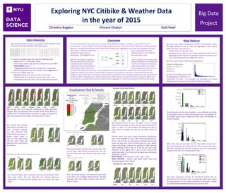
1. Exploring NYC Citibike & Weather Data
in the year of 2015
Christina Bogdan Vincent Chabot Urjit Patel
Big Data
Project
The lower frequency of trips for the 60-75 bucket may be
attributed to the fact that there are generally fewer days where
the temperature is in this range compared to cold days - maybe
we could have normalized the data to account for this.
Most rides here are less than 15 min. The bucket 15-30 min is
also quite important but above 45 min, there are very few rides.
We may conclude that very few customer use it for recreational
purposes but more as a transportation way.
The distribution of the trips duration is very different according
to the gender (most of rides from women users are between 0-
15 minutes when most of rides from men users are between 15
and 30 minutes)
Data Cleaning
We used two data sources in our project: 2015 Weather Data
from (13k rows) and Citibike’s 2015 data (rows)
To clean the weather data, we took the following steps:
- Replace all ‘***’ fields with a blank
- Extract year, month, day, and hour features from the YR—
MODAHRMN column
- - Aggregate all data from the minute level to hour level
- Bucket temperature data and create a binary RAIN feature
To clean the Citibike data, we:
- Aggregated data from minute level to hour level
- Pivot the data such that each trip has two rows – one
representing the trip’s start, and one representing its end
Map Reduce
We used map reduce techniques on NYU’s HPC Dumbo server
(through Hadoop) to join our data and aggregate it over several
views. We used map reduce to:
- Merge Citibike & Weather data
- Aggregate joined data by hour and by weekday to feed into D3
- Aggregate joined data by trip duration and either gender, rain,
hour, and temperature for additional analysis
All of our tasks had the following configurations:
Cluster Configuration:
Number of nodes: 6
Mappers: 4
Reducers: 1
On top of providing input for D3,
the aggregations allowed us to
Understand the data – for example, our groupings are largely
skewed toward having <10 trips/level of detail (see above)
Visualization Tool & Results
We can see that on Friday the frequency of rides decreases
majorly. Also, we observed that we have much more density in
middle area of the Manhattan compare to edges. Brooklyn Citi
bike rides density is much lower than Manhattan overall
We noticed that females
(especially in Brooklyn) are
more sensitive towards
rain. We observed high
proportional decrement in
female riders when it
rains, on the other hand
side for male riders we
observed less proportional
decrement.
Our research shows that, In general, there are more female riders
than male riders. But we observed very strange behavior,
Specifically on Friday--female Citibike riders are fewer than male
riders
We observed that If it rains “at night”, It has a strong
affect on the number of rides. On the other hand side If it
rains in a day, It of course affects the people but due to
daily routine of people, we still can see high amount of
rides.
Further, wcan see some pretty interesting distribution
here. From midnight to 5 am, rides continuously decrease.
From 5 am to 9 am, It continuously increases. We can see
some red dots near 33rd to 42nd street at 6 am. Which
shows that these stations are getting in high demand
early morning. From 9 am to 3 pm we can see some
reduction in use. Again from 3 pm to 6 pm we can see
some increment. From 6 pm we can again see continuous
reduction. Overall,
BUSY HOURS- morning 6 am - 9 am, 5 pm - 7 pm.
BUSY STATIONS - stations near West 34/42 street and
Pershing Square North Station
We observed fewer female riders during night. But
on the other side during the busy hours, we can
see that there are more female riders than male
riders
At an hour-level analysis, we observed same thing
as we did in our weekday based analysis. We also
observed that rain affects females more than it
does to males.
Very Low (<30)
Moderate Low (30 to 45)
Medium (45 to 60)
Moderate High (60 to 75)
Very high (>75)
Yes/No
Trip starts/Trip Ends
0-24
Overview
The main objective of our project was to explore how different weather conditions - particularly rain and
temperature - impact Citibike ridership throughout New York city in the year of 2015. We explored these weather
features in conjunction with two main views of the Citibike data: aggregation over hour and weekday. We were
then able to create an interactive tool using javascript’s D3.js
library that allows users to explore patterns in the data for
themselves. We highlight some key data points here.
With D3, we hoped to empower users to explore any intuitions that
they have about the connections between weather and Citibikerides
and extract useful information. There are hundreds of interesting
insights that can be uncovered by examining weather and Citibike
data together. At the same time, the average person may not have
the technical background necessary to mine insights from the data themselves. Rather than tell this person what
insights are important for them to understand, we wanted to allow anyone to be able to understand how the two
datasets relate on their own - this was our motivation for creating the map. A big data infrastructure was necessarily to
handle the 2015 Citibikedata. Our weather dataset was relatively small, but the Citbike data was around 3GB in total.
To manage this, we performed many map reduce tasks to aggregate our data. This was done on NYU’s Dumbo server.