Pop music media packet
•Download as PPTX, PDF•
0 likes•397 views
Media Pack
Report
Share
Report
Share

Recommended
Evolution of Accommodation in Ghana II
The document summarizes the evolution of accommodation in Ghana since independence in 1957. It discusses three main eras:
1) Immediate Post-Independence Era (1957-1976): The goal was even development of accommodation across Ghana. Hotels and rest houses were established nationwide by Dr. Nkrumah. The State Hotels Corporation was formed to manage facilities.
2) Era of Stagnation (1977-1986): Demand for hotels fell and some collapsed. Management of facilities changed between government organizations.
3) Era of Rejuvenation (1987-present): Hotels in Ghana grew again and became competitive. Government divested from state-owned hotels and liberalized foreign investment, leading
Deivis pte
El documento habla sobre la incorporación de personas en actividades productivas que contribuyan al desarrollo del país y su estrecha relación con el sector educativo. También menciona la excelencia en la gestión de recursos y los enfoques de formación donde el individuo es responsable de su propio aprendizaje.
Listening skills 01 / 08
Listening is the vital to be a good communicator. 70% of our time spent in some form of communication activity – is listening. And this not include the time we spent with Idiot Box. In today’s society with more telephones and mobile phones every day, this percentage is really increasing. So if we spend all that time listening, we must be able to remember most of it. Do You? What do you think? Can you remember what was said at the last training session? Can you recall all of it, or only some of it?
theHerald
The document summarizes various academic and extracurricular achievements of students at The King's School in Chester. It discusses the school being ranked highly in national exam tables, with many students receiving offers from top universities including Oxford and Cambridge. It also outlines successes in competitions such as debating, chess, mathematics challenges, and a national student investment challenge. Students were also commended in a design competition for their innovative chopstick/fork design.
Trabajo final expresión oral y escrita mauro 2
Este documento presenta el trabajo final de un estudiante de Ciencia de la Información y la Documentación sobre su aporte en el campo laboral de la bibliotecología y su propuesta de cambio con lo aprendido en Expresión Oral y Escrita. El estudiante determina que aplica funciones de lenguaje y tipos de textos en su trabajo, y propone hacer una encuesta a usuarios para mejorar los servicios de la biblioteca, considerando la digitalización versus la consulta física de libros.
Asimon
La profecía de Isaac Asimov predijo la incorporación masiva de las tecnologías de la información y la comunicación (TIC) en la educación. Propuso que los estudiantes deben tener acceso a computadoras e Internet desde una edad temprana para buscar información de manera independiente y a su propio ritmo. Actualmente, la mayoría de las escuelas cuentan con aulas completamente equipadas con computadoras, Internet inalámbrico, pizarras digitales y otras herramientas tecnológicas, cumpliendo así con la visión
Listening skills 02 / 08
Listening is the vital to be a good communicator. 70% of our time spent in some form of communication activity – is listening. And this not include the time we spent with Idiot Box. In today’s society with more telephones and mobile phones every day, this percentage is really increasing. So if we spend all that time listening, we must be able to remember most of it. Do You? What do you think? Can you remember what was said at the last training session? Can you recall all of it, or only some of it?
Audience feed back
Several surveys were conducted to gather feedback on various design elements of a media product, including the front cover, contents page, and double page spread. The results are presented in pie charts and bar charts. Overall, the feedback was overwhelmingly positive, with most respondents liking or approving of the images, layouts, color schemes, and text used throughout the product. Only a small number of respondents disliked certain elements.
Audience feed back
The document contains survey results from asking people about different aspects of a media product's design, including the front cover, contents page, and double page spread. Charts and graphs show that most people liked the main image, layout, color scheme, cover lines, images, and use of consistent color on the front cover and contents page. Only one person disliked the layout of the front cover and double page spread. No one thought the contents page looked unprofessional. All would buy the media product in a shop.
Question 7
The author feels they have learned from progressing through the process of their preliminary task. Specifically, their music magazine cover and contents page created in Photoshop and Quark look more professional than their initial school magazine, as the author now has a better understanding of the design tools. Additionally, the professional work uses fewer colors and considers the audience more carefully, making it appear more polished than earlier versions that utilized more colorful elements without audience preferences in mind.
Question 7
The student learned from progressing through the preliminary task to the professional work. Their music magazine cover and contents page looked more professional than the school magazine as they had gained more experience using the design tools. In the preliminary task, the student used many colors but learned for professional work to use fewer colors and consider the audience preferences to achieve a more professional look.
Production process
The document describes the production process for creating a magazine cover and contents page. First, the original photo was converted to black and white and filters were added to create the cover design. Text was added including the artist name and barcode. For the contents page, a template was made and text and graphics were added to highlight the information. The double page spread involved adding an article from Word along with a drop cap, cover line, and masthead in red to help the elements stand out.
Production process
The document describes the production process for creating a magazine cover and contents page. First, the original photo was converted to black and white and filters were added to create the cover design. Text was added including the artist name and barcode. For the contents page, a template was made and text and graphics were added to highlight the information. The double page spread involved adding an article from Word along with a drop cap, cover line and masthead in red to help the information stand out.
Pie charts on my results from my questionnaire
The document contains the results of several surveys asking people about their preferences related to indie music and magazines. For favorite indie bands, the most popular choices were Arctic Monkeys, Kings of Leon, and Bastille. Favorite indie artists included Miles Kane, Ellie Goulding, and Ben Howard. When asked about words associated with indie pop, responses included unique, music, individual, and vintage. Common colors associated with indie were purple, black, and white. Most people reported buying magazines monthly and would pay £3 for an indie magazine. Popular color schemes suggested for an indie magazine were black and white and purple and black.
Article research
The document discusses the style and design elements for a magazine double page spread. It requests a bold masthead in red, black, and white colors that bleeds across both pages. The image should be on one side opposite the text. It also asks for a drop cap opening to draw the reader in, mimicking the style of professional music magazines like NME. The overall goal is to design the spread to look like a published magazine feature.
Publication plan
PopTastic is a £2.50 magazine targeted at newsagents and supermarkets that will focus on pop artists and bands of interest to younger audiences. It will provide entertaining articles and interviews on readers' favorite music stars using a colloquial, friendly style with simple vocabulary, slang, and shortened paragraphs. Images will dominate the layouts, and regular content will include features like "Hotty of the Week" and fictional interviews.
Planning production
This document outlines the planned production of a pop music magazine, including elements like the front cover featuring an attractive girl in makeup, coverlines about One Direction and Tulisa, and various articles and features inside such as an interview with One Direction, a competition to have dinner with the band, fashion advice, and celebrity photos. It also describes a double page spread article about a Radio City live music event that will interview attendees and feature popular artists to interest readers.
Planning production
This document outlines the content plan for a magazine targeted at 12-18 year old girls. The front cover will feature a brightly dressed young girl to appeal to the target audience. Inside contents will include an interview with One Direction about being grateful for their experience, an article on Tulisa speaking out against school bullying, and a competition to have dinner with One Direction. Images on the contents page will feature fashionable girls, One Direction, and other pop artists. A double page spread will feature an interview with One Direction discussing their favorite experiences and memories as a band.
Initial plans for my magazine
The document outlines initial plans for a pop music magazine targeted towards 16-25 year olds. It will be published monthly with 50-60 pages including regular content such as interviews, album reviews, song recommendations, top 10 lists, and posters. Feature articles will cover weekly celebrity gossip, advice columns, competitions, celebrity horoscopes, celebrity diaries, and recaps of embarrassing celebrity moments.
Audience research questionnaire results
The document outlines the results of a questionnaire given to 20 people to conduct audience research for a pop magazine. Most respondents were aged 13-18 and female. One Direction and 5 Seconds of Summer were the most popular artists. Ed Sheeran, Sam Smith and One Direction were named as top favorite artists. Respondents associated pop music most with being happy and gossip. They preferred bright colors like pink, yellow and red for the magazine and wanted to see cover stories and Q&As. This research will help the creator design an appealing magazine for their target audience of teenage girls by including favored artists, genres and design elements.
Double page spread analysis
The document describes conventions used in magazine double page spreads featuring celebrity interviews. These include displaying the artist's name prominently, using the title of the article which often references a quote from the interview, and including pull quotes from the article. Images are typically large taking up one full page to clearly show the artist. Color schemes aim to reflect the artist's personality and style. Additional elements are subheadings summarizing sections, page numbers for navigation, and icons or text indicating it is a cover story.
More Related Content
Viewers also liked
Trabajo final expresión oral y escrita mauro 2
Este documento presenta el trabajo final de un estudiante de Ciencia de la Información y la Documentación sobre su aporte en el campo laboral de la bibliotecología y su propuesta de cambio con lo aprendido en Expresión Oral y Escrita. El estudiante determina que aplica funciones de lenguaje y tipos de textos en su trabajo, y propone hacer una encuesta a usuarios para mejorar los servicios de la biblioteca, considerando la digitalización versus la consulta física de libros.
Asimon
La profecía de Isaac Asimov predijo la incorporación masiva de las tecnologías de la información y la comunicación (TIC) en la educación. Propuso que los estudiantes deben tener acceso a computadoras e Internet desde una edad temprana para buscar información de manera independiente y a su propio ritmo. Actualmente, la mayoría de las escuelas cuentan con aulas completamente equipadas con computadoras, Internet inalámbrico, pizarras digitales y otras herramientas tecnológicas, cumpliendo así con la visión
Listening skills 02 / 08
Listening is the vital to be a good communicator. 70% of our time spent in some form of communication activity – is listening. And this not include the time we spent with Idiot Box. In today’s society with more telephones and mobile phones every day, this percentage is really increasing. So if we spend all that time listening, we must be able to remember most of it. Do You? What do you think? Can you remember what was said at the last training session? Can you recall all of it, or only some of it?
Viewers also liked (8)
More from ASMEDIADANIELLE
Audience feed back
Several surveys were conducted to gather feedback on various design elements of a media product, including the front cover, contents page, and double page spread. The results are presented in pie charts and bar charts. Overall, the feedback was overwhelmingly positive, with most respondents liking or approving of the images, layouts, color schemes, and text used throughout the product. Only a small number of respondents disliked certain elements.
Audience feed back
The document contains survey results from asking people about different aspects of a media product's design, including the front cover, contents page, and double page spread. Charts and graphs show that most people liked the main image, layout, color scheme, cover lines, images, and use of consistent color on the front cover and contents page. Only one person disliked the layout of the front cover and double page spread. No one thought the contents page looked unprofessional. All would buy the media product in a shop.
Question 7
The author feels they have learned from progressing through the process of their preliminary task. Specifically, their music magazine cover and contents page created in Photoshop and Quark look more professional than their initial school magazine, as the author now has a better understanding of the design tools. Additionally, the professional work uses fewer colors and considers the audience more carefully, making it appear more polished than earlier versions that utilized more colorful elements without audience preferences in mind.
Question 7
The student learned from progressing through the preliminary task to the professional work. Their music magazine cover and contents page looked more professional than the school magazine as they had gained more experience using the design tools. In the preliminary task, the student used many colors but learned for professional work to use fewer colors and consider the audience preferences to achieve a more professional look.
Production process
The document describes the production process for creating a magazine cover and contents page. First, the original photo was converted to black and white and filters were added to create the cover design. Text was added including the artist name and barcode. For the contents page, a template was made and text and graphics were added to highlight the information. The double page spread involved adding an article from Word along with a drop cap, cover line, and masthead in red to help the elements stand out.
Production process
The document describes the production process for creating a magazine cover and contents page. First, the original photo was converted to black and white and filters were added to create the cover design. Text was added including the artist name and barcode. For the contents page, a template was made and text and graphics were added to highlight the information. The double page spread involved adding an article from Word along with a drop cap, cover line and masthead in red to help the information stand out.
Pie charts on my results from my questionnaire
The document contains the results of several surveys asking people about their preferences related to indie music and magazines. For favorite indie bands, the most popular choices were Arctic Monkeys, Kings of Leon, and Bastille. Favorite indie artists included Miles Kane, Ellie Goulding, and Ben Howard. When asked about words associated with indie pop, responses included unique, music, individual, and vintage. Common colors associated with indie were purple, black, and white. Most people reported buying magazines monthly and would pay £3 for an indie magazine. Popular color schemes suggested for an indie magazine were black and white and purple and black.
Article research
The document discusses the style and design elements for a magazine double page spread. It requests a bold masthead in red, black, and white colors that bleeds across both pages. The image should be on one side opposite the text. It also asks for a drop cap opening to draw the reader in, mimicking the style of professional music magazines like NME. The overall goal is to design the spread to look like a published magazine feature.
Publication plan
PopTastic is a £2.50 magazine targeted at newsagents and supermarkets that will focus on pop artists and bands of interest to younger audiences. It will provide entertaining articles and interviews on readers' favorite music stars using a colloquial, friendly style with simple vocabulary, slang, and shortened paragraphs. Images will dominate the layouts, and regular content will include features like "Hotty of the Week" and fictional interviews.
Planning production
This document outlines the planned production of a pop music magazine, including elements like the front cover featuring an attractive girl in makeup, coverlines about One Direction and Tulisa, and various articles and features inside such as an interview with One Direction, a competition to have dinner with the band, fashion advice, and celebrity photos. It also describes a double page spread article about a Radio City live music event that will interview attendees and feature popular artists to interest readers.
Planning production
This document outlines the content plan for a magazine targeted at 12-18 year old girls. The front cover will feature a brightly dressed young girl to appeal to the target audience. Inside contents will include an interview with One Direction about being grateful for their experience, an article on Tulisa speaking out against school bullying, and a competition to have dinner with One Direction. Images on the contents page will feature fashionable girls, One Direction, and other pop artists. A double page spread will feature an interview with One Direction discussing their favorite experiences and memories as a band.
Initial plans for my magazine
The document outlines initial plans for a pop music magazine targeted towards 16-25 year olds. It will be published monthly with 50-60 pages including regular content such as interviews, album reviews, song recommendations, top 10 lists, and posters. Feature articles will cover weekly celebrity gossip, advice columns, competitions, celebrity horoscopes, celebrity diaries, and recaps of embarrassing celebrity moments.
Audience research questionnaire results
The document outlines the results of a questionnaire given to 20 people to conduct audience research for a pop magazine. Most respondents were aged 13-18 and female. One Direction and 5 Seconds of Summer were the most popular artists. Ed Sheeran, Sam Smith and One Direction were named as top favorite artists. Respondents associated pop music most with being happy and gossip. They preferred bright colors like pink, yellow and red for the magazine and wanted to see cover stories and Q&As. This research will help the creator design an appealing magazine for their target audience of teenage girls by including favored artists, genres and design elements.
Double page spread analysis
The document describes conventions used in magazine double page spreads featuring celebrity interviews. These include displaying the artist's name prominently, using the title of the article which often references a quote from the interview, and including pull quotes from the article. Images are typically large taking up one full page to clearly show the artist. Color schemes aim to reflect the artist's personality and style. Additional elements are subheadings summarizing sections, page numbers for navigation, and icons or text indicating it is a cover story.
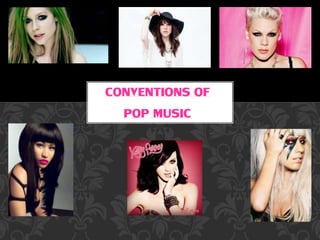
The conventions of pop music magazines
The document provides guidance on design elements that are important for the front cover and interior pages of a music magazine. These include using a masthead that relates to music and draws the eye, cover lines featuring artists that appeal to the target audience, and interior images of bands/artists in the magazine's genre. Color schemes should be chosen based on the magazine's intended audience, and contents pages should include page numbers and subheadings to aid navigation.
Analysis of pop magazine contents pages
The document analyzes the contents page of a pop magazine. It finds that the page uses bright colors, many images of pop artists and fashion, and an informal tone to address its young, female target audience simply and engage them. Key elements that help reach this audience include large page numbers, highlighted text, and a rule-of-thirds layout that organizes the busy page clearly.
Magazine front cover analysis
This magazine is called Top of the Pops and was launched in 1995 as a supplemental magazine for the TV show of the same name. It features charts, quizzes, lyrics and posters. While originally aimed at readers of Smash Hits and NME magazines, over time it shifted its focus to young girls aged 11-14. It helped name the girl group The Spice Girls. The magazine continues to be published despite the TV show being cancelled. It has had multiple editors over the years and is currently edited by Peter Hartmagazine.
Research into the marketing place
This document provides information about two music magazines: Top of the Pops magazine which is published 4 weekly, has a circulation of 104,709, and 48 pages per issue. The second is We Love Pop magazine, published monthly with a circulation of 115,000 and 66 pages per issue. Both magazines contain feature articles and regular content.
Main task initial ideas
The document outlines initial ideas for a magazine, including that it will focus on pop music genre and target teenagers as its audience. Research will be conducted on the pop genre as well as other music genres like reggae, rock, and R&B to help inform the magazine's content and direction.
Screenshots of production on contents page
This document describes the process of creating a contents page from start to finish. It begins with an initial blank contents page. The author then adds a title and border using text and shape tools. Relevant images are included to anchor subsequent text. Finally, issue number and date are added to complete the contents page according to conventions.
More from ASMEDIADANIELLE (20)
Recently uploaded
➒➌➎➏➑➐➋➑➐➐ Satta Matka Dpboss Matka Guessing Indian Matka
➒➌➎➏➑➐➋➑➐➐ Satta Matka Dpboss Matka Guessing Indian Matka➒➌➎➏➑➐➋➑➐➐Dpboss Matka Guessing Satta Matka Kalyan Chart Indian Matka
➒➌➎➏➑➐➋➑➐➐ Satta Matka Dpboss Matka Guessing Indian Matka
KALYAN MATKA | MATKA RESULT | KALYAN MATKA TIPS | SATTA MATKA | MATKA.COM | MATKA PANA JODI TODAY | BATTA SATKA | MATKA PATTI JODI NUMBER | MATKA RESULTS | MATKA CHART | MATKA JODI | SATTA COM | FULL RATE GAME | MATKA GAME | MATKA WAPKA | ALL MATKA RESULT LIVE ONLINE | MATKA RESULT | KALYAN MATKA RESULT | DPBOSS MATKA 143 | MAIN MATKA➒➌➎➏➑➐➋➑➐➐ Kalyan Matka Satta Matka Dpboss Matka Guessing Indian Matka
➒➌➎➏➑➐➋➑➐➐ Kalyan Matka Satta Matka Dpboss Matka Guessing Indian Matka➒➌➎➏➑➐➋➑➐➐Dpboss Matka Guessing Satta Matka Kalyan Chart Indian Matka
➒➌➎➏➑➐➋➑➐➐KALYAN MATKA | MATKA RESULT | KALYAN MATKA TIPS | SATTA MATKA | MATKA.COM | MATKA PANA JODI TODAY | BATTA SATKA | MATKA PATTI JODI NUMBER | MATKA RESULTS | MATKA CHART | MATKA JODI | SATTA COM | FULL RATE GAME | MATKA GAME | MATKA WAPKA | ALL MATKA RESULT LIVE ONLINE | MATKA RESULT | KALYAN MATKA RESULT | DPBOSS MATKA 143 | MAIN MATKA➒➌➎➏➑➐➋➑➐➐ Satta Matka Dpboss Matka Guessing Indian Matka
➒➌➎➏➑➐➋➑➐➐ Satta Matka Dpboss Matka Guessing Indian Matka➒➌➎➏➑➐➋➑➐➐Dpboss Matka Guessing Satta Matka Kalyan Chart Indian Matka
➒➌➎➏➑➐➋➑➐➐ Satta Matka Dpboss Matka Guessing Indian Matka KALYAN MATKA | MATKA RESULT | KALYAN MATKA TIPS | SATTA MATKA | MATKA.COM | MATKA PANA JODI TODAY | BATTA SATKA | MATKA PATTI JODI NUMBER | MATKA RESULTS | MATKA CHART | MATKA JODI | SATTA COM | FULL RATE GAME | MATKA GAME | MATKA WAPKA | ALL MATKA RESULT LIVE ONLINE | MATKA RESULT | KALYAN MATKA RESULT | DPBOSS MATKA 143 | MAIN MATKAFemmely-ACP-how to use social media to drive engagement
Femmely-ACP-how to use social media to drive engagement
➒➌➎➏➑➐➋➑➐➐ Satta Matka Dpboss Matka Guessing Indian Matka KALYAN MATKA |
➒➌➎➏➑➐➋➑➐➐ Satta Matka Dpboss Matka Guessing Indian Matka KALYAN MATKA |➒➌➎➏➑➐➋➑➐➐Dpboss Matka Guessing Satta Matka Kalyan Chart Indian Matka
➒➌➎➏➑➐➋➑➐➐ Satta Matka Dpboss Matka Guessing Indian Matka
KALYAN MATKA | MATKA RESULT | KALYAN MATKA TIPS | SATTA MATKA | MATKA.COM | MATKA PANA JODI TODAY | BATTA SATKA | MATKA PATTI JODI NUMBER | MATKA RESULTS | MATKA CHART | MATKA JODI | SATTA COM | FULL RATE GAME | MATKA GAME | MATKA WAPKA | ALL MATKA RESULT LIVE ONLINE | MATKA RESULT | KALYAN MATKA RESULT | DPBOSS MATKA 143 | MAIN MATKAMr. Brainwash ❤️ Beautiful Girl _ FRANK FLUEGEL GALERIE.pdf
Mr. Brainwash Beautiful Girl / Mixed Media / signed / Unique
Year: 2023
Format: 96,5 x 127 cm / 37.8 x 50 inch
Material: Fine Art Paper with hand-torn edges.
Method: Mixed Media, Stencil, Spray Paint.
Edition: Unique
Other: handsigned by Mr. Brainwash front and verso.
Beautiful Girl by Mr. Brainwash is a mixed media artwork on paper done in 2023. It is unique and of course signed by Mr. Brainwash. The picture is a tribute to his own most successful work of art, the Balloon Girl. In this new creation, however, the theme of the little girl is slightly modified.
In Mr. Brainwash’s mixed media artwork titled “Beautiful Girl,” we are presented with a captivating depiction of a little girl adorned in a summer dress, with two playful pigtails framing her face. The artwork exudes a sense of innocence and whimsy, as the girl is shown in a dreamy state, lifting one end of her skirt and looking down as if she were about to dance. Through the use of mixed media, Mr. Brainwash skillfully combines different artistic elements to create a visually striking composition. The vibrant colors and bold brushstrokes bring the artwork to life, evoking a sense of joy and happiness. The attention to detail in the girl’s expression and body language adds depth and character to the piece, allowing viewers to connect with the young protagonist on a personal and emotional level. “Beautiful Girl” is a testament to Mr. Brainwash’s unique artistic style, blending elements of street art, pop art, and contemporary art to create a visually captivating and emotionally resonant artwork.
The use of mixed media in “Beautiful Girl” adds an additional layer of complexity to the artwork. By combining different artistic techniques and materials, such as stencils, spray paint, and collage, Mr. Brainwash creates a dynamic and textured composition that grabs the viewer’s attention. The juxtaposition of different textures and patterns adds depth and visual interest to the piece, while also emphasizing the artist’s eclectic and experimental approach to art-making. The inclusion of collage elements, such as newspaper clippings and torn posters, further enhances the artwork’s urban and contemporary feel. Overall, “Beautiful Girl” is a visually captivating and thought-provoking artwork that showcases Mr. Brainwash’s talent for blending different artistic elements to create a truly unique and engaging piece.
原版制作(UNITO毕业证书)都灵大学毕业证Offer一模一样
学校原件一模一样【微信:741003700 】《(UNITO毕业证书)都灵大学毕业证》【微信:741003700 】学位证,留信认证(真实可查,永久存档)原件一模一样纸张工艺/offer、雅思、外壳等材料/诚信可靠,可直接看成品样本,帮您解决无法毕业带来的各种难题!外壳,原版制作,诚信可靠,可直接看成品样本。行业标杆!精益求精,诚心合作,真诚制作!多年品质 ,按需精细制作,24小时接单,全套进口原装设备。十五年致力于帮助留学生解决难题,包您满意。
本公司拥有海外各大学样板无数,能完美还原。
1:1完美还原海外各大学毕业材料上的工艺:水印,阴影底纹,钢印LOGO烫金烫银,LOGO烫金烫银复合重叠。文字图案浮雕、激光镭射、紫外荧光、温感、复印防伪等防伪工艺。材料咨询办理、认证咨询办理请加学历顾问Q/微741003700
【主营项目】
一.毕业证【q微741003700】成绩单、使馆认证、教育部认证、雅思托福成绩单、学生卡等!
二.真实使馆公证(即留学回国人员证明,不成功不收费)
三.真实教育部学历学位认证(教育部存档!教育部留服网站永久可查)
四.办理各国各大学文凭(一对一专业服务,可全程监控跟踪进度)
如果您处于以下几种情况:
◇在校期间,因各种原因未能顺利毕业……拿不到官方毕业证【q/微741003700】
◇面对父母的压力,希望尽快拿到;
◇不清楚认证流程以及材料该如何准备;
◇回国时间很长,忘记办理;
◇回国马上就要找工作,办给用人单位看;
◇企事业单位必须要求办理的
◇需要报考公务员、购买免税车、落转户口
◇申请留学生创业基金
留信网认证的作用:
1:该专业认证可证明留学生真实身份
2:同时对留学生所学专业登记给予评定
3:国家专业人才认证中心颁发入库证书
4:这个认证书并且可以归档倒地方
5:凡事获得留信网入网的信息将会逐步更新到个人身份内,将在公安局网内查询个人身份证信息后,同步读取人才网入库信息
6:个人职称评审加20分
7:个人信誉贷款加10分
8:在国家人才网主办的国家网络招聘大会中纳入资料,供国家高端企业选择人才
❼❷⓿❺❻❷❽❷❼❽ Dpboss Matka ! Fix Satta Matka ! Matka Result ! Matka Guessing ! ...
❼❷⓿❺❻❷❽❷❼❽ Dpboss Matka ! Fix Satta Matka ! Matka Result ! Matka Guessing ! ...❼❷⓿❺❻❷❽❷❼❽ Dpboss Kalyan Satta Matka Guessing Matka Result Main Bazar chart
❼❷⓿❺❻❷❽❷❼❽ Dpboss Matka ! Fix Satta Matka ! Matka Result ! Matka Guessing ! Final Matka ! Matka Result ! Dpboss Matka ! Matka Guessing ! Satta Matta Matka 143 ! Kalyan Matka ! Satta Matka Fast Result ! Kalyan Matka Guessing ! Dpboss Matka Guessing ! Satta 143 ! Kalyan Chart ! Kalyan final ! Satta guessing ! Matka tips ! Matka 143 ! India Matka ! Matka 420 ! matka Mumbai ! Satta chart ! Indian Satta ! Satta King ! Satta 143 ! Satta batta ! Satta मटका ! Satta chart ! Matka 143 ! Matka Satta ! India Matka ! Indian Satta Matka ! Final ankDpboss Matka Guessing Satta Matta Matka Kalyan Chart Indian Matka
8328958814Sattamatka.satta.matka.satta matka.kalyan weekly chart.kalyan chart.kalyan jodi chart.kalyan penal chart.kalyan today.kalyan open.fix satta.fix fix fix Satta matka nambar
➒➌➎➏➑➐➋➑➐➐ Dpboss Matka Guessing Satta Matka Kalyan panel Chart Indian Matka ...
➒➌➎➏➑➐➋➑➐➐ Dpboss Matka Guessing Satta Matka Kalyan panel Chart Indian Matka ...➒➌➎➏➑➐➋➑➐➐Dpboss Matka Guessing Satta Matka Kalyan Chart Indian Matka
KALYAN MATKA | MATKA RESULT | KALYAN MATKA TIPS | SATTA MATKA | MATKA.COM | MATKA PANA JODI TODAY | BATTA SATKA | MATKA PATTI JODI NUMBER | MATKA RESULTS | MATKA CHART | MATKA JODI | SATTA COM | FULL RATE GAME | MATKA GAME | MATKA WAPKA | ALL MATKA RESULT LIVE ONLINE | MATKA RESULT | KALYAN MATKA RESULT | DPBOSS MATKA 143 | MAIN MATKAVTV FULL SCRIPT ------------------------
HERE IS THE FULL SCRIPT OF VINNAITHTHAANDI VARUVAAYA BY GAUTHAM VAASUDEV MENON
➒➌➎➏➑➐➋➑➐➐ Kalyan Matka Satta Matka Dpboss Matka Guessing Indian Matka
➒➌➎➏➑➐➋➑➐➐ Kalyan Matka Satta Matka Dpboss Matka Guessing Indian Matka➒➌➎➏➑➐➋➑➐➐Dpboss Matka Guessing Satta Matka Kalyan Chart Indian Matka
➒➌➎➏➑➐➋➑➐➐ Kalyan Matka Satta Matka Dpboss Matka Guessing Indian Matka➒➌➎➏➑➐➋➑➐➐ Satta Matka Dpboss Matka Guessing Indian Matka
➒➌➎➏➑➐➋➑➐➐ Satta Matka Dpboss Matka Guessing Indian Matka➒➌➎➏➑➐➋➑➐➐Dpboss Matka Guessing Satta Matka Kalyan Chart Indian Matka
➒➌➎➏➑➐➋➑➐➐ Satta Matka Dpboss Matka Guessing Indian Matka KALYAN MATKA | MATKA RESULT | KALYAN MATKA TIPS | SATTA MATKA | MATKA.COM | MATKA PANA JODI TODAY | BATTA SATKA | MATKA PATTI JODI NUMBER | MATKA RESULTS | MATKA CHART | MATKA JODI | SATTA COM | FULL RATE GAME | MATKA GAME | MATKA WAPKA | ALL MATKA RESULT LIVE ONLINE | MATKA RESULT | KALYAN MATKA RESULT | DPBOSS MATKA 143 | MAIN MATKAMatka Guessing Satta Matta Matka Kalyan Chart Indian Matka Dpboss
Matka Guessing Satta Matta Matka Kalyan Chart Indian Matka Dpboss➒➌➎➏➑➐➋➑➐➐Dpboss Matka Guessing Satta Matka Kalyan Chart Indian Matka
9356872877Sattamatka.satta.matka.satta matka.kalyan weekly chart.kalyan chart.kalyan jodi chart.kalyan penal chart.kalyan today.kalyan open.fix satta.fix fix fix Satta matka nambar. Dpboss Matka Guessing Satta Matta Matka Kalyan Chart Indian MatkaA Brief Introduction About Hanying Chen_
Vancouver-based artist Hanying Chen boasts extensive skills in writing, directing, producing, and singing, reflecting her diverse talents in the performing arts. As she looks ahead, Hanying is driven to craft a fulfilling career path that harmonizes with her deep passion for artistic expression. In the coming years, she envisions cultivating a balanced life, blending her professional aspirations with her desire to foster meaningful connections in her vibrant urban community.
➒➌➎➏➑➐➋➑➐➐ Satta Matka Dpboss Matka Guessing Indian Matka
➒➌➎➏➑➐➋➑➐➐ Satta Matka Dpboss Matka Guessing Indian Matka➒➌➎➏➑➐➋➑➐➐Dpboss Matka Guessing Satta Matka Kalyan Chart Indian Matka
➒➌➎➏➑➐➋➑➐➐ Satta Matka Dpboss Matka Guessing Indian Matka
KALYAN MATKA | MATKA RESULT | KALYAN MATKA TIPS | SATTA MATKA | MATKA.COM | MATKA PANA JODI TODAY | BATTA SATKA | MATKA PATTI JODI NUMBER | MATKA RESULTS | MATKA CHART | MATKA JODI | SATTA COM | FULL RATE GAME | MATKA GAME | MATKA WAPKA | ALL MATKA RESULT LIVE ONLINE | MATKA RESULT | KALYAN MATKA RESULT | DPBOSS MATKA 143 | MAIN MATKA
哪里办理(sjsu毕业证书)美国圣何塞州立大学毕业证硕士文凭证书原版一模一样
原版定制【微信:bwp0011】《(sjsu毕业证书)美国圣何塞州立大学毕业证硕士文凭证书》【微信:bwp0011】成绩单 、雅思、外壳、留信学历认证永久存档查询,采用学校原版纸张、特殊工艺完全按照原版一比一制作(包括:隐形水印,阴影底纹,钢印LOGO烫金烫银,LOGO烫金烫银复合重叠,文字图案浮雕,激光镭射,紫外荧光,温感,复印防伪)行业标杆!精益求精,诚心合作,真诚制作!多年品质 ,按需精细制作,24小时接单,全套进口原装设备,十五年致力于帮助留学生解决难题,业务范围有加拿大、英国、澳洲、韩国、美国、新加坡,新西兰等学历材料,包您满意。
【业务选择办理准则】
一、工作未确定,回国需先给父母、亲戚朋友看下文凭的情况,办理一份就读学校的毕业证【微信bwp0011】文凭即可
二、回国进私企、外企、自己做生意的情况,这些单位是不查询毕业证真伪的,而且国内没有渠道去查询国外文凭的真假,也不需要提供真实教育部认证。鉴于此,办理一份毕业证【微信bwp0011】即可
三、进国企,银行,事业单位,考公务员等等,这些单位是必需要提供真实教育部认证的,办理教育部认证所需资料众多且烦琐,所有材料您都必须提供原件,我们凭借丰富的经验,快捷的绿色通道帮您快速整合材料,让您少走弯路。
留信网认证的作用:
1:该专业认证可证明留学生真实身份
2:同时对留学生所学专业登记给予评定
3:国家专业人才认证中心颁发入库证书
4:这个认证书并且可以归档倒地方
5:凡事获得留信网入网的信息将会逐步更新到个人身份内,将在公安局网内查询个人身份证信息后,同步读取人才网入库信息
6:个人职称评审加20分
7:个人信誉贷款加10分
8:在国家人才网主办的国家网络招聘大会中纳入资料,供国家高端企业选择人才
【关于价格问题(保证一手价格)】
我们所定的价格是非常合理的,而且我们现在做得单子大多数都是代理和回头客户介绍的所以一般现在有新的单子 我给客户的都是第一手的代理价格,因为我想坦诚对待大家 不想跟大家在价格方面浪费时间
对于老客户或者被老客户介绍过来的朋友,我们都会适当给一些优惠。
➒➌➎➏➑➐➋➑➐➐ Satta Matka Dpboss Matka Guessing Indian Matka
➒➌➎➏➑➐➋➑➐➐ Satta Matka Dpboss Matka Guessing Indian Matka➒➌➎➏➑➐➋➑➐➐Dpboss Matka Guessing Satta Matka Kalyan Chart Indian Matka
➒➌➎➏➑➐➋➑➐➐ Satta Matka Dpboss Matka Guessing Indian Matka
KALYAN MATKA | MATKA RESULT | KALYAN MATKA TIPS | SATTA MATKA | MATKA.COM | MATKA PANA JODI TODAY | BATTA SATKA | MATKA PATTI JODI NUMBER | MATKA RESULTS | MATKA CHART | MATKA JODI | SATTA COM | FULL RATE GAME | MATKA GAME | MATKA WAPKA | ALL MATKA RESULT LIVE ONLINE | MATKA RESULT | KALYAN MATKA RESULT | DPBOSS MATKA 143 | MAIN MATKARecently uploaded (20)
➒➌➎➏➑➐➋➑➐➐ Satta Matka Dpboss Matka Guessing Indian Matka
➒➌➎➏➑➐➋➑➐➐ Satta Matka Dpboss Matka Guessing Indian Matka
➒➌➎➏➑➐➋➑➐➐ Kalyan Matka Satta Matka Dpboss Matka Guessing Indian Matka
➒➌➎➏➑➐➋➑➐➐ Kalyan Matka Satta Matka Dpboss Matka Guessing Indian Matka
➒➌➎➏➑➐➋➑➐➐ Satta Matka Dpboss Matka Guessing Indian Matka
➒➌➎➏➑➐➋➑➐➐ Satta Matka Dpboss Matka Guessing Indian Matka
Femmely-ACP-how to use social media to drive engagement
Femmely-ACP-how to use social media to drive engagement
➒➌➎➏➑➐➋➑➐➐ Satta Matka Dpboss Matka Guessing Indian Matka KALYAN MATKA |
➒➌➎➏➑➐➋➑➐➐ Satta Matka Dpboss Matka Guessing Indian Matka KALYAN MATKA |
Mr. Brainwash ❤️ Beautiful Girl _ FRANK FLUEGEL GALERIE.pdf
Mr. Brainwash ❤️ Beautiful Girl _ FRANK FLUEGEL GALERIE.pdf
❼❷⓿❺❻❷❽❷❼❽ Dpboss Matka ! Fix Satta Matka ! Matka Result ! Matka Guessing ! ...
❼❷⓿❺❻❷❽❷❼❽ Dpboss Matka ! Fix Satta Matka ! Matka Result ! Matka Guessing ! ...
Dpboss Matka Guessing Satta Matta Matka Kalyan Chart Indian Matka
Dpboss Matka Guessing Satta Matta Matka Kalyan Chart Indian Matka
➒➌➎➏➑➐➋➑➐➐ Dpboss Matka Guessing Satta Matka Kalyan panel Chart Indian Matka ...
➒➌➎➏➑➐➋➑➐➐ Dpboss Matka Guessing Satta Matka Kalyan panel Chart Indian Matka ...
➒➌➎➏➑➐➋➑➐➐ Kalyan Matka Satta Matka Dpboss Matka Guessing Indian Matka
➒➌➎➏➑➐➋➑➐➐ Kalyan Matka Satta Matka Dpboss Matka Guessing Indian Matka
➒➌➎➏➑➐➋➑➐➐ Satta Matka Dpboss Matka Guessing Indian Matka
➒➌➎➏➑➐➋➑➐➐ Satta Matka Dpboss Matka Guessing Indian Matka
Matka Guessing Satta Matta Matka Kalyan Chart Indian Matka Dpboss
Matka Guessing Satta Matta Matka Kalyan Chart Indian Matka Dpboss
➒➌➎➏➑➐➋➑➐➐ Satta Matka Dpboss Matka Guessing Indian Matka
➒➌➎➏➑➐➋➑➐➐ Satta Matka Dpboss Matka Guessing Indian Matka
➒➌➎➏➑➐➋➑➐➐ Satta Matka Dpboss Matka Guessing Indian Matka
➒➌➎➏➑➐➋➑➐➐ Satta Matka Dpboss Matka Guessing Indian Matka