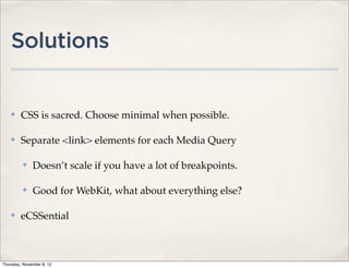
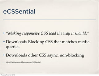
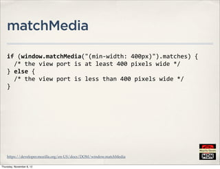
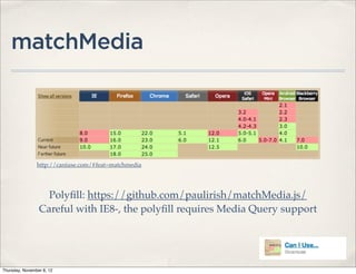
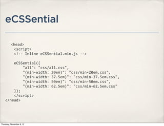
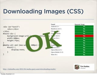
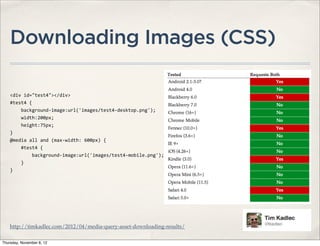
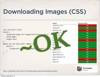
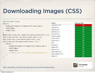
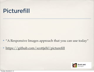
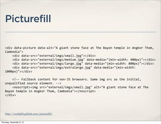
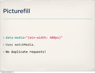
The document is a presentation on responsive web design (RWD) given by Zach Leatherman. It discusses the goals of RWD, including providing a flexible grid and flexible media. It also covers potential performance issues with RWD like unnecessary CSS downloads and large images on small screens. The presentation provides solutions to these problems like using media queries to separate CSS and choosing minimal CSS when possible.


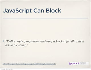
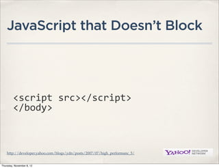
![JavaScript that Doesn’t Block
var
script
=
document.createElement("script");
script.type
=
"text/javascript";
script.src
=
"foo.js";
document.getElementsByTagName("head")
[0].appendChild(script);
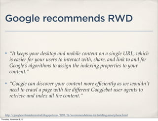
http://calendar.perfplanet.com/2010/the-truth-about-non-blocking-javascript/
Thursday, November 8, 12](https://image.slidesharecdn.com/perfrwd-130114171958-phpapp02/85/Performance-Responsive-Web-Design-21-320.jpg)


![[jqconatx] Adaptive Images for Responsive Web Design](https://cdn.slidesharecdn.com/ss_thumbnails/adaptive-imagesv14-130911193737-phpapp01-thumbnail.jpg?width=640&height=640&fit=bounds)