Pecha kucha presentation in reflection of vienna script
1. Pecha Kucha presentation in reflection of Vienna script
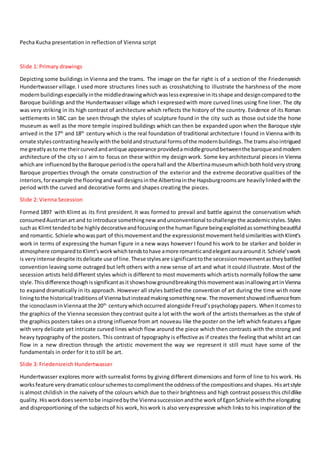
Slide 1: Primary drawings
Depicting some buildings in Vienna and the trams. The image on the far right is of a section of the Friedensreich
Hundertwasser village. I used more structures lines such as crosshatching to illustrate the harshness of the more
modern buildingsespeciallyinthe middledrawingwhichwaslessexpressive initsshape anddesigncomparedtothe
Baroque buildings and the Hundertwasser village which I expressedwith more curvedlines using fine liner. The city
was very striking in its high contrast of architecture which reflects the history of the country. Evidence of its Roman
settlements in 5BC can be seen through the styles of sculpture found in the city such as those outside the horse
museum as well as the more temple inspired buildings which can then be expanded upon when the Baroque style
arrived in the 17th
and 18th
century which is the real foundation of traditional architecture I found in Vienna withits
ornate stylescontrastingheavilywiththe boldandstructural formsof the modernbuildings.The tramsalsointrigued
me greatlyastome theircurvedandantique appearance providedamiddlegroundbetweenthe baroqueandmodern
architecture of the city so I aim to focus on these within my design work. Some key architectural pieces in Vienna
whichare influencedbythe Baroque periodisthe operahall and the Albertinamuseumwhichbothholdverystrong
Baroque properties through the ornate construction of the exterior and the extreme decorative qualities of the
interiors,forexample the flooringandwall designsinthe Albertinainthe Hapsburgroomsare heavilylinkedwiththe
period with the curved and decorative forms and shapes creating the pieces.
Slide 2: Vienna Secession
Formed 1897 with Klimt as its first president.It was formed to prevail and battle against the conservatism which
consumedAustrianart and to introduce somethingnew andunconventional tochallenge the academicstyles.Styles
suchas Klimttendedtobe highlydecorativeandfocusingonthe humanfigure beingexploitedassomethingbeautiful
and romantic. Schiele whowaspart of thismovementandthe expressionistmovementheldsimilaritieswithKlimt’s
work in terms of expressing the human figure in a new ways however I found his work to be starker and bolder in
atmosphere comparedtoKlimt’sworkwhichtendstohave amore romanticandelegantauraaroundit.Schiele’swork
is veryintense despite itsdelicate use of line.These stylesare significanttothe secession movementastheybattled
convention leaving some outraged but left others with a new sense of art and what it could illustrate. Most of the
secession artists helddifferent styles which is different to most movements which artists normally follow the same
style.Thisdifference thoughissignificantasitshowshow groundbreakingthismovementwasinallowingartinVienna
to expand dramatically in its approach. However all styles battled the convention of art during the time with none
liningtothe historical traditionsof Viennabutinsteadmakingsomethingnew.The movementshowedinfluencefrom
the iconoclasminViennaat the 20th
centurywhichoccurred alongside Freud’spsychologypapers. Whenitcomesto
the graphics of the Vienna secession theycontrast quite a lot with the work of the artists themselves as the style of
the graphics posters takes on a strong influence from art nouveau like the poster on the left which features a figure
with very delicate yet intricate curved lines which flow around the piece which then contrasts with the strong and
heavy typography of the posters. This contrast of typography is effective as if creates the feeling that whilst art can
flow in a new direction through the artistic movement the way we represent it still must have some of the
fundamentals in order for it to still be art.
Slide 3: Friedensreich Hundertwasser
Hundertwasser explores more with surrealist forms by giving different dimensions and form of line to his work. His
worksfeature very dramaticcolourschemestocomplimentthe oddnessof the compositionsandshapes. Hisartstyle
is almost childish in the naivety of the colours which due to their brightness and high contrast possessthis childlike
quality.Hisworkdoesseemtobe inspiredbythe Viennasuccessionandthe workof EgonSchiele withthe elongating
and disproportioning of the subjectsof his work, hiswork is also veryexpressive which links to his inspirationof the
2. expressionistmovementwhichSchielewasalsoabigpartof.Itiscleartosee withinhisbodyofworkbotharchitectural
and paintedthathe wasveryagainstthe use of straightline whichiseffective asitreinforcesthe childlikestructure of
his work but also gives it an ongoing flow which despite the loud colour schemes gives it a certain calmness and
tranquillity.Hisworkoriginallyconsistedof minimalisticorganicformsutilisingstraightlinesanditisclear to see that
style whilststronglyevolvedasmainlykeptits originsas hiswork throughoutthe majorityof his life heldnaturalistic
qualitiesinitsstructure andlineformationwhichverymuchfocusedonthe flow of the piece.Hisworkcanbe seento
take on psychedelicatmospheresthroughthe consistencyof curvedandnon-linearlinesinhisworkwhichworkwith
the bright colours which whilst are very stark and loud do have a certain harmony to them which allow a certain
hallucinatory effect to be illustrated. From the early 1950’s his main focus was on architecture and communicating
nature and art withinthe worldaroundhim,he didso bygoing againstthe greyand dull modernbuildingsof Vienna
which were being constructedand instead gave his buildingsintense colours, new linear qualities and flow to them
whichmimickedthe natural flowof naturebutmade itvividandalivethroughthe colours. Hundertwassermademany
of hispaintshimself.He paintedwithwatercolours,inoilandwithegg tempera,withshinylacquersandgroundearth.
He usedvariouspaintsinonepaintingandputthemnexttoeachother,sothattheycontrastednotonlyintheircolour
but also in their texture.
Slide 4: Egon Schiele
Focusing on eroticism and elongating the human body to give it strange proportions. The elongation and slight
disproportionsof hisworkillustratehisinfluence of the ViennaSecession withhimcreatingcontroversialpieceswhich
wentagainstthe academicstylesof art duringthe time,Schiele actuallyleftthe School of Arts and Crafts in Vienna
due to not likingthe traditional wayshisteacherswere tellinghimdofollow.He workedunderKlimt whoworkedas
hisbenefactorincreatinglinksinthe industryand settingupshows. He had incestuoustendencies towardshissister
whichwhilstdisturbing,illustratesthathis interestinthe nakedform was there from a young age. Left the academy
of arts and crafts and set up the “New Art Movement” Neukunstgruppe with other dissatisfied students from that
course in 1909. His exploration of the human form and sexuality was highly controversial as society them was
conservative withthose issueshoweverSchiele’schallenge tothisshowshow the early20t centauryinViennawasa
bigmile stone indevelopingartisticstyles. Schiele’sworkwasmore daringas he wenttowardsnude art and combing
Klimt’s decorative style with it. He developed the human bodyby elongating its proportions, deformitiesand sexual
openness. His distortion and interpretation of emotion and sexuality replaced conventional idealisms of beauty. In
1912 he was arrestedforsupposedlyseducingamodel whowasunderage and the police seizedmanypaintingsthey
consideredpornographicwhichillustrateshowwhilstthe artisticculture of Viennawasacceptingof newart,everyday
people were still veryconservative whichgivesthe impressionof a rather oppressive country.Duringworldwarone
he was given a clerk job after his heart was found to be too weak, which allowed him to paint and draw Russian
prisoners. In his earlyyears, Schiele was strongly influenced by Klimt and Kokoschka however he saw the limitations
of theirstylessosteadilydevelopedhisown.ComparedtoKlimthis style of figure waslessromanticand starker and
more intense despitehisuse of finelinestodefine the figurehoweverasense of emotionisclearwithinhisworkwith
the subjects as well as sexual directness. Watercolour, gouache, and graphite on paper were common materials by
Schiele,the watercolourwas effective atcreatingsubtle butdefiningtonestothe figure withthe fadedand washed
texture contrastingwell the starkandharshlinesof the graphite whichgivesasort of depthto hiswork.The delicacy
of the graphite’s application however gives a sense of gentleness to his work despite the cold and distanced
atmosphere of them, the delicacy of the graphite whilst contrasting in texture and tone with the watercolour
compliments it well with materials communicating an effortlessness.
Slide 5: Gustav Klimt
Similarto Schiele a sense of adornmentto the female figure isillustrated howeverhiswork holdsa more decorative
style with the gold adorning most of his works. The flow of the pieces creates a sort of romantic atmosphere which
createsa sense of beautyand etherealnesstohiswork. Klimtwasthe firstpresidentof the ViennaSecessionandwas
a figure head of the movement with his decorative style contrasting with the traditional and conservative culture of
3. Vienna.KlimtwasverymuchinspiredbyJapaneseartandthe techniquesandmethodsitused. Duringhis“goldphase”
he usedgoldleaf constantlywhichiswhathe usedto achieve the goldtoneswhichreflectthe lightsignificantlyinhis
work givingitan almost godlike glow.Thisuse of gold leaf wasinterestingasmany artistsbefore the secessionused
the simple materials of oil paint,graphite and ink so this suddenchange in material had a big impact on the artistic
worldbecause Klimt’sworkwasdevelopingintoaprogressive change whichbroughtlife tothe artinVienna.Afterhis
family died in 1892 his artistic vision and characteristics severely developed in terms of style with his “nuda
veritas”basically denouncingboththe policyof the Habsburgs andthe Austriansociety,whichignoredall politicaland
social problemsof that time whichwasa massive thingto do as Austriansocietyandculture hadalwaysfollowedthe
politics and features of society so to disregard it entirely was a rather radical step but it was an effective one as it
initiated new artistic styles that defied convention to emerge. With his influence in the secession it began to allow
multiple art styles such as naturalism, realism, and symbolism to coexist which was significant as most artistic
movementthroughouthistorylinkartiststogetherinone style sobyKlimthelpingdifferent stylescoexistinthe same
movementmeantthatthe movementoverallwasmore powerfulIchangingthe wayAustriaandthe worldinterpreted
art. Klimt’spiecesfeature awide range of spherical shapes,rectangularformsand swirlswhichadornthe clothingof
the subjects in his pieces which are effective in communicating mural and mosaic textures within his work which
contrast with artists like Schiele and Hundertwasser using bolder shapes which focused more on the structure of
objects rather than the decoration within them. The style of decoration within Klimt’s work has some similarities
between Art Deco shapes which were bold and geometric and the art nouveau period which highlighted a flow and
elegance withinart.The style of hisworkfluctuatesasinhisgoldenperiodhe focusedonusingbolderandeyecatching
shapeswithinthe decorationof hispieceswhichIfeel were usedtodraw attention tothe beautyof the humanfigure
and howit is golden.Howeverinhisoil paintingsof landscapesare createdwithmuchmore delicate brushworkand
the tones of the paints are a lot calmer and tranquil which I feel is his way of communicating the calm and subtle
beautyof nature sohisstyle overallwastocommunicate the beautyof asubjectorobjectthroughhow he utilisedthe
colours and forms.
Slide 6: Rembrandt
WhilstRembrandtisa 17th
centuryartist I verymuchwas inspiredbyhisworkwhichIsaw at the Albertinasuchashis
Elephant. His use of mark making was extremelyinteresting as it hold similaritieswith Da Vinci’s due to the delicacy
and detail it also has its own style which is achieved through the looseness and flow of some of his mark making is
extremelyeffective.Forexample inhisdrawingsof the lionshismark makingis veryminimal withonlya small setof
lines defining the shape of the lion and its mane, the effect of his minimalistic approach is that an effortlessness is
illustrated but with the key detail of the lion captured it conveys elegance. I prefer his etches and sketches to his
paintings as whilst theyare very detailed and realistic I do prefer the texture of the mark making he doeswithin his
etchingsasa warmerandmore personal emotionisconveyed tome throughthem.Rembrandt’spiecesespeciallyhis
sketching and etchings focus on the religious aspects such as Christ but also many self-portraits of him in different
clothingandatdifferentangles.The inclusionof religioninsome of hispiecesisnotuncommonforhistime asreligion
inthe pastwasthe epicentreforculture andsocietysomanyartistsusedtotake thatastheirkeyinspirationasreligious
art was more popular to buy and also to be commissioned for churches. But with Rembrandt focusing more of
portraiture and other topics it was more uncommon especiallywith his styles of mark making which were highly
unusual for the period as many focusedon succeeding in creating realistic portraits for commissionso many did not
thinktoexpandoutside of thatfieldinart. Rembrandtscommonmaterialsinhisetchingsandsketcheswaspencil,ink
and penwhichwas effective inallowinghimtofocuson the tonal propertiesof hisworkandhow the techniquesand
pressure of the materialseffectedthistone,inhisElephantpiece in1637he variedthe pressure forthe materialwhich
allowedmore delicate tonal qualitiestobe producedinhissmall selectionof markswhichoverall hasa larger impact
for me. The erraticnessof some of his mark makingin portraitsalso givesa certain energy,life andmovementtohis
workwhichwasuncommonforartatthistime whichfocusedmore onperfectionof lineandcreatingperfectoutcomes
rather than experimenting so for me these portraits of the time can seem rather flat and dull.
Slide 7: Alfred Kubin
He was part of the symbolism and expressionism movements and his more famous work includes paintings and
illustrations. He featured a nervous breakdown after the war and tried to commit suicide so his dark illustrationsof
4. both human like figure and beats can link to these events in his life as dark and symbolic ideas can spark after such
mental issues as a means of expressing them. Surrealism and expressionism. His work focuses on dark, spectral and
symbolicfantasiesaswellasafocusontrauma whichcorrelatestohismother’sdeathin1896and mental issues. Very
psychologically disturbingandhe interprets the humanmindand bodyintodifferent meanings insome of hispieces,
whilst some may seem disturbing the serene and calmness which is part of the atmosphere in some pieces is oddly
contrastingthe fantasticalbeastswithinhisworks. Piecesfeaturinghumansare muchmore disturbingandeye opening
in theirmeaningthan the ones withthe beastsas they seemto be interpretationsandphysical formsof howit feels
to have a mental illness and the emotions experienced which can be viewed as very personal art to him due to his
experience withsuchthings.Hisworkwasdeclareddegeneratebythe Naziregimebuthe wasable tocontinueworking
secretlyuntil the endof WWII whichillustrateshow despite the Viennasecessionopeningupnew doorsintothe way
art ismade there were groupslike the Nazi’swho rose from political andsocial issuesduringthistime whowere still
very conservative so freedom to express within art was still highly controversial and controlled. He did a lot of
illustrationfor novels - The Other Side has an atmosphere of claustrophobic absurdityreminiscent of the writingsof
Franz Kafka, these drawingsfeature veryconfusingandweirdobjectsandmeaningswhichreflectboththe novel and
Kubins’ style very well. Kubin may have been inspired by the psychology writings of Freud to express mental illness
throughhisworkas withnewlightbeingshoneonthe humanmindatthispointintime wasverysignificanttoalotof
fieldsespeciallyartmovements.Kubinmainlyusedpen,ink,watercolourandlithographwithinhisworkwhichmeans
that it is very tonal and normally involves the grey scale of tones rather than colour which is effective at illustrating
and complimentingthe darkermeaningsof hiswork.The inkandwatercolourare alsoeffectivematerialsforhiswork
as the smooth and washed textures they produce can generate a flow within his work which can give it a more
hallucinatoryanddreamlike feelingwhichcomplimentsthe meaningof the workwell. In1911 he became part of the
Der Blaue Reiter art group which focused on rejecting the Neue Künstlervereinigung München in Munich, Germany.
The Der Blaue Reitergroupbuiltconnectionbetweenvisual artandmusic. Whilstitlackedartisticmanifesto itcentred
on the workof KandinskyandMarc. It focusedonexpressingspiritual truthsthroughart whichrelatestoKubinswork
as he focusedon expressingthe truthsbehindthe feelingsof mental illnessthroughhisillustrations. The group also
hadaninterestedincubism,fauvism,primitivismandmedievalartwhichshowshowartisticmovementswithinEurope
at the time were verymuchfocusedoncombingartisticmovementstogeneratesomethingnew.Withsomeof Kubins’
work occurring during the world wars I feel as though they reflect the horrors of war within them, for example his
piece “gatewayto hell”in1900 clearlyillustratesmengoingoff towarand throwingthemselvesintohellwhichwasa
physical representationof the truthbehindit.Hispiece “oppression”featuresasmall andthinmanbeingsquashedby
a large cat fish which illustrates the oppression of society and the government during the early 20th
century but in a
rather subtle way by showing that the “big fish” (portraying the government) is squeezing the life out of its people.
Kubins’illustrativestyleintriguesme alotasthe markmakingholdsanerraticqualityinthe wayKubinassketchedout
the drawing but the fineness of this erratic mark making allows for very delicate pieces to be made which I feel is
effectiveinillustratingviewsonmental illnesshow there is always a storm within but it seems calm on the outside.
Slide 8: Roy Lichtenstein
Whilst Roy Lichtenstein is an American artist from the pop art movement in the 60’s, when I saw his work at the
Albertinaitreallyspoke tome asit contrastedentirelywiththe otherworkIhad beenlookingatpreviously.The part
that drewme to hiswork the most was hisbold use of colourwhichhe broke up by usinga range of dotsand stripes
in places to simulate tone and texture. His work is highly influenced by advertisement and comic books and he
personally described the pop art movement as industrial painting. The biggest influence to his most popular work is
said to be his professor Hoyt L. Sherman. His work first came to be influenced also by the abstract expressionist
movement. His work in the 60’s first took its step into pop art when he began working with adapting commercial
wrappersand packaginginto art piecesaswell as popularcartoons such as MickeyMouse.In hisearlywork he used
oil and magna (early acrylic paint) to paint works such as “Drowning girl” which really was a leading piece in kick
startinghishighprofile period.The use of oil andmagnapaintisveryeffectiveasbothmaterialsare highlypigmented
sotheyare able toachievetheboldandintensecoloursfeaturedthroughouthiswork,theyare alsoeasytomanipulate
so creatingsharp linesinhisworkwassuccessful andwas a keypart of hisstyle as the cleanlinessof the linesiswhat
helped create such bold and engaging pieces. Lichtenstein tended to use “ben-day” dots on parts like skin tone to
5. mimica photographicquality,the build-upof white andred dotsalso helpscreate subtle andcomic like variationsin
the skintone.Hisworkwasfirstcriticisedasunoriginal,emptyandvulgarwhichillustrateshow throughouthistoryart
has always been the subject of criticism due to the lack of change of convention and conservatism still continuing.
With his2D work beingcriticised,Lichtensteinalsocollaboratedwithceramiststocreate 3D versionsof the headsof
his pieces and still keeping the various dots and colours of the pieces. Lichtenstein faced constant back lash for his
work supposedly ripping off comic strips and whilst Lichtenstein admitted it was his main source he stated that he
reinforceditandreworkingpartsof ittomake ithighart. Iaimtoincorporate Lichtenstein’sstyleintomyownthrough
takinginspirationfromhismarkmakingindotsandlinestobreakupboldcoloursaswell asthe use of boldblacklines
to give depth and definition to objects.
Slide 9: Friedensreich Hundertwasser inspired experiments
These drawingswere done inresponse tomystudiesinViennaandtheyincorporate the buildingsandtramsI saw in
ViennawhichIhave illustrateusingastyle inspiredbyFriedensreichHundertwasser. The flow of the linessurrounding
the trams were inspired by the flow of his own forms within his work (far right piece). The composition and colour
scheme of the top leftpiece wasinspiredbyhisbolduse of contrastingtonesaswell asis distortedrepresentationof
objects. I used felt tips which I then applied water too to blur the colours which was effective at creating a water
colouredeffectbut the colours being a lot more pigmented, this was effective in translating Hundertwasser style.
Slide 10: Composition experiments
With these drawings I was experimenting with different compositions using the photographs I took in Vienna. After
my HundertwasserexperimentsIwasverystuckonwhere totake my workso I wentbackwardsanddecidedtofocus
onhowcomposingthe traditionalbaroquestylesfoundinViennaandthe modernarchitectureandart couldtranslate
the atmosphere of Vienna. These compositions were successful inallowingme tosee how geometricformscanwork
well with the flow and delicacy of the baroque style, the combination of geometric and curved forms is something I
aimto take forwardinmy workand re workit accordingto the stylesof the artistsI have researched.Ifeel asthough
the combinationof the Popartmovementandthe stylesof Rembrandtmightworkwelltogethercompositionallydue
to their high contrast.
Slide 11: Lichtenstein and Rembrandt experiments with hints of the Hundertwasser style
These three experimentshave beencreatedusingacrylicpaint,inkandfine liner. The firstexperimentfeaturestraffic
lights, architecture and minimalistic art which I have re worked and composed together to create this piece, I then
achieved the bold pigmented colours and tones found in Hundertwasser’s and Lichtenstein’s style by using acrylic
paintwhichassuccessful inachievingarange of pigmentedtoneswhichworkwell together.Ithenusedafine linerto
outline the objects within the painting to mimic Lichtenstein’s style of comic strip art which has bold black outlines.
With my second experiment I worked with combining the pop art style of Lichtenstein and the mark makings of
Rembrandt. I achieved a similar style to Lichtenstein by using bold colours which range from the primary coloursto
greyertonesbutalsothroughthe stripedanddottedmarksmade tobreakuptheboldcolours.Thistophalfcontrasted
significantly with the bottom half which I used ink to create a wash liked effect and a reflection of the top of the
painting,the ideatohave thiscontrastwasinspiredbythe originalphotographof the signswhichinvolvedthembeing
reflected in a puddle. The washed and slightly erratic techniques used to apply the inkwas inspiredby Rembrandt’s
style and whilst this was moderately successful over all I would like to developit slightly so that the composition of
these twostylesworksbetter. The finalexperiment involvedthe Popartstyle of Lichtensteinagainhoweverthistime
I workedwithlessobjectsand involvedtypographywithinthe piece whichoverall wasverysuccessful asitaddedan
appealing contrast to the motor bike and I alternated the tones and pattern of the typographiesfill which it hit the
form of the motorbike whichgave ita sense of depth.I didlike the complimentingtonesof blue,redandgreyI used
for thispiece andhowthe small additionof yellowinthe “A”addsan offseteffectwhichluresthe viewerof the piece
in.