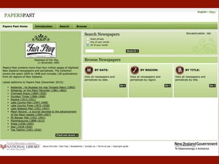
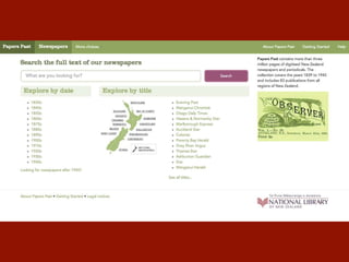
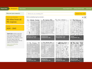
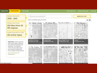
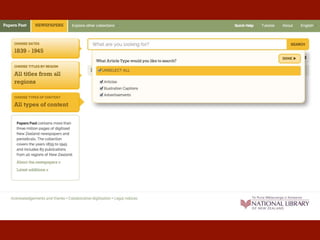
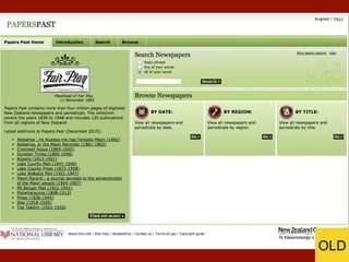
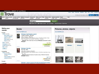
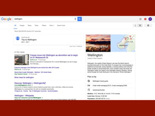
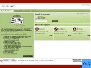
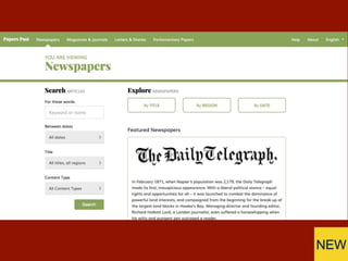
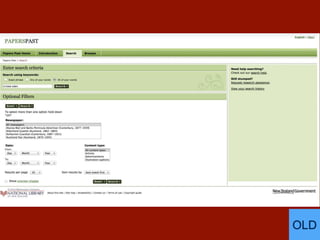
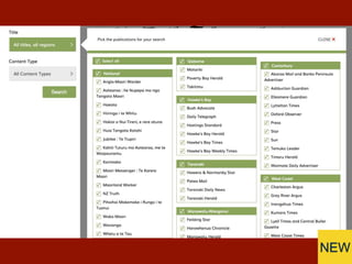
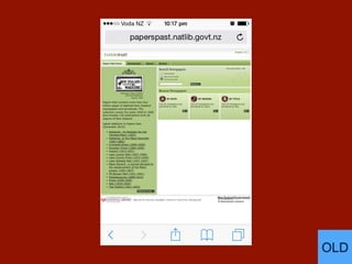
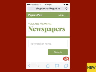
The New Papers Past
User experience lessons learned
National Digital Forum
November 22, 2016
Michael Lascarides
National Library of New Zealand
@mlascarides
130 Newspapers
~3.5 Million Pages
~40 million articles
~3M
pageviews/month
The
Reasons
“WHY ARE YOU
DOING THIS?!”
Business drivers:
Technical Debt +
Content Workflow
Constraints:
Beloved service
Different formats
Smallish budget
Opportunities:
Improve UX
Future-proofing
Device-friendly
Design approach:
Thoughtful discussion
Prototyping
User testing
Agile development &
iteration
The Iterations
“Sometimes I start
browsing and then
search, sometimes I
search and then refine
by browsing.”
Needs moar button.
Feeling disconnected.
Hello Click Suite!
The
Redesign
OLD
A fundamental UX question:
How do we get more
materials to people without
#&@king up their current
experience?
NEW
OLD
NEW
NEW
OLD
NEW
OLD
NEW
OLD
NEW
OLD
NEW
The URLs
/cgi-bin/paperspast?a=d&cl=CL1.NZABIG&e=-------10--1----0--
/newspapers/mt-benger-mail/1881/3/2
format
publication (or collection)
year
month
day
page
/newspapers/TS18691231.2.12
Publication
Date
Benefits:
Easy to understand
Easy for GA to parse
Easy for spiders to traverse
Bandwidth savings!
Google teething:
• PageRank slow to build
back up after long decline
• Getting indexing recipes
right
The Result
Feedback in Beta:
92% Positive
Feedback in Beta:
92% Positive
Feedback immediately after
launch:
60% Positive
Signs point to more
engagement:
• 14% more sessions with
search
• 35% more pages per visit
on mobile
• 7% more searches
More to come.
Future-proofed & iterative!
Thank You!
National Digital Forum
November 22, 2016
Michael Lascarides
National Library of New Zealand
@mlascarides

Papers Past - A Redesign Case Study

Editor's Notes

  • #2 Hello. I'm Michael, and I'm from the National Library Online team.
  • #15 Blank search gets you front pages. We would fall in love with this for a loooooong time.
  • #23 Search to side. Flyouts all from same direction.
  • #26 Abandoning the months-long front-page experiment. All historical front pages look the same as thumbnails, turns out.
  • #30 Approach 1: All the same results.
  • #31 Approach 2: Horses for courses.
  • #33 “What’s missing?” Search bar. Much remarked by GLAM peeps. Barely a comment from the patrons.
  • #35 Mobile-friendly chunkiness.
  • #36 Consistent components across formats, very different facets.
  • #37 Wasted space.
  • #38 Scannable and filterable.
  • #39 Wasted space. Most articles long and thin.
  • #40 Top of article is same distance from top of page, but much more context above it.
  • #41 Painful search by region. Worked ok with 8 papers!
  • #42 No “advanced search”. Everything is out front.
  • #43 Mobile phone view!
  • #44 Only the essentials.
  • #58 Hello. I'm Michael, and I'm from the National Library Online team.