Download to read offline
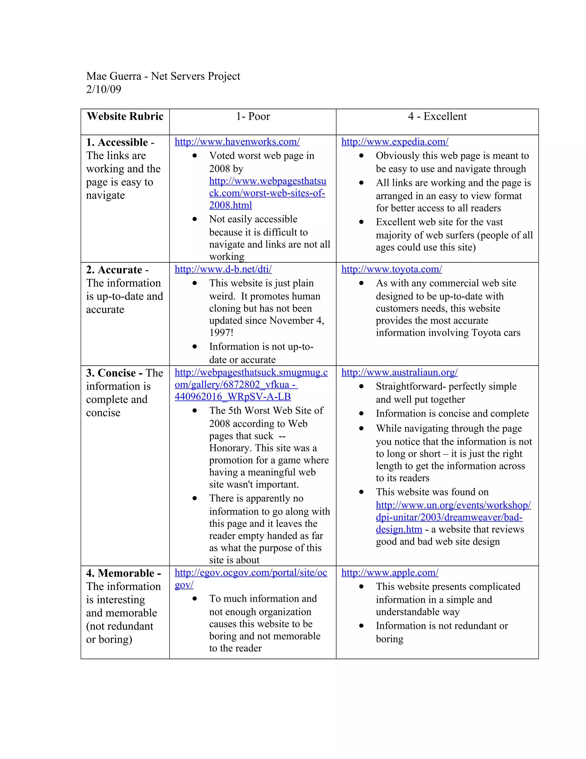

The document evaluates and compares several websites based on criteria such as accessibility, accuracy, conciseness, and memorability. For accessibility, Expedia.com receives high marks for having all links working and an easy to navigate format, while Havenworks.com receives low marks for being difficult to navigate with broken links. For accuracy, Toyota.com provides up-to-date car information, unlike D-B.net which promotes outdated human cloning content from 1997. For conciseness, Australiaun.org presents straightforward, perfectly simple information of just the right length, unlike a site promoting a meaningless game. For memorability, Apple.com avoids redundancy and boredom through simple presentation of complex topics, unlike Ocgov.


