MTA.Info Homepage Mockup
•
1 like•483 views

The document describes a redesign of the MTA.info homepage. The original homepage had an outdated design, too many links, and poor information structure. To understand user needs, the designer conducted a Q&A with 100 imaginary MTA users. Based on the results, the top priorities were the trip planner, service status, future plans, tourism, and app center. The designer then redesigned the homepage layout and widgets to prioritize these areas based on user value, simplify navigation, and allow for quick online payments, improving the overall user experience.

More Related Content
Viewers also liked
Viewers also liked (14)
Similar to MTA.Info Homepage Mockup
Similar to MTA.Info Homepage Mockup (20)
Recently uploaded
Recently uploaded (20)
MTA.Info Homepage Mockup
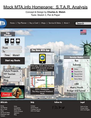
- 1. Mock MTA.info Homepage: S.T.A.R. Analysis Concept & Design by Charles A. Walsh Tools: Sketch 3, Pen & Paper
- 2. S.T.A.R. Analysis: Mock MTA Homepage MTA.info needed a new homepage. The homepage had an outdated design, too many links, and little information structure. To find out what visitors use most and deliver increased usability, accessibility, and the overall user experience of the overall homepage. Situation: Task:
- 3. S.T.A.R. Analysis: Mock MTA Homepage I held a Q&A with 100 imaginary MTA.info users about which features they used most frequently. The consensus: 1. Trip Planner 2. Service Status 3. Future plans section 4. tourism 5. App Center Action: The Q&A results allowed to begin the information design and sketch process. 1. Information Design I placed each link on the homepage in categories: Blog, Future Projects, Apps, etc. Then, ordered them by importance according to the Q&A results. The categories mentioned in the would be featured in the body of the homepage. Everything else would be placed in the Directory footer. The header menu was simplified and ordered- based on user value from the Q&A, including a language option. To accommodate for the new fictional MTA App, I placed a “Buy a Card” option for online payments in the menu to increase MTA revenue. Wireframes Information Grouping
- 4. S.T.A.R. Analysis: Mock MTA Homepage 3. Interactive Design All widgets labeled with a “+” on the homepage are retractable. This creates better flow and fixes the link clutter found on the original website. 2. Visual Design The homepage follows a Z-Pattern. Widgets are placed on the page according to user importance. I then redesigned the Trip Planner. I kept the important options--transportation mode, To & From, Time, and extra options--creating a more user-friendly widget.
- 5. S.T.A.R. Analysis: Mock MTA Homepage Result: By organizing the MTA homepage according to the highest User Value, The new homepage allows users to navigate faster, make quick online payments, and is overall more visually appealing. By organizing the MTA homepage according to my user research, The new model allows faster navigation, quick online payments, and is visually appealing, improving the overall UX of the MTA.info homepage. Result: