This document provides a summary of the revised edition of the book "Silverlight 2 in Action". It has been updated to cover Silverlight 4 and includes new chapters on data binding, validation, networking, navigation, testing with MVVM and using WCF RIA Services. The book is intended to teach developers how to build rich client applications with Silverlight.


![12 CHAPTER 1 Introducing Silverlight
Typically, you’ll leave the options at their default values and just click through this dia-
log. But it’s important to understand what’s available to you. Table 1.1 describes each
of the options presented in this dialog.
Table 1.1 The New Silverlight Application dialog options
Option Description
Host in a new Silverlight applications, even out-of-browser apps, are served from a website. You
website can also serve them from a static HTML page on the file system but this is a limit-
ing option. You’ll typically want to leave this checked, unless you have an existing
website you want to use when building your application.
New Web Project Provide a project name for the website. The default is usually sufficient.
Name
New Web Project If you’re an ASP .NET programmer and have a preference as to the ASP
.NET project
Type type, set it here. Otherwise, leave at the default.
Silverlight Version This allows you to select either Silverlight 3 or Silverlight 4. For this book, every
example will assume Silverlight 4.
Enable WCF RIA Check this if you want to link the web project to the Silverlight project as a WCF RIA
Services Services endpoint. This enables additional compile-time tooling.
Once the new solution is created, you’ll see two projects. The first one is the Silver-
light application; the second is the website. The website project contains a folder Cli-
entBin, which will contain the compiled output (.xap file) from your Silverlight
application. It also contains two test pages that may be used to test your Silverlight
application. By default, the .aspx page is set as the startup page but you may use the
HTML page if you later plan to host on a non-.NET server. (Yes, Silverlight applications
may be hosted by any HTTP server and not just Internet Information Services [IIS]
running ASP.NET.)
With the project open and ready, it’s time to turn to the user interface.
1.6.2 User interface
Open the MainPage.xaml file; it’s usually open by default when you create a new Sil-
verlight project. MainPage.xaml is the start page for your application, set as such by a
single line of code inside App.xaml.cs.
Inside the opening and closing Grid tags, add the following XAML markup:
<Button Content="Get Tweets"
Height="23"
HorizontalAlignment="Left"
Margin="12,12,0,0"
x:Name="GetTweets"
VerticalAlignment="Top"
Width="75"/>
<ListBox x:Name="TweetList"
Margin="12,41,12,12"/>
Download from Wow! eBook <www.wowebook.com>](https://image.slidesharecdn.com/manning-silverlight-4-in-action-sep-2010-100919221158-phpapp01/85/Manning-silverlight-4-in-action-sep-2010-43-320.jpg)


![40 CHAPTER 2 Core XAML
<Grid x:Name="LayoutRoot"
Background="Black">
Brush type
</Grid> converter
</UserControl>
There are enough built-in type converters that you may never have to write a new one
yourself. But they’re an extensibility point in XAML and, therefore, provide you with
flexibility to do some things that XAML may not handle natively.
CREATING CUSTOM TYPE CONVERTERS
First, since you need to decorate your type with a type converter attribute, you’ll need
access to the source. If you don’t have access to the type source and can specify the
converter just for a single property of your own class, that’ll work too. The difference
is that a converter specified at the property level will only work for that one property
in that one class and not in all instances of that type in all properties and in all classes.
Next, you’ll need to decide on a string format. The options are wide open, with the
exception that you can’t use the curly braces {} because they initialize the processing
of markup extensions (discussed earlier in this chapter). Listing 2.16 shows a sample
type converter that converts a string into a Border object. The format for the border is
<color> <thickness>, where color is a named color or an eight-digit hex color and thickness
is a number greater than or equal to zero.
Listing 2.16 A custom type converter that converts from a string to a border (C#)
public class BorderTypeConverter : TypeConverter
TypeConverter
{ base class
public override bool CanConvertFrom(
ITypeDescriptorContext context,
Type sourceType)
{
return sourceType == typeof(string);
XAML only
} requires strings
public override object ConvertFrom(
ITypeDescriptorContext context,
CultureInfo culture,
object value)
{
string val = value as string;
if (val == null) return null; Delimit
string[] parts = val.Split(' '); on space
if (parts.Length < 2) XamlReader.Load
Guard against to parse color
return null; malformed strings
SolidColorBrush brush = (SolidColorBrush)XamlReader.Load(
"<SolidColorBrush " + "xmlns=" +
"'http://schemas.microsoft.com/winfx/2006/xaml/presentation'"
+ " Color='" + parts[0] + "' />");
double d;
double.TryParse(parts[1], out d); Parse thickness
Download from Wow! eBook <www.wowebook.com>](https://image.slidesharecdn.com/manning-silverlight-4-in-action-sep-2010-100919221158-phpapp01/85/Manning-silverlight-4-in-action-sep-2010-71-320.jpg)
![XAML extensions and type converters 41
Thickness thick = new Thickness(d);
Border border = new Border();
border.BorderThickness = thick; Create
border.BorderBrush = brush; Border
Resulting
return border; Border object
}
}
Note that this example, in order to be production ready, would require additional
guard conditions and the ability to delimit on commas as well as spaces.
To create a custom type converter, you must first inherit from the TypeConverter
base class. For the type converter to be used in XAML, you only need to support
converting from the string type. More general-purpose converters will support addi-
tional types.
Note the hack I use to get the color information—it allows us to use any color rep-
resentation that the XAML parser can parse. XamlReader.Load is a nifty function that
has lots of uses, not only for its intended purpose of creating branches of the object
tree at runtime but also for simply invoking the parser as we did here. Some things in
Silverlight are simply easier to parse in XAML than they are in code—color is one
of them.
NOTE The Silverlight color enumeration understands only a few of the
many named colors, and the Silverlight Color class has no parse method to
get the remaining colors or the hex representation. Using the XAML parser
via XamlReader.Load() in listing 2.16, you reduce hundreds of lines of pars-
ing code down to a single line. We’ll cover more on the XamlReader class in
the next section.
Listing 2.17 illustrates a simple example of our custom type converter. Note that this
example also shows how to declare a dependency property—something we’ll cover in
more detail in chapter 24.
Listing 2.17 A simple class that uses our custom type converter
public class TestClass : Control
{
[TypeConverter(typeof(BorderTypeConverter))] TypeConverterAttribute
public Border Border
{
get { return (Border)GetValue(BorderProperty); }
set { SetValue(BorderProperty, value); }
}
public static readonly DependencyProperty BorderProperty =
DependencyProperty.Register("Border", typeof(Border),
typeof(TestClass), null);
}
Download from Wow! eBook <www.wowebook.com>](https://image.slidesharecdn.com/manning-silverlight-4-in-action-sep-2010-100919221158-phpapp01/85/Manning-silverlight-4-in-action-sep-2010-72-320.jpg)


![Integrating the Silverlight plug-in 63
■ Relate your Silverlight application to the HTML DOM.
■ Clarify the initial experience.
■ Handle plug-in events.
■ Send initialization parameters.
These general tasks cover a lot of ground, but we’re going to dive into the details that
make each task possible.
3.3.1 Relating the Silverlight application to the HTML DOM
The first three parameters of createObjectEx function build the relationship
between a Silverlight application and the HTML DOM. These parameters are called
source, parentElement, and id.
SOURCE
The source parameter specifies the URI of the Silverlight content that should be
loaded. In a managed code application, this content is bundled up as a .xap file, as dis-
cussed earlier in this chapter. The source property can reference a .xap file on the
hosting server or on a remote server. This gives you the ability to easily share your Sil-
verlight applications and improve server performance through load balancing. This
isn’t as easy with Silverlight 1.0.
Silverlight 1.0 didn’t have support for .xap files. Instead, Silverlight 1.0 relied on
setting the source of a plug-in through one of two approaches. The first approach
involves referencing a .xaml file that exists on the hosting server. The other approach
is to reference XAML content defined in the hosting web page. This type of XAML con-
tent is known as inline XAML. Either way, both of these approaches are dependent
upon the JavaScript programming model. Silverlight 2+ still supports these
approaches so that the source property in Silverlight 4 can be used in three different
ways, all of which are shown in table 3.4.
Table 3.4 The three approaches for referencing a Silverlight application
Approach File extension Examplea
Packaged .xap source: "http://www.myserver.com/myApp.xap"
Loose .xaml source: "/relativePath/page.xaml"
Inline [none] source: "#myXamlID"
a. Assuming this is part of a createObjectEx call
We won’t be discussing the loose and inline approaches in detail because the pack-
aged approach is the most widely used and is the only option that supports the man-
aged code Silverlight 2+ APIs. It’s recommended because of its flexible, compact, and
portable nature. Regardless of the approach you choose, the Silverlight plug-in is
always placed inside the parentElement.
Download from Wow! eBook <www.wowebook.com>](https://image.slidesharecdn.com/manning-silverlight-4-in-action-sep-2010-100919221158-phpapp01/85/Manning-silverlight-4-in-action-sep-2010-94-320.jpg)


![Integrating the Silverlight plug-in 71
3.3.4 Sending initialization parameters
A Silverlight application is a lot like any other .NET application. As an example, imag-
ine a basic command-line program. This program allows you to pass parameters to it
before it starts. Then, when the application does start, it’s responsible for parsing the
parameters. Once parsed, the application decides what to do with these parameters.
This is exactly how Silverlight uses initialization parameters as well.
The initialization parameters in Silverlight are sent through a parameter named
initParams. initParams is another parameter in the createObjectEx function. Like-
wise, there’s a parameter called context. This parameter allows you to uniquely tag a
Silverlight plug-in instance. Both parameters are shown here:
Silverlight.createObjectEx({
...
properties: {
...
},
events: { },
initParams: "key1=value1, key2=123, keyX=valueY",
context: "27d3b786-4e0c-4ae2-97a3-cee8921c7d3d"
});
This code demonstrates the basic usage of the initParams and context parameters.
Each of these parameters serves its own special purpose. In reality, you’ll probably
only use the initParams parameter because the context parameter doesn’t have as
much value in the Silverlight 4 world. The reason is because each Silverlight applica-
tion runs within its own domain and code sharing isn’t necessary like it is in the
scripting world of Silverlight 1.0. Regardless, we’ll cover them both in detail for the
sake of completeness.
INITPARAMS
The initParams parameter enables you to send any number of user-defined, key-
value pairs to a Silverlight application. The application is then responsible for reading
and interpreting the key-value pairs when it starts as shown in section 3.1.4. But first,
let’s build an understanding of how these key-value pairs are created.
The key-value pairs are represented in typical dictionary [key]=[value] form, sepa-
rated by commas. Naturally, the entire string of initParams represents a collection
of key-value pairs. This is different from initParams in Silverlight 1.0.
In Silverlight 1.0, the initParams parameter took a list of comma-delimited values.
This is important to recognize if you’re promoting your Silverlight 1.0 application to
Silverlight 4 because this approach isn’t valid in 4. If you are, in fact, doing this kind of
migration, you may want to consider how the context parameter is used as well.
CONTEXT
The context parameter gives you a way to uniquely identify a Silverlight plug-in. This
plug-in passes the value of the context parameter to the onLoad event associated with
the plug-in. The event then uses this string value to distinguish the plug-in from oth-
ers without having to check the HTML DOM. This empowers you to share scripted
code across multiple Silverlight plug-ins that exist on the same web page.
Download from Wow! eBook <www.wowebook.com>](https://image.slidesharecdn.com/manning-silverlight-4-in-action-sep-2010-100919221158-phpapp01/85/Manning-silverlight-4-in-action-sep-2010-102-320.jpg)


![Working with the user’s browser window 79
4.2.4 Accessing the query string
One common approach for managing state in a web application involves using the
query string. The query string empowers you to store small amounts of data relevant
to a user’s session. In addition, the query string can be used as a sort of a bookmark to
allow a user to come back to a specific location at a later point in time. As an example,
let’s pretend we want to send you the search results for a query on Silverlight; we
could email you the following web address:
http://search.msn.com/results.aspx?q=Silverlight&mkt=en-us&FORM=LVCP
This web address enables you to see the search results we’re referring to. This is more
convenient than telling someone to go to a search engine, enter “Silverlight” into the
query box, and wait for the results. This simpler approach is made possible through
the values that are stored after the ? (question mark)—values that represent the
QueryString of the Uri for an HtmlDocument.
The QueryString is readable through a collection of key/value pairs. This collec-
tion is part of a larger entity known as the DocumentUri. The DocumentUri represents
the Uri of the current page, allowing you to always gain your current bearings within
an application. Figure 4.3 shows how the parts of the DocumentUri are related.
This figure shows the breakdown of
a web address. Note that, significantly, DocumentUri
the QueryString starts after the ? in a
web address. In addition, each key/ http://www.silverlightinaction.com?page=1&id=1234
value pair is separated by an & (amper-
sand). The QueryString in figure 4.3 QueryString
has two key/value pairs, which could
be read using this code: Figure 4.3 The elements of a web address
HtmlWindow window = HtmlPage.Window;
HtmlDocument document = HtmlPage.Document;
foreach (string key in document.QueryString.Keys)
{
window.Alert("Key: " + key + "; Value: " + document.QueryString[key]);
}
Note that you can’t set the key/value pairs of this collection from code. Instead, if you
need to set the QueryString values, you’ll need to use the navigation techniques
shown table 4.6. This will reset the values associated with the QueryString, as well as
the contents of the page. Once the contents of the page are loaded, you can use the
HtmlDocument to navigate the page.
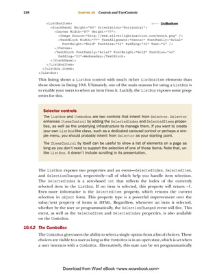
4.3 Working with the user’s browser window
The hosting browser window is represented as an HtmlWindow object. This object can’t
be instantiated from code, but you can get the current instance of the hosting
browser’s HtmlWindow through the HtmlPage class’s Window property. This can be
accomplished by using the following code:
HtmlWindow window = HtmlPage.Window;
Download from Wow! eBook <www.wowebook.com>](https://image.slidesharecdn.com/manning-silverlight-4-in-action-sep-2010-100919221158-phpapp01/85/Manning-silverlight-4-in-action-sep-2010-110-320.jpg)


![Bridging the scripting and managed code worlds 83
of these features, you need to learn to call managed code from JavaScript. In addition,
you’ll also learn how to use JavaScript from managed code.
4.4.1 Calling managed code from JavaScript
Calling managed code from JavaScript is a fairly simple process—it consists of three
basic steps intended to expose managed code elements to the scripting world. Once
these tasks have been performed, you’re free to reference the managed elements
from JavaScript. To demonstrate this, let’s pretend you want to use a method from
managed code to call a web service.
The first step in calling managed code from JavaScript involves using the Script-
ableType attribute. This attribute, which is part of the System.Windows.Browser
namespace, makes a class accessible to the JavaScript world. This attribute doesn’t expose
any special properties, so you can apply it to any class using the following approach:
[ScriptableType]
public partial class MainPage : UserControl
This C# code shows how to make a type accessible to JavaScript by exposing the
default Silverlight page to JavaScript. In reality, you can make any class accessible to
the scripting world and will typically create a dedicated class or classes just for that
interface. Once a class has been marked as a ScriptableType, all public properties,
methods, and events are available to JavaScript. Alternatively, you can decide to only
expose select member items. Fortunately, this is also an easy process.
To expose member items, you use a similar but different attribute—ScriptableMem-
ber. The ScriptableMember attribute may be applied to the events, methods, and prop-
erties that can be used with script. You add the attribute as shown in this C# code:
[ScriptableMember]
public void ExecuteWebService()
{
// Make a call to a web service
}
This attribute gives you the ability to set a scripting alias if you so desire, which you can
accomplish by setting the string-typed ScriptAlias property. This may be useful if
you want to prevent naming conflicts within script. Everything you’ve seen up to this
point is pretty basic, but we haven’t created the bridge to JavaScript yet.
To create the bridge to the scripting world, you must register an instance of the
class to be exposed by using the statically visible RegisterScriptableObject method.
This method, which belongs to the HtmlPage class, empowers you to give a class
instance an alias. This alias can then be used from script. You can accomplish this
using the RegisterScriptableObject method shown in the following C# code:
public MainPage()
{
InitializeComponent();
HtmlPage.RegisterScriptableObject("bridge", this);
}
Download from Wow! eBook <www.wowebook.com>](https://image.slidesharecdn.com/manning-silverlight-4-in-action-sep-2010-100919221158-phpapp01/85/Manning-silverlight-4-in-action-sep-2010-114-320.jpg)

![Bridging the scripting and managed code worlds 85
Silverlight. For instance, you may decide to create something known as a headless Sil-
verlight application.
A headless Silverlight application is an application that doesn’t have a UI.
Instead, it uses objects registered as ScriptableType elements as the brains for a tra-
ditional web page. This approach allows you to write nonvisual components using
the .NET Framework and integrate existing code libraries. This type of application is
valuable because you can use it to perform tasks that the browser’s JavaScript engine
can’t do. For instance, you may choose to use a headless Silverlight application
to make cross-domain requests or listen to a socket (both items discussed in chap-
ter 14). Regardless, you may still need to rely on the features of a preexisting
JavaScript library. For these situations, you can use Silverlight to call JavaScript from
managed code.
4.4.2 Using JavaScript from managed code
Silverlight gives you the flexibility to call JavaScript from managed code and, in turn,
the ability to call any method on an HTML or JavaScript object. This can be useful if
you’re integrating Silverlight with a preexisting web application. There’s one spot in
particular where this feature is especially valuable: printing.
Silverlight has basic printing capabilities (see chapter 19), but the Window object in
the HTML DOM also exposes a print method. You can use Silverlight’s ability to call a
function on a JavaScript object to deliver this functionality. To accomplish this, you
use a method called Invoke. This method can be used to execute a JavaScript function
from managed code, as demonstrated in the following C# code:
HtmlWindow window = HtmlPage.Window;
window.Invoke("print", new object[]{});
This code can be used to print the current web page, including your Silverlight
application. The Invoke method can be applied to any HtmlDocument, HtmlElement,
or HtmlWindow object. The first parameter of this method represents the name of the
function to be invoked. The second parameter represents the arguments that will be
passed to this function when it’s called. As you can see, this parameter is an array of
objects, so you have the flexibility to pass anything you need to a JavaScript function.
Silverlight gives you the ability to execute JavaScript code from managed code. In
addition, you can go the other way and call managed code from JavaScript. These two
features show how you can use Silverlight to bridge the scripting and managed code
worlds. This is important because you need to use this approach if you want to com-
municate between two different types of plug-ins, such as Flash and Silverlight, or
between technologies such as AJAX and Silverlight.
Silverlight gives you the ability to bridge scripting and managed code running
inside the browser. In addition, you can use Silverlight to learn about the user’s
browser window. What’s perhaps even more interesting, you can use managed code to
interact with the HTML DOM. All this is made possible by the rich HTML DOM API
that’s an integral part of Silverlight.
Download from Wow! eBook <www.wowebook.com>](https://image.slidesharecdn.com/manning-silverlight-4-in-action-sep-2010-100919221158-phpapp01/85/Manning-silverlight-4-in-action-sep-2010-116-320.jpg)


![COM automation 119
5.5.4 Automating Excel
Finally, the canonical example of using COM automation in Silverlight is to automate
Excel to populate data. Listing 5.3 shows an example of creating a worksheet with data
and a chart.
Listing 5.3 Automating Excel to create data and a chart
if (AutomationFactory.IsAvailable)
{
dynamic excel =
AutomationFactory.CreateObject("Excel.Application");
excel.Visible = true;
dynamic workbook = excel.workbooks; Create
workbook.Add(); worksheet
dynamic sheet = excel.ActiveSheet;
int i = 1;
double[] data = new double[] { 1.0, 5.0, 9.5, 2.7, 3.2, 0.6 };
foreach (double d in data) Iterate
{ dummy data
dynamic cell = sheet.Cells[i, 1];
cell.Value = "Row " + i; Label
cell.ColumnWidth = 10; cell
cell = sheet.Cells[i, 2];
cell.Value = d; Value
i++; cell
}
dynamic shapes = sheet.Shapes; Add 3d rotated
shapes.AddChart(-4100, 120, 2, 300, 200);
chart (type –4100)
}
The resulting worksheet with data and chart looks like figure 5.16. Note that the com-
munication need not be one way as shown in this example. You can also wire up Excel
data change events to update the data back in your own Silverlight application.
That’s pretty impressive from what’s otherwise thought of as a web application
technology. Though you can’t actually embed Office UI (such an Excel worksheet)
into your application, the ability to automate Excel and other Office applications
really helps to make Silverlight ready for business.
You can do quite a bit with elevated trust mode applications in Silverlight 4 and above.
The local file access capability makes for an even richer cross-platform experience and
enables scenarios previously restricted to platform-specific desktop applications.
Special among the elevated trust features, the COM capabilities are almost endless
but should be used with discretion and caution. This feature provides yet another
option for creating Windows client applications.
COM automation is exciting, powerful, and a little scary. The sky is the limit with what
you can do. Coming back down to Earth on the elevated trust capabilities, we’ll next
cover the control you have over the window hosting the out-of-browser application.
Download from Wow! eBook <www.wowebook.com>](https://image.slidesharecdn.com/manning-silverlight-4-in-action-sep-2010-100919221158-phpapp01/85/Manning-silverlight-4-in-action-sep-2010-150-320.jpg)


![130 CHAPTER 5 Integrating with the desktop
retrieve the names of the directories that match a certain
pattern; the GetFileNames method allows you to search
for files that match a particular filter. To gain a solid
understanding of how these filters work, look at the sam-
ple isolated storage area structure in figure 5.20.
The isolated storage area depicted in figure 5.20 con-
tains a number of common filesystem items. For instance, Figure 5.20 An illustration
there are three text files, one XAML file, and one subdirec- of a potential isolated storage
area
tory. With this hierarchical structure in mind, let’s turn our
focus to mastering the filtering string syntax used for searching the isolated storage area.
The first and most verbose approach involves searching for a specifically named
item. This approach works with both the GetDirectoryNames and GetFileNames meth-
ods. To perform the search, you simply provide the exact path to the file or directory.
If the filename or directory is found, a string array with one element will be returned.
Otherwise, an empty result set will be returned. Both approaches are shown here:
string[] directory1 = isoFile.GetDirectoryNames("Directory1");
string[] noDirFound = isoFile.GetDirectoryNames("Directory2");
string[] testfile1 = isoFile.GetFileNames("testfile1.txt");
string[] noFileFound = isoFile.GetFileNames("testfile2.txt");
string[] nestedFile = isoFile.GetFileNames("Directory1/file1.txt");
Similarly, wildcard characters may be used to pattern-match file names. Following nor-
mal Windows operating system rules, the * character matches any number of charac-
ters, and the ? character matches any single character:
string[] results1 = isoFile.GetFileNames("*");
string[] results2 = isoFile.GetFileNames("Directory1/*");
string[] results3 = isoFile.GetFileNames("textfile*");
string[] results4 = isoFile.GetFileNames("*.txt");
The * and ? wildcard characters are applicable within the GetDirectoryNames
method as well. Once you have the file you’re looking for, you can open it and work
on it just like you would any other file, including deleting it.
REMOVING ITEMS FROM ISOLATED STORAGE
The IsolatedStorageFile class exposes two utility methods that enable you to
remove items from the storage area. The first method, DeleteDirectory, is used to
remove a directory from the isolated storage area. The second method, DeleteFile,
similarly allows you to remove a file. The usage of the DeleteFile method is illus-
trated here:
soFile.DeleteFile("testfile1.txt");
isoFile.DeleteFile("Directory1/file1.txt");
As this example shows, you must explicitly provide the absolute path to the file
you want to delete. If you provide an invalid path, an IsolatedStorageException
will be thrown. In addition, this same exception will be thrown if you attempt to
remove a directory that isn’t empty. Other than that, the syntax is the same when
Download from Wow! eBook <www.wowebook.com>](https://image.slidesharecdn.com/manning-silverlight-4-in-action-sep-2010-100919221158-phpapp01/85/Manning-silverlight-4-in-action-sep-2010-161-320.jpg)


![136 CHAPTER 5 Integrating with the desktop
5.8.3 Administering isolated storage
Administering an isolated storage area involves interacting with the physical filesys-
tem. The reason you’d want to do this is to test a user’s initial interaction with a Silver-
light application. During development, it can be easy to get lost in the action and
forget a user’s initial experience with an application. Because the isolated storage area
is separate from the browser’s cache, you need an easy way to remove information
from the isolated storage area, so you should know where the isolated storage area is
located on the physical filesystem.
The isolated storage area is located in different locations based on the user’s oper-
ating system. The specific location for each operating system is shown in table 5.6.
Table 5.6 The base location of the isolated storage area on each operating system supported in Silverlight
Operating system Location
Mac OS X AppData/Local
Windows XP C:Documents and Settings[UserName]Application DataMicrosoftSilverlightis
Windows Vista C:Users[UserName]AppDataLocalLowMicrosoftSilverlightis
and Windows 7
This table shows the base location for the isolated storage area. Each unique Silver-
light application that uses isolated storage will create a new directory under this loca-
tion. This new directory will be given a name that appears encrypted, but don’t let this
fool you. The data stored in the isolated storage area isn’t encrypted so you shouldn’t
store sensitive information, such as passwords, in the isolated storage.
Isolated storage is a great way to store nonpermanent data on the end user’s local
machine. It’s flexible in that it works in all modes of Silverlight operation (in-
browser, out-of-browser, elevated out-of-browser) and works as a virtual filesystem.
When combined with the other features described in this chapter, it really helps
round out a feature set that makes for extremely capable connected and discon-
nected rich Internet applications.
5.9 Summary
For a web technology, Silverlight provides an unprecedented level of desktop integra-
tion. With Silverlight 4, we now have the ability to run in and out of the browser in the
partial trust mode or out of the browser in the elevated trust mode.
When running out of the browser in partial trust, you gain additional storage
capacity without prompting, additional keyboard information, and a reduction in host
chrome that allows you to take a greater advantage of screen real estate and provide a
truly custom experience. For many behind-the-firewall business applications, and
both custom experiences and self-contained Internet-delivered applications, this is a
compelling option with no real downside.
Download from Wow! eBook <www.wowebook.com>](https://image.slidesharecdn.com/manning-silverlight-4-in-action-sep-2010-100919221158-phpapp01/85/Manning-silverlight-4-in-action-sep-2010-167-320.jpg)


![184 CHAPTER 7 Panels
ADDING ROWS AND COLUMNS AT RUNTIME
Adding rows or columns programmatically at runtime is as simple as writing two lines
of code. The first line of code is responsible for creating either a RowDefinition or
ColumnDefinition object. The other line of code is then responsible for adding the
newly created object to the appropriate collection. Significantly, there are two different
ways to add the object to the collection. First, here’s how to programmatically add a row:
RowDefinition myRow = new RowDefinition();
myGrid.RowDefinitions.Add(myRow);
The preceding adds a row to the grid created in the previous example. Similarly, this
code adds a column to the same grid but uses the Insert method to insert the column
definition at the far left of the grid:
ColumnDefinition myColumn = new ColumnDefinition();
myGrid.ColumnDefinitions.Insert(0, myColumn);
The first approach adds a single row to the bottom of the Grid because the Add
method always appends an object to the end of a collection. In situations where you
need to have more control over where a column or row is added to a Grid, you may
consider using the Insert method. Either way, you can see how easy it is to add rows
and columns on the fly. And, fortunately, it’s just as easy to remove them.
REMOVING ROWS AND COLUMNS AT RUNTIME
To remove either a row or a column from a Grid, you must use one of two approaches.
The first approach uses the Remove method, which attempts to remove the first occur-
rence of the object provided. If the row or column is successfully removed, this
method returns true. Otherwise, if something unexpected has occurred, this method
returns false:
RowDefinition myRow = myGrid.RowDefinitions[0];
myGrid.RowDefinitions.Remove(myRow);
Occasionally, you may want to explicitly state which row or column to remove based
on an index. For these situations, you should consider using the RemoveAt method:
int lastColumnIndex = myGrid.ColumnDefinitions.Count - 1;
myGrid.ColumnDefinitions.RemoveAt(lastColumnIndex);
The RemoveAt method enables you to specify which row or column to remove by using
a specific index. This index is based on the zero-based indexing scheme used by the Row-
Definitions and ColumnDefinitions collections. Once the row or column is removed,
the remaining rows or columns will simply move up in the collection. This process
occurs completely at runtime and demonstrates how powerful the Grid can be. Another
feature that shows the power of the Grid is the ability to customize the cell boundaries.
7.3.6 Customizing cell boundaries
Silverlight provides a way to customize the cell boundaries of a Grid that’s similar to the
border property in CSS. But, Silverlight goes one step further and gives the user the abil-
ity to use this boundary to dynamically resize the cells of a Grid. This user-controlled
Download from Wow! eBook <www.wowebook.com>](https://image.slidesharecdn.com/manning-silverlight-4-in-action-sep-2010-100919221158-phpapp01/85/Manning-silverlight-4-in-action-sep-2010-215-320.jpg)
![The Grid 185
sizing feature enables a user to reallocate space from one cell to another. During this
process, as one cell increases in size, other cells in the Grid may decrease in size. Sig-
nificantly, this resizing process doesn’t change the dimensions of the overall Grid. To
take advantage of this powerful feature, you use a GridSplitter.
A GridSplitter is an element in the System.Windows.Controls namespace. But,
this item isn’t part of the core Silverlight runtime. Instead, this element is known as an
extended control. These types of controls must be accessed slightly differently than a
standard element such as a Grid. Over the course of this section, you’ll learn how to
access the library of extended controls. Then you’ll learn how to use the GridSplit-
ter within a Grid.
ACCESSING EXTENDED CONTROLS
The extended controls, including the GridSplitter, are part of an assembly called
System.Windows.Controls, which is included in the Silverlight SDK, itself part of the
developer tools download. This assembly includes a number of controls designed to
complement the core Silverlight controls. You’ll learn about the core Silverlight con-
trols in chapter 10 and the other extended controls throughout this book. For now, it’s
important to recognize that this assembly is not part of the core Silverlight runtime; if
you want to use any of the extended controls, you must reference the System.Windows.
Controls assembly. You can do so by adding a reference to the assembly in Visual Studio
and then referencing the namespace through a prefix:
<UserControl x:Class="ExtendedControls.Page"
xmlns="http://schemas.microsoft.com/winfx/2006/xaml/presentation"
xmlns:x="http://schemas.microsoft.com/winfx/2006/xaml"
xmlns:ext="clr-namespace:System.Windows.Controls;
[CA]assembly=System.Windows.Controls"
Width="400" Height="300">
<Grid x:Name="LayoutRoot" Background="White" />
</UserControl>
This code shows how to reference the extended controls assembly to pull in a control
not included in the core Silverlight runtime.
WARNING Referencing the System.Windows.Controls assembly will cause it
to be bundled with your application’s .xap, increasing the size of the .xap
file by about 427 KB before compression (as of the time of writing). This can
cause your application to take slightly longer to download unless you take
advantage of assembly caching described in chapter 3.
We’ve given this assembly the friendly prefix ext to reference the extended controls.
The sdk prefix will also be used in relation to our current discussion involving the
GridSplitter.
USING THE GRIDSPLITTER
The GridSplitter defines a divider within a Grid. This divider can be used to style
the boundaries of the cells in the Grid. Alternatively, a GridSplitter can be moved by
a user with the mouse or keyboard. To get a feel for how this works and the basic syn-
tax of a GridSplitter, take a look at listing 7.10.
Download from Wow! eBook <www.wowebook.com>](https://image.slidesharecdn.com/manning-silverlight-4-in-action-sep-2010-100919221158-phpapp01/85/Manning-silverlight-4-in-action-sep-2010-216-320.jpg)


![212 CHAPTER 9 Text
Much like the FontStyle property, the TextDecorations property has more options
in WPF—the reason why it has such an abstract name.
The next property is more line or paragraph-oriented: TextWrapping.
TEXTWRAPPING
The TextWrapping property enables you to specify how text should wrap across multi-
ple lines within a TextBlock. By default, Silverlight doesn’t wrap text within a Text-
Block. You can set the TextWrapping attribute to Wrap, and the text will break and
resume on the next line if the Width of the TextBlock is exceeded. This wrapping
effect is shown in listing 9.3.
Listing 9.3 Text wrapping
Result:
XAML:
<Canvas Width="200" Height="140">
<TextBlock Text="Eating a lot of fruit can help you live to a
[CA]ripe old age."
Width="150" TextWrapping
TextWrapping="Wrap" />
property
</Canvas>
Listing 9.3 shows how to change the TextWrapping property from its default value of
NoWrap. The value and its destination value of Wrap belong to the TextWrapping enu-
meration. This type is only available to TextBlock elements—you can’t use it in
Inline elements such as Run. The Run element also lacks the ability to specify its own
TextTrimming or TextAlignment, separate from the TextBlock.
TEXTTRIMMING
There are often cases when you want to show only as much text as will fit into a pre-
defined rectangle on the screen. The remaining text should be clipped off. In those
cases, it’s common to provide the user with a visual cue that the text’s been trimmed.
Rather than have you calculate the trimming manually, Silverlight supports the
TextTrimming property. As shown in listing 9.4, Silverlight supports the WordEllipsis
style of text trimming, where the ellipsis is shown after the last whole word that will fit
in the rectangle.
Listing 9.4 Text trimming with a small font
Result:
XAML:
<Grid x:Name="LayoutRoot" Background="White">
<TextBlock Width="150"
Download from Wow! eBook <www.wowebook.com>](https://image.slidesharecdn.com/manning-silverlight-4-in-action-sep-2010-100919221158-phpapp01/85/Manning-silverlight-4-in-action-sep-2010-243-320.jpg)


![256 CHAPTER 10 Controls and UserControls
public bool IsLocked CLR property
{ wrapper
get { return (bool)(GetValue(IsLockedProperty)); }
set { SetValue(IsLockedProperty, value); }
}
This listing shows how to register a property as a DependencyProperty. Note the name
of the DependencyProperty itself. This name can be anything, but it generally follows
a naming template of [CLR Wrapper Name]Property. This DependencyProperty serves as
a key in the property dictionary used by the GetValue and SetValue methods of a CLR
property wrapper. Also note the fourth parameter, which allows you to define behav-
ioral aspects and automatically respond to property value changes.
While the rest of the runtime uses the dependency properties directly, the CLR
property wrapper is required because it’s used by direct property assignments in
XAML or from your own code. Note that, unlike a normal CLR property, you’ll assign
the value to and read it from the dependency property system. In addition, you
won’t perform any other logic in the setter; you’ll do that inside the changed call-
back instead.
RESPONDING TO PROPERTY VALUE CHANGES
Dependency properties have the ability to automatically respond to property value
changes in a way that you determine. To stay connected with a value change, the
PropertyChangedCallback passes along a DependencyPropertyChangedEventArgs
instance, which gives you three properties to help you react to a change as necessary.
These three properties are described in table 10.11.
Table 10.11 The properties of the DependencyPropertyChangedEventArgs structure
Property Description
NewValue The value of the property after the change has completed
OldValue The value of the property before the change has completed
Property The DependencyProperty that triggered the change
This table shows the properties of the DependencyPropertyChangedEventArgs struc-
ture. This structure is associated with the dependency property that was changed. To
get the object that this property is associated with, you must rely on the first parameter
passed from the PropertyChangedCallback. This parameter represents the Depen-
dencyObject whose property value was changed, so you’ll most likely need to perform
a conversion, as shown here:
private static void OnIsLockedChanged(DependencyObject o,
DependencyPropertyChangedEventArgs e)
{
LockableTextBox textBox = (LockableTextBox)(o);
textBox.UpdateUI();
}
Download from Wow! eBook <www.wowebook.com>](https://image.slidesharecdn.com/manning-silverlight-4-in-action-sep-2010-100919221158-phpapp01/85/Manning-silverlight-4-in-action-sep-2010-287-320.jpg)


![Understanding your binding source 273
Let’s assume for a moment that we have a class Repository that exposes a collec-
tion of Emoticon objects through a property named Emoticons. We could then set up
a static resource for pure XAML binding or set the DataContext from the page or
within the code-behind, as shown in the previous examples. Once that’s set up, we’d
be able to refer to individual elements in the collection using the index syntax within
the binding statement, as shown in listing 11.4.
Listing 11.4 Binding to a specific element in a collection, using a numeric index
C#:
public class Repository
{
...
private ObservableCollection<Emoticon> _emoticons; Collection
public ObservableCollection<Emoticon> Emoticons
to bind to
{
get { return _emoticons; }
}
}
XAML:
<UserControl.Resources>
<local:Repository x:Key=“repository” />
</UserControl.Resources>
<Grid x:Name=“LayoutRoot”
DataContext=“{StaticResource repository}”> Indexed
<TextBlock Text=“{Binding Emoticons[2].Name}” />
binding
</Grid>
In listing 11.4, the TextBlock will resolve its text property to be the value in reposi-
tory.Emoticons[2].Name and display that on the screen. The syntax is consistent with
C# indexing conventions.
Binding to a single element in a collection using a numeric index in a binding
expression is useful, but often we want to bind using a string key instead.
11.2.5 Binding to a keyed (string indexed) element
Property bags and datasets are commonplace in the desktop application world. Silver-
light 4 introduced the ability to bind to these types of structures by introducing keyed
or string-indexed binding expressions.
Listing 11.5 shows the same example as 11.4 but now the collection is being
accessed via a string key.
Listing 11.5 Binding to a specific element in a collection, using a numeric index
C#:
public class Repository
{
...
Download from Wow! eBook <www.wowebook.com>](https://image.slidesharecdn.com/manning-silverlight-4-in-action-sep-2010-100919221158-phpapp01/85/Manning-silverlight-4-in-action-sep-2010-304-320.jpg)
![274 CHAPTER 11 Binding
private Dictionary<string, Emoticon> _emoticons;
public Dictionary<string, Emoticon> Emoticons Collection
{ to bind to
get { return _emoticons; }
}
}
XAML:
<UserControl.Resources>
<local:Repository x:Key=“repository” />
</UserControl.Resources>
<Grid x:Name=“LayoutRoot”
DataContext=“{StaticResource repository}”> Keyed/string-
<TextBlock Text=“{Binding Emoticons[Smiley].Name}” />
indexed binding
</Grid>
Listing 11.5 works assuming your Emoticons dictionary has an element with the key
Smiley. This feature enables a ton of must-have scenarios in Silverlight, specifically
around binding to the data of a shape unknown at design time.
Binding to a single element in a collection using a numeric index or string key in a
binding expression is useful, but it’s more common to bind to an entire collection
rather than a single element within that collection. That’s the situation you’ll run into
when you want to populate a ListBox or other ItemsControl.
11.2.6 Binding to an entire collection
Binding to a collection is an important task in a lot of applications. There are numer-
ous times when you need to show a list of the items in a collection. You may want to
display a collection of emoticons or you may want to show a list of the days of the
week. Either way, these lists are made up of individual items, so it’s only natural to use
a control derived from ItemsControl.
An ItemsControl is a basic control used to show a collection of items. We discussed
this control in chapter 10, but we didn’t talk about the process of binding data to the
control. Instead, you saw the manual approach of adding items one by one to the Items
collection. Although this technique is useful in some situations, the ItemsControl pro-
vides a more elegant approach through the ItemsSource property (see listing 11.6).
Listing 11.6 Binding a collection of Emoticon objects to a ListBox
Result:
XAML:
<ListBox x:Name=“myListBox” Height=“100” />
Download from Wow! eBook <www.wowebook.com>](https://image.slidesharecdn.com/manning-silverlight-4-in-action-sep-2010-100919221158-phpapp01/85/Manning-silverlight-4-in-action-sep-2010-305-320.jpg)


![Creating data templates 281
that contains three or four pieces of data in each row? That’s where data templates
come in.
A data template is a way to define how a piece of information will be shown. Imag-
ine looking at a baseball player’s statistics. Although these statistics can be easily
viewed in tabular format, it’s much more interesting to look at them on a baseball
card. For an example, see table 11.1.
Raw data (statistics) Presentation via data template
Player: Scarpacci
Position: Pitcher (P)
Team: J-Force
Picture: [A URL]
Table 11.1 One example
of a data template
This table demonstrates the general idea of a data template: it gives your data a face.
The value in this approach is that it allows you to quickly change the way your data
looks without changing your code—the main raison d’être for XAML. Just as base-
ball card designs change each year, your data may change its look based on its con-
text. Data templates allow you to make this change easily, without affecting the
underlying model. To take advantage of this feature, you must create a DataTem-
plate object.
A DataTemplate object describes the visual representation of a piece of informa-
tion. This object can be used with two types of controls within the Silverlight class
library. The first is a ContentControl. More interesting and probably more commonly
used is the ItemsControl. Within this section, you’ll see how to create a data template
with each of these control types.
11.4.1 Using a DataTemplate with a ContentControl
A ContentControl is a type of control defined by a single piece of content, which we
discussed in chapter 10. Every ContentControl exposes a property called Content-
Template, which specifies the DataTemplate to use when displaying the content of a
ContentControl. This content can be styled with a DataTemplate using an approach
similar to that shown in listing 11.9.
Listing 11.9 A DataTemplate used with a ContentControl
Result:
Download from Wow! eBook <www.wowebook.com>](https://image.slidesharecdn.com/manning-silverlight-4-in-action-sep-2010-100919221158-phpapp01/85/Manning-silverlight-4-in-action-sep-2010-312-320.jpg)


![294 CHAPTER 12 Data controls: DataGrid and DataForm
column names and edit controls based on the types bound to it. Like the DataGrid, it
also provides full customization of the representation of each of the bound fields.
Like the DataGrid, the DataForm can work with multiple rows of data. The presen-
tation differs in that you’ll see only one row at a time, as is typical in a details form. In
fact, the DataGrid and DataForm are sometimes used together to show a master-detail
relationship where the DataGrid contains all the records and the DataForm is used to
show an editable form for the DataGrid row.
The DataForm was originally developed for Silverlight by the same team that
brought us WCF RIA Services. In order to support continued iteration on the control,
it was moved from the SDK, where the now-mature DataGrid resides, and placed in
the Silverlight Toolkit in the System.Windows.Controls.Data.DataForm.Toolkit
assembly. The Silverlight Toolkit can be thought of as an agile extension of the Silver-
light SDK, with the bonus that you have access to the source code for the controls and
tests it contains.
Though not all applications will use the DataForm, it’s much richer and more cus-
tomizable than it initially appears. Virtually any forms-over-data application can use this
control to show a UI that can be as simple as a list of fields or as complex as a customized
layout with specific field styles, sizes, and positioning. How it looks is up to you.
In this section, we’ll take a tour through the capabilities of the DataForm, starting
with a simple binding to a single object and then to a collection of objects. Next, we’ll
work with the command buttons for canceling updates and submitting data. Once we
have the functional mechanics down, we’ll customize the display of fields using prop-
erties and then using richer data templates for the edit, add, and display modes. The
section will wrap up with a discussion of IEditableObject and how that interface can
make working with the DataForm even easier.
12.2.1 Displaying your data
The easiest thing to do with the DataForm is to bind it to an object and watch it gener-
ate all the fields you need. We’ll step away from the Emoticon class for the remaining
examples here to show the breadth of controls the DataForm understands. Let’s create
a new simple Person class, as shown in listing 12.5. (The Required attribute, used in
this class, will be covered in chapter 13, which focuses on validation.)
Listing 12.5 The Person class
public enum MaritalStatus
{
Unknown,
Married,
Single,
Divorced
}
public class Person
{
[Required]
Download from Wow! eBook <www.wowebook.com>](https://image.slidesharecdn.com/manning-silverlight-4-in-action-sep-2010-100919221158-phpapp01/85/Manning-silverlight-4-in-action-sep-2010-325-320.jpg)
![The DataForm 295
public string LastName { get; set; }
[Required]
public string FirstName { get; set; }
public bool IsRegistered { get; set; }
public MaritalStatus MaritalStatus { get; set; }
public DateTime DateOfBirth { get; set; }
[Required]
public string EmailAddress { get; set; }
[Required]
public int NumberOfChildren { get; set; }
}
We’ll then bind to it in XAML using a static resource, much as we have in other exam-
ples. Instead of individual controls, we’ll use the entire object as our data source for
the new DataForm control, as shown in listing 12.6.
Listing 12.6 Binding the DataForm to a single Person object
<UserControl.Resources>
<local:Person x:Key="me" /> Person as
</UserControl.Resources> resource
<Grid x:Name="LayoutRoot" Margin="30"> Binding to
<toolkit:DataForm CurrentItem="{StaticResource me}" />
person
</Grid>
The property that’s used to generate the form is the CurrentItem property, in this
sample case bound to a single object sitting in the Resources section of this control.
The resulting DataForm, as seen in figure 12.1, is impressive in the breadth of controls
it has auto-generated for you. Not only did we not have to write any code specific to
the DataForm, but we also didn’t have to place any edit controls in the markup.
Note that the DataForm displayed a CheckBox for the bool property, a ComboBox for
the enum (populated with all the possible values defined in the enumeration, of
course), and a DatePicker for the DateTime property. Not bad for a default form, and
certainly workable for a simple utility application.
Figure 12.1 DataForm
showing generated edit controls
bound to a single object without
a backing collection. Note that
there’s no toolbar or set of
navigation buttons. Not all fields
are shown, so your form will look
slightly different.
Download from Wow! eBook <www.wowebook.com>](https://image.slidesharecdn.com/manning-silverlight-4-in-action-sep-2010-100919221158-phpapp01/85/Manning-silverlight-4-in-action-sep-2010-326-320.jpg)


![304 CHAPTER 12 Data controls: DataGrid and DataForm
controls from scratch, especially when you consider the annotations we’ll cover in the
next section.
Now that we’ve seen how to edit data in the DataGrid and DataForm, we’ll want to
impose some parameters around how the data is displayed. We can do this in code,
but it’s typically more efficient to use data annotations.
12.3 Annotating for display
The DataForm and DataGrid both offer the ability to set the properties of columns
and labels, including things such as the display caption and tooltips. But, if you share
the data between many instances of the controls, instances which may vary in their dis-
play properties in other ways, it can be both tedious and a maintenance burden to
have to repeat this configuration in multiple places.
Autogeneration of columns and labels often leaves us with even uglier results.
Sadly, many internal applications go into production with programmer-friendly but
user-unfriendly display properties because it was too much effort to keep the UI
updated and in sync with the data model.
The System.ComponentModel.DataAnnotations assembly and namespace found
in the Silverlight SDK provide a number of attributes designed to make data validation
and display hinting easier for controls such as the DataForm, DataGrid, and some
third-party controls. The approach taken by these attributes is to mark up the proper-
ties in your entities using attributes in code rather than require code within the prop-
erties or external to your entities.
The two main attributes that we’ll cover here are Display and Editable. In chap-
ter 13, we’ll take a look at the validation attributes and how they can further enhance
the DataGrid and DataForm.
12.3.1 The Display attribute
Both the DataGrid and the DataForm provide the capability to automatically generate
display and edit controls, and associated labels or column headers, at runtime.
Though the controls themselves provide a number of ways to customize the field
information, there are times when you’d be better served by a centralized definition
of that metadata.
One way to centralize that metadata is to annotate the properties on the entities
themselves. The assembly System.ComponentModel.DataAnnotations provides a
number of attributes designed specifically for this purpose (see listing 12.10).
Listing 12.10 The Person class with Display attributes attached
public class Person
{
...
[Display(Name = "Registered",
Description = "Check if this person has registered with us.")]
public bool IsRegistered { get; set; }
Download from Wow! eBook <www.wowebook.com>](https://image.slidesharecdn.com/manning-silverlight-4-in-action-sep-2010-100919221158-phpapp01/85/Manning-silverlight-4-in-action-sep-2010-335-320.jpg)
![Annotating for display 305
[Display(Name = "Marital Status",
Description = "Optional marital status information.")]
public MaritalStatus MaritalStatus { get; set; }
...
}
The result of including the Display attribute with the name and description can be
seen in figure 12.5. Note that the MaritalStatus field has its correctly formatted dis-
play name shown in the label, and the Registered field shows the information icon
with the associated tooltip containing the description property.
Figure 12.5 Portion of a DataForm showing the tooltips with the Description property of the
Display attribute and the field captions pulled from the Name property of the same attribute.
The DisplayAttribute enables us to control a number of different aspects of the
onscreen representation of the control, above and beyond just the field label and the
tooltip. It can control whether the field is automatically generated as a column in the
DataGrid or field in the DataForm. It can also control the order the fields are dis-
played in or information on the string to use when localizing. Table 12.9 has the com-
plete list of the different properties available.
Table 12.9 DisplayAttribute properties and their uses
Property Description
AutoGenerateField Set this value to false if you don’t want controls like the DataForm to
automatically generate a control for this property.
AutoGenerateFilter Set to true if you want the filtering UI automatically displayed for this
field. It is currently unused by the DataGrid and DataForm controls.
Description A resource name or regular text that will be displayed by the rendering
control. In the case of the DataForm, this shows up in a tooltip over
the information icon.
GroupName A resource name or regular text to display as the heading for a group of
related fields. Currently unused by the DataGrid and DataForm
controls.
Name A resource name or regular text to display as the name of this field. This
is typically used in field labels.
Order Relative order for this field in display. By default, fields are displayed in
the order they’re defined in the class. This property allows you to over-
ride that behavior.
Prompt Specifies a prompt, such as a watermark, to use when displaying this
field. Currently unused by the DataGrid and DataForm controls.
Download from Wow! eBook <www.wowebook.com>](https://image.slidesharecdn.com/manning-silverlight-4-in-action-sep-2010-100919221158-phpapp01/85/Manning-silverlight-4-in-action-sep-2010-336-320.jpg)
![306 CHAPTER 12 Data controls: DataGrid and DataForm
Table 12.9 DisplayAttribute properties and their uses (continued)
Property Description
ResourceType If you intend to use localized resources, specify the type container for
those resources here.
ShortName A resource name or regular text to display as the name of this field. This
is typically used in column headers.
In several instances in table 12.9, I wrote that a property is “typically used as” some-
thing or other. The DisplayAttribute simply contains data; it doesn’t provide behav-
ior or any enforcement of proper use. It’s up to the consuming control—typically a
DataGrid, DataForm or a third-party control—to decide how that data will be used.
In addition to the DisplayAttribute and its properties, one final important attri-
bute-based setting you have as a developer is the ability to mark individual properties
as editable or read only.
12.3.2 The Editable attribute
On occasion, you may want to designate certain properties as read only from a UI
point of view but still allow them to be manipulated via code. One way to handle that
is to provide an accessor (property get) with no corresponding property set and then
provide an explicit mutator method. Unfortunately, that makes the programming
interface more cumbersome.
Another approach is to provide a normal property getter and setter but mark the
property as read only at the UI level. Like the Display attribute discussed in the previ-
ous section, you could certainly do this on a form-by-form basis. But you may want to
instead centralize this information on the entity itself, as shown in listing 12.11.
Listing 12.11 Controlling editability using the Editable attribute
public class Person
{
...
[Display(Name = "Marital Status",
Description = "Optional marital status information.")] Editable
[Editable(false)]
attribute
public MaritalStatus MaritalStatus { get; set; }
...
}
In this example, we’ve marked the Marital Status field as read only by applying an
EditableAttribute with the editable flag set to false. The result will be an onscreen
field that’s disabled, as shown in figure 12.6.
Figure 12.6 shows the Marital Status field disabled. Note also that its information
icon isn’t displayed, even though we’ve included a display description. The display of
the field control itself will depend upon the disabled state for the control in use. This
Download from Wow! eBook <www.wowebook.com>](https://image.slidesharecdn.com/manning-silverlight-4-in-action-sep-2010-100919221158-phpapp01/85/Manning-silverlight-4-in-action-sep-2010-337-320.jpg)


![Synchronous validation with IDataErrorInfo 317
Now that the binding is set up for each of the TextBox instances on the form, we
can get to the actual validation code. We’ll put the validation code inline in the
Employee class. Once you have some experience with it, you may want to pull the com-
mon validation helper code out into a separate class, called from your entities.
13.3.2 Simple validation with IDataErrorInfo
The first thing to do is to implement IDataErrorInfo in the class. The modifications
to the Employee class to do this look like listing 13.3.
Listing 13.3 Implementing IDataErrorInfo in the Employee class
public class Employee : INotifyPropertyChanged, IDataErrorInfo
{
...
#region IDataErrorInfo Members
private string _dataError = string.Empty; Class-level
string IDataErrorInfo.Error
error property
{
get { return _dataError; }
}
private Dictionary<string, string> _dataErrors =
new Dictionary<string,string>(); Field-level
string IDataErrorInfo.this[string columnName]
error property
{
get
{
if (_dataErrors.ContainsKey(columnName))
return _dataErrors[columnName];
else
return null;
}
}
#endregion
}
The Dictionary of strings holds the field-level error messages, whereas the single
string property holds the class-level error message. To try out the interface, we’ll
implement the same validation we did in the simple exception-based validation exam-
ple and check the length of the LastName field:
public string LastName
{
get { return _lastName; }
set
{
if (string.IsNullOrEmpty(value))
_dataErrors["LastName"] = "Last Name is required";
else if (value.Trim().Length < 2)
_dataErrors["LastName"] =
"Last Name must be at least 2 letters long.";
Download from Wow! eBook <www.wowebook.com>](https://image.slidesharecdn.com/manning-silverlight-4-in-action-sep-2010-100919221158-phpapp01/85/Manning-silverlight-4-in-action-sep-2010-348-320.jpg)
![318 CHAPTER 13 Input validation
else
if (_dataErrors.ContainsKey("LastName"))
_dataErrors.Remove("LastName");
_lastName = value;
NotifyPropertyChanged("LastName");
}
}
There are two primary differences in the structure of this rule-checking code as
opposed to the exception-based code. First, we needed to include a branch that clears
the error when valid, and second, the rules as written let potentially bad data into the
class. The second difference is a matter of preference and business rules; you may eas-
ily change it so the data is only set when valid. The former check is required because
the only thing the binding system uses to check for the presence of an error is
whether employee["FieldName"] returns a string or null.
Running the application produces the same results as the exception-based version,
as it should. We changed only our implementation of validation at the business object
level, not the user interface elements that display the results.
13.3.3 Cross-field validation with IDataErrorInfo
What about cases when you want to validate
Level Allowable salary range
more than one field? For example, let’s say that
we need to ensure that an employee’s salary is 100 50,000–64,999
in range when related to his or her level. The
101 65,000–79,999
valid salary ranges for each level are listed in
table 13.3. 102 80,000–104,999
You could put this in the setter for one of
Table 13.3 Validation rules for salary
the fields, but unless you include the check in and level
both, you’re making the mistake of assuming
the field data will be input in a specific order. In cases like this, it’s better to pull the
validation code out into a common function and call it from both setters, as shown in
listing 13.4.
Listing 13.4 Cross-field validation code using IDataErrorInfo
private int _level;
public int Level
{
get { return _level; }
set
{ Call to validation
if (ValidateSalaryAndLevel(value, Salary))
function
{
_level = value;
NotifyPropertyChanged("Level");
}
}
Download from Wow! eBook <www.wowebook.com>](https://image.slidesharecdn.com/manning-silverlight-4-in-action-sep-2010-100919221158-phpapp01/85/Manning-silverlight-4-in-action-sep-2010-349-320.jpg)
![Synchronous validation with IDataErrorInfo 319
}
private decimal _salary;
public decimal Salary
{
get { return _salary; }
set
{ Call to validation
if (ValidateSalaryAndLevel(Level, value))
function
{
_salary = value;
NotifyPropertyChanged("Salary");
}
}
}
private bool ValidateSalaryAndLevel(int level, decimal salary)
{
if (level < 100 || level > 102)
{
_dataErrors["Level"] = "Level must be between 100 and 102";
return false;
}
bool isValid = false; Check for
switch (level)
valid salary
{
case 100:
isValid = (salary >= 50000 && salary < 65000);
break;
case 101:
isValid = (salary >= 65000 && salary < 80000);
break;
case 102:
isValid = (salary >= 80000 && salary < 105000);
break;
}
if (isValid)
{
if (_dataErrors.ContainsKey("Level"))
_dataErrors.Remove("Level"); Clear existing
if (_dataErrors.ContainsKey("Salary")) errors
_dataErrors.Remove("Salary");
}
else Set new errors
{
_dataErrors["Level"] = "Level does not match salary range";
_dataErrors["Salary"] = "Salary does not match level";
}
return isValid;
}
Download from Wow! eBook <www.wowebook.com>](https://image.slidesharecdn.com/manning-silverlight-4-in-action-sep-2010-100919221158-phpapp01/85/Manning-silverlight-4-in-action-sep-2010-350-320.jpg)


![Asynchronous validation with INotifyDataErrorInfo 323
if (!string.IsNullOrEmpty(propertyName))
{
if (_validationErrors.ContainsKey(propertyName)) Return errors
return _validationErrors[propertyName];
for field
else
return null;
}
else
{
return _classValidationErrors;
}
}
bool INotifyDataErrorInfo.HasErrors
{ Check for
get
existing errors
{
if (_classValidationErrors.Count > 0)
return true;
foreach (string key in _validationErrors.Keys)
{
if (_validationErrors[key].Count > 0)
return true;
}
return false;
}
}
#endregion
}
That’s what’s needed for the interface. I included the code for it but rarely—if ever—
bother with class-level errors, preferring instead to light up specific fields. Your mile-
age may vary.
13.4.3 Binding support
In addition to implementing the interface, the binding on the fields will need to be
modified to support listening to the INotifyDataErrorInfo interface, just as we did
with the other validation approaches:
Text="{Binding LastName, Mode=TwoWay,
➥ ValidatesOnNotifyDataErrors=True}"
The next step is to create some code to do the actual validation. Let’s assume for a
moment that the salary and level validation requires a web service call rather than a
simple in-code lookup table. The web service may call out to a rules engine or may
simply look up values in the database.
13.4.4 Building the WCF web service
In the web project associated with this Silverlight project, add a folder called Services
and into it add a new Silverlight-Enabled WCF Service called ValidationService. The
Download from Wow! eBook <www.wowebook.com>](https://image.slidesharecdn.com/manning-silverlight-4-in-action-sep-2010-100919221158-phpapp01/85/Manning-silverlight-4-in-action-sep-2010-354-320.jpg)
![324 CHAPTER 13 Input validation
template is essentially a SOAP web service served up using WCF. You’ll find it easier to
use than full-blown WCF and more functional than an .asmx service.
Inside the service code, create a ValidateSalaryAndLevel method that looks like
listing 13.6; we’ll cover web services in more detail in chapter 14.
Listing 13.6 WCF service code for ValidateSalaryAndLevel
[OperationContract]
public bool ValidateSalaryAndLevel(int level, decimal salary)
{
bool isValid = false; WCF
operation contract
switch (level)
{
case 100:
isValid = (salary >= 50000 && salary < 65000);
break;
case 101:
isValid = (salary >= 65000 && salary < 80000);
break;
case 102:
isValid = (salary >= 80000 && salary < 105000);
break;
}
return isValid;
}
For simplicity, I chose the simple route of returning a Boolean and left it up to the cli-
ent to assign the appropriate messages to the controls. You may decide instead to
return a class that has a Boolean indicating whether validation passed and then a col-
lection of error messages with field names or a couple of strongly-typed properties
with the error messages for each field.
13.4.5 Adding the client service code
The next step is to add a service reference in your Silverlight project to the WCF web
service in the web project. Right-click the Silverlight project, select Add Service Refer-
ence, click Discover, and name the reference ValidationServices.
Once the reference is added, add the client code from listing 13.7 into the
Employee class.
Listing 13.7 ValidateSalaryAndLevelAsync in the Employee class
private void ValidateSalaryAndLevelAsync(int level, decimal salary)
{
var client = new ValidationServices.ValidationServiceClient();
client.ValidateSalaryAndLevelCompleted += (o, e) =>
{ Clear existing
_validationErrors["Level"].Clear();
errors
Download from Wow! eBook <www.wowebook.com>](https://image.slidesharecdn.com/manning-silverlight-4-in-action-sep-2010-100919221158-phpapp01/85/Manning-silverlight-4-in-action-sep-2010-355-320.jpg)
![Asynchronous validation with INotifyDataErrorInfo 325
_validationErrors["Salary"].Clear(); Clear existing
if (e.Result) errors
Only set
{ fields if valid
_level = level;
_salary = salary;
NotifyPropertyChanged("Level");
NotifyPropertyChanged("Salary");
}
else
{
if (level < 100 || level > 102)
{
_validationErrors["Level"]
➥ .Add("Level must be between 100 and 102.");
} Set error
_validationErrors["Level"]
messages
➥ .Add("Level does not match salary range.");
_validationErrors["Salary"]
➥ .Add("Salary does not match level.");
} Error change
if (ErrorsChanged != null)
notification
{
ErrorsChanged(this, new DataErrorsChangedEventArgs("Level"));
ErrorsChanged(this, new DataErrorsChangedEventArgs("Salary"));
}
};
client.ValidateSalaryAndLevelAsync(level, salary); Call service
}
The ValidateSalaryAndLevelAsync class calls out to the web service and validates the
salary and the level. If the web service says the values are valid, the underlying fields
are updated. If it says the values are invalid, it sets up error messages for the fields. For
grins, on an invalid return, it also validates the level number itself.
There are other ways to handle this type of validation, of course. You could have a
separate local client method that evaluates the level and call that either asynchro-
nously or synchronously from the client. You could also have the web service return
error messages.
Also, for simplicity, the web service client code is in the Employee entity class. In a
real application, I strongly encourage you to separate this code out into a separate ser-
vice client layer that is, at most, loosely coupled to the Employee entity. See chapter 16
on the ViewModel pattern for guidance on this and other topics.
13.4.6 Property modifications
The last step is to add the calls to ValidateSalaryAndLevelAsync. In my code, I han-
dle the property setting and the change notification inside the async method so the
setters are significantly simplified:
private int _tempLevel;
private int _level;
public int Level
Download from Wow! eBook <www.wowebook.com>](https://image.slidesharecdn.com/manning-silverlight-4-in-action-sep-2010-100919221158-phpapp01/85/Manning-silverlight-4-in-action-sep-2010-356-320.jpg)


![328 CHAPTER 13 Input validation
Table 13.5 Validation attributes in System.ComponentModel.DataAnnotations (continued)
Validation attribute class Validation capabilities
RequiredAttribute It specifies that the value for this property must be nonnull and
not empty.
StringLengthAttribute It enables you to check the length of the value—must be
between the specified minimum and maximum length.
CustomValidationAttribute A catch-all validator that allows you to call custom code to per-
form the validation.
ValidationAttribute The abstract base class for all other validators. You can create
your own validation attributes by deriving from this class.
Note that this namespace also defines the ValidationException type. You’ll recall that
in our earlier example we simply used System.Exception. With the introduction of
this DLL, you can now use the ValidationException rather than the base System.
Exception. But since this DLL provides so many other ways to handle validation, I’d
encourage you to try packaging your validation code in either a function used from a
CustomValidationAttribute, or as a class derived from ValidationAttribute.
We’ll only cover a handful of these attributes because the pattern is the same
across the set. In addition, only the DataGrid and DataForm (and a handful of third-
party controls) support these annotations, so these attributes aren’t necessarily a solu-
tion for all applications.
13.5.2 Annotating your entity
If we take the same Person class we used for the DataForm examples in chapter 12, we
can now mark that up to include some basic validation capabilities. To show off valida-
tion, we’ll also add two new properties: EmailAddress and NumberOfChildren. The
final class, with appropriate validation attributes in place, looks like listing 13.8.
Listing 13.8 The Person class with validation attributes in place
public class Person
{
[Required]
[StringLength(25)]
public string LastName { get; set; }
[Required]
[StringLength(25)]
public string FirstName { get; set; }
[Required]
public DateTime DateOfBirth { get; set; }
public bool IsRegistered { get; set; }
public MaritalStatus MaritalStatus { get; set; }
Download from Wow! eBook <www.wowebook.com>](https://image.slidesharecdn.com/manning-silverlight-4-in-action-sep-2010-100919221158-phpapp01/85/Manning-silverlight-4-in-action-sep-2010-359-320.jpg)
![Annotating for validation 329
[Required]
[StringLength(320)]
[RegularExpression(@"^[a-zA-Z][w.&-]*[a-zA-Z0-9]@[a-zA-Z0-9]
➥ [w.-]*[a-zA-Z0-9].[a-zA-Z.]*[a-zA-Z]$")]
public string EmailAddress { get; set; }
[Range(0, 20)]
public int NumberOfChildren { get; set; }
}
Note that email address validation is complicated, and I don’t present the regular
expression used here as a fully correct version of an email validation expression, just
as an example.
If we then load up the DataForm we used in the earlier examples and let it autogen-
erate the fields based on the updates to the Person class, we get the result shown in
figure 13.5.
The validation attributes may be used both with the DataGrid and with the Data-
Form and with some third-party controls. Without altering the controls themselves,
there are workarounds to use some of the attributes in your own code, but they’re nei-
ther robust nor fully implemented, so I won’t include them here.
Figure 13.5 The DataForm with validation rules in place, showing the Validation
Summary and default validation messages
Download from Wow! eBook <www.wowebook.com>](https://image.slidesharecdn.com/manning-silverlight-4-in-action-sep-2010-100919221158-phpapp01/85/Manning-silverlight-4-in-action-sep-2010-360-320.jpg)
![330 CHAPTER 13 Input validation
13.5.3 Calling external validation functions
One of the validation attributes that could be used in your entities is the CustomVali-
dationAttribute. This attribute takes as parameters a .NET type and the string name
of a method to call on that type.
If we wanted to extend our Person class to only allow names that begin with B, we
could create a simple validation method and class like listing 13.9.
Listing 13.9 A simple custom validation function
public class CustomValidationMethods
{
public static ValidationResult NameBeginsWithB(string name)
{
if (name.StartsWith("B"))
return ValidationResult.Success;
else
return new ValidationResult("Name does not begin with 'B'");
}
}
The static method simply needs to take in the appropriate type and return a Valida-
tionResult indicating whether the value passed validation. We then wire it up to our
Person class using the CustomValidationAttribute like this:
[CustomValidation(typeof(CustomValidationMethods),
"NameBeginsWithB"]
public string LastName { get; set; }
When validation is performed on the field, your custom function will be called and
you’ll get a validation error message that contains the text supplied in the Valida-
tionResult or, if provided, the custom error message tied to that instance of the Cus-
tomValidationAttribute. An example may be seen in figure 13.6.
The custom validation function has an alternate signature that’s worth consider-
ation. In addition to taking in the value to be validated, it can also take as a parameter
a value of type ValidationContext. ValidationContext provides some additional
information that the validation function may wish to use either in building the error
message or in performing the actual validation. Taking the previous example and add-
ing the context property results in the validation function shown in listing 13.10.
Listing 13.10 A custom validation function with ValidationContext
public static ValidationResult NameBeginsWithB(
string name, ValidationContext context)
{
if (name.StartsWith("B"))
return ValidationResult.Success;
else
return new ValidationResult(
string.Format("{0} does not begin with 'B'",
context.DisplayName));
}
Download from Wow! eBook <www.wowebook.com>](https://image.slidesharecdn.com/manning-silverlight-4-in-action-sep-2010-100919221158-phpapp01/85/Manning-silverlight-4-in-action-sep-2010-361-320.jpg)

![332 CHAPTER 13 Input validation
a custom validation method. Listing 13.11 shows our custom validation code packaged
into a custom validation attribute.
Listing 13.11 Custom validation attribute
public class NameBeginsWithBAttribute : ValidationAttribute
{
protected override ValidationResult IsValid(
object value, ValidationContext validationContext)
{ Guard condition due
if (!(value is string))
to object typing
return new ValidationResult(
"Incorrect data type. Expected string");
Allow
if (string.IsNullOrEmpty((string)value))
empty/null
return ValidationResult.Success; Actual
if (((string)value).StartsWith("B"))
validation code
return ValidationResult.Success;
else
return new ValidationResult(
string.Format("{0} does not begin with 'B'",
validationContext.DisplayName));
}
}
The only thing we’re required to do is override the IsValid function and return an
appropriate ValidationResult. Once we do that, we can use the validator just like we
would any other:
[NameBeginsWithB()]
public string LastName { get; set; }
The end result is the same error message display we saw with the custom validation
function approach. But our validator is both simpler to use and less prone to breaking
because it’s self-contained inside a custom validator attribute class.
That’s attribute-based validation in a nutshell. If you can use the DataGrid and
DataForm as your primary controls, attribute-based validation is, by far, the easiest
approach to getting validation into your classes. Not only does the markup avoid code
in your class, but you can also add buddy classes (partial classes) to mark up existing
entities from your ORM.
We’ll cover the enhanced cross-tier validation features brought by WCF RIA Ser-
vices in chapter 17. Until then, keep in mind that binding and validation are core Sil-
verlight features and work without the addition of a framework such as WCF RIA
Services or a pattern such as ViewModel (see chapter 16).
13.6 Comparison of validation approaches
Let’s wrap up our discussion of validation by summarizing what I consider to be the
pros and cons of each validation method, shown in table 13.6.
Download from Wow! eBook <www.wowebook.com>](https://image.slidesharecdn.com/manning-silverlight-4-in-action-sep-2010-100919221158-phpapp01/85/Manning-silverlight-4-in-action-sep-2010-363-320.jpg)


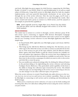

![Connecting to data sources 345
(sender as SilverService.SampleAsmxSoapClient).CloseAsync();
}
C#-SampleAsmx.asmx service in web project:
[WebService(Namespace = "http://services.10rem.net/")]
[WebServiceBinding(ConformsTo = WsiProfiles.BasicProfile1_1)]
[System.ComponentModel.ToolboxItem(false)]
public class SampleAsmx : System.Web.Services.WebService
{
[WebMethod]
public DateTime GetTime()
{
return DateTime.Now;
}
}
This shows the entire process of creating the proxy B, adding an event handler C,
calling an asynchronous method D, and handling the results E. In this example, the
SOAP service you’re connecting to exposes a method called GetTime, which accepts no
input properties and outputs a DateTime of the current time. You first create a Bind-
ing of type BasicHttpBinding. This tells the proxy that the service you’re connecting
to uses SOAP 1.1. The default constructor for BasicHttpBinding creates a Binding
with no security. An optional parameter on the constructor accepts a BasicHttpSecu-
rityMode, which allows you to tell the binding how to secure itself; for example, you
can tell the binding to use SSL when transmitting the SOAP message. You also create
an EndpointAddress that points to the URI of the service you’re about to call. Finally,
you create the proxy using the service reference created earlier and pass into it the
binding BasicHttpBinding and the initialized EndpointAddress objects.
NOTE The port number for your development-mode web service may change
from time to time, breaking any service references. To force the port number
to stick, right-click the web project, select Properties, and click the Web tab.
Then, select the option to always use the specified port number.
Next, you need to add an event handler to be called when your asynchronous method
call returns. You can do this by using the Visual Studio shortcut of pressing the + key,
then the = key, and then pressing Tab twice after selecting the GetTimeCompleted event
on your proxy. Using this shortcut automatically finishes the event handler declaration
for you and creates a stubbed method as the event handler. Finally, you call the Get-
TimeAsync() method on the proxy to begin the asynchronous call to the service. Intel-
liSense will show you a [webmethod]Completed event and a [webmethod]Async()
method for each method exposed by the SOAP service. When you created the service ref-
erence in the previous step, Visual Studio queried the service to see what methods were
available and made proxy methods for each of them.
After the service returns, the method declared as the event handler-proxy_
GetTimeCompleted-gets called with the results. Because the method is outputting the
results as a Datetime object, you can convert it to a string using standard .NET conver-
sion methods, which you can then assign to the Text property of a TextBlock. The
Download from Wow! eBook <www.wowebook.com>](https://image.slidesharecdn.com/manning-silverlight-4-in-action-sep-2010-100919221158-phpapp01/85/Manning-silverlight-4-in-action-sep-2010-376-320.jpg)

![Connecting to data sources 347
}
void proxy_GetCoolTextCompleted(object sender,
SilverService.GetCoolTextCompletedEventArgs e)
{
Results.Text = e.Result;
(sender as SilverService.SampleAsmxSoapClient).CloseAsync();
}
C#-web service:
[WebMethod]
public string GetCoolText(int number)
{
switch (number)
{
case 1: return "one";
case 2: return "two";
case 3: return "three";
...
}
}
Listing 14.2 builds on the code from listing 14.1. This is an example of sending of a
single int as a parameter to the GetCoolText method on the web service. This
approach is fine for sending a simple data value, but what about complex data types?
Still no problem.
USING COMPLEX DATA TYPES
Sending and receiving complex data types over a SOAP service is also a simple matter.
When you created the service reference, the signatures for objects used in the SOAP mes-
sage were automatically analyzed and a client-side proxy made for those as well. With this
proxy, you can instantiate objects of that type in your application (see listing 14.3).
Listing 14.3 Using complex data types with a SOAP service
Service:
[WebMethod]
public void SetSomething(int count, WsUser myObject)
{
//Perform database operations here
}
...
public class WsUser
{
public int Id { get; set; }
public string Name { get; set; }
public bool IsValid { get; set; }
}
C#:
private void UploadUser()
{
Binding myBinding = new BasicHttpBinding();
Download from Wow! eBook <www.wowebook.com>](https://image.slidesharecdn.com/manning-silverlight-4-in-action-sep-2010-100919221158-phpapp01/85/Manning-silverlight-4-in-action-sep-2010-378-320.jpg)


![356 CHAPTER 14 Networking and communications
This approach to creating the stack is usable only when you’re using the low-level
HttpWebRequest class. That’s helpful, but what if you want it to automatically be used
by any WebRequest-derived classes?
14.3.2 Automatically using the client stack
A second way to use the client stack is to have it automatically selected based on spe-
cific URLs or schemes. That way, any call to the specified URL or scheme will use the
stack you specify. The FTP, FILE, HTTP, and HTTPS schemes are already assigned to the
browser stack, but you can override them or go a more specific route and specify that
the client stack should be used for any HTTP* calls to a specific web site, or a specific
service at a known URL. For example, if you want all calls to 10rem.net, both regular
and SSL, to use the client stack, you’d put the following early in your code:
WebRequest.RegisterPrefix(
"http://10rem.net", WebRequestCreator.ClientHttp);
WebRequest.RegisterPrefix(
"https://10rem.net", WebRequestCreator.ClientHttp);
After this is done, any classes that use WebRequest or a class which derives from it will
automatically use the client HTTP stack you have specified.
The client stack brings along a number of enhancements, including the ability to
automatically and manually set some HTTP header values previously unavailable to you.
14.3.3 Automatically setting the HTTP Referer and other headers
When a HTTP request is sent across the wire, it includes a number of headers that we
typically don’t see. For example, if I open up Yahoo! in my browser, the request con-
tains the following info:
GET http://www.yahoo.com/ HTTP/1.1
Accept: */*
Accept-Language: en-us
User-Agent: Mozilla/4.0 (compatible; MSIE 7.0; Windows NT 6.1;
➥ Trident/4.0; SLCC2; .NET CLR 2.0.50727; .NET CLR 3.5.30729;
➥ .NET CLR 3.0.30729; Media Center PC 6.0; Tablet PC 2.0;
➥ .NET CLR 3.0.30618; .NET CLR 3.5.21022; InfoPath.2;
➥ Media Center PC 5.0; MS-RTC LM 8; SLCC1; WWTClient2; Zune 4.0;
➥ .NET4.0C; .NET4.0E; MS-RTC LM 8)
Accept-Encoding: gzip, deflate
Connection: Keep-Alive
Host: www.yahoo.com
Cookie: [lots of cookie stuff]
The first line is the verb and the target. In this case, we’re GETting the Yahoo! home
page. Most of the stuff after that is pretty standard. IE8 is sending some information
about the browser in use, what formats it’ll accept, the cookies, and so on. Collectively,
those are called HTTP headers. New to Silverlight 4, and unique to the client network-
ing stack, is the ability to send the HTTP Referer (sic) header with all requests, includ-
ing out-of-browser network requests.
Download from Wow! eBook <www.wowebook.com>](https://image.slidesharecdn.com/manning-silverlight-4-in-action-sep-2010-100919221158-phpapp01/85/Manning-silverlight-4-in-action-sep-2010-387-320.jpg)


![Making the data usable 365
This example shows a simple but typical JSON object. As you can see, the returned
JSON represents the same object as the XML returned in listing 14.10, but in a more
compact form. Luckily, the methods for converting the JSON object into a useful for-
mat are similar as well. Let’s start by taking a look at using the JsonObject syntax.
JSONOBJECT
As with XML, there’s more than one way to use JSON-formatted data returned from a
web service. The JSON being deserialized in these examples is shown in the previous
example. The ways of working with JSON data differ greatly, as the following examples
will show:
public void UpdateUiText(Object stream)
{
JsonObject nh = (JsonObject)JsonObject.Load((Stream)stream);
City.Text = nh["neighbourhood"]["city"];
Name.Text = nh["neighbourhood"]["name"];
Results.Text = nh.ToString();
}
One way to read JSON data is by using JsonObject.Load to convert the stream into an
object based on the structure found within the stream. To get access to the JsonObject,
you need to add a reference to the System.Json assembly and add a Using statement
for the same namespace to the page. After the JsonObject has been created, it’s a matter
of using the name of the property you want as the key. If the property is nested, you add
more keys, as when accessing the city property inside the Neighbourhood class.
DATACONTRACTJSONSERIALIZER
Another way to access returned JSON involves using the DataContractJsonSerial-
izer to deserialize the stream into objects of predefined types. This new object to seri-
alize and deserialize JSON is included in the System.Runtime.Serialization.Json
namespace and in the System.ServiceModel.Web assembly. The two methods of the
DataContractJsonSerializer are ReadObject and WriteObject, which deserialize
and serialize JSON objects respectively.
The following example again uses the Neighbourhood class defined earlier:
public class MyResults
{
public Neighbourhood neighbourhood { get; set; }
}
...
public void UpdateUiText(Object stream)
{
DataContractJsonSerializer ser =
new DataContractJsonSerializer(typeof(MyResults));
MyResults nh = (MyResults)ser.ReadObject((Stream)stream);
City.Text = nh.neighbourhood.city;
Name.Text = nh.neighbourhood.name;
}
This example shows the classes that hold the data after it’s deserialized, as well as the
method that does the work. This approach is simple. First, you instantiate the
Download from Wow! eBook <www.wowebook.com>](https://image.slidesharecdn.com/manning-silverlight-4-in-action-sep-2010-100919221158-phpapp01/85/Manning-silverlight-4-in-action-sep-2010-396-320.jpg)

![Using advanced services 367
Listing 14.12 Reading an out parameter from a WCF service
WCF C#:
[OperationContract]
string GetSomeData(int Id, out MyErrorObject myError);
Silverlight C#:
void serviceProxy_GetSomeDataCompleted(object sender,
GetSomeDataCompletedEventArgs e)
{
if (e.Error != null)
{
Message.Text = e.Error.Message;
}
if (e.myError != null)
{
Message.Text = e.myError.Message;
}
else
{
Message.Text = e.Result.ToString();
}
}
In this example, you see a standard [ServiceMethod]Completed method like those
shown throughout this chapter. This example also demonstrates error trapping and a
custom out parameter.
Now that you’ve seen standard WCF services, let’s dig deeper and look at how WCF
duplex services can enable you to push data from a server to Silverlight.
14.5.2 WCF duplex services
So far, we’ve talked about ways to send and receive data that requires the Silverlight
application to initiate each individual request. A couple of options allow the server to
push data directly to your application. Duplex WCF services and sockets each provide
a channel that allows properly configured server resources to send data without an
explicit client request each time.
Duplex services give the server the ability to send, or push, data directly to the cli-
ent as it becomes available. Ajax applications have to send a request for updates to the
server that execute on a loop with a timer. This approach, known as polling, creates
overhead, both in your application and on the network, that can be avoided by using
these techniques.
Duplex communication is possible in Silverlight using properly configured WCF
services. This is useful if you’re building an application that needs to receive notifica-
tions of changed properties on the server, such as when scores change in a sporting
event, or an open record changes in a database. To enable duplex communication
within Silverlight, a pair of new assemblies, both named System.ServiceModel.Poll-
ingDuplex.dll, need to be referenced-one by the server application hosting the
duplex service and the other by your Silverlight application. They’re identifiable by
Download from Wow! eBook <www.wowebook.com>](https://image.slidesharecdn.com/manning-silverlight-4-in-action-sep-2010-100919221158-phpapp01/85/Manning-silverlight-4-in-action-sep-2010-398-320.jpg)

![Using advanced services 369
poll.BuildChannelFactory<IDuplexSessionChannel>(new
BindingParameterCollection());
IAsyncResult factoryOpenResult =
channelFactory.BeginOpen(new
AsyncCallback(OnOpenFactoryComplete), channelFactory);
if (factoryOpenResult.CompletedSynchronously)
{
OpenTheChannel(factoryOpenResult);
}
}
In this example, you start the process of binding to a duplex web service. You begin by
creating a PollingDuplexHttpBinding object, on which you set the timeout proper-
ties. You then use that polling object to create an IChannelFactory of type IDuplex-
SessionChannel. The next step is to begin the asynchronous call using the BeginOpen
method of the factory you just created.
The PollingDuplexHttpBinding constructor accepts an optional parameter that
allows you to specify either single messages per poll or multiple messages per poll. If
you want to support HTTP message chunking-multiple messages per poll-you can pass
the parameter in to the constructor like this:
var poll = PollingDuplexHttpBinding(
PollingDuplexMode.MultipleMessagesPerPoll);
Using the multiple messages option can significantly reduce the round trips for ser-
vices that typically have more than one message waiting in response to a poll, allowing
the service to scale better.
One thing you’ll see throughout these samples is the calling of CompletedSyn-
chronously immediately after the asynchronous call. You do this in case the response
is immediate, as can occur for some small asynchronous operations. With this in
mind, note that all the asynchronous calls are to methods that also check the Com-
pletedSynchronously property and then either return or call the proper next
method. Here’s an example of one such method:
void OnOpenFactoryComplete(IAsyncResult result)
{
if (result.CompletedSynchronously)
return;
else
OpenTheChannel(result);
}
For the rest of this sample, we won’t show the On[action]Completed methods, because
they all follow the pattern of this example. The next step is to open the channel with the
WCF service and to begin polling it for queued messages, as in listing 14.15.
Listing 14.15 Opening the duplex channel and establishing polling
C#:
void OpenTheChannel(IAsyncResult result)
{
Download from Wow! eBook <www.wowebook.com>](https://image.slidesharecdn.com/manning-silverlight-4-in-action-sep-2010-100919221158-phpapp01/85/Manning-silverlight-4-in-action-sep-2010-400-320.jpg)


![374 CHAPTER 14 Networking and communications
{
byte[] response = new byte[1024];
receivedArgs.SetBuffer(response, 0, response.Length);
Socket socket = (Socket)receivedArgs.UserToken;
socket.ReceiveAsync(receivedArgs);
}
else
throw new SocketException((int)receivedArgs.SocketError);
break;
case SocketAsyncOperation.Receive:
ReceiveMessageOverSocket(receivedArgs);
break;
}
}
You can determine the type of response by evaluating the value of the LastOperation
property of SocketAsyncEventArgs, as shown in table 14.2.
Value Description
None Connection not yet established
Connect Connection established
Receive Packets received
Table 14.2 SocketAsyncEventArgs
Send Packets sent
LastOperation values
Now you need to set up the connection to receive data, as shown here:
public void ReceiveMessageOverSocket(SocketAsyncEventArgs receivedArgs)
{
string message = Encoding.UTF8.GetString(receivedArgs.Buffer,
receivedArgs.Offset, receivedArgs.BytesTransferred);
UIThread.Post(UpdateUIControls, message);
Socket socket = (Socket)receivedArgs.UserToken;
socket.ReceiveAsync(receivedArgs);
}
When the message comes in, it needs to be converted into the correct format (a
string, in this case); it can then be deserialized using any of the methods described in
previous sections, depending on the format of the incoming data.
In additional to the traditional point-to-point connection offered by the Socket
class, Silverlight supports multicast sockets where there may be many broadcasting
servers or a single broadcasting server, sending to multiple clients.
14.5.4 Multicast sockets
The System.Net.Sockets namespace includes another type of socket implementa-
tion: UDP multicast sockets. IP multicast is a component of the core IP protocols, sup-
porting one-to-many communication over IP, most often using UDP. Multicast is an
Download from Wow! eBook <www.wowebook.com>](https://image.slidesharecdn.com/manning-silverlight-4-in-action-sep-2010-100919221158-phpapp01/85/Manning-silverlight-4-in-action-sep-2010-405-320.jpg)


![398 CHAPTER 15 Navigation and dialogs
This mapping XAML fragment sits inside the navigation:Frame element and pro-
vides the two mappings required for the URLs you’d normally use: no page and a spe-
cific page. Maps are read top-down and complete when the first match is hit. If you
want to pass parameters to your page, you can get more complex and include support
for query string values.
PASSING AND RECEIVING PAGE PARAMETERS
A common pattern in web applications is to pass parameters to a page using the query
string. The query string is the set of delimited name/value pairs after the question
mark in a URL. For example:
http://myapp.com/app.aspx?customer=1234
In this case, the query string would produce two name/value pairs: customer with a
value of 27 and invoice with a value of 2506.
That works well for passing parameters to an actual HTML page, but how does it fit
in with the hashtag approach used with Silverlight navigation? How do you pass
parameters to internal Silverlight pages? In a Silverlight application, much as we’ve
gotten used to elsewhere on the Web, you may want something a little friendlier:
http://myapp.com/app.aspx#/CustomerDetail/1234
In this case, when you have mapping set up, Silverlight will load the CustomerDetail
page and pass in a parameter of 1234. How is that parameter passed in? It’s entirely up
to you and how you do the mapping. For example, let’s say you want 1234 to map to a
CustomerID query string variable. You provide a map that looks like this:
<uriMapper:UriMapping Uri="/CustomerDetail/{CustomerID}"
MappedUri="/Views/CustomerDetail.xaml?CustomerID={CustomerID}" />
That map needs to appear near the top, preferably after the Home mapping, in order
to be hit. Remember, the maps are evaluated top-down, and the first match is the only
one that will be executed.
Retrieving the parameter from within the Page is super simple. The Navigation-
Context object on the property of the same name in the Page class includes a Que-
ryString property that may be used to retrieve the parameters passed into the page.
It’s an IDictionary of strings, so no parsing is required; use the name/value pairs as
they’re provided:
protected override void OnNavigatedTo(NavigationEventArgs e)
{
if (NavigationContext.QueryString.ContainsKey("CustomerID"))
{
string id = NavigationContext.QueryString["CustomerID"];
if (!string.IsNullOrWhiteSpace(id))
LoadCustomerDetails(id);
}
}
Download from Wow! eBook <www.wowebook.com>](https://image.slidesharecdn.com/manning-silverlight-4-in-action-sep-2010-100919221158-phpapp01/85/Manning-silverlight-4-in-action-sep-2010-429-320.jpg)


![Project setup and traditional code-behind approach 419
WEB SERVICES
Silverlight applications run on the client and can talk to server-side databases only via
a service of some sort. You can choose multiple types of services. For example, you
could go with a REST-based solution (chapter 14) or something using WCF RIA Ser-
vices (chapter 17). For this, you’ll use a regular Silverlight-enabled WCF service: a
SOAP web service built using WCF. Create a folder named Services in the web project,
and add into it a new Silverlight Enabled WCF Service named EmployeeService.svc.
Listing 16.1 shows the code for that service.
Listing 16.1 WCF service to expose data to the Silverlight application
using MvvmApplication.Web;
[ServiceContract(Namespace = "services.web.mvvmapplication")]
[AspNetCompatibilityRequirements(RequirementsMode =
AspNetCompatibilityRequirementsMode.Allowed)]
public class EmployeeService
{
[OperationContract]
public IList<Employee> GetEmployees()
{
var context = new AdventureWorksEntities(); Return all employees,
return context.Employees.ToList();
unsorted
}
}
The service is a basic Silverlight-enabled web service. It uses the entity data model to
return the list of all employees in the database. You could also use a LINQ expression
to be more selective about the list, narrow down the number of columns returned
(which would also require a new return type), or sort the data. The function could
also return an IQueryable<Employee> to enable better client-side LINQ integration.
When the service has been created, add a web reference from the Silverlight appli-
cation to the newly created service. Be sure to do a build first, or the service reference
will typically fail. Name the service reference namespace Services. Be sure to refer to
chapter 14 as needed for more information on services and service references.
EMPLOYEE LIST VIEW
Next, in the Views folder, add a new view (Silverlight Page) named Employ-
eeList.xaml. For information on adding pages to Silverlight navigation applications,
please see chapter 15. The EmployeeList.xaml markup should look like listing 16.2.
(Note: Drag the DataGrid onto the design surface from the toolbox in order to get all
the references and namespaces automatically set up.)
Listing 16.2 EmployeeList.xaml markup
<Grid x:Name="LayoutRoot">
<sdk:DataGrid AutoGenerateColumns="True"
Margin="12,55,119,12"
x:Name="EmployeesGrid" />
Download from Wow! eBook <www.wowebook.com>](https://image.slidesharecdn.com/manning-silverlight-4-in-action-sep-2010-100919221158-phpapp01/85/Manning-silverlight-4-in-action-sep-2010-450-320.jpg)


![444 CHAPTER 16 Structuring and testing with the MVVM/ViewModel pattern
In the MVVM pattern, those entities are frequently promoted up as ViewModels
themselves. If you consider that the definition of a ViewModel includes both the data
and the functionality required for a View, this makes sense. Consider that these View-
Models can provide the functionality for calling the vacation bonus service and can
then be reused in the detail pop-up, and you can quickly see how these entity-like
ViewModel classes can be helpful.
For this example, you’ll update the application to use new EmployeeViewModel
classes in all the client-side places that once used the Employee data entity. First, list-
ing 16.17 shows the new EmployeeViewModel class. Add it as a new class in your View-
Model folder.
Listing 16.17 EmployeeViewModel class
using System;
using System.ComponentModel.DataAnnotations;
namespace MvvmApplication.ViewModels
{
public class EmployeeViewModel : ViewModel
{
private string _firstName;
[Display(Name="First Name")]
public string FirstName
{
get { return _firstName; }
set
{
_firstName = value;
NotifyPropertyChanged("FirstName");
NotifyPropertyChanged("FullName");
}
}
private string _lastName;
[Display(Name = "Last Name")]
public string LastName
{
get { return _lastName; }
set
{
_lastName = value;
NotifyPropertyChanged("LastName");
NotifyPropertyChanged("FullName");
}
}
[Display(Name = "Full Name")]
public string FullName
{ Calculated
get { return LastName + ", " + FirstName; }
field
}
private string _title;
public string Title
Download from Wow! eBook <www.wowebook.com>](https://image.slidesharecdn.com/manning-silverlight-4-in-action-sep-2010-100919221158-phpapp01/85/Manning-silverlight-4-in-action-sep-2010-475-320.jpg)
![Better separation from the UI 445
{
get { return _title; }
set { _title = value; NotifyPropertyChanged("Title"); }
}
private DateTime _hireDate; Friendly
[Display(Name = "Hire Date")]
field name
public DateTime HireDate
{
get { return _hireDate; }
set { _hireDate = value; NotifyPropertyChanged("HireDate"); }
}
private short _vacationHours;
[Display(Name = "Vacation Hours")]
public short VacationHours
{
get { return _vacationHours; }
set
{
_vacationHours = value;
NotifyPropertyChanged("VacationHours");
}
}
private short _sickLeaveHours;
[Display(Name = "Sick Leave Hours")]
public short SickLeaveHours
{
get { return _sickLeaveHours; }
set
{
_sickLeaveHours = value;
NotifyPropertyChanged("SickLeaveHours");
}
}
private bool _salaried;
public bool Salaried
{
get { return _salaried; }
set { _salaried = value; NotifyPropertyChanged("Salaried"); }
}
}
}
Note that this class looks like most entity classes. There’s a calculated field for the
FullName, as well as direct exposure of each of the other properties of interest in the
employee data class. You use Display annotations from System.Component-
Model.DataAnnotations to make the DataGrid show friendly column names for these
properties. Annotating for display was discussed in chapter 12. You could also include
validation annotations from chapter 13, but that’s unnecessary for this example.
Whether you consider this class to be a ViewModel depends on how you’ll use it. If
you add functionality to call services, for example, it becomes more clear-cut in most
people’s eyes that this is a real ViewModel. For me, ViewModel or entity isn’t a huge
Download from Wow! eBook <www.wowebook.com>](https://image.slidesharecdn.com/manning-silverlight-4-in-action-sep-2010-100919221158-phpapp01/85/Manning-silverlight-4-in-action-sep-2010-476-320.jpg)


![Better separation from the UI 449
or a production version, for example. The IoC container can also serve up a single
shared class instance, effectively a singleton without the singleton plumbing.
Some developers use interface-based development and IoC for everything because
they’ve mastered its use and have found it to speed up their work. I’m not one of
those developers, but I can certainly appreciate where mastery of this pattern can
allow effective use across projects regardless of size or complexity.
Another interesting concept is that of the ViewModel locator. Often, ViewModel
locators are themselves implemented using IoC.
VIEWMODEL LOCATOR
Closely related to IoC is the idea of a ViewModel locator. A ViewModel locator is a ser-
vice that can supply a ViewModel instance to a View. That instance may be internally
cached, hard-coded, or delivered via IoC. I’ve even seen some interesting implementa-
tions that use the Managed Extensibility Framework (MEF).
An extremely simple ViewModel locator that keys off the view name may look some-
thing like listing 16.20. Create the ViewModelLocator class in the ViewModels folder.
Listing 16.20 A simple ViewModel locator using hard-coded ViewModel instances
using System.Collections.Generic;
namespace MvvmApplication.ViewModels
{
public class ViewModelLocator
{
private Dictionary<string, ViewModel> _viewModels =
new Dictionary<string, ViewModel>();
public ViewModelLocator()
{
_viewModels.Add("EmployeeList", new EmployeeListViewModel());
_viewModels.Add("EmployeeDetail", new EmployeeViewModel());
}
public ViewModel this[string viewName] Indexer for
{ binding
get { return _viewModels[viewName]; }
}
}
}
In practice, a real locator would have a much more robust mechanism for discovering
and adding ViewModel instances to its internal list. In this example, they’re all hard-
coded, and you don’t allow for more than one instance of any specific type. Addition-
ally, the only usable one is the EmployeeListViewModel, because the EmployeeDetail
would need instancing.
The ViewModel locator is surfaced as a resource to be used in binding. The
resource itself would be defined in a resource dictionary merged into App.xaml in
order to have applicationwide scope. Listing 16.21 shows an updated App.xaml with
this resource included and a new Resources.xaml file in the Assets folder.
Download from Wow! eBook <www.wowebook.com>](https://image.slidesharecdn.com/manning-silverlight-4-in-action-sep-2010-100919221158-phpapp01/85/Manning-silverlight-4-in-action-sep-2010-480-320.jpg)
![450 CHAPTER 16 Structuring and testing with the MVVM/ViewModel pattern
Listing 16.21 The ViewModel locator in XAML
App.xaml:
<Application x:Class="MvvmApplication.App"
xmlns="http://schemas.microsoft.com/winfx/2006/xaml/presentation"
xmlns:x="http://schemas.microsoft.com/winfx/2006/xaml">
<Application.Resources>
<ResourceDictionary>
<ResourceDictionary.MergedDictionaries>
<ResourceDictionary Source="Assets/Styles.xaml" />
<ResourceDictionary Source="Assets/Resources.xaml" /> Merged
</ResourceDictionary.MergedDictionaries> dictionary
</ResourceDictionary>
</Application.Resources>
</Application>
Assets/Resources.xaml:
<ResourceDictionary
xmlns="http://schemas.microsoft.com/winfx/2006/xaml/presentation"
xmlns:vm="clr-namespace:MvvmApplication.ViewModels"
xmlns:x="http://schemas.microsoft.com/winfx/2006/xaml">
<vm:ViewModelLocator x:Key="ViewModelLocator" /> ViewModelLocator
</ResourceDictionary>
To use this locator, you eliminate the ViewModel creation from the code-behind and
bind to this resource. In the EmployeeList.xaml file, this is as easy as adding the fol-
lowing line to the navigation:Page element.
DataContext="{Binding [EmployeeList],
➥ Source={StaticResource ViewModelLocator}}"
That bit sets the DataContext of the page to the value returned from the calling the
ViewModelLocator’s indexer function, passing in the string EmployeeList.
You then change the EmployeeList code-behind so the OnNavigatedTo event uses
the ViewModel provided by the locator rather than one created in the code-behind.
Listing 16.22 shows the updated OnNavigatedTo method.
Listing 16.22 Updated OnNavigatedTo method in EmployeeList code-behind
private EmployeeListViewModel _viewModel = null;
protected override void OnNavigatedTo(NavigationEventArgs e)
{
_viewModel = DataContext as EmployeeListViewModel;
_viewModel.EmployeesLoaded += (s, ea) =>
{
LoadingProgress.Visibility = Visibility.Collapsed;
};
LoadingProgress.Visibility = Visibility.Visible;
_viewModel.LoadEmployees();
}
Download from Wow! eBook <www.wowebook.com>](https://image.slidesharecdn.com/manning-silverlight-4-in-action-sep-2010-100919221158-phpapp01/85/Manning-silverlight-4-in-action-sep-2010-481-320.jpg)

![452 CHAPTER 16 Structuring and testing with the MVVM/ViewModel pattern
Figure 16.8 Adding a new Silverlight Unit Test Application to the solution. I named the project
MvvmApplication.Tests, but the name isn’t important.
you’ll need to install the Silverlight Toolkit. If you don’t already have it installed, you can
grab the latest version from http://silverlight.codeplex.com.
When you have the bits installed, you’ll get a new template in Visual Studio. Con-
tinuing with the same solution you’ve been working with for this chapter, add a new
Silverlight Unit Test Application project. I named mine MvvmApplication.Tests. Fig-
ure 16.8 shows the Add New Project dialog with the correct options selected.
The project template automatically includes a single default test. You’ll replace
that with three simple tests that show how to use the Assert object and its functions.
Listing 16.23 shows the three tests in place in the default Tests class.
Listing 16.23 Simple tests
namespace MvvmApplication.Tests
{
[TestClass]
public class Tests
{
[TestMethod]
public void TestToMakeSureTrueIsActuallyTrue()
{
Assert.IsTrue(true);
}
[TestMethod]
Download from Wow! eBook <www.wowebook.com>](https://image.slidesharecdn.com/manning-silverlight-4-in-action-sep-2010-100919221158-phpapp01/85/Manning-silverlight-4-in-action-sep-2010-483-320.jpg)
![Testing 453
public void TestToMakeSureTheListObjectIsNotNull()
{
List<int> l = new List<int>();
Assert.IsNotNull(l);
}
[TestMethod]
public void ThisTestShouldFail()
{
Assert.IsTrue(false);
}
}
}
The tests include two that should pass without any issue and one that should fail 100%
of the time. Set the automatically added test .aspx file in the web project to the start
page, and run (run; don’t start in debug mode unless you want to break on the excep-
tion). When you do, it’ll look something like figure 16.9.
Simple tests are… simple. They help you understand how the test system works,
but they’re not doing anything useful for you yet. You want to test functionality in the
application itself. To do that, you’ll need to put all the testable stuff into one or more
class libraries. To keep things simple, you’ll move everything but the views into a sin-
gle core project.
Figure 16.9 Silverlight unit test runner with two passed tests and one failed test
Download from Wow! eBook <www.wowebook.com>](https://image.slidesharecdn.com/manning-silverlight-4-in-action-sep-2010-100919221158-phpapp01/85/Manning-silverlight-4-in-action-sep-2010-484-320.jpg)

![Testing 455
Figure 16.11 Add the ServiceReferences.ClientConfig file from the core project to the main project
using the Add As Link option.
When you’ve completed all these steps, set the application test page in the web project
as the start page, and run the solution. Make sure the Silverlight app is running and
working as it did before. If everything is good, you’re ready to move on to doing some
real testing.
16.5.2 Testing the ViewModel
In a well-architected MVVM application, testing the ViewModel covers the majority of
the scenarios you’d normally test through UI automation. The more value converters
or UI magic in use, the less meaningful the ViewModel test becomes. I don’t want to
scare you away from using awesome things such as value converters or validation
annotations, but it’s something you need to keep in mind when you’re testing.
Caveats aside, testing the ViewModel will give you a pretty high level of confidence
that the majority of the system is working as designed, so let’s start there. In the test
project, remove the test class you created earlier. Add a new Silverlight Test Class file
to the MvvmApplication.Tests project, and name it EmployeeListViewModelTests.
Listing 16.24 shows your first two tests.
Listing 16.24 The first ViewModel tests
[TestClass]
public class EmployeeListViewModelTests
{
[TestMethod]
public void SelectedEmployeeCanBeSetAndRetrieved() SelectedEmployee
{
EmployeeViewModel employee = new EmployeeViewModel();
Download from Wow! eBook <www.wowebook.com>](https://image.slidesharecdn.com/manning-silverlight-4-in-action-sep-2010-100919221158-phpapp01/85/Manning-silverlight-4-in-action-sep-2010-486-320.jpg)
![456 CHAPTER 16 Structuring and testing with the MVVM/ViewModel pattern
EmployeeListViewModel vm = new EmployeeListViewModel();
vm.SelectedEmployee = employee;
Assert.ReferenceEquals(employee, vm.SelectedEmployee);
}
[TestMethod] Bonus
public void EmployeeVacationBonusIsProperlyApplied()
test
{
EmployeeViewModel employee = new EmployeeViewModel();
EmployeeListViewModel vm = new EmployeeListViewModel();
vm.SelectedEmployee = employee;
employee.VacationHours = 0;
employee.HireDate = DateTime.Today.AddYears(-4);
vm.AddVacationBonusToSelectedEmployee();
Assert.AreEqual(employee.VacationHours, 10);
employee.VacationHours = 0;
employee.HireDate = DateTime.Today.AddYears(-8);
vm.AddVacationBonusToSelectedEmployee();
Assert.AreEqual(employee.VacationHours, 20);
employee.VacationHours = 0;
employee.HireDate = DateTime.Today.AddYears(-15);
vm.AddVacationBonusToSelectedEmployee();
Assert.AreEqual(employee.VacationHours, 30);
employee.VacationHours = 0;
employee.HireDate = DateTime.Today.AddYears(-25);
vm.AddVacationBonusToSelectedEmployee();
Assert.AreEqual(employee.VacationHours, 40);
}
}
The first test tests the utility of the SelectedEmployee property. It checks to see that
when you assign an object to the property, the object can be retrieved. The second test
exercises the vacation bonus logic. Note that this test doesn’t have 100 percent cover-
age for the full domain of hire dates and vacation hours; to do that, every value from
zero through some reasonable upper bound would need to be tested.
Both of these tests cover synchronous functionality only—you do something and
hang around until the result comes back. If you want to test anything network-related
in Silverlight, you need to use an asynchronous test.
16.5.3 Testing asynchronous operations
Testing asynchronous operations takes a little extra work. You’ll need a different test
base class and the asynchronous methods it exposes. Listing 16.25 shows an asynchro-
nous call test against the EmployeeDataService class.
Listing 16.25 Asynchronous call test
[TestClass]
public class EmployeeDataServiceTests : SilverlightTest
{
Download from Wow! eBook <www.wowebook.com>](https://image.slidesharecdn.com/manning-silverlight-4-in-action-sep-2010-100919221158-phpapp01/85/Manning-silverlight-4-in-action-sep-2010-487-320.jpg)
![Summary 457
[TestMethod]
[Asynchronous]
public void TestEmployeeServiceCallReturnsData()
{
var service = new EmployeeDataService();
service.EmployeesLoaded += (s, e) =>
{
Assert.IsNotNull(service.Employees);
Assert.IsTrue(service.Employees.Count > 0); Mark as
EnqueueTestComplete();
complete
};
service.LoadEmployees();
}
}
This example shows the test class inherited from the SilverlightTest base class. This
immediately makes your class fall outside of code compatibility with the full Visual Stu-
dio testing framework. That’s a concern only if you want to share your tests with full .NET
projects, or if you have plans to migrate them to another testing platform in the future.
The SilverlightTest base class supplies the critical EnqueueTestComplete method.
That method tells the test framework that the method is complete, and the framework
can release it from the holding pattern created by the [Asynchronous] attribute.
Before running the test, there’s one more step. Just as you did when breaking the
original Silverlight project in two, you need to add the ServiceReferences.ClientCon-
fig file to the MvvmApplication.Tests project, as a link. That file is generated by the
project that has the service reference, but it must be located by the project that is the
main entry point of execution.
The Silverlight Unit Testing Framework is a capable test framework for Silverlight.
When it first came out, there were no other supported Silverlight testing frameworks.
Now you have several choices.
The Silverlight Unit Testing Framework has some trade-offs, such as not being inte-
grated with any build processes and requiring a run to see the results rather than keep-
ing an open window or a docked pane in the IDE. You’ll need to evaluate those for your
own projects and stack up the framework against other robust unit-testing frameworks.
When you structure your application using MVVM principles and good coding and
architecture practices, it makes your applications much easier to test. It’s important to
test. It’s important to unit-test functionality and to keep those tests up to date. It’s ben-
eficial to use tests to drive functionality using a TDD-derived approach. If there were
no way to test Silverlight code, you definitely wouldn’t be in your happy place. I hope
the simplicity of the Silverlight Unit Testing Framework will help you integrate testing
into your own application development cycle.
16.6 Summary
When you get into developing applications of complexity beyond basic samples, your
code can get pretty ugly quickly if you don’t follow a good architectural pattern such
Download from Wow! eBook <www.wowebook.com>](https://image.slidesharecdn.com/manning-silverlight-4-in-action-sep-2010-100919221158-phpapp01/85/Manning-silverlight-4-in-action-sep-2010-488-320.jpg)


![472 CHAPTER 17 WCF RIA Services
The JSON endpoint also supports updating data. For space and relevance reasons,
I won’t create a full update UI here, but the code is similar to any other JSON Ajax call
using a POST.
JSON is great for Ajax applications, but the format itself can be limiting. Although
not as rich as the WCF native formats, another widely understood format is SOAP.
EXPOSING A SOAP ENDPOINT
Like JSON endpoints, SOAP endpoints are updatable services exposed using a service
endpoint definition in the web.config. The entry to add for SOAP is
<add name="Soap"
type="Microsoft.ServiceModel.DomainServices.Hosting.SoapXmlEndpointFactory,
➥ Microsoft.ServiceModel.DomainServices.Hosting, Version=4.0.0.0,
➥ Culture=neutral, PublicKeyToken=31bf3856ad364e35" />
This requires the same assembly reference the JSON example required. Note that the
public key token and other assembly information are identical as well.
Unlike the JSON approach, the SOAP endpoint ends up working right at the root
service level. For example, to get the Web Services Description Language (WSDL) for
the SOAP service in your solution, hit this URL with the browser:
http://.../Services/Chapter17-Web-Services-EmployeeService.svc?wsdl
You don’t need to add /Soap to the URL.
To fully utilize the SOAP client, you’ll need to add a service reference from another
project and generate the client. As was the case in the JSON version, the service is
read/write but doesn’t expose the entity metadata to the client. To take advantage of
WCF RIA Services, you’ll want a full Silverlight application, aware of WCF RIA Services
and aware of the metadata it uses.
17.2.3 Domain service method types
The methods in the domain service have names starting with Get, Insert, Update, and
Delete. This naming convention allows for automatic wire-up of the operations with
the client. This convention-over-configuration approach is common outside the Micro-
soft developer ecosystem and is just starting to make its way into Microsoft products.
Conventions don’t always work for everyone or in every situation, though. For
instances where you’d rather not go with convention, you can use a series of attri-
butes to make your choices explicit. Table 17.1 shows the attributes, conventions, and
their descriptions.
Table 17.1 Naming conventions, equivalent attributes, and their purposes
Name prefix Attribute Purpose
(Any) [Query()] A method that returns data without any side effects. The usual
approach is to prefix with Get, but any prefix is fine as long as
the function returns an instance of an entity T, an
IEnumerable<T>, or an IQueryable<T>.
Insert, Add, [Insert()] An operation that inserts a single entity into the data store. The
Create method takes the entity as a parameter.
Download from Wow! eBook <www.wowebook.com>](https://image.slidesharecdn.com/manning-silverlight-4-in-action-sep-2010-100919221158-phpapp01/85/Manning-silverlight-4-in-action-sep-2010-503-320.jpg)
![Exposing data with the domain service 473
Table 17.1 Naming conventions, equivalent attributes, and their purposes (continued)
Name prefix Attribute Purpose
Update, Change, [Update()] An operation that updates a single entity in the data store. The
Modify method takes the entity as a parameter.
Delete, Remove [Delete()] An operation that deletes an entity in the data store. The
method takes the entity as a parameter.
(Any) [Invoke()] A business method that must be executed without tracking or
deferred execution. It may or may not have side effects. Use
only when one of the other method types can’t be used.
(Any) [Update()] A named update with UsingCustomMethod=true set in
the attribute. This is a purpose-built function that performs a
specific type of update. An example may be a product discount
or firing an employee.
In the remainder of this section, we’ll go through each of the types of operations on
the domain service.
QUERY METHODS
Query methods are methods that return a single entity or a set of entities. The default
query method generated by the template returns all instances of the entity in the data
store. This allows you to further compose the query on the client with additional crite-
ria to limit the result set.
Query methods may be indicated by convention or attribute, as shown previously.
When using the attribute, you have a few options to set. These are shown in table 17.2.
Table 17.2 QueryAttribute members
Member Description
HasSideEffects Queries shouldn’t typically have side effects that would alter data. If they do, set
this property to true so clients can make decisions as to how to use the
method. For example, an HTTP client may send a POST instead of a GET.
IsComposable Set this to true if the query allows composing to add additional criteria.
IsDefault Set this to true if this query is the default query for the entity type.
ResultLimit This is the maximum number of results the method should return. Defaults to 0,
which indicated unlimited results.
Creating a query method on the service is pretty simple if you follow the naming and
method signature conventions. Here’s an example of one that returns only salaried
employees:
public IEnumerable<Employee> GetSalariedEmployees()
{
return from Employee emp in ObjectContext.Employees
where emp.SalariedFlag == true
select emp;
}
Download from Wow! eBook <www.wowebook.com>](https://image.slidesharecdn.com/manning-silverlight-4-in-action-sep-2010-100919221158-phpapp01/85/Manning-silverlight-4-in-action-sep-2010-504-320.jpg)

![Exposing data with the domain service 475
public void UpdateEmployee(Employee currentEmployee)
{
this.ObjectContext.Employees.AttachAsModified(currentEmployee,
this.ChangeSet.GetOriginal(currentEmployee));
}
That tells the server-side object context to add this employee and mark it in the modi-
fied state, using the passed-in employee object as the current state and the original
object as the last-known state from the data store. The Attach and AttachAsModified
functions are all provided by the Entity Framework. The specific function used for
your data provider may vary.
For a given entity, it’s unusual to create alternate general insert, update, and delete
methods. Doing so would confuse RIA services, not to mention your fellow program-
mers. There’s one exception—the named update method.
NAMED UPDATE METHODS
Normally, the update methods are handled automatically based on the state of the
data. But you may have situations where you need to provide a custom update method
that you’ll call directly rather than let Silverlight infer the update operation for a par-
ticular entity during the SubmitChanges call on the domain context.
To mark an update operation as a named update operation, it needs to have the
usual update operation signature and the Update attribute with UsingCustomMethod =
true. Here’s an example:
[Update(UsingCustomMethod = true)]
public void SpecialCascadedUpdate(Employee emp)
{
...
}
This approach exists to allow you to handle special cases related to business logic or
database complexities. It’s still called as part of the batched SubmitChanges call. If you
want to immediately execute a function, another approach is available.
INVOKE METHODS
CRUD methods are called as part of a batch—the entities have the CRUD operations
performed on them but aren’t sent to the server for the actual action until the call to
SubmitChanges is made on the client.
Invoke methods are normal methods you can use to perform some sort of calcula-
tion or return a piece of data. They’re operations that need to be executed without
change tracking or deferred execution. Invoke methods shouldn’t be used to load
data; that’s what query methods are intended for. Returning an entity from an Invoke
method bypasses the pattern and won’t cause the appropriate change tracking and
entity generation to occur on the client.
Although the Invoke attribute is optional, to be considered an invoke method, a
method shouldn’t take entities as a parameter or return an entity, IEnumerable, or
IQueryable of entities as a result.
A typical invoke method, if there could be such a thing, might look like this (exam-
ple shamelessly stolen from chapter 16 on MVVM):
Download from Wow! eBook <www.wowebook.com>](https://image.slidesharecdn.com/manning-silverlight-4-in-action-sep-2010-100919221158-phpapp01/85/Manning-silverlight-4-in-action-sep-2010-506-320.jpg)
![476 CHAPTER 17 WCF RIA Services
[Invoke()]
public int CalculateVacationBonus(DateTime hireDate)
{
int vacationBonus;
DateTime today = DateTime.Today;
int yearsInService = today.Year - hireDate.Year;
if (hireDate.AddYears(yearsInService) > today)
yearsInService--;
if (yearsInService < 5)
vacationBonus = 10;
else
vacationBonus = 20;
return vacationBonus;
}
It’s a regular business method. Given that it’s on the server, you probably have a rea-
son—it may call another web service, or it may hit a database to do a lookup. In this
case, it’s on the server to illustrate the invoke type.
As mentioned, the Invoke attribute is optional. When in doubt, add the attribute
to make your intentions clear. For normal CRUD methods where the name is suffi-
ciently patterned using the naming conventions, this is usually unnecessary. But I find
that Invoke methods can be ambiguous at first glance. Speaking of naming conven-
tions, what happens when you want to avoid having them kick in?
IGNORING METHODS DESPITE THE NAME
Some of these operations require the use of attributes, but many are autogenerated via
the naming conventions. If you don’t want RIA Services to generate a domain method
for your service method, apply the Ignore attribute to that method, as shown here:
[Ignore()]
public void UpdateEmployeeButNotReally(Employee emp)
{
...
}
With that attribute in place, despite the fact that the method uses the Update naming
convention and method signature, it won’t be generated as an update call on the client.
The domain service provides a number of standard method types, many of which
are autogenerated from the tooling but may be modified or replaced. Domain ser-
vices provide CRUD operations in the form of insert, update, delete, and query meth-
ods. In addition, arbitrary functionality may be included in invoke methods.
When discussing the IQueryable type, I sneaked an EmployeeContext object into the
example. What’s that, and what does it provide? That’s the subject of the next section.
17.2.4 Using a domain service from Silverlight
Domain services execute on the server, running under the full .NET 4 framework. The
client-side equivalent of the domain service is the domain context object. Domain
Download from Wow! eBook <www.wowebook.com>](https://image.slidesharecdn.com/manning-silverlight-4-in-action-sep-2010-100919221158-phpapp01/85/Manning-silverlight-4-in-action-sep-2010-507-320.jpg)


![Updating data 493
Table 17.7 Important public members of the Entity class
Member Description
EntityState The data state of this entity: Detached, Unmodified, Modified,
New, or Deleted
HasChanges Indicates that this entity has changed since the last time it was saved
HasValidationErrors Indicates that this entity has failed validation
ValidationErrors Returns a collection of validation errors
GetOriginal Returns an instance of the unchanged entity from cache
events on the client. To give you an idea of the robustness of the properties set up, list-
ing 17.3 shows the Gender property for the Employee.
Listing 17.3 The generated client-side Employee Entity property Gender
[DataMember()]
[Required()] Validation
[StringLength(1)] attributes
public string Gender
{
get
{
return this._gender;
}
set
{
if ((this._gender != value))
{
this.OnGenderChanging(value);
this.RaiseDataMemberChanging("Gender");
this.ValidateProperty("Gender", value);
this._gender = value;
this.RaiseDataMemberChanged("Gender");
this.OnGenderChanged();
}
}
}
The setter for the property includes a number of calls to generated methods. Those
methods perform validation and take care of INotifyPropertyChanged notification as
well as raise information events, such as DataMemberChanging and DataMemberChanged.
In this example, the OnGenderChanging and OnGenderChanged methods are partial
methods that you can implement in a buddy class on the client, should you wish. A
buddy class is a partial class you create to augment an existing partial class. In this way,
you can modify the behavior of the class without introducing an inherited class.
Note the use of attributes to tell the UI that this is a required field with a maximum
length of 1. This information was automatically inferred from the entity model on the
Download from Wow! eBook <www.wowebook.com>](https://image.slidesharecdn.com/manning-silverlight-4-in-action-sep-2010-100919221158-phpapp01/85/Manning-silverlight-4-in-action-sep-2010-524-320.jpg)

![Updating data 495
CONTROLLING DISPLAY
The DataForm labels and the DataGrid column headers have that ugly PascalCase text
formatting. It’d be nicer to introduce actual spaces to make the fields more human-
readable. You may even want to provide some tooltip descriptive information for cer-
tain fields.
In the EmployeeService.metadata.cs class on the server, scroll down to the
Employee partial class and the nested EmployeeMetadata class within it. Find the
BirthDate field, and add this attribute:
[Display(Name="Birth Date",
Description="The date this person was born.")]
public DateTime BirthDate { get; set; }
That says to use the string “Birth Date” for column headers and field labels; and if a
tooltip or other description approach is available, use this description. Figure 17.14
shows how this looks at runtime.
Figure 17.14 The Display annotation in use on the DataGrid on the left and the DataForm on the
right. At lower right is the Description property in a tooltip.
As you learned in chapter 13, annotations can be used for more than display. One of
the more powerful uses is for validation.
ADDING VALIDATION
You get data type validation and the inferred validation (string length, required, and
so forth) from the database for free. But you’ll typically want to add your own valida-
tion to make the UI more bulletproof.
In the EmployeeService.metadata.cs class, scroll down to the Employee partial
class and the nested EmployeeMetadata class within it. Find the Gender field, and add
this attribute:
[RegularExpression("[MmFf]",
ErrorMessage="Specify (M)ale or (F)emale, please")]
public string Gender { get; set; }
Run the application, and attempt to type something else into the Gender field. The
regular expression restricts the valid input choices to M, m, F, and f. The metadata
Download from Wow! eBook <www.wowebook.com>](https://image.slidesharecdn.com/manning-silverlight-4-in-action-sep-2010-100919221158-phpapp01/85/Manning-silverlight-4-in-action-sep-2010-526-320.jpg)
![496 CHAPTER 17 WCF RIA Services
entered on the server was automatically carried over to the client. If you open the
Chapter17.Web.g.cs file on the client and navigate to the generated Gender property,
you’ll see the addition of the new attribute:
[DataMember()]
[RegularExpression("[MFmf]",
ErrorMessage="Specify (M)ale or (F)emale, please")]
[Required()]
[StringLength(1)]
public string Gender
...
The StringLength, Required, and DataMember attributes were previously there as part
of the inferred metadata coming from the data model.9
Annotation for display and validation is a nice, easy way to add significant robust-
ness to your classes. Because the information goes into metadata buddy classes, you
don’t have to worry about the autogeneration process stepping on them.
What you’ve seen so far is a model where the entity generated by the data access
layer, typically based directly on tables or views on the database, makes its way from the
database through the service to the client and into the UI. That’s okay sometimes,
especially when you have good mapping at the data access layer, but an additional
layer of abstraction could help protect the UI from changes in the database. That layer
is called a presentation model.
17.5 Loose coupling: using presentation models
So far, you’ve created a tight coupling between your database and the UI due to bring-
ing the data structure through from back to front. RIA Services enables you to create
entities that combine data from multiple entities in the data access layer—for exam-
ple, combining the Contact and Employee classes into a single logical entity.
When using a presentation model, you can respond to changes in the database or
database model by changing only how the presentation model aggregates that data.
Also, you can simplify the client code by designing a model that aggregates only those
fields that are relevant to users of the client.
Although conceptually similar, the presentation model here shouldn’t be confused
with the Presentation Model pattern. The pattern shares some similar goals and
approaches, but the RIA Services approach is more server-centric.
I consider the presentation model to be one of the most important additions to
WCF RIA Services in terms of making it work with best practices and patterns such as
MVVM. As great as RIA Services is without it, it always bothered me that the data model
was logically coupling the UI to the services to the data access layer to the database.
Change one, and they all have to change—not a good situation to be in.
Ideally, you’d have a good object-persistence mapper that would flatten objects
and relationships and handle all this for you, along with the knowledge to use it. That
alone would eliminate most uses of the presentation model approach, including the
9
For more information on annotating your classes, look at chapters 12 and 13.
Download from Wow! eBook <www.wowebook.com>](https://image.slidesharecdn.com/manning-silverlight-4-in-action-sep-2010-100919221158-phpapp01/85/Manning-silverlight-4-in-action-sep-2010-527-320.jpg)
![Loose coupling: using presentation models 497
example I’ll include in this chapter. In many cases, developers don’t have this avail-
able to them, or don’t have the knowledge required to set up an existing one, or per-
haps are further constrained by other business or environmental factors.
The presentation model approach is also good for combining data from multiple
sources. You can create a single entity that’s composed of fields from multiple databases.
In all of these cases, the presentation model approach can be a huge help.
In this section, you’ll take the employee service and model you’ve been working
with and convert (more correctly, rewrite) it to introduce a presentation model. I’ll
show you how to query data, update data, and insert data using this new model.
17.5.1 Creating the employee presentation model
You’ve been unable to perform insert and update operations on the Employee class so
far because it’s tied to the Contact class. This relationship is purely a database thing. It
makes little or no sense from an end-user perspective; they’re logically part of the
same entity. This is a common scenario, because we tend to factor out things such as
contact information, address information, and more in the database, and it always
causes no end of annoyances at the UI level.
You have two goals in creating an employee presentation model:
■ Expose the contact information as first-class fields of a logical employee entity.
■ Limit the other fields that are returned to the client.
The first step in creating a presentation model is to create a class named EmployeeP-
resentationModel on the server project. Create this class in the server-side Models
folder. Listing 17.4 shows the code to use.
Listing 17.4 The EmployeePresentationModel class
public class EmployeePresentationModel
{
[Key]
[Display(AutoGenerateField = false)]
public int EmployeeID { get; set; }
[Required]
public string NationalIDNumber { get; set; }
[Required]
public string FirstName { get; set; }
[Required]
public string LastName { get; set; }
[Required]
public bool NameStyle { get; set; }
[Display(AutoGenerateField=false)]
public int ContactID { get; set; }
[Display(Name="Email Address")]
public string EmailAddress { get; set; }
[Required]
public int EmailPromotion { get; set; }
public string Phone { get; set; }
[Required]
public string Title { get; set; }
Download from Wow! eBook <www.wowebook.com>](https://image.slidesharecdn.com/manning-silverlight-4-in-action-sep-2010-100919221158-phpapp01/85/Manning-silverlight-4-in-action-sep-2010-528-320.jpg)
![498 CHAPTER 17 WCF RIA Services
[Display(Name="Birth Date")]
public DateTime BirthDate { get; set; }
[Required]
[Display(Name = "Hire Date")]
public DateTime HireDate { get; set; }
[Required]
public string LoginID { get; set; }
[Required]
public string MaritalStatus { get; set; }
[Required]
[StringLength(1)]
[RegularExpression("[MFmf]",
ErrorMessage = "Specify (M)ale or (F)emale, please")]
public string Gender { get; set; }
[Required]
public bool SalariedFlag { get; set; }
[Required]
public int VacationHours { get; set; }
[Required]
public int SickLeaveHours { get; set; }
[Required]
public bool CurrentFlag { get; set; }
}
In this listing, you create an aggregate Employee class that includes fields from both
the Employee and Contact classes you’ve been using so far. Also, because the metadata
is no longer inferred from the database or read using the metadata buddy class you
previously created, you add a minimum amount of metadata to ensure that required
fields are marked as such and to make a few of the names easier to read.
In your own classes, you’ll need to make sure you account for required fields. If
you can’t infer them when performing an insert or update operation, you’ll need to
include them in the class so the user can input their values.
This new class now abstracts you from the database. If the structure of the database
changes, you can change the query and update operations—the UI won’t be affected
(assuming it’s a structural change, not a change in what defines an employee).
The next step is getting this information down to the client. To do that, you’ll need
to create at least one query operation and wire it through all the way to the Domain-
DataSource you’ve been using.
17.5.2 Supporting query operations
The presentation model approach requires a completely new domain service and new
query and update operations. The new domain service class will no longer be directly
based on the LinqToEntitiesDomainService base class, but will instead be based
directly on the DomainService base class.
For lack of a better name, I called the domain service EmployeeContactService,
because it aggregates both the Employee and Contact entities. Create a new class file
with this name, and place it in the Services folder on the server project. Listing 17.5
contains the code for this service.
Download from Wow! eBook <www.wowebook.com>](https://image.slidesharecdn.com/manning-silverlight-4-in-action-sep-2010-100919221158-phpapp01/85/Manning-silverlight-4-in-action-sep-2010-529-320.jpg)
![Loose coupling: using presentation models 499
Listing 17.5 The EmployeeContactService
[EnableClientAccess]
public class EmployeeContactService : DomainService
{
private AdventureWorksEntities _context = new AdventureWorksEntities();
public IQueryable<EmployeePresentationModel> GetEmployees()
{
return from e in _context.Employees
orderby e.Title, e.HireDate
select new EmployeePresentationModel()
{
BirthDate = e.BirthDate,
ContactID = e.ContactID,
CurrentFlag = e.CurrentFlag,
EmailAddress = e.Contact.EmailAddress,
EmailPromotion = e.Contact.EmailPromotion,
EmployeeID = e.EmployeeID,
FirstName = e.Contact.FirstName,
LastName = e.Contact.LastName,
NameStyle = e.Contact.NameStyle,
NationalIDNumber = e.NationalIDNumber,
Phone = e.Contact.Phone,
SalariedFlag = e.SalariedFlag,
SickLeaveHours = (int)e.SickLeaveHours,
Title = e.Title,
HireDate = e.HireDate,
Gender = e.Gender,
VacationHours = (int)e.VacationHours
};
}
}
The main code in this function performs a standard mapping of properties from two
entities to one other. Note that even with the custom methods, you’re still able to
return IQueryable and to allow composition on the client.
WIRING UP TO THE UI
Because you have the same query name as you used in the EmployeeService do-
main service, to use the new service from the UI, you need to make only one change-
change the DomainContext property of the DomainDataSource to point to the
EmployeeContactContext:
<riaControls:DomainDataSource.DomainContext>
<!--<domain:EmployeeContext />-->
<domain:EmployeeContactContext />
</riaControls:DomainDataSource.DomainContext>
Be sure to build before making this change; otherwise, the EmployeeContactContext
class won’t exist on the client. Note that you didn’t have to update any service refer-
ences or add a new service reference—the WCF RIA Services tooling took care of that
for you. That alone is worth the price of admission.
Download from Wow! eBook <www.wowebook.com>](https://image.slidesharecdn.com/manning-silverlight-4-in-action-sep-2010-100919221158-phpapp01/85/Manning-silverlight-4-in-action-sep-2010-530-320.jpg)

![Loose coupling: using presentation models 501
Listing 17.6 shows how to map from the presentation model back to the database
entities.
Listing 17.6 The UpdateEmployee method
private void MapEmployee(Employee emp, EmployeePresentationModel
➥ employeePM)
{
emp.BirthDate = employeePM.BirthDate;
emp.CurrentFlag = employeePM.CurrentFlag;
emp.Contact.EmailAddress = employeePM.EmailAddress;
emp.Contact.EmailPromotion = employeePM.EmailPromotion;
emp.Contact.FirstName = employeePM.FirstName;
emp.Contact.LastName = employeePM.LastName;
emp.Contact.NameStyle = employeePM.NameStyle;
emp.Contact.Phone = employeePM.Phone;
emp.NationalIDNumber = employeePM.NationalIDNumber;
emp.SalariedFlag = employeePM.SalariedFlag;
emp.SickLeaveHours = (short)employeePM.SickLeaveHours;
emp.Title = employeePM.Title;
emp.HireDate = employeePM.HireDate;
emp.Gender = employeePM.Gender;
emp.VacationHours = (short)employeePM.VacationHours;
emp.MaritalStatus = employeePM.MaritalStatus;
emp.LoginID = employeePM.LoginID; Get current
} persisted entity
[Update]
public void UpdateEmployee(EmployeePresentationModel employeePM)
{
Employee emp = _context.Employees.
➥ Where(e => e.EmployeeID == employeePM.EmployeeID)
➥ .FirstOrDefault();
MapEmployee(emp, employeePM);
EmployeePresentationModel original =
➥ this.ChangeSet
➥ .GetOriginal<EmployeePresentationModel>(employeePM);
if (original.CurrentFlag != employeePM.CurrentFlag ||
original.EmailAddress != employeePM.EmailAddress ||
original.EmailPromotion != employeePM.EmailPromotion ||
original.FirstName != employeePM.FirstName ||
original.LastName != employeePM.LastName ||
original.NameStyle != employeePM.NameStyle ||
original.Phone != employeePM.Phone)
{
emp.Contact.ModifiedDate = DateTime.Now;
} Save to
_context.SaveChanges();
database
}
You’re definitely in manual-plumbing land at this point. Of course, if you want to have
separation between two layers, you’ll have some mapping. Here, the mapping is in a
Download from Wow! eBook <www.wowebook.com>](https://image.slidesharecdn.com/manning-silverlight-4-in-action-sep-2010-100919221158-phpapp01/85/Manning-silverlight-4-in-action-sep-2010-532-320.jpg)
![502 CHAPTER 17 WCF RIA Services
reusable function so the Insert method can use it. Note how you check the original
employee to see if there were any changes before setting the modified date for the
Contact object. You’ll want to do the same for the Employee object; I left that out for
space considerations.
The code you write in this function will be pretty dependent on your choice of
data access layer. The code here works well with the Entity Framework objects.
The next type of operation you’ll need to support is the insertion of new objects.
This one can get tricky due to the creation of dependent entities and the generation
of keys.
17.5.4 Supporting insert operations
Update operations are easy, because you often don’t have to worry much about entity
relationships or foreign keys. Insert operations usually have a few extra steps to per-
form in addition to the mapping.
Listing 17.7 shows the InsertEmployee function. This function makes use of the
MapEmployee function from the previous listing.
Listing 17.7 The InsertEmployee function
[Insert]
public void InsertEmployee(EmployeePresentationModel employeePM)
{
Contact contact = _context.Contacts.CreateObject();
Employee emp = _context.Employees.CreateObject();
emp.Contact = contact;
MapEmployee(emp, employeePM);
contact.ModifiedDate = DateTime.Now;
contact.rowguid = Guid.NewGuid();
contact.PasswordHash = "Adventure";
contact.PasswordSalt = "xyzzy";
emp.ModifiedDate = DateTime.Now;
emp.rowguid = Guid.NewGuid();
_context.Contacts.AddObject(contact);
_context.Employees.AddObject(emp);
_context.SaveChanges();
}
This function creates the Contact and Employee data entities and sets the contact to
be the contact for the Employee. It then calls the MapEmployee function from the pre-
vious listing to map the presentation model properties to the data entity properties.
The next step is to set a few fields; the password-related fields here are dummies, but
the modified date fields are correct. The last step before saving changes is to add the
Contact and Employee to the entity sets. Finally, with a call to SaveChanges, the infor-
mation all goes in the database.
Download from Wow! eBook <www.wowebook.com>](https://image.slidesharecdn.com/manning-silverlight-4-in-action-sep-2010-100919221158-phpapp01/85/Manning-silverlight-4-in-action-sep-2010-533-320.jpg)


![508 CHAPTER 17 WCF RIA Services
Configuring the site and application to use FBA is a two-step process. The first step is
to open the web.config file and ensure that the authentication mode is set to Forms:
<authentication mode="Forms">
<forms name=".Chapter17_ASPXAUTH" />
</authentication>
The second step is to open App.xaml.cs and check the constructor to ensure the
Authentication property of the web context is set to FormsAuthentication:
webContext.Authentication = new FormsAuthentication();
With those two options set and a user created, you’re ready to try out the application.
Try logging in via the link on the main page. You’ll see the UI change to indicate your
login name, and the credential information itself will be available throughout
the application.
Although FBA is the most common form of authentication, we can’t forget good
old Windows authentication.
WINDOWS AUTHENTICATION
Windows authentication relies on the Windows operating system and security infra-
structure to provide the appropriate authentication scheme and tokens. For behind-
the-firewall systems, Windows authentication is usually the better approach because
there’s no separate login process. Instead, the Silverlight application participates in
single sign-on (SSO) along with other applications on the client.
To configure the application to use Windows authentication, first set the authenti-
cation mode in web.config:
<authentication mode="Windows" />
Then, in the App.xaml.cs file, modify the constructor to set the authentication to Win-
dows:
webContext.Authentication = new WindowsAuthentication();
The business application template has startup logic that attempts to automatically
resolve the credentials of the signed-in user. You’ll find with WindowsAuthentication
that a second or two after the application launches, you’re greeted with your creden-
tials in the upper-right corner. No Login dialog required!
REQUIRING AUTHENTICATION
Regardless of which approach you use (forms or Windows), you can require authenti-
cation from code or via attributes. On a domain service, it’s easy to mark a single
method as requiring a valid user account by applying the RequiresAuthentication
attribute:
[Insert]
[RequiresAuthentication]
public void InsertEmployee(EmployeePresentationModel employeePM)
Technically, this falls under authorization because you’re granting access based on
security. But the authorization system is even more powerful than this.
Download from Wow! eBook <www.wowebook.com>](https://image.slidesharecdn.com/manning-silverlight-4-in-action-sep-2010-100919221158-phpapp01/85/Manning-silverlight-4-in-action-sep-2010-539-320.jpg)
![Authentication and authorization 509
17.7.2 Authorization
When you authorize users, you’re granting them permission to perform an action.
Authorization comes in many forms: client-side code can check to see whether users
are authenticated, as well as whether they’re members of a specific role; and server-
side code or attributes can grant access to individual service methods.
The usual approach when working with authorization in ASP.NET and in RIA Ser-
vices is to use role-based authorization. This is especially useful with forms-based
authentication, because the roles can be configured using the same ASP.NET adminis-
tration application.
ROLE-BASED AUTHORIZATION
Although you could enable access to individual features on a user-by-user basis, role-
based authorization is by far the most common way to grant access. In this model,
users belong to roles, such as Manager, Administrator, or HR, and individual permis-
sions are granted to the roles.
To enable roles in the RIA Services application, ensure that the roleManager entry
in web.config is set to true:
<roleManager enabled="true" />
When that setting is confirmed and you’ve created some users and added them to
appropriate roles, you can start to modify the application to look for those roles. The
easiest and most powerful check you can make is on the service methods on the
domain service. This is done via the RequiresRole attribute:
[Insert]
[RequiresRole("Manager")]
public void InsertEmployee(EmployeePresentationModel employeePM)
The RequiresRole attribute takes in one or more role names as strings. When the client
attempts to access the service method, the server consults the security tokens provided
and checks to see whether the user has the correct role. If the user isn’t a member of
that role, the service call results in an exception, which you must trap on the client.
You must handle this exception and gracefully inform the user that access isn’t
allowed. When using the DomainDataSource control, you do this in the LoadedData
event:
private void DataSource_LoadedData(object sender, LoadedDataEventArgs e)
{
if (e.HasError)
{
if (e.Error is DomainOperationException &&
e.Error.Message.Contains("denied"))
{
MessageBox.Show("Insufficient permissions for operation. Nyah!");
e.MarkErrorAsHandled();
}
}
}
Download from Wow! eBook <www.wowebook.com>](https://image.slidesharecdn.com/manning-silverlight-4-in-action-sep-2010-100919221158-phpapp01/85/Manning-silverlight-4-in-action-sep-2010-540-320.jpg)


![Shapes 519
Listing 18.5 The syntax and look of a basic Ellipse
Result:
XAML:
<Ellipse Stroke="Black" Width="104" Height="64"
Canvas.Left="8" Canvas.Top="8"/>
The Ellipse doesn’t provide any properties that distinguish it from the Rectangle.
The difference lies in how the two Shape elements are rendered. It’s important to rec-
ognize that Silverlight provides this type of Shape for your graphical needs—if for
nothing else than to know that you can draw a circle. Now, let’s move on to something
a little more interesting: the Polyline.
18.1.4 Polyline
What if you need to create an application that represents an EKG (or ECG) monitor?
How do you go about displaying the electrical impulses projected by a heart? Or, per-
haps you need to create a line chart that represents sales or financial trends. These
types of scenarios can entail large amounts of data that may be best illustrated
through intricate line-art drawings.
You could use several Line elements, but this could prove to be cumbersome. The
Polyline provides a nice alternative that allows you to create a series of connected
line pieces using a single element. Listing 18.6 shows a Polyline in action.
Listing 18.6 A Polyline
Result:
XAML:
<Polyline Stroke="Black"
Points="10,50 20,40 23,44 25,49 40,12 46,50 51,42 55,50" />
The Polyline uses a space-delimited list of coordinate pairs to define the line drawn.
Although each coordinate pair in this example contains integer values, each value rep-
resents a Point. A Point is represented in the form of [X-Coordinate],[Y-Coordinate]. Col-
lectively, all these Point elements are stored in the Points property. In being consistent
with the Line, each Point within the list is relative to the containing layout panel.
18.1.5 Polygon
The Polygon goes one step beyond the Polyline by ensuring that the Shape is always
closed. A Polyline creates an open Shape, whereas a Polygon always draws a closed
Shape. Listing 18.7 shows a basic trapezoid created with a Polygon.
Download from Wow! eBook <www.wowebook.com>](https://image.slidesharecdn.com/manning-silverlight-4-in-action-sep-2010-100919221158-phpapp01/85/Manning-silverlight-4-in-action-sep-2010-550-320.jpg)


![558 CHAPTER 19 Printing
In the Services folder of the web project, create a new class named EmployeeRe-
portItem. Listing 19.7 shows the implementation of this class.
Listing 19.7 The EmployeeReportItem class
public class EmployeeReportItem
{
public int EmployeeID { get; set; }
public string FirstName { get; set; }
public string LastName { get; set; }
public string Title { get; set; }
public string EmailAddress { get; set; }
public string Phone { get; set; }
public DateTime HireDate { get; set; }
}
Note that since we’re using .NET 4 on the server, we don’t need to include DataCon-
tract and DataMember attributes in the class. WCF will serialize all public members by
default.
Once the EmployeeReportItem class is in place, we can use it from our service.
ADDING THE SERVICE IMPLEMENTATION
The last step on the server-side of the project is to add the implementation of the GetEm-
ployeeReportData method of the service. This implementation will join the two entities
and pull out fields from them to create EmployeeReportItem instances. Those instances
will then be returned to the caller, our Silverlight client in this case. Listing 19.8 lists the
code required in the service.
Listing 19.8 The GetEmployees method of the AdventureWorksService class
[OperationContract]
public List<EmployeeReportItem> GetEmployeeReportData()
{
using (AdventureWorksEntities context =
new AdventureWorksEntities()) {
var items =
(from emp in context.Employees Shape into
select new EmployeeReportItem() EmployeeReportItem
{
EmployeeID = emp.EmployeeID,
FirstName = emp.Contact.FirstName,
LastName = emp.Contact.LastName,
Title = emp.Title,
EmailAddress = emp.Contact.EmailAddress,
Phone = emp.Contact.Phone,
HireDate = emp.HireDate Limit return
}).Take (100) count
.ToList ();
return items;
}
}
Download from Wow! eBook <www.wowebook.com>](https://image.slidesharecdn.com/manning-silverlight-4-in-action-sep-2010-100919221158-phpapp01/85/Manning-silverlight-4-in-action-sep-2010-589-320.jpg)


![600 CHAPTER 20 Displaying and capturing media
Listing 20.6 Setting up the video stream
private int _frameTime = 0;
private const int _frameWidth = 320, _frameHeight = 200;
private const int _framePixelSize = 4;
private const int _frameBufferSize =
_frameHeight * _frameWidth * _framePixelSize;
private const int _frameStreamSize = _frameBufferSize * 100;
private MemoryStream _frameStream = new MemoryStream(_frameStreamSize);
private MediaStreamDescription _videoDesc;
private void PrepareVideo()
{ 30 frames
_frameTime = (int)TimeSpan.FromSeconds((double)1/30).Ticks; per second
Dictionary<MediaStreamAttributeKeys, string> streamAttributes =
new Dictionary<MediaStreamAttributeKeys, string>();
streamAttributes[MediaStreamAttributeKeys.VideoFourCC] = D
"RGBA";
streamAttributes[MediaStreamAttributeKeys.Height] = E
_frameHeight.ToString();
streamAttributes[MediaStreamAttributeKeys.Width] =
_frameWidth.ToString();
_videoDesc = new MediaStreamDescription( F
MediaStreamType.Video, streamAttributes);
}
protected override void OpenMediaAsync()
{
Dictionary<MediaSourceAttributesKeys, string> sourceAttributes =
new Dictionary<MediaSourceAttributesKeys, string>();
List<MediaStreamDescription> availableStreams =
new List<MediaStreamDescription>();
PrepareVideo(); B
availableStreams.Add(_videoDesc);
sourceAttributes[MediaSourceAttributesKeys.Duration] = 0 is infinite
TimeSpan.FromSeconds(0).Ticks.ToString( time
CultureInfo.InvariantCulture);
sourceAttributes[MediaSourceAttributesKeys.CanSeek] =
false.ToString();
ReportOpenMediaCompleted(
sourceAttributes, availableStreams); C
}
Listing 20.6 shows two functions: OpenMediaAsync and PrepareVideo. They’ve been
broken up that way because OpenMediaAsync will also need to support audio later in
this section.
When the class is wired up to a MediaElement, Silverlight will first call the OpenMe-
diaAsync function. In that function, you need to tell Silverlight what streams are avail-
able B, a single video stream in this case. Then you need to set up attributes for the
Download from Wow! eBook <www.wowebook.com>](https://image.slidesharecdn.com/manning-silverlight-4-in-action-sep-2010-100919221158-phpapp01/85/Manning-silverlight-4-in-action-sep-2010-631-320.jpg)
![Working with raw media 601
duration of the video, infinite in our case, and whether you allow seeking. You take
that information and pass it into the ReportOpenMediaCompleted method C to tell
Silverlight you’re ready.
The PrepareVideo method sets up some variables that will be used when we gener-
ate the samples. First, we identify the amount of time per frame. This can vary over the
course of the video, but it’ll be easier on the developer if you pick a constant frame rate.
Then we set up a dictionary of attributes that identifies the format of the video D and
the dimensions of each frame E. Finally, that’s all packed into a MediaStreamDescrip-
tion F to be used when we start generating frames.
Once the video stream is set up, the next thing to do is to start pumping out frames
to be displayed.
RETURNING THE SAMPLE
The main purpose of a MediaStreamSource implementation is to return samples. In
the case of video, a sample is one complete frame, ready to be displayed. Listing 20.7
shows the GetVideoSample function, called by GetSampleAsync.
Listing 20.7 Returning the video frame sample
private int _frameStreamOffset = 0;
private Dictionary<MediaSampleAttributeKeys, string> _emptySampleDict =
new Dictionary<MediaSampleAttributeKeys, string>();
private Random _random = new Random();
private byte[] _frameBuffer = new byte[_frameBufferSize];
private void GetVideoSample()
{
if (_frameStreamOffset + _frameBufferSize > _frameStreamSize)
{
_frameStream.Seek(0, SeekOrigin.Begin); Rewind
_frameStreamOffset = 0; when at end
}
for (int i = 0; i < _frameBufferSize; i+= _framePixelSize)
{
if (_random.Next(0, 2) > 0)
{
_frameBuffer[i] = _frameBuffer[i + 1] =
_frameBuffer[i + 2] = 0x55;
}
else
{
B
_frameBuffer[i] = _frameBuffer[i + 1] =
_frameBuffer[i + 2] = 0xDD;
} Alpha value
_frameBuffer[i + 3] = 0xFF; 0xFF = Opaque
}
_frameStream.Write(_frameBuffer, 0, _frameBufferSize); C
MediaStreamSample msSamp = new MediaStreamSample( D
_videoDesc, _frameStream, _frameStreamOffset,
Download from Wow! eBook <www.wowebook.com>](https://image.slidesharecdn.com/manning-silverlight-4-in-action-sep-2010-100919221158-phpapp01/85/Manning-silverlight-4-in-action-sep-2010-632-320.jpg)

![Working with raw media 603
Listing 20.8 A simplified WaveFormatEx structure
public class WaveFormatEx
{
public short FormatTag { get; set; }
public short Channels { get; set; }
public int SamplesPerSec { get; set; }
public int AvgBytesPerSec { get; set; }
public short BlockAlign { get; set; }
public short BitsPerSample { get; set; }
public short Size { get; set; }
public const uint SizeOf = 18;
public byte[] ext { get; set; }
public const Int16 FormatPCM = 1; Main output
public string ToHexString() function
{
string s = "";
s += ToLittleEndianString(string.Format("{0:X4}", FormatTag));
s += ToLittleEndianString(string.Format("{0:X4}", Channels));
s += ToLittleEndianString(string.Format("{0:X8}", SamplesPerSec));
s += ToLittleEndianString(string.Format("{0:X8}", AvgBytesPerSec));
s += ToLittleEndianString(string.Format("{0:X4}", BlockAlign));
s += ToLittleEndianString(string.Format("{0:X4}", BitsPerSample));
s += ToLittleEndianString(string.Format("{0:X4}", Size));
return s;
}
public static string ToLittleEndianString(string bigEndianString)
{
if (bigEndianString == null) { return ""; }
char[] be = bigEndianString.ToCharArray();
if (be.Length % 2 != 0) { return ""; }
int i, ai, bi, ci, di;
char a, b, c, d;
for (i = 0; i < be.Length / 2; i += 2)
{
ai = i; bi = i + 1;
ci = be.Length - 2 - i;
di = be.Length - 1 - i;
a = be[ai]; b = be[bi]; c = be[ci]; d = be[di];
be[ci] = a; be[di] = b; be[ai] = c; be[bi] = d;
}
return new string(be);
} Utility
public Int64 AudioDurationFromBufferSize( functions
UInt32 cbAudioDataSize)
{
if (AvgBytesPerSec == 0) return 0;
return (Int64)(cbAudioDataSize * 10000000 / AvgBytesPerSec);
}
}
Download from Wow! eBook <www.wowebook.com>](https://image.slidesharecdn.com/manning-silverlight-4-in-action-sep-2010-100919221158-phpapp01/85/Manning-silverlight-4-in-action-sep-2010-634-320.jpg)

![Working with raw media 605
_waveFormat.SamplesPerSec = _audioSampleRate; Must be
_waveFormat.Size = 0; zero
Dictionary<MediaStreamAttributeKeys, string> streamAttributes =
new Dictionary<MediaStreamAttributeKeys, string>();
streamAttributes[MediaStreamAttributeKeys.CodecPrivateData] =
_waveFormat.ToHexString(); E
_audioDesc = new MediaStreamDescription(
MediaStreamType.Audio, streamAttributes);
}
The most important parts of this listing are the constants controlling the sample for-
mat B. For this example, we’re generating 16-bit samples, in two channels (stereo
sound), at a sample rate of 44,100 samples per second: CD-quality audio.
Once those constants are established, they’re used to figure out almost everything
else, including the number of bytes per second C and the block alignment D. Once
the WaveFormatEx structure is filled out with this information, I set it as the Codec Pri-
vate Data E using its little-endian hex string format. Finally, I create the audio
description from that data, to be used when reporting samples back to Silverlight.
CREATING SOUND SAMPLES
The final step is to output the audio samples. This requires generating the individual
samples and returning them in chunks of predefined size. We’ll use a random num-
ber generator to generate the noise, much like we did with video. Listing 20.10 shows
how to fill a buffer with audio and return those samples to Silverlight.
Listing 20.10 Outputting audio samples
private long _currentAudioTimeStamp = 0;
private const int _audioBufferSize = 256; Internal
private const int _audioStreamSize = _audioBufferSize * 100; buffer size
private byte[] _audioBuffer = new byte[_audioBufferSize];
private MemoryStream _audioStream = new MemoryStream(_audioStreamSize);
private int _audioStreamOffset = 0;
private double _volume = 0.5;
private void GetAudioSample()
{
if (_audioStreamOffset + _audioBufferSize > _audioStreamSize) B
{
_audioStream.Seek(0, SeekOrigin.Begin);
_audioStreamOffset = 0;
}
for (int i = 0; i < _audioBufferSize;
i += _audioBitsPerSample / 8)
{
short sample = Sample
(short)(_random.Next((int)short.MinValue, randomizer
(int)short.MaxValue) * _volume);
_audioBuffer[i] = (byte)(sample & 0xFF00);
_audioBuffer[i + 1] = (byte)(sample & 0x00FF);
C
}
Download from Wow! eBook <www.wowebook.com>](https://image.slidesharecdn.com/manning-silverlight-4-in-action-sep-2010-100919221158-phpapp01/85/Manning-silverlight-4-in-action-sep-2010-636-320.jpg)


![Using the webcam 615
protected override void OnCaptureStarted() B
{
VideoFrameQueue.Open();
}
protected override void OnCaptureStopped() C
{
VideoFrameQueue.Close();
}
protected override void OnFormatChange(VideoFormat videoFormat)
{
VideoFrameQueue.VideoFormat = videoFormat; Capture
} format
protected override void OnSample(
long sampleTimeInHundredNanoseconds,
long frameDurationInHundredNanoseconds,
byte[] sampleData)
{
_currentFrame++; Append frame
VideoFrameQueue.Append( to queue
_currentFrame,
sampleTimeInHundredNanoseconds,
frameDurationInHundredNanoseconds,
sampleData);
System.Diagnostics.Debug.WriteLine(_currentFrame);
}
}
In this example, CustomVideoSink derives from the VideoSink class. That class pro-
vides four overridable members of interest. The OnCaptureStarted B and OnCap-
tureStopped C methods are used for startup and shutdown code. In those methods,
I open and close a fictional VideoFrameQueue class. The implementation of that class
would vary significantly based on what you intend to do with the raw bytes, so I’ve left
it out of this example.
One other utility method is OnFormatChanged. This is executed when the video for-
mat is changed, and will always fire at least once, at the beginning of the capture.
Once you know the video format, you can start doing something useful with the bytes
that make up each frame. The OnSample method provides those bytes to us.
In the OnSample method, you’ll almost certainly want to write the bytes and other
required information to a queue to be processed. I’ve represented that with the Vid-
eoFrameQueue member. The queue would likely have a worker on a background thread
that would write the frame to a larger file format, or do some simple encoding/
compression as required. If you try to do that all inside this method, you’ll run into
timing issues.
The last step is to hook your custom video sink in to the processing pipeline. First,
in the code-behind of the listing from the start of this chapter, add the following pri-
vate member variable:
private CustomVideoSink _sink = new CustomVideoSink();
Download from Wow! eBook <www.wowebook.com>](https://image.slidesharecdn.com/manning-silverlight-4-in-action-sep-2010-100919221158-phpapp01/85/Manning-silverlight-4-in-action-sep-2010-646-320.jpg)


![624 CHAPTER 21 Working with bitmap images
DIRECT PIXEL ACCESS
The third approach to using the WriteableBitmap is to create an image from scratch.
This is useful when you want to create an image from code or allow the user to draw
on an empty canvas using the mouse.
The direct pixel access techniques shown here also work for any of the previous
approaches, once the base image is loaded. Keep in mind that cross-domain images
don’t allow direct pixel access, and you’ll get an exception if you try to do so.
To create an image from scratch, you need only provide dimensions, like this:
WriteableBitmap bmp = new WriteableBitmap(640, 480);
Then you’re free to start working with the image. The pixels are manipulated using
the Pixels property, which returns an array of integers. Each 32-bit integer represents
one pixel in pARGB (premultiplied alpha, red, green, blue) format. This example iter-
ates through the array, setting completely random values for the pixels:
Random random = new Random();
for (int i = 0; i < bmp.Pixels.Length; i++)
bmp.Pixels[i] = random.Next();
ResultBitmap.Source = bmp;
That’s interesting, but not particularly helpful, as it doesn’t show how to set a specific
color. Setting a single pixel to a specific color is just as easy:
Color c = Colors.Orange;
bitmap.Pixels[i] = c.A << 24 | c.R << 16 | c.G << 8 | c.B;
The shifting combined with the bitwise OR operation packs the four values into their
correct position within the integer. To get an existing value, the code is a little more
verbose, but still amounts to the reverse of putting the pixel:
int pixel = bitmap.Pixels[i]
Color c = Color.FromArgb((byte)(pixel >> 24),
(byte)(pixel >> 16),
(byte)(pixel >> 8),
(byte)(pixel));
In this example, the variable c will contain the correct color code for the pixel at posi-
tion i. The bitshift operators and byte masking take care of getting the correct values
from the correct positions in the integer.
One interesting use of all this is to create new images using an algorithm. One of
the most impressive and best-known algorithms is the Mandelbrot fractal. We’ll close
the section on the WriteableBitmap by creating our own little Mandelbrot fractal
generator.
21.2.3 A Mandelbrot fractal generator
I love fractals. A number of the desktop wallpapers I created and offer through my
personal site were generated using fractal explorer programs such as Ktaza (no longer
available). In this section, we’ll build a simple visualizer for the Mandelbrot set, a com-
mon fractal. The Silverlight application will be able to produce results like figure 21.3.
Download from Wow! eBook <www.wowebook.com>](https://image.slidesharecdn.com/manning-silverlight-4-in-action-sep-2010-100919221158-phpapp01/85/Manning-silverlight-4-in-action-sep-2010-655-320.jpg)
![Creating images at runtime 625
Figure 21.3 The WriteableBitmap sample application modified to show a Mandelbrot fractal
For efficiency, we’ll simply modify the same project we’ve been working with through-
out this section. Inside the button click handler, add the code from listing 21.3. This
code generates a Mandelbrot fractal, coloring it using the escape time algorithm.
Listing 21.3 Mandelbrot fractal in WriteableBitmap
int width = 1024; int height = 768;
int[] colorTable = new int[256];
for (int i = 0; i < 256; i++) B
{
Color c = Color.FromArgb(
0xFF, (byte)(255 - i), (byte)(255 - i), (byte)(255));
colorTable[i] = c.A << 24 | c.R << 16 | c.G << 8 | c.B;
}
WriteableBitmap bmp = new WriteableBitmap(width, height);
for (int x = 0; x < width; x++)
{
for (int y = 0; y < height; y++)
Download from Wow! eBook <www.wowebook.com>](https://image.slidesharecdn.com/manning-silverlight-4-in-action-sep-2010-100919221158-phpapp01/85/Manning-silverlight-4-in-action-sep-2010-656-320.jpg)
![626 CHAPTER 21 Working with bitmap images
{
double zoom = 300;
double x0 = 0; double y0 = 0;
double cx = (x - width / 2) / zoom;
double cy = (y - height / 2) / zoom;
int iteration = 0;
int maxIterations = 1000;
while (x0 * x0 + y0 * y0 <= 4 && iteration < maxIterations)
{
double xtemp = x0 * x0 - y0 * y0 + cx;
y0 = 2 * x0 * y0 + cy;
x0 = xtemp;
iteration++;
}
if (iteration == maxIterations)
{
bmp.Pixels[(y * width) + x] =
colorTable[colorTable.GetUpperBound(0)];
}
else
{ Escape time
bmp.Pixels[(y * width) + x] = coloration
colorTable[iteration % colorTable.Length];
}
}
}
ResultBitmap.Source = bmp; C
Listing 21.3 shows how to generate a simple Mandelbrot fractal with coloration based
on the escape time algorithm. The code to make this work in Silverlight is straightfor-
ward. First, I build a color table B to be used by the escape time algorithm. The col-
ors simply fade from white to dark blue. I then create the WriteableBitmap instance.
The majority of the remaining code is an implementation of the Mandelbrot frac-
tal algorithm. Should you want to modify the scale of the content, the zoom variable is
a good place to begin.
The final step is to set the source of the bitmap onscreen to be the WriteableBit-
map C. This is consistent with the other examples.
When I run this on my PC, the 1024 x 768 fractal generates and displays in subsec-
ond time. I remember in the ’80s I had a CBM-BASIC program that generated a Man-
delbrot set, and it ran all night, just to create a 320 x 200 image. Impressive.
WriteableBitmap enables a number of important scenarios. First, you can use it to
duplicate an existing image to prepare it for editing. Second, you can take a snapshot
of a portion of the visual tree in order to create a thumbnail, or to snap a frame of a
video. Third, you can generate images, or modify existing images, entirely from code.
The scenarios for WriteableBitmap reach across all types of applications from games,
to image manipulation, to forms-over-data business applications. Plus, just about any-
where you can use an Image, you can use a WriteableBitmap.
Download from Wow! eBook <www.wowebook.com>](https://image.slidesharecdn.com/manning-silverlight-4-in-action-sep-2010-100919221158-phpapp01/85/Manning-silverlight-4-in-action-sep-2010-657-320.jpg)


![Storyboarding 649
Storyboard.TargetProperty="Width"
To="180" />
</Storyboard>
...
<Rectangle x:Name="myRectangle" Width="180" Height="120" Fill="Green" />
<Rectangle x:Name="myRectangle2" Width="90" Height="30" Fill="Pink" />
This listing defines the primary target of the Storyboard as myRectangle. This target
is used by the myColorAnimation and myDoubleAnimation2 animations. myDoubleAn-
imation uses myRectangle2 as the target instead of myRectangle. This is accom-
plished by overriding the TargetName value set in the storyboard itself. Note that each
of the animations in this listing targets a separate property.
To target a property within an animation, you use the TargetProperty attached
property. As you’ve probably guessed, this attribute allows you to specify which prop-
erty of the target element should be animated. You can specify the name of this prop-
erty in a couple of ways.
The first and most explicit approach involves setting the name of the property you
intend to animate. This approach is used in myDoubleAnimation and myDouble-
Animation2. Generally, this approach will work for most of the properties throughout
the Silverlight APIs, but it won’t always be enough.
Consider the situation where you want to change the color of a Brush. Generally,
the color of a Brush is defined as a property within a property within a property. This
is shown in the myColorAnimation animation of the listing. Although at first this may
not seem possible within XAML, there is a way.
XAML supports a flexible property path model that enables you to access nested
properties. This model allows you to access the individual properties by drilling
through the hierarchy using element types. To drill down through the hierarchy, you
begin at an element type. From there, you access a specific property by using a period
as a delimiter. If the property represents a collection, you can access the individual
items by using an indexing syntax. To gain a firmer understanding of these syntactical
details, review listing 22.5.
Listing 22.5 Complex property paths in XAML Storyboards
<Storyboard x:Name="myStoryboard" Storyboard.TargetName="myRectangle">
<ColorAnimation
Storyboard.TargetProperty="(Shape.Fill).
(GradientBrush.GradientStops)[1].(GradientStop.Color)" B
To="#FFBB0000" />
<ColorAnimation
Storyboard.TargetProperty="(Shape.Fill).
(GradientBrush.GradientStops)[3].(GradientStop.Color)" C
To="#FFBB0000" />
</Storyboard>
...
Download from Wow! eBook <www.wowebook.com>](https://image.slidesharecdn.com/manning-silverlight-4-in-action-sep-2010-100919221158-phpapp01/85/Manning-silverlight-4-in-action-sep-2010-680-320.jpg)

![Storyboarding 651
Table 22.3 Methods associated with the Storyboard object (continued)
Method Description
Resume(...) Continues the animations associated with a Storyboard from a previ-
ous position.
Seek(...) Skips to a new position within a Storyboard. The position is repre-
sented as a TimeSpan value.
Stop(...) Halts the playback of the animations associated with a Storyboard
and resets the playback position to the beginning of the Storyboard.
The methods described in this table enable you to programmatically interact with a
Storyboard. In doing so, you can easily deliver a dynamic animation experience. This
experience may involve leaping forward to a later part in an animation or giving the
user control via interactive playback features. Either way, an important part of inter-
acting with an animation involves knowing when it’s finished. Thankfully, the Story-
board exposes the Completed event.
The Completed event is the only event exposed by the Storyboard element. In
reality, this event is part of the Timeline. Regardless, the Completed event is triggered
when the assigning Storyboard has finished. A Storyboard is deemed finished once
all its child Timeline elements have completed. Listing 22.6 shows a MediaElement
performing one complete rotation when a user clicks it. Once this animation has com-
pleted, it’ll use another animation to fade the MediaElement out of view.
Listing 22.6 Using the Playback methods and Completed event
XAML:
<MediaElement x:Name="media"
Source="http://www.silverlightinaction.com/video2.wmv"
AutoPlay="True"
MouseLeftButtonUp="media_MouseLeftButtonUp"
RenderTransformOrigin="0.5,0.5">
<MediaElement.Resources>
<Storyboard x:Name="myStoryboard1"
Completed="myStoryboard1_Completed">
<DoubleAnimation Storyboard.TargetName="media"
Storyboard.TargetProperty="(UIElement.RenderTransform).
➥ (TransformGroup.Children)[0].(RotateTransform.Angle)"
From="0" To="360"
Duration="00:00:02" />
</Storyboard>
<Storyboard x:Name="myStoryboard2">
<DoubleAnimation Storyboard.TargetName="media"
Storyboard.TargetProperty="Opacity"
From="1" To="0"
Duration="00:00:02" />
</Storyboard>
</MediaElement.Resources>
<MediaElement.RenderTransform>
Download from Wow! eBook <www.wowebook.com>](https://image.slidesharecdn.com/manning-silverlight-4-in-action-sep-2010-100919221158-phpapp01/85/Manning-silverlight-4-in-action-sep-2010-682-320.jpg)

![Storyboarding 653
</Storyboard>
</Canvas.Resources>
<Image x:Name="myImage"
Source="http://www.silverlightinaction.com/man.png" />
</Canvas>
This listing shows how easy it is to define a Storyboard as a resource in XAML. The
definition of the Storyboard is placed within the Resources collection of the root
Canvas. The root element of a Silverlight page is generally where you’ll place your
resources because it makes the resources accessible to all the elements within the
page. Thankfully, the Resources collection can store as many or as few resources as
you need.
Once a Storyboard is defined as a resource, it’s your responsibility to start it. You
must first programmatically retrieve it. This step involves retrieving the storyboard by
key. The following example shows the Storyboard from listing 22.7 being retrieved
from the resources collection, then programmatically started via the Begin method:
Storyboard myStoryboard = (Storyboard)(myCanvas.Resources["myStoryboard"]);
myStoryboard.Begin();
This illustrates how simple it is to programmatically start a Storyboard defined as a
resource.
There are times when you know that a specific action should automatically start a
Storyboard. For these situations, Silverlight provides an elegant shortcut that enables
you to automatically start a Storyboard when a defined event occurs.
STORYBOARD AS A TRIGGER
The second approach for defining a Storyboard involves setting it as an event
handler. An EventTrigger is a special element that enables you to declaratively
define a response for a specified event. When this event occurs, the EventTrigger
automatically starts the defined Storyboard. To accomplish this, you follow a few
simple steps.
First you decide which event you want to respond to. Currently, the only event sup-
ported within the EventTrigger is the Loaded event. To specify this event as the trig-
gering event, you must identify the type of object responsible for the event. Once
identified, you can set it, as well as the event, through the RoutedEvent property as
shown in this example:
<EventTrigger RoutedEvent="Canvas.Loaded">
<!-- Insert Actions here -->
</EventTrigger>
As this shows, the RoutedEvent property uses a syntax that resembles elementType-
Name.eventName. The type name comes from the parent type. Generally, you’ll be able
to retrieve this type name from the attached property containing the trigger. This
attached property is called Triggers, and it’s available from all UIElement objects. If
you were to expand on our previous code example, you should have something like
this XAML fragment:
Download from Wow! eBook <www.wowebook.com>](https://image.slidesharecdn.com/manning-silverlight-4-in-action-sep-2010-100919221158-phpapp01/85/Manning-silverlight-4-in-action-sep-2010-684-320.jpg)


![656 CHAPTER 22 Animation and behaviors
</DoubleAnimationUsingKeyFrames>
</Storyboard>
</BeginStoryboard>
</EventTrigger>
</Canvas.Triggers>
<Ellipse Width="50" Height="50" x:Name="myEllipse"
Fill="Maroon" Stroke="Black" />
</Canvas>
This example illustrates the general syntax of a KeyFrame. This example uses two key-
frame animations to move an Ellipse around the Canvas. The new position of the
Ellipse is interpolated between the values specified within the Value property of
each KeyFrame. The KeyFrame determines how to interpolate these values by referring
to the type of KeyFrame.
The type of KeyFrame always follows a naming template that mimics [interpolation-
Type]propertyTypeKeyFrame. This syntax specifies the type of property that’s the target of
the animation. The syntax also specifies what type of interpolation should be used to
generate the in-between values. To simultaneously address both important items, Sil-
verlight provides the keyframe types shown in table 22.4.
Table 22.4 The keyframe types available within Silverlight
Discrete keyframe types Linear keyframe types Spline keyframe types
DiscreteColorKeyFrame LinearColorKeyFrame SplineColorKeyFrame
DiscreteDoubleKeyFrame LinearDoubleKeyFrame SplineDoubleKeyFrame
DiscreteObjectKeyFrame
DiscretePointKeyFrame LinearPointKeyFrame SplinePointKeyFrame
Each type of keyframe helps to address specific animation scenarios. To understand
when a specific type of animation is relevant, it’s important to understand the various
types of interpolation.
22.4.1 Interpolation: it’s about acceleration
An interpolation type gives you control over how an animation will accelerate or deceler-
ate as it progresses. The interpolation type signals how an animation should estimate
the values in between keyframes. To estimate the values as you see fit, Silverlight pro-
vides three interpolation types: linear, spline, and discrete.
LINEAR INTERPOLATION
Linear interpolation constructs the most direct transition between two key frames. The
linear descriptor is used because the change between two keyframes occurs at a con-
stant, linear rate. Figure 22.6 shows an object moving between several points using lin-
ear interpolation.
Download from Wow! eBook <www.wowebook.com>](https://image.slidesharecdn.com/manning-silverlight-4-in-action-sep-2010-100919221158-phpapp01/85/Manning-silverlight-4-in-action-sep-2010-687-320.jpg)


![Easing functions 663
<ScaleTransform x:Name="Transform" /> B
</Rectangle.RenderTransform>
</Rectangle>
<Button x:Name="StartAnimation" Content="Start"
HorizontalAlignment="Center" VerticalAlignment="Bottom"
Width="100" Height="25" Margin="5"
Click="StartAnimation_Click"/> Event handler
</Grid>
This example shows markup that contains a single rectangle to be animated. The
things we’ll be animating are the ScaleX and ScaleY properties of the ScaleTrans-
form B attached to the rectangle. The result of this is a spring-type animation, which
looks like you’re sitting directly below a block suspended from a rubber band.
To start the animation, I used a button with the event handler wired up in markup.
The code-behind code in the event handler is a single line:
private void StartAnimation_Click(object sender, RoutedEventArgs e)
{
((Storyboard)Resources["AnimateTarget"]).Begin();
}
The line of code in the event handler finds the resource named AnimateTarget and,
assuming it’s a Storyboard, calls the function to start animating. With this code in
place, run the application and click the button. You’ll see the rectangle bounce in and
out until it comes to a quick rest. Try changing the Oscillations or Springiness
parameters in the easing function for very different effects: Oscillations controls the
number of bounces; Springiness controls the depth of the bounces.
The built-in easing functions will serve the vast majority of our needs; you can cre-
ate just about any typical effect using them. What about atypical effects? What if you
want to include physics, or a function the team didn’t think of? For those situations,
the Silverlight team had the foresight to open up the API to enable us to create our
own easing functions.
22.5.2 Creating a custom easing function
The WPF and Silverlight teams put together a pretty comprehensive set of standard
easing functions. Most folks will never need or want to write one of their own.
That said, you may come up with a specialized function and want to package that
in a way that enables others to use it from XAML or code in their own animation.
To create your own easing function, you derive from EasingFunctionBase and
override the EaseInCore function.
EASINGFUNCTIONBASE
EasingFunctionBase provides the structure of an easing function. It includes the
EasingMode and its dependency property, as well as the Ease function, which is called
by the animation system. The Ease function, in turn, calls EaseInCore, the function
you provide.
Download from Wow! eBook <www.wowebook.com>](https://image.slidesharecdn.com/manning-silverlight-4-in-action-sep-2010-100919221158-phpapp01/85/Manning-silverlight-4-in-action-sep-2010-694-320.jpg)


![676 CHAPTER 23 Resources, styles, and control templates
Finally, we get to our main page. MainPage.xaml is using a resource B defined in
StandardColors.xaml. It’s also using a control style C defined in ControlStyles.xaml.
Finally, the TextBlock D is using an implicit style defined in ControlStyles.xaml.
If you’re coming from a CSS background, the way the resources are nested may
seem odd to you because each goes into a discrete dictionary instead of a global sheet.
In the next section, we’ll cover how to access those discrete dictionaries, whether
they’re at an element level or application level.
USING DECLARATIVE RESOURCES AT RUNTIME
Referencing resources at design time is useful for setting up the initial state of an
application. As an application runs, you may need to work with those resources
dynamically. To help you accomplish this feat, Silverlight enables you to search for,
insert, edit, and remove resources at runtime.
Searching for a resource at runtime involves referencing the Resources property,
which is a ResourceDictionary available on every FrameworkElement and Applica-
tion. Because of this, you can readily search for a declarative resource by using its key.
If the resource isn’t found, null will be returned; if the resource is found, its object
representation will be returned. Because the return value may be an object, you may
need to cast the value to another type, as shown in this example:
var brush =
myStackPanel.Resources["theSolidColorBrush"] as SolidColorBrush;
if (brush != null)
brush.Color = Colors.Blue;
This code retrieves the SolidColorBrush defined as a resource in listing 23.2. Once
it’s retrieved, this Brush is changed from Green to Blue. This small but interesting
change occurs at runtime. When this code is executed, the TextBlock in listing 23.2
changes to Blue without any additional code because the Silverlight system automati-
cally listens for those changes. But, it doesn’t necessarily listen for when resources
are removed.
Accessing resources in elements uses the same syntax for any given element. To
access resources defined in the application, it’s slightly different:
var brush =
Application.Current.Resources["theSolidColorBrush"] as SolidColorBrush;
if (brush != null)
brush.Color = Colors.Blue;
Rather than specifying an element, you need to specify Application.Current. Once
you move beyond that, the syntax is the same. This will also pick up any merged-in
resources, so there’s no special step required to navigate down into any other diction-
aries. (Note that in XAML, the difference is abstracted away by the StaticResource
extension.)
Resources may be removed at runtime through the Remove method. This method
takes a string that represents the key of the resource to delete. Once it’s deleted, this
resource can’t be used. If the resource was applied to any items in your Silverlight
Download from Wow! eBook <www.wowebook.com>](https://image.slidesharecdn.com/manning-silverlight-4-in-action-sep-2010-100919221158-phpapp01/85/Manning-silverlight-4-in-action-sep-2010-707-320.jpg)


![680 CHAPTER 23 Resources, styles, and control templates
USING EMBEDDED FILES
An embedded file is a file embedded within a Silverlight assembly, which may be
either an application or a library. Either way, an embedded file becomes a part of an
assembly by changing the build action to Resource. This file can be retrieved at design
time or runtime by providing a special URL structure.
Embedded resources are accessible through a URL that has three parts. The first
part names the assembly to which the resource belongs. The second piece is a special
keyword called Component that declares a resource as being retrieved. The final part is
a relative URL that maps to the location of the resource within the assembly. These
three items come together to form a URL template that looks like the following:
[AssemblyName];component/[RelativePath]
This template can be used at design time or runtime. The design-time implementa-
tion relies on the element type to convert the resource. At runtime, you must manu-
ally convert the resource. First, you retrieve the embedded resource from the
assembly through the Application class, as shown in this line of code:
StreamResourceInfo resource = Application.GetResourceStream(
new Uri("SilverlightApp1;component/embedded.png", UriKind.Relative));
This example shows how to retrieve the resource from the assembly. This resource is
represented as a StreamResourceInfo, which is part of the System.Windows.
Resources namespace. This class instance must be converted to the type appropriate
for your situation. As we mentioned earlier, you shouldn’t come across this scenario
very often. When it comes to content files, you’ll probably come across a loose
resource. In XAML, you’ll most likely use declarative resources. This approach is espe-
cially true if you’re giving your elements Style.
23.2 Giving your elements style
As you saw in section 23.1, resources are the nonexecutable parts of your application.
These parts are useful for creating items that can be reused multiple times. In addi-
tion to being reused, resources can also be shared by multiple elements. These two
characteristics make resources a natural fit for styling.
Styling is a way to consistently share the same property values across multiple ele-
ments. To see why this is a good idea, imagine needing to create a typical forms-based
application. This application must use TextBox elements that have a bold 9 pt Ver-
dana font for input. In addition, you want to give the TextBox elements a subtle gradi-
ent background to make them more appealing. Without styles, you may decide to
implement these visual enhancements as shown in listing 23.8.
Listing 23.8 Brute-force approach to applying common properties
Result:
Download from Wow! eBook <www.wowebook.com>](https://image.slidesharecdn.com/manning-silverlight-4-in-action-sep-2010-100919221158-phpapp01/85/Manning-silverlight-4-in-action-sep-2010-711-320.jpg)


![Creating a custom panel 707
currentAngle += angleIncrement;
}
}
}
return base.ArrangeOverride(finalSize);
}
The arrange step is where the real layout happens. It’s in this function that the indi-
vidual children are placed in their final locations. This is the function that requires
digging way back to 10th or 11th grade to remember that trigonometry.
This function, like the previous one, starts by sorting the children into their
respective orbits. This is done via the SortElements function, the body of which is
shown in listing 24.5. I then run through each orbit, calculating the size of the circle
and the angular offset of each item. The angle chosen is based on the number of
items in that orbit; it’s 360 degrees evenly divided by the item count.
Then, I calculate the left and top position given the angle. This left and top will
actually be used for the center point of the element being placed. With that calcu-
lated, I call Arrange on the element to move it to its final location.
Listings 24.3 and 24.4 relied on common functions. The code for both, Calcula-
teOrbitSpacing and SortElements, is included in listing 24.5, wrapping up the code
for the OrbitPanel class.
Listing 24.5 Supporting functions
private double CalculateOrbitSpacing(Size availableSize)
{
double constrainingSize = Math.Min(
availableSize.Width, availableSize.Height);
double space = constrainingSize / 2;
return space / Orbits;
}
private List<UIElement>[] SortElements()
{
var list = new List<UIElement>[Orbits];
for (int i = 0; i < Orbits; i++)
{
if (i == Orbits - 1)
list[i] = (from UIElement child in Children
where GetOrbit(child) >= i
select child).ToList<UIElement>();
else
list[i] = (from UIElement child in Children
where GetOrbit(child) == i
select child).ToList<UIElement>();
}
return list;
}
Download from Wow! eBook <www.wowebook.com>](https://image.slidesharecdn.com/manning-silverlight-4-in-action-sep-2010-100919221158-phpapp01/85/Manning-silverlight-4-in-action-sep-2010-738-320.jpg)


![Creating a custom control 713
In general, you want this contract to be as small as possible. Think long and hard
about what things you must have in the contract, as opposed to what could be accom-
plished with binding.
In our control, the contract can be kept small: just a single toggle button. We need
the toggle button, in this case, because we’re going to use it to expand and collapse
the bottom section of the expander control. Listing 24.8 shows the class with the con-
tract in place.
Listing 24.8 Contract with the control template
[TemplatePart(Name=Expander.ExpanderButtonName, Template
Type = typeof(ToggleButton))] part
public class Expander : ContentControl
{
private const string ExpanderButtonName = "ExpanderButton";
private ToggleButton _expanderButton;
public Expander()
{
DefaultStyleKey = typeof(Expander);
}
public override void OnApplyTemplate() OnApplyTemplate
{
base.OnApplyTemplate();
_expanderButton =
GetTemplateChild(ExpanderButtonName) as ToggleButton;
if (_expanderButton != null)
{
_expanderButton.Checked +=
new RoutedEventHandler(OnExpanderButtonChecked);
_expanderButton.Unchecked +=
new RoutedEventHandler(OnExpanderButtonUnchecked);
}
}
void OnExpanderButtonUnchecked(object sender, RoutedEventArgs e)
{ }
void OnExpanderButtonChecked(object sender, RoutedEventArgs e)
{ }
}
The contract is defined both explicitly and implicitly. The explicit contract definition
is the TemplatePart attribute on the class. Though not enforced in code, this is used
by Expression Blend to enforce the contract in the tool. The attribute specifies both
the name of the required element as well as its type. A best practice is to use a constant
for the name, as it’ll also be used elsewhere in the code.
The implicit contract is enforced by the OnApplyTemplate function. In this func-
tion, you’re going to look for the various template parts and attempt to resolve them
Download from Wow! eBook <www.wowebook.com>](https://image.slidesharecdn.com/manning-silverlight-4-in-action-sep-2010-100919221158-phpapp01/85/Manning-silverlight-4-in-action-sep-2010-744-320.jpg)

![Creating a custom control 715
Content="{TemplateBinding Content}"
ContentTemplate="{TemplateBinding ContentTemplate}" />
</Grid>
</Grid>
</Grid>
</ControlTemplate>
</Setter.Value>
</Setter>
</Style>
Note that this style doesn’t have a key. The key is the type it targets; that’s why the con-
structor in listing 24.8 specifies the class type as the default style key.
This listing shows the default style and template for the Expander control. The
template is defined just like the control templates we saw in chapter 23. In this case, I
use a grid to hold both the header and the content. The header and content are both
implemented using ContentPresenter elements. The ContentPresenter, when
bound to appropriate content and content template properties, takes care of all the
dirty work associated with presenting arbitrary content. Without it, there’d need to be
some way to use a TextBlock when it’s text, and other specialized types otherwise.
For this listing to work, the ResourceDictionary tag will need the following
namespace added:
xmlns:clib="clr-namespace:ControlsLib"
In listing 24.9, I left room for the spot where the visual states will go. The final piece of
a custom control is the support and definition of VisualStateManager controlled
state management.
24.2.5 Visual states
Visual states describe the UI modes or states a control can be in. One visual state may
be when the mouse is over the control; another when the mouse button is clicked. A
third visual state may be when something is considered selected.
In our control, the visual states will be Expanded and Collapsed. Using visual states
rather than hard-coding expand and collapse logic allows the designer or developer
to completely customize what it means for the control to be expanded or collapsed.
Remember, controls are lookless—they define behavior, not appearance.
Listing 24.10 shows the parts of the Expander class required for supporting visual
states.
Listing 24.10 Supporting visual states
[TemplatePart(Name=Expander.ExpanderButtonName,
Type = typeof(ToggleButton))]
[TemplateVisualState(Name = Expander.ExpandedStateName,
Visual state
GroupName = "ExpanderStates")]
contract
[TemplateVisualState(Name = Expander.CollapsedStateName,
GroupName = "ExpanderStates")]
public class Expander : ContentControl
{
Download from Wow! eBook <www.wowebook.com>](https://image.slidesharecdn.com/manning-silverlight-4-in-action-sep-2010-100919221158-phpapp01/85/Manning-silverlight-4-in-action-sep-2010-746-320.jpg)


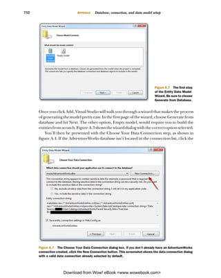


![SILVERLIGHT/.NET
Silverlight 4 IN ACTION Pete Brown
“Goes deeply into why Silverlight works the way SEE INSERT
it does, not just step by step explanations. Pete
Brown is the only guy who could have written
this book.” —Al Pascual, ERSI
S
ilverlight gives you entirely new ways to create rich inter-
net applications, and now Silverlight 4 adds many power-
ful enhancements to the mix. “It raises the bar for
Silverlight 4 in Action is a comprehensive guide to application Silverlight titles—go and
building using C#. It goes into action immediately in a thor- buy this book!”
ough introduction. It then follows up with numerous nifty —Richard Costall
examples to explore flexible layout, control extensibility, the NxtGenUG Blog
communication and binding models, rich media, animation,
and much more. “This is a great book and
This book explores practical questions in patterns, testing, its MVVM chapter
and performance optimization throughout. No previous a true gem.”
experience with Silverlight is required. —Omar Shraim, Manning
Author Online Forum
What’s Inside
Comprehensive and deep
Author an authority
Effective UI design with MVVM
Building with WCF RIA Services
Out-of-browser, COM and Custom Chrome
Pete Brown is the Microsoft Community Program Manager
for Silverlight and WPF. The First Edition was written by
independent developers Chad Campbell and John Stockton.
For online access to the author and a free ebook for owners
of this book, go to manning.com/Silverlight4inAction
MANNING $49.99 / Can $57.99 [INCLUDING eBOOK]](https://image.slidesharecdn.com/manning-silverlight-4-in-action-sep-2010-100919221158-phpapp01/85/Manning-silverlight-4-in-action-sep-2010-798-320.jpg)


