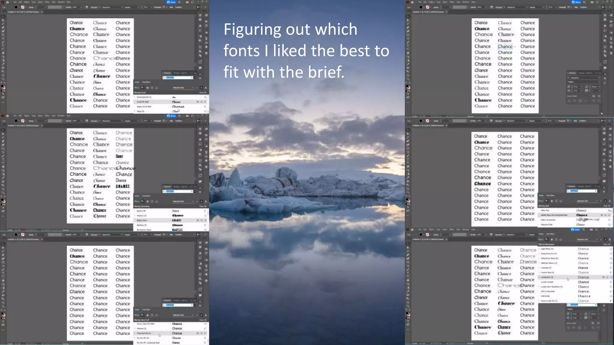
Figuring out which
fonts I liked the best to
fit with the brief.
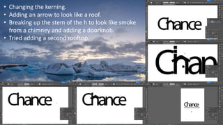
• Changing the kerning.
• Adding an arrow to look like a roof.
• Breaking up the stem of the h to look like smoke
from a chimney and adding a doorknob.
• Tried adding a second rooftop.
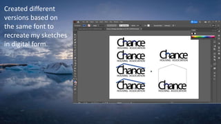
Created different
versions based on
the same font to
recreate my sketches
in digital form.
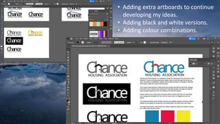
• Adding extra artboards to continue
developing my ideas.
• Adding black and white versions.
• Adding colour combinations.
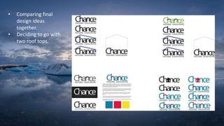
• Comparing final
design ideas
together.
• Deciding to go with
two roof tops.

Logo-presentation.pptx

  • 1.
    Figuring out which fontsI liked the best to fit with the brief.
  • 2.
    • Changing thekerning. • Adding an arrow to look like a roof. • Breaking up the stem of the h to look like smoke from a chimney and adding a doorknob. • Tried adding a second rooftop.
  • 3.
    Created different versions basedon the same font to recreate my sketches in digital form.
  • 4.
    • Adding extraartboards to continue developing my ideas. • Adding black and white versions. • Adding colour combinations.
  • 5.
    • Comparing final designideas together. • Deciding to go with two roof tops.